|
| Group |
Round |
C/R |
Comment |
Date |
Image |
| 70 |
Jan 19 |
Reply |
Well done Frans! Glenn |
Jan 18th |
| 70 |
Jan 19 |
Comment |
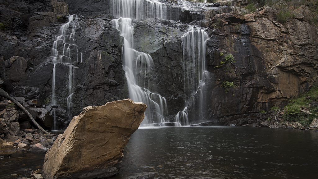
Hi All. Thanks for your wonderful suggestions. I have taken them on board and put them into practice. I think I like Kathryn's interpretation the best. Not too overdone but a little more punch. I like how the ripples in the foreground are now evident. Thanks again for your time everyone. Cheers Glenn. |
Jan 14th |
| 70 |
Jan 19 |
Comment |
Technically you have left me amazed Todd. You are achieving what you are setting out to do. Your end results are amazing. The colours are great and when I first looked I thought there was a ridge of fire but on closer inspection realized it was a road with cars. We may soon see some of your shots in magazines. Many viewers wouldn't like the tree in the top right hand corner but I feel it balances the image out nicely. Well Done! Cheers Glenn |
Jan 14th |
| 70 |
Jan 19 |
Comment |
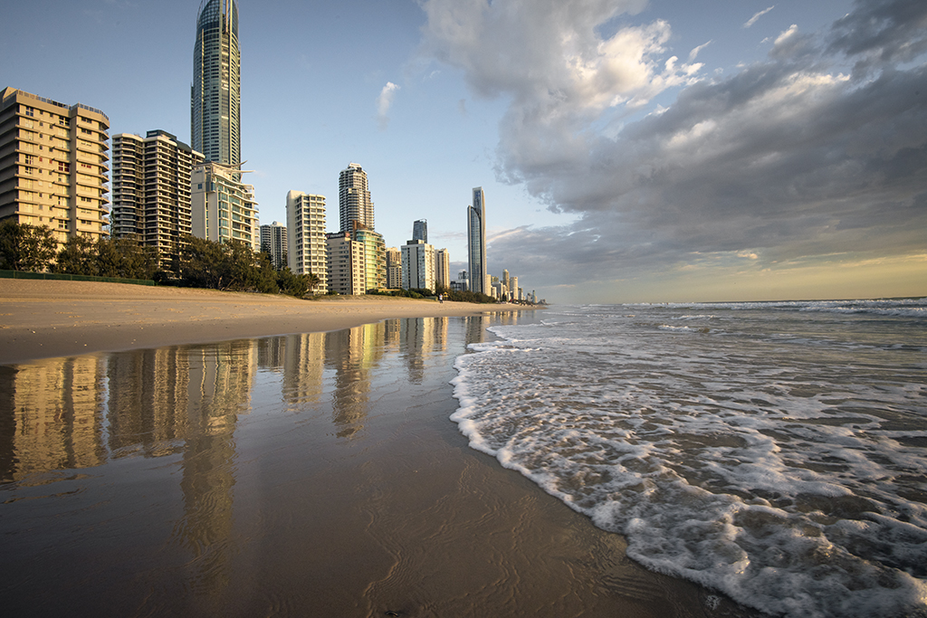
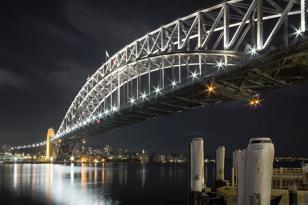
Hi Frans. My eye went straight to the lit up displays which are very sharp for a night shot. I then the started looking around and could appreciate the small light on the roof, the curved roof with its bollards and the posts in the foreground. The roof is handled well and my eye went from the displays to the roof. Colours are treated well and everything just seems to balance. Great work! Cheers Glenn |
Jan 14th |
| 70 |
Jan 19 |
Comment |
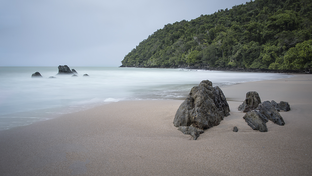
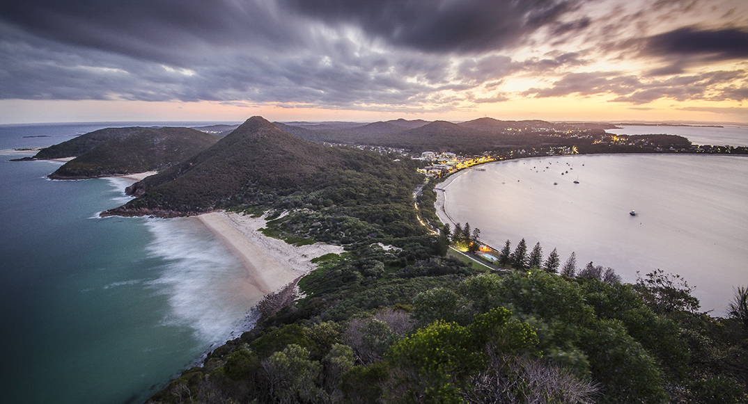
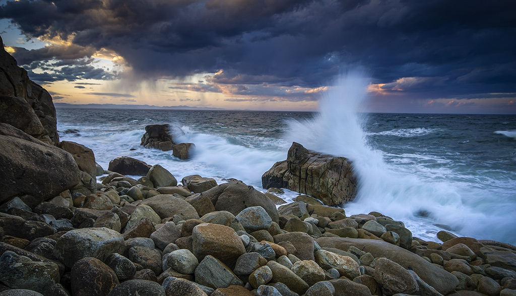
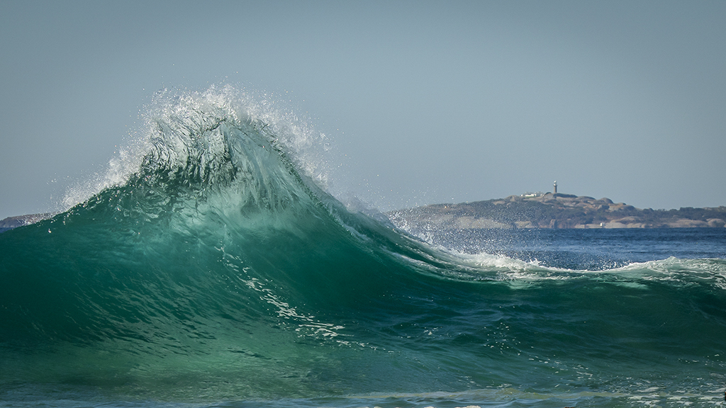
Wow, Pierre what an emotive image. I feel for the poor gulls and I can feel the cold as I write this. Did you use an umbrella? The grey colour gives the image a very cold moody feel. I understand the feeling you have tried to portray and you have succeeded. It's nice to get your message across to the viewer. Great! Cheers Glenn |
Jan 13th |
| 70 |
Jan 19 |
Comment |
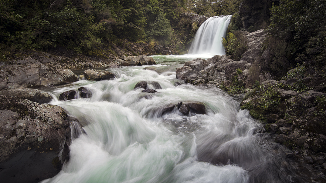
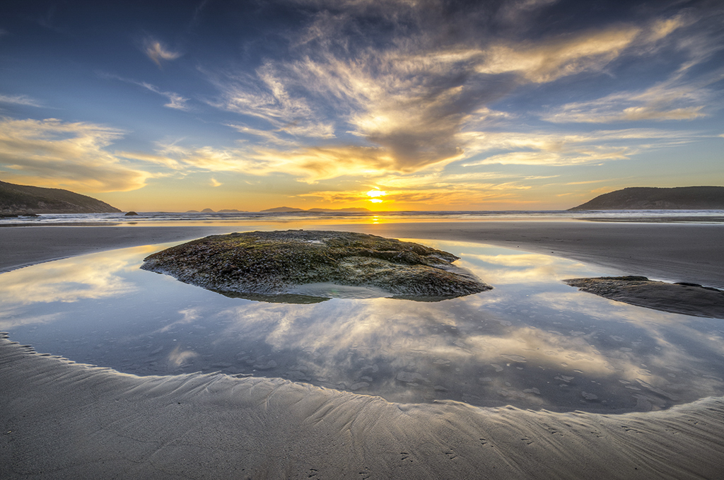
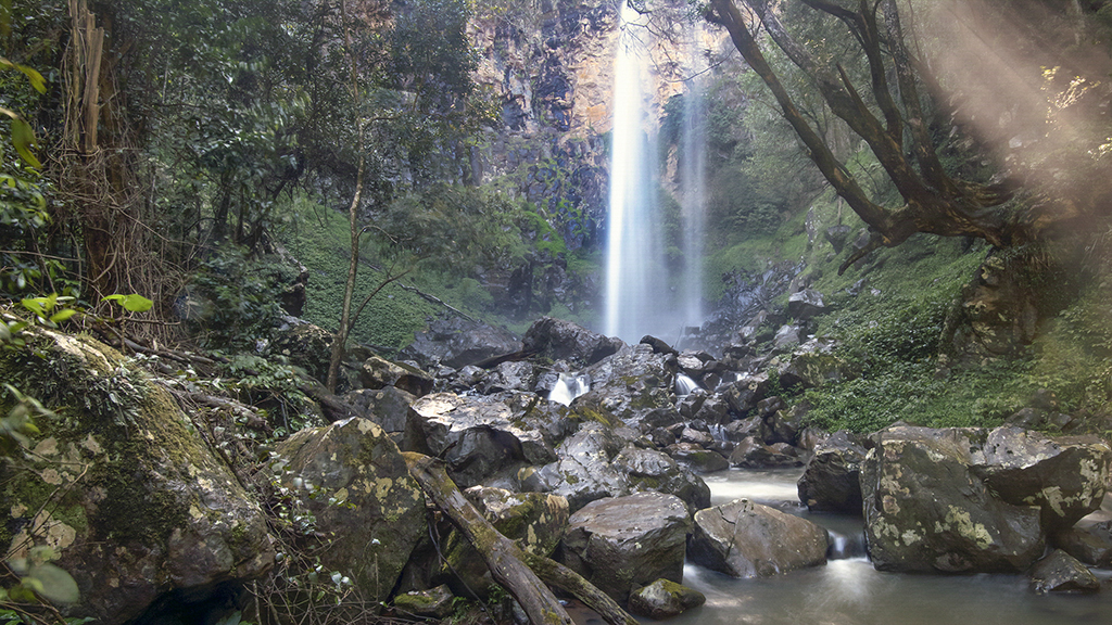
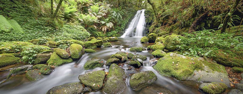
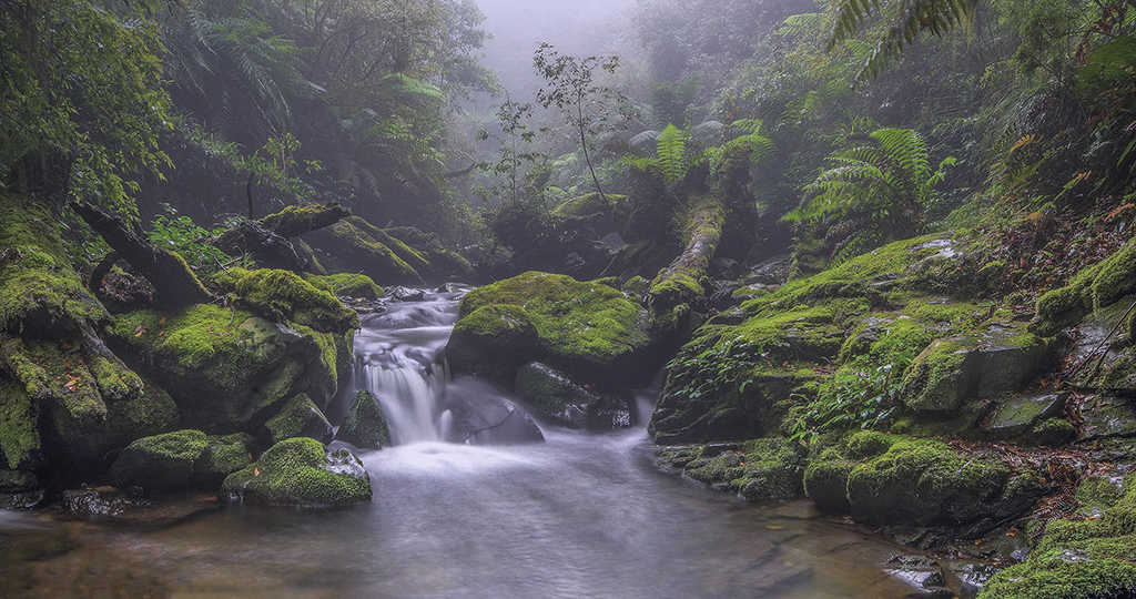
Hi Judy. My kind of image. I really like soft water. You have handled the water movement well but I would have quickened the shutter speed to 1/2 sec to make the movement more distinct. It's great when you get a dull day and filters don't need to be applied. Give 1/2 sec a go and see what you think. Cheers Glenn. |
Jan 13th |
| 70 |
Jan 19 |
Comment |
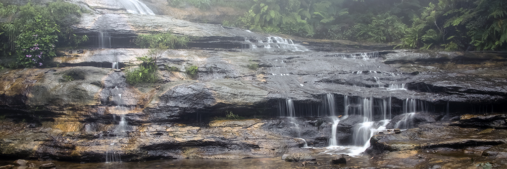
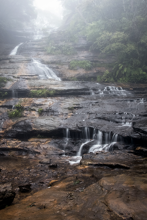
Hi Kathryn. I really like this image, probably because we don't see anything like it in Australia. The textures in the cliffs which border the image are wonderful and force the eye to the monuments in the distance. The light is well handled and the glow on the middle monument is really nice. The foreground is great and you could possibly brighten up the yellow bushes for a bit of interest. I had a play with this image in photoshop be couldn't improve it. Excellent. Cheers Glenn. |
Jan 13th |
| 70 |
Jan 19 |
Comment |
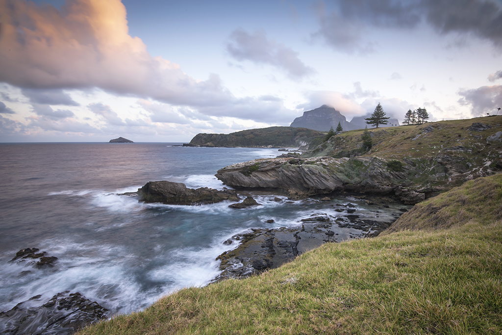
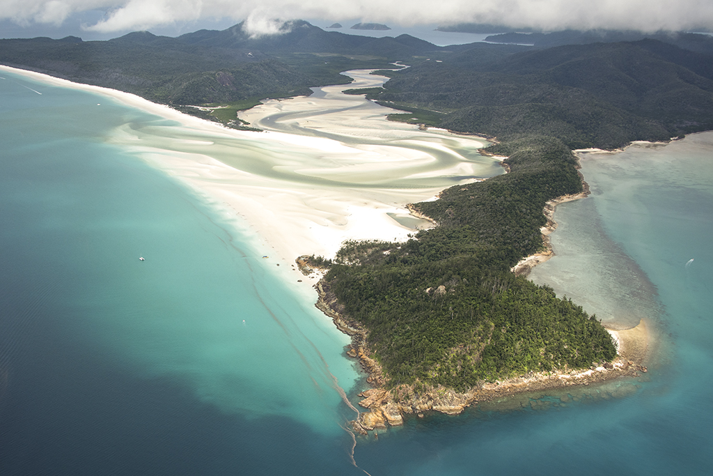
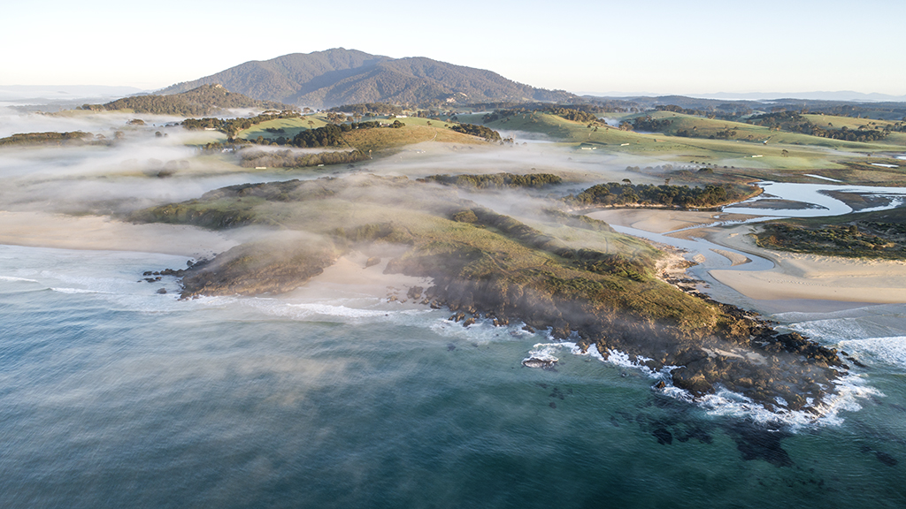
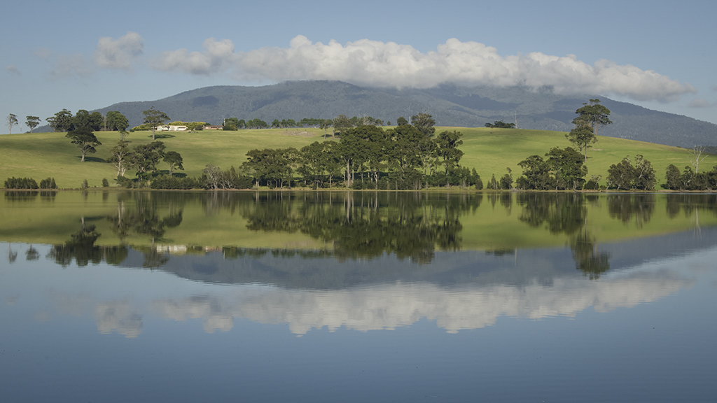
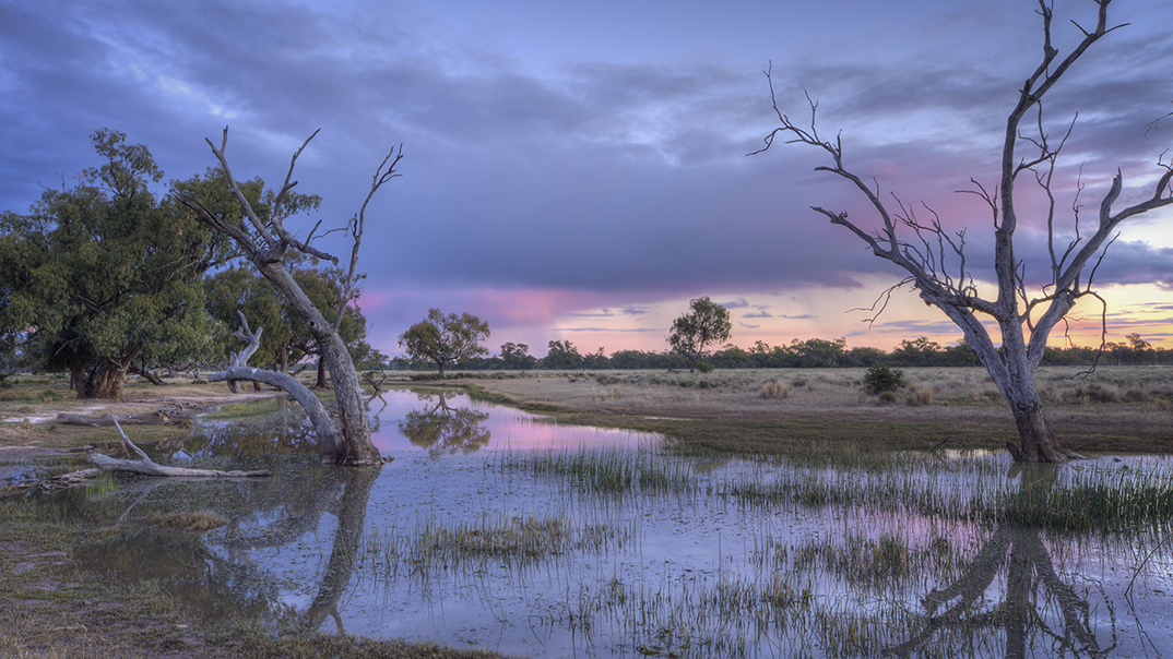
Hi Lamar. A wonderful landscape image. It is said not to have the horizon in the centre but I agree with Frans that it works well here. The reflections are well handled and the vegetation on either side of the image lead ones eye to island in the background. This vegetation has just enough light to show what it is and if it was a little darker the image would be spoiled. The colours are wonderful and you have captured a beautiful sunrise.I am not a fan of over saturation but this image is handled well. Well Done! Cheers Glenn. |
Jan 13th |
7 comments - 1 reply for Group 70
|
7 comments - 1 reply Total
|