|
| Group |
Round |
C/R |
Comment |
Date |
Image |
| 3 |
Aug 23 |
Reply |
Thank you, Joan, for your thoughtful comment. Creativity is about experimentation and expression unique to each artist. As others have noted, there are many ways to take this photo, and my rendition shows how I saw the scene.
Have a wonderful day!
lt |
Aug 30th |
| 3 |
Aug 23 |
Reply |
Hello Ruth,
I am working more in B&W these days and less in color for a change of pace. I am also experimenting with B&W film photography. Not too long ago, I bought a 35mm SLR manufactured in the 1970s. It helps me learn more about light, exposure, and metering, and I find it a fun pastime. It also teaches me patience because I have to wait a couple of weeks for the film to be developed.
lt |
Aug 23rd |
| 3 |
Aug 23 |
Reply |
That is a great question! |
Aug 23rd |
| 3 |
Aug 23 |
Reply |
Those tiny flowers really need a photo capture all their own. They are really beautiful.
lt |
Aug 23rd |
| 3 |
Aug 23 |
Comment |
Hello Joan,
I can see why you found this to be a hillside worth photographing. The yellow flowers pull the eye into the image. I also like the tree as it contrasts the mustard in bloom because the tree is leafless.
I agree with the others that the sky replacement isn't working to improve the photo. I like Ruth's idea of keeping the original sky and adding contrast, clarity, dehaze, and vibrance. I did try working with the sky (the image is just too small to share an edit), and I noticed a sensor dust spot in the white sky. If you move the dehaze slider to the right (+100), spots pop up. Easy to fix by removing spots either in Lightroom or Photoshop.
Thanks for sharing this pretty scene!
lt |
Aug 23rd |
| 3 |
Aug 23 |
Comment |
Hello Kieu-Hanh,
I agree with the ladies; you have captured a beautiful scene. When I view the image at 100%, it appears sharp. The colors are beautiful, the HDR treatment is not overdone, and the blue sky looks natural in hue and tone, as does the algae on the stone wall on the right. There is a lot to see in this historic fishing village. What a lucky person you were to travel to this location.
I do agree with Mary Ann about a new crop. This will offset the mountain range in the back so the horizon is not in the center of the photo. I often like to use the 16x9 crop ratio with landscapes like you have here because it keeps more of what is on the left and right sides of the image intact (which tells a bigger story). The downside to this ratio is that more expansive photographs do not work on some social media sharing groups, but the photo will look great in 16x9 if you print.
Thanks for sharing your photo from your travels!
lt |
Aug 23rd |
| 3 |
Aug 23 |
Comment |
Hello Robert,
I am glad the group was able to give you some ideas for your photo this month. Each member has a unique area of interest, so you will find various ideas to help you improve or confirm what you like about your photograph.
Like you, I have used presets when editing my photographs; it was the only way to get a handle on post-processing. If you ask ten photographers to edit a photo, you will get ten differing opinions, so as time goes on, you will fall into a style that speaks to you. Some of my favorite landscape photographers on YouTube include Nigel Danson, Simon Baxter, and Photo Tom, to name just three. Check out their channels for great videos and view their amazing images.
In my edit, I tried to find the Adobe Landscape preset you said you used in Lightroom, but I did not see it. Was it in the drop-down panel on the Develop module on the right or the Preset section on the left? My adjustments to the original image were from the basic panel (exposure +5.4, contrast +6, highlights -54, whites +21, blacks -18, dehaze +13). I also applied some dodging and burns to different areas for effect. Lastly, I straightened the photo in the Transform section in Lightroom. I think you have a good sky with interesting clouds. I liked Michael's idea of a different crop and used one of my favorite crops, the 16X9.
Curious what you think.
Best regards,
LuAnn |
Aug 21st |
 |
| 3 |
Aug 23 |
Reply |
That is a lovely suggestion, Kieu-Hahn. I will have to give it a try. One question. Your edit was in color so do you not like the B&W conversion? Perhaps it is not your style?
Just curious.
Thanks,
lt |
Aug 17th |
| 3 |
Aug 23 |
Reply |
Hello Mary Ann,
I am glad you like my photo! You are correct that the eye wanders through the image, which was my intent; there is more than the main subject to look at, like the deep texture of the other leaves and their veins, as you noted. I was also drawn to look at the background flowers in the softer, dimmer light. That is where I see the "wow" in the image, and it holds my eye to show me everything I found.
It is funny. I found this scene in a chaotic woodland alongside a dusty gravel road. It amazes me that I found something beautiful in such an unforgiving environment.
Best regards,
lt |
Aug 14th |
| 3 |
Aug 23 |
Reply |
Hello Michael,
Thanks for your comment and clarification. There is no need to apologize you did nothing wrong. I was looking for clarity on why you did not like the border; you didn't leave an explanation in your first comment.
I know you took the Image Evaluation course, so you would have read lesson one that touches on "bias" in section "4a: The Definition of Impact - How an Image Makes Us Feel."
The third paragraph notes that it is vital to recognize that our own biases may affect how an image impacts us. We all have a bias/a preference (myself included), which is not a negative characteristic. If you have or go on to take the PSA Image Critique course, you will learn even more about how bias can influence our observations and is one area of subjectivity we can influence. I highly recommend this PSA course.
My thought process in using a black border on a primarily black image was more of a last-minute addition, mainly because the photo is presented on a black screen. I have been doing a lot of printing lately, so I won't rule out using the black-on-black border until I see it printed. It may turn out that it is just a choice for a digital group, or it may offer something in print format.
I hope this clarifies my comment. Your response did not offend me, so no worries. This was a good topic that led to an excellent discussion.
Best regards,
lt |
Aug 12th |
| 3 |
Aug 23 |
Comment |
Thank you, Michael, for your comments on my photo.
I usually do not use a stroke line around my photographs. But, because digital groups have a black background and my photo was black and white, I used the line for separation; the frame came with the grey stroke line I chose. I am sorry you find the border "weird" and not "pleasing." It sounds like you are biased toward this type of stroke and border used in a photograph because you did not explain your reasoning. You are correct that it is different, but is it in bad taste? Can you expound a bit on your thoughts?
Also, thanks for pointing out the brightness level on the leaves in the photo. I checked the value in Lightroom; the brightest point of the leaf on the left in the background is at 67%, and the main subject's brightest area is around 90%. That is okay because it shows a variance in luminosity levels, helps draw the eye around the image, and presents depth from darker to lighter tones.
Best regards,
lt |
Aug 11th |
| 3 |
Aug 23 |
Comment |
You are so creative, Michael; I love what you have done with this image very much!! You have achieved something original that will result in an emotional response from the viewers who probably have not seen a version done this way before.
The light and color of the building in the center are such that it draws the eye into the image. You also have a figure-ground relationship with the darker blue sky behind the brighter yellow building, an advanced technique rarely seen.
Compositionally, you have a symmetrical balance that might intrigue a viewer because, when done well, the subjects pop.
My only suggestion is to note the duck swimming in the lower right corner; it is also in the sky. Is this something you did purposely, or would you consider removing it?
You are an artist everyone should follow. I see your work improve in leaps and bounds. Thanks for sharing this with the group this month.
Best regards,
lt |
Aug 3rd |
| 3 |
Aug 23 |
Comment |
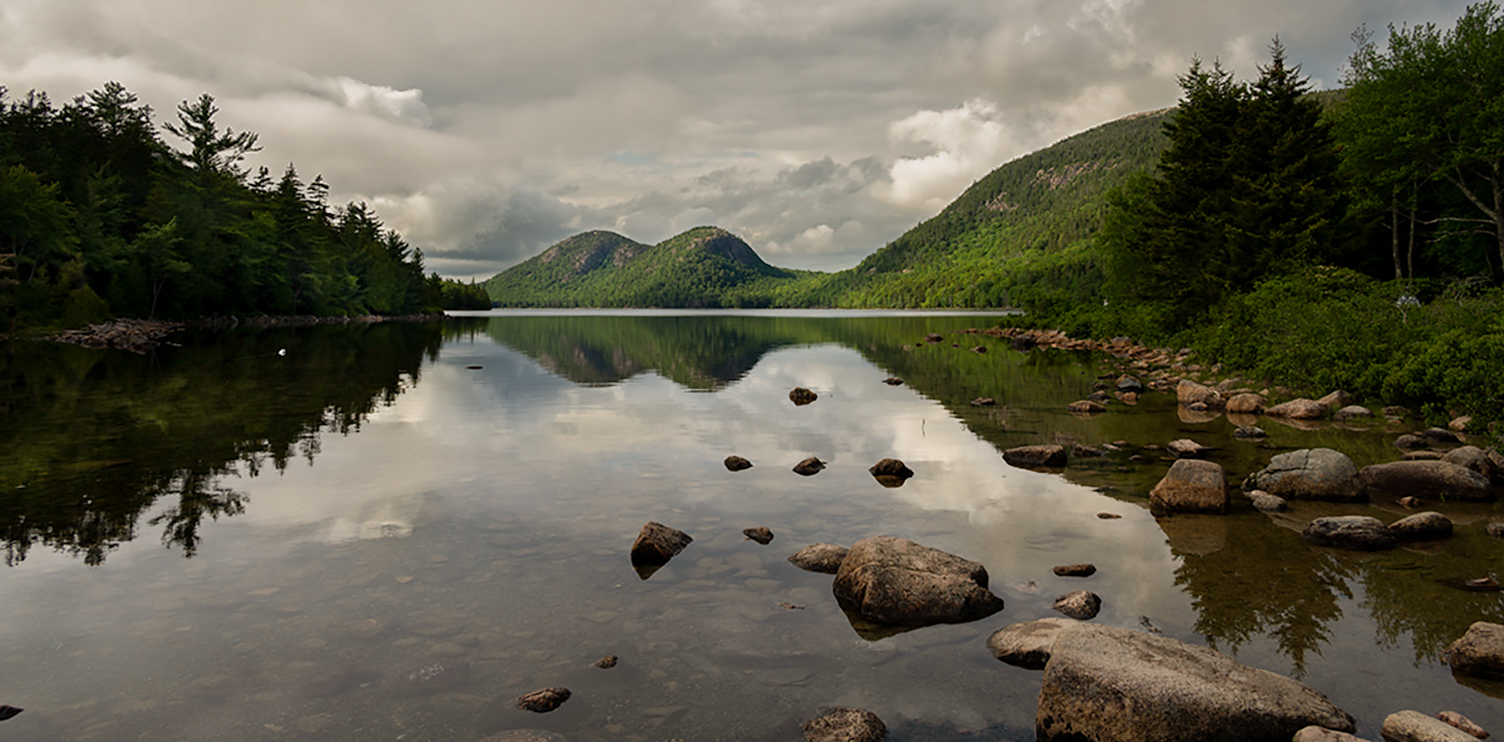
Hello Ruth,
What a spectacular view! I like the flowers in the foreground, showing that something beautiful can grow in a rugged mountain region. Your composition is good with the pile of rocks off-center and on the rule of thirds. Your camera's dynamic range was good so you were able to recover from the bright sky above the scene.
My only question is about the saturation level of the blue sky; is it too saturated? Lastly, if you have another opportunity to photograph this location again, would you be able to have the flowers closer in view in the foreground so the viewer could see more details of them? I know it might not fit with your intent for taking the photo with such a spectacular view.
Thanks for sharing a super travel photo with the group!
lt
|
Aug 2nd |
| 3 |
Aug 23 |
Comment |
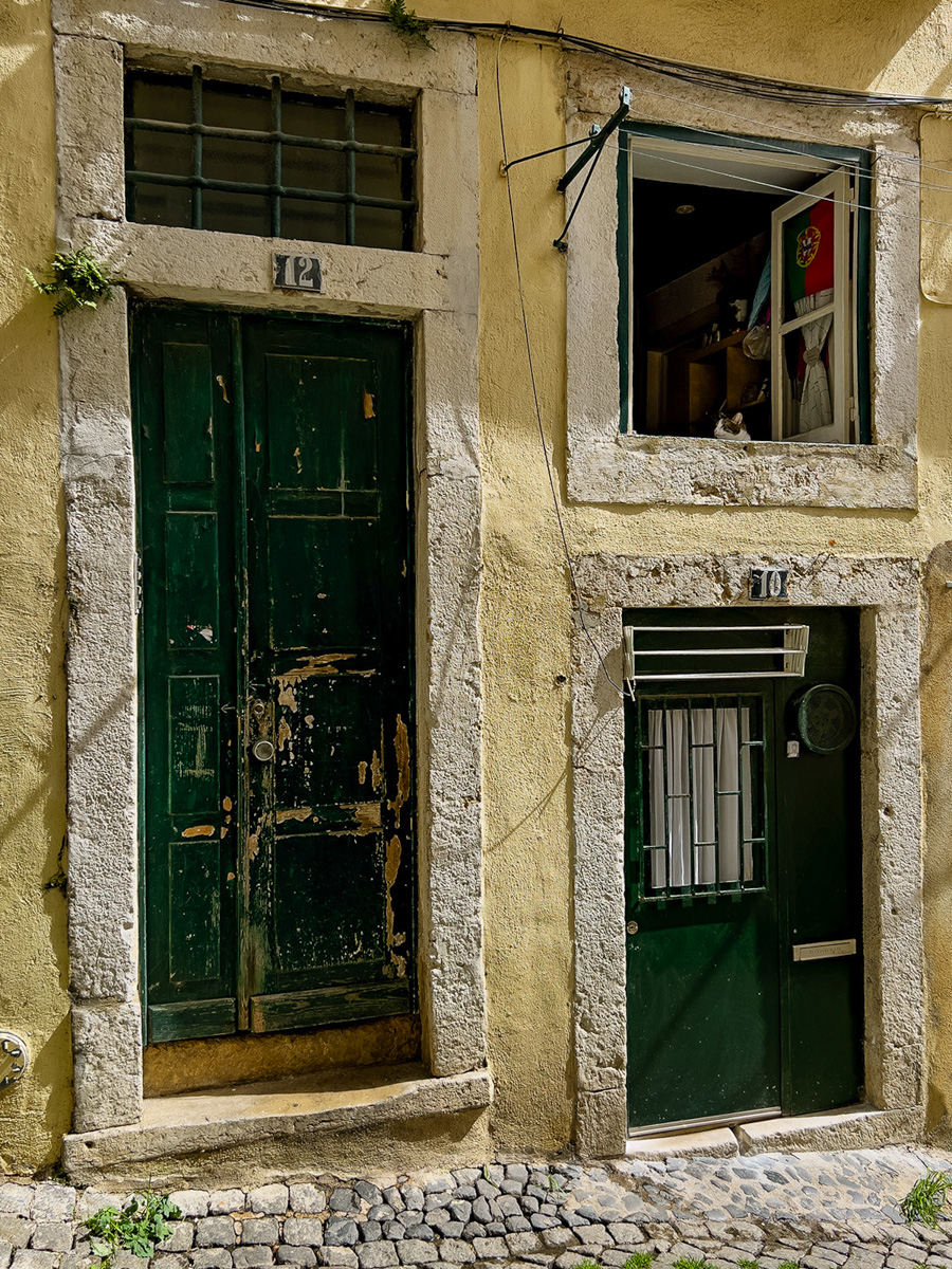
Hello Mary Ann,
What a lovely photo, and the cat in the window is perfect! I love cats.
You did an excellent job with your composition and using the angle to help tell the story. The color palette is warm and pleasing; the cobblestone street, the facade of the building, and the tiny curb area speak of a foreign country getaway.
In my suggestion for edits to help enhance your image, I used LR and straightened it with the Transform tool. Then, I added a medium contrast on the Tone Curve and deleted the darkest black point (2nd one from the lower left corner of the curve). In the basic panel, I lowered the highlights a bit and raised the shadows a bit to help draw the eye to the window the cat is in. Now, I can see some detail in the room, and the cat is more noticeable.
All these adjustments are minor and subject to personal preference. Thanks for sharing this excellent travel photo! I just photographed a cat a few days ago. I will have to submit it for next month; you inspired me!!
Best regards,
lt |
Aug 2nd |
 |
7 comments - 7 replies for Group 3
|
| 62 |
Aug 23 |
Reply |
Hello Mark,
Thanks for being a stickler with your comment about having a vertical reference in an image. There is no way to correct that now, but I will remember your point in the future when I return to this location.
I was using a 35mm lens this go-round, and working with a prime being so close to the building wasn't helping me this time. I only have two lenses for this camera, 35mm and 50mm, and my goal is to shoot what works best with those lenses.
Your comment was helpful. Thanks for sharing.
lt |
Aug 31st |
| 62 |
Aug 23 |
Reply |
Thanks for your comment, Oliver! |
Aug 23rd |
| 62 |
Aug 23 |
Reply |
Hi Bob,
I just shot a roll of Tri-X, so as soon as I get the scans back, I will submit a shot from that roll and see what you think. I recently bought color filters for this SLR camera (red, green, yellow, and red), so I am waiting to see how those shots turn out too. With all the great cameras out nowadays, no one is interested in film, I get it. But I am having fun with the experiment!
Talk soon,
lt |
Aug 23rd |
| 62 |
Aug 23 |
Reply |
Hi Bunny,
I will try borders in PS in the future. That is a good tip. Glad you like the photo!
lt |
Aug 23rd |
| 62 |
Aug 23 |
Reply |
Thanks, Israel, for your thoughts and comments. Glad you like the photo.
lt |
Aug 23rd |
| 62 |
Aug 23 |
Reply |
Thanks, Emil, for your thoughts on film photography.
I have put my digital cameras away for a while and have been working on figuring out my film SLR. Call me crazy, but I enjoy learning about exposure, light, and metering the old-fashioned way. It is teaching me about having patience because I have to wait a couple of weeks to get my scans online, and I have to take good notes so I know what I did back then if I need to change something (LOL). I doubt I will ever develop my film; I don't see a desire to learn it right now.
lt |
Aug 23rd |
| 62 |
Aug 23 |
Reply |
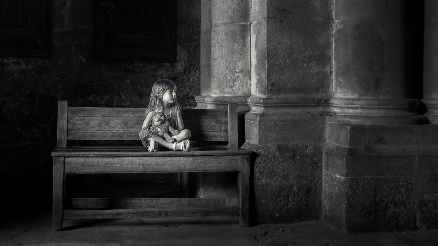
Hello Israel,
I cropped the tile out of the image not only to bring the child closer to the viewer, but the tile did not add anything interesting to the image; it actually detracts the eye from the subject. What looks like to me to be a rectangular steel cover in front of the girl takes my attention away from this beautiful child. My curiosity causes me to wonder if that is a trap door or an escape hatch. If it opened, could someone come out of it and scare the child? Those possibilities could bring tension into the photo for a viewer and work against your intent for taking this photograph. You do have enough foreground space to see this is a walkway; the bench and child are in the middle, and the shadow shows a brick area in the background. You also captured a unique scene with beautiful light.
The 16x9 crop gives the space more breathing room on the sides, and the pillar on the right is not as constrained. Using this crop is unique and creative, but it will depend on your audience when and where to use it.
I hope this helps.
lt |
Aug 13th |
| 62 |
Aug 23 |
Reply |
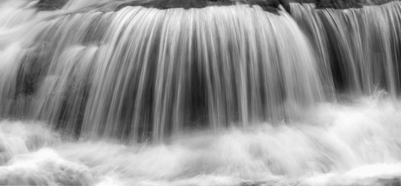
Hello Bob,
In my work with waterfalls, I look for the contemplative feel and appeal in the scene. Where the water comes from really doesn't matter in that instance (not all water scenes have to be documentary in style). It's the power of the water that intrigues me. So, my crop minimizes the distraction of where the water comes from to show its strength and meditative quality on the subconscious mind.
You could compare this idea to those who photograph flowers. Some capture the entire flower, and others look deeper and capture the essence of its beauty.
Hope this helps clarify my thoughts.
lt |
Aug 9th |
| 62 |
Aug 23 |
Comment |
Hello Israel,
You have terrific opportunities to find great scenes to photograph. The little child in this photograph is beautiful and worth your wait. She sits patiently with her doll in her lap; this story will captivate your viewers' attention.
My only suggestion is to enhance the light in the black-and-white image more. Notice the intensity of the light in the color photo compared to the B&W. In doing the conversion, you seemed to have lessened or narrowed the light on the child.
I adjusted the tone curve and used the medium contrast option on my sample's tone curve in LR. I also used a 16x9 crop to help tighten the scene, making the little child more present yet keeping the left and right side details in the space. The stone floor tiles seemed to overpower her.
I am curious what you think.
Best regards,
lt |
Aug 2nd |
 |
| 62 |
Aug 23 |
Comment |
Hello Bob,
Your photo of the Jackson Lower Falls is a fantastic image to me! I love to photograph waterfalls any way I can find them. I agree with you on the shutter speed; 1/4 second produces an excellent water flow. You could also try different aperture settings and see what you think. I have used wider apertures depending on the waterfall I was shooting.
I suggest trying a tighter crop (16x9) and lowering the top of the frame to a smaller distance above the falls. The crop will simplify and direct the viewer's attention to your subject in the center. Let me know what you think.
Great job; thanks for sharing!!
lt
|
Aug 2nd |
 |
| 62 |
Aug 23 |
Comment |
Potter Cove is a beautiful image, Bunny. The vastness of the area and the rocky landscape is a sight to behold. I also found it interesting to read a little about this location that some say is the most 'cosmopolitan' place in Antarctica.
I like your approach to editing this image. Monochrome conversion works perfectly. It feels like there is a matte-type finish to the photo (dehazing edit, maybe), which, for me, gives it a classic appeal. I like your composition and placement of the mountain peak, making the snow drift more visible than in the original. I do not see any need for change or correction.
Thanks for sharing yet another photo from your travels,
lt |
Aug 2nd |
| 62 |
Aug 23 |
Comment |
Hello Mark,
Your photograph caught my eye immediately when I saw it. The wide to narrow pathway directs my eye deep into the photo to the vanishing point. The boulders even seem to point to the stairway. The stones or smaller boulders in the sand capture my imagination.
I like both images as they tell and show a great story. The original stands out the most for me because of the warm light inside the area. I like your editing process, but I do have a question. What are your thoughts on using the B&W color sliders in Lightroom (after you convert to B&W in LR) to adjust the tones in the image?
I ended up watching a video on this location and the ruins. What a great adventure you had! Did you ever find the mushrooms you were looking for?
Best regards,
lt |
Aug 2nd |
| 62 |
Aug 23 |
Comment |
Hello Emil,
What a lovely 'Daisy Chain' you have created! The arrangement is a unique orientation of daisies, and converting to B&W gives the image a nostalgic look and feel, almost film-like. The tones you created in the final edits cover a broad tonal range from whites to blacks. This photo would look lovely framed and hanging in an entryway or coffee shop.
"A great photograph is a full expression of what one feels." Ansel Adams
lt |
Aug 2nd |
| 62 |
Aug 23 |
Comment |
Hello Pete,
This is a great photo, I agree! It reminds me of the photos I used to take at Mauy Thai (kickboxing) fights years ago. His expression is perfect; the missing tooth makes me wonder if he is a boxer and if the conversation is about a fight or bout he had. Even looking in his glasses, it feels like I might be looking at the inside of a gym, so even though this was at a jazz event, a neutral viewer can build their own story by looking at this photograph. I have no corrections to offer.
Thanks for sharing!
lt |
Aug 2nd |
6 comments - 8 replies for Group 62
|
13 comments - 15 replies Total
|


