|
| Group |
Round |
C/R |
Comment |
Date |
Image |
| 3 |
May 23 |
Reply |
I do like the changes you made, Ruth. I also agree with Michael that printing on metallic would be lovely! |
May 24th |
| 3 |
May 23 |
Comment |
Hello Kieu-Hanh,
Your flower this month is lovely! The color palette is vibrant, and the angle is suitable for viewing. I agree with your choice that using a black background helps the subject stand out.
What my attention is drawn to is the aperture setting of f/5. I suggest a narrower aperture so more of the flower is in sharper focus. I could not tell where the focus point was, be it on an orange leaf, blue petal, or spathe from which the flower emerges. Getting a sharp focus is a common challenge for photographers. So I recommend (in this instance) taking several shots using different aperture settings. Then when you are at home editing your photos, you will have more choices.
On a side note, if you shoot moving subjects, you will want to use different shutter speeds.
Hope this helps.
lt |
May 23rd |
| 3 |
May 23 |
Comment |
Hello Joan,
I find your image to be an intriguing abstract or mountain close-up. The color palette is interesting, and the dark brown tones have me pondering where you saw this scene.
I have looked at this image several times on and off since you submitted it for May. You noted that you borrowed a camera but did not specify what make or model, nor did you note if this was a jpg or raw file, nor do I see any camera settings. The file is 730 x 1000 pixels with a resolution of 72x72. The camera settings include f/11, 1/8 shutter speed, and ISO 80. Lightroom tells me the camera was a Panasonic DMC-FZ30 which has an 8-mega-pixel sensor (the release date appears to have been 2005). I suspect the file may have been severely cropped because the image has a soft focus. I detect chromatic aberration or unusually shaped worm-like artifacts in solid brown areas. Some camera sensors will produce this worm-like effect, but I cannot determine whether this is the case. Sometimes this effect can appear if there is a conflict between the file/camera model and Lightroom software.
If you care to give me some feed back on my thoughts, I would be interested in helping you further.
lt |
May 18th |
| 3 |
May 23 |
Reply |
Hello Michael,
Yes, the red jacket does compete for attention, as you noted. I did notice it, but in the edited version, the white areas stand out more, so I focused my comments on those areas. I have to be careful not to overwhelm people when I give constructive criticism. You asked if the red jacket could be a landing spot for attention, and my response is if this was a landscape where you had a designated foreground interest, then yes. But this is a scenic view of a mountain range, and I don't think having the red jacket as a landing spot works in this instance. But I do like your thought process in considering it. I hope this clarifies the point.
Next, you asked about my term 'tension.' Yes, my comment was about competing focal points; do I look at the elements I noted or go to the "dramatic" view in the valley? My brain has a challenge, but the draw to the light in the valley is stronger and bigger than staying at the bridge in the foreground; the people are small, and their backs are to the camera. If the red jacket person were doing something exciting or appearing to be jumping off the bridge or hanging over the railing too far, say, you would have a reason to stop there first.
Your next point (3) referenced my comment on a previous image. Every image we process must stand on its merits when we edit. The elements in your earlier photo (backlit trees and silhouettes) and this image have different strengths and weaknesses; I would not recommend comparing them. When a photograph is simplified and uncomplicated, it becomes more appealing, easier to view, and appreciated.
Lastly, welcome to the Club of over-processing aficionados! I am also guilty of over-editing. Everything in moderation is usually the way to go.
Let me know if I missed anything or if something needs further explanation. I love to write so I could go on and on!
Have a great day,
lt |
May 18th |
| 3 |
May 23 |
Reply |
Hey, Bob! How are you doing?
I am glad you stopped by for a visit and that you like the image!
Have a great day!
lt |
May 17th |
| 3 |
May 23 |
Comment |
Hello Michael,
Your image is beautiful and filled with wonderful memories to last you a lifetime and then some.
You noted in your description that you registered this image on your camera's sensor during a break in the clouds that illuminated the valley ahead of your path with beautiful light. The light is what I see unfolding in your original image, and the sunlight draws me into the photo.
In your edited version, I am curious why you are illuminating the mountain on the right, the people on the bridge, and the water under the bridge, as it was not illustrated in the original. In doing this, you are taking the eye away from what drew you to the image in the first place; the light in the valley. I am unsure where to rest my eye in the edited photograph. The viewing audience will be drawn to the human element in a photo. By brightening this area, you bring tension into the photograph; note the luminosity values of the rushing water and the person with a white jacket compared to the light in the valley.
Outside of that, I recommend adjusting the midtones; the image feels flat.
Let me know if you want me to clarify anything.
lt |
May 17th |
 |
| 3 |
May 23 |
Comment |
Hello Mary Ann,
What a lovely photo. You must have been in awe when you walked through the corridor.
I like Ruth's idea of removing the man with the cell phone. In my edit, I ran the photo through Nik Perspective Efex to straighten and align the entryway and added some clarity for pop. I used the Auto button in the LR basic panel and adjusted it accordingly.
You must have lots of great memories from your travels!
Best regards,
LuAnn |
May 7th |
 |
| 3 |
May 23 |
Comment |
Hello Ruth,
What a great idea to freeze tulips; I had to look it up, and low and behold, someone froze tulips in a bundt pan; very creative idea! I have never tried this, but now I am curious.
You asked for suggestions, so here goes. The brightness stands out for me at the top. It is darker on top than the bottom; this makes the image feel top-heavy. Evening out the brightness should be an easy fix in post-processing.
Next, the purple petal with the sharp edges keeps drawing my attention. Fixing the edge might be tricky, but you could edit in Photoshop with a soft blending brush at low opacity (5 - 10%); it is time-consuming but can be done.
Lastly, I would paint the brown tips of the leaves with a brush; dead foliage defeats the purpose of prolonging the life of the flowers, just my opinion.
Let me know what you think. I think you are onto something with this idea. You are almost there!
Best regards,
LuAnn |
May 7th |
| 3 |
May 23 |
Reply |
Thanks, Ruth; I am glad you like the photo! These marine invertebrates are called Sea Nettles and come from the Pacific coast. They do collide with each other and are mesmerizing to watch in person.
Do you have large aquariums where you live? I do recommend a rubber lens hood if you ever give it a try.
Best regards,
LuAnn |
May 6th |
| 3 |
May 23 |
Reply |
Hello Michael,
I am glad you like my image! About the lighting: there was a rotating color light wheel, I think, at the bottom and perhaps a white light at the top illuminating the tank. The colors changed quickly; remember the 1960s tinsel Christmas trees with the color wheel? These jellies were transparent, so they used colored lighting to stand out.
This permanent exhibit is at the Mall of America, Minnesota's largest aquarium. The tank was vertical, so that explains the vertical crop. Yes, the subjects look ever so slightly soft, but that is because they are constantly moving, which adds to the ambiance.
I may have adding some sharpening but I do not think the image needs it. These creatures are moving so soft focus works for me in this instance.
Best regards,
lt |
May 6th |
5 comments - 5 replies for Group 3
|
| 62 |
May 23 |
Reply |
Thanks, Bob, for your comments and I am glad you like my version of this pair of flowers. I am a bit of a rule breaker so I don't mind two flowers. However, if I were to photograph Peonies, I would focus on 1 ball as well!
Have a good day,
lt |
May 23rd |
| 62 |
May 23 |
Reply |
Thanks for your kind thoughts, Israel! Yes, Emil has excellent editing skills that we can learn from; I am glad he is part of the group. But you are an amazing photographer and photo editor yourself, Israel! I am so impressed with the work you share online.
Have a great day, my friend!
lt |
May 17th |
| 62 |
May 23 |
Reply |
Hello Oliver,
Thanks for your thoughts and comments. Yes, I agree Emil has an eye for B&W editing and a style that fits what he is drawn towards. If I shoot in B&W, I have my camera set to RAW, so if I decide to go back to color, I can. Software nowadays is so flexible we can change our edits at the snap of a finger if it suits us.
Have a wonderful day, my friend!
lt |
May 17th |
| 62 |
May 23 |
Reply |
Hi Bob,
Yes, you are right there are lots of ways Oliver could take this image that is what is so great about the scene he captured!
lt |
May 13th |
| 62 |
May 23 |
Comment |
Hello Israel,
You have access to some unique villages and towns in Israel. This photograph tells a harrowing story of living in challenging times; this image has a strong emotional impact as well. This image should do well in a photojournalism competition.
My suggestion to help improve your image is to open the shadows on the right, especially the lower half of the right side of the photo, a little so the viewer can make out some details. You want the area to still be in natural shadow. Then it appears the donkey was lightened, but he looks a bit electric; I recommend backing off on that adjustment a little. You can adjust the brightness of the overall image by moving the tone curve to the left and then completing your adjustments in the basic panel in Lightroom. Have you adjusted the tone curve in LR before?
You can also use the original color image to compare the shadows and see that the B&W image has much darker shadows than the color version. So you have some leeway to make adjustments.
Thanks for sharing a great photo this month.
lt
|
May 12th |
| 62 |
May 23 |
Comment |
I like Emil's edit. The chest is a touch brighter and helps hold the eye on the front side of the bird.
lt |
May 12th |
| 62 |
May 23 |
Reply |
I like the chest feathering now Bunny your edit made a difference.
lt |
May 12th |
| 62 |
May 23 |
Comment |
Hello Bob,
I like your silhouette photo of the driftwood in this scene. The branches also seem to follow the same angle as the clouds in the sky, leaning to the right. I love the color photo, and Bunny's edit makes that a hero shot, too. I do not have anything to add this go-round. Excellent work, Bob!
lt |
May 12th |
| 62 |
May 23 |
Comment |
Hello Emil,
Spring is an excellent time of year. I was outside yesterday and photographed crab apple tree flowers in our pasture. The pollinators were also out on the flowers in the flower beds; such a joy to see spring again.
I like your dogwood photo with the three blooms, an excellent representation of spring. The petals have a pleasant texture, and each is at a unique angle, and my eye is interested in looking at the differences. I also like the flipped version.
In my edit, I offer a lighter rendition of these blooms. I used LR, converted the image to Monochrome, and then adjusted the basic panel. In Photoshop, I removed a couple of branches that did not seem to contribute to the stem and flowers. I tried sharpening and enlarging the file in Topaz, but my file copy is pretty small to give it a fair assessment.
Curious what you think.
lt |
May 12th |
 |
| 62 |
May 23 |
Reply |
Hello Emil,
I like your bias! I can see how your edit made a noticeable difference in where my eye goes now. I will keep this technique in mind for the next B&W flower. Thanks for the help!
lt |
May 11th |
| 62 |
May 23 |
Comment |
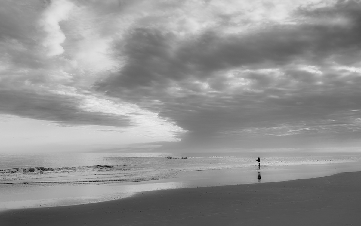
Hello Oliver
Your photo depicts a quiet setting of a lone fisherman with the sea all to his own for the moment. I think the elements work well for black and white, and the photo has a lot of potentials depending on which way you want to edit it.
In my example I show a smooth and soft look. I eliminated the footprints in the sand with dehaze and minus shadows to eliminate some distractions. I also took Bunny's idea to define the horizon line as well. My adjustments included whites -15, blacks -45, texture -80, clarity -40, and dehaze -18. I also used a linear gradient on the sky to define the clouds and a mask to remove the footprints with -26 exposure, 78 contrast, -9 shadows, -32 whites, and 12 blacks.
This edit exemplifies a more ethereal editing style and adds a contemplative mood.
Take care,
lt
|
May 11th |
 |
| 62 |
May 23 |
Comment |
Hi Mark,
Great vacation I would love to visit Japan! You captured an interesting scene with the people resting inside this archway. You shot quickly and ended up with a scene that tells a story. I tried a few edits but ended up liking what Bunny did in the end; if I were to add anything, I would recommend keeping the contrast soft as it is a style appreciated by Japanese photographers.
Thanks for sharing this image with the group!
lt |
May 11th |
| 62 |
May 23 |
Reply |
Excellent question, Bunny. When I had my Fuji X100V rangefinder-style camera, I always shot in B&W. I haven't gotten into the habit with my Sony yet. I frequently shoot in B&W with my Leica Q2, as it is more like a rangefinder. I probably need to experiment more, and I also have to learn to "stop and smell the roses" more to improve my patience (concentrate more on the scene and take fewer photos). I, too, am learning to stop and look for the shadows in nature. When you find good shadows, you know you have good light.
There is always something we can improve on and the journey is amazing; I hope it never ends!
lt |
May 5th |
| 62 |
May 23 |
Comment |
Bunny, your image is excellent and filled with feather details! The clarity is spot on for a 24-600 zoom lens; I am impressed with its capabilities. I like the crop and positioning of the bird in this photo. There is also a nice catchlight in the eye. The background has a lovely soft blur and shows depth in the image.
The only comment I have is in the area of the chest feathers. A couple of them have bright highlights that I recommend a bit of editing. Otherwise, you are good to go!
Thanks for sharing (and inspiring me) with your bird photography!!
Best regards,
lt |
May 5th |
| 62 |
May 23 |
Reply |
Hello Bunny,
I am glad you liked this photograph. I am learning a lot about shadows and light, and hopefully, one day, I can see in B&W more quickly when out in nature.
Have a wonderful day! |
May 5th |
7 comments - 8 replies for Group 62
|
| 86 |
May 23 |
Comment |
Hello Quang, I hope you are doing well!
I saw your photo, and I have to say that I like it very much. I have never heard of Inkwork and must check out the app. I love the simplicity in this image; to me, it is a fresh and new look. I could see a neutral viewer smiling at this photo; it brought me a chuckle and a smile of happiness. |
May 5th |
1 comment - 0 replies for Group 86
|
13 comments - 13 replies Total
|


