|
| Group |
Round |
C/R |
Comment |
Date |
Image |
| 3 |
Apr 23 |
Reply |
Thanks for your comment, Joan. I will think about removing the flower on the left.
lt |
Apr 25th |
| 3 |
Apr 23 |
Reply |
I like your edit, Ruth! I hope it better tells the story "you" want to tell. Remember, in competition, a neutral viewer will interpret the image based on "their" feelings and biases. We have no guarantee they will see in our photographs what we saw when we pressed the shutter button.
Have a nice day!
lt |
Apr 21st |
| 3 |
Apr 23 |
Reply |
Hello Ruth,
When I looked at your photo and read your description, you noted," I was intrigued by the tire swing, which was partially buried in snow and strikingly dark against all the white snow." I based my edit on that information. I used the original photo to edit and simplify to bring out what you noted in your statement about the scene. Regarding using a vertical crop, I have learned over the years that vertical subjects look better in vertical formats. You are a landscape photographer, and I can see why you chose a horizontal format because that is consistent with that style of photography.
I hope this clarifies your question about my edit.
lt |
Apr 21st |
| 3 |
Apr 23 |
Reply |
I understand, Ruth, that you feel the crop is too tight on this flower photo. It may be because you enjoy wide-open landscapes in photography, and I enjoy macro photography. I have looked at other artists like Anne Belmont and Kathleen Clemens, who only shoot macro floral photography, and I do not see where my crop is too tight compared to their work. Their full-bloom images are cropped even tighter than mine.
I appreciate your thoughts and opinions. Have a nice day,
lt |
Apr 21st |
| 3 |
Apr 23 |
Reply |
Hello Michael,
I hear you clearly; why doesn't the viewer see my "intent" for taking the image?" I often feel the same when I receive responses to my photographs. But when a neutral viewer looks at your photo, it will not have the same impact on them as it did for you because you were there, and this scene captured your heart when you saw it for many reasons. The image will not have the same meaning, generate the same memories, or have the same associations you have made with the photo. The photographic impact is possibly the most subjective of the elements, which include: emotional response, originality, point of interest, intent, and story. The impact is what the "viewer sees and feels," making them want to stop and look longer at your photograph. Intent can be challenging to understand, but it is all about learning to "see."
That said, I chose a tighter crop and more clarity, and I noticed the sensor spot because I am a macro photographer and look for details in what I photograph.
I hope this helps.
lt |
Apr 11th |
| 3 |
Apr 23 |
Comment |
Hello Joan,
I like your photography of the couple in the exhibit; this feels like street photography. The man has something in his hand, and they are discussing it. There could be many things they could be talking about, so that gives the viewer something to stop and ponder; I wonder what they could be talking about; does he have a map through the maze; what is he telling her? Great light, and the color palette looks good.
I tried to remove the dark line at the top, as Ruth and Ruth Brooks suggested, but I am not bothered by it. I did try to remove it in Photoshop (like removing a fence; easy peasy), but the file was too small. In street photography, you do not necessarily have to remove all the distractions, so I don't see an urgent need. I like Ruth Brooks's edit, though I wish you could remove the red handbag. I do love handbags, but the red draws the eye for me.
Thanks for sharing a fun image this month. Happy Easter!
lt |
Apr 9th |
| 3 |
Apr 23 |
Reply |
Ruth,
I have observed my edit on my flower for a couple of days. I am unsure if the square crop is working and would like your thoughts. When I look at the photo sample I posted for Ruth Brooks, my eye stays in the middle of the image and can no longer move freely around the image to wonder and ponder what this garden setting was all about. How do you feel about this new crop?
Hope you are having a Happy Easter today!
lt |
Apr 9th |
| 3 |
Apr 23 |
Reply |
You're very welcome, I am glad you liked it!
Have a wonderful Easter, Ruth!
LuAnn |
Apr 8th |
| 3 |
Apr 23 |
Comment |
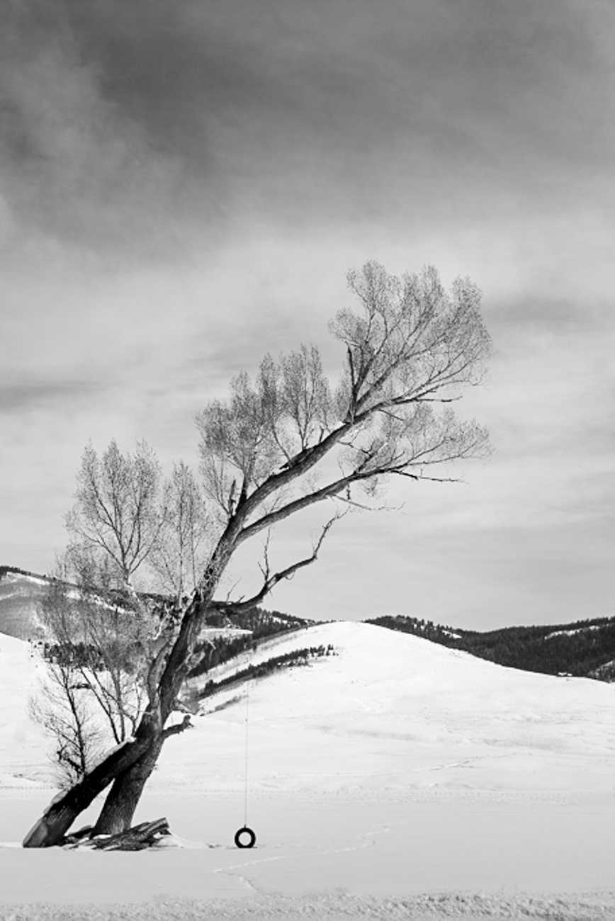
Hello Ruth,
Your photo tells an enjoyable story. There is a bit of a juxtaposition in the balance of the image, which will hopefully capture the viewer's eye. The tire is tiny, yet the tree seems to be bending to the will of the little tire!
Your editing style differs from mine, so I did not go overboard with my edited sample. I tried some basic exposure adjustments like darkening the sky, darkening the branches, and adding a couple of radial filters to bring contrast where the tree and sky converge. I think the exposure will be a personal preference for this image.
My image copy is small in size, so my edit and changes to luminosity will not show well because of the lack of pixels. But on the raw file, you will have better luck.
I liked Ruth's idea of a new crop but took it further. Because the subject is vertical, the format should follow in line and be a vertical crop. You said the tire caught your eye, so I focused on eliminating the tiny distractions on the snow that do not contribute to the story you wanted to tell. Because they were so far off in the distance, they would be perceived as distractions and draw the eye away from the subject.
I am curious about what you think! |
Apr 8th |
 |
| 3 |
Apr 23 |
Comment |
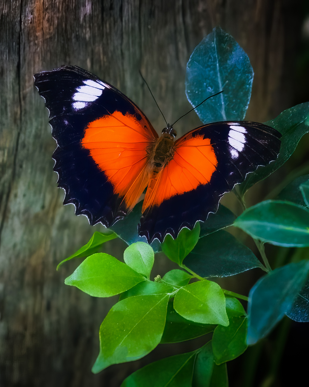
Hello Ruth,
I love this orange butterfly, and I love to see people out with macro lenses (my lens of choice)! Your presentation is lovely. The butterfly is well-placed with a left-to-right composition. The bark background is excellent and compliments the subject in a minimalistic way. Your color palette is natural, allowing the butterfly to stand out with bold colors.
The first thing, outside of the butterfly, that I noticed was the flat light and high luminance level. I used Color Efex Pro 5 and added a Blue Monday present to enhance the blue leaves and add contrast; blue and orange are complimentary colors. Then in Nik Analog Efex Pro 3, I added a Subtle Bokeh preset to soften the background a bit more. In Photoshop, I removed some spots on the leaves that pulled my eye away from the subject and lowered the brightness on the tips of the light green leaves. Lastly, I used Topaz DiNoise to sharpen the image.
I may have gone nuts on the editing, but I love the photo and couldn't resist; I hope you don't mind. The process took me 5 minutes cause the edits were simple and easy.
I am curious; what do you think? |
Apr 8th |
 |
| 3 |
Apr 23 |
Comment |
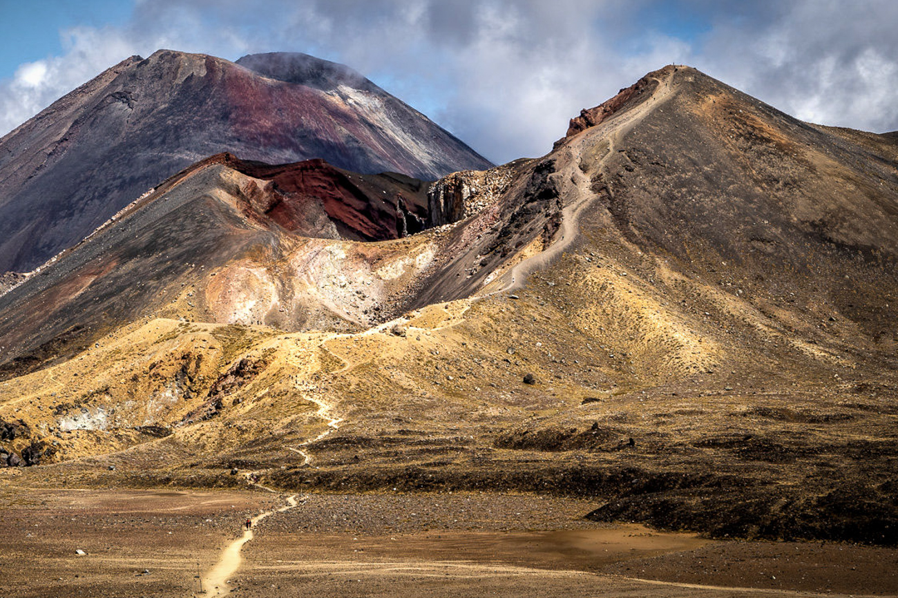
What a beautiful location, Michael; I bet you had an amazing time! I love the scenery; the colors and tones look natural, and having the hikers on the trail gives the viewer something to put the size in perspective.
In my sample edit, I experimented with a new crop and used the golden spiral focusing on the red rock area. This brings the viewer closer and eliminates some of the sky that does not add to the image. I added a linear gradient on the sky to lower brightness and removed some sensor spots in the upper left corner (only viewable on the original). I added a clarity bump in Color Efex Pro 5 to increase the warm tones.
What do you think?
|
Apr 7th |
 |
| 3 |
Apr 23 |
Reply |
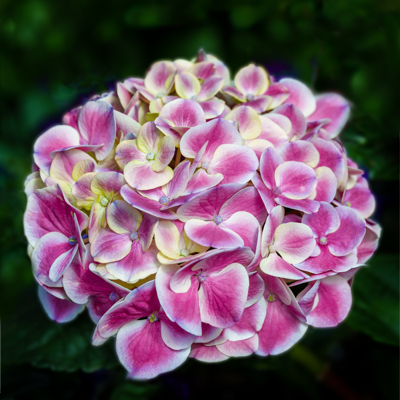
Hi Ruth,
I did edit the flower to a square crop, removed the extra hydrangeas, and applied a square crop. After I uploaded the revision, I see I would need to do more cleanup on the edges after adding to the frame. I am still getting used to making major edits in Photoshop; I sometimes lose patience as I am not that detail-oriented.
Thanks for adding to the discussion.
lt |
Apr 7th |
| 3 |
Apr 23 |
Reply |
I am glad you like the flower, Ruth, and find it easy to explore the bloom. I did a square crop, added to the borders, and removed the extra hydrangeas to give more breathing room. Is this better?
PS: 4/9/23 I just noticed I did not leave a little of the right bloom, as you noted in your suggested comment. I am not sure that would work because the luminosity value of that bloom would draw the eye out of the frame. What do you think?
I appreciate your thoughts.
Happy Easter!
lt |
Apr 7th |
 |
| 3 |
Apr 23 |
Reply |
Hello Michael,
The portrait version was to see the flower's appearance and help inspire the group into a conversation. There is nothing I can do about the yellow as it was part of the flower; it also helps hold your eye to the top and have a place to rest your eye; if you think about it that way. Some would say it draws the eye to the flower because it is different. Otherwise, you look at the image and get frustrated searching all the blossoms, not knowing where to concentrate your attention. Does that make sense?
I agree with you, Michael; this image has good resolution. But it is the lens that is producing sharp focus, not the camera itself. Fast prime lenses are known to produce sharper images over zooms. The drawback to prime lenses is that you must use your feet to zoom instead of zooming with the lens. I found this concept interesting, so when I bought the Sony, I purchased three prime lenses when I traded in most of my Fuji gear. The camera has plenty of pixels, so I also have the option to crop in post and still be able to produce a large image if I print.
Great questions and observations! |
Apr 7th |
4 comments - 10 replies for Group 3
|
| 24 |
Apr 23 |
Comment |
Hello Lance,
Your flower and butterfly image is captivating with well defined edges and depth. I love the fresh and new narrow-style crop; not something I see often. The simplicity of the image, along with the beautiful hexagon shaped bokeh is a classic look art lovers can embrace.
Correct me if I am wrong, but when you speak of the Japanese aesthetic are you referring to Wabi Sabi?
Thank you for sharing a beautiful image.
LuAnn |
Apr 9th |
1 comment - 0 replies for Group 24
|
| 62 |
Apr 23 |
Reply |
Hello Mark,
I am glad you like this 'Time Travel' photo! I do like the contrast between the dark subject in front and the bright background. Getting the luminosity just right in one setting can come across as too dark or flat in another; it is challenging to get right for all viewing situations.
Have a great day!
lt
|
Apr 25th |
| 62 |
Apr 23 |
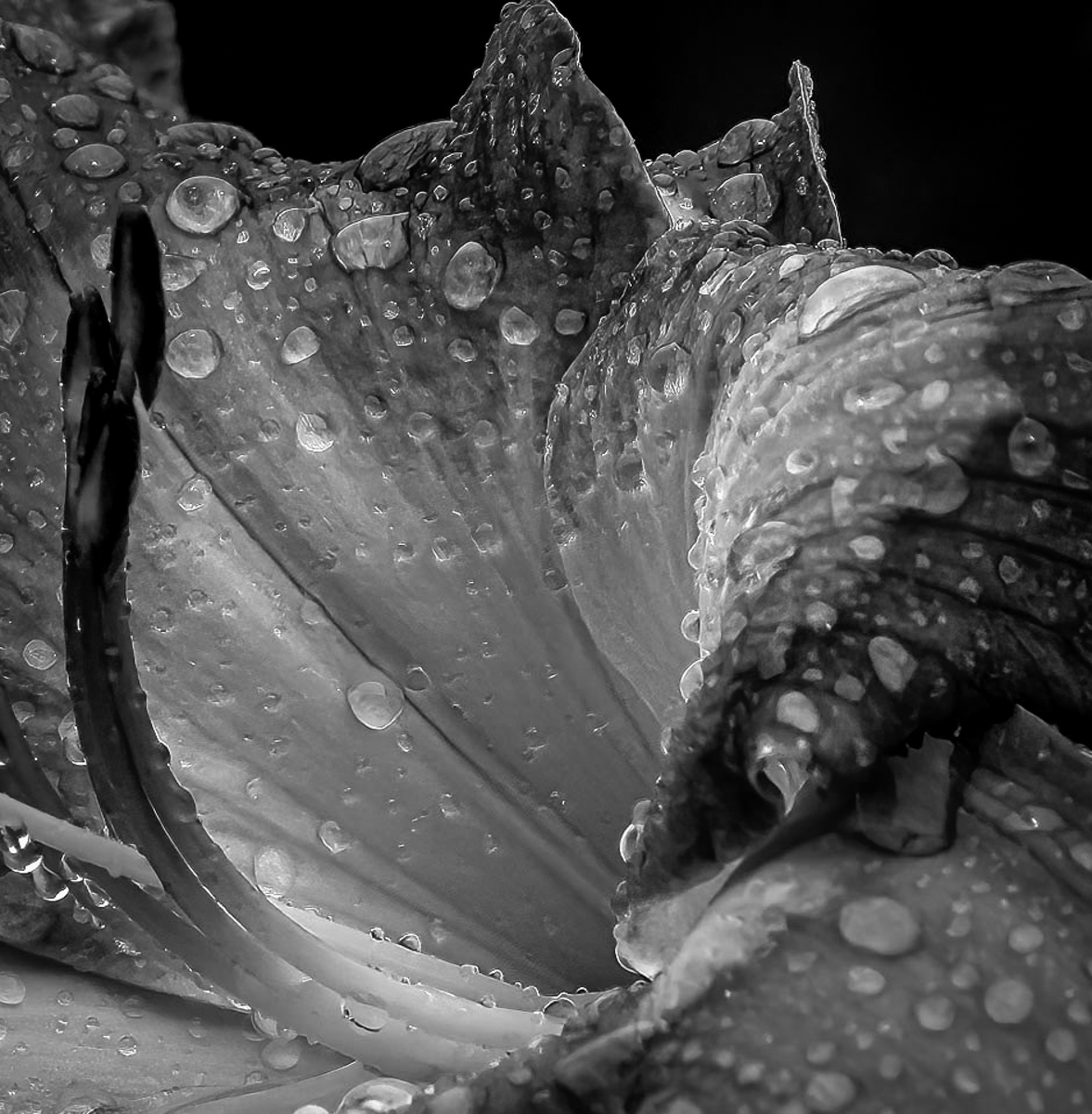
Comment |
Hello Bob,
I hope you are doing well and that you are enjoying spring! It is in the 80s here; not sure what happened to spring, but I am sure it will be back in town soon as temps plummet 20 degrees this next week.
I take it your reason for registering this scene on your digital sensor was to capture the raindrops. The soft focus of the drops in the foreground allows my eye to drift to the back of the bloom, where I can investigate the many organically shaped drops of water.
In my edit, I offer my perspective on your flower. I converted the original in LR and used the monochrome profile. I adjusted the black and white sliders, changed the brightness in the tone curve, and added a slight vignette in the Effects panel. I re-cropped using the golden spiral grid (mostly because I am a macro photographer) to bring the viewer's eye closer to the background and less foreground since it was in soft focus.
I am curious what you think.
Have a great day in all you do!
lt |
Apr 14th |
 |
| 62 |
Apr 23 |
Comment |
Hello Bunny,
I love your photo of Skóg Bay! In this scene, you captured a scene that could be thought of as a mystery to many who have never been there, but as a brave soul, you rode in a boat I would have been fearful to even step foot into, so thank you for doing this ride for me!!
In my edit, I used three linear gradients and applied two masks where I dodged and burned to bring out the peaks and valleys of tones as I saw them. The most significant difference between our two edits is that I tried to capitalize on the softness and chose not to use texture, clarity, or contrast. For me, the texture in the sky takes my eye away from the subject - the hills.
I am curious what you think.
PS I did go back and remove a couple of black specks and adjusted the tone curve.
Best regards,
LuAnn |
Apr 14th |
 |
| 62 |
Apr 23 |
Reply |
You are most welcome, Israel! I am glad you liked my idea. I will come to Israel one day, my friend, and you will be the first person I contact. Best wishes to you and your wife!
Happy Easter, and Shalom from Minnesota
LuAnn |
Apr 12th |
| 62 |
Apr 23 |
Comment |
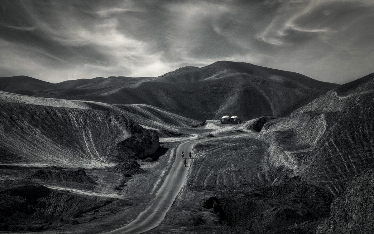
Hello Israel,
You are producing some fantastic landscape photography; excellent work! Your desert scene is very compelling; I love the domes for contrast and the three motorcycles that draw the eye into the image. The sky enhances the curves of the landscape and adds drama to the photo.
In my example, I did the following exposure +.20, shadows +1, whites +57, blacks -37, vignette -18. I used four linear gradients around the frame to lower exposure and draw the eye to the center of the frame. The vignette also capitalizes on the texture of the mountain ranges on both sides, and this helps the viewer see more than just what lies ahead.
The only think that is left is to adjust the white balance. I see a warm tone to the overall image which I you can adjust to your preference with the white balance sliders.
Thanks for sharing a great image this month!!
Wishing I was there,
lt |
Apr 11th |
 |
| 62 |
Apr 23 |
Comment |
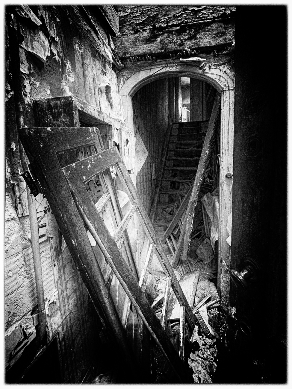
Hello Mark,
Great image; I love the character of the weathered look; there is a lot for a viewer to see in this image. I do like your idea to draw the eye to the stairway. The natural daylight is also perfect for telling this story of abandonment and decay.
In my edit, I used your color photo, and in Lightroom, I over-saturated the image's red, blue, and yellow colors. Then I went into Nik Silver Efex Pro 3 to do some magic. I used my favorite preset Pinhole and made adjustments to see the door knob on the right side of the frame; open doors say come on in; great point of view! I did use a border because there was some white on the lower right side of the frame, and the border covered it. Also, this group page has a black background, so the border helps the photo stand out. There is grain, and I feel it strengthens your story.
I am curious what you think.
Happy Easter!
lt |
Apr 9th |
 |
| 62 |
Apr 23 |
Comment |
Hello Emil,
Your image is beautiful and well-presented! I like your simplistic style and having limited elements in the photograph. The detail in the grassy area is impressive and full of texture and interest. The angle of view on the building gives the image depth as if the viewer could walk into the frame. The sky is calm, the light is balanced and not harsh, and the wispy clouds perfectly complement the scene. I also think the elements tell a story of age and a time that has passed, which many viewers can relate to and appreciate.
Thank you for sharing this excellent image!
lt |
Apr 8th |
| 62 |
Apr 23 |
Reply |
You can share it with your husband it is. It's a Sumiko Amythest Phono Cartridge, a next-gen moving magnet pick-up. It came with the turntable. This level of technical specs is above my pay grade, but I am sure the further we get into this hobby I will have to learn about it - haha!
Have a great day music lover!
lt |
Apr 7th |
| 62 |
Apr 23 |
Reply |
Hi Bunny,
Small world isn't it; many LP lovers live in the shadows of our contemporary culture, my husband and I are finding. We now shop at stores popping up in our communities selling vintage albums; I am glad they are making a comeback, also.
I like your edit where you played with the lighting. The contrast of the bright light, however, was what caught my eye, creating interest in taking the photo. Both versions have value and purpose, depending on where we hang them. Thanks for sharing; you have a very creative eye.
lt |
Apr 7th |
| 62 |
Apr 23 |
Reply |
Hello Larry,
I am glad to hear I created an image that led you to listen again to the classic "Moon River!" I remember that tune. Audrey Hepburn initially performed it in the 1961 movie "Breakfast at Tiffany's," winning an Academy Award for Best Original Song. Andy Williams, whose theme tune it became, performed "Moon River" for the first time at the same Academy Awards ceremony. He had a captivating voice that resonated with me; I also had to listen to it online again - wow, how time flies.
I agree with you on the quality of minimalistic images; you capture only the essence of what drew you to the subject or scene, and that is where you find your impact. Topping it off with the right light and perspective completes a composition. I, too, favor Silver Efex software for B&W conversions. Occasionally I can do it in Lightroom, but more often than not, I use Silver Efex.
Now I won't get those lyrics out of my head!! Thanks for stopping by, my friend.
lt |
Apr 7th |
| 62 |
Apr 23 |
Reply |
Hello Lance,
I was delighted to see your comment on my photograph!
The soundtrack is Blues Magoos on the Red Mercury label, Electric Comic Book (April 1967). My husband is also an audiophile with an appreciation for analog, jazz, and blues styles of music.
When I first developed an interest in soft focus photography, I did experiment with the 50mm lens, as you noted. It was a struggle, and I found that the technical build of a Lensbaby gave the exact look I was looking for more effortlessly. Knowing who I am as a photographer (more creative than technically minded), I bought the Velvet 56 lens and loved it. The lens is a manual, f/1.6 prime lens. I believe the aperture for this photo was f/5.6.
I have seen your website, Visualizing Art, and love your photo, "Restoration 1." The image has originality and a strong impact. I see the exaggerated perspective as a new and fresh look, and the simplicity of the picture tells me exactly where to look. I hope to create this aesthetic look and feel in my work someday.
Thanks for visiting group 62, and I hope to hear from you again.
Take care,
LuAnn
|
Apr 7th |
| 62 |
Apr 23 |
Reply |
Hello Bob,
My husband is going through some challenging times right now and I have to help where I can, but I also can not stay away from photography because it brings me such joy.
I created this photo for my husband's music room. I knew the subject would be perfect for B&W, but it was challenging because I couldn't move the turntable. The room had plenty of light, so it came down to waiting for the right light. I used a white styrofoam board to bounce the light and obscure the distractions from the window behind it.
I am glad you like how I have presented the image!
lt |
Apr 7th |
| 62 |
Apr 23 |
Reply |
Hello Oliver,
Yes, I remember B&W tv! I stayed with my grandmother when I was young, and my mother worked. She had a small square tv in a cabinet, and we would watch the news and Queen for the Day. Then later we would play solitaire!! I remember those bygone days well.
I agree with you; capturing impact in an image that a neutral viewer can relate to immediately upon viewing is challenging. I took this photo last October and did not see anything worthy of presentation, so I put it away till this month. Creating impact is something I want to research and focus on this year.
Have a great day, my friend!
lt
|
Apr 7th |
| 62 |
Apr 23 |
Comment |
Hello Oliver,
You found a real keeper shot with this old house under a tree. I like the simplicity of the scene, and it makes a great subject for black-and-white conversion. I agree with Bob about the outbuilding. If it had more character, then I would recommend leaving it in. The house stands independently and has enough interest to hold a viewer's eye.
The B&W photo was not large enough for me to work on, but your second crop is excellent! The clouds, the tree, and the house make a lovely image. The only other thing I can add is to lower the highlights and add a soft vignette.
Best regards,
lt |
Apr 2nd |
6 comments - 8 replies for Group 62
|
11 comments - 18 replies Total
|


