|
| Group |
Round |
C/R |
Comment |
Date |
Image |
| 3 |
Jan 23 |
Reply |
Thanks for your thoughts.
|
Jan 31st |
| 3 |
Jan 23 |
Reply |
Yes, I love this photo because it is creative and different from what I usually shoot and see others doing. My husband has a music room where he listens to vinyl records, and he ordered this photo to be printed on a large acoustic tile to hang on the wall for sound. I can't wait to see it. The fabric is almost like silk, and the colors are vibrant. We already had a couple of other photos done; I couldn't believe how well they turned out.
Have a great day!
lt |
Jan 21st |
| 3 |
Jan 23 |
Reply |
Hi Joan,
Your image aligns with the golden ratio pretty closely. Most photographers use the rule of thirds for composition but there are many more ways to look at an image than through the rule of thirds; it is only a guideline. You will find those that do not easily see the artistic side of a photograph - left-brain dominant people will display strong tehnical skills but may struggle with the concepts of mood, emotion, feeling and creativity. The reverse works for right-brain dominant photographers (that's me) who struggle with the more technical aspects such as camera settings.
Most photographers are taught the technical side and don't realize there is a whole other world on the creative side of photography to explore. I like the peeling paint on the bridge; it shows character from a realist perspective. This photo is pretty small in size so it is not possible for me to try any edits on it. But you could work with the clarity a bit and highlight sliders for added sharpness.
I hope this is helpful. Have you taken the PSA Image Evaluation course by chance? I am one of the instructors and I think you would love this course and what it has to offer.
Best regards,
LuAnn |
Jan 21st |
| 3 |
Jan 23 |
Comment |
Hello Joan,
Great photo this month! I love the geometric lines and shapes, complimentary colors, with a strong subject in the frame. This image has originality as I have not seen one of the Golden Gate Bridge taken with this point of view. The light is spot-on and accentuates the subject, and the sailing vessel comes across the frame on a diagonal. Well done!
lt |
Jan 18th |
| 3 |
Jan 23 |
Comment |
Hello Kieu-Hahn,
I like your architectural photo this month; the symmetry nicely draws the eye into the frame as it curves from the left into the background; it's a vanishing line.
I researched the type of stone this building is made from: white Imperial Danby marble from Vermont. Because of this, I would not recommend darkening the photograph or adding any contrast. If I were to suggest any change, it would be to add just a tiny amount of warmth to the image; the stone is a bit cool and could use a bit of warmth.
Thanks for sharing an excellent photograph of the Thomas Jefferson Memorial!
lt |
Jan 8th |
| 3 |
Jan 23 |
Reply |
I hope you do take a still life class, Mary Ann, you are doing really well and it will help you build on your current skills.
lt |
Jan 8th |
| 3 |
Jan 23 |
Comment |
Excellent photo, Ruth, and I love the area you have to photograph!
I like Ruth Brooks's edit and what I notice about it is the tonality of the yellows allows the eye to now pass over the foreground and go into the background to take in the majestic view. You could probably do some dodging and burning to help further direct the viewer's eye to the mountains stopping at areas of interest along the way. As in her edit, the tonality doesn't invite the eye to stop and linger. Do you know what I mean?
Lovely; thanks for sharing!
lt |
Jan 8th |
| 3 |
Jan 23 |
Comment |
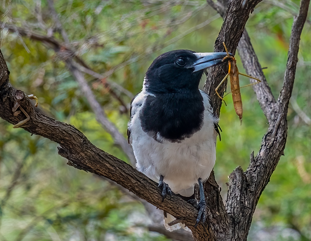
Hello Ruth,
Your photography is a lovely catch for you and this bird! I see those legs hanging in the tree; poor cricket. You have detail on the bird, considering it is black and white. There is also a soft catchlight. The cricket has nice color contrast.
I agree with your choice to flip this image. The only thing I see is the background is too bright. In my edit, I used Lightroom and applied an auto adjustment in the basic panel. It dropped the highlights, exposure, and blacks and added a bit of contrast, shadows, whites, and vibrance. If you use Photoshop, you could add a blur on the background to compensate for the narrow aperture.
I also used the golden spiral and did a new crop, putting the cricket in the center of the spiral.
I hope to learn how to photograph birds soon with my Sony camera. Your photo is an inspiration!
Have a great day!
lt |
Jan 8th |
 |
| 3 |
Jan 23 |
Reply |
I agree with you, Ruth. I also really like the color palette. |
Jan 8th |
| 3 |
Jan 23 |
Reply |
I agree; this would make a lovely wall hanger!
|
Jan 8th |
| 3 |
Jan 23 |
Reply |
Hello Hello Ruth,
Thanks for the tip about the outside border. I will have to try changing the border's size next time I edit the photo. I think I might also try it with a different color palette.
If I ever figure out the new camera, I hope to have fun with it; thanks for the encouragement. As I am learning about autofocus, there are seven settings found on different menus that help you when doing bird photography on this camera. My Fuji camera was more of a point-and-shoot comparatively, so there is quite an intense learning curve with this camera.
Have a great day!
lt |
Jan 8th |
| 3 |
Jan 23 |
Reply |
Hi Ruth,
The paper wasp nest was interesting in real life, but in a photograph, it did not excite me. It is interesting what you did in your sample re-edit of the original. There is texture and variation of colors. The original nest is very pale, as you would expect, because when it hangs in a tree, you don't notice it; it's camouflaged.
Maybe I will relook at this subject and shoot it again in a different light. It is nice to get people's opinions, so I appreciate your comments.
Have a great day!
lt |
Jan 8th |
| 3 |
Jan 23 |
Reply |
Hello Mary Ann,
Glad you like the photo! Why did I turn the photo orange? In the Image Evaluation course, I learned that specific colors draw the viewer's eye more than others. The top colors are red, orange, and yellow. There are others, and blues and greens are my first choice favorite colors, but when I saw the image in this color palette, I knew it was a good choice.
The frame within a frame gives the image originality, and this helps with the impact when a viewer sees it.
My husband has a small music room, so he is having this photo printed on a cloth acoustic sound tile. We had two printed from the car abstracts I did, and I was impressed at how well they turned out. I have always printed on paper (usually luster), but now I am interested in canvas prints or metal with the right image.
Have a wonderful day!
lt |
Jan 8th |
| 3 |
Jan 23 |
Reply |
Hello Michael,
Thanks for your kind words, Michael; I am glad you liked the photo! It is nice to have alternatives in my arsenal of photographic genres. I love macro first and foremost, but in the winter now, I have to think about different subjects. I stumbled upon abstracts from that theme park I went to in the fall, and now I am hooked. There was no potential in the original photo of this paper wasp nest. So I tried to see if it has any value as an abstract photograph. In the future, I will not delete a photo until trying it as an abstract.
Have a great day!
lt |
Jan 8th |
| 3 |
Jan 23 |
Comment |
Hello Mary Ann,
What an elegant still life! My first thought was how lovely the simplicity is of two bowls and lemons. An analogous color palette (blue, yellow, green) works well, and the grey background adds a coolness to the image as if the scene were photographed in an antique kitchen cupboard.
My suggestion to help enhance your still life is to mist the sliced lemon to give it a refreshing look and feel.
Have you taken the PSA still life class? Your work shows excellent improvement.
lt |
Jan 2nd |
| 3 |
Jan 23 |
Comment |
Hello Michael,
Your photograph this month is excellent; I didn't know one could do ICM with a cellphone! The colors in the painting and the people harmonize well. The area of negative white space helps the photo feel light and airy even though there is motion. I also like your creativity in breaking the rule of space by having the man walk out of the frame's right side; usually, we leave room for them to walk into, but I like your bold move to place him close to the edge of the frame.
This ICM technique represents your artistic expression and should be enjoyed as such. I have no suggestions for change to offer.
Thanks for sharing!
LuAnn |
Jan 2nd |
6 comments - 10 replies for Group 3
|
| 62 |
Jan 23 |
Reply |
Hi Mark,
Thank you for your kind words! I, too, love Emil's edit. I have to go back and give his idea a try.
Have a great day!
lt |
Jan 23rd |
| 62 |
Jan 23 |
Reply |
Yes, I agree, Oliver; I love Emil's edit!
lt
|
Jan 22nd |
| 62 |
Jan 23 |
Reply |
Hello Israel,
The Masada (a stronghold: Metzuda) thanks for letting me know. Do you think this was the stronghold David sought sanctuary for his parents when he was running from King Saul? How exciting to live in such a country so rich in history!
Have a good day!
lt
|
Jan 22nd |
| 62 |
Jan 23 |
Reply |
Glad your move is making progress, Bob! Time will pass quickly.
Thanks for the heads up on using a mask in Studio 2. I don't use it often enough and forgot about it at the time. Masking is an excellent idea!
lt |
Jan 21st |
| 62 |
Jan 23 |
Comment |
Hello Oliver,
Great photo, and I love the symmetry! A viewer could spend a good amount of time just looking at all the details (ceiling, walls, floor, and furniture). You meticulously converted it to black and white, and the tonality goes the full range from white to black.
I do have one question. Why did you choose this point of view and symmetry? The room seems to have a symmetrical balance, but the point of view is slight to the left.
I agree with Israel; the sharpness you got from handholding this at 1/13 second is remarkable!
Well done!
lt |
Jan 21st |
| 62 |
Jan 23 |
Comment |
I love your photograph, Israel. I did one like this back in June 2022. Your photo tells a compelling story. Do you know how to tell how many volts of electricity is running through those lines? There are oval ceramic insulators at the ends of the cross-bars. At one time, I read that "each ceramic insulator" accounted for 10,000 volts of electricity in that line, so you would have to add up the number of insulators to find the total voltage. Not sure if that holds true where you photographed this scene, but it adds to the story being told.
I like your choice of the sky; it seems to have a sense of symmetry. You have a vanishing point with all the towers to draw the eye into the photo. The dunes on the right help give the scene some context to the location. The dark tones also add to the mystery.
Well done!
lt |
Jan 21st |
| 62 |
Jan 23 |
Comment |
Hi Bob,
Thanks again for inviting me to Tony Sweet's zoom; he is a very interesting photographer.
I like what you have done with this photo. I have a question. What would you think of smoothing the streaks in the clouds to simulate the wispy feel on the ground?
Your creativity is very inspiring!
lt |
Jan 21st |
| 62 |
Jan 23 |
Reply |
I did not know Photoshop had this feature; thanks for noting it, Oliver!
lt |
Jan 21st |
| 62 |
Jan 23 |
Comment |
Hello Emil,
Your waterfall photo is lovely! Your camera is highly acclaimed for its sharpness, which shows in this image. I love the tonality range as it is not too dark, and the details really pop in the rocks. You have a nice slice of foreground interest, and the light is soft and beautiful, setting the stage for a well-composed and thought-out photograph.
Well done!
lt |
Jan 21st |
| 62 |
Jan 23 |
Reply |
Excellent, Emil; I love your edit!!
The wood post on the right now has better clarity, and people can understand the image. I also like the darker tones on the steps under the chains; these were the wooden steps going to a building where they sold antiques.
Do you think I need to bring up the overall brightness? I am excited that this image has potential now.
Have a great day, and thanks for the help!
lt |
Jan 8th |
| 62 |
Jan 23 |
Comment |
Hello Mark,
Great photo and I love the story. The coach is teaching this young man to focus and make eye contact with your partner to intimidate them. You can't be weak in a boxing ring. I used to shoot ring-side at Muay Thai kickboxing fights and I loved capturing the action and the expressions on the fighters faces.
You captured a good close-up and the coach has a face with character and determination. You did not note your camera settings but I do not see a problem with sharpness. The watch is a bit bright so maybe you could tone it down a bit.
Nice job. Wish I was there to see them box!
LT |
Jan 2nd |
| 62 |
Jan 23 |
Reply |
Thank you, Oliver; I am glad you liked this photo!
I found Topaz Studio 2 challenging to use; it's great fun to play with on a snowy day, or if you enjoy the creative aspect of photography, you could get lost in all the details.
I have well-documented what created this look, but I suspect the edits are unique to the underlying image and how Studio 2 works. My husband thought perhaps the creative element was too strong having it on the whole image, so I did spend a day in Photoshop masking to bring back part of the original photo. Someone on my Facebook page said he didn't know where to look in this image. So along with what my husband thought, I figured different people would see something different - and that's ok. Maybe it's the left-brain vs. the right-brain way of looking at art (technical vs. creative aesthetics).
I found out the next day from watching "The Joy of Editing" with Dave Kelly on YouTube that Topaz is not supporting 'Studio 2' anymore; no more updates. With that sad news, my bubble burst. It was fun while it lasted, and I love the results. I think I am going to research Tony Kuyper's TK8 editing plug-in for Photoshop now. It seems to be stable software and very useful for black and white.
Best regards,
LuAnn |
Jan 1st |
5 comments - 7 replies for Group 62
|
11 comments - 17 replies Total
|


