|
| Group |
Round |
C/R |
Comment |
Date |
Image |
| 3 |
Dec 22 |
Reply |
Thank you, Kieu-Hanh, for your comments! Van Gogh is also what came to mind when I started to edit this photo. Blue is my favorite color.
Happy holiday season to you!
LuAnn |
Dec 24th |
| 3 |
Dec 22 |
Reply |
Thanks, Joan, for your comments! I have another abstract for next month; this category is starting to become addicting.
I wish you a very Merry Christmas and a Happy and Healthy New Year!
Take care,
LuAnn |
Dec 24th |
| 3 |
Dec 22 |
Reply |
I am glad you liked my edit, Joan.
Your photo was creative, and I thank you for sharing this idea with the group.
lt |
Dec 19th |
| 3 |
Dec 22 |
Reply |
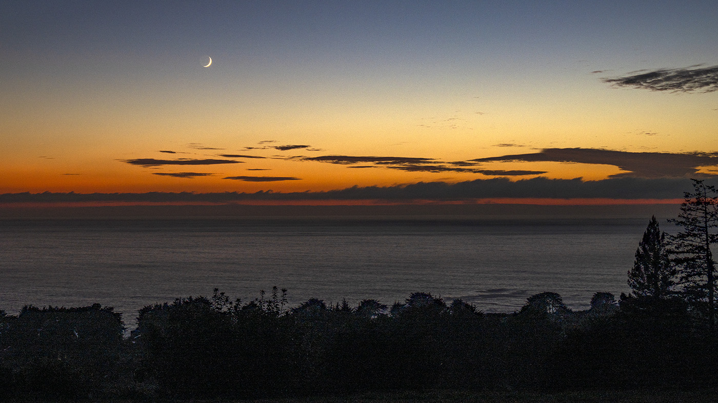
Sorry, Mary Ann, for the confusion.
I should have rewritten my original comment. Just before I sent it I noticed flipping the image wouldn't work because it changed the angle of the moon. I believe your moon is a waxing crescent. So I only removed distractions in the sky.
I have attached a copy of the image flipped so you can see how the moon is now backward. My point is, it is a good idea to flip your image to see if the flow of elements is better, but we have to watch for elements in the photos that should not be flipped like moon phases, text in an image, historical sites known to the public from a specific direction, and women wearing kimonos.
I think if you just clean up some of the small cloud fragments in the sky, it would make the image cleaner.
Thanks for sharing this photo with the group. I like that you are trying many different types of photography; you must be getting more comfortable with what you are shooting.
lt |
Dec 19th |
 |
| 3 |
Dec 22 |
Comment |
Hello Kieu-Hanh,
I like what you have done with this photo, creating something more creative for a change of pace. I find that woodland areas can sometimes have a messy floor in the fall (sticks and twigs seem to introduce chaos) that seems to stand out more than during the summer months. Adding a painterly effect helps revive the beauty of this space. The original photo is just another fall photo everyone takes, but I vote for the creative rendition!
Toning down the impressionistic effect on the trail and at the end of the vanishing point would help draw the eye comfortably through the photo.
Thanks for the inspiration!
lt |
Dec 19th |
| 3 |
Dec 22 |
Comment |
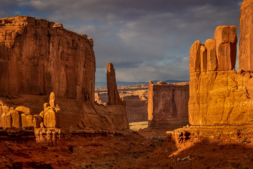
Hello Ruth,
Another unique photographic destination with a spectacular view! The image has nice depth (looking between the rock formations), and the clouds help soften the intense sunshine this area typically receives.
The only thing I changed in my edit was opening the dark shadows. When I first looked at the image, I felt tension arise between the left and right sides of the frame. Our eyes are drawn to the light, but the heaviness of the dark shadow areas competed for my attention. So I played with the shadows to open them up.
I enjoy your travel photography; thanks for sharing!
LT |
Dec 19th |
 |
| 3 |
Dec 22 |
Comment |
Hello Mary Ann,
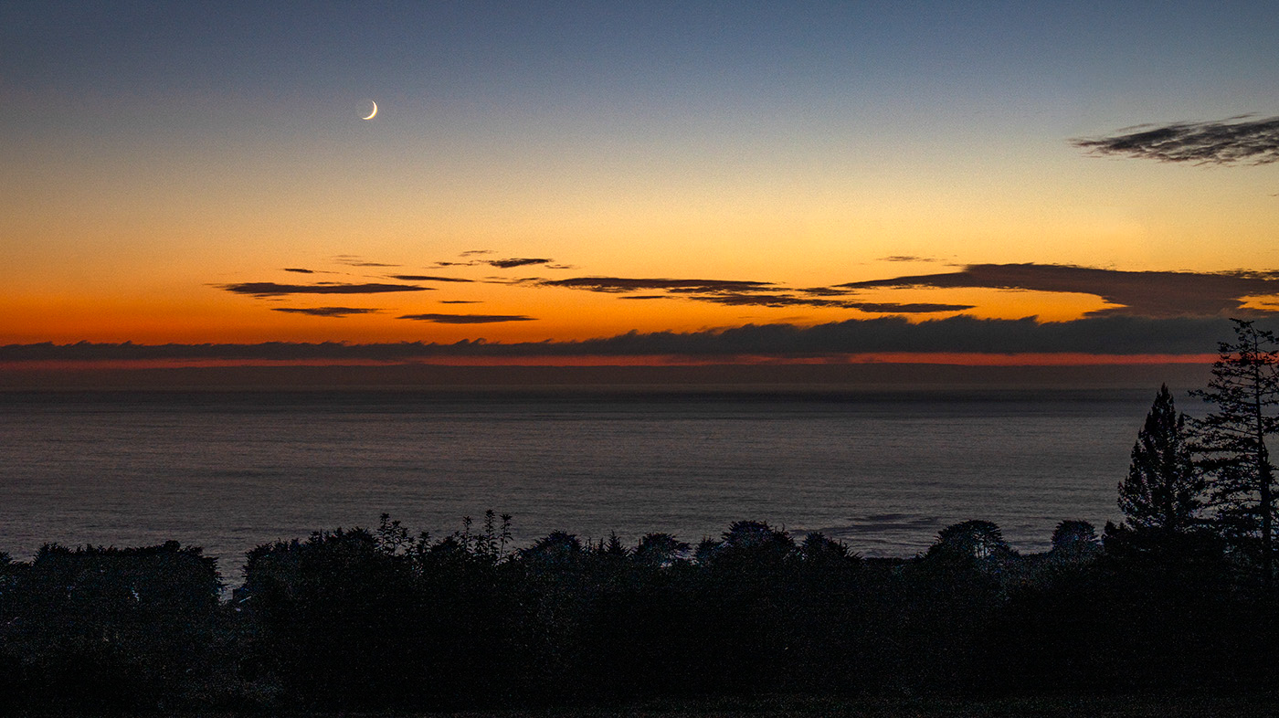
I really love your night sky moon photo! You were able to think quickly and create a well-thought-out photo. The viewer will be drawn to the orange sky, which takes them to the moon. No reason to have anything in view in the foreground, just the essence of a coming night from a shoreline.
My edit shows a flipped version. You learned to do this in the image evaluation course. I also took out some of the telltale signs of distracting clouds in Photoshop with the lasso tool and spot healing brush.
You may want to consider removing the black cloud on the right side, but to me, it shows the passing of time and contributes to the story.
I am adding to this comment the fact that you may not be able to flip this image. The brightest part of the moon changes its placement from left side to the right side. I am not an expert on photographing the moon, so it will be interesting if anyone comments.
Merry Christmas!
LuAnn |
Dec 6th |
 |
| 3 |
Dec 22 |
Reply |
Hello Ruth,
I, too, like the feeling of a Monet painting with the blues in this abstract. I will see if I can do it again when I am out and about. Since the theme park is closed for the winter, I need to find another idea for winter. Perhaps winter macros might be fun; been a while since I did them.
Have you ever tried abstract photography?
Merry Christmas!
LuAnn |
Dec 6th |
| 3 |
Dec 22 |
Reply |
Hi Mary Ann,
Thank you for your kind words! I am really enjoying this new genre. It's too bad we have snow and winter here in Minnesota because the theme park is now closed for the year. But I will try something new with the abstract idea, and we will see if I can pull it off. I have to have a challenge.
Merry Christmas!
LuAnn |
Dec 6th |
| 3 |
Dec 22 |
Comment |
Hi Joan,
I like this photo for its simple lines and minimalistic style. I also like the point of view angle because it is unique. The CC judge could have had any number of reasons for not liking this image. You have to remember that your image is judged against other images, so maybe another photo caught his/her eye more for whatever reason, more color, stronger story, emotional response, better impact, or perhaps their bias got in the way you never know. It doesn't matter; those of us in Group 3 like it, and that's all that matters, right?
My edit started in Topaz Gigapixel to enlarge it; I needed it bigger for editing. I used Viveza 3 and added a fill light preset. Then I resized for this group and removed the noise at the top of the frame. It is such a simple photo and the smooth texture has a comforting feel.
Hope you like it,
lt
|
Dec 5th |
 |
| 3 |
Dec 22 |
Comment |
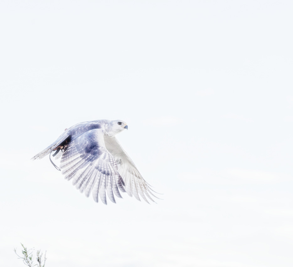
Hello Ruth,
What an exciting idea to edit a bird of prey in high-key light. I wish I could have watched the PSA video; what a good opportunity. I like your creativity and effort to try something different. Usually, we see wildlife photography in a realistic style; this adds a twist of originality to it.
My edit is close to yours. I used Nik Color Efex Pro 5 high-key preset. I used a square crop and the left part of the top of the tree to give a story that the bird was high above the tree tops. My bird has more cool tones, and yours has a warm tone to the underside of its wing.
Curious what you think.
Have a fun day,
LT |
Dec 5th |
 |
| 3 |
Dec 22 |
Comment |
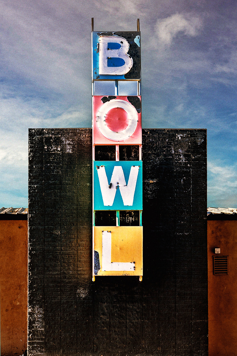
Hello Michael,
Your photo reminds me of those taken years ago off Route 66 when Kodachrome cameras and film were popular. Your photo is symmetrical, has good color, and tells an interesting story about the fading of bowling alleys. I wonder what the rest of the building is like. Your editing process is well done, and the colors are a balanced hue.
The only change I have for you to consider is adding a bit of grain. I used Color Efex Pro 5 and used Film Grain kodak Porta 160NC, grain 5.4, and Film Effex Modern Branded. With a vintage sign like this, I feel they go together well. Curious what you think. |
Dec 5th |
 |
| 3 |
Dec 22 |
Reply |
Hello Ruth,
I am glad you, too, like my abstract! The first thought I had was it reminded me of an ocean landscape. I love the blue color; it has a reasonably analogous color palette. I think the curving lines give a viewer pathways through the image.
Have a great day!
LT |
Dec 5th |
| 3 |
Dec 22 |
Reply |
Hi Michael,
I am excited that you like my abstract! I never thought I would figure this genre out, but this antique theme park has made my day with opportunities. They are closed now until spring.
Blue is my favorite color. When I saw this materialize in Topaz, I knew I was onto something. I agree. I, too, like the balance in the image with the lighter tones on top. I don't think it is my reflection on the windshield, but I will have to keep that in mind in the future. There is another car in the window on the other side of this car.
Yes, I will be printing this photo - my first abstract!
Have a great day,
LT |
Dec 5th |
6 comments - 8 replies for Group 3
|
| 18 |
Dec 22 |
Comment |
Hello Joan,
What a beautiful abstract! You are very creative with this technique. I like your choice of soft, warm hues of yellow and orange; they bring a warm glow to the image. The orange glow makes me think of a home in the woods, and the traveler will reach their destination just ahead.
I note in your description that you were reminded of the fires. That works as well. Your image is lovely, and I can see viewers interpreting it in various ways. Thanks for sharing!
LuAnn |
Dec 22nd |
1 comment - 0 replies for Group 18
|
| 36 |
Dec 22 |
Reply |
I am glad you liked my edit, Adi!
This is the 2x3 crop you asked to see.
I had to enlarge the image to work on it, and I did not have time to add clarity this time. Adding clarity is a personal choice, and my first edit was just a sample and not a finished image.
You will get better at editing; practice, practice, practice is all there is to it!
LuAnn |
Dec 23rd |
 |
| 36 |
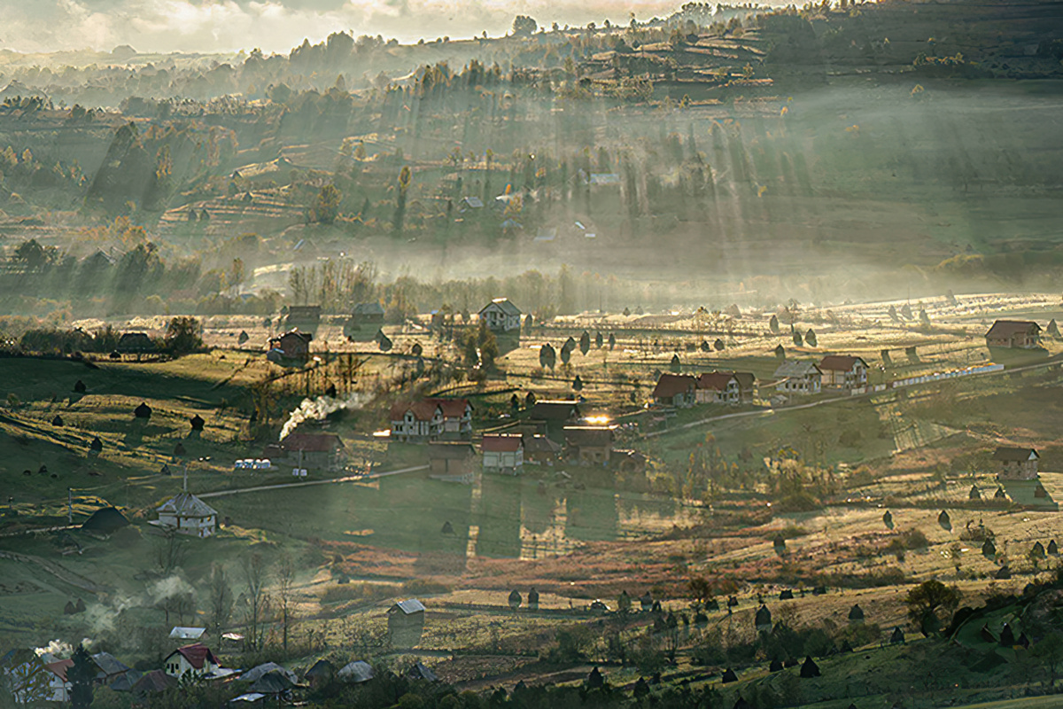
Dec 22 |
Comment |
Hello Adi,
Your image caught my eye as I looked through the photos from all the groups in digital dialogue. I applaud you for your attempts to capture the fog. There is interest in the scene because of the scattering of the houses beneath the sunbeams and atmosphere.
I did have a problem getting past the two areas of the overexposed sky at the top and the scene below being so far from view. I was struggling with where to rest my eye.
In my edit, I first added a clarity bump in Nik Color Efex Pro 5. Then I re-cropped to 16x9, removing the distractions on the top and right side of the frame. Now the diagonal leading line stands out, and the sprinkling of houses gives the viewer a place to pause and take notice. If the clarity is too much, you can always adjust it with the Dehaze slider to personal preference.
I'm curious about what you think.
LuAnn |
Dec 23rd |
 |
1 comment - 1 reply for Group 36
|
| 62 |
Dec 22 |
Reply |
Thanks, Bob, for your kind comments on my flower!
Merry Christmas!
LuAnn |
Dec 20th |
| 62 |
Dec 22 |
Reply |
Hi Mark,
Thanks for the tip. I will fix that easily enough.
Happy holidays!
LuAnn |
Dec 20th |
| 62 |
Dec 22 |
Reply |
Hi Michael,
Thanks for the visit, and I am glad you like my photo!
Have a great day!
LuAnn |
Dec 20th |
| 62 |
Dec 22 |
Reply |
Merry Christmas, Oliver!
Thanks for your comment; I will consider adding contrast. This photo has turned out better than I expected.
Best regards,
LuAnn |
Dec 20th |
| 62 |
Dec 22 |
Comment |
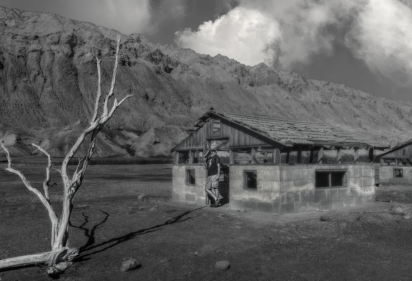
Hello Israel,
You have a great group of friends to explore the wilderness and learn photography! Your work has improved over time by leaps and bounds.
Your image has a nice leading line from the left; overall simplicity and a story. You mentioned cropping to remove the building on the right; I could see that working. You could center the cowboy then the tree and buildings could provide balance. The downside to centering a subject is the image becomes static, and the eye doesn't move about the photograph as it does when you offset a subject. But it works, and don't hesitate to try it and see what you think.
In the future, to help get your model to stand out, have him bring an extra shirt (one white and one black). If you are shooting B&W and the background he leans against is dark, wear a white or lighter-colored shirt. You can learn more about this idea of separation by searching the internet for Gestalt Principle: Figure-ground relationships. Differentiating elements by the perception of subject and background.
The second option is to get closer to the model and separate him from the building. Doing this will give the scene more depth, and he will stand out more from the building. Be creative with your posing and have fun.
I hope these ideas are helpful. My edit shows a new crop.
Happy Hanukkah!
LuAnn
|
Dec 20th |
 |
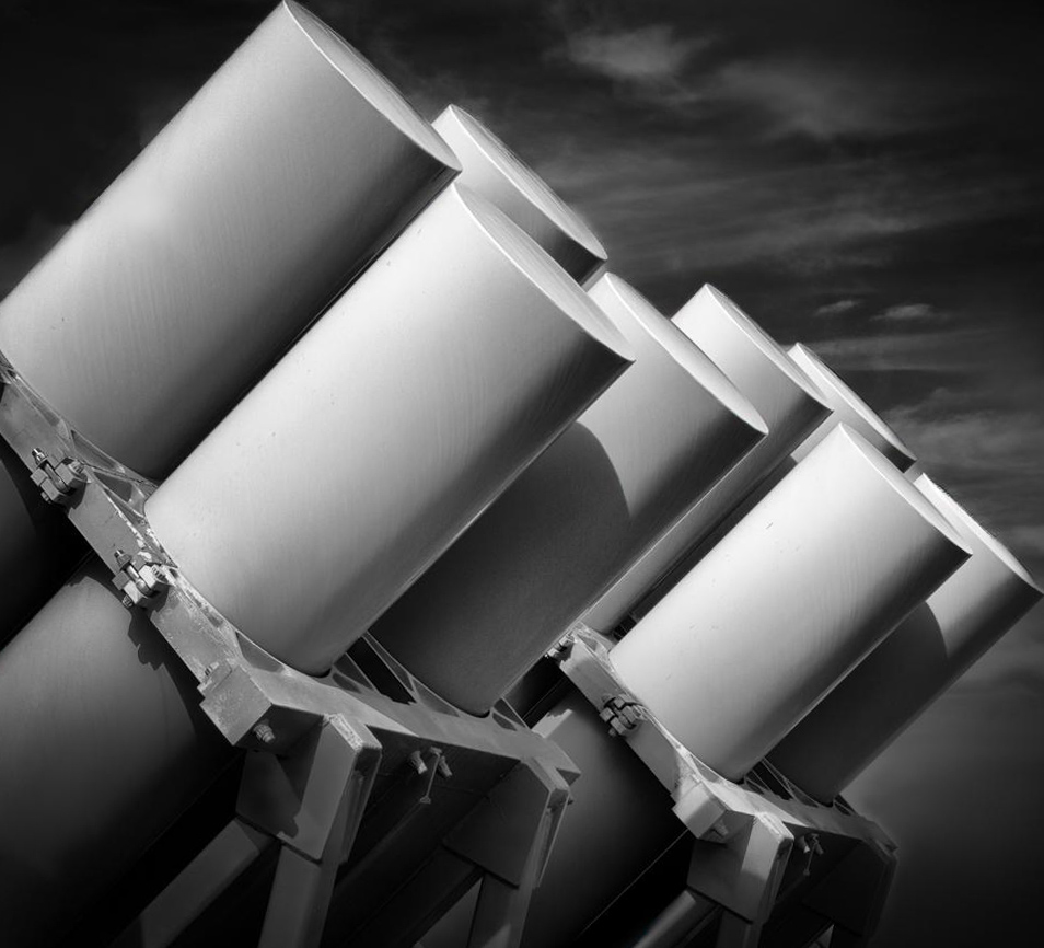
| 62 |
Dec 22 |
Comment |
Hello Bunny,
I have to agree with the group; you have made these canisters into a work of art!
My edit is simple. I flipped the image and used the diagonal crop tool in LR, and adjusted the angle a bit.
Have a great holiday!
lt |
Dec 20th |
 |
| 62 |
Dec 22 |
Comment |
Hi Emil,
This month's subject is engaging and an impressive shot taken with your iPhone! Aren't these little phones wonderful? The crystals have an interesting balance in the image. I am curious and drawn into the scene, wondering what I see. The crystal shapes are in a circling type of pattern, and this helps engage the viewer to look at all areas of the photograph.
In my edit, I flipped the image and removed the partial spikes in the lower left corner. The viewer now looks into the photo from left to right.
I am curious what you think.
Merry Christmas!
lt |
Dec 20th |
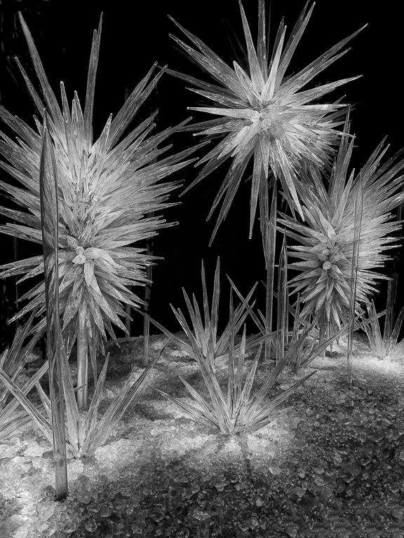 |
| 62 |
Dec 22 |
Reply |
Thanks, Bunny, for your comment. I was worried the crop was too tight; relief!
Best regards,
LuAnn |
Dec 9th |
| 62 |
Dec 22 |
Reply |
Thanks, Emil, for your comment; I will see what I can do.
Merry Christmas!
LuAnn |
Dec 9th |
| 62 |
Dec 22 |
Comment |
Hello Mark,
I like your creative idea of editing this building with high key lighting and in a minimalistic style. The impact of the photo is through your originality. I definitely gave the image an "ooh, awe!" when I first saw it, so it is an attention-getter. The three water towers complete the story. I can't tell the age of the building, but from what I remember about New York, they have a lot of water towers on buildings. The black-and-white version doesn't grab my attention like the high-key image.
It is nicely done.
lt |
Dec 5th |
| 62 |
Dec 22 |
Comment |
Hi Bob,
I agree with Ms. Bunny that the black-and-white conversion works excellently in bringing out the texture of the bird. We have tons of these guys on our hobby farm; they intermingle with my horse and the deer. I always see these Tom's in their brown tone hues; it is nice to see one in black and white. Excellent job. I have nothing to change or edit.
When do you expect to be settled in from your move? I hope all is going well.
Best regards,
LuAnn |
Dec 5th |
| 62 |
Dec 22 |
Comment |
Hello Oliver,
What an elegant fine art photograph you have created this month!! I love it. The image has a dark and moody ethereal feel to it, my favorite. When I look at the scene, I feel like the bird is out searching for land and life; this branch is all he can find. Having the head of the bird in light will draw the viewer to the bird, and in return, the bird looking back at the branch shows the left-to-right flow of the elements. The minimalistic style of the photo is all the image needs.
Nicely done!
lt |
Dec 5th |
6 comments - 6 replies for Group 62
|
| 99 |
Dec 22 |
Comment |
Hello Michael,
Your photo triptych is beautiful. The subjects are interesting; I appreciate the intimate close-up view to see the many details. Your technique for assembling the three photos is excellent, and the simplistic framing completes the set. Your work is meticulous! Thanks for sharing this photo!!
LuAnn |
Dec 22nd |
1 comment - 0 replies for Group 99
|
15 comments - 15 replies Total
|


