|
| Group |
Round |
C/R |
Comment |
Date |
Image |
| 3 |
Nov 22 |
Reply |
Hi Kieu-Hanh,
Thanks for your comments; I am glad you like my first abstract! Also, thanks for the link to Joseph Miller's Exhibits; I will have to check that site out more.
Have a Happy Thanksgiving!
lt |
Nov 20th |
| 3 |
Nov 22 |
Reply |
Hi Bob,
This was the same Blue Hudson car I submitted to this group in October. The photo was taken at the side window, viewing the backseat. The sun was high and bright in the sky. The beams illuminated the interior, and as I walked by the side of the car, I saw that crazy pop-up door lock button. The weathered glass really helped make this a great abstract and my first-ever abstract.
Have a Happy Thanksgiving, Bob!
lt |
Nov 20th |
| 3 |
Nov 22 |
Reply |
Good guess, Ruth!
I took this photo in an antique theme park with various older vehicles on the property. I hate to say this was a "junk" car because I can still see the elusive beauty in its imperfections.
This vehicle was the exact car I photographed last month; the blue Hudson. The sun that day was bright and high in the sky. The beams of light were shining in the backseat area of the car. The interior was old, worn, and very tattered. Then I saw the push button door lock in the light in the weathered window pane. I had no idea this would turn into an abstract.
Have a Happy Thanksgiving!
lt |
Nov 20th |
| 3 |
Nov 22 |
Comment |
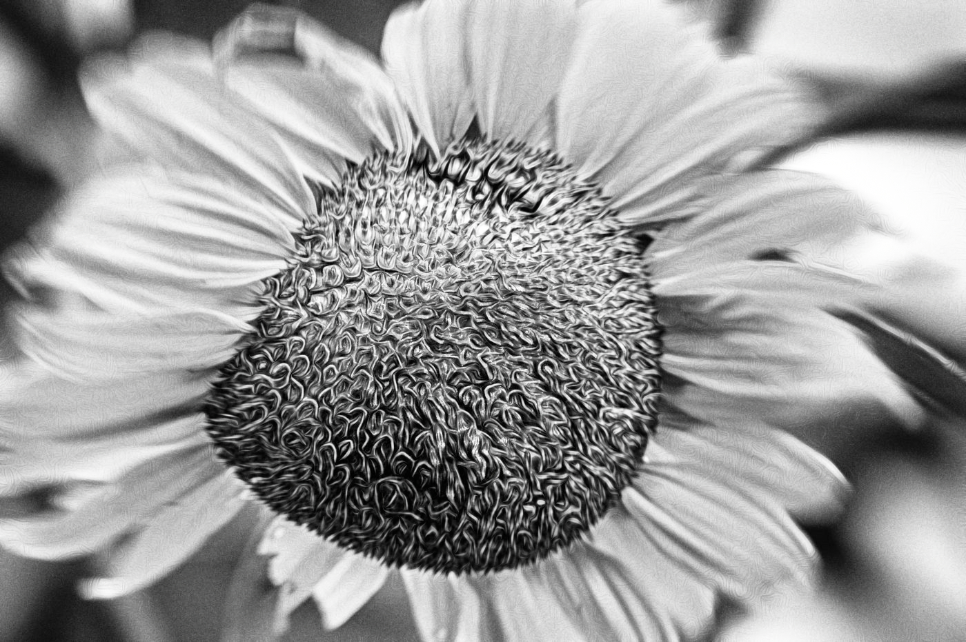
Hello Kieu-Hanh,
I think this flower looks good in B&W. I agree; the crop works nicely and removes distractions. Some of the petals have a bit of overexposure, but if that is not a concern for you, then I can see them working creatively in this image. You have turned a quiet little flower into one that is bold and attention-getting.
Nicely done
lt |
Nov 20th |
| 3 |
Nov 22 |
Comment |
Hi Joan,
Your image is lovely, almost like a beautiful piece of wood. We have a new cork floor in our music room, and this image reminds me of what I see.
You forgot to note your camera settings; regardless, the image is very sharp. I find the shapes and layers fascinating, and the mountains in the background give the image good depth. The color palette is warm and feels inviting, and the space is filled with the sense of smooth ripples I could reach out and touch.
I have no recommendations to change anything. Your image is beautiful as I see it.
Happy Thanksgiving!
lt |
Nov 20th |
| 3 |
Nov 22 |
Reply |
Hi Michael,
I had to try your idea of using Topaz Photo AI on an old milky way photo I took back in 2020. You are right; that software does work wonders with reducing/removing noise; I was impressed.
You talked about focusing on the moon in your comment; why did you choose that as your focal point? Isn't the moon too far away to lock focus?
When I was out on a photo workshop for the Milky Way, the instructor advised us to focus on something in the near foreground (an island in the lake, a tree, rocks, etc.) while we still had light in the day. Then tape the focus ring on our lens with Gaffer tape (it doesn't leave a tape residue), so if we bumped the lens, we wouldn't disrupt our focus point in the dark. Have you tried or heard of this technique?
At that time, I only had a 10-24mm lens f/4. Those photos were terrible and noisy (ISO had to be 3200). He told me the ideal lens was a 16mm prime f/1.4 (I use the Fujifilm system), to which I would get sharp noise-free images. I also could use a lower ISO setting. He had the lens, and of course, his images were beautiful, but he was the instructor.
Great discussion!
LT
|
Nov 11th |
| 3 |
Nov 22 |
Reply |
Thanks for your comment, Ruth. The image does have a mystery, that is for sure.
Any thoughts on what you think the subject is? I had not done abstracts before and only stumbled upon an idea this year.
Have a nice week!
LuAnn |
Nov 11th |
| 3 |
Nov 22 |
Comment |
Hello Mary Ann,
I love your idea of taking advantage of a good opportunity while you wait for the night sky. I love this photo's golden hour light; it adds warmth to the landscape. Because the light is low, I see this image as more meditative than a scene where I need to see details, so I am okay with the foreground vegetation being in soft focus.
I capitalize on this effect in my edit, by applying a Golden Hour preset from Nik Viveza. I like how there is softness in the sky as well as the foreground. If the saturation is too much, just lower it a touch or lower the overall opacity of the preset; this is a personal preference.
Curious what you think.
Best regards,
LuAnn |
Nov 11th |
 |
| 3 |
Nov 22 |
Comment |
Hello Ruth,
Your image this month is lovely; Colorado is a beautiful state with a lot to offer photographers. Overall, I see a foreground, middle ground, and background, which is essential for a landscape photograph. I notice the trunks of the birch trees and then catch a glimpse of the lovely reflection. The image has an array of yellow tones from front to back. The snow-covered mountain peak in the background gives the viewer an idea of the location. The overcast cloud cover is perfect, and the luminosity in the sky shows good detail.
In my edit, I only added a clarity bump in Nik Color Efex Pro 5. I found the tones a bit flat. People are drawn to fall colors because they are vibrant. I think desaturating the yellow takes away from the love of the season and why we photograph it.
Thanks for sharing a great image this month!
LuAnn |
Nov 11th |
 |
| 3 |
Nov 22 |
Comment |
Hi Ruth,
Great photo of this man with his prized possession! At first, when I saw the photo, I wasn't quite sure what the story was, but after further study, his smile, and seeing the watch band in his hand, it is clear why he is so happy; he lost his watch, and now it is found!
In my edit, I tried something different. I first flipped the photo horizontally. In the original image, the man moves away from the camera towards the lower right corner of the frame. In the edit, he is moving toward the viewer; now, as we read the photo from left to right, it feels like a more comfortable direction.
I used a bleach bypass filter in Nik Color Efex Pro 5 to adjust the colors. This filter added some contrast and mellowed the yellow in the background. The man is an athlete, so the contrast in the bleach bypass filter emphasizes this to the viewer; it gives him some "grit." I also cropped the photo to align with the rule of thirds; he was pretty centered in the frame before.
I am curious what you think.
Thanks for sharing a fun image this month!
LuAnn |
Nov 10th |
 |
| 3 |
Nov 22 |
Reply |
Hi Ruth,
Thanks for your comments on my image; I am glad you like it! The figure (as you put it) reminded me of the tv series "Mystery Theatre 3000," where the guy and Tom Servo (robot) were sitting in the front seats at a theatre watching an old movie; they were in silhouette - crazy!
I will let you know later what the subject is.
LuAnn |
Nov 2nd |
| 3 |
Nov 22 |
Comment |
Hello Michael,
The Milky Way in this image is beautiful! It looks like you have a clear view; the color of the galactic core is visible and bright in the sky. The truck in the foreground makes an excellent foreground interest piece that adds to the impact of the overall photo. Your Sony camera has excellent focus, and the truck is sharp in the frame. I am curious where was your focus point? You also did a great job light painting with your cellphone; I do not find the truck overly bright, either. Your editing work with Topaz AI works nicely.
I do not do astrophotography much, but when I did, I remember I was told by John Gregor, an amazing landscape photographer, to use the fastest glass I could afford for my camera brand. I used a Fuji camera with a 10-24mm f/1.4 lens. He said the f/1.4 was key to getting noise-free shots. Your camera settings look good. You also used sky apps, so you must keep practicing and vacation more in Hawaii!
Thanks for sharing a great image this month!
LuAnn |
Nov 1st |
| 3 |
Nov 22 |
Comment |
Hello Michael,
I am delighted you like my abstract! I will have to print this photo and see how it looks; now, my husband wants a copy for his room! I love the scenarios you came up with trying to figure out what I photographed. Or, as you said, did I create this from my studio still-life table?
I will reveal the subject later in the month. I am interested in what others think of this photo now, and I hope to get more discussions on how to create abstract photography. Many of us have seen ICM photography and landscape abstracts. But how else can you make an abstract? We will see if I get any more comments.
Have a wonderful day,
LuAnn |
Nov 1st |
7 comments - 6 replies for Group 3
|
| 10 |
Nov 22 |
Reply |
The white background gives the image a contemporary, young, and modern look and feel. Perhaps that is not the feeling you had intended for this image. |
Nov 12th |
| 10 |
Nov 22 |
Comment |
Hello Doug,
I love your flower photograph; the beauty is in the simplicity of red and white. I follow Kathleen Clemens and am taking a course from Rosy LaLande on flower painting; they are both fantastic floral photography artists.
I am drawn to your flower because of the soft focus. I like to see those tiny veins and details in the two petals in front. I am very familiar with other Gerbera daisies (it is a favorite flower for me, too), so I do not need to see all of it in focus. I love the uncomplicated and minimalistic look of this image, and I also like the high-key format. I could see this photograph on my wall. I would love to ponder it from a distance on my couch as I watched it snow outside.
Thanks for sharing a lovely photograph this month!
Best wishes,
LuAnn |
Nov 12th |
1 comment - 1 reply for Group 10
|
| 62 |
Nov 22 |
Reply |
Glad you like it, Bunny.
Lt |
Nov 24th |
| 62 |
Nov 22 |
Comment |
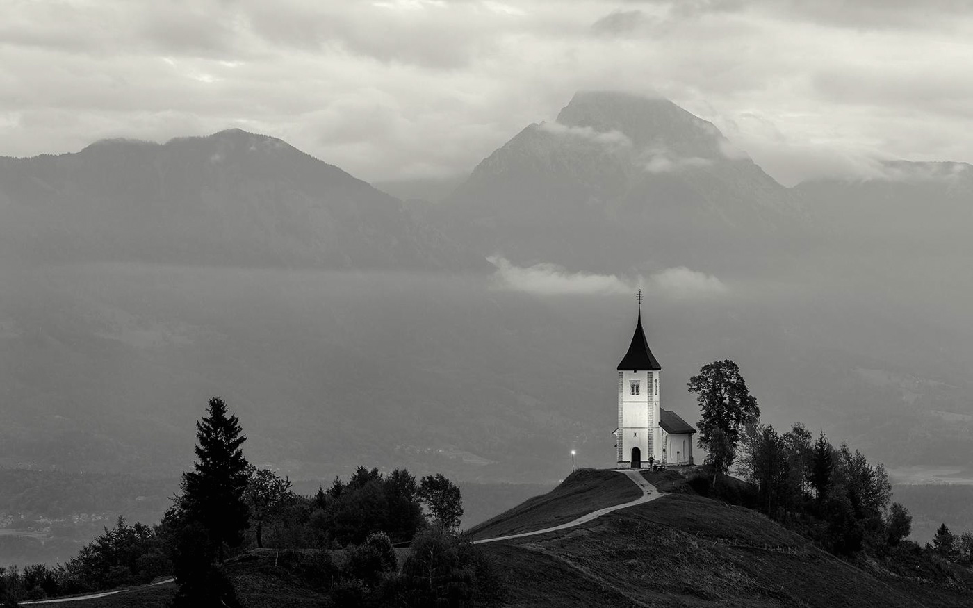
Hi Emil,
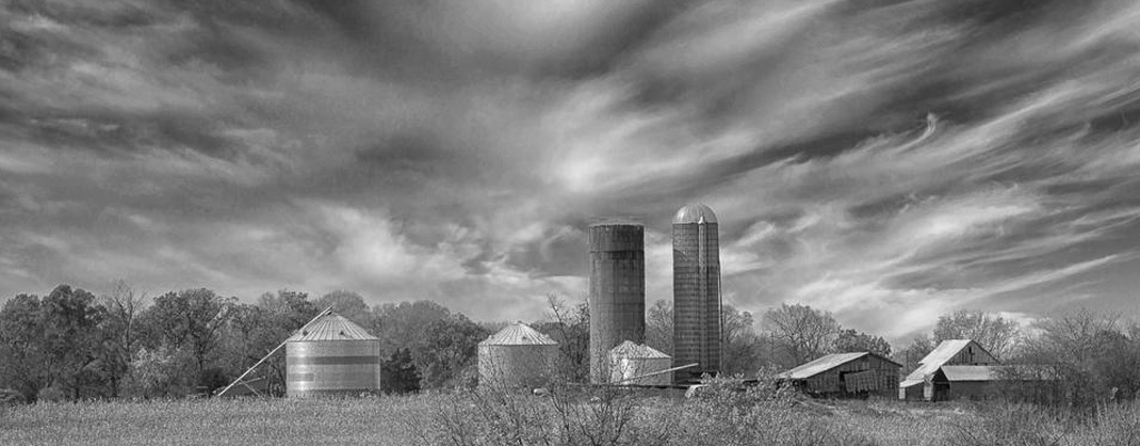
What part of the midwest did you find this farm? I think this will be a successful concept for a photographic project.
I like the tonality in the image; I think it is very much your style. The challenge is the placement of the buildings in the frame. The silos are centered, and this is often a static position. But the story I see is a time of rest at year-end after their plentiful harvest.
I did bring the photo into LR to review other crop options. The dark pine challenges me in the foreground; it stands out too much, pulling me from the subject.
I used a custom crop after starting with a 16x9. The right silo is on the right golden ratio vertical line, and for the outer edges of the frame, I used the balance tool to balance the shorter buildings. I did make some minor contrast adjustments.
It's not a finished photo, just an idea. I am curious what you think.
Happy Thanksgiving!
lt |
Nov 20th |
 |
| 62 |
Nov 22 |
Comment |
Oliver, this is a remarkable portrait, and the man's hand gesture helps visually tell the story. Your edits are beautiful; the histogram has an excellent range of tones from whites to blacks. The sharpness of his eyes really draws me into the photo. The texture of his face and details are all interesting points throughout the image. I find myself wanting to linger and search the picture for clues to tell me who this man is that you photographed.
You noted you used an aperture of f/2.8. When you do more portrait photography, I am sure you will want to use a narrower aperture. Having more of his face in focus would be a plus, especially the areas close to his eyes, like the checks and chin beard.
Well done, Oliver!
Best regards,
LuAnn |
Nov 19th |
| 62 |
Nov 22 |
Reply |
Glad you like it, Bunny.
Lt |
Nov 19th |
| 62 |
Nov 22 |
Comment |
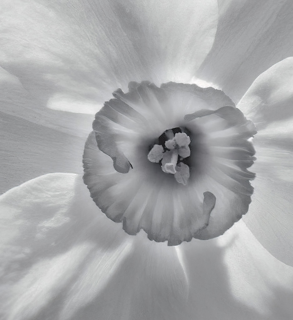
Hello Bunny,
You captured nice exposure with this lovely Daffodil. I also like your idea to keep the flower off-center.
I have to follow suit and try my hand at an edit. I started off in Color Efex Pro 5 and converted it to black and white. I added Pro Contrast, Glamour Glow, and Tonal Contrast. I did enlarge the photo in Topaz Photo AI so I could work with a large size. I also added some sharpening.
Back in Lightroom, I cropped and turned the image, so the detail on the petal led the eye to the center of the flower. It is just another option for this lovely flower.
From a distance, it doesn't look too bad.
Have a nice day,
lt |
Nov 18th |
 |
| 62 |
Nov 22 |
Comment |
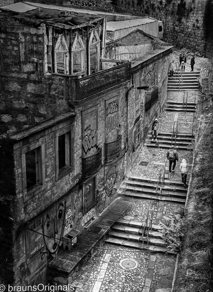
Hi Mark,
I like your image with all of the interesting graffiti and stonework. I like your idea of highlighting the walkway-a great place to be as a photographer. I see lots of macros shots jumping out at me.
In my sample image, I just used the linear gradient in Lightroom. I put one on the diagonal over the buildings to darken them and one on the right to balance the brightness on the walkway. I wanted it to be bright, just not overly bright. I also enabled the lens profile for iPhone 13 (it corrected a little distortion) and balanced the photo with the Straighten Tool on the right edge.
I am curious what you think.
Best regards,
LuAnn |
Nov 18th |
 |
| 62 |
Nov 22 |
Reply |
Hello Mark,
Thank you so much for your very kind words. I also like the silkiness of the tulip as well.
Have a wonderful day,
LuAnn |
Nov 18th |
| 62 |
Nov 22 |
Comment |
Hello Bob,
I like your creative tree shaking on your sunflower. I applaud you for your perseverance in abstract photography. If we don't keep trying, we will never accomplish our goal, so bravo to you!
I like what you have done to the center of the flower. I like the clarity, and the tiny individual florets are in good focus to see several of them.
The biggest difficulty, I find, is with the black-and-white format; with color, we might have more opportunities and options.
In my edit, I first converted the color photo in Nik Analog Efex Pro 3 using the Motion 6 preset. I played with some of the settings to keep the center of the flower in focus while adding motion to the petals. Next, I went to Topaz Studio 2 and used the Cuddle Critter preset with Screen for opacity. I selectively added the texture to certain parts of the flower and varied the intensity in other areas. There is a small amount of grain; I happen to like grain because most people don't choose to use it.
I am curious what you think.
Thanks for the challenge!
LT
|
Nov 12th |
 |
| 62 |
Nov 22 |
Reply |
Hi Bob,
Thanks for your comment! I am not sure of the type of tulip; this is, but it does have a ruffled edge. The petal is not missing on the side; it could be the angle that makes it appear that way. I am glad you like it.
You will have to check out my abstract photo this month on Group 3 when you have time. You have inspired me to be more creative!
Have a good weekend, my friend
LT |
Nov 12th |
| 62 |
Nov 22 |
Comment |
I also think this is an amazing photo, Israel. I like Emil's edit and his idea to darken the roof line of the church; it does make it pop more. It also appears he dealt with the light Oliver pointed out on the right side of the church; this removes the distraction.
In my sample edit, I erased the three bright specks on the right side of the church and three that I found as tiny distractions on the left side in the distance. I then moved the tone curve to the left to 227/250 in Lightroom. It could be that this edit comes down to personal preference; your image is already wonderful.
Excellent work, and thanks for sharing!
LT |
Nov 11th |
 |
| 62 |
Nov 22 |
Reply |
Thanks, Emil, for your comments.
It is such a balancing act working with tones in high key black and white images. I appreciate your idea and will give it a try. I may have to make the background pure white as I think it will compete with the flower if I adjust the tones.
Best regards,
LuAnn |
Nov 7th |
| 62 |
Nov 22 |
Reply |
Thanks, Emil, for your comments.
It is such a balancing act working with tones in high key black and white images. I appreciate your idea and will give it a try. I may have to make the background pure white as I think it will compete with the flower if I adjust the tones.
Best regards,
LuAnn |
Nov 5th |
| 62 |
Nov 22 |
Reply |
Hi Bunny,
Thanks for the feedback. I have used Bay Photo in the past; excellent printer! I now do my printing on an Epson P800. I enjoy learning the process of printing. I am also dabbling in matting. However, I find matting will take some time to figure out not sure if I have the attention to detail required.
Have a great weekend!
LuAnn |
Nov 4th |
| 62 |
Nov 22 |
Reply |
Interesting! I will note what you said and see if I can find a photo of mine to fit this description. Thanks for the help!
LT |
Nov 4th |
| 62 |
Nov 22 |
Reply |
Hi Oliver,
Thanks for your comments; I am glad you like my photo.
I thought luster would be the best choice for this high-key photo too; I'm just curious for opinions. I have lots of matte paper and trying to figure out which type of photos work on matte; haven't found any yet.
Have a great week!
LuAnn |
Nov 4th |
| 62 |
Nov 22 |
Reply |
Hi Bunny,
Thanks for your kind words. Tulips are my favorite flower to photograph; so easy to work with, and they have that minimalist look and feel. I will probably print this one; great idea. Do you have a suggestion for a paper type that would work with high key?
LuAnn |
Nov 2nd |
6 comments - 10 replies for Group 62
|
| 99 |
Nov 22 |
Comment |
Oh, this is an excellent still-life, Michael!
The first thing I noticed was the story unfolding between the Clematis and the seeds. I envision a conversation of some sort taking place between these elements.
The black-and-white version and the shadow add drama. I find the curved feather-like lines interesting. These flowers look lovely even when they are past their prime. Your composition with the three seeds in front adds perfect foreground interest and leads the eye into the flower.
If I were to recommend any change, it would be to have a solid thin pin stripe border instead of the variable one you have now. I think these two elements would be in better balance. I also think the flower is slightly too far to the left; can you adjust the visual balance across the frame by adding more negative space to the left side of the photo?
You are doing amazingly well with your lightbox!
Best regards,
LuAnn
|
Nov 2nd |
1 comment - 0 replies for Group 99
|
15 comments - 17 replies Total
|


