|
| Group |
Round |
C/R |
Comment |
Date |
Image |
| 3 |
Oct 22 |
Reply |
I agree, Ruth; this was an excellent capture!
LT |
Oct 22nd |
| 3 |
Oct 22 |
Reply |
The background is not the sky. In her description, she said the photo was of the Mesquite Dunes near Stovepipe Wells. So the mountain range is in the background. I thought it was the sky at first, too.
LT |
Oct 22nd |
| 3 |
Oct 22 |
Reply |
Remember, Mary Ann, you can stack a polarizer on your lens and then add an ND filter if they are both circular or square. It all depends on the day and the light.
LT
|
Oct 22nd |
| 3 |
Oct 22 |
Comment |
Hello Kieu-Hanh. I am glad to dialogue with you about minimalism; this is my favorite genre of photography. To answer your question, "Does my minimalist image communicate well to express my single message as clearly as possible?" I do not see this image as a minimalistic photo, so my answer is no.
The story you want to tell is not clear to the viewer. The feedback for the photograph tells me the viewers think you wanted to take a photo of this bird in a wetland; your description doesn't give us any clues that your intent was minimalism. If you intended to capture this bird as the primary subject, I suggest stripping away anything that takes the eye away from looking at the bird - that is minimalism. The image you submitted is below the recommended guidelines of 1200-1400 pixels, so I could not show you an example of what I am talking about.
The goal for a minimalist photographer is to capture the 'essence' or 'soul' of your subject; what was it that caught your eye when you looked at this scene? Was it something about the bird (feathers, beak, or bill)? Was it a feeling (and what was the feeling)? Your title for the photo tells me your intent was the bird.
You can't control how the viewer will respond to your image; this might be your current frustration. A neutral viewer will bring their own experience to the photo they are viewing. People in PSA groups are used to seeing landscapes and bird photography, so every time we see these elements together, that is what we presume the author intended. If you want to create minimalistic work, then you have to strip away anything that does not contribute to the story you want to tell. It has to be clear in a minimal way what you want the viewer to get out of viewing your photography.
Your second question was, "let me know when minimalism works well and when it doesn't." Minimalism doesn't work when you have too much detail in the image. So when you are at a scene, look for ways to simplify, simplify, simplify until you capture the essence and soul of the subject.
Let me know if you have more questions, I am happy to help clarify.
LT |
Oct 21st |
| 3 |
Oct 22 |
Reply |
Michael,
I love your vertical black-and-white version! How did it do in the camera club? I like the simple white matte and black frame. Your logo is also very artistic!
Well done!
LT |
Oct 20th |
| 3 |
Oct 22 |
Reply |
Hello Mary Ann,
I am glad you like this vintage old car! The professional photographer that gave the workshop referred to this as abstract, so I called it as he did. I also love the yellow leaf; it makes the photo unique. If I didn't note in the description the subject was a car, would you have guessed it to be a car?
I have looked up the definition since several people commented on the use of this term for this subject. The description seems to cover quite a broad array of images, from close-up to actual abstracts. One definition was, "Abstract photography is a style of photography where the subject in the image is not immediately identifiable, or there is no subject at all." The photo example was a double exposure of a woman (face, arms, and torso). Then there are the abstracts we often see, conceived, or imagined outside of 'reality.' Still life is defined as anything that doesn't move, table-top photography, inanimate objects, flowers, or food.
In the end, whatever genre it is, it works for me. I think this would be fun to work on in the winter or any time a photographer wants to be a bit creative!
Have a great day, my friend!
LT |
Oct 20th |
| 3 |
Oct 22 |
Comment |
Hello Kieu-Hanh,
You have a lovely minimalistic photo this month. The lone bird and contrasting colors make a pretty presentation.
Thanks for sharing!
LT |
Oct 20th |
| 3 |
Oct 22 |
Comment |
Excellent photo, Joan! I love the light and how it highlights where the person is walking. The man helps a viewer see the scale of this area. The blue background looks as though it is marbled; very cool.
The only thing I can suggest is to add a little exposure or brightness. You could do this by moving the white point curve on the tone curve to the left, and moving the midtones right to compensate.
Hope you have a chance to photograph fall colors where you live. They weren't as dynamic as they have been in years past where I am.
Best regards,
LuAnn |
Oct 12th |
| 3 |
Oct 22 |
Reply |
Hello Joan,
Thanks for your thoughts and comments on my photo. I love antiques, so this car is beautiful to me and gracefully tells a story of aging. I was on a photo walk with a professional photographer who took a group of us through a theme park filled with vintage cars, and he planned to teach us to shoot abstracts. I have been to this park before but never realized the great finds the park had to offer.
Hope your fall is full of color and you have time to get outside and shoot some beautiful leaves and fall foliage.
Best regards,
LuAnn |
Oct 12th |
| 3 |
Oct 22 |
Reply |
Hi Kieu-Hahn,
You have a cute description of this photo! Thanks for your comments. I like the story you built from this image. I did not place the leaf as I typically shoot what I see as I see it; more documentary. This is not a style everyone enjoys, but I like it.
I hope you are having a good fall season and have some time to photograph fall colors.
Best regards,
LuAnn |
Oct 12th |
| 3 |
Oct 22 |
Reply |
Hi Ruth,
I think Michael referred to my tabletop still life of fruit, garlic, rocks, and feathers. I have not photographed automobiles yet, so this was a unique way to start something new. And, yes, it is a found still life. The professional photographer I was with called it abstract because it was only a part of a car. Next month I have a much more abstract photo, and I am excited to show that one as well.
Hope you are having a great fall!
LuAnn |
Oct 12th |
| 3 |
Oct 22 |
Reply |
Hi Ruth,
Thanks for your comments. When I took the still life class PSA offered, the instructor would have classified this photo as found still life. When I took the picture, though, I was with a group of professional photographers who called it abstract since the vehicle was not prominent in the frame. So whatever it is, I love it. I love the color palette.
I hope you are having a great fall!
LuAnn |
Oct 12th |
| 3 |
Oct 22 |
Reply |
I am glad you like the group, Joan. I am part of the PSA Education Team (Image Evaluation Instructor) and I believe the more we know the better we will be as photographers.
Never stop learning!
Best regards,
LuAnn |
Oct 9th |
| 3 |
Oct 22 |
Reply |
Ruth,
If you edit in LR, go to the View menu tab and make sure you have "Show Toolbar" selected. This is the toolbar that appears under the photo area.
Then go to the Spot Healing tool, and under your photo, you should see a box to select "Visualize Spots." There is a slider to adjust the view to the right of this selection box.
Now you will quickly see your spots.
I hope this helps,
LuAnn |
Oct 9th |
| 3 |
Oct 22 |
Comment |
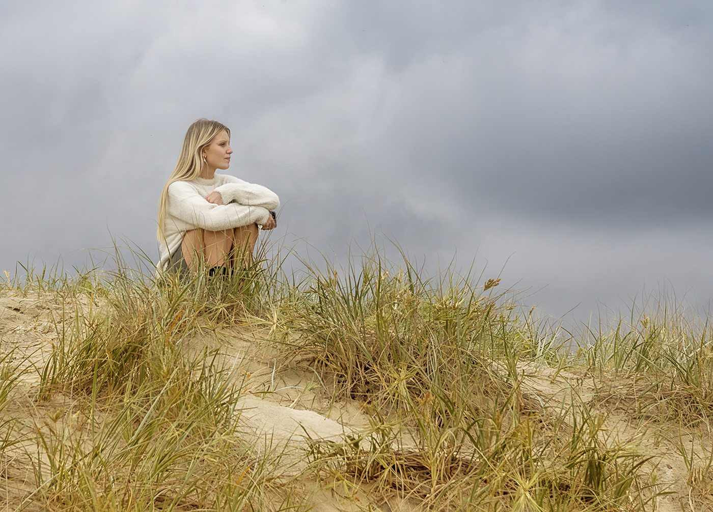
Hello, Ruth, and welcome to group 3!
I love this casual portrait of this woman on the beach. The clouds, the pose, and the expression add mood and mystery to the photograph. Your crop aligns nicely with the golden spiral, and the simplicity of the photo is very captivating.
I experimented with the original photo with some basic edits in Lightroom. I like the original because the natural color of the woman's skin and the sand's tone make me think of a beautiful soft natural photo edit. I recommend ever so lightly bringing out more details in the clouds. I also cleaned up some sensor spots in the cloud area. I applied a Classic Portrait and Warm Glow in Nik Color Efex Pro 5 to the image. I think this adds a bit of brightness to the overall image. You can fine-tune the light even further with your own personal preferences.
We do not see many portraits in our group, so thank you for sharing this lovely photo with us this month!
Best regards,
LuAnn |
Oct 8th |
 |
| 3 |
Oct 22 |
Reply |
Excellent work, Michael!
I also read Witta's comment below, and I have to agree with her idea as well. You have started an excellent dialogue regarding the placement of elements in a photograph. I went to the Group 77 bulletin board and found Lance's discussion informative.
This month has just begun, and I am already learning things I never expected. Every month's dialogue should be as exciting to read as this one. Thanks, Michael, for your input on this topic of conversation. |
Oct 7th |
| 3 |
Oct 22 |
Comment |
Hi Ruth,
You have captured a beautiful mountain view with a creative framing of fall colors; the blue and orange hues complement each other nicely. The atmospheric perspective adds depth to the image. The leading lines from the foothills in front of the mountain help direct my eye to the mountain's peak, where they intersect.
Looking at the histogram, the bulk of the exposure is in the mid-tones and shadow areas with minimal highlights and no pure whites. Because the fall color is in the foreground (the first thing the viewer sees looking at the image), I recommend raising the exposure and shadows slightly. I also recommend whitening the clouds hovering over the mountain, as in the original photograph; the mountain peak is white, but the clouds are more grey. Lastly, for some reason, the trees seem to be soft. I recommend adding selective sharpening to only the trees. You did not mention if you used a tripod or calculated your focal distance with hyperfocal calculations. Because the fall color leaves take up 2/3 of the image, you might want them in sharper focus.
I hope this is helpful feedback. Thanks for sharing a lovely image with the group this month. I wish I could travel to Colorado to take in these breathtaking views!
LuAnn |
Oct 6th |
| 3 |
Oct 22 |
Reply |
Please don't worry about rearranging this image; it is adorable as you present it. My comment was to get you to think about all aspects of a competition. Just remember the 8-second rule, and you will do fine.
LT |
Oct 3rd |
| 3 |
Oct 22 |
Comment |
I have to say, Michael, the more I look at your image, the more I see the age coming through in the photo. Unfortunately, if the judge in a competition doesn't realize this in the 8 seconds they spend reviewing images, your image might not get the attention it deserves.
Best wishes,
LT |
Oct 3rd |
| 3 |
Oct 22 |
Reply |
That is fair, Michael; the only problem is not every viewer knows the age of a seed head, so this tells us you will get a variety of responses based on your viewing audience's knowledge of the subject.
Easy fix, take a second copy; one to show flower loving friends and one for those who do not have that level of expertise. This could help you decide which version to submit to an Open class where visual balance may be more noticed or the Flower/Botany category where life cycles are more valued in competition.
LT |
Oct 3rd |
| 3 |
Oct 22 |
Comment |
Hello Mary Ann,
I love your enthusiasm for taking photography classes. I take courses to get out with others who enjoy the same hobby and learn new techniques others use; learning never stops.
I like the crop in your edited version. Leaving a white sky draws the viewer's eye, and there is nothing to see once there, no clouds. What kind of ND filter did you use (2 stop, 4 stop, 10 stop)? What did you want to gain from using an ND filter (versus a polarizer) in this scene?
I am curious about the composition. It appears that you were standing up and shooting straight at the rocks and birds. I would like to suggest looking for a vantage point with leading lines that lead the eye to something of interest in the image, which will make the image more dynamic versus static.
Shooting birds on a long exposure, I think, in this scene are working against each other. But we must try things like this and study the outcome to know what works and does not. When you have birds in a photograph, the viewer will want to see them in sharp focus. Unless you shoot with a Lensbaby soft focus lens, the whole image will show a soft blur, which can often work well.
I hope this was helpful.
LT
|
Oct 3rd |
| 3 |
Oct 22 |
Comment |
Hello Michael,
I love your dedication to persevere with these seed heads, making your lightbox a perfect tool. These subjects are in sharp focus, there is ample separation between them, and your design choice adds rhythm. I love the white background as it gives the image a classic look and delicate art appeal.
If I added or changed anything, it would be to move seed head number three to the center. I feel this would give the image more visual balance because the texture is different than the other two.
Keep up the excellent work!
Best regards,
LuAnn |
Oct 3rd |
| 3 |
Oct 22 |
Reply |
Hello Michael,
Thank you for your kind words about this image. I see I forgot to explain the meaning behind the yellow leaf in my description. As part of my reasoning for taking minimalist photography, I strive for a viewer to stop and linger. A single leaf element can add a contemplative vive to an image and help the viewer be curious and study the photograph further. All the details in this image are old, aging, discarded, singular, and in an antique theme park (which also could be a metaphor for something else). To me, the yellow leaf takes the photo to the next level, from just being a photo of an old weathered car to a piece of art they could see hanging on their wall.
Best regards,
LuAnn |
Oct 3rd |
8 comments - 15 replies for Group 3
|
| 62 |
Oct 22 |
Reply |
Glad you like my edit, Oliver! I love dark and moody, but this image spoke to me in a lighter tone. It also lets the flower retain the shadow.
LT |
Oct 22nd |
| 62 |
Oct 22 |
Reply |
Thank you, Bob, for your comment! You are a rising artist, so you can be late for the party here at group 62. I know you are working diligently on your next masterpiece, and I can't wait to see it!!
Best regards,
LuAnn |
Oct 11th |
| 62 |
Oct 22 |
Comment |
Hello Israel,
Your image tells a compelling story. The color version speaks of the sad and lonely place these workers work. This image is filled with the emotional impact of hard-working men in Uganda who intently labor with minimal and inadequate tools.
I believe the story is more impactful in color because it allows me to see the other four men in the scene; the histogram shows few white and highlighted tones (low dynamic range), making it difficult for the men to stand out. The location also contrasts with the green forest, and the golden rock formation comes out best in the color version, as do the main subject and the men in the background.
Technically, I noticed your aperture was at f/4. Was there a particular reason you chose this aperture? Ideally, this setting is best used for portraitures or close-ups (f/2.8-f/5.6). I recommend f/8 or higher for more sharpness for a landscape setting like this.
I also see you have an excellent camera, and I wonder if you used the Highlight Weighted metering mode to help control the highlights? Did you use an ND filter? I find them useful when the sun is high and bright in the sky. Lastly, did you use shutter priority or aperture priority? Doing photography like this from a Jeep must have been challenging.
Thank you, Israel, for sharing this incredible photo with us this month.
Best regards,
LuAnn |
Oct 11th |
| 62 |
Oct 22 |
Comment |
|
Oct 11th |
| 62 |
Oct 22 |
Comment |
Excellent Bob! What an artist you have become. I love this image and agree the flower is best in sharp focus. I am interested in the swirl; it is captivating and draws my eye to the subject. The photo has a whimsical feel and is very spirit-lifting to look at; you have outdone yourself!
Bravo, my friend!
LT
|
Oct 10th |
| 62 |
Oct 22 |
Comment |
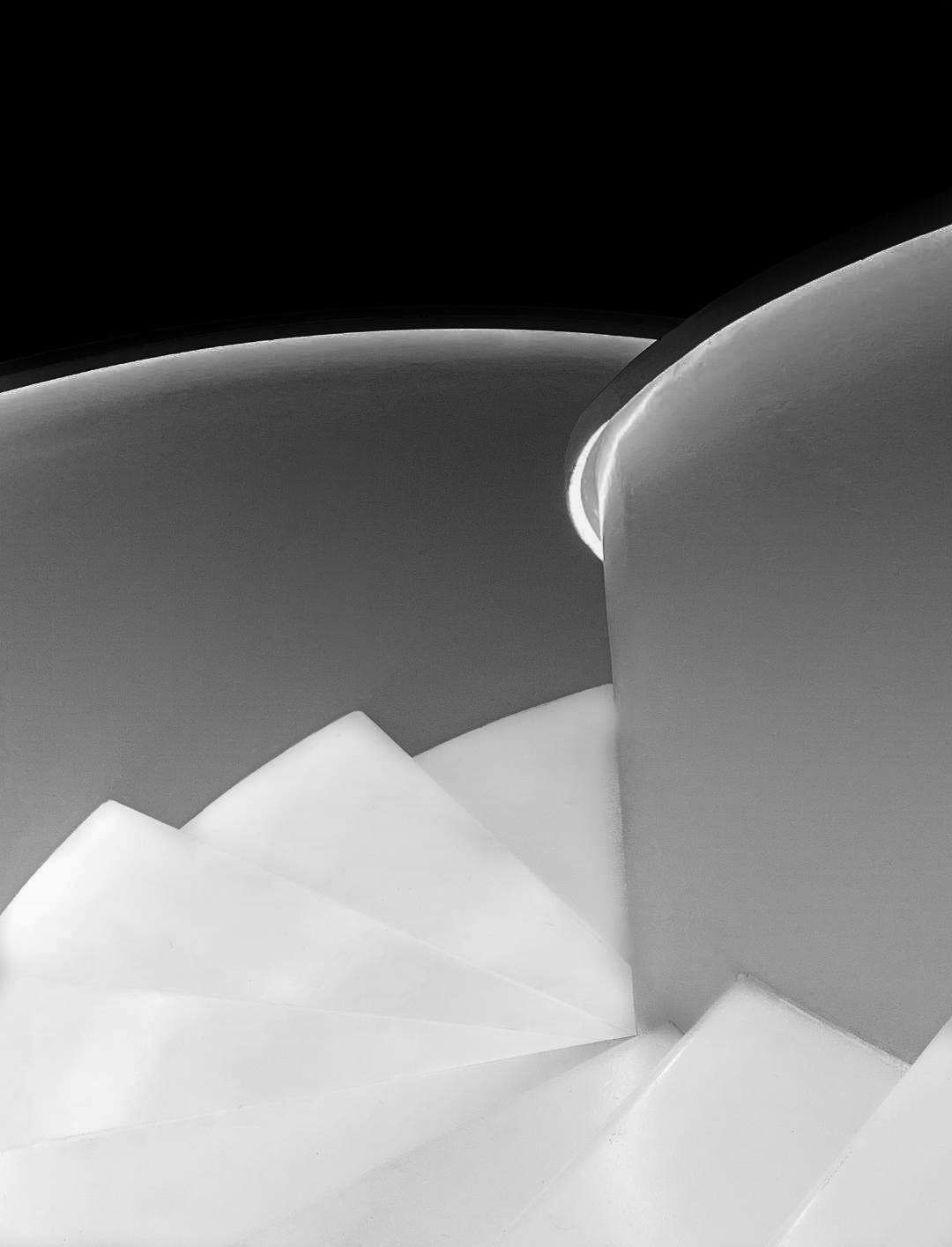
Hi Mark,
Thanks for submitting a larger photo! I love the simplicity of your image; black and white is the perfect process for this stairway. The under-the-railing lights add a nice glow to the steps. The way you processed your image works for me, just as you have presented.
But we love to edit photos in this group, so I tried to find something different to give you yet another option for your photograph. My photo example was edited in Silver Efex Pro 3. I used the Grad ND EV-2 preset and played with the sliders. The highlights are a little brighter, with a more obvious gradation of tones from black to white. The wall of the stairs is more in the midtones and is the most significant difference from the original photo. The only other thing I did was spot removal of about eight black specks that jumped out at me.
Thanks for sharing a wonderful minimalist-style photo this month; my favorite genre!
Best regards,
LuAnn |
Oct 10th |
 |
| 62 |
Oct 22 |
Reply |
Good eye, Emil; I like your edit! I will have to remember to use the dodging and burning tools more when I edit in Capture One.
LuAnn |
Oct 9th |
| 62 |
Oct 22 |
Comment |
Emil,
You are a master at editing black-and-white photography; I applaud your work on this image. This photograph has a strong emotional impact, making me feel like I could walk right into the scene. I love the balance of tones and how the darker clouds above the mountain produce a shadow beneath. I can sense the separation of the mountain from the sky; depth and dimension come alive looking at this image. The clouds also take on a spherical shape, and I can envision the curvature of the sky.
I also know that the success of this image is not just in your editing alone, but it was the vision you saw and the planning you did before you took the photograph. Perhaps you could share some of what happened before you took this photo with the group; I'd love to hear how it came about.
Best regards,
LuAnn |
Oct 9th |
| 62 |
Oct 22 |
Comment |
Hello Oliver,
I love your Hibiscus flower photograph in black and white! It is difficult to capture the beauty of a flower in black and white; we are so used to seeing them in vibrant, rich colors nowadays. But you have found a great way to bring out the beauty in this macro/close-up of the stigma. Your crop looks like it fits the golden ratio rule. I like the lines and texture on the petals leading to the subject.
I worked with several different software programs this afternoon to see what I could come up with, and this is my final result. It is not much different from yours, except I used the golden spiral rule to give it a new crop. I also cleaned up the pollen and white spots in Photoshop on the petals to simplify the photo because I found the pollen and highlights distracting. I used Topaz Gigapixel to resize and sharpen.
I am curious what you think.
Best regards,
LuAnn |
Oct 6th |
 |
| 62 |
Oct 22 |
Reply |
Hello Bunny,
Thank you for your comments about my image. I like your idea to darken the background a bit!
Best regards,
LuAnn |
Oct 4th |
| 62 |
Oct 22 |
Comment |
Hello Bunny,
I have been captivated since yesterday when I first saw your photograph. I genuinely admire your creativity and how you see the world. You inspire me to try shooting with different points of view merely to shake things up. But with this image, I think you have outdone yourself! The leaning lighthouse seems to have taken on a new identity with this tilt, resembling the male anatomy! The clouds in the background sky only add to the story you are telling. Even if you did not realize this then, I had to research to see if I was going mad. But I have read this resemblance frequently happens in nature and architecture.
I think you have a lovely fine art photograph here, and I commend you for your insightful artistry!
Best regards,
LuAnn |
Oct 4th |
| 62 |
Oct 22 |
Comment |
That is an exciting discussion on Helicon Focus and handheld photography. I use this software as well with my macro work. I will check out YouTube (my favorite learning channel) too!
LT |
Oct 3rd |
| 62 |
Oct 22 |
Reply |
Your edits, Oliver, are always welcome! I like how you framed her in the frame. Well done, my friend!
LT |
Oct 3rd |
| 62 |
Oct 22 |
Reply |
Hello Mark, and welcome to group 62! It is so good to have you with us.
I could crop a bit on the left side; thanks for the suggestion.
I do, however, like the sad face and texture in the left panel. I feel it adds character to the old carnival wagon and perhaps will broaden the story of just a portrait to an environmental portrait for some.
Your thoughts?
LT
|
Oct 3rd |
8 comments - 6 replies for Group 62
|
16 comments - 21 replies Total
|


