|
| Group |
Round |
C/R |
Comment |
Date |
Image |
| 3 |
Sep 22 |
Reply |
Thanks, Ruth, for your comments and suggestion. More contrast is an option and I will keep it in mind.
Have a great day,
LuAnn |
Sep 29th |
| 3 |
Sep 22 |
Reply |
Hello Kieu-Hanh,
It is great to hear the angles in the image were intentional and show us your creative talents! In the future, could you note that in your description so that we are not caught off guard? In competition, a judge always looks for straight lines and people in expected proportions. When you break the rules of composition, it helps to let us know, so our comments are appropriate. You might look for a creative category in a competition, so you have a fair chance of earning points on this photo.
Much thanks,
LuAnn |
Sep 23rd |
| 3 |
Sep 22 |
Reply |
Hello Kiev-Hanh,
Thank you for your kind words and thoughts. Mary Ann also brought up the point that the water droplet was not in the original image. I believe it came with the overlay I used when editing. I like the droplet because you not only see the beautiful sunflower, but your eye is drawn to the droplet to have a resting place in the image. In other words, it was an added bonus.
Have a good weekend,
LuAnn |
Sep 21st |
| 3 |
Sep 22 |
Reply |
Hi Mary Ann,
Camera Raw has a round Masking tool on the right side. If you press and hold the lower right corner of the icon, you will see the option for Linear Gradient; select it. Your cursor turns into crosshairs, so position it on the edge of the frame, hold the shift key to keep it straight, and pull the gradient towards the center of the image.
You can use it diagonally or straight. There might even be a video link in PS to show you all it can do.
I hope this helps!
LT |
Sep 20th |
| 3 |
Sep 22 |
Comment |
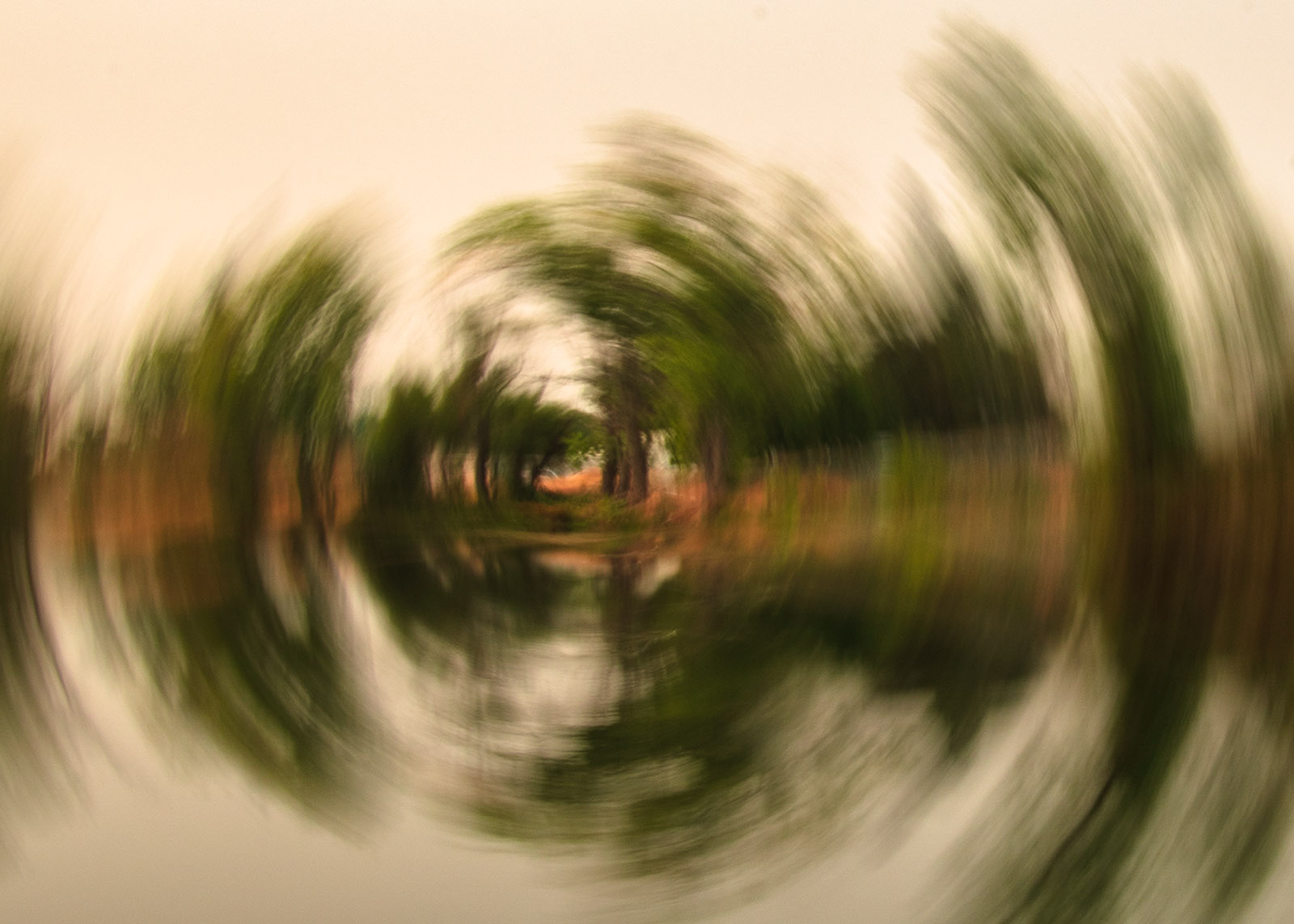
Hello Kieh-Hanh,
The first thing that grabs my attention with this photo is the beautiful color of the sky! The day looks like a perfect time to be out for a walk. I also like that you captured people walking on the bridge; this makes the shot.
The challenge with the image is the perspective; it needs adjusting as the bridge feels like it is falling. The other challenge with this perspective is the people are stretched thinner than a neutral viewer would expect them to look.
I recommend practicing changing your perspective (the tilt of your cellphone) and seeing what you need to do to get a bridge like this to be more upright. Perhaps a lower position (closer to the ground) would help.
My comment is not meant to be harsh, but when a judge looks at an image with buildings or bridges, they often will find issues when they are not straight.
Best regards,
LT |
Sep 18th |
| 3 |
Sep 22 |
Comment |
Hello Mary Ann,
What a fun ICM photo you have created! I have wanted to try this for a long time. With an abstract, I don't think it is necessary to know what the before scene was, though it is fun to learn about your adventure for discussion. I am guessing it was a landscape with water in front and land, trees, and possibly a white house in the background. Am I close? <smiling!>
I find it difficult to critique an abstract because the work is so personal to the artist, and it is the artist's interpretation we are trying to discern. If I were to recommend something, it would be increasing the exposure with the tone curve - parametric curve (in LR, it is the grey circle with the 's' shape in the center). I set the highlights to +47, Lights +63, Darks +52, and Shadows +11. I also created two gradient filters, one on the top and one on the bottom, to help balance the tones.
My edit was quick and just a suggestion. I am curious what you think.
Best regards,
LuAnn |
Sep 13th |
 |
| 3 |
Sep 22 |
Comment |
Hello Ruth,
I agree with the group; you have done an excellent job on this portrait! Your model has a friendly smile, eyes on the camera, and a nice pose. The golden light from your reflector adds nice warmth.
You asked for tips and this is what I can offer:
- Try to have the light come from the right or left of model: side light, 45 degree or so.
- Try to block the sun with model = cool hallow effects without lens hood.
- Crop sun out of the photo completely by moving your camera position this helps model stand out more and give photo more punch.
- Try turning on LCD screen on camera and walk around model to get light where you think it looks best.
- Golden hour is good light for portraits
- Use a lens hood gives more pop, but without hood you might like lens flares or haze
- Slightly under expose your photo to save details
- In editing: if model seems dark lower highlights, up shadows, up exposure a touch, lower blacks to add contrast, and up white slider all to give balance to image.
- Do you have dynamic range or highlight control in camera?
These are just some thoughts I can suggest for portraiture.
Best regards,
LuAnn |
Sep 11th |
| 3 |
Sep 22 |
Comment |
Hello Christine,
What a beautiful location to be able to photograph; Milan is a dream vacation for many. I like the vanishing line captured into the light at the end of the canal. The image is nicely balanced, and the colors appear natural; I even notice the building's color reflecting in the water.
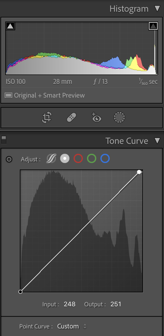
Your description did not specify what your basic editing in LR included. Did you add additional sharpening or boost the clarity? The sidewalk area on the left side of the frame is grabbing my eye, especially where the pebble-style edges outline the walking path. The other thing that holds my eye is the white sun. I do not see the sun this strong in the original image. The bright area of the sun is so strong that it keeps pulling me away from looking at the buildings, people walking, and beautiful architecture. The histogram is showing some overexposed highlights, so I recommend using the Tone Curve in LR and moving the white slider as you see in my edit.
I have been using the tone curve more lately to adjust highlights than the highlight slider. Have you tried this technique when editing?
Thanks for sharing a great photo with the group this month!
LuAnn |
Sep 11th |
 |
| 3 |
Sep 22 |
Reply |
Hello Ian,
Thank you for stopping by group 3, and I am glad you like my sunflower! As you noted, I never thought about seeing a picture within a picture; I will have to keep that in mind for the future. I am just starting to photograph flowers; it is not my usual genre.
Take care,
LT |
Sep 11th |
| 3 |
Sep 22 |
Reply |
Hi Joan, and welcome to group 3!
Thanks for your thoughts and comments on my sunflower. I am taking a flower class from Rosie LaLonde to see if I can learn to paint flowers in the future. I love her style, though they are super intense.
What is your favorite genre to photograph, Joan? I like a documentary style of photography (photos of all types), still-life photos, and, recently, minimalistic work with rocks and feathers. My favorite lens is my 80mm macro, which I use quite a bit. I have a new compact camera with a fixed 28mm lens that I am forcing myself to learn to use more. It has a macro crop feature which I am enjoying.
I look forward to seeing your style of photography as we move ahead!
Have a great weekend,
LuAnn |
Sep 11th |
| 3 |
Sep 22 |
Reply |
Hi Mary Ann,
Thanks for your comments!
I went back to the original to see if maybe I uploaded the wrong original photo, but this color version is the same file number. I wonder if the conversion process I used put the water drop on the flower. I used a Nik Analog preset so this is very possible. Nice catch!
LT |
Sep 6th |
| 3 |
Sep 22 |
Reply |
Hi Michael,
Have you considered displaying your photos in coffee shops, art galleries, libraries, and small diners around town? Camera clubs I have belonged to over the years rotated their images through these types of small establishments regularly. Usually, it is for a short time, anywhere from a month to 2 or 3. Don't be shy; your work is beautiful.
LT |
Sep 6th |
| 3 |
Sep 22 |
Reply |
Thank you, Michael, for your comment!
I started to print my photos to hang on my walls at home. I used a soft cream mat with a chocolate brown second mat on the inside for this image, then framed it with a simple black metal frame. Photos seem to come to life when you print them.
Do you mat and frame your photos?
Take care,
LT |
Sep 5th |
| 3 |
Sep 22 |
Comment |
Hello Michael,
I am impressed by this month's image show of beauty, originality, and artistic creativity! The three images balance the soft round shape of a dandelion puff ball on the left and a lovely variety I can't quite identify on the right. The beautiful Milk Thistle in the center has the perfect contrast with its thorns. The white background is also excellent, giving the photo a simple and minimalistic appeal. Your color palette provides the photograph with unity as the three subjects work together harmoniously.
I do have a question. Are these specimens medicinal or editable?
I hope you enter this image in a competition. I would love to hear how it does!
Thanks for sharing a great photo!! |
Sep 5th |
5 comments - 9 replies for Group 3
|
| 31 |
Sep 22 |
Reply |
Perfect! Thanks for sharing, Ian!
LT |
Sep 12th |
| 31 |
Sep 22 |
Reply |
Ian,
By any chance do you have an original photo so we could see the before version of this photo?
Thanks
LuAnn |
Sep 11th |
| 31 |
Sep 22 |
Reply |
Thanks, Ian, I have you on my list to check out next month; love your work.
LT |
Sep 11th |
| 31 |
Sep 22 |
Comment |
Ian, The light and tonality are very striking in this monochrome image. I like your choice of a minimalistic presentation, just the essential elements of the car. The pano format works perfectly; the grill and logo are well positioned in the frame. Even though this is a close-up, I can still see depth through the grill.
I am glad I saw your image this month!
Good luck in the competition,
LuAnn |
Sep 11th |
1 comment - 3 replies for Group 31
|
| 62 |
Sep 22 |
Reply |
Happy Shana Tova, Israel!
One last thought. In the future, when you have an obstacle in the front that you can't avoid, take the photo anyway. You might be able to darken the area in post-processing to obscure it. I do understand being challenged by these obstacles.
Blessings,
LuAnn |
Sep 21st |
| 62 |
Sep 22 |
Reply |
I like your idea, Bunny, of using props. I am inspired; maybe I could bring a man's beret, note pad and a coffee cup to a park bench, like a found still life. That is an excellent idea!
LT |
Sep 20th |
| 62 |
Sep 22 |
Reply |
Thanks, Emil; I appreciate the suggestion.
LT |
Sep 20th |
| 62 |
Sep 22 |
Comment |
Hello Israel,
What an excellent opportunity you had to photograph this opera. I read that Aida is universally revered as one of the greatest operatic masterpieces (originally performed in 1871 in Cairo), and you had a chance to photograph it; how amazing!
My only suggestion is that if you have the option to expand on this crop, I would suggest adding more to the sides and bottom of the frame; the crop is too tight. I appreciate seeing more of the action on the stage with all of the characters you have included. To me, this helps build the story you are trying to tell of this opera, and that is where the impact is on this image (the cast). I'm afraid I have to disagree that removing the person in the white robe and veil would not be a good idea. His posture and the lighting on him tell me he has a valuable part in this scene.
The three women on the floor frame the actors above them, so I see them as essential elements of the story. The challenge is the woman on the left; her hair is touching the side of the frame (add some space here). The woman on the floor in the center is partially outside the frame. One rule of portraiture I have learned from the pro's is never to crop where a limb bends, so there is no cropping at the joint of ankles, knees, elbows, waist, fingers, etc., and especially not on the face. The reason is it distorts the human figure.
By the way, who is the person with the branch like arms and hands? I couldn't find any info on him.
I do like Bunny's crop. This would be a nice photograph to add to a collection of photos taken from this scene. You can include a wide shot, middle crop shot, and tight crop as Bunny is suggesting. This would make a nice collection and tell a great story.
You are living a photographer's dream, Israel, keep up the good work!
LT
|
Sep 20th |
| 62 |
Sep 22 |
Comment |
Wow is right, Bob; this image is stunning! I also love the color photograph; the colors are so vibrant and cheerful.
I am impressed with the lightbox work. You have perfected your artistic abilities with this tool. I agree with Ian's small border; I would try light grey, perhaps.
Is this entered in a competition? Will you be framing this? Canvas, photo paper, or metal, perhaps?
You are an inspiration, my friend; keep up the excellent work.
LT |
Sep 19th |
| 62 |
Sep 22 |
Comment |
Hello Oliver,
I just typed a reply and then lost connection to the internet; man, I hate when that happens <laughing!>
I love this photo of your grandson. Your black-and-white conversion turned out great! I love the minimalistic style as well. Bunny has an excellent idea of adding symmetry. Although it challenges the idea - is this one grandson or identical twins?
My thought would be to keep the symmetry of the walls and only have one runway and one grandson.
Excellent work, Oliver! You come away with several great ideas for modifications.
Have a great day!
LuAnn |
Sep 19th |
| 62 |
Sep 22 |
Comment |
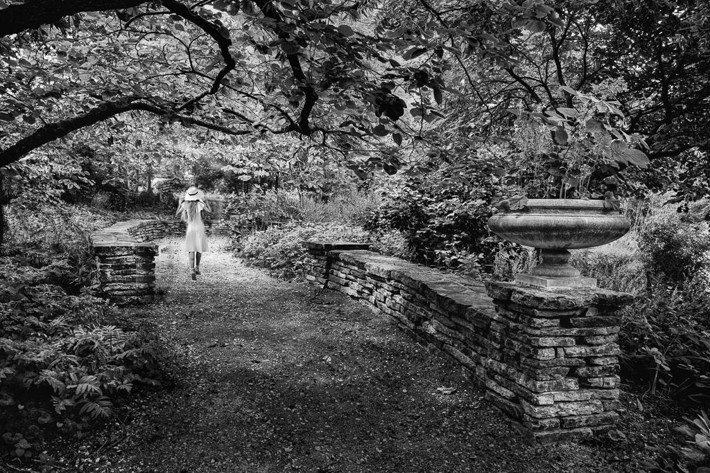
Hi Emil,
I love your garden scene even though it is a bit busy, as you said. I agree with all the ideas the group offered. I like Bunny's idea of having a person on the path, so here is a suggestion to expand on what she was thinking. My edit is not perfect; it was quick just to show an example. Her photo was free on a photo website.
Much is to be said about having a person in a photo to connect with a viewer. Even if you don't see their face, a connection with another human draws the eye. I also think the woman distracts my eye from the business in the photo; I have a landing place now for my attention.
LT |
Sep 6th |
 |
| 62 |
Sep 22 |
Reply |
You're very welcome, Bunny! |
Sep 5th |
| 62 |
Sep 22 |
Comment |
Hi Bunny,
Wow, now you are doing fantastic street photography! Who knew!!
I love the details in Brent's beard, the points on his incisor teeth, and everything else! The light captures the crucial elements of this portrait, and his eyes have a nice catchlight.
I understand your hesitation to photograph people on the street, but I agree this man's appearance says he would love the attention. Regarding posing people, just asking people to act naturally usually works just fine. Talking with them and letting them know what attracted you to take their photo also helps make you both feel at ease. Simply being honest is my advice. You can usually tell if someone is approachable or if you should keep your distance. Practicing with friends or family helps before heading out on an adventure too.
My suggestion for the future is to consider taking an environmental portrait. Including some background adds to the story you are telling with your photography - just a thought.
Best regards,
LT
|
Sep 5th |
| 62 |
Sep 22 |
Reply |
That's a good point, Oliver! Would the photo have been better if the shuttlecock was not in the photo, just its shadow?
LT |
Sep 4th |
| 62 |
Sep 22 |
Reply |
Hey Bob,
Thanks for your comments on my shuttlecock! I was out of ideas for what to photograph, and I found this subject in a box in storage. I think it was from my parents long ago. When in doubt, shooting shadows always work.
I wanted to go to the state fair this year. But I noticed in the news shooting and brawl triggered the closing of the fair yesterday, so things are changing as to where one can go alone to find photo opportunities.
Have a great Labor Day weekend!!
LT |
Sep 4th |
| 62 |
Sep 22 |
Reply |
Thanks, Bunny! I always get great ideas from group 62. Today I'm in a laundromat. I brought my camera to kill some time. You never know where you'll find your next photo!
Have a great weekend!
LT |
Sep 3rd |
| 62 |
Sep 22 |
Comment |
Awesome, Oliver, I brought you over to the dark (dramatic) side!! I like your idea to darken it more.
Thanks for the help!
LT |
Sep 3rd |
6 comments - 7 replies for Group 62
|
| 80 |
Sep 22 |
Comment |
Wow, Bob, you are becoming a fantastic artist!
I love the remix version a lot. The colors and abstract point-of-view are like a breath of fresh air from the ordinary. I enjoy how your image has unique lines and shapes; I am drawn to look at each one for what my crazy imagination might find <laughing!>. A viewer could see cute little faces in abstract shapes.
Compositionally, the flower is centered, but, in this instance, you broke the rule. There is enough to look at around the subject, which is not a problem for me because my eye moves to the rich reds, blues, and greens, and these colors support eye movement.
My only suggestion is to consider raising the brightness a bit. The histogram isn't showing anything in the white section. Adding brightness will help the Dahlia pop. It doesn't have to be a lot, and I recommend using the tone curve if you use Lightroom.
Thanks for sharing a great image this month!!
LT |
Sep 5th |
1 comment - 0 replies for Group 80
|
13 comments - 19 replies Total
|


