|
| Group |
Round |
C/R |
Comment |
Date |
Image |
| 3 |
Aug 22 |
Reply |
Did you feather your selection of the moon? That would be my guess. |
Aug 19th |
| 3 |
Aug 22 |
Reply |
Hi MaryAnn,
Your image size was really large (3204 x 1266) and when I opened it, it was too big for my screen, so I resized it to a version 1400 on the long edge. I like what you did and where you placed the moon. Nice work!
LT |
Aug 18th |
 |
| 3 |
Aug 22 |
Reply |
Thanks, Mary Ann, for your thoughts and comments! I have recently printed my favorite photos to fill up the empty wall space here at home. I plan to print this photo on watercolor paper to see if it comes out anything like this photo with implied texture.
Thanks for your comment; it is helpful to me to know what others think.
LT |
Aug 13th |
| 3 |
Aug 22 |
Comment |
Hello Kieu-Hanh,
You have a lovely image this month with a butterfly and lily. This variety is one of the most fragrant lilies in a garden; the Star Gazer, also known as the Oriental Hybrid Lily. You have a nice diagonal with the flower bowing to the butterfly. The butterfly has nice color on its wings, and the lily is a lovely shade of pink. The soft green background is a nice neutral compliment to the subject.
You noted that you were planning to submit the photo to a nature competition, so I have some thoughts for you to consider. The PSA definition for the Nature category says Photographs of human-created hybrid plants are not allowed in competition. When I look this variety of lily up online, it states that it is a hybrid. I would recommend asking someone in your club about this concern. There is always the open category to enter your image into if nature doesn't work.
The other challenge I see in the photo for the competition is the butterfly is not in sharp focus, and the whites on the top petals of the flower are overexposed and void of color or texture. These are two things a judge will be most critical about in competition. I recommend using a small flexible defuser (or piece of white paper) when photographing flowers and butterflies. The diffuser doesn't have to be close to the subject; holding it overhead to break the harsh light from reaching your subject is all you need to achieve.
I hope this is helpful. Good luck in the competition!
LT |
Aug 13th |
| 3 |
Aug 22 |
Comment |
Hello Christine,
It is nice to have you in the group!
The first thing I noticed about your photo is the beautiful colors and creative framing. I find the photograph has a nice asymmetrical balance, the horizon line is perfectly placed, and the grand view of San Giorgio Maggiore looks straight through the center of the image. I also notice the careful placement of the spire on the steeple across the water is nicely within the viewing area.
The only thought I have is I find the stone window opening taking up a lot of the foreground area. Since the space is blurred, what do you think of cropping even tighter?
Thanks for sharing a great photo this month! Glad you are here!!
Best regards,
LuAnn |
Aug 11th |
| 3 |
Aug 22 |
Reply |
I am surprised the judge gave that comparison of a towel for your image. It would be one thing to say "beautiful towel" but quite another to say "kitchen towel." So I see your point.
I wish you success in your efforts with your club. It will be a tough sell but if you love what you do, persevere!
LT |
Aug 8th |
| 3 |
Aug 22 |
Comment |
Hello Ruth,
I like the creative framing you used on your image; this adds a touch of originality. A nice grouping of rocks from the lower left corner directs my eye to the gravel path. From there, I can quickly move around the frame to the outbuildings. The mountain range gives an idea of the location in an unspecific way. The colors are natural, and the sky is a soft mid-day tone of blue. Very nicely done.
The only suggestion I have is to lower the luminosity a bit. I have attached a screen copy of the tone curve adjustment I am suggesting. I find the tone curve to be a better choice when adjusting luminosity than the sliders in the "Basic" group in Lightroom, which tends to be a more global adjustment.
Thanks for sharing a great image!
LT |
Aug 8th |
 |
| 3 |
Aug 22 |
Reply |
Hello Michael,
You will receive this response in a camera club because most entries lean toward realism. Creativity is not high on the list unless you submit the image to a specific creative category. It always has been this way, and I suspect it will continue.
I submitted an image for personal evaluation by a PSA judge several years ago who liked my creative photograph. He even took it to his camera club to see what they would say about it. But it did not do well, and he said that is to be suspected; it's just not what clubs are looking to shoot. You must keep creating and submitting creative photographs until the theme becomes more popular with the clubs; was his advice.
What category did you enter your photo in, in the competition? How many of the photos entered in the competition were creative? Or were they all mostly realistic?
Keep working on making images the way you like them, Michael. Also, try looking for art galleries that have exhibits for creative photography.
I hope this helps,
LT |
Aug 8th |
| 3 |
Aug 22 |
Comment |
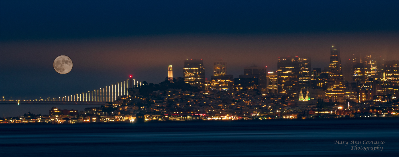
Hi Mary Ann,
Very impressive cityscape you have submitted this month, excellent work! You have captured the city as it is with fog. The photo has a nice flow and an asymmetrical balance.
I have a couple of suggestions for you to think about. I used Lightroom and applied the Lens Correction for your Nikon camera. I am not sure if you do that in the software you use. It did adjust the image for distortion a tiny bit. Then I applied an Auto upright transform tool, and again LR made a slight adjustment with the alignment. For these adjustments, it is best to use the original photo.
Lastly, I wonder if the moon's brightness is too apparent compared to the haze over the city. I did apply a bit of negative clarity and dehaze, so perhaps you could take a look at doing this and see what you think. I do not see many San Francisco cityscapes, so I can't say for sure if this is necessary.
Have a great weekend,
LuAnn
|
Aug 7th |
| 3 |
Aug 22 |
Comment |
Excellent work, Michael!
I love your garden and all the beautiful varieties of flowers you grow. Your simulated textured background works well. The individual flowers are well placed. How did you decide which flower would go where? Did you do a storyboard or sketch them out in place before arranging them?
Your photo is inspiring. I could see this as an excellent idea for photographing the little things I find in the woodland areas I photograph. I have always wanted to photograph woodland areas, but they are so chaotic; this would be an excellent solution.
Thanks for sharing a great photo,
LuAnn
|
Aug 4th |
| 3 |
Aug 22 |
Reply |
Hello Michael,
Thank you for your comments! I am glad to hear you like this photo. Sometimes we run across photos we like but just can't put our finger on why. Or, we have terrible photos with the worst light and feel there is absolutely no hope for them - this was my photo because of the chaotic woodland background.
I agree with you; most people are more interested in seeing realism in photography and sharp and in-focus images than ones that lean more to the creative side. But I love creativity and want to do more of it.
Years ago, I saw Mike Moats (his website Tiny Landscapes) who talked about using Anthropics Smart Photo Editor. He produced fantastic macro images with this software but said the feedback wasn't what he had hoped. I think he stopped using it for a while because he became discouraged. But I love change and try to use SPE whenever possible.
Best regards,
LuAnn |
Aug 4th |
5 comments - 6 replies for Group 3
|
| 62 |
Aug 22 |
Comment |
Hello Israel,
I have to agree; this is a fantastic photo, and what a great idea to flip the image, laying the bridge on its side! This makes the photo original, and you will stand out in the camera club competition because of it!
I like Oliver's idea to darken the background, but I would like to add that you can remove the suspension cables as they do not contribute to the image (but contribute to the bridge; we don't need to see them).
Nice work!
LT
|
Aug 13th |
| 62 |
Aug 22 |
Comment |
Yes, I, too, love the mystery in this photograph!! And the pinhole preset was perfect. I even like the bright spot at the top as it makes me take note of the dent in the hood, but then my eye goes to the all-important name - CASE and down the vertical circling around back to the dent, so great flow!
Your edits were spot on I wouldn't change anything!
LT |
Aug 8th |
| 62 |
Aug 22 |
Comment |
Beautiful lilies, Bob, are these the ones with the profuse fragrance? Also known as Star Gazer? Your creativity is coming along, and your light board work is inspiring! I like high-key photography, so I wonder how dead flowers would look photographed this way.
I agree with the group; a little more space on the bottom and slightly less on top for balance. Have you tried to flip the image horizontally? I did this in LR to see how it looked. If you notice, the long petal on the forward lily now gives the viewer a left-to-right pathway (baroque diagonal) into the cluster of flowers. The original direction you have is a lower right to upper left direction (sinister diagonal). This path can sometimes bring tension into an image. It all has to do with reading from left to right, and this being a comfortable way to view an image to see the path following our reading style. It doesn't work will all photos, but sometimes it can make them better or more appealing.
One more thing I just noticed. There are white-on-white dots of texture sprinkled on the photo around the blooms. Did you notice these? Perhaps removing them would help.
What do you think?
LT |
Aug 7th |
 |
| 62 |
Aug 22 |
Reply |
Thanks, Bob, I appreciate your thoughts and comments! |
Aug 7th |
| 62 |
Aug 22 |
Reply |
Thank you, Emil, for your comments! I am glad you like my photo. I hope to find more white mushrooms one day, but this year has been too hot, and we have had a lack of rain, so there are no mushrooms to photograph. I need an alternative subject to fall back on. I didn't plan for a year with no mushrooms <smiling>!
The woodlands have been so plain and dry, but maybe that is a subject in and of itself. Shoot, what is there before you maybe is what I should be thinking.
Have a great weekend!
LT
|
Aug 7th |
| 62 |
Aug 22 |
Reply |
Thanks for your comments, Bunny; I am glad you like my photo. Oliver uploaded an original to show the area in which I found this mushroom. Just an old tree stump along a walking trail.
Have a great day!
LuAnn |
Aug 7th |
| 62 |
Aug 22 |
Reply |
Hello Bob,
I hope you are doing well. I did recently have the original uploaded, as you requested. I forgot to submit it initially; senior moment.
This photo was taken on a stroll through a park looking for mushrooms - documentary style. I found the white mushroom jumped out at me; it was simply growing out of this tree stump along the trail path. I did not move or change anything to make it appear better or cleaner.
I love the texture on the cap too. Being in the field, I had no idea the photo would be so cool. The sharp contrast is very striking.
Best regards,
LT |
Aug 7th |
| 62 |
Aug 22 |
Comment |
This sample is a BW monotone in blue. Again I used Silver Efex Pro 3. I selected the Mijet3 tone and Dust & Lint 1. This reminded me of something found in water.
Thanks for sharing a great image this month!! And for letting us play with it. Bob has been an inspiration for many of us.
Best regards,
LuAnn |
Aug 7th |
 |
| 62 |
Aug 22 |
Comment |
Hi Bunny!
This is an inspiring photo! How creative to be somewhere and shoot what you see! Who'd a thought!! The bright orb in the center has my attention trying to figure out the subject.
The first thing that came to mind when you said: "something a little different" was monotone. I can only post one sample at a time, so I will submit them separately.
Thanks for the encouragement to just shoot something, anything. I have been stuck beyond my strength, so I have to get out and try something new this week.
I had so much fun playing with your photo. This one I did in Silver Efex Pro 3 and I used the Antique Plate II preset. I like the fine grain to assimilate texture and give the impression of something found in the sand.
LT |
Aug 7th |
 |
| 62 |
Aug 22 |
Comment |
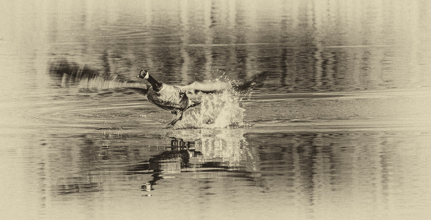
Hello Oliver,
I love your enthusiasm for trying all genres of photography! You experienced the whole gamut; early riser, full coffee mug, and on the trail at the crack of dawn. Now I'm tired, so I will be satisfied to sit back and enjoy your photo <smiling!>!
I like how you minimized the distractions and zoomed in on the bird. My eyes are captivated by the motion in those incredible wings lifting this bird in the air.
The only challenge I see is the vertical lines in the water are playing against my attention on the bird. So with my example, I went into Gigapixel and enlarged the file so I could work on it. Then in Silver Efex Pro 3, I used the Antique Plate II and kept the settings the preset offered. This finished photo is just an idea, not meant to be a final copy.
I like how the preset used a white vignette around the edges to tone down the busy vertical lines. The focus is on the immediate circle of water splash and the bird. I like the antique tone because this is a nature shot; for me, it fits nicely with a softness that goes with the bird; the B&W seemed harsh in comparison.
What do you think? |
Aug 4th |
 |
| 62 |
Aug 22 |
Reply |
Clearing my history corrected what I saw. Thanks!
I understand that I don't have to have pure white and pure black in B&W photography. But learning to get to that point where you instinctively see it in every image takes time. But I appreciate you pointing it out.
LT |
Aug 3rd |
| 62 |
Aug 22 |
Reply |
Oh, maybe I need to clear my cache on my computer. I will try that and thanks for the screen shot!!
LT |
Aug 3rd |
| 62 |
Aug 22 |
Reply |
Hello Oliver,
Thank you for your comments! I can see what you are saying about the white cap. I was cautious about lowering the white luminosity below 255, but I see it could come down slightly.
I wish I could replace that white border with the narrow one. Did Tom have any suggestions for swapping out this one?
Thanks for your help and for being a positive inspiration as a group administrator!
Best regards,
LuAnn |
Aug 2nd |
6 comments - 7 replies for Group 62
|
| 80 |
Aug 22 |
Comment |
Hello Bob,
Beautiful flower, and I love your creative touch!
I like your choice to use the sinister diagonal to pose the flower. This direction adds a touch of tension to the photo but compliments the downward angle of the flower. I feel the flower is bowing to the light shining from above. When you flip the image, the flower appears to curve away from the light, which is unnatural to me.
Yes, I, too, see a bit of wabi sabi in your photo, the Japanese term for the elusive beauty of imperfection (making something old beautiful again, wasting nothing).
The only item I find distracting is the purple in the upper right corner. For whatever reason, my eye keeps going in that direction. The color feels menacing (danger lurking about in the garden), so I would either change the color to blend with the background or see what you could do with the intensity.
The impact of your image has quite a subjective story to tell of human nature. Do you see the many stories a neutral viewer could tell with this whimsical flower portrait?
I always enjoy viewing your art, Bob; well done!
LT |
Aug 11th |
1 comment - 0 replies for Group 80
|
12 comments - 13 replies Total
|


