|
| Group |
Round |
C/R |
Comment |
Date |
Image |
| 3 |
Jun 22 |
Reply |
Now you're getting it, John!!
Photography is all about light and when you have a light, light it.
LT |
Jun 29th |
| 3 |
Jun 22 |
Reply |
I agree, your suggestion to have the light on was excellent.
|
Jun 20th |
| 3 |
Jun 22 |
Reply |
I like your thought on not removing the stone behind the soldier. Excellent point.
|
Jun 20th |
| 3 |
Jun 22 |
Reply |
I am noticing an area of white in the sky just above the dark cloud on the left. I hate to say it but I think the brightness at the top of the image is a bit too bright now because the spot is more pronounced. What do you think?
LT |
Jun 20th |
| 3 |
Jun 22 |
Reply |
Thank you, Debasish, for your edit and comments. I appreciate hearing from you and others because your observation of mood and feeling explains the emotional impact this image has on a neutral viewer, something we usually don't look for when editing or creating images.
Best regards,
LT
|
Jun 20th |
| 3 |
Jun 22 |
Reply |
Thank you, Mary Ann, I appreciate your thoughts and comments.
LT |
Jun 20th |
| 3 |
Jun 22 |
Reply |
I have always wanted to do a metal print. I will keep your suggestion in mind for this image!
Thanks,
LT |
Jun 20th |
| 3 |
Jun 22 |
Reply |
Thanks, John, I appreciate your thoughts.
It was a professional Nat Geo photographer that told me to show more at the back of the canoe to see the path he traveled as opposed to the standard way of having negative space in front of the canoe. It is a different approach and I immediately took to it because it was different. Often times we look for ways to grab people's attention and add interest to our images so I liked his advice for the simple reason it adds originality.
I am glad you are a part of the group and will be sad to see you go. Maybe you will reconsider.
All my best,
LuAnn |
Jun 19th |
| 3 |
Jun 22 |
Reply |
Thanks, John, I am glad you like the group and find benefits in being a part of it!
LT |
Jun 19th |
| 3 |
Jun 22 |
Reply |
Thanks, Paul, I appreciate your thoughts and comments. I had no idea the impact the image has on others.
Best regards,
LuAnn |
Jun 19th |
| 3 |
Jun 22 |
Comment |
Excellent photo with great emotional impact. From how you described the image, I can see your intent clearly.
LT |
Jun 19th |
| 3 |
Jun 22 |
Comment |
Hello Ruth,
Lovely image and beautiful story! I like the color palette; the scene tells of a warm climate and a fantastic day. This woman is attracted to the birds and isn't even offering them any bread. I really like the three birds coming in from the upper right corner directly towards the woman.
My suggestion to help enhance this image is the remove three birds (one on the left for sure, one above her head with a wing over its head, and one in front of the trees if possible).
Was she feeding the birds? What a great capture!
LT |
Jun 19th |
| 3 |
Jun 22 |
Comment |
I like your cord board, John; I love the nostalgia and I think the HDR processing adds to its character and charm.
As far as the white cord going out of frame, you could try to paint in the texture from another cord in Photoshop. If that doesn't work, you could try to recover some of the lost pixels from the over-exposed highlights from the original raw file.
I really prefer your original crop. Putting the gold label at the top of the frame draws the eye to the top edge of the frame, and then the image feels tight/constrained.
Hope this is helpful.
LT |
Jun 19th |
| 3 |
Jun 22 |
Reply |
I agree, Ruth, good point. Keeping the boats dark helps retain Michael's intent for taking the photo. |
Jun 19th |
| 3 |
Jun 22 |
Reply |
I have a thought to consider.
If the boats were outside their mooring, they would be in direct line of sight to the sunset and become distracting elements. I also think we would lose sight of Michael's "intent" for taking the photo in the first place; the sunset.
I think the photographer's intent is often overlooked for its value when critiquing an image so I thought I would add this for the group.
I hope this helps. |
Jun 19th |
| 3 |
Jun 22 |
Reply |
When you compare the edited version to your originally posted image which do you prefer and why? |
Jun 19th |
| 3 |
Jun 22 |
Reply |
I like your edit, Mary Ann!! That is excellent! I also like that you are up for photographic challenges. This is how we learn by inspiring each other to push ourselves beyond what we think we are able to do.
Maybe this group should pose a challenge for everyone for the upcoming month. What could we challenge each other to do photographically?
Have a great day,
LuAnn |
Jun 19th |
| 3 |
Jun 22 |
Reply |
I am so happy all is well with you and my edit, Mary Ann. I just like to share things I learn with my friends here in group 3. Photography is my passion and when I can learn something new I have to share it with friends; that's just who I am.
Best regards,
LuAnn |
Jun 11th |
| 3 |
Jun 22 |
Reply |
Hello Mary Ann,
You make a good point about giving our subjective critiques of other photographers' work and art. But, if you were offended by my edit, I publicly apologize, as that was never my intent. I also returned to my comments to ensure I did not say anything negative about your edit. I simply have been swept away with enthusiasm in taking a class and wanted to share what I learned with the group and you because you edit your work in Photoshop.
I have to share a personal experience with you. I created a still-life photo of a pomegranate, babies breath flower, and a dish in a vintage box and submitted it for critique. The first thing the judge told me was yuk!; old fruit!! I worked so hard creating that still life I was heartbroken. But I learned a valuable lesson from that experience. If I do a still life with fruit again, it will have to be fresh and juicy because that is what "the judge" wanted to see in the competition. Also, a judge will deduct points for bruised or wilting leaves, dead buds, or any sign of age on a flower.
The expectation is high; flowers are to be in pristine and stunning condition. What people want to see in a competition can be completely different from what I am comfortable with hanging on my wall at home. So I always recommend asking this question before taking a photo. Is this a photo for the competition, or is this a photo for me to hang on my wall? Because they both will have different criteria before I click the shutter. Just something to think about going forward.
Have a great day,
LuAnn |
Jun 11th |
| 3 |
Jun 22 |
Reply |
Thanks, Ruth; I value your input and appreciate your sharing your thoughts.
I, too, like something about each photo. After reading the comments above, I found that a little less contrast may appeal to more viewers. It's good to have options that are better than the alternative - deleting the photo <smiling>.
Best regards,
LuAnn |
Jun 10th |
| 3 |
Jun 22 |
Reply |
Thanks, Ruth, for your comments! My edit was long and not perfect I just wanted to share an idea. It does give Mary Ann an option because I know she likes to do edits in PS so I simply hope to just inspire her.
Hope you are having a great spring!
Best regards,
LuAnn |
Jun 10th |
| 3 |
Jun 22 |
Reply |
Thanks, Kieu-Hanh, for your thoughts and comments.
I agree with you; I, too, am torn between the two variations of this photo. I also like the blue and will probably go with how I originally edited the photo.
I chose the 16x9 crop on advice from a professional photographer who set up the outing. His thought was when you want to make an image original; something has to change from how most people view the scene. His idea is to leave space at the back of the canoe; this shows where the canoe came from instead of where he is going. It is a different point of view than what we are most accustomed to, but I try to use it as often as possible to show originality.
LT |
Jun 7th |
| 3 |
Jun 22 |
Reply |
Thanks, John, for your thoughts and comments.
I think what everyone is seeing in the edited version is too much contrast produced by the preset I used. But, hey, nothing ventured nothing gained.
I use Capture One Pro to edit instead of Lightroom because it works better with my FujiFilm photos. Presets that I have purchased from them over the years, however, I find I have never found a good reason to use them. Several of the ones Capture One uses were ones created by professional photographers from around the world. What I am finding is photographers in different parts of the world like to see landscapes, people, and life through different colored lenses.
I am grateful for your thoughts and comments!
Have a great day,
LuAnn |
Jun 7th |
| 3 |
Jun 22 |
Reply |
Hi John,
I compliment you on making a remarkable transformation with your image! The goal for digital study groups is to comment on an image and offer a subjective opinion with suggestions and a sample edit. We are here to support all group members and help them improve as photographers. So please do not feel bad about the photo you originally posted. Because of that original image, look at the improvements you were able to make quite quickly; I might add, from the group's suggestions. If you had submitted a perfect photograph, this would not have been a teachable moment for you or anyone else in this group.
Keep up the good work!
LuAnn |
Jun 7th |
| 3 |
Jun 22 |
Reply |
You are funny, Michael! At least white balance is a quick fix.
LT |
Jun 5th |
| 3 |
Jun 22 |
Comment |
I have to agree, Michael, this is a good sunset. I am especially drawn to the nice reflection and your point of view; it draws my eyes into the photo. There are no distractions that I find bothersome. The shadows on the boats under cover show detail and are not too dark. I like how you handled the hue in the clouds; they look wispy and natural. The image includes minimal elements to tell the story you said you wanted to tell.
I have not been to your state in a while so I have to ask, are the clouds normally that yellow? Would you consider adjusting the WB a bit?
Thanks for sharing a beautiful photo!
LuAnn |
Jun 4th |
| 3 |
Jun 22 |
Reply |
Hi Michael,
I love the background and can't believe I did that! This image is so good because Mary Ann had perfect exposure and the light was right.
With cloning, I selected small areas and then used the clone tool. I spent half a day working on the photo. The texture I added is barely visible; it mostly enhanced the photo's hue a bit and maybe evened out the cloning but not much. I double-checked the difference after I added it.
The course can be found here: https://itsbyrosielalonde.teachable.com
and the course I learned to edit like this was: Level 2, Perfecting and Enhancing Your Flower Images in Photoshop.
I would go into more details, but Rosie cautions people not to share because this is her business to teach flower editing. Check her out on YouTube; she has done some videos that I found initially that led me to take the course. She was a wedding photographer for years, so she is meticulous with her editing.
Lastly, I typically do not use global adjustments for initial edits on exposure. I often use the tone curve and pull back the whites away from 255; this drops my highlights from clipping in one adjustment. Then I find magic in moving the midtone slider on the tone curve. Most images you will notice have a flat look to them. By adjusting the midtones, you can brighten the image better than with the global adjustments (exposure, whites, blacks, shadows, highlights). Look at the green sepal leaves just under the petals, for example.
I did not sharpen the photo at the end, and I can see it could use some sharpening which is normal after editing.
I hope this helps, but I am most interested in what Mary Ann thinks.
LuAnn |
Jun 4th |
| 3 |
Jun 22 |
Comment |
Hello John,
Lovely image. I have never been to Sanibel Island, but I have been to Naples, Florida, which I believe is about an hour away on the gulf side. I think you made a good go of replacing the sky, and it did need one based on the plain white original sky.
I find the highlights in the new sky are overexposed, though; this is drawing the eye of the viewer to these clouds and away from looking at the rest of the image. I also see that in your editing, you must have removed part of the legs from the structure as I find some pieces remaining but not attacked to anything. You can still remove these items in Photoshop. I also recommend removing the stray branches from the palm tree on the left, cleaning up the area, and minimizing these distractions will simplify the photo. I would like to see you lower the vibrance on the plants. With the bright light and strong colors I find them working against you and a bit harsh.
You noted that you over-exposed the sky in the original photo. Was that in-camera over-exposed or in post-processing the RAW file? If you shot it overexposing, you can not recover those details. I would recommend under-exposing and then in post-use selective edits to raise the shadows. Another option would be to take several photos at different exposures on a tripod and then blend or stack them in post-processing.
I hope this information is helpful for you. Let me know if I need to clarify anything for you.
Best regards,
LuAnn |
Jun 3rd |
| 3 |
Jun 22 |
Comment |
Hello Mary Ann,
You're pretty rose captured my attention for its color, clarity, and sharpness; well done! They say orange roses make a wonderful, unique gift and can convey enthusiasm. So I took this rose as a challenge to play with for a bit. I find the light perfect as it also shows good detail in the petals and the leaves below.
I am taking a PS class on painting flowers by Rosie LaLonde. Her course is very intense, so I needed a specimen to practice what I had learned today, and your rose came in perfect timing and was an ideal candidate.
My edits were to clone stamp the background and leave the essence of what I see as the subject; I love minimalism photography. I then added levels and brightness adjustments to darken the overall image, brighten the whites, and adjust the midtone sliders to add richness to the colors. I also added some contrast. Oh, I also added a texture from 2 Lil Owls and removed it from the rose petals.
My selections are not perfect, but I spent considerable time editing, and I had great fun working with your photo!
I hope you like it.
Best regards,
LuAnn |
Jun 2nd |
 |
| 3 |
Jun 22 |
Reply |
Hi Micheal,
Can you be more specific? What do you like about the unedited original raw file (sorry the edited version was deleted and all I had to show was this original raw file) and what do you not like about the newly edited version with more natural colors and tones?
Are you drawn to blue water? Might they play into your decision? And yes, the awarded image had the above treeline cropped out. The challenge I had with that was cropping gave me fewer pixels for printing a larger print.
He was paddling into the sunrise around 5am.
I appreciate your thoughts on this image.
LT
|
Jun 2nd |
6 comments - 24 replies for Group 3
|
| 48 |
Jun 22 |
Reply |
I will check her out!
LT |
Jun 7th |
| 48 |
Jun 22 |
Reply |
Yes Bev your second one is much better!
LT |
Jun 4th |
| 48 |
Jun 22 |
Reply |
I will check her out!
LT |
Jun 3rd |
| 48 |
Jun 22 |
Comment |
Hi again, Bev,
You are very creative! I love your water lily very much. I am inspired now to go to my zoo and photograph the lilies there; they are very similar.
I love the background you chose. I like the fine lines and how the lines curve into the flower itself; they also show motion. I like your thoughts on the flower; it reminds me of Andy Warhol's work. The white parts of the petals being void of color may be the problem. Any chance you can change the white to a complementary color?
Keep up the excellent work!
LuAnn |
Jun 3rd |
1 comment - 3 replies for Group 48
|
| 62 |
Jun 22 |
Comment |
Hello Israel,
I love this image and the story you are telling! It looks beautiful in black and white because it brings out the essential elements; the man's illuminated face and hands drenched in melted wax; what a powerful story.
The only thing I would add is to open the shadows on the waxed hand, similar to how it is in the original. I think the melted wax is vital for the viewer to see. This area holds a great emotional impact. |
Jun 20th |
| 62 |
Jun 22 |
Reply |
Thanks, Bob, for noticing the PJ story. |
Jun 20th |
| 62 |
Jun 22 |
Reply |
Very cool, Emil, which film camera did you use? I like your choice of processing.
LT |
Jun 8th |
| 62 |
Jun 22 |
Comment |
Hi Bob,
I agree with everyone's comments; you have created an excellent abstract photograph! How long have you had a desire for abstract work?
I also love both the black and white (which is very dynamic) and the color version; I probably will lean more towards the black and white because of its rhythm from the lines, shapes, and patterns. The static colors on the lower half of the color image come across as a distraction to me but not so much in the B&W version (they remind me of a television test pattern back from the 1960s - sorry). I like seeing the vibrant yellow, orange and red larger pieces on the other parts of the color image the best.
I wish you great success in your competition and share the results when they are available.
It is such a joy to be part of such an amazingly talented group!
Best regards,
LuAnn |
Jun 7th |
| 62 |
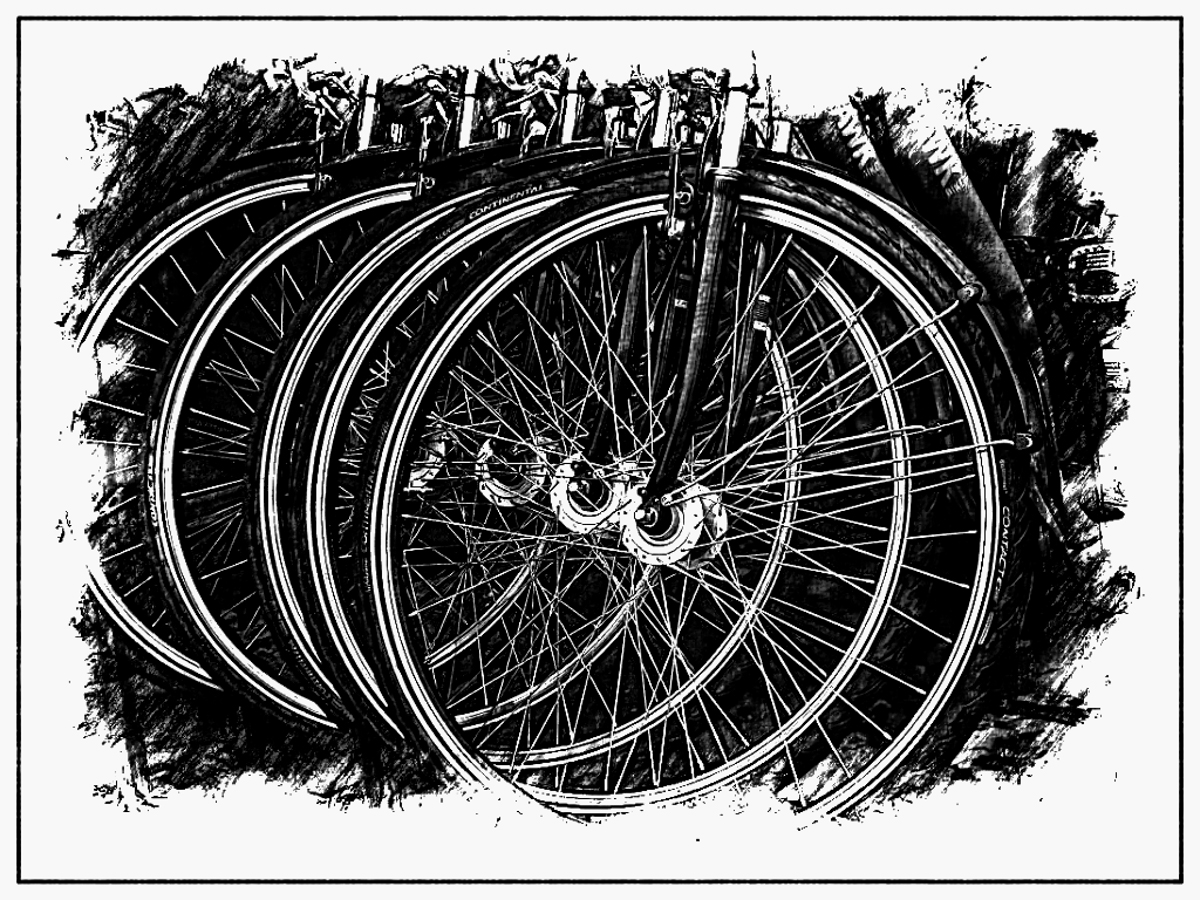
Jun 22 |
Comment |
Hello Bunny,
I like your idea of bike riding and your creative vision of how you saw bike riding from a different perspective that day. You captured an ordinary subject and made it creative by capturing the lines, circles, and geometric shapes. I think black and white works well for this image as the focus is where you may have envisioned it to be.
Just for fun, my edit is another creative out-of-the-box option.
Enjoy!
LuAnn |
Jun 3rd |
 |
| 62 |
Jun 22 |
Reply |
Hello Bev! Thanks for the visit to group 62. I am glad you like my photo and the vignette. Usually vignettes are not well received but I agree with you it does seem to work well in this instance.
Have a great week!
LuAnn |
Jun 3rd |
| 62 |
Jun 22 |
Comment |
Great image, Emil, and I love the dark, moody processing. The Gaussian Blur works perfectly on this image and helps tell a vintage-style story with mood and atmospheric perspective. I will have to remember to use the blur technique on a suitable image in the future. Sometimes we get focused on making everything sharp and in focus and lose touch with our creativity, so bravo!
My recommendation is with regards to the wires. I recommend leaving them in the photo; they contribute to the timeline and vintage feel.
I have been stuck with inspiration for what to photograph lately, and you and Oliver have inspired me again!
Have a great week!
LuAnn |
Jun 1st |
| 62 |
Jun 22 |
Comment |
I love your abstract blowball, Oliver! You will have no problem judging an abstract theme since you have experience taking the Image Evaluation course! Use the Art Elements and Design Principles, and you will blow them away with your critiques!
I think your subject is excellent in black and white; it captures my attention immediately. You have apparent lines, shapes, patterns, and positive space (art elements) in your photo. The design principles I see you have used include balance, contrast, and pattern (pattern in Design Principles repeats the line, shape, and pattern from the art elements); I see movement in the tiny hairs of the seed heads, and there is a regular rhythmic repetition and unity in how the seed heads float as a single unit in the breeze.
We have lots of dandelions in the fall on our property, so I have to capture more. You have inspired me to get out and shoot!
Thanks for sharing!
LuAnn |
Jun 1st |
5 comments - 3 replies for Group 62
|
12 comments - 30 replies Total
|


