|
| Group |
Round |
C/R |
Comment |
Date |
Image |
| 3 |
May 22 |
Reply |
Thank you, Bev, I appreciate your comments! If you have time, please check out my photo on group 62; I would be interested in what you think.
LT |
Jun 2nd |
| 3 |
May 22 |
Reply |
Thanks, Ruth, for your thoughts! |
Jun 2nd |
| 3 |
May 22 |
Reply |
I will do that tomorrow. I did not save the edit but will get one to you.
LT |
Jun 2nd |
| 3 |
May 22 |
Reply |
thanks for your reply.
LT |
May 23rd |
| 3 |
May 22 |
Reply |
This response looks like a duplicate, Michael, feel free to delete it if it is. |
May 20th |
| 3 |
May 22 |
Reply |
Hi Michael,
I have a question for you. Did you shoot in a priority mode on this image, like aperture or shutter priority? With aperture priority, you can typically change apertures quickly; maybe this process could be an option.
Lastly, you might want to check out Steve Perry, an excellent nature photographer; he's been around for a long time. He has awesome YouTube videos on camera settings that might be helpful to you when shooting nature. Here is a link to his website and video links.
https://backcountrygallery.com
https://www.youtube.com/c/backcountrygallery/videos |
May 20th |
| 3 |
May 22 |
Reply |
I will do that tomorrow. I did not save the edit but will get one to you.
LT |
May 16th |
| 3 |
May 22 |
Comment |
Hello Ruth,
I like the warm and cool tones in your ocean photo, and the creative framing of the boat lift makes for an original point of view. I find your dodging, burning, and cloning out the lamp were good choices.
I really like Oliver's suggestion of the square crop. Removing the elements on the shore, in my observation, improves the photograph because it simplifies it; now, I can focus on the boat in the ocean. I am curious, did you dodge the white boat? I sense there is a haloing effect around the boat. If so, just lower the effect a bit. Lastly, I am finding the exposure a bit dark. I would like to recommend using the Tone Curve in Lightroom to brighten the image instead of using the sliders. Have you used the Tone Curve much? I am finding it makes adjustments really easy with minimal changes. On the Input I have 115 and Output 143.
LT |
May 16th |
 |
| 3 |
May 22 |
Reply |
You are very welcome!
LT |
May 14th |
| 3 |
May 22 |
Reply |
Oh my goodness, Michael, I never thought you were argumentative; we are here to discuss our thoughts and ideas openly. My dialogue was to prompt a response from John as the photographer; he would know the area where he took the photo best, so I am curious what he has to say about his photograph.
Your comments about lens distortion are accurate. John noted he was shooting at 34mm, and that focal length falls within the standard wide-angle focal length. So, yes, I agree with you it wasn't lens distortion. You also noted the person's foot does not look distorted, and I agree with you; good point.
I know I can always count on you, Micheal, for an excellent photographic discussion. Thank you for your participation in this discussion; I hope more members comment on this topic; we can all learn from this discussion.
Best regards,
LT |
May 14th |
| 3 |
May 22 |
Reply |
I see what you are saying, Michael, and I appreciate your clarity. Unfortunately, it will be a subjective opinion in a competition that is either ok with it or sees it as a distraction; that is my point for John in this discussion.
|
May 14th |
| 3 |
May 22 |
Reply |
Thanks, Ruth, for your thoughts! |
May 13th |
| 3 |
May 22 |
Reply |
Thanks for your comment, Mary Ann! |
May 13th |
| 3 |
May 22 |
Reply |
Thank you, Bev, I appreciate your comments! If you have time, please check out my photo on group 62; I would be interested in what you think.
LT |
May 13th |
| 3 |
May 22 |
Reply |
Hello Mary Ann,
I appreciate your effort to show fog (also known as atmospheric perspective) in your image. The challenge I have is the foreground and background are too close to each other; there isn't enough space between them to show the atmosphere of fog. Initially, the image looks like the exposure was too dark.
I am sure you have seen fog over a road as you are driving along. Think about a scene and what you would see. You will notice that the part of the road closer to you looks and feels clearer in the foreground area. While the distant landscape is probably darker and further away, and the fog makes the distance appear even further away. Fog clouds blur details of objects, making them appear further away.
In this image of the two deer, the background is white; this color, I believe, is working against you. Colors, except white, fade into the distance when there is fog. But the white color of the fence advances in the frame, so the fog is not as noticeable as you would like.
I hope this is helpful in understanding the atmospheric perspective of fog. I recommend researching on the internet this topic to further your understanding.
Best regards,
LuAnn |
May 12th |
| 3 |
May 22 |
Reply |
Hello Mary Ann,
I appreciate your effort to show fog (also known as atmospheric perspective) in your image. The challenge I have is the foreground and background are too close to each other; there isn't enough space between them to show the atmosphere of fog. Initially, the image looks like the exposure was too dark.
I am sure you have seen fog over a road as you are driving along. Think about a scene and what you would see. You will notice that the part of the road closer to you looks and feels clearer in the foreground area. While the distant landscape is probably darker and further away, and the fog makes the distance appear even further away. Fog clouds blur details of objects, making them appear further away.
In this image of the two deer, the background is white; this color, I believe, is working against you. Colors, except white, fade into the distance when there is fog. But the white color of the fence advances in the frame, so the fog is not as noticeable as you would like.
I hope this is helpful in understanding the atmospheric perspective of fog. I recommend researching on the internet this topic to further your understanding.
Best regards,
LuAnn |
May 10th |
| 3 |
May 22 |
Comment |
Hello Mary Ann,
Great catch getting a nice close-up of the deer in action! I find the foreground grasses to have some interest and the background gives you additional options in how you could finalize your photo.
To me, because the exposure is only in the shadow area of the histogram, I converted the photo to black and white. I used Nik Color Efex Pro 3 and the Full Dynamic Harsh preset to put more mid-tones in the image; I think the original is too dark. As you notice, now you can see their eyes, the fur (texture) on their bodies, and there is more definition to the grasses. My recommendation is to replace the background in Photoshop with something to your liking. Or, if you like the fence background, you could leave it as-is for a documentary-style photograph.
I hope this was helpful,
LT |
May 9th |
 |
| 3 |
May 22 |
Comment |
I agree this is a pretty spring image with a warm and uplifting feel. I like the cherry blossoms and how they act as a creative frame for the scene. I also like the soft pinks and blue hues in the photograph.
The image is small at only 1024 pixels on the long edge, so it isn't easy to see the focus or clarity in the photo. I find it ideal if the two boats overlapping one another would have a bit more separation, and I also find the highlights to be a bit over-exposed. Since the title of your photo says the image is about the cherry blossoms, I would like to see them in sharp focus as the subject, especially those at the top of the frame. |
May 9th |
| 3 |
May 22 |
Comment |
Hi John,
I love street photography, and what a great story! I like what Michael had to say about the placement and intersecting points (verticals, triangles, etc.); his comments help us understand what we see beyond the obvious; a person interacting with the mural. I also like the vibrant colors and the whimsy being played out; how clever!
When I look at the image, something feels off, I am thinking the alignment. I looked at the straighten tool in Lightroom, and I straightened the center vertical line a bit. But I think what I am noticing is the sidewalk distortion. Do you see it? The sidewalk is dipping down under the person's shoe (concave shape curve). I am thinking lens distortion. I did use the Lens Correction tool in Lightroom and made a +42 adjustment on the distortion with constrain crop checked on. What do you think about the concrete; was it level when you took the photo?
LuAnn |
May 9th |
| 3 |
May 22 |
Reply |
Hi John,
Glad you like my tulip! I could crop more from the top; how about a square crop?
LT |
May 9th |
| 3 |
May 22 |
Comment |
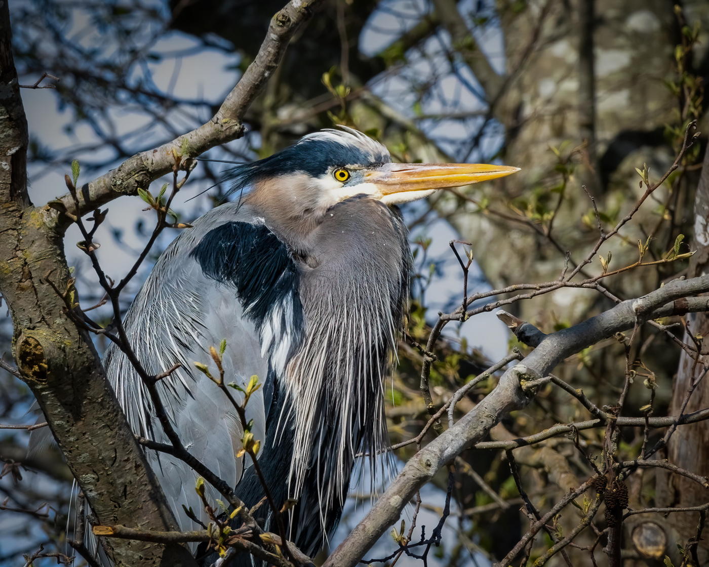
I like your bird photo, Michael, and how you captured it in a natural setting. The heron is centered in the frame, the bird's feathers have detail, his eye is sharp, and the narrow aperture has the whole bird in focus.
The area I thought needed some attention was the overall brightness. I also see the white feathering under the beak and eye is over exposed and may not be recoverable.
I am not proficient in Lightroom, but in my edits, I lowered the white point with the Tone Curve to 233 (instead of using global sliders); I felt the highlights were high because of the bright sun. I added a vignette -10, so it wasn't seen but felt to control the brightness further. Then I applied a brush mask to the blue sky areas and tried to lower the saturation (not sure it did a good enough job), which seemed too strong. The second mask bumped up the saturation on the bill, and in the third mask, I lowered the highlights on the bird by selecting Subject; it mainly chose the head area and not all of the body, but this was the area I wanted.
I am curious what you think and if you can even tell the difference. I tried to make the edits discreet because it is a nature photo. I do not have my rules out but I am not sure if you can make this many edits for nature competition; just so you know.
Let me know what you think.
LuAnn |
May 6th |
 |
| 3 |
May 22 |
Reply |
Hello Michael,
Thank you for your comments; you made my day!
I am branching out, and now that spring is upon us, I am looking to learn more about flower photography for spring. I found this beauty at the grocery store, so it isn't a grand specimen, but it is a subject I could practice on at a small cost. The tulips I found all seemed to have fragile stems, so they were probably quickly grown.
I found a flower painting class, so we will see if I can quickly learn the steps for next month's photo. The editing and painting are in Photoshop; what better way to learn Photoshop than to dive in with flowers!
Enjoy spring!
Best regards,
LuAnn |
May 6th |
5 comments - 17 replies for Group 3
|
| 62 |
May 22 |
Reply |
Yes, they would! What a lovely scene that would make and easy props to carry!
LT |
Jun 2nd |
| 62 |
May 22 |
Reply |
I think you forgot to upload your edit. Brightness on high key images is a challenge. I did try to keep the highlights below 255 on the tone curve.
Thanks for the visit!
LT |
Jun 2nd |
| 62 |
May 22 |
Reply |
Thank you, Mary Ann! I am glad you like it.
LT |
Jun 2nd |
| 62 |
May 22 |
Reply |
Thank you, Mary Ann! I am glad you like it.
LT |
May 16th |
| 62 |
May 22 |
Reply |
Yes, they would! What a lovely scene that would make and easy props to carry!
LT |
May 15th |
| 62 |
May 22 |
Reply |
Thanks, Nick, for the edit and comments on critiquing minimalist photographs; I agree and will work on those areas.
LT |
May 14th |
| 62 |
May 22 |
Reply |
Nice adjustment, Bev; I think it makes a noticable difference.
LT |
May 14th |
| 62 |
May 22 |
Reply |
I think you forgot to upload your edit. Brightness on high key images is a challenge. I did try to keep the highlights below 255 on the tone curve.
Thanks for the visit!
LT |
May 13th |
| 62 |
May 22 |
Comment |
Hello Israel,
Your photography is getting better and better each and every time you submit a photo. This image is very dynamic just in the simple subject of a light beam and person holding candles.
The example edits people shared with you I also think were well done and each has its high point of interest. For me, and because I am not familiar with this church, I would like to see a bit more light to get an understanding of where and what I am looking at. Other than that I just love the drama.
Best regards,
LuAnn |
May 13th |
| 62 |
May 22 |
Comment |
Wonderful action shot, Nick, and I do like that you show the path the rider came from; it tells a story how he was rounding a curve. The focus on the details of the course are sharp, giving the viewer a live action feel. My husband and I watch these dirt bike races on tv at night, along with MotoGP motorcycle races, and Rally crashes in Europe. I find these sports to be very exhilarating to watch.
I do like Emil's square crop, and I do like the crop you chose as I see more of the story coming along with the bigger crop. The one thing I am curious about is, is it possible to open the shadows on the right side of frame by the rear tire? I think that is an area of direct action and could add some interest to the foreground area.
Nicely done!
LT |
May 13th |
| 62 |
May 22 |
Reply |
Thank you, Nick; I appreciate your comments. Is the distraction in the middle on the edge of the big leaf? I am curious what you see that I am missing. Also, could you comment on why you say simple photography is most difficult to analyze?
Minimalism is very new to me, and I find great pleasure in this style. It is getting to the essence of a subject, which can be exhilarating, yet the challenge is to find the right subject enticing enough to hold a viewer's attention. It isn't easy to find your place in a sea of outstanding photographers and remain unique.
Have a good evening,
LT |
May 13th |
| 62 |
May 22 |
Reply |
My intent was to give you positive, constructive feedback on your image. I am glad you find my comments helpful.
LT |
May 13th |
| 62 |
May 22 |
Reply |
Thank you so much, Emil, for your kind words! I will be printing this photo.
I am just taken aback at how well received this photo is with this group. I am truly humbled.
Kind regards,
LuAnn |
May 13th |
| 62 |
May 22 |
Comment |
Hi Emil,
I love Fountain Grass; we have several clumps in our landscape; they are effortless to grow. I like your idea of using the black background; this helps the grasses pop. There are many organic lines, textures, and shapes along with motion that gives the image interest.
For me, I like the angle and open crop of the first image because I follow the implied line of the seed head from tip to stem, there is ample room to explore this floating beauty, and my eye moves from left to right throughout the photo. After flipping the image, my eye movement isn't as free and easy as the other way; it's probably just how I look at things.
To me, the cropped version feels tight, and I feel forced to find a sharp seed head so I can rest my eye. I want to suggest in the future, having a sharp subject in the center (one that stands out among the rest) to focus on but still have the blur to show motion around it.
Best regards,
LuAnn
|
May 12th |
| 62 |
May 22 |
Reply |
Thank you, Bunny; your comments are very helpful!
LT |
May 12th |
| 62 |
May 22 |
Reply |
Thank you also, Bob, for your kind words! I have been so impressed with everyone's images this month that I am newly inspired and want to get outside to shoot again.
Have a great day!
LT |
May 12th |
| 62 |
May 22 |
Reply |
Thank you for your kind words, Oliver! |
May 12th |
| 62 |
May 22 |
Comment |
I love your beautiful abstract photograph, Bob. I commend you for your effort and hard work; thanks for sharing your technique! I would have never seen this outcome in a pond leaf had I not seen it done.
I have no corrections to offer. Now you have given me a second reason to get out of the house! Thank you!!
LT |
May 12th |
| 62 |
May 22 |
Comment |
I love the great ideas you received on this photo, Oliver. You have inspired me to find an outdoor setting and get out of my studio <laughing>! I love the minimal theme; this takes the viewer to the story's heart, with five elements (bush, flowers, table, chairs, foreground).
I have to compliment Israel that his idea and edits were excellent in removing the tree and replace with more bush and flowers! I also like Bob's advice about the stick on the right; he is such a fashion plate, right in vogue! And Ms. Bunny's idea to stage the table is perfect. I want to suggest another similar idea; a man's hat or fedora and a white rose; a symbol of peace, innocence, and love to broaden the story for the viewer to add their sentiments.
Have a wonderful day!
LuAnn |
May 12th |
| 62 |
May 22 |
Comment |
It's unanimous, Bunny; this is a fantastic image! Your flower draws my eye into the black and white version. To look at it is very mesmerizing; I can almost sense the flower moving.
I do like the original, but I do agree that orange and red hues are powerful colors. Perhaps lowering the saturation a tiny bit to take the edge off would help.
|
May 11th |
| 62 |
May 22 |
Comment |
Hello Oliver,
Thank you for your very kind thoughts and comments!
I have to laugh. I have been working on finding myself as a photographer for nine years. I have shot every category that camera club challenges suggested, but nothing hit home for me. Then I stumbled upon minimalistic photography and still life in my studio during covid. I enjoy this genre, so we will see if I can be consistent and creative (this is the tricky part) with it. Figuring out how to photograph a flower is my goal for spring and summer; I hope no one becomes bored of black and white flower photography.
Best regards,
LuAnn
|
May 1st |
7 comments - 14 replies for Group 62
|
12 comments - 31 replies Total
|


