|
| Group |
Round |
C/R |
Comment |
Date |
Image |
| 3 |
Apr 22 |
Reply |
I spent some time and think I finally found the strips you were referring to; do you think those stripes contribute enough to the edited image to have them brought back into the edited version of the photo?
LT |
May 1st |
| 3 |
Apr 22 |
Reply |
I spent some time and think I finally found the strips you were referring to; do you think those stripes contribute enough to the edited image to have them brought back into the edited version of the photo?
LT |
Apr 30th |
| 3 |
Apr 22 |
Reply |
Can you give more detail as to what you are seeing? I do not understand what you are referencing when you say "bring back the details of the triangle roof at the top since the new sky seems to get to that part too."
Are you referring to the sky area right side of the frame? To me, it looks like the sky replacement added a mountain range in the background as well. |
Apr 21st |
| 3 |
Apr 22 |
Reply |
Got it, funny! I had to reread your response. I have not seen many altered reality photos in competitions in my local clubs; most everyone is realistic and everything has to be sharp and accurate and follow the rule of thirds. But I really enjoy Michael's creativity because I love change.
It is sunny here today, 54 for a high. I can't believe spring finally made it!
LT |
Apr 21st |
| 3 |
Apr 22 |
Reply |
Thanks for your reply, John.
|
Apr 21st |
| 3 |
Apr 22 |
Reply |
Thank you for your comments, Kieu-Hanh. I agree with you about wishing the water could be crystal clear and beautiful. But rivers and streams in northern Minnesota unfortunately are never clear or blue. This area is also known as the iron range where iron ore and taconite mining took place in the 1800s for the steel industry.
What color is the water in lakes and streams where you live?
Best regards,
LT |
Apr 11th |
| 3 |
Apr 22 |
Reply |
You are correct about competition photos needing impact to be winning images. Your description of the photo did not include any information about your intent for taking the photo, so I asked the question; not everyone in these study groups is competitive.
You might consider simplifying your image to eliminate distractions even more for a competition, leaving just the essence of what drew your eye to this flower; anything more could be considered distracting to the eye of the viewer. This might include getting closer, using a macro lens, or finding a subject that is at the peak of bloom.
By the way, I really liked your Moroccan Teapot in your cellphone group; very creative! You are a talented photographer.
Anyway, I hope this helps.
LT |
Apr 10th |
| 3 |
Apr 22 |
Comment |
Thanks Bob for your kind words and for the visit!!
I too like this in black and white. I don't think I will ever be a landscape photographer I don't particularly care to weather the elements in the winter. It was very cold when I took this photo.
I received your email so I will talk to you soon.
Best regards, my friend,
LT |
Apr 7th |
| 3 |
Apr 22 |
Comment |
I have to agree with Oliver's comment this is a lovely photograph. Though I am not a gardener, I appreciate those who photograph them. I like the soft green background; it has a beautiful rich hue, and the bokeh is perfect. The light was also excellent; the highlights are well under control. The image is nice and sharp, making this an overall well-composed photograph.
Your image this month, Kieu-Hanh, shows excellent improvement in your skill as a photographer.
Will you be submitting this to a camera club competition?
Well done!
LT
|
Apr 7th |
| 3 |
Apr 22 |
Reply |
I see the dog, John! How amazing! What breed do you think it could be?
We need to take time and ponder photographs sometimes; you never know what you will find hidden in the pixels. Have you ever seen Bev Doolittle's work: Woodland Encounter? It's incredible what you could find in her work.
https://www.bevdoolittle.net/art.asp?!=W&ID=16113
Best regards,
LuAnn |
Apr 5th |
| 3 |
Apr 22 |
Reply |
You're correct, Micheal, you don't have the ability to tell them what your intent was that is why you have to 'show' it in your image; it needs to be obvious (hum, where have I heard that term before?). Winning images do not come easily they are created with great care and attention to all details.
LT |
Apr 4th |
| 3 |
Apr 22 |
Reply |
Hi John,
I am glad you like this group; all the members are very proud of group 3 and try to help each other out where we can.
I think many photographers are challenged with how to present images. Some of the answers are personal preference. Still, the other half is attracting the attention of a neutral viewer (the general public at an art exhibit or a judge in a competition). If you are competitive, have handy the definitions of the categories in which you submit your work. I also recommend knowing your competition by learning from those who won previously, what the judge liked, and what the audience commented on the most in the image. The key to a successful image in competition is 'impact.' A photograph will not be successful without impact.
Have a great day!
LT |
Apr 4th |
| 3 |
Apr 22 |
Comment |
Hello Mary Ann,
Wow, attending a baseball game and getting autographs must have been thrilling at the ballpark! I am glad to see you're persevering still life photography. Each time you complete an image, you grow and learn in this challenging genre.
When I look at the image, I see you have the elements aligned across the rule of thirds with the hat on the left and the ball on the right. The flow of the image I read from left side to right side horizontally. The light appears from the right, and the white balance has a cool tonal value.
Since your story says you waited for signatures on the glove and ball, I would like to see that in this still life! That is your 'piece de resistance' separating this photo from your competition, one with significant importance. I also see many dust particles that you can easily remove with a tape-style lint roller before photographing. As far as the composition, I suggest trying to arrange the items on the impact points if you use the rule of thirds. This new arrangement will add depth to your image; right now, there is no angle drawing my eye into the frame, so the image appears static and only 2D-dimensional. You could add a little warmth to the photo with a simple adjustment to the white balance.
Lastly, if you choose to submit this image to competition, remember to remove your logo as this would be a disqualification by a judge.
I hope this is helpful information. I look forward to your comments.
LT |
Apr 4th |
| 3 |
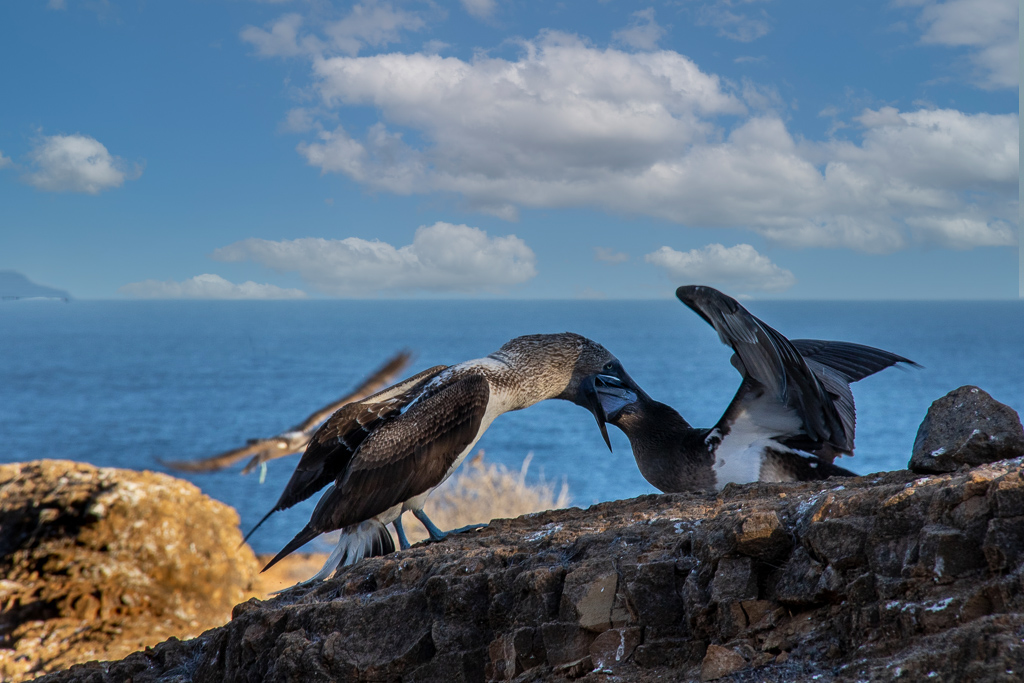
Apr 22 |
Comment |
Hello Ruth,
I love your enthusiasm for nature photography. Visiting the Galapagos Islands must have been a vacation of a lifetime!
I agree; you have a strong story in this photo; birds showing action are always a plus. I like the simple background and calm water; the rocks contrast the cool blue tones with warm golden tones, and the sun from the right puts the story in context to the time of day; a very peaceful location.
I came up empty-handed as far as keeping the edits to a minimum for the nature category. But if you consider the open class, then there is an option. I believe the blurry bird in the sky was too large of a blur to keep; it was more significant than your subject. So I swapped out the bird and added a new sky. I have just a few sky choices in PS; I hardly ever replace skies. But for the purpose of discussion, this was my choice. I would probably go with a simpler sky if I had more options. Lastly, I suggest working to open up the shadows on the two birds to your liking; their heads in shadow are distracting.
Hope this gives you some ideas to try.
LT
|
Apr 4th |
 |
| 3 |
Apr 22 |
Reply |
I love B&W conversions, and your edit accomplishes your intent, Michael.
My thought now is that this removed the original photographer's intent for the photo and substituted it for another. Does that make sense?
John noted in his description that he likes the abstract nature of the image, he was drawn to the repetition of patterns. He also said he wanted to minimize the sky to fit his 4:3 format. Has his intent been accommodated for in this B&W conversion?
I am trying to look at this image from John's perspective in case he is thinking of entering this photo for a competition.
LT
|
Apr 4th |
| 3 |
Apr 22 |
Comment |
Hello John,
I like your edit of the Sandstone and Tile building. I like your tight crop which emphasizes the geometry of the building, pattern, and texture. In the original, the point of interest is the tile roof and the windows on the right. Swapping out the sky was a good choice as well; now the hues are in line with the tonality of the sandstone.
What catches my eye in the original photo is the rich reddish tones of the roof tiles. In the edited version the tones seem to have been desaturated. What would you say to add the saturation back into the roof tiles? They appear flat now to my eye. This I think would also add some depth to the image.
LT |
Apr 4th |
| 3 |
Apr 22 |
Reply |
Hi Ruth,
I appreciate your detailed comment.
The two faces I see are one on the left bank looks like a buck with antlers (I see an eye, the antler is left of the waterfall, and a long snout), and across from its nose, I see what makes me think of a rooster with a cocks comb on its head!
The snow I think is a combination of snow and froth from the flowing water. Yes, the snow is hard to pick out with the mix of water.
Isn't it funny what we see when we each look at a photograph? You, me, and Michael all saw something different in this single image. Now we know if we were judging this photo, it would probably end up with different scoring as well.
All is good!
LT |
Apr 4th |
| 3 |
Apr 22 |
Reply |
Hi Michael,
I love your B&W edit! My favorite edit of this image is the B&W version I have in my library.
I am sorry you were "bothered by the muddiness in the waterfall and river"(ouch!). The color of this water actually helps to tell the story of Minnesota a state that I love and waterways that are rich with iron and other minerals!
Thank you for your comment
LT |
Apr 4th |
| 3 |
Apr 22 |
Reply |
Ruth,
Please enlighten me, what are floating zebras exactly? |
Apr 4th |
| 3 |
Apr 22 |
Reply |
Hello Michael,
I love the dialogue you have going here with your photograph! You have asked a very interesting question. When I first looked at your image, I could tell it was creative, especially when looking at the yellows, orange, and green hues on the tree's base. Is it obvious? That depends on how you define obvious for the given category. Many camera clubs tweek common rules to their taste, so you will always have to ask for clarification on the rules when in doubt.
I believe creative photography is more open to interpretation than other categories, but that is my subjective opinion. As a photographer, I know you like to use Topaz creatively, so it was easy for me to see the painterly overlay with that knowledge about your style.
When you contemplate submitting an image for competition, review the description, ask for one if one is not provided, and look at previous entry winners to see what the judges were looking for in a creative photo.
A judge could love your creative art, but the photo may not place once the judge makes it through 60 to 100 photographs for the club's salon. Rumor has it that if you submit your photograph to ten different judges, you'll get ten different critiques because of the subjective nature of the competition, something to keep in mind.
In the future, if you submit a photo to this group that you want to enter in a camera club competition, let us know so we can gear our comments accordingly. Not everyone in group 3 is competitive, and some answers are given in a more general tone than others.
I hope this helps.
LT |
Apr 4th |
| 3 |
Apr 22 |
Comment |
Hello Michael,
Wow, what a beautiful capture of tree bark on this Madrona tree. I love the rich yellows and orange/red hues; they make for a very warm and striking abstract. I like the left to right diagonal; it helps my eye move through the image. The turned edges of the bark bring out the texture and draws my eye in to investigate what lies beneath the bark. I also find the painterly texture overlay works well on your photo; it adds interest to an otherwise smooth and plane area of the tree. I could see this photo hanging in an entry way where one could see it frequently.
The only suggestion I have for you to address is on the top of the photo I see discoloring on the yellow curved edge of bark (perhaps the edge was dried out), and the upper left side I find the little bit of rolled bark that is overlapping another layer; both areas feel distracting. These could easily be fixed by painting or readjusting the crop.
You have inspired me to pursue more tree bark photography, Michael, thanks for sharing!
LuAnn |
Apr 2nd |
7 comments - 15 replies for Group 3
|
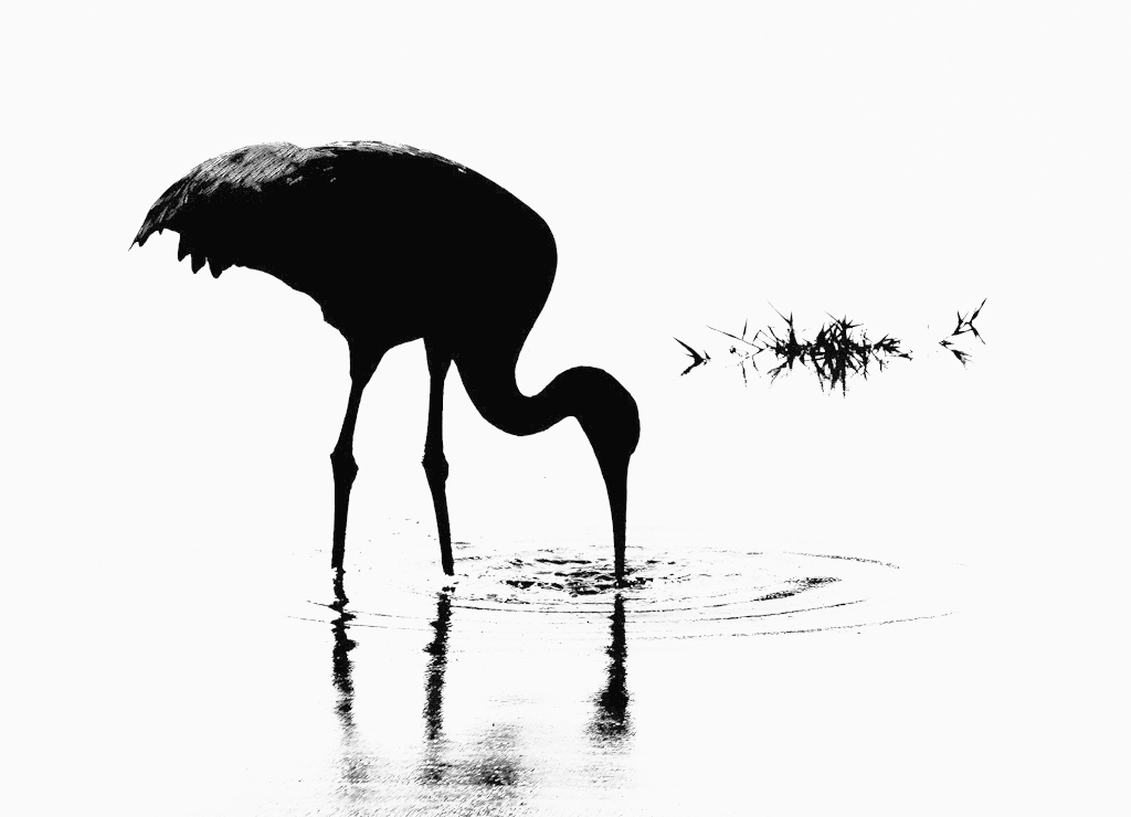
| 16 |
Apr 22 |
Comment |
Hello Joan,
I fell in love with your wading bird silhouette and have to compliment you; this is stunning! I have never experimented with hi-key images before but now I have been inspired. I like the originality you have in your photo; the feathers on the back have evidence of line and texture as opposed to being a complete silhouette; well done.
I do have an edit to offer for a suggestion. It is not much different from yours the only difference is I lowered the highlights just a bit and applied the Nik Software Silver Efex Pro 3 High Key 1 filter. It did remove a little more from the water and gave emphasis to the back wing area.
Excellent work!
Thanks for sharing.
LuAnn |
Apr 4th |
 |
1 comment - 0 replies for Group 16
|
| 17 |
Apr 22 |
Comment |
Hello Sheldon,
I am captivated by your graphic art photograph; it's stunning! Can you talk about how you created this image? What was the original like? How did you edit to get such strong colors?
Beautiful!!
LuAnn |
Apr 4th |
1 comment - 0 replies for Group 17
|
| 28 |
Apr 22 |
Comment |
Hello Deborah,
I really am enjoying your hi-key Old Barn photo. I find minimalist photography my absolute favorite style. I am glad to hear you printed this photo; it must be outstanding in print? What type of paper did you use? Textured matte or luster?
I love the simplicity, and it immediately draws me to the subject.
When I looked at the image in Lightroom, I noticed that the horizon line was too high, so I adjusted it to ride just above the rooflines of the buildings. Lastly, I noticed the highlights were a little bright, so I lowered them. I also re-cropped the photo removing the separate structure on the right; it doesn't seem to me to enhance the subject, so I eliminated it as a distraction. My sample edit shows the essence of the scene.
I am curious what you think. Thank you for sharing this fantastic photo!
LuAnn |
Apr 5th |
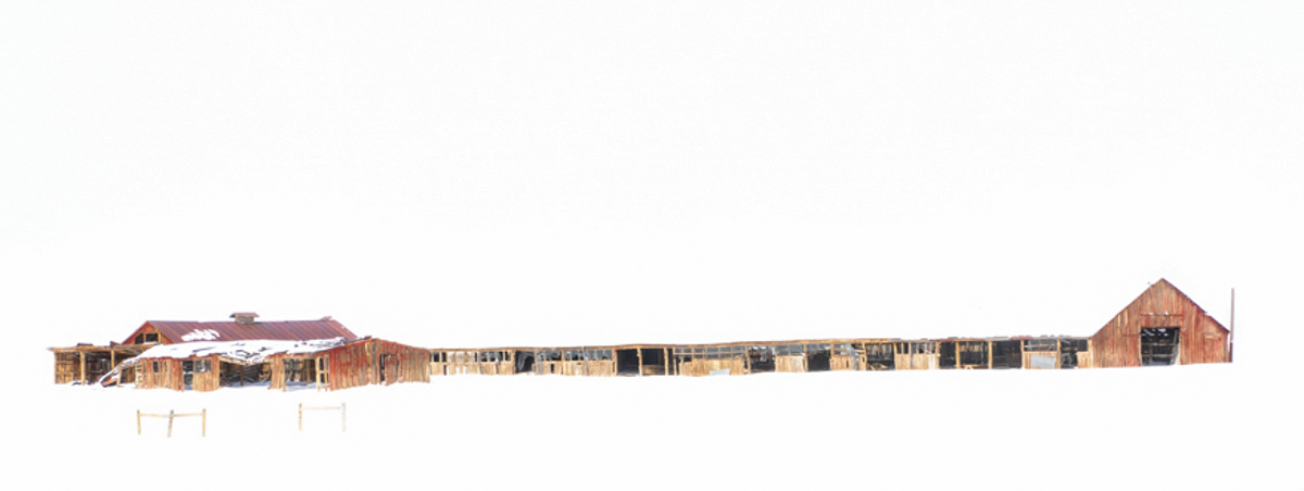 |
1 comment - 0 replies for Group 28
|
| 62 |
Apr 22 |
Reply |
Adding a piece of the rope on the right really makes a statement and I agree it is necessary it adds power to the image.
If I were to add anything to the comments, it would be to remove the text on the back of the boat. I feel it is distracting because I can't complete the name. What is your opinion, Nick? |
Apr 21st |
| 62 |
Apr 22 |
Reply |
Thank you, Israel, I am glad you like the photo! |
Apr 21st |
| 62 |
Apr 22 |
Reply |
Thank you for your comments, Bob! |
Apr 21st |
| 62 |
Apr 22 |
Reply |
Thank you, Israel, for clarifying why so much cloud area in the photo. Perhaps you could lower the brightness on the one at the top of the screen; this would help as it really pulls my eye away from the scene below.
Best regards,
LT |
Apr 8th |
| 62 |
Apr 22 |
Comment |
Hello Israel,
Wow, I wish I could visit Israel; what a beautiful country! The park reminds me of the desert southwest here in the US.
The background mountain range adds depth, drawing my eye through the image; the aerial perspective is a plus. You captured good details in the foothills; I like the variation of tones in the foreground landscape from light to dark. The car and trees add interest and scale and bring unity to the overall photograph.
The only concern I see is the clouds overpowering the scene, especially the brightest cloud at the top of the frame, and my eyes beg to see more of the land formation below.
My example image was made very quickly. I just wanted to show my interpretation of a more appealing aspect ratio. I initially used Nick's recommended 16:9 ratio but unlocked the ratio to include all land areas from left to right sides of the frame; so consider it a custom ratio.
I am curious what you think.
LT
|
Apr 7th |
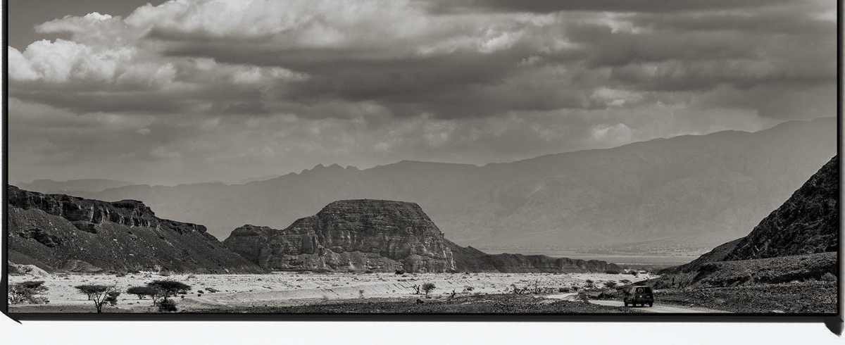 |
| 62 |
Apr 22 |
Comment |
Hello Bob,
I am glad you clarified your decision to go with the original BW version of the rose. I think the artist's intent gets overlooked sometimes, and now you have explained its importance to me. I completely understand what drew you to take this photo. You have achieved your goal, and the image shows originality because of your intent. Often, that is all that matters, leaving the rest up to subjective choices that change from viewer to viewer. Your image shows the soft and delicate inner glow you wanted, which is precisely what I am seeing.
I try to remind myself to consider the photographer's intent; sometimes, I jog right into my subjective opinion. I appreciate your gentle reminder of why you photographed the rose.
Well done, my friend.
LT
|
Apr 7th |
| 62 |
Apr 22 |
Comment |
Hi Bunny,
Wow, going to Bhutan must have been an incredible travel adventure! Bravo!!
I like the simplicity in your image and the face in the peak; funny, I seem to see faces in photos more and more lately.
I agree with Oliver; pulling out details in the snow on the face of the mountain will add impact. Since this is black and white, I would try a dark sky instead of clouds. For me, I see the clouds as a distraction. I guess I see this from a minimalist perspective and that simplicity is attractive to me.
LT |
Apr 7th |
| 62 |
Apr 22 |
Comment |
It looks unanimous, Emil; this is a beautiful photograph. I like the story of this old barn. There is ample negative space surrounding the location, so the subject is not confined. I like how you edited out the car and wires; this eliminates the distractions and reduces the photo to the essence of what you saw that day; the view is clear for the viewer, which is important. The oak shows age and compliments the barn, like pasture mates that grew up together. Your sky replacement is well done and also is a compliment to the scene.
I like Oliver's edit adding to the trees; it fills the white space without drawing attention. I am sure this is a personal preference, but the adjustment was well handled.
Congratulations on a job well done!
LT |
Apr 7th |
| 62 |
Apr 22 |
Reply |
Thank you, Emil, your feedback means a great deal to me as a photographer.
LT |
Apr 5th |
| 62 |
Apr 22 |
Reply |
Hey Oliver,
I submitted a ticket to Topaz and they told me JPEG to RAW AI does not work with Big Sur or Monterey. They have unexpected delays for updates to that application and are unsure when or IF this will be release.
She did say the same functionality to JPEGtoRAW AI has been incorporated into Gigapixel AI's compression mode. You can use a 1 to 1 ratio if you don't want to upscale, and this will still restore editing capabilities. To clarify, none of the capabilities would be lost by using Gigapixel AI instead of JPEGtoRAW AI. Restoring editing capabilities is referring to the function of converting a JPEG to a RAW image. If anything, the current Gigapixel AI will be better quality as it has their new AI Engine in place, she said.
In addition, I learned Gigapixel AI can convert jpg or png files to DNGs or TIFFs. Gigapixel AI's other job is to resize and enhance low-resolution images. However, if the resolution or size is not an issue or should be kept the same, then you would want to use the "scale" model and use the "custom" option with an input of '1.'
Finally she said, This will not upscale the image, and it will stay the same size. When saving, you will have the option to create the file as a DNG or TIFF for uncompressed editing capabilities. If you do want to resize or enhance, then you can do that all-in-one step.
I thought it was very nice of their support team to give me such great detailed information about this product. Hope this is helpful to you.
LT |
Apr 4th |
| 62 |
Apr 22 |
Reply |
Nick,
When you tried printing on matte paper, did you edit your photo in your software program as "Proofing" with the ICC profile for the matte paper selected? I learned that editing a photo specifically for matte printing is tricky but necessary. Still, if you use the Proofing tab when editing, you can make adjustments so it fits the paper profile better.
It was a youtube video I watch on this topic. Just curious about your technique.
LT |
Apr 3rd |
| 62 |
Apr 22 |
Reply |
Thank you, Oliver; the high praises humble me! I seemed to have turned a corner in my photography. I think I will continue with the minimalist style. I have two bouquets of tulips to work on within the next few days, so I can't wait to give flowers another try.
Yes, do try to focus-bracketing. I love it! My camera was tricky to figure out, but it was well worth my determination to learn how to do it. |
Apr 3rd |
| 62 |
Apr 22 |
Reply |
I just tried to update Jpeg to RAW AI Topaz Software but it does not load. I had to open a support ticket and they are busy they said so it may be a day or two to hear back. The new version runs as a standalone so I will let you know how it goes.
Yes, I also like Gigapixel AI and will be using it more when the need arises. |
Apr 3rd |
| 62 |
Apr 22 |
Reply |
Hi Bunny,
I am glad you like my photo! No, Capture One does not stack photos. Like you, I used Helicon Focus. My Fuji camera does focus bracketing then I take the images into Helicon Focus to focus stack them. |
Apr 3rd |
| 62 |
Apr 22 |
Reply |
Hello Nick,
Thank you for your kind words! I have this image printed and framed on my desk. I am just getting used to printing, and Emil suggested trying Red River paper, so for this photo, I used Palo Duro SoftGloss Rag. It has a bit of a warm tint to it, but in a white frame, it looks nice. Do you print your work? Do you have a favorite paper choice for B&W?
I also checked out Robert Mapplethorpe; his work is inspirational! Thanks for referencing him in your comments.
Have a great day, my friend
LT |
Apr 3rd |
| 62 |
Apr 22 |
Reply |
Bunny,
Did you use frequency separation to remove the glare in the glasses? |
Apr 3rd |
| 62 |
Apr 22 |
Comment |
Hello Oliver,
You are doing well with portraiture. I am impressed with this image! I like the timeless look of the man in black and white. You have him posed well on a diagonal, and the crop is perfect.
When I looked at the photo in LRC, I noticed that the highlights were just a tiny bit high; that is an easy fix. The other thing you noted was that the file was in Jpeg. I see you used Topaz software. Did you try Topaz Jpg to Raw software? Topaz is improving by leaps and bounds; I have been using Gigapixel to increase file sizes on some of my images.
Thanks for sharing this great image with us!
Best regards,
LuAnn |
Apr 3rd |
5 comments - 12 replies for Group 62
|
| 86 |
Apr 22 |
Comment |
Hello Belinda,
What an amazing photograph you made with your cellphone! I recently became interested in cellphone photography from a new camera club I joined. They are all into cellphone photos so I am very interested in finding a group to learn this genre.
I love the colors and tonality in your color version. The impact of the image for me is the creativity; it is original and has a wow factor.
In my version of Lightroom Classic, the highlights seem a bit bright. The only question I have for you is with the ornamental faces above, can they be adjusted with a free transform tool like the one in Photoshop to level them, or does the angle/perspective prevent this adjustment?
Well done and very creative,
LuAnn |
Apr 4th |
1 comment - 0 replies for Group 86
|
| 96 |
Apr 22 |
Comment |
Hello Haru,
You have skillfully emphasized nature's beauty in this waterfall photograph. Your image has an impact through the emotional response the scene invokes.
I am captivated by the swirl in the water. But after pondering the scene a while, it does not seem to fit this location; my thought is to ask myself, is this real? I like the edited version to answer your question, but perhaps the spiral is spiraling too fast and too bright.
My eye movement moves with a golden spiral starting at the bottom right corner with the foreground rock interest, moving up and over the falls then down to the golden water, which holds my attention.
Have you noticed the two animal faces in the tallest waterfall - amazing.
I hope sharing my thoughts is helpful to you.
Have a good day,
LuAnn |
Apr 5th |
1 comment - 0 replies for Group 96
|
17 comments - 27 replies Total
|


