|
| Group |
Round |
C/R |
Comment |
Date |
Image |
| 3 |
Mar 22 |
Reply |
You have access in Photoshop to several grid overlays. They include the rule of thirds, grid, diagonals, triangles, golden spiral, and the golden ratio. You access them by activating the crop tool then make a selection on the menu bar at the top of screen (overlay option box). Then click the mouse on the upper left corner of the photo crop corner to activate and press the 'O' key to rotate through the different views. The triangles, and golden spiral, noted above, have multiple view options. To scroll through those options press and hold the shift/ O key when one is in view. The golden spiral has 8 grid options to view and triangles have two views. |
Mar 31st |
| 3 |
Mar 22 |
Reply |
Hi Lisa,
I use a Fuji XT4 mirrorless camera. And yes, it has focus stacking. Pretty slick feature. You give it point A and point B focus points then the camera determines how many images to take to achieve the focus. It can be anywhere from 2-4 to 100 images all depending on the subject.
LT |
Mar 30th |
| 3 |
Mar 22 |
Reply |
Kieu-Hanh, I think your new crop improves the image significantly. I struggled with the green leaf on the left side and the blurred blade of grass. Your crop is excellent in removing distractions. Thanks for showing us your idea!
LT |
Mar 20th |
| 3 |
Mar 22 |
Reply |
That makes sense; cloudy, rainy, and snowy may have been the culprit. I asked Linda Rutherford (the judge that night) if she had a website, but she said no. I have read online, and she said last night that she travels to Africa and around the world; this year, she is off to Romania for landscape photography. She has received many accolades for her photography online. I had no idea before meeting her what a great photographer she was; it was fun listening to her critiques. Oh well! |
Mar 18th |
| 3 |
Mar 22 |
Reply |
That is great to hear! We all bring something different and are willing to share our expertise; that makes it fun for me too.
LT |
Mar 18th |
| 3 |
Mar 22 |
Reply |
I find that interesting about the personality of the mother alligator versus the crocodile. I have only seen alligators a few times, so I find it fascinating to learn these characteristics about them.
I used to think horses weren't intelligent till I owned three of them. The whole of the animal kingdom is amazing when you take the time to learn about it.
LT
|
Mar 18th |
| 3 |
Mar 22 |
Reply |
Do you think the green lily pad on the left is distracting?
LT |
Mar 18th |
| 3 |
Mar 22 |
Comment |
Hi Michael,
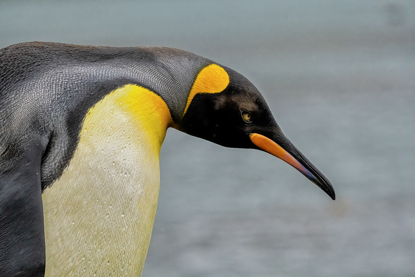
I went to a camera club meeting last night and met an experienced nature photographer/judge who has been to South Georgia Antarctica like you! I couldn't resist asking her about King Penguin's eyes when she finished judging our photos. Don't get me wrong, it was not that I didn't believe what you said, but because I knew her and she was a nature photographer, I wanted to pick her brain a bit.
She said King penguins have beautiful brown eyes. When they tip their head, the sunlight shines in their eye, revealing the beautiful iris, and you see the beautiful color. And when you get a straight-on shot at eye level, she said it is even more beautiful!
It was nice to hear her story of how some boats never land at the location because of the ice and that you can't walk on the ice, so they would have to return to their docks.
That is a trip of a lifetime!
Best regards,
LuAnn |
Mar 18th |
| 3 |
Mar 22 |
Reply |
Yes, you can focus stack manually, and it is not that much work. You might even be more precise on where you get the focus when you do it manually.
Never stop learning!
LT |
Mar 18th |
| 3 |
Mar 22 |
Reply |
Thanks, Michael, for your thoughts. Composition and balance were the most challenging things for me to learn in still life. I learn best by watching, so I followed Don Giannatti on YouTube. He has several excellent videos on constructing still life scenes. I watched other people as well, but he stands out as the one I watched the most.
LT |
Mar 18th |
| 3 |
Mar 22 |
Reply |
Thanks, Kieu-Hanh, for your comment!
LT |
Mar 18th |
| 3 |
Mar 22 |
Reply |
You're very welcome! |
Mar 18th |
| 3 |
Mar 22 |
Reply |
Hi Mary Ann,
I appreciate your question. My Fuji camera does focus stacking. I set focus points 'A' and 'B,' and when I click the shutter, the camera determines how many photos to take to give me the focus area I have set based on those two points. It's a clever technique. Does your camera do focus stacking?
LuAnn |
Mar 15th |
| 3 |
Mar 22 |
Reply |
Great question, Ruth; thanks for asking!
When I see this image in Lightroom and use the crop overlay tools, I find the photograph aligns with the golden spiral very nicely. In addition, it works with the golden ratio and then the rule of thirds. The space on the right I see as a negative space. The dark color balances (asymmetrically) with the red garlic through visual weight.
If I were to crop the photo anymore, then the eye would be stuck circling about the three subjects and not having a place to rest. I see the negative space creating a sense of simplicity and helping the viewer focus on the main subject without distraction.
I hope this helps. Let me know.
LT |
Mar 15th |
| 3 |
Mar 22 |
Reply |
I love your perseverance, Mary Ann! I look forward to seeing what you come up with on the painted ladies. |
Mar 15th |
| 3 |
Mar 22 |
Reply |
Mary Ann, you do not have to have a fancy lighting setup to add light to your scene. Using a small flashlight, or desk lamp can be something you would have easy access to would do the job. I would recommend using a daylight-balanced bulb in a lamp. In addition, if you wanted to diffuse that light, try using a thin piece of white fabric, or baker's paper taped to a lampshade or secured somehow between the light and the subject. With flashlights, you can use tissue paper to diffuse the light.
Just a thought. |
Mar 15th |
| 3 |
Mar 22 |
Reply |
Ruth, could you do a quick edit to show the group your idea by blurring the white gourds? It is helpful to visualize this personal opinion.
LT |
Mar 15th |
| 3 |
Mar 22 |
Comment |
I have another question, Ruth. What story do you see unfolding in this photo of the alligator? I ask this because I was reviewing the definition for nature photography, and it says that storytelling is a must in nature images. And that there are four levels to storytelling.
Thanks,
LuAnn |
Mar 15th |
| 3 |
Mar 22 |
Reply |
Michael, can you tell us what you think are the important elements in this photo for clarity? Thanks! |
Mar 15th |
| 3 |
Mar 22 |
Comment |
Baby alligator's really are cute creatures. I think this little guys eyes are very curious; I wonder what he is thinking.
I know you like to enter your images in competitions; will this photo be entered sometime soon? I am wonder about the haze on the water; it appears to have a blue tint to it because of the time of day; even though you used a polarizing filter. For the purpose of discussion, will this be a concern to a judge if you enter this photo in competition? I ask this question for those in the group who do not currently do competitions.
Thanks for sharing this intriguing photo!
LT
|
Mar 15th |
| 3 |
Mar 22 |
Reply |
Could you post a sample edit of your suggestion, Kieu-Hanh? It would be nice to see how you visualize your suggestion. |
Mar 15th |
| 3 |
Mar 22 |
Reply |
Hello Michael,
The King Penguin is not a common flightless bird for me, perhaps for many in this group. Before I edited, I searched the internet for examples and found some with the eye more visible. Your description of the image set me up to fail in my edit because you said, "it is difficult to get an image of a King where the eye is clearly visible." You could have shared that they are not like other birds and educated us on this point. I am not a nature judge; that is a specialty field many judges shy away from doing. I recommend you submit your image to the Individual Image Evaluation group for Nature on PSA's website to get the answer you are seeking.
Regarding the breast color, according to "www.Animalia.bio" they say "Adult penguins also possess an orange-colored patch, which is most intense at the throat of the animal, turning to pale yellow on the upper breast and gradually becoming white on the back of the animal." This explains what I see in your photograph.
Viveza is not a tool I use often, but it is an option in Topaz Studio.
LT |
Mar 14th |
| 3 |
Mar 22 |
Reply |
I am glad I could do something for you that you like!
Have a great day,
LT |
Mar 8th |
| 3 |
Mar 22 |
Comment |
Hi Michael,
Great image of this penguin! I like the simplicity and can see the texture and eye; critical areas for nature photography. What a trip that must have been!
My edit was in Nik Viveza 3, and I applied a tonal adjustment preset; this brought out the eye color and enhanced his bill, head, and shoulder areas. Then I had to remove some white specks that Viveza left, which were easy enough to remove in Photoshop.
I did use a radial filter around the eye in Lightroom before I went into Viveza 3. I also lower the highlights on the shoulder area a bit.
I hope this helps.
LT |
Mar 3rd |
 |
| 3 |
Mar 22 |
Comment |
Hello Mary Ann,
Your artistic abilities are improving by leaps and bounds! I added your original photo from November so everyone can see your improvements. I believe that was when you first submitted your edit. I like how you have minimalized the subject and presented just four elements with a simple background. In minimalist photography, some people recommend having no more than four elements. For me, I see a rose, a vase, and a watch with a plain background. Your color palette is warm; the story I see is vintage.
The first thing I notice is the flat tonality of the black background. For this, I recommend some added contrast and brightness; the gold vase will pop with added contrast and brightness. Next, I see the white highlights from the flash on the front of the vase; have you considered using side lighting? Side lighting will also help add depth and dimension to the photo. Last, the oil painting effect seems evenly placed on all the subjects; I suggest masking some of the areas, so the intensity of the effect is not so even. I like the impact of the oil painting on the vase, but the watch seems overpowered by the effect. Does this make sense?
PS: You can remove the two white highlights from the flash in Photoshop.
Best regards,
LuAnn |
Mar 3rd |
| 3 |
Mar 22 |
Comment |
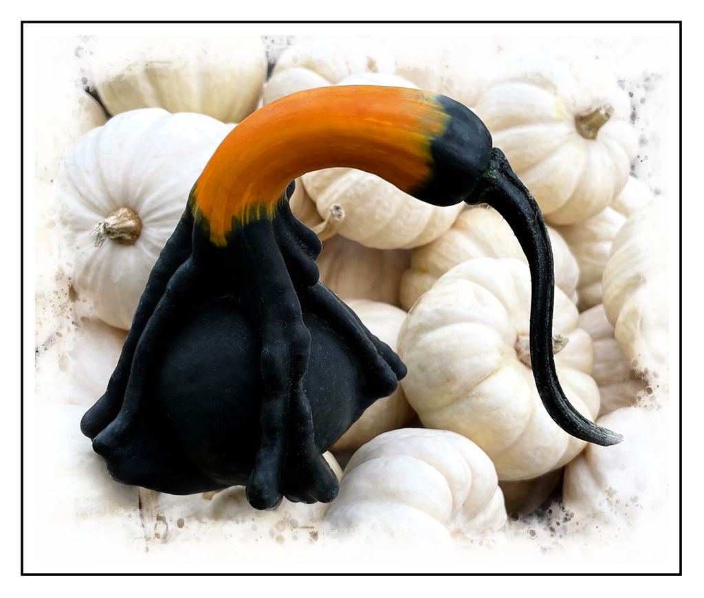
Hello Kieu Hanh,
Your gourd image this month has captured my eye. I like the stark contrast between the Black Swan Gourd and the smaller white gourds. Having one colorful gourd helps focus the eye on the single subject, yet the white gourds complement the black swan and help tell a bigger story.
In my sample edit, I added an HDR preset with a lovely vignette to fill in the corners of the frame. To me, the black border helps define the edge of the frame. I also removed some of the blemishes in Photoshop to help increase the beauty of the Black Swam.
Thanks for sharing a great image!
LuAnn |
Mar 3rd |
 |
6 comments - 20 replies for Group 3
|
| 50 |
Mar 22 |
Comment |
Hello Mary Ann,
Lovely still life! I am glad you are pursuing this genre. I see four books in the photo; I understand your image theme is about reading books. I agree with Lorna that monochrome helps eliminate distractions when removing the color; it is a perfect format for learning still life. It also can help simplify a photo. I also find the image has an asymmetrical balance from left to right.
In looking at the histogram, I mainly find the tones in the shadow and mid-tone range; I recommend adjusting the light to balance it more to the right. Create more shadows with how and where you place your light source. The point of view is straight-on from the camera lens, a static position that doesn't allow the eye to move through the photo and limits the depth of field. May I suggest using the rule of thirds guide on your camera (I believe the D500 does have one) and positioning essential elements at the four intersecting points on the grid? Currently, all the pieces are snuggled close together, and there is no spacing for breathing room and depth. Start there and see what you think.
I hope you find this helpful.
LuAnn |
Mar 18th |
1 comment - 0 replies for Group 50
|
| 62 |
Mar 22 |
Reply |
Very helpful feedback, Nick, Thanks! |
Mar 22nd |
| 62 |
Mar 22 |
Reply |
As always, I appreciate your thoughts, Bob! |
Mar 22nd |
| 62 |
Mar 22 |
Reply |
I understand checking the rules; that is the first thing to do when entering a competition. My question is more about photographing letters and documents. Maybe on their own, they aren't a strong enough subject, as Oliver pointed out when he said it didn't hold his attention. Typically, words are distracting, and they should be kept to a minimum because they draw the eye away from the subject; in this example, the pen. Or, maybe my camera was too close in this instance, and the story was too simple or not compelling enough. Perhaps if I stepped back further, added more to the story like a desk, ink well, or something of that nature, it would improve its appeal.
Does this help clarify my question? |
Mar 20th |
| 62 |
Mar 22 |
Reply |
I have never seen anyone circle areas of concern before, what a great idea! Did you do this in Photoshop? |
Mar 20th |
| 62 |
Mar 22 |
Reply |
Thanks for your comment, Nick.
Working with letters and words in photography, in general, has its challenges. I usually avoid photographing too much because they can be distracting, and the eye doesn't know where to rest, let alone understand the context of the image, as Bunny pointed out. What is your opinion about photographing a letter document for competitive photography? I am open to discussing this type of subject.
LuAnn |
Mar 20th |
| 62 |
Mar 22 |
Reply |
I am glad you like the idea Oliver and I had on the hood. I am curious what a salon judge will think after you use the new crop.
Have a great Sunday!
LuAnn |
Mar 20th |
| 62 |
Mar 22 |
Reply |
Thank you, Bunny, for your comment. I find your suggestion very helpful; pointing out the obvious. "When using words make them meaningful to the reader!" I'll give it a try! The idea makes me laugh because it is so simple and makes great sense.
Have a great day!
LT
|
Mar 18th |
| 62 |
Mar 22 |
Comment |
Hi Bob,
My turn to be late to comment, sorry.
Your image is great! I also love the nostalgia and how chrome pops in the photograph. Your editing process has brought out the timeless beauty nicely. I find all the details like the pine needles, peeling chrome, and misc debris add to this old car's character, saying, I refuse to die and look old!
I like Oliver's idea to show more of the hood; lines and curves would be an added plus. I understand your thought not to include more of the hood, but the viewer knows this is an old car. I think the hood ornament would only distract the eye from the curves if they were in view, something to consider.
I hope this helps!
LuAnn |
Mar 18th |
| 62 |
Mar 22 |
Comment |
Hi Emil,
I love the nostalgic feel of your image. I also really like the colors in the original photo, especially the rich yellow and blue hues. There is a nice diagonal line of sight from the people to the train. The light on the train gives the scene an authentic feel that the train is running. The overall light on the scene tells me this couple may have caught the last train of the day; perhaps, that makes for a great story!
I sympathize that the moment was short, and there was no time for planning or retakes; posing people is not an easy task if you don't do it regularly. I notice the tonality is leaning more to the darker tones and midtone range. There is harsh lighting on the faces. My eye is drawn to the people, and I glance at the train diagonally but back to the peoples' faces. If there had been a chance to adjust, I would have had the people looking more towards your camera.
I hope this helps. Thanks for sharing.
LuAnn |
Mar 18th |
| 62 |
Mar 22 |
Comment |
Hello Israel,
Sorry I am late. We had water damage in our home, so I have been distracted. No worries, though; all will be back in shape by the end of the year.
I love your image and how you narrowed the view to the man in the middle. I think Oliver had a great idea diminishing the sax player in front; I LOVE Emil's idea of using a square crop and having the man in back in a blur (beautiful edit). Ms. Bunny always finds unique options; I've never used a dark glow filter before. I also like how Nick photographed his edit to see the layers; great idea! I would have never thought of doing a poster-style edit. I like the difference in his edit of eliminating the frontman and man in the back; this makes the subject prominent and lets the viewer know exactly where to look. My choice? It's a cross between Emil's square crop and Nick's minimalist style.
I do not have any suggestions to share this time. I think the group has given you excellent choices for this great image. Lucky you to be able to go to music events in the evening. My husband signed us up to attend a local jazz club once a month. It sure is nice to get out and go to these local venues after the long adventure with Covid.
Best wishes to you and your family, Israel!
LuAnn |
Mar 15th |
| 62 |
Mar 22 |
Comment |
Lovely image, Bunny. Your capture of the sunbeams is beautiful! The woodland area has an excellent base beneath the trees with hardly any distractions.
I took your photo into PS to experiment. The area where the sun is poking out does seem a bit bright and distracting. But, easy fix, you might try using the clone stamp tool to fill in the area a bit where the highlights seem to be harshest.
I am curious which cellphone you used? Do you shoot HEIC or Jpg?
LuAnn
|
Mar 8th |
| 62 |
Mar 22 |
Comment |
Hello Nick
I find your cityscape of Montreal to have a calming feel to its landscape. The many details and textures provide interest. The bridges in the background and the mountain range expand on the story of this city. I like the darker foreground interest from the treetop vantage point contrasting the lighter surrounding architecture. I compliment you on your style and technique in editing your black and white photography. I have no suggestion for improvement; I greatly appreciate how you have presented your first image. |
Mar 8th |
| 62 |
Mar 22 |
Reply |
I think it is a fun application to have in the tool belt for photography. I use the borders the most. I haven't yet been able to figure out how people make the presets but there are videos on that.
Have fun! |
Mar 5th |
| 62 |
Mar 22 |
Reply |
That's an interesting idea, Emil, I will give it a try!
LT |
Mar 5th |
| 62 |
Mar 22 |
Reply |
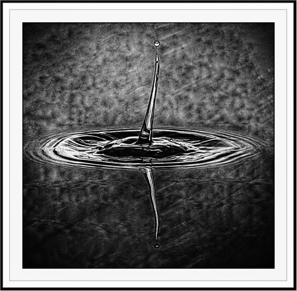
I really like this color version! I agree with your thoughts on complex water drops.
My borders I do in Smart Photo Editor by Anthropics. This is a good tool for those who like artistic edit presets. Depending on the style you choose they can have hundreds of pages of presets to pick from; I learned about this tool from Mike Moats Tiny Landscape Photography.
LT |
Mar 5th |
| 62 |
Mar 22 |
Comment |
Hello Oliver,
Boy, I applaud your hard work to figure out water droplet photography. What I have seen on YouTube shows that this is no easy challenge. I think black and white conversion adds another layer of challenge to this type of photography; creating a unique background that lends itself to variations in lighting is probably the secret ingredient.
In my example, the preset I chose enhanced the background texture to give more visual interest. The contrast may be a bit dark, but I didn't have an option to adjust it. Finally, the keyline border helps define the edges. This is just something for thought.
LT |
Mar 5th |
 |
| 62 |
Mar 22 |
Reply |
I see your point, Oliver, that it doesn't hold one's attention for long. You added a copy of the original letter to my submission, so maybe this will spark some ideas to improve the photo. My goal was to use the fountain pen somehow. Perhaps showing the letter in a journal or on a bigger desktop would help. My fear then would be I would lose the focus on the nib. Dilemma, dilemma, so it goes!
Cheers!
LT |
Mar 4th |
| 62 |
Mar 22 |
Reply |
Hi Bob,
I had Oliver add a second original photo to this so you can see the letter I used. It is a photocopy of a vintage letter. See if that gives you any ideas on a new crop that might make the photo more appealing.
Thanks,
LuAnn |
Mar 4th |
| 62 |
Mar 22 |
Comment |
Hello Israel,
I love my macro lens; glad you like the photo. You said you darkened the highlights; did you mean the ones on the paper or the pen? The text looks darker, and I like it!
Which Leica do you have? I have the Q2; compact 28mm fixed lens. I do not have a photo of the setup, but it is straightforward. I have a 12" square space on the left of my keyboard with an adjustable desk lamp arm. The camera was on a tripod up close to the desk edge, and I handheld a Lume Cube light on the subjects'; left side or right side as needed. I have a 450 lumens Refresh LED lightbulb in the desk lamp. I put no thought into the setup, and I messed around until I came up with this photo. Because it's a macro photograph, the space you use can be set up anywhere.
Let me know why you say your macro shots are not successful, and I'll see if I can help you out. Email me if you like: luann.thatcher@winternet.com. |
Mar 1st |
7 comments - 12 replies for Group 62
|
| 82 |
Mar 22 |
Reply |
You're very welcome! |
Mar 18th |
| 82 |
Mar 22 |
Comment |
Hello Keith,
First, I want to compliment you on your photo in the PSA carousel of the artistically creative tree; very beautiful! To me, I see an animal of sorts walking towards the left. I love the feel and movement produced by the artistic filter on the greenery; it's like I can visually feel the wind blowing through the branches. Very nicely done.
I like your ocean scene also. I find it has a contemplative feel and a minimalist style. The setting sun on the right illuminates and brings out the texture in the water and beach. The lone person walking on the beach gives context to the ocean's vastness. Very nice.
|
Mar 18th |
1 comment - 1 reply for Group 82
|
15 comments - 33 replies Total
|


