|
| Group |
Round |
C/R |
Comment |
Date |
Image |
| 3 |
Dec 21 |
Reply |
Thanks Lisa. |
Dec 29th |
| 3 |
Dec 21 |
Reply |
Thanks, Mary Ann, for taking a second look.
LT |
Dec 10th |
| 3 |
Dec 21 |
Reply |
Hi Ruth,
Mary Ann commented below to try a different crop; a tighter crop. So I made a third image and posted it above. When you have time, can you comment on the change?
Thanks!
LT |
Dec 9th |
| 3 |
Dec 21 |
Reply |
Hello Mary Ann,
For the sake of discussion, I re-edited the photo and changed the format to a vertical (see new photo above). I did some dodging and burning as well. Have these changes made an improvement? Any other suggestions?
LT |
Dec 9th |
| 3 |
Dec 21 |
Reply |
Hi Michael,
I have not forgotten about your B&W version. I was going to comment on it in group 99. I have a photo of 3 pears in Group 62; you should stop by and check it out!
I share your passion, Michael, for learning more about light. I also realize beautiful landscapes are not always easy to return to when a curious editing idea comes up after returning home. But no worries, you can always practice with this image in the meantime.
I have followed a photographer named Yuri - Fine Art Photography on YouTube for a long time. He could take a photo and recreate it in Lightroom with dodging and burning edits. Here's a link check him out: https://www.youtube.com/watch?v=N0NJdwlySzE
Have you also checked out Karl Taylor? He is more of a portrait photographer but a master of light non-the-less.
Also, the more you learn about image evaluation the more you will see when the balance is out of alignment or when something is in need of adjustment. It just takes time, practice, and most of all Patience. Just keep it in perspective because opinions are subjective.
Continue to work on it and don't stop till you get it right; then repeat the process!
Best regards,
LuAnn |
Dec 9th |
| 3 |
Dec 21 |
Comment |
Nice composite and happy holidays to you too, Kieu-Hanh!
Great idea for a Christmas card. Your Santa looks good with nice lighting on his face and garments. The red text is a nice complimentary color to the overall colors in the photograph.
Merry Christmas,
LT
|
Dec 8th |
| 3 |
Dec 21 |
Comment |
You chose an excellent vantage point for a photo of the Eiffel Tower, Lisa! Your image is sharp, has an emotional impact, and the color palette is done well. I have seen this photo with the statue on the left and the right of the Eiffel Tower. I think your choice to put her on the right is good; it adds a bit of tension to the photo. You have a lovely sky and no distractions.
For me, removing the balloon under the tower is fine either way. It all depends on what you want to do with the photo. If you submit it to a travel competition, you can't delete anything from the image.
Well done!
LT |
Dec 8th |
| 3 |
Dec 21 |
Comment |
Hello Mary Ann,
I also love your image this month and congratulations on the sale!!
I agree with Ruth that you have an excellent combination of elements to draw a viewer's eye to the lighthouse. The whispy clouds are unusual and eye-catching. The cool color palette works perfectly for an incredible day at the beach.
The edited image does appear a little softer than the original one. You might want to check this out. Also, you could experiment with a narrower aperture in the future with distant landscapes such as this example. Otherwise, my only other comment would be to brighten the lighter cliff areas a little more directing the viewer's eye to that lighthouse. You can do this with the dodge tool in PS.
Well done!
LuAnn |
Dec 8th |
| 3 |
Dec 21 |
Comment |
Lovely landscape, Ruth; I like the black and white version as well. The added snow transforms the scene, adding texture and contrast that makes this location unique for a viewer like me. The hikers add perspective/scale and add impact. You have a nice sky with some details, and the overall color palette appears natural; all typical of your style of photography.
I do not have any changes to offer. Well done! |
Dec 8th |
| 3 |
Dec 21 |
Comment |
Hello Michael,
I am enjoying your Three Graces photograph. I like the minimal scene with no distractions; it helps me focus on the rocks and birds on the tree. I appreciate your hard work with the PS edits; you have improved the original image greatly.
For me, I would prefer to see a bit of the horizon in the background. I say this because I expect that there would be a horizon, so my eye is searching for one but only seeing it ever so faintly. Your idea to remove the horizon is interesting, but I think you lose depth in removing it from the photograph. Can you see what I mean? The only other concern I have is the balance of light. The light on the rocks is bright, but the water and sky have a flat lighting effect.
I hope this is helpful.
LT |
Dec 8th |
| 3 |
Dec 21 |
Reply |
Thank you, Ruth, for your comment. You are correct a tighter crop will also look great with a lily. They are beautiful flowers and fun to photograph.
LT |
Dec 8th |
| 3 |
Dec 21 |
Reply |
Thank you, Michael, I am glad you like it. It is very simple I was worried it would be too simple.
Best regards,
LuAnn |
Dec 4th |
5 comments - 7 replies for Group 3
|
| 62 |
Dec 21 |
Comment |
Hello Israel,
I like your photo of the migration of the cranes. I agree with everyone's ideas so I won't have to repeat anything there. The only adjust I suggest is with the vignette. It is recommended that vignettes be felt and not seen so I recommend lessening the strength of the vignette so the four corners are not so white.
Best regards,
LT |
Dec 16th |
| 62 |
Dec 21 |
Comment |
I am enjoying your train photos, Bob. It reminds me when I took a train ride through the Grand Canyon and there was a (staged) train robbery. It was lots of fun. Three handsome cowboys on their horses running along side the train and jumping on board. We did not expect it and it was well done reenactment. So your photo has meaning to me and I relate to the bullet holes in the windows.
The color photo seems to be grabbing my eye. Perhaps because of the red rust dripping down the side of the car. Maybe darkening the red areas only on your B&W image that would bring out the character of the trains age, and add the needed contrast.
In original 3 I think making the overall tonality dark and black is too much. It feels like the adjustments are too global and nothing stands out as a POI (point of interest) for me to rest my eye on. Emil's lighting idea may enhance this image as well.
I like original 2 because it is different as an abstract. But again, I think the white tones are too low and need to be brighter. I like the letters above the train L O N G. I know that space always holds the title of a train so these letters define that space for me. Having all four letters tells me it is a complete word. Only having L O N seems to add tension for me and makes me think the image is missing something or overly cropped.
I agree you could stand back a bit from the train but I read you didn't have that as an option being the area was closed to the public. Good for you to have gotten as far as you did!
I like how Emil edited with extracting details, and adding the diagonal lighting. That was a very clever enhancement! I wish the letters L O N would have included the G (as I noted above). So I think your original crop was a better choice.
I know my comments send you back to the drawing board but I think your images have potential with just a few new tweaks.
Best regards,
LuAnn
|
Dec 16th |
| 62 |
Dec 21 |
Comment |
Your image is fascinating, Bunny. I can see the interest in the distracting water at a lock and dam (almost mesmerizing), and I agree with the lock being off-center; this helps the eye move about the photograph more, and I can see the frothy water on the right side.
If you add a different, more dramatic sky, you take away from the intent of the photograph. The suggested changes are minor and subjective. Either way, I think you have a nice image with good overall lighting and tonal range.
Best regards,
LuAnn |
Dec 13th |
| 62 |
Dec 21 |
Comment |
Hi Leah,
You have quite a discussion going here. After reading everyone's comments, I have to say I like your original B&W version with Oliver's sky. The B&W, with the partial sign and plain sky, feels like it is missing something even though it has an interest. With Oliver's edit in adding a dramatic sky, I can envision why the photographer would only capture a partial sign; a storm is brewing! You might even be able to find a sky replacement that is even more dramatic to solidify the idea.
Symmetry is an important compositional element, but every image seems to have it. So when I stumble upon a photo that breaks the rule with originality, I have to smile and say, Yes!
Does this make sense?
LuAnn |
Dec 13th |
| 62 |
Dec 21 |
Comment |
Great image, Emil. I like how you have captured the details in the interior of the vehicle. The luminance values in the image cover the entire tonal range from blacks to whites. The blacks are not harsh, which is part of your style, so you are consistent in your editing from image to image. There is a nice clear view of the dash; any car buff would love this photo.
I tried my hand at an edit, but I couldn't produce anything better than what you already have done-nice work!
LuAnn |
Dec 13th |
| 62 |
Dec 21 |
Comment |
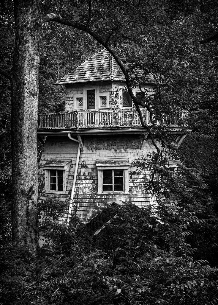
Hello Oliver,
Wow, you are a fantastic photographer to have amazing photos like this from 20 years ago; that is awesome!
I like how you captured the building. It is tucked back in the trees in a thickly wooded area, perfect for black and white photography.
I tried to adjust the image's tonal range. To me, the light seemed too uniform over the whole photograph, which makes it appear flat, lacking depth. Here is what I did.
I used Nik Silver Efex Pro 3. First, I chose the Fine Art preset to get the overall look. I reduced Dynamic Brightness as I checked each of the ten zone system boxes on the top of the histogram in Pro 3; have you ever adjusted luminance using these boxes? I adjusted various sliders till I got the light balanced out. Then I applied the Agfa PX 100 film type AND film grain, keeping the grain around 450. Lastly, I selected Burn All Edges 1.
I hope this is clear. It is an easy adjustment, just difficult to write out.
Best regards,
LuAnn |
Dec 13th |
 |
| 62 |
Dec 21 |
Reply |
That's excellent, Michael!
LT |
Dec 12th |
| 62 |
Dec 21 |
Reply |
Hello Michael,
Yes, you are correct the image is a bit flat. Probably due to the fact that matte finishes are appealing to me. I can't say for sure but I am guessing that was what I chose. The flesh of the pears, to me, looked better with the matte than a traditional finish.
Did you know fine art black and white photography is usually (not always) printed on matte paper? The photo store I buy my paper at has lots of examples of B&W done on matte paper. It takes some getting used to but I think it can grow on photographers that enjoy black and white.
Thank you for the visit, and your comments.
Best regards,
LT |
Dec 12th |
| 62 |
Dec 21 |
Reply |
Hi Leah,
Yes, Edward Weston, I got started with the romaine lettuce because of his work with peppers. His work is inspiring to me. I will check out his artichoke photography!
Best wishes
LT |
Dec 12th |
| 62 |
Dec 21 |
Reply |
Hi Leah,
You'll have to share a link to Stieglitz artichoke; now I am curious what he did. I am enjoying still life and minimal photograph right now. Yes, wintertime makes this the perfect genre to shoot. I do have to work on lighting, but that will evolve. Getting the light right doesn't come easy; so much to learn. This image did not look good in color (but that is a good idea) because the skin and color of the pears weren't appealing. I chose black and white as that added the drama the scene, I thought, needed. But your right; it is nice to have options of B&W or color.
Merry Christmas!
LuAnn |
Dec 8th |
| 62 |
Dec 21 |
Reply |
Hello Oliver,
Don't feel guilty. You can put yourself right up there with Edward Weston's thoughts on Pepper No. 30! You made me laugh!
In black and white photography, it truly is all about light. It was good to hear how your eye traveled through the image and what you noticed. This feedback is valuable.
I like your edited photo too. Your version casts darker shadows on the pears than mine. I think, in the past, I leaned more towards harsh, dark tones in my images, so this lighter version was an experiment to lighten things up.
Now I have twenty-six days to create another image; the pressure is on!
Merry Christmas, my friend!
LuAnn |
Dec 5th |
| 62 |
Dec 21 |
Reply |
Thanks, Bunny, for elaborating on the potential stories a viewer can assume from this photograph. My goal in the future is to become better at storytelling with my photography. I have a theme I am working on, so we will see where I go from here. I am finding black and white photography is my preference. |
Dec 5th |
| 62 |
Dec 21 |
Reply |
Hello Bob,
Thank you for your kind words; I am glad you liked the photo.
I see the spot you referred to, and I will note fixing that before printing. Lighting is not easy for me but what I have found is you have to persevere till you get it right. Then repeat.
In this exercise, I have learned about different ways of creating light, from using black and white foam boards to window light and softboxes with removable grids (this one I need to add to my arsenal).
I also now make notes in my files in Capture One and LRC about how I edited the photo. I see now I have to remember to add notes on lighting.
Have a great day!
LuAnn |
Dec 5th |
| 62 |
Dec 21 |
Reply |
Oh, you mean on the pears themselves not just under them maybe?
That is a good idea, thanks for sharing!!
LuAnn |
Dec 4th |
| 62 |
Dec 21 |
Reply |
Thank you, Angela, I am glad you like this photo! I appreciate the visit to group 62.
Merry Christmas!
LuAnn |
Dec 2nd |
7 comments - 9 replies for Group 62
|
12 comments - 16 replies Total
|


