|
| Group |
Round |
C/R |
Comment |
Date |
Image |
| 3 |
Nov 21 |
Reply |
Thanks for your reply, Lisa |
Nov 26th |
| 3 |
Nov 21 |
Reply |
Thank you, Ruth, for your encouraging words they mean a great deal. Still life photography looks so simple but when it comes down to doing it there are so many things to consider. It can take several days to get a composition right and then we see something that needs changing.
Have a wonderful thanksgiving!
LuAnn |
Nov 18th |
| 3 |
Nov 21 |
Comment |
Yes, Kieu-Hanh, you are right; my apple and green leaves are imperfect. As you already know, one of the rules of composition tells us it's ok to break the rules. We strive as photographers to achieve perfection in every image, but in the end, we will never really be perfect; there is always something that a photographer can still improve, and I am sure you see that in your work.
The apple appears to look dented and not quite fresh, and yes, there is a yellow spot on the top, and the three leaves have insect bite marks, all evidence of the history of this apple; this is realism, to me, and I am glad you notice them. My artistic intent was not to photograph a perfect apple and green leaf. If it were, I would have photographed a plastic apple and leaf, but that was not my intent.
Nothing lasts, nothing is finished, and nothing is perfect. These are three truths of the Japanese concept of Wabi-Sabi which I stumbled upon and became interested in the concept a few years ago. My interest in my photography is to embrace perfectly imperfect subjects, to be different and unique.
I guess I can sum up this response to say some people are by nature driven to perfectionism and others are not. If we all create the same work, then no one will stand out; I am an individual and see the world through an individualist's lens.
|
Nov 14th |
| 3 |
Nov 21 |
Reply |
You are very lucky to have a friend you can work on projects with like this. Don't give up on your idea; I know you can do it!
LT |
Nov 13th |
| 3 |
Nov 21 |
Reply |
Thank you, Mary Ann, for your kind words. For some reason, the apple and leaves came together quite quickly and easily.
I have been working on a single flower for a minimalist photograph I have always wanted to try. But I seem to be struggling greatly with it. I seem to be a million miles away from figuring it out; I am just baffled. Some days, photography can be quite an exciting roller coaster ride; some images are easier than others to produce.
Have a great week!
LuAnn |
Nov 13th |
| 3 |
Nov 21 |
Reply |
Hello Randy,
We swapped out your original image earlier in the month, so my response needs to be updated because the photo changed.
I like your crop of this image. It pinpoints the person well. I looked at the photo in Lightroom and will recommend an additional crop.
The subject is pretty centered in the frame; this gives the image a static feel and prevents the viewer from looking around the photo. I re-cropped to put the person's head more on the rule of thirds right vertical line. Notice how the diagonal lines of the tree branches give the viewer more places to look.
I hope this edit is helpful.
LT |
Nov 13th |
 |
| 3 |
Nov 21 |
Reply |
Yes, my edit has opened up the dark shadows on the back of his pants; compare the folds in the original photo. I hate to open them too much because then the image looks over processed. |
Nov 13th |
| 3 |
Nov 21 |
Comment |
Hello Mary Ann,
Compositing is a technique I have always wanted to try. Julianne Kost (Adobe Lightroom Evangelist) has excellent videos on YouTube about doing this type of photography. You have inspired me to consider trying something this winter.
I agree with Kieu-Hanh the vase needs to be more off-center; things placed in the center of the frame tend to be static and less photographically interesting. This placement also prevents the eye from moving through the frame. Try aligning the elements on the impact points of the rule of thirds for a guide.
Would you consider a horizontal image? I find the watch case cover distracting; the cover doesn't add anything to the composition and only hinders the line of sight to see the numbers.
Have you tried to make the timepiece more out of focus and the vase in sharper focus in the front? You might try taking an upright photo of the watch so you could get the whole face in focus then using the transform tool in PS to manipulate it into placement in the image.
I hope this was helpful. I look forward to seeing you pursue this project to a final image!
LT |
Nov 13th |
| 3 |
Nov 21 |
Comment |
Hi Lisa,
The pyramid comes alive in your black and white conversion. I agree with Kieu-Hanh that removing the museum is not something you would want to do, as Michael suggests, mainly because it is a historical sight; he may not have realized this. People know the museum is behind the water fountain; they expect the image to produce that reality.
My recommendation is two-part. Work on the brightness of the light, as others have noted, and consider removing the person walking by the museum and the bright light. The person doesn't add anything to the photo, so either darken that area or crop the person out. If you had the time and patience, you could clone him out if cropping is too restrictive. Also, you should have no problem burning that area of light; it was easy enough in Lightroom. I don't fancy complicated edits.
LT
|
Nov 13th |
| 3 |
Nov 21 |
Comment |
Hello Kieu-Hanh,
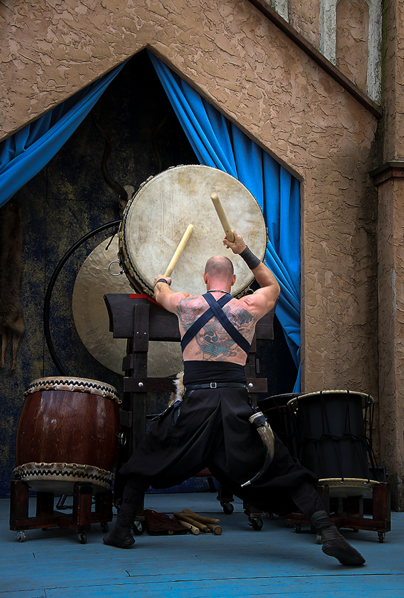
Great photo this month! I like it a lot and I can tell from what you say about it that it is a favorite for you as well.
You have a very compelling image and a striking subject for sure. The only thing I would suggest working on is the brightness of the image. In my quick example, I used a radial filter in Lightroom and brought down the exposure -.75, highlights -.26, shadows +2, whites +37, blacks +20, clarity +18, and dehaze -9.
I also created a radial filter for his pants to lift the shadows a bit; this I did separately. Someone else recommended it and I agree with the idea.
Hope you like it.
LT |
Nov 9th |
 |
| 3 |
Nov 21 |
Comment |
I will have third that and say you did a great job, Michael! I see nothing to correct.
LT |
Nov 8th |
| 3 |
Nov 21 |
Reply |
Hi Randy,
I am glad you like my photo!
You could email Helicon Focus support to see if it is compatible with that year's iMac.
Regarding the right side of the apple, I did replace the original apple photo above correcting the spot Michael pointed out; it was just a spot I missed. Thank you for the compliment on my editing; I don't always get it right but I do my best.
Have a great weekend,
LuAnn |
Nov 7th |
| 3 |
Nov 21 |
Reply |
Thanks, Michael, for your comment. I will take a look at the original. The original 2 photo does not show the spot on the right side and I know the apple used was in perfect condition. It must have been an error in the edit.
LT |
Nov 2nd |
| 3 |
Nov 21 |
Comment |
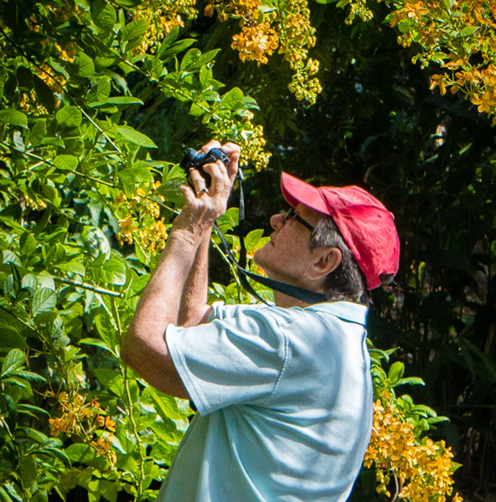
You are getting to be a good street photographer, Randy; I like your shot! I see you used the rule of thirds to align your subject, your highlights are good; nothing is overexposed. The color looks natural and you have an interesting subject looking at the yellow flowers on the tree.
In your edited version, I see you did your best to remove some of the blue skies at the top of the frame, nicely done.
I do not see any correction. Let me know if you have any questions.
LuAnn |
Nov 1st |
| 3 |
Nov 21 |
Comment |
What a lovely location, Ruth, and an exciting landscape! You have a grassland, tree line, dunes, Rocky Mountains, and snow all in one spot. I can see why you photographed this location. Your photo quickly identifies the dunes as the subject without the need for a title. The soft light sweeps over the dunes in a lovely way.
I checked the histogram in Lightroom, and I believe you have everything set well for this photo. I do not have any corrections to offer.
Well done!
LuAnn |
Nov 1st |
7 comments - 8 replies for Group 3
|
| 36 |
Nov 21 |
Comment |
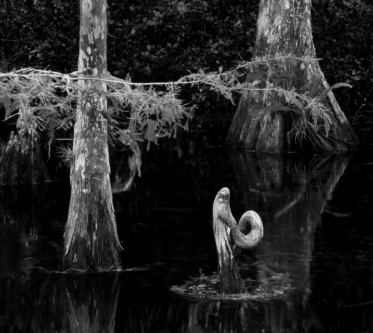
Hello Larry,
You are one brave photographer and animal tamer to keep the gators at bay for this photo. I am impressed with your determination!
I like the story in this image, and the stillness of the water with only small ripples around the Madonna tell me quickly where to find the subject. I agree with the discussion on the brightness of the two trees and branches. I looked at your edit in LR and, on my computer, it still looks a bit bright. I've attached a revision for your consideration.
I have a question that no one else seems to have addressed, perhaps because it is not a problem. The two trees appear to me to be tilting to the right. I have corrected this in my edited photo; what do you think? Necessary or unnecessary?
Best regards,
LuAnn Thatcher |
Nov 15th |
 |
1 comment - 0 replies for Group 36
|
| 62 |
Nov 21 |
Reply |
I appreciate your comments, Stephen, thanks for visiting group 62 and come back again!
LT |
Nov 26th |
| 62 |
Nov 21 |
Reply |
Thanks, Oliver, I see your point when you say it feels static. That's helpful!
LT |
Nov 16th |
| 62 |
Nov 21 |
Reply |
Your example, Israel, is very helpful. I like the diagonal (bottom left to the upper right) you chose, and now I see why it is better. I was stuck before, but now I can see more clearly.
Thank you!
LT |
Nov 13th |
| 62 |
Nov 21 |
Comment |
You are a lucky photographer to have an opportunity to go with a pro once a month to different locations. Your photography has grown by leaps and bounds because of this.
I really like the approach taken to capture the light and the doorway. You had great clouds and something of interest in the doorway that adds the necessary depth to the image.
My only question is, the silhouette is jet black and solid void of texture. What would the photo look like if you opened up those shadows just a tiny bit so you could see a hint of the texture of the stone?
|
Nov 13th |
| 62 |
Nov 21 |
Comment |
I like your General Motors Truck, Bob, just as you have photographed it. The texture captivates the eye and pulls me. You captured the essential features of the vehicle with the logo and a like-new light! It looks like the light has been intact for a while. I also like your crop.
I do not have any suggestions. Well done! |
Nov 13th |
| 62 |
Nov 21 |
Comment |
You took the creative route with this portrait, Bunny, and I find the idea very original. I have to agree with Stephen's comment about using a pattern on a face.
Your close-up revision makes the pattern more pronounced, and I think it gives a more sinister feel to your husband. But, we have to try different things and welcome others' comments as they lead us through the creative process. I like Israel's idea of the black background; it puts the pattern in more context.
But still, something seems missing. I like your thought that cloning in more foliage on the other side of the image or replacing the background (maybe) would be an option. Lastly, a studio shot is always an option.
I would be interested to see your final image. |
Nov 13th |
| 62 |
Nov 21 |
Reply |
Thanks for the boost of confidence, Israel. I have a long ways to go but it is fun.
Can I ask you why you think a diagonal placement of the lettuce would be better? Is it because it was further cropped? Less is visible? Or something else? This would be helpful for me to know.
|
Nov 13th |
| 62 |
Nov 21 |
Reply |
Thanks, Leah, for your comment. I will have to try carrots next time. I was thinking about trying radishes but carrots sound fun too! |
Nov 13th |
| 62 |
Nov 21 |
Comment |
Hello Oliver,
You have a wonderful discussion going on your composite. I have never done a composite so I have nothing to add at this time. I like the bird you chose and I like the detail under his wings. I think your image is very creative and original. It definitely catches my attention to stop and look further.
Could you composite some people walking on the beach? Maybe that is the missing element?
Excellent job for trying your hand at something new and different.
LT
|
Nov 12th |
| 62 |
Nov 21 |
Comment |
Hi Leah,
One more comment.
In comparing the diagonal in the original image to the black and white photo, the black and white angle feels better; it is on a sinister diagonal according to dynamic symmetry (viewer reads this diagonal from lower-right corner to upper left). For me, it feels better because of the dark, moody feel of the image.
The original color photograph seems to be simulating the opposite of a sinister diagonal, which would be a baroque diagonal (viewer reads this diagonal from the lower-left corner to upper right), except, to me, the building appears to be pointing into the ground as I perceive it. Looking at the B&W photo, the building seems to be aiming upwards and feels more comfortable to view.
A great book title: "Dynamic Symmetry - The Foundation of Masterful Art" by Tavis Leaf Glover is a good read on this subject. He also is on YouTube, and his website is www.ipoxstudios.com.
I am really drawn to your B&W photo.
LT |
Nov 9th |
| 62 |
Nov 21 |
Comment |
It's unanimous, Emil, this is a great image! It's a classic look for black and white photography as well. In your B&W version, I like the space around the desk; it gives the subject (the desk) room to breathe. You did an excellent job removing white containers in the background as well. The shadows are good, the light is perfect, and the details in the wood slats in the window sill contribute to an interesting story.
Well done.
LuAnn |
Nov 9th |
| 62 |
Nov 21 |
Reply |
Thanks, Stephen!
LT |
Nov 8th |
| 62 |
Nov 21 |
Reply |
Thank you, Stephen, for your thoughts and comments.
I thought about a pure black background initially. I was worried it would affect the depth and dimension in the image, so I chose not to use black.
Here is a quick example I did this morning of the image with a black background.
Thanks again for visiting and commenting on my photo.
LuAnn |
Nov 8th |
 |
| 62 |
Nov 21 |
Reply |
Nicely done, Bunny, great edit, and thanks for your comment!
LT |
Nov 2nd |
| 62 |
Nov 21 |
Comment |
Sometimes being in a "whatever works" frame of mind is an excellent place to be, Leah; I like your results!
Your image is abstract, and things are not as I would expect them to be, so I spent time observing your photo because I was intrigued by the scene. Your image influenced me to stop and look closer, which all photographers try to achieve with their photography.
I hate to recommend changes to an abstract photo because I would change "your vision" to what I would like to see. I believe you captured something of interest. The only recommendation I have is to work with the brightness; the whites seem a bit flat/grey. Try to make the whites brighter without overexposing them.
I am inspired now, Leah; I have to give puddle photography a try real soon!
LuAnn |
Nov 1st |
7 comments - 8 replies for Group 62
|
15 comments - 16 replies Total
|


