|
| Group |
Round |
C/R |
Comment |
Date |
Image |
| 3 |
Oct 21 |
Reply |
Good point, Lisa, about taking the trees out. Good explanation!
LT |
Oct 27th |
| 3 |
Oct 21 |
Comment |
Hello Lisa!
Love your image just as you created it! I agree with Tom and his feeling of falling headlong down the left side; that, for me, is what makes this image a great photo. I especially like the man on the right. He is oblivious to what is going on in the other escalator, yet he plays a significant role in your photo as a whole (when two different worlds collide). It's a new and unexpected way to present an everyday scene, and it has a considerable impact to boot. Well done! |
Oct 25th |
| 3 |
Oct 21 |
Reply |
I have to agree with you, Randy. I like the more context in the original image. It tells a bigger story than just a photo of a bird.
LT |
Oct 25th |
| 3 |
Oct 21 |
Reply |
Glad to help, Kieu-Hanh!
LT |
Oct 25th |
| 3 |
Oct 21 |
Comment |
Hello Ruth,
What a wonderful opportunity to visit Peru! The scene is lovely and free of unnecessary distractions. I do like Michael's second edit and crop idea.
I have to say I am stumped with this photo because of the sharpness. I have several photos from an Alaskan vacation that I wish my camera settings would have been different for of whales and bears I photographed. You could look at making the image an abstract which would be fun. But I don't see you submitting many abstract photos. I really like the smudge tool and creative filters in Topaz Software.
Best regards,
LT |
Oct 25th |
| 3 |
Oct 21 |
Comment |
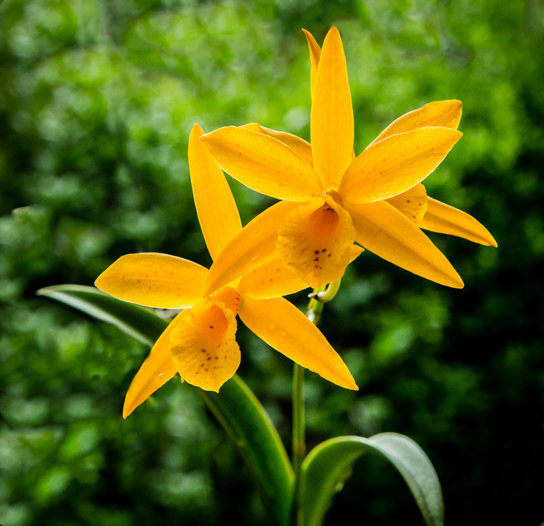
Hi Randy,
Beautiful orchid! My mother-in-law used to grow them when she lived in Florida; very beautiful plants.
My quick edit removed that stem and the brown dried leaves in the lower-left corner.
Have a great day, Randy!
LT
|
Oct 25th |
 |
| 3 |
Oct 21 |
Reply |
Thanks for your comments, Ruth.
I don't think sky replacements will be something I will pursue much in my photography. It was fun to try the easy 'sky replacement' edit in Photoshop. I tend to enjoy more documentary style of photography and still lifes. But if I do try another, I will make note of balancing the light in the image; excellent point.
LT |
Oct 25th |
| 3 |
Oct 21 |
Reply |
Thanks, Randy, I thought the same as well.
LT |
Oct 25th |
| 3 |
Oct 21 |
Reply |
Thanks for your comments, Kieu-Hanh, I like the idea of more trees on the side of the frame. I will have to give it a try.
LT |
Oct 25th |
| 3 |
Oct 21 |
Comment |
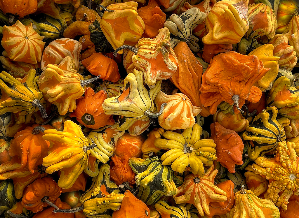
Hello Kieu-Hanh,
I have to agree with Michael, this is a great image! Love the colorful gourds and the subjects are perfect for a fall photo.
When I look at the image, it feels like it is upside down. So in my edit, I simply rotated it. In addition, and just for fun, I used photoshop to clone in more gourds in the black empty spaces as these areas seemed like they were missing something.
Best regards,
LuAnn |
Oct 17th |
 |
| 3 |
Oct 21 |
Reply |
Michael,
The one area I would suggest working on, for competition, is the area around the sun. In my subjective opinion, something feels out of place with the brighter sun flares compared to the atmosphere in the rest of the image. It catches my eye, and I keep going back to it; this would be a problem area if I were judging. The word that comes to mind is cartoonish lines. I think a little refining would help.
One last point, if you enter this in competition, do not leave your logo on the image; this is a disqualification.
LT |
Oct 15th |
| 3 |
Oct 21 |
Comment |
Hello Michael,
I see you are taking a liking to altered reality in your photography. I find your image is thought-provoking in that it makes the viewer consider your title.
To me, the photo has many attributes of an altered reality photograph, such as a change in natural color, the shape and form of the grass, and a blend of three images taken by you and combined.
You have changed the organic green grass and sun from having a sense of relaxation and calm to alarm by simply using red. This single change helps to convey the story you want to tell your viewers. Lastly, I can see your photograph appealing to the innate emotions of some of your viewers.
Are you going to submit this photo to a competition? |
Oct 15th |
| 3 |
Oct 21 |
Reply |
Thanks for your comments, Mary Ann.
I agree with you; I still needed to balance the light of the sky and the building. Your example edit does a great job of showing that I can achieve balance with minimal adjustments.
Thanks for the help,
LT |
Oct 7th |
| 3 |
Oct 21 |
Comment |
Your robin photo is excellent, Mary Ann. I like the detail you were able to capture in the feathers. I agree with Tom about the interesting pose. I think it also tells that the bird is on alert instead of relaxed and being at ease. It's like catching an elusive moment.
I like Tom's example of a crop. It does bring the bird to the viewer's eye more for a close-up look. It also appears he reduced the brightness/saturation of the lime green, bright spots in the photo, which also is a plus. I typically like more elements in an image to tell more of a story about a location, but the new crop removes some clutter in this instance, all good.
Well done!
LT |
Oct 7th |
| 3 |
Oct 21 |
Reply |
Thanks for your thoughts, Michael. I will have to look at balancing brightness more.
I believe you can start a discussion on the bulletin board anytime. Let me know if you run into a problem. A topic on altering images sounds interesting.
LT |
Oct 4th |
6 comments - 9 replies for Group 3
|
| 62 |
Oct 21 |
Reply |
Don't give up, Bob, it will be worth your effort to keep trying.
I remember when I started doing macro photography and suffered through several challenges; even to this day. We have to keep on keeping on to see the great accomplishments we have ahead of us.
Never give up, my friend, never.
LT |
Oct 25th |
| 62 |
Oct 21 |
Reply |
Thank you, Leah, great thought on cropping some of the foreground away. I will give it a try!
LT |
Oct 25th |
| 62 |
Oct 21 |
Comment |
Emil, Great photo, and I love the detail you have in your clouds. Even in the lightest areas, there is faint detail.
When I read your description and started reading the responses, I remembered a photo I love by Andreas Gursky titled: Rhein II.
Here is a link to it.
(https://thecircular.org/rhein-ii-the-worlds-most-expensive-photo/).
He doesn't even have clouds in his sky, just an overcast sky with a soft horizontal cloud layer. If Andreas can get $4.3 million for his image, think what potential your image has; I like your photo a lot more, just the way it is!
Best regards,
LT |
Oct 25th |
| 62 |
Oct 21 |
Reply |
Aw, thanks, Bob, your too kind!!
LT |
Oct 25th |
| 62 |
Oct 21 |
Comment |
Hello Bob,
I like the barn (excellent details!), and I agree with flipping it around; the stone wall now leads the viewer into the scene. I agree with Oliver there is a halo around the barn in the B&W. I still see this halo in your latest edit.
The brightness in the lower clouds in your new edit seems too bright. The grass, brick wall, and barn do not show light in the same way as the lower clouds, which would make me suspect a cloud replacement if I were judging this image.
I almost think the first sky was better, but I am not a cloud replacement expert like you. I liked the wispy clouds, but the sky was a bit dark compared to the grass, which was much brighter.
I hope this helps.
LT |
Oct 25th |
| 62 |
Oct 21 |
Comment |
I really like the mood of your image, Israel. What an opportunity to get close enough even to photograph this scene.
I like the water as the leading line; there are great details on the shoreline surrounding this factory, and the steam coming out of the chimneys directs the light perfectly above the subject. I have no corrections or changes to offer. You have done an excellent job!
|
Oct 25th |
| 62 |
Oct 21 |
Comment |
Hi Bunny,
I like your image; it is simple yet brings with it an air of complexity. I wanted to offer you a suggestion that leans more to the creative side to give you yet another option for your photograph.
What caught my eye initially was the horizontal lines, 43 in all; this is where I saw the complexity. So my edit is a pen and ink rendition of 'The Fisherman.' The man and boat were not in sharp focus in the original photo, so pen and ink seemed to pop out at me as an editing option. I also like the white vignetting that takes away some repetitive lines yet leaves the center area to convey he is on water. I think the added white canvas enhances your image. I believe printing this image on a canvas textured paper would add texture to the white space.
I know pen and ink in photography may not be everyone's cup of tea, but I could see this image hanging in a cabin by a lake.
What do you think?
LT |
Oct 18th |
 |
| 62 |
Oct 21 |
Reply |
Thank you, Bunny, I will take your suggestion into consideration!
LT |
Oct 18th |
| 62 |
Oct 21 |
Comment |
Oliver,
This was a great capture and you have the subject in nice sharp focus. The frog is literally bathing in the light. I love the texture on his body, and his eye is clear and visible. The lines and veins in the leaves help draw my eye to the subject.
I really like Emil's edit; he is such a master at applying the fine art look. Bob's idea of coming in on the right is also an excellent suggestion. Lastly, I agree with you Oliver to watch that you don't overexpose the frog; there is a white area just under his eye that would need protecting.
Well done and good work even though your lens choice may not have been your ideal choice it still gave you an amazing photograph!
LT |
Oct 15th |
| 62 |
Oct 21 |
Comment |
Hello Leah,
I love, love, your image! I also think you received excellent suggestions from everyone in the group. Here is my take on something different. I use Nik Double Exposure 6 in the Classic Camera section. It also applies a light leak from the left side which I thought was pretty classic for a very classic building.
Curious what you think.
LT |
Oct 15th |
 |
| 62 |
Oct 21 |
Reply |
Hello Oliver,
It was no problem to help you out with group 62. I already moderate group 3 so it was like I had a few more members to add; no big deal. Any time you need assistance, just let me know.
I agree, Oliver, the brightness on the bush in my photo still needs adjusting. I wonder if the sepia processing darkened the photo making it such a challenge.
Also, thanks for the tip on creating sky folders. That sounds like the way to go.
Best regards,
LT |
Oct 7th |
| 62 |
Oct 21 |
Reply |
Yes, Emil, I agree, the dialog we all enjoy in this group really makes this a fun group. Thanks to Oliver, he does an excellent job of moderating :-)!
Best regards,
LT |
Oct 7th |
| 62 |
Oct 21 |
Reply |
Thank you, Bob, for all your helpful advice. I think this is going to be a new adventure in accumulating new sky files. It has potential, as I have found; now I have to see if I have the patience to do the editing to make it look natural.
I am on a new project. I am shooting film with my new/used Olympus OM-1n camera. I bought the camera not too long ago. It came with a 35mm lens to compliment the 50mm. Film is quite interesting. I have my first four rolls off to Indie Film Lab for processing. We will see what I can do with film. I like the look and feel of range finder-style cameras so I thought this would be a good place to start.
Best regards,
LuAnn |
Oct 7th |
| 62 |
Oct 21 |
Reply |
Great! It was an easy fix with the lasso tool and brightness in PS.
Hey Bob, do you know how to download more sky replacements in PS?
LT |
Oct 4th |
| 62 |
Oct 21 |
Reply |
Hi Bob,
Thanks for your thoughts on my image. Does this edit work? I lightened the water and darkened the bush. |
Oct 4th |
 |
6 comments - 9 replies for Group 62
|
| 99 |
Oct 21 |
Comment |
Hello Michael,
Very nice image this month; I like the minimalist feel with just the three silos. I have only one question. Do you think the white balance is a bit too blue? For me, I would have leaned ever so slightly towards a sepia tone (+9 warmer).
Just a thought,
LuAnn |
Oct 29th |
1 comment - 0 replies for Group 99
|
13 comments - 18 replies Total
|


