|
| Group |
Round |
C/R |
Comment |
Date |
Image |
| 3 |
Aug 21 |
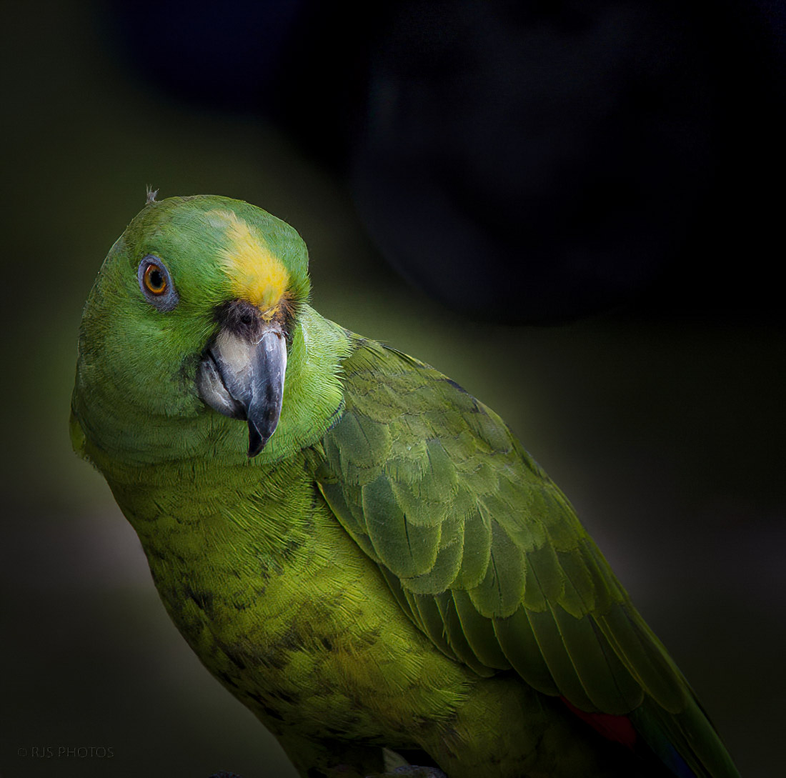
Reply |
Here is one more edit with a simple framing.
LT |
Aug 25th |
 |
| 3 |
Aug 21 |
Reply |
Ok, Randy, I can work with just editing in LR.
On this edit, I used just LR and it took just a couple of seconds.
1. I used the Radial filter and encircled the bird matching the shape of the circle to the bird's body (oval shape).
2. I inverted the selection so that any adjustments I made only affected the background. I unchecked the invert check box.
3. I pulled the Exposure slider left to -4 all the way.
4. I used the Brush tool with a large-sized brush of 23.0 and Feather and Flow sliders were at 100 all the way to the right.
5. Lastly, I played with the radial filter I previously made to bring in some of the nice green tones that were around the bird making sure the radial filter was not too tight around the bird. I also added a bit of sharpening on the bird's head.
That's it. I think this is something you could do in your version of LR. Take your time and experiment with the filters and you can make these changes work in no time.
Let me know what you think. |
Aug 25th |
 |
| 3 |
Aug 21 |
Reply |
Thanks, John, for visiting group 3!
I am glad you clarified the difference between butterflies and moths; I find this interesting! |
Aug 24th |
| 3 |
Aug 21 |
Reply |
Glad you like the photo, Randy. If you do try this soap bubble technique and have any trouble, let me know. I'm happy to help. |
Aug 24th |
| 3 |
Aug 21 |
Reply |
Thanks, Ruth! |
Aug 24th |
| 3 |
Aug 21 |
Reply |
Thanks, Kieu-Hanh, for your comment! |
Aug 24th |
| 3 |
Aug 21 |
Comment |
From the woman's pose, I think she knows her surroundings well (without looking) and that you are taking her photo. Street Photography is trendy in Japan; busy cities like this make street photography easy. No one notices you with all the people, lights, and commotion distracting them; you are just another tourist.
I like how you captured her in front of the poster. The photo tells a story, and she is more important than the man in the poster, so I am glad she covers half his face; she's the star in this photo. The viewer has to look at her and not be distracted by the man.
Well done! |
Aug 24th |
| 3 |
Aug 21 |
Comment |
Fall is starting to change the color of the leaves on our trees now. Fall has to be a time of year for many people. I like your photo
I agree with Randy, Michael's edit does make an improvement. One more thing you could look at is the vertical perspective is tilting to the left a bit; the transform tool should fix this.
|
Aug 24th |
| 3 |
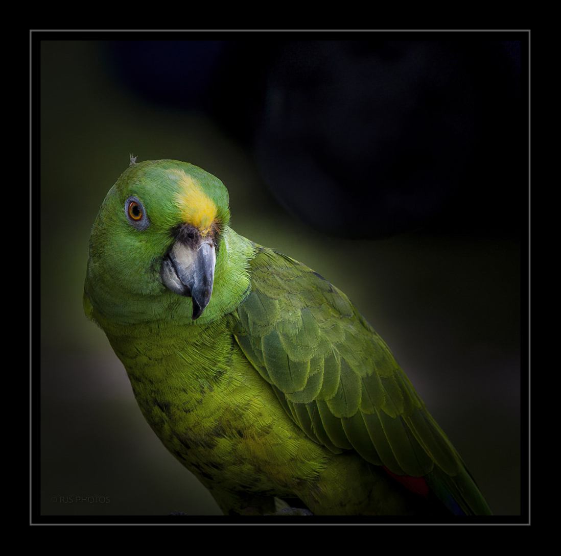
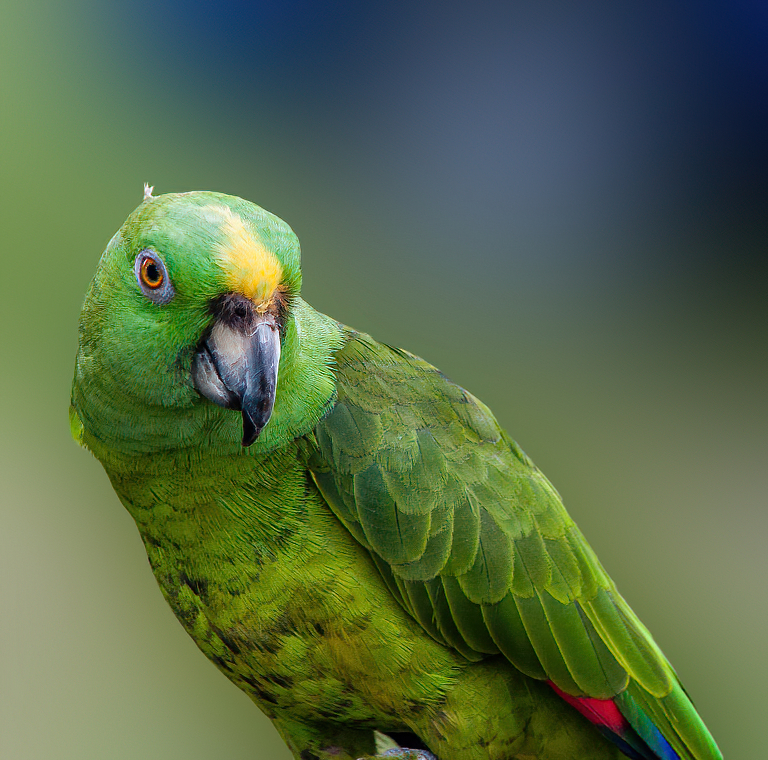
Aug 21 |
Comment |
Hi Randy,
I have to agree this is a beautiful parrot. I think you tried as best you could to simplify your background. But, all is not lost; there is a way to fix the distraction in the background from the car's wheel.
I took the image into Photoshop, used a Gaussian blur on the background, and added a little sharpening. Other options are selecting your subject and replacing the background with one of your choosing, like a woodland or jungle landscape. I recently learned how to replace skies in Photoshop, and it was quick and simple. I know you can do it too.
I am curious what you think of my edit?
Best regards! |
Aug 24th |
 |
| 3 |
Aug 21 |
Reply |
Yes, I like this version better. It makes a noticeable difference.
|
Aug 24th |
| 3 |
Aug 21 |
Reply |
Thank you, Jan, for your comment!
Thanks for visiting Group 3
Best regards,
LuAnn |
Aug 10th |
| 3 |
Aug 21 |
Reply |
No problem, Michael, it is just some things to think about when you edit in the future.
LT
|
Aug 4th |
| 3 |
Aug 21 |
Reply |
I like what you did to the photo, Mary Ann. The only thing left is to add a little more sharpening to the butterfly. I say this because the viewer will be looking at the details on the wing and will notice some softness.
Michael also had a good suggestion below for you. There are many ways to create a simple photo of a butterfly; creativity is endless.
Best regards,
LuAnn |
Aug 4th |
| 3 |
Aug 21 |
Reply |
Thanks, Mary Ann!
I will have to see if I can desaturate the first one.
LT |
Aug 3rd |
| 3 |
Aug 21 |
Reply |
Great edit, Michael, very creative! I like that you turned the butterfly to look into the frame. Do you agree it feels better once turned?
I also like the color and light adjusts you made; they do make the butterfly standout more.
I am curious what Mary Ann will think. Nicely done!
LT |
Aug 2nd |
| 3 |
Aug 21 |
Reply |
I have to agree with you, Michael, the colors in the second one seem more appealing. I think it was that second bubble was older and the colors were more spread out. But I could be wrong. Every bubble is unique.
LT |
Aug 2nd |
| 3 |
Aug 21 |
Comment |
Your butterfly, Mary Ann, is beautiful! The scene is simple with just a subject and rocks on a beach, and there is a nice contrast of warm and cool tones in the image. You have also placed your subject on the rule of thirds, so the composition looks good. Your camera settings capture the butterfly in sharp focus and the stones a little softer.
My first suggestion is to remove the brown twig stem behind the butterfly in Photoshop; it is a distraction and unnecessary for the story. The next step to consider is the luminosity; the whole image seems to have the same intense bright light. I recommend adding some dodging and burning to help the butterfly stand out from the rocks in a more dynamic way.
Lastly, next time you photograph a butterfly, try to compose with the insect looking into the center of the photo. Think of this rule where viewers read left to right, so if the insect was in the lower left impact point of the rule of thirds, he should be facing the center of the photograph.
I hope this is helpful. Let me know if you have any questions.
Best regards,
LuAnn |
Aug 2nd |
| 3 |
Aug 21 |
Comment |
Beautiful image, Ruth, and I love the intimate story of two bees working together on this flower. The lighting pinpoints the subjects nicely. I also really like your choice to put a delicate pink stroke border around the image; it finishes the photo perfectly.
The only recommendation I have for this photograph is to adjust the overexposed highlights; they pull my eye away from the bees. If this is not possible, you can paint them out in photoshop with the clone stamp tool; I just tried it, and I think it will make a nice improvement you would be happy with.
Best regards,
LuAnn |
Aug 2nd |
| 3 |
Aug 21 |
Comment |
Hello Michael,
I enjoy seeing your work in Topaz Studio 2. I, too, love working with textures, and I think this photo is an excellent subject-the wildflower story I find interesting.
What stands out for me is the yellow flower head on the left side in the background. I recommend lowering the saturation, so it is not quite as bright as the center of the Asters.
Next, the overall luminosity appears too bright; I would like to see the flowers stand out more from the background; this will also give the image some depth. For this, I suggest using a luminosity adjustment on the background or use gradients to lower this brightness.
Lastly, I recommend raising the saturation on just the blue flower petals and the three yellow flower centers just a little bit.
I hope this is helpful.
Best regards,
LuAnn |
Aug 2nd |
| 3 |
Aug 21 |
Reply |
Hi Michael,
Thank you for your kind words! I just uploaded a second version of the soap bubble. You have to give this genre a try if you have spare time and have a dark room. It was loads of fun to get a beautiful bubble!
Best regards,
LuAnn |
Aug 2nd |
6 comments - 14 replies for Group 3
|
| 62 |
Aug 21 |
Comment |
Emil,
Did you use a tripod?
LuAnn |
Aug 14th |
| 62 |
Aug 21 |
Reply |
Hi Bunny,
I like your idea, inspired by Bob, for this photo! I would have never thought to try it upside down. It will definitely catch someone's attention. I think it also tells an interesting story.
When I edited it in Silver Efex I never thought to try something in Topaz. I will give this a try next time - Thanks!
|
Aug 14th |
| 62 |
Aug 21 |
Reply |
Hello Leah,
Thanks for your comment on my photo. There are lots of ideas and choices for this photo and they all have merit. I appreciate your input.
Best regards,
LuAnn |
Aug 14th |
| 62 |
Aug 21 |
Reply |
Hello Stephen,
Thanks for visiting group 62 and leaving your comments on my photo!
Negative space is a compositional technique where you would be leaving a lot of empty space around the subject. This creates a sense of simplicity and helps the viewer to focus on the main subject without distractions. In this image, there is no negative space because the gate is filling the frame. Filling the frame is a separate compositional rule.
Negative space is a great technique to use, and it will for sure make a dynamic photograph.
I hope this clarifies your question,
LuAnn |
Aug 8th |
| 62 |
Aug 21 |
Reply |
Thank you, Israel, I am glad you find a variety of edits to choose from for your photo; each one has merits.
You are probably right, lens distortion is the culprit.
Best regards,
LuAnn |
Aug 8th |
| 62 |
Aug 21 |
Reply |
Thanks, Bob, I'll check it out!
LT |
Aug 7th |
| 62 |
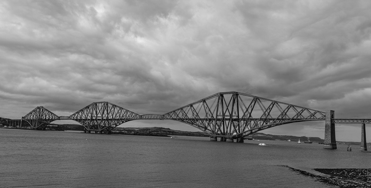
Aug 21 |
Comment |
Hello Israel,
I have never had Scotch Whiskey, but it is among the best I hear.
I like your bridge photo; it covers quite an expanse of space across the water. I like the angle you took the shot from, and the water had minimal boat traffic.
When I initially looked at the scene, and after reading Emil's edit process, I noticed the slanting landscape and the bridge still seemed to tilt down on the left. After trying my hand at straightening the bridge, I see now what Emil meant when he said, "level the bridge without disrupting the scene too much." It appears that both the bridge and the horizon line can not be level simultaneously in this instance.
So, here is my idea of something different for your photo. I decided to change the clouds in the sky. I did not care for the sun in the upper left corner (I do understand Oliver's idea of doing that), so I decided to replace the sky altogether. For some reason, these clouds seem to have a calmer feel and blend with the image well. You might finish this idea by raising the luminosity levels a bit to your liking; I did not get a chance to do that.
I am curious what you think.
Best regards,
LuAnn |
Aug 7th |
 |
| 62 |
Aug 21 |
Comment |
Hey, Bob, on a side note, I made my first sky replacement with Photoshop's new sky replacement tool, and I was amazed at how easy it was! I thought of you when I did it. We have a 100-year-old church down the street in our humble rural community, and one morning I took my wide-angle lens and took a photo. I saw someone explain the new sky replacement tool, so I thought I would try it. It took mear seconds, and PS comes with sample skies to use. Maybe I will submit the photo next month so you can see what I did.
Thanks to encouraging friends, I was so proud of myself for learning something out of my comfort zone.
Best regards,
LuAnn |
Aug 7th |
| 62 |
Aug 21 |
Comment |
It is almost unanimous, Bunny, this is a perfect image as you have created it!!
Amazing what you did with a camera phone. I agree with Oliver, it is definitely print-worthy in my opinion as well. Too bad California is so far away from Minnesota I'd be heading over to Bodie State Park this afternoon!
Congratulations,
LuAnn |
Aug 7th |
| 62 |
Aug 21 |
Comment |
Hi Bob,
Wow, Bob, the sky man went abstract on me here; great work!
What I see in your original photo is a wild boar pig after receiving way too many "jabs," and he went bonkers twirling out of control in the B&W!!
Love your creativity. I am inspired to try this myself.
Best regards,
LuAnn |
Aug 7th |
| 62 |
Aug 21 |
Comment |
Oliver, this is an amazingly well-done image!
What a joy I bet it was to have fun working with your grandson. I also thought this was an older woman who let you take her photo. The mask is incredibly realistic; I love the chin hair (haha!). Great hair, skin details, and texture throughout the photo. I do like the version of the smile you chose; I think it adds to the realism.
My first suggestion is to look at the neck area. The triangular shape at the neckline may need some adjusting; I had to look closely to find this. Lastly, to me, it feels a little too sharp. I say this from looking at the jacket; I sense extra sharpening.
That's it for me!! I agree with Emil, I too can't wait to see what you do for October!
Best regards,
LuAnn |
Aug 7th |
| 62 |
Aug 21 |
Comment |
Hello Emil,
The Grit of the City is a beautiful photo. I like the crop because it eliminates any possible distractions, and my eye can focus on the building and grand stairway. In addition, there are many art elements, including lines, geometric shapes, patterns, tonality, texture, and balance. Very nicely composed and processed. I have never created an IR image so I can't comment on this process.
As far as editing goes, I have to agree with Bob on the softness of the image. I tried to sharpen it a bit in Topaz Sharpen AI, but because it is a jpg, I could not improve it. Perhaps the RAW file will allow you to do this. The only other thing I would add is the building is tipping a bit backward. In Lightroom, the Upright tool does improve the angle.
Thanks for sharing another great image, Emil!
Best regards,
LuAnn |
Aug 7th |
| 62 |
Aug 21 |
Reply |
Fancy meeting you here, Michael!
Thank you for your feedback; I appreciate your thoughts and recommendations. We can edit photos like this in many ways and styles, from classic to 90's grunge. I love how each person has great ideas and observations, and they are all winners, in my opinion.
Best regards,
LuAnn |
Aug 6th |
| 62 |
Aug 21 |
Reply |
Thanks for your thoughts, Emil. I will try to lower the brightness in the center area; good thought.
Best regards,
LuAnn |
Aug 6th |
| 62 |
Aug 21 |
Reply |
Thanks for your comment, Bob.
It was a fun shot spur of the moment. I liked the grudge effect because it went along with finding the gate; in a dirty, grungy berm under a bandshell along a river walkway. I love change, so I want to try different editing techniques. Grunge isn't for everyone, and that is ok.
Good to hear from you after the group's month-long break!
Best regards,
LuAnn |
Aug 6th |
| 62 |
Aug 21 |
Reply |
Wow, that was easy. I will have to remember that!
Thanks,
LT |
Aug 5th |
| 62 |
Aug 21 |
Reply |
Hello Oliver,
I really like your edit! I know there is a trick to capturing webs but I am not sure what it is. If you have any advice, please let me know.
You had a good eye to find those webs!
Best regards,
LuAnn |
Aug 5th |
7 comments - 11 replies for Group 62
|
| 82 |
Aug 21 |
Reply |
Hello Laurie,
I like your eagle image. He seems to be working hard on this catch his buddy captured but not too busy to notice you. It is a great shot to find an eagle in such a vulnerable position. Brave you to have done it in a kayak!
I saw your astrophotography photo of the Milky Way on the Study Group Showcase, very nice! I have a question. I am new to astrophotography. I noticed the bright blue star on the left side of the milky way. Is that a blue star? I have never noticed them before in a photo.
Best regards,
LuAnn |
Aug 15th |
0 comments - 1 reply for Group 82
|
13 comments - 26 replies Total
|


