|
| Group |
Round |
C/R |
Comment |
Date |
Image |
| 3 |
May 21 |
Comment |
Hi Randy,
You found an exciting photo; I would have taken notice of this frond as well. I agree with Ruth; the image has a journalistic or even documentary style. This photograph has an impact as Kieu-Hanh said it made her smile. I find the community sign in the background helps give some context to the picture. I like how you captured the palm trees in the background by leaving separation between the trunks. The colors in this photo appear natural and accurate to the time of day, location, and season.
The only thing I can think of that may help enhance your photo is to add more contrast and possibly a white vignette. The bright afternoon light desaturates the colors a bit, so adding contrast would help strengthen those hues. The vignette would help hold the viewer's eye at the subject and not wander off to the edges of the frame.
Thanks for sharing your image; I enjoyed it very much.
LuAnn |
May 24th |
| 3 |
May 21 |
Reply |
I really like your edit; the colors are more soothing now.
LT |
May 16th |
| 3 |
May 21 |
Reply |
Very interesting and good to know! I will make a note to consider this when I judge travel.
Thanks,
LuAnn |
May 12th |
| 3 |
May 21 |
Reply |
Thanks for sharing the original, Ruth.
I am not as bothered by the blue color as the others in the group. The blue in the sky is not over-saturated so it was my thought that the water wasn't over-saturated just a stronger blue than we might be used to.
Do you think the water is over-saturated, Ruth?
LT
|
May 12th |
| 3 |
May 21 |
Comment |
Beautiful photograph, Michael; I love your post-processing technique; Topaz is fantastic software! Yes, I agree with Mary Ann; the angle of the bird works for me as well. You have a lovely triad color palate; this is probably why the photo works nicely; it fits a color scheme. There is excellent feather detail and texture on the plant for interest, and you also have a perfect catch-light in the eye. The textured background almost looks like hydrangea blooms in a soft blur.
I only have one suggestion. Try flipping the image horizontally and see what you think; this may be another excellent option for this photo. This view allows the viewer to move from the lower-left corner and study the details in the body feathers before moving to the bird's face.
LuAnn |
May 6th |
| 3 |
May 21 |
Comment |
I like your intentional camera blur on this photo; it does give the image a dream-like feel, as the title says. There is interest in the photograph; the trees have good separation between them. There are sailing masts on the horizon for additional interest and people on the beach in their little world, oblivious to one another.
The only point I would like to make is that I find the yellow a bit oversaturated.
Very nice,
LuAnn |
May 6th |
| 3 |
May 21 |
Comment |
The red and white rose is a beautiful flower, Kieu-Hanh. The colors are vibrant; the highlights are under control, the background is nicely softened to let the rose be a subject without distractions. I also like your tiny red border; it is a nice compliment to the photo.
What catches my eye is the center of the flower is not sharp. It looks like a metering mode of Pattern was used, so this focused on the outer edges of the rose where it is red. Try a single-point focus mode and center on the center of the flower; this should help. |
May 6th |
| 3 |
May 21 |
Reply |
Hi Mary Ann,
You ask a great question!
If you were submitting your image for competition, I would first determine if the photo has a visual impact. The impact of an image is possibly the most subjective of the elements but by far the most important; if an image does not have an impact, it is not a winning photo in a competition. Next, I would determine if the image has originality; will this photo stand out from another? Is there a compelling point of interest, does the photograph tell a story, is the photographer's intent obvious? From there, you move into evaluating the technical elements, compositional elements, artistic elements, and presentation elements of the photograph.
As I see it, there are two types of photographs, one we love for personal reasons (most of my images I take for personal reasons), and then there are the photos we take for competition. Both great photos, but we will compose them differently to please a different audience.
I hope this answers your question. Let me know if you need further clarification.
Best regards,
LuAnn |
May 3rd |
| 3 |
May 21 |
Reply |
If I ever get the chance to visit Seattle again, I will look you up for a photo adventure!
LT |
May 3rd |
| 3 |
May 21 |
Reply |
Wow, that is awesome! I hope you like this new group!
Best wishes,
LT |
May 3rd |
| 3 |
May 21 |
Reply |
I agree with your comment, Michael, on the fleeting moment we have with that moment of perfect light.
Have you tried to record the time of day and tried your shot the next day when you had time to plan? Or, was it just not the same light you saw the day before?
LT
|
May 3rd |
| 3 |
May 21 |
Reply |
I am glad you liked the edit, Mary Ann!
I generally use Lightroom for study group editing; otherwise, I use Capture One Pro 21; I find it a better tool to edit Fujifilm RAW files. I selectively dodged the calla lilies and lowered part of the vase to bring out the orange leaf (an area of interest, in my humble opinion). Then I used the brush tool to burn the places in the background that I felt needed darkening.
The rest of the image I left as you, the artist, designed it. If this image was for a competition, I might recommend different edits; I view photography for personal enjoyment differently from those for the competition world; not everyone does this.
Best regards,
LuAnn
|
May 3rd |
| 3 |
May 21 |
Comment |
Hello Ruth,
What a wonderful travel photo and a great place to visit; I have never been to Peru. I do find the image does meet the requirements of a travel photo for a competition. I can see the picture expresses characteristic features of the culture of a land as naturally found; the people harvesting and the round huts. The people do not appear to have been staged for the photo; they are working as if you were not there; this is important when entering a competition. The colors are vibrant, and there is a lovely 'S' shape in the water to draw the viewer's eye to the background. There is interest in the background with the different types of buildings and more huts.
You did not submit an original version of this photo, so I cannot see where you started before you sharpened the image and adjusted any saturation. I find the highlights are clipping on several small white areas in the photo (-25 in Lightroom). Unfortunately, the subjects are not on an impact point for the thirds or golden ratio grid. I find the people in the boat and the people at the hut feel out of balance in the image; they are quite a distance from any impact point on the grid. I also sense that the sharpening is a little too much on the golden grasses.
I hope this helps, Ruth.
Best regards,
LuAnn |
May 1st |
| 3 |
May 21 |
Comment |
Hello Mary Ann,
I have read that the word Calla means 'beautiful' in Greek, and your bouquet is beautiful; what a wonderful gift!
I like your idea of capturing the light and the flowers. I also see the golden spiral in this image. The white lilies catch my eye, so I see the spiral starting there. Then it curves around to the long grasses and then moves down to the clear vase to see the curious orange leaf inside. I like your new crop from the original photo; you have eliminated some distractions.
I darkened the background in my sample edit slightly; it seems a little bright for me and draws my eye back to look at the shiny gold finish instead of staying at the flowers. I also added a contrast boost to brighten the calla lilies up some.
I am curious what you think.
Have a great day!
LuAnn |
May 1st |
 |
6 comments - 8 replies for Group 3
|
| 62 |
May 21 |
Reply |
Stay in touch with the group here, Israel, we all want to know you are ok.
Best regards,
LuAnn |
May 27th |
| 62 |
May 21 |
Reply |
Thank you, Israel, for sharing what is going on in your city. America has no idea how stressful your nation has it during these horrific times. I try to stay updated and listen to Behold Israel on YouTube.
I only mentioned the rule of monochrome just in case you were to enter into a competition or international exhibition; these organizations can be sticklers for these rules. I love the pop of color in your image, and I am glad you shared it with the group. You have inspired me to try something different. I am stuck in a quandary right now with my photography. Being locked in this last year, I am finding I need to find other subjects to photograph. Too bad we don't have camels :-)!
Shalom, my friend, shalom.
LuAnn |
May 25th |
| 62 |
May 21 |
Comment |
Hello Oliver,
I have to agree with everyone in the group; this image has a captivating story. You have good light, no distractions, a willing subject, and both organic and man-made lines and textures. I hope you have a chance to enter this photo in a competition.
My only question is, do you think there is too much texture on her face? I know judges can be sticklers about this on skin. The face almost looks like a pencil sketch; that can be a good thing, depending on your editing style. In Lightroom, I did have to lower the highlight slider -30 on the bows of her glasses.
Excellent work, my friend. I look forward to seeing what you come up with for next month!
LuAnn |
May 24th |
| 62 |
May 21 |
Comment |
Hello Israel,
I have thought about you a lot because of the news. I pray for Israel, the jews, and the iron dome. Shalom to you and your family. I can not imagine what your world is going through right now.
I love your image this month, Israel. This camel looks like it is out for a joy ride; do they smile? He is not intimidated at all by the bicyclist. I like everything you did to edit this image. The yellow tone works well with the desert environment. The bicyclists are perfect; two plus a camel makes three, and quite a juxtaposition in forms of transportation. The camel is looking at the camera; there is motion and interaction with the riders. Even the light fits the environment.
My only question is, is the blue shirt allowed in monochrome photography? I had to look up PSA monochrome definition, and this is what I found.
"An image is considered to be Monochrome only if it gives the impression of having no color (i.e., contains only shades of gray which can include pure black and pure white) OR it gives the impression of being a grayscale image that has been toned in one color across the entire image. (For example, by Sepia, red, gold, etc.)A grayscale or multi-colored image modified or giving the impression of having been modified by partial toning, multi toning, or by the inclusion of spot coloring does not meet the definition of monochrome and shall be classified as a Color Work."
I look forward to someone clarifying this for me.
Best wishes,
LuAnn
|
May 24th |
| 62 |
May 21 |
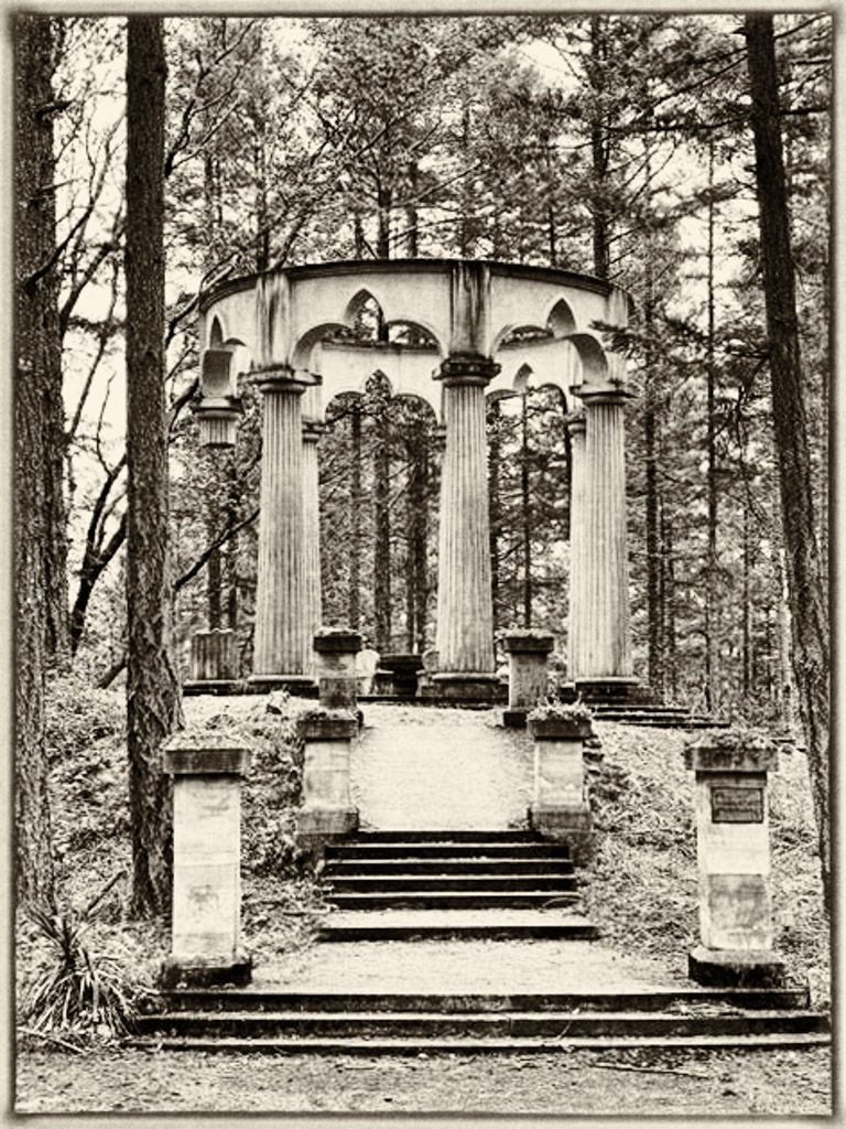
Comment |
Hi Bunny,
I appreciate all your efforts to edit this mausoleum photograph in an old-world style. The story is also fascinating; I would never have known about the symbolism had you not mentioned it. I will have to research this for future photography outings.
I have limited experience with the antique tones in monochrome photography, so this image has inspired me. I like your point of view; it feels like I could walk right up into the area. I now notice the broken pillar! When I first saw the scene, it appeared to be busy with all the surrounding vegetation. But with the yellow-toned monochrome editing, the business is under control and not a distraction. The walkway is well positioned, and the light is good. I think the darker background and the trees in focus allow the mausoleum to stand out and conform to the style of the finished edit chosen. The pillars are light and stand out for me, so I would not change anything there.
On my sample edit, I went a little darker. I chose 034 Yellowed 2 in Silver Efex Pro. Then I selected the Adox Silvermax 21 film type and adjusted the preset border to a smaller size. For me, I lean towards doing minor editing as often as possible.
Thanks for inspiring me!
LuAnn |
May 24th |
 |
| 62 |
May 21 |
Comment |
Your photograph this month is beautiful, Emil. A desert landscape is such a unique environment for many of us. I don't think I have ever been to the desert to see a scene like this.
I like the foreground placement of the driftwood in the lower right rule of thirds. I love the curvy lines of the dunes; they help my eye move from side to side and front to back through the photo. The varying shades of grey of the dunes also help each one stand out from the other, giving the feel of depth.
A concern I have is with the intensity of the light in the background on the dunes. The light is similar in strength to the light on the driftwood; it's pulling my eye from the subject. The dunes in the back are a distance away, so what would you say to lower the brightness in the background or raise the light's strength in the foreground?
Thanks for sharing a great image,
LuAnn |
May 24th |
| 62 |
May 21 |
Comment |
Leah, this is another beautiful architectural image; I love the contrasts between the light and dark shadows; there are many geometric shapes, with a splash of organic dirt on the doorstep. You have inspired me to get out and take some photos!
My edit idea is simple. I used Silver Efex Pro, selected the film noir one preset, added seven control points to darken the black areas and bring down the brightness on the brick a bit, used border type 9 with a size of -92%, and lowered the grain to 351.
Best regards,
LuAnn |
May 6th |
 |
| 62 |
May 21 |
Comment |
Hi Bob,
Lovely Lupine flower this month. I really like your edit technique. The post-processing gives the image a raised-metallic-like texture that is appealing to me. The first thing that comes to mind is to print this on metallic paper or metal.
I did take the photo into Topaz DiNoise and found a little extra sharpening helped the prominent flowers in front. If you could reproduce the effect, I would suggest sharpening on the original raw file then edit in Topaz again.
Nice work!
LuAnn |
May 6th |
6 comments - 2 replies for Group 62
|
| 99 |
May 21 |
Comment |
Hello Linda,
Nice to meet you here on PSA Digital! What a beautiful Silver Bell bloom! You did an excellent job editing a single flower from the original photo. The background has a nice bokeh effect, and there are no distractions, just lovely smooth diagonal light and faint shadows. The texture of the Silver Bell draws my eye into the photo to where I find lots of details, including tone, shape, line, and the glistening of the flower, to my delight.
I read Peter's comment about the dead space in the upper right corner. So I took the photo into Lightroom to look at the crop overlay tools to see how it was lining up. In my edit, I adjusted the highlight up +20, whites +20, and clarity -14; this helped brighten the photo and soften the background a tiny bit more. I then gave it a new crop and used the guidelines of the golden spiral to place the baby bud on the spiral's center point. These changes should help the problem Peter was seeing.
Best regards,
LuAnn Thatcher |
May 6th |
 |
1 comment - 0 replies for Group 99
|
13 comments - 10 replies Total
|


