|
| Group |
Round |
C/R |
Comment |
Date |
Image |
| 3 |
Oct 20 |
Reply |
Thank you, John, for the visit and your comment! |
Oct 20th |
| 3 |
Oct 20 |
Reply |
Got it.
LT |
Oct 16th |
| 3 |
Oct 20 |
Reply |
Hello Ruth,
Thanks for your comments. I tend to be more of a moody style photographer. I am drawn to these dark moments in time, and I love the atmospheric perspective. This photo was a lucky shot. This area was a great location in the Northern Minnesota wilderness on a road that ended close to the Canadian border. Those that enjoy living off the grid call this wilderness area home, and wildlife sightings are more abundant.
If I had a full-frame camera, I could probably do the tighter crop. But I am all about breaking the rules and being different. I hoped to include the breathing room in front of the eagle to show he was searching for prey from a the distance.
Best regards,
LT |
Oct 16th |
| 3 |
Oct 20 |
Reply |
Hi Larry,
Thanks for the visit here, and for visiting my website! It is a work in progress. I too love the photos of the man in the canoe. I think I captured 1500 shots of him as he paddled for a sunset shoot.
LT |
Oct 16th |
| 3 |
Oct 20 |
Reply |
Thanks, Mary Ann, for your comments. Usually a drive by opportunity doesn't always work out, but this one did ok. Four years ago I was just a newby at bird photography. The Tamron 150-600mm lens was a tank. Everytime I took it hiking I had to have my husband carry it separately; haha!
Have a great day!
LT |
Oct 16th |
| 3 |
Oct 20 |
Reply |
Thanks, Kieu-Hanh, for your comments. A square crop is one of my favorites. I will experiment with it and see what it looks like.
LT |
Oct 16th |
| 3 |
Oct 20 |
Comment |
Your landscape scene, Mary Sue, has a nice clear view of the milky way. I see no obstacles in the way, like trees or mountains. You have some good elements in the photo, include the north star on the left vertical rule of thirds. The milky way itself is centered on the upper horizontal rule of thirds. There is a nicely lit foreground of golden grasses and a darker middle ground of rolling hills. The sun is peaking over the horizon as a bonus.
The original file and the edited version you submitted are both jpegs. As I see it, the brightest area of the photograph is the north star, followed by the sun at the horizon, then the foreground grasses,' and finally completing the circle around the image the milky way.
My suggestion is to work with the adjustments in the basic-panel if you use Lightroom. You could raise the expose a bit +1.25, raise contrast 5, lower highlights -35, raise shadows 49, and lower whites and blacks -10 and -9, respectively. Vibrance adjust to 20, and saturation to 3. My other suggestion would be to play with the split tones of the highlights and shadows. This adjustment could help put some color into the sky; currently it looks flat.
If you work in Photoshop, you could take advantage of layers and prevent the milky way from taking on the split-tone adjusts as well; this is a limitation of Lightroom.
In my opinion, if you could shoot the milky way in RAW, then you might have even more options available for editing.
Best regards,
LuAnn |
Oct 14th |
| 3 |
Oct 20 |
Comment |
Hi Lisa,
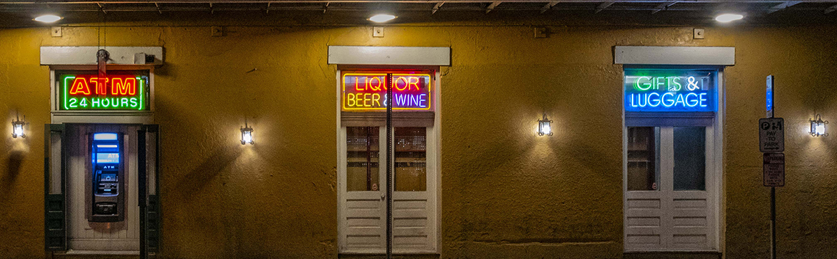
Neon Noir sounds like it is a contemporary twist on the film Noir style back in the film days. Brandon Woelfel on instagram does a lot of this style; he mostly shoots at night.
You basically adjust your white balance to the blue side. Then work with the Lightroom sliders to turn the highlights towards the purple side, and the shadows towards the teal side; no greens or yellows in the image. Shooting images in areas that have a lot of neon signs is key and atmospheric perspective is an added bonus if you have it. If you look on YouTube Peter Mckinnon, and Blue Lightening TV show you how to do the editing. They call the style Neon Noir/Cyber Punk.
To achievve the look it takes some handy work balancing the colors. But in the end it is interesting. At least it is worth a look at the Instagram sites where people have perfected it. Also checkout Noealz - Anime Photography on YouTube he has some great work in Korea.
I don't have access to shoot in locations with neon signs but it is something with a fun contemporary twist if you're looking for something creative.
LT |
Oct 7th |
| 3 |
Oct 20 |
Reply |
Can you explain what you mean, Mary Ann? That is an interesting idea.
LT |
Oct 7th |
| 3 |
Oct 20 |
Comment |
Great image, Kieu-Hanh, and a compassionate story. I like how you captured the simplicity of the moment with just the one visitor.
When I look at the image in Lightroom, the white balance is off; you can see a teal color in the sky. The highlights are hot by about a stop. I tried to adjust the white balance but because the image is a JPEG I was not able to make the adjustment. I recropped the image to eliminate the sky, but with the loss of pixels the image didn't have any sharpness.
I don't know what your focal length was but if you could have been closer it could have been a great shot. The photo looks great as a horizontal without the sky. Hopefully you have a RAW file you can work with.
I wish I could have found a solution for you.
Best regards,
LuAnn |
Oct 7th |
| 3 |
Oct 20 |
Comment |
Beautiful image, Ruth. Is this one you will enter in competition?
I agree with Kieu-Hanh, about the clouds in the sky having better drama. But if you submit this image in nature photography category, you won't be able to blend in the sky. But I think you have enough pixels to work with; I assume your ISO was low during this time of day.
The only thing I can add is the horizontal balance seems off. It feels as though the image is lower on the right. I am gaging that feel from looking at the pink flowers in front. What do you think?
Best regards,
LuAnn |
Oct 7th |
| 3 |
Oct 20 |
Comment |
Ya, I agree your lantern should be lit up.
Have you tried a Neon Noir edit with this type of image, Lisa? That would look cool.
LuAnn |
Oct 6th |
 |
| 3 |
Oct 20 |
Reply |
Kieu-Hanh,
Do you have time to do a quick edit to show us how you would make this change?
LuAnn |
Oct 6th |
| 3 |
Oct 20 |
Reply |
Isaac,
That is a beautiful edit! The horse and rider step out of the image; awesome. Mary Ann will love this edit.
LuAnn |
Oct 6th |
| 3 |
Oct 20 |
Reply |
Thank you, Isaac, for your comment. The image is already heavily cropped I am afraid to make it any tighter, unfortunately. Great thought though!
Best regards,
LuAnn |
Oct 4th |
5 comments - 10 replies for Group 3
|
| 62 |
Oct 20 |
Reply |
Awesome, Bob, glad I could help! I am glad you are a student and able to learn more about photography. Have fun!!
LT |
Oct 21st |
| 62 |
Oct 20 |
Reply |
Hi Bob,
I am using LrC revision 9.4 creative cloud.
When you look at the develop module window on the right are the sliders. The first one is called the basic panel. Open this panel.
Inside you will see Treatment: (this is where you select color or black & white), Profile: (this is where you select color or monochrome) and 4 little squares on the right side of this line; click there.
I selected the 'ALL' tab not color or B&W.
Inside this drop-down there is a section halfway down that says 'Modern (10).' Within this group you will find Modern 05.
Hope this helps.
LT |
Oct 21st |
| 62 |
Oct 20 |
Reply |
I am glad you find them helpful, Emil.
LuAnn |
Oct 13th |
| 62 |
Oct 20 |
Reply |
Larry,
Your point about times when flipping an image might not be recommended is well taken. In many situations flipping an image horizontally can give the image a natural flow, but you pointed out a good example of when this may not apply; historical landmarks.
Thanks,
LuAnn |
Oct 12th |
| 62 |
Oct 20 |
Reply |
Israel,
The radial filter can also be used as a tool to make a vignette. Adjustment brush is another choice. I just like the performance I get from radial filter. There are many ways to edit and they are all good.
LuAnn |
Oct 7th |
| 62 |
Oct 20 |
Reply |
I enjoy your enthusiasm, Israel.
Shalom
LuAnn |
Oct 7th |
| 62 |
Oct 20 |
Reply |
Bob,
That is a great point about the bow and horizon. I do not do a lot of landscape so I will have to make a note on your suggestion.
LuAnn |
Oct 7th |
| 62 |
Oct 20 |
Reply |
The radial filter is just something that I have been using for a long time.
I do not do my editing in Photoshop very much so I never got into using Actions. I just keep things simple and natural its just my style, Israel. My camera produces great color that I am happy with just out of camera.
Do you like using Actions? Do you use Photoshop a lot for editing? You will have to share what you have learned. Perhaps I can learn something from you.
Best regards,
LuAnn |
Oct 7th |
| 62 |
Oct 20 |
Reply |
Ok, that's cool.
You know, when I edited my sample photos in LR and exported the copy to my desktop, both the LR copy in the LR software and the exported image are of different white balance colors. I don't know if this is just crazy LR or what. I calibrate my monitor weekly for judging. I don't seem to have this problem when I use Capture One. Does anyone else experience this phenomenon when using LR?
LuAnn |
Oct 6th |
| 62 |
Oct 20 |
Comment |
I really had fun with your image, Leah, and I love your creative idea! I was stuck and now you have inspired me to create something new and different for my November photo - thank you!!
Your image has character, its definitely unique, and a perfect cadidate for black and white. The feel is nostalgic and the post-processing options are endless.
I used Anthropic's photo editor and dove into presets and textures. I added a pen and watercolor preset, adjusted the black and whites, added a canvas texture, and a small gradiant border; you can see the border when the background behind the photo is grey.
Curious what you think!
Best regards,
LuAnn |
Oct 6th |
 |
| 62 |
Oct 20 |
Comment |
Bob,
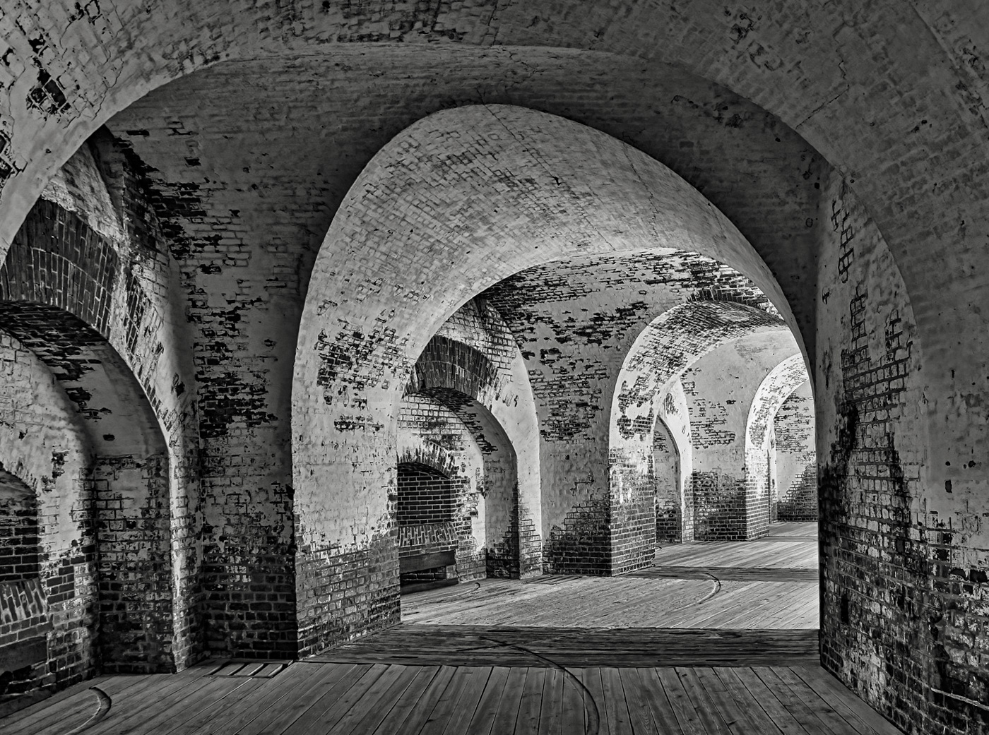
Your settings made a great image. The scene is void of distractions, and there is enough interest in the stone archway to keep a viewer's eye engaged in the image. There are enough details in the brick to beg the question, what was life like here in 1862?
You may have noticed I flipped the image in my sample photo to see if it is a better photo when presented this way. To me, I sense it may flow better; not that your method is wrong, mind you. In countries that read from left to right, this can be a subconscious preference. The left to right movement also leads us into the action rather than away from it. I like your image flipped; what do you think? It's just a thought.
The edits I did in Lightroom. I tried to use Luminar 3, but the program freezes, so I had to stick to LR. I used the preset Modern 5 in the drop-down menu in the Basic section. Then the adjustments were as follows: exposure -30, highlights -69, shadows -10, whites -29, blacks +39, texture -10, clarity +7, dehaze +15, tone curve -15, +6, -10, -6. In the Transform box, I selected Auto.
I look forward to your thoughts, my friend!
Best regards,
LuAnn |
Oct 6th |
 |
| 62 |
Oct 20 |
Comment |
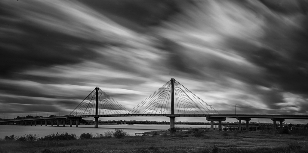
Nice photo, Emil, I like the moody atmosphere in the scene. The foreground is subtle but enough to walk the viewer into the image. Great lines and drama in the sky helps the viewer want to linger a while and ponder the photograph.
In my sample image, I used a radial filter to bring out the bridge more, and added gradiants to the edges (-0.18) in LR. I used the brush tool on the foreground to darken it a bit. Then in the adjustments I moved the histogram to the right to balance the tones. Highlights 0, shadows +62, white +42, black +4, texture +9, clarity +10, and dehaze -2. Tone curve is -5, +2, -11, -9.
When I compare the two images, they appear pretty close.
Best regards,
LuAnn |
Oct 6th |
 |
| 62 |
Oct 20 |
Reply |
Thanks for your feedback, Bob!
Yes, it is fun to work with old stuff. Now that I look at this image, I could probably try my hand with different colors and textures and come up with a composite. I have never done a composite before.
Have you ever possessed images with film noir? I just saw today that contemporary photographers are creating photography with Neon Noir, and it is fascinating.
Best regards,
LuAnn
|
Oct 6th |
| 62 |
Oct 20 |
Reply |
I like your edit, Emil, your edits are very subtle - nice.
Can you tell me, did you adjust white balance? You image looks a little sepia toned and I like it.
LuAnn |
Oct 6th |
| 62 |
Oct 20 |
Comment |
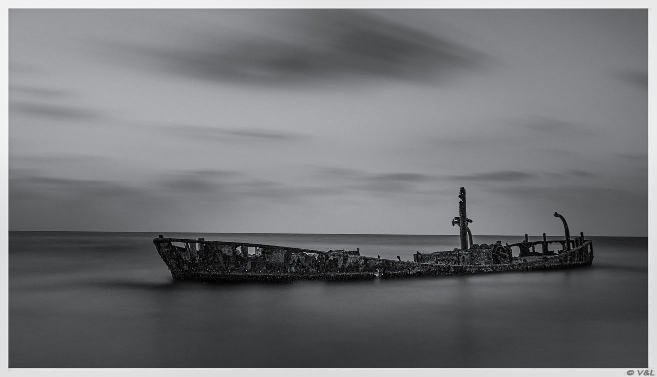
Hello Israel,
The first thing I noticed in your image was the peaceful and calm waters surrounding this abandoned ship. I couldn't help but wonder what type of voyages and experiences this ship had in its lifetime.
My edits consisted of using a radial filter around the ship to brighten it up a little; the deep shadows seemed to beg to be revealed enough to see some texture. Lightroom showed on the histogram that the highlights were blowing out because of the white border, so I adjusted them. I lowered the black slidder, raised the texture a little, and added a little clarity. I finished by running the photo through Topaz Sharpen with very minimal auto settings.
Tell me what you think?
Best regards,
LuAnn |
Oct 6th |
 |
| 62 |
Oct 20 |
Comment |
Bob,
Can you let us know what your camera, lens, focal length, and settings were? Also, did you use a filter, a tripod, and what was the time of day?
I love this image!
Thanks,
LuAnn |
Oct 6th |
| 62 |
Oct 20 |
Comment |
Leah,
Could you tell us what your camera and settings were? Did you use a tripod, and what type of lighting did you use?
I love experiments like this!
Thanks,
LuAnn |
Oct 6th |
6 comments - 11 replies for Group 62
|
11 comments - 21 replies Total
|


