|
| Group |
Round |
C/R |
Comment |
Date |
Image |
| 3 |
Sep 20 |
Reply |
That is a great idea, Ruth, creating a deeper story.
What do you think about the diagonal Mary Sue chose in this image? Does the chain seem backwards to you, Ruth, or different in any way?
In western countries we read from left to right. Mary Sue chose a sinister diagonal placement for the chain going from upper left to lower right. As I understand this diagonal, it tends to be an angle that can put tension into an image or be more aggressive. The baroque diagonal that goes from lower left to upper right is a positive angle because that is the direction we read and we are more comfortable moving in that direction. So in this image that would imply the chain is going down hill. Usually when we analyze photos we look for lower left to upper right movement.
What do you think?
LuAnn |
Sep 25th |
| 3 |
Sep 20 |
Comment |
Thank you, Lisa and Ruth, for your comments. This is a very interesting mushroom. Now I see I should have taken a shot from a different angle that way I would have gotten the underside of the cap and the stem. I will just have to add this idea to the bucket list! |
Sep 25th |
| 3 |
Sep 20 |
Comment |
Hello Kieu-Hanh,
The air show must have been an exciting event to see. The pilot accomplished quite a feat by landing on top of a moving vehicle.
Your image has interest; it's not every day a plan lands on a vehicle. There are no distractions outside of what's on the tarmac. I like the billowy clouds in the sky and there are no harsh highlights in the image.
I would like to see more movement in the propeller; the movement now seems very slight; I can not tell if the truck is moving with the plane the tires are in shadow. I took the photo into Lightroom and find the luminosity leans towards the mid-tones; brightening the image up a little would help. I would find the impact of a plane landing on a truck to be more ideal if the plane was in mid-landing on the truck. It looks as if the pilot is exiting the plane and the impact moment has passed.
I hope this helps you for the next air show opportunity you get.
Best regards,
LuAnn |
Sep 22nd |
| 3 |
Sep 20 |
Comment |
Hello Mary Sue,
You have a quiet image of a galvanized-steel chain, possibly for anchoring a boat. From what you wrote, the water droplets and the tension in the chain caught your attention. You like the blurry background and believe it makes those elements stand out.
As I look at your image, the heavy gauge chain has an industrial feel; the material looks strong enough to weather many a storm. The water droplets are tiny and hold a reflection against a bokeh background that has green foliage implying a lush, natural, outdoor environment. The image is well balanced using diagonal symmetry, and the story implies a summer day at the water's edge.
In my opinion, the photograph, though it is minimal, it lacks impact, a wow factor, something to give the viewer an emotional response, or an idea of a story. The chain gives a feel of something harsh and cold. My eye wants to see the reflection in the water droplets, but they are too tiny. My eye is drawn to the lush greenery (warm color tones) in the background. I feel as if the impact of the scene is hidden somewhere in the bokeh behind the chain.
I do not know how you feel about black and white photography, but have you thought about editing a copy of this image in B&W?
Best regards,
LuAnn |
Sep 22nd |
| 3 |
Sep 20 |
Comment |
Mary Ann,
You asked how I added the clouds. I occasionally use a software app by Anthropics called Smart Photo Editor; it is pretty old software. Like most photography apps, it has different presets, and one was of the cloud pattern. I didn't do anything special I just selected it and did not mask or blend. I am sure it was an overlay. I was surprised it worked so well. I didn't look at the edit magnified, but I thought it might be an example of what you could do.
Some times when you crop an image, you sacrifice pixels in the process. Then if you decide to print or enlarge the photo, it turns out pixelated; once pixels are deleted, they can't be replaced. In my opinion, I try to find other alternatives to fix an image that won't take me a significant amount of time to do.
I hope this helps.
Best regards,
LuAnn |
Sep 15th |
| 3 |
Sep 20 |
Reply |
Hello Mary Ann,
Your question, I am afraid, does not have an easy answer. I do share your position on being a natural style photographer. I love to shoot with my FujiFilm cameras and capture what I see as I see it. FujiFilm has film simulations in their cameras that I can set to get stylized custom Jpegs with retro color palettes that I like. I love antiques, old and vintage things, so I guess this draws me to the style.
I can see you are developing a unique style in your photography with your question about authenticity. Finding your niche in photography can frequently take a photographer years to ascertain. As I see authenticity for myself, I have a choice, I either follow the crowd or stand as an individual and stick to the style I love; the style that says who I am as a photographer. I am not alone in this stance. I know several professional and creative photographers who have spoken as much about their work when discussing this topic.
Some people endorse artistic/creative photos, and that is okay; it's freedom of expression. There is a genre for everyone, and you will find that not all photographers like the same genre and style; we put our spin on what we capture to personalize our work.
As a salon judge, I have a set of rules I follow based on PSA club guidelines. Camera clubs will create a list of categories for the year, and my job as their judge will be to determine if the photographer followed their predetermined rules. I will also critique their images based on rules of composition (rule of thirds, leading lines, etc.) and technical elements (camera settings, lighting, etc.).
The nature category is one where no modifications are allowed to an image. No techniques that add, relocate, replace, or remove are permitted. However, cropping, HDR, focus stacking, and dodging and burning are permitted. This category also has a rule that no hand-of-man element can be in a nature photograph (including human-created animals).
Some clubs will have altered reality categories and abstract photography; these are more prevalent in the last couple of years. Go to PSA's photo website (psa-photo.org/index.php?division-definitions). On the Divisions-definition page, you will find the rules on what is allowed and not allowed in the categories.
I know you are new to PSA, so this should be of help if you haven't seen it before. Let me know if you have any other questions. I hope the rest of the group will have something to add. Authenticity is an excellent question, thanks for asking!
Best regards,
LuAnn |
Sep 14th |
| 3 |
Sep 20 |
Comment |
Thank you both, Mary Ann and Oliver, for your comments!
You are funny, Oliver, about the positioning of the mushroom. Maybe that was what caught my eye that it wasn't showing a stem as most mushrooms do. This one does seem to be stuck by its cap to the log.
Best regards,
LuAnn |
Sep 12th |
| 3 |
Sep 20 |
Comment |
Boy, between the two sample edits Ruth and Mary Ann submitted, I think Lisa will have a big decision to make. I like Mary Ann's square crop and the snippet of Paris in the signage on top of the stairway. The colors in the image are nice and vibrant.
But I like Ruth's suggestion as well. I do see your point about the top of the frame. Cropping off the piece does take away from the fact now the viewer will not know this is Paris; I like that it is just a hint.
I could not tell the man was wearing glasses; he is so small in the frame. The vibrant colors, the graffiti on the wall, and the bright blue door and number 17 overpower him competing for attention. But because he is a human figure, I don't think it is as essential for the man to be sharp in the frame; this is my opinion. |
Sep 12th |
| 3 |
Sep 20 |
Comment |
What an opportunity to go to the Galapagos Islands!
I like your image, Ruth. I find the flow from mother to pup works nicely. You have their eyes in view and the pup's attention, very natural scene. I have to chuckle at what appears to be a neckerchief on the pup! You didn't include all your camera settings, how far from the two were you (focal length)? What lens did you use? What was your ISO? Did you shoot handheld?
I know you like natural photographs for competitions. I tried a few different options, but I think your tones in the animals are more to your liking. I tried to darken the sand a bit, but then I lost the nature photography look. If the image is sharpened anymore, the white sand behind the pup's head on the rock blows out. I think your second crop works nicely.
On a side note, did you capture any shots from a lower to the ground perspective? I know nature judges like the direct sightline view sometimes more than from a higher perspective.
How was your trip to the Galapagos Islands? Did you do a photography tour? My husband just said he was interested in this location for a trip. I'd love to hear about your adventure.
Best regards,
LuAnn |
Sep 12th |
| 3 |
Sep 20 |
Comment |
Hi Mary Ann,
I like this skyline view of a city with the birds in the clear blue sky. To me, the birds and the sailboat make the image. I think they give perspective and tell me a story of a bright sunny day at the ocean.
As you mentioned as an option, I tried to crop the sky, but I found the photo became too pixelated. My alternative was to add some clouds. In my example, I used Photoshop and removed the three birds in front of the buildings; I like the nice triangular formation of the remaining birds. I then added some sharpening and balanced the horizon. One word of caution, be careful when placing your subject in the center of the frame; this often causes an image to become static.
The only other obstacle is dealing with the haze of the day.
I hope this helps and gives you some ideas for your photograph.
Best regards,
LuAnn |
Sep 12th |
 |
| 3 |
Sep 20 |
Reply |
I really like your edit, Mary Ann! I am glad you posted a pic because that was not what I envisioned you were thinking of; love the square crop.
Great image, Lisa!
LT |
Sep 4th |
| 3 |
Sep 20 |
Reply |
Mary Ann, I find your idea of cropping off the left interesting; do you have time to copy her image and show us what your crop idea would look like in a sample?
Thanks,
LT |
Sep 4th |
| 3 |
Sep 20 |
Reply |
I am glad you like the frame, Randy, it gives the image a nice finished look. Not every photo needs one, nor does every photographer like them and that is ok. I first started looking at using them when I heard a print judge tell a club that in his opinion he thought an image was not finished until it was framed; a very subjective opinion but I found it interesting.
I checked my Lightroom version to see if I could help point you into a module. Look to see if your version has a Print module. Inside Print, there is a group of adjustments called Image Settings. Within Image settings, look for Stroke Border. This adjustment will allow you to put a .2 pt border which is tiny to a 200 pt border which is thick like the old black and white images used.
There is also a box with a color (mine shows white) by clicking the color box in Image Settings you can change the color of the border.
Let me know if you have it.
I wish you well.
LuAnn |
Sep 3rd |
| 3 |
Sep 20 |
Comment |
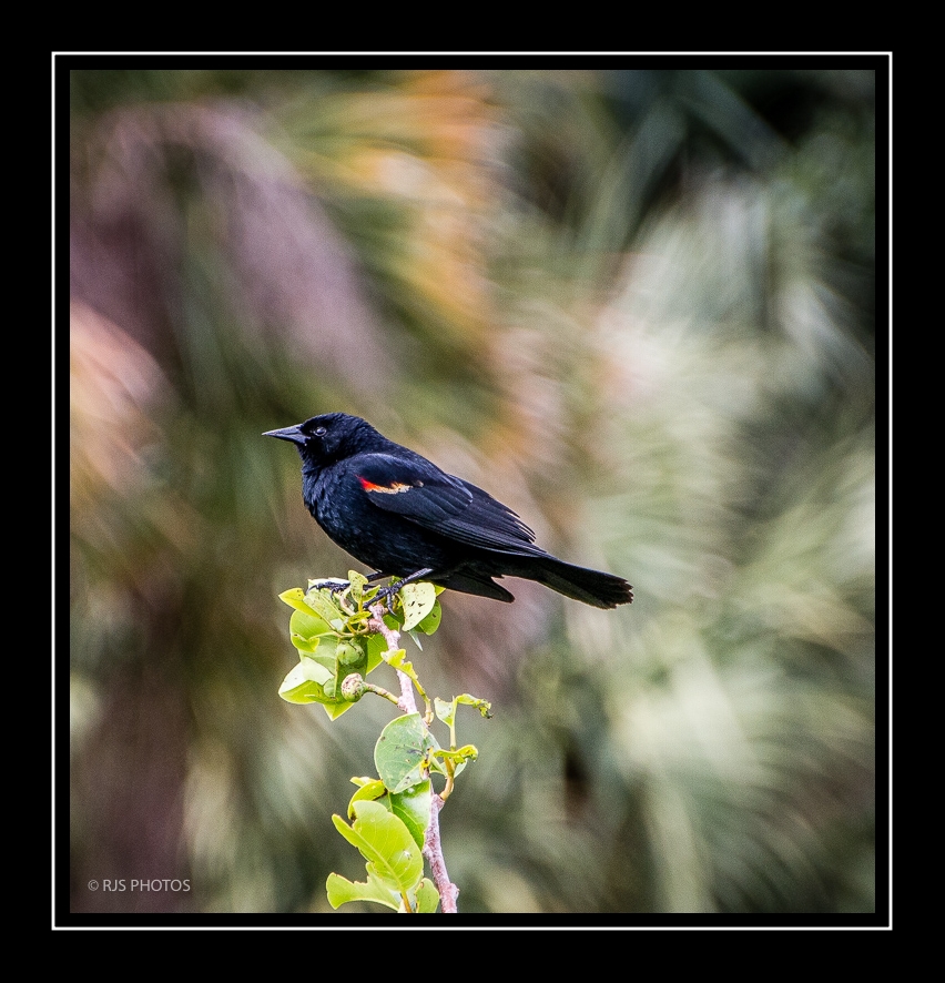
Hello Randy,
What an awesome photo of this Red-winged black bird! I like your background; what did you do to get the swirling effect? Your adjustment to cut down the highlights on the background has worked perfectly. I think your vignette is also done well; I can feel it but it is not noticeable very nicely done. I also like the crop in which you removed that leaf that stood out.
The only think this image needs, in my opinion, is a mat and frame! Because our dialog window is white, I chose a black mat so your image stands out. Hope you like it!
Best regards,
LuAnn |
Sep 1st |
 |
9 comments - 5 replies for Group 3
|
| 62 |
Sep 20 |
Comment |
Bob,
Can you go over to group 3 and take a look at Maryann's picture of the cityscape with the birds in the sky at the end of the comments I added a photo and I included clouds in it which is a first for me but I thought of you right away when I did it so could you please comment on it I'm just curious what you think of how I added clouds!
Thanks
LuAnn |
Sep 13th |
| 62 |
Sep 20 |
Reply |
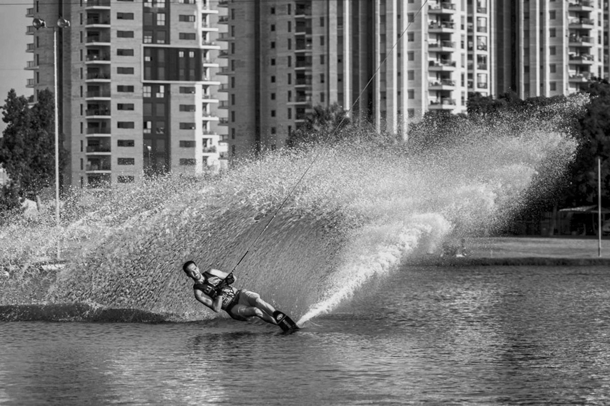
I kind of thought so. Add it to your camera bag especially when dealing with bright sun; I always carry one in my bag. The highlight in the water at the tail end of the ski looks hot. Don't feel bad forgetting it, we all forget something.
Shalom,
LuAnn |
Sep 13th |
| 62 |
Sep 20 |
Reply |
Yes, Oliver, I like your edit too! Turned out to be a great image for you.
Best regards,
LuAnn |
Sep 12th |
| 62 |
Sep 20 |
Comment |
Israel,
Did you use a polarizer filter?
LuAnn |
Sep 12th |
| 62 |
Sep 20 |
Reply |
I am very sorry to hear the virus is back in Israel; not good.
I am glad I was able to give you things to think about and that you liked my edit! I love to do research and I enjoy helping people when and where I can. If I ever get my husband to vacation in Israel, I will most definitely look you up, my friend!!
Best regards,
LuAnn |
Sep 12th |
| 62 |
Sep 20 |
Reply |
I am glad you like the photozine idea. If you do persue it, let me know. I am thinking of doing it for Christmas. We have 3 months to figure it out.
Best regards,
LuAnn |
Sep 12th |
| 62 |
Sep 20 |
Comment |
Bob,
It is fantastic to hear I found another user of Topaz!! I love that software more nowadays than I did a few years back. They have made great strides with AI technology.
I like how you edited using the Glow filter, Impressionistic, and Monet filters; these are all my favorites. I can see you achieved your goal from not so sharp to an image with some wow! I agree with Oliver that the boughs swaying makes the photo. Infrared photography is so intriguing; too bad, you have to convert a camera to achieve it.
I have a couple of points to consider. I see some blur in the upper left corner, upper right corner, and left and right sides just above the water that seems to be a distraction. Do you know why this is; I don't see it in original 2?
I do not have any other comment. Good work this month!
Best regards,
LuAnn |
Sep 12th |
| 62 |
Sep 20 |
Comment |
Great action scene, Israel, and bravo for you to try something challenging! You captured a great wave and excellent background to complete your story to capture sports in a residential area.
I found some additional info in your EXIF data that you used center-weighted average metering mode, and you used manual mode. Did you use a tripod or monopod?
When I zoom in a little on your photo, I find the image is soft. It also looks like some sharpening was added in post-processing; it is a bit too much for me.
Here are my suggestions.
I would shoot in shutter priority and start around 1/2000s for water skiing. With the fast action of water skiing sports, you will have plenty to worry about to get the shot. Sony is an excellent camera so trust your camera to balance your ISO and aperture.
Consider setting your ISO with a limit like 6400 at the high end. Every camera brand has its limitations for ISO so find out what yours is for your camera.
Try an aperture closer to f/5.6 - f/9 to reduce the softness. I couldn't tell if you used burst mode (high continuous shooting), but this would be good for fast-action sports. Your lens was a good choice because of the f/2.8 aperture.
I suggest multi metering mode (I believe that is what Sony calls it) instead of center-weighted metering. Multi metering divides the area into multiple areas and works out the exposure of the scene. If the scene is bright, the meter might underexpose, but you can quickly compensate with the exposure compensation dial to bring the exposure to the correct setting quickly.
I read that Sony has a highlight metering mode that takes exposure off the brightest part of the image and makes sure not to overexpose; do you use this feature? It sounds interesting and worth some investigation.
I hope this helps Israel. I wanted to give you some different ideas about shooting fast-action sports.
In my image, I started with the color version. I used software to adjust the highlights, then used a polaroid B&W setting and adjusted for accurate black tones. I sharpened at the end. I gave the image a new crop, so the man's head was positioned more on the rule of thirds lower left quadrant.
Best regards,
LuAnn |
Sep 12th |
 |
| 62 |
Sep 20 |
Comment |
Hey Gary, wonderful image!!
I want a Mamiya camera now. I agree with Oliver that this is a delightful image, and I would not change anything. This photo is a classic that needs no modern-day correction in my humble opinion.
I love the grain, the color is you, Gary, and seeing her missing leg brings tears to one's eyes, so you have an emotional impact. She had a great spirit to pose for you-what a beautiful dog. Do you have more images of her?
Best regards,
LuAnn |
Sep 11th |
| 62 |
Sep 20 |
Comment |
I like your back alley photo this month, Leah! Nothing beats black and white photography for me I just love this type of work.
Your EXIF data tells me that your ISO was 200, aperture f/5.6, shutter 1/2000, spot metered, and shot in Aperture priority. Your lens was 21mm.
I think this is an interesting scene of emptiness in a city. This photograph fits the atmosphere we are living with the virus that is keeping us indoors. I am not bothered by the wires. I did look closely at them in Lightroom, and it appears that most of the wires are bi-colored. The wires were an element that caught my eye and held my attention when I viewed your image. I also like the one-point perspective as it draws the eye into the photo. I agree with Emil about brightening the road.
My only comment is to go out and shoot more scenes like this and make a photo zine. A zine is short for small magazine of photos produced by a single person. Sometimes, I have read, they make them on a photocopier. I have one from Paul C Smith titled, stolen moments. His is black and white with a variety of different scenes in it. His book is 5 3/4" x 8 1/4." When you open a page he has 3 images of different sizes of a beach scene. Then turn the page and it is 2 images of a horse and rider shillouette. He was creative and spread some images across both pages with a small photo on the edge. It's cool. I was thinking of doing this myself. It would make a great Christmas gift.
I look forward to more of your work, Leah!
Best regards,
LuAnn |
Sep 11th |
| 62 |
Sep 20 |
Comment |
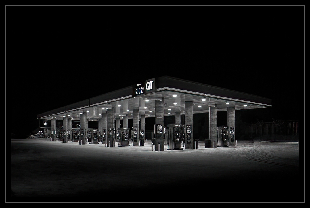
Hello Emil,
I enjoyed viewing your photograph of this Quick Trip gas station. When I look at your image, I see an artist with a sharp eye and impeccable attention to detail; pillars are well space to convey depth in the photograph. Your approach to remove the extraneous light sources and objects gives the viewer insight into your photography style. I see originality and a modern personal point of view when looking at this classic scene.
For me, the only troublesome area in this photo is the border and sharpness. Because our group views images on a black background, I have no idea where the boundaries are to your image. I added a subtle grey pinstripe to define the perimeter. This border idea may not be part of your style, but I offer it as a suggestion.
Best regards,
LuAnn |
Sep 11th |
 |
| 62 |
Sep 20 |
Comment |
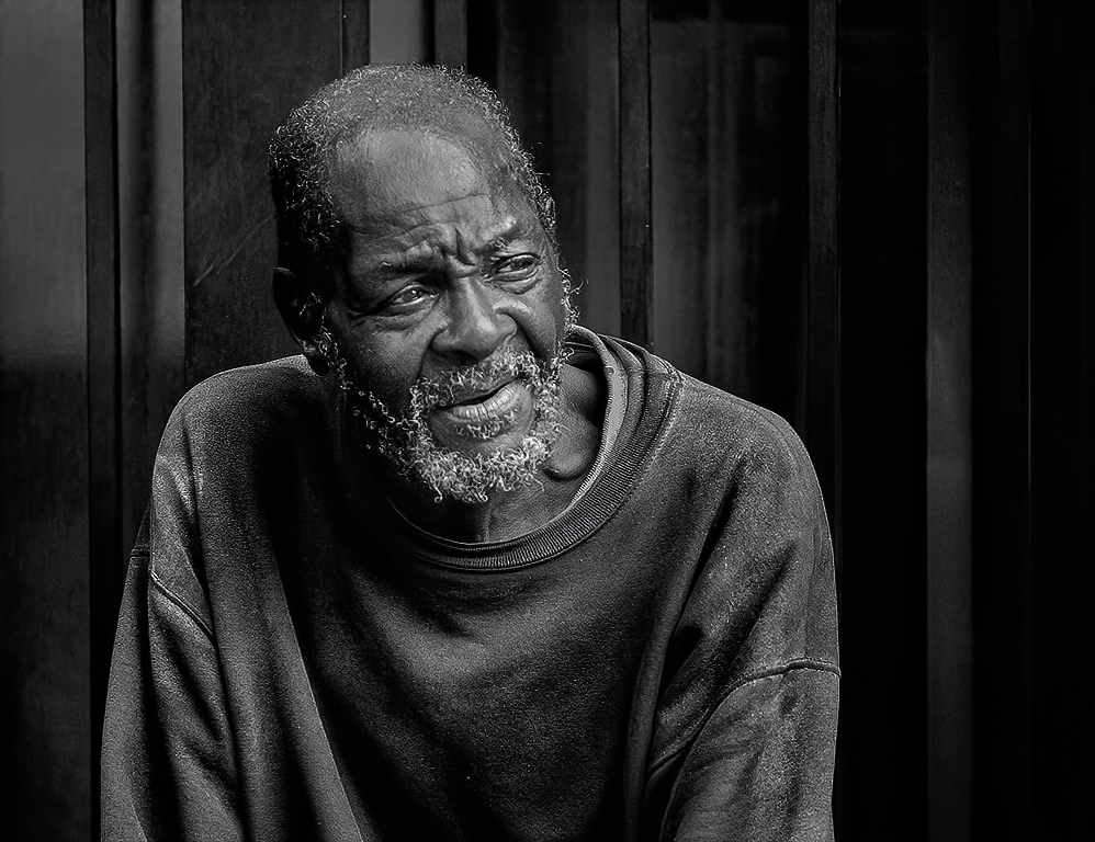
Car photography, wow, I have never tried that!
This is street photography with a twist, my friend, nicely done! Did he even know you took his photo?
You captured a nice minimal scene and there are no distractions just your subject. You caught a very natural pose with lots of character showing through in the details on his face. I think the vertical lines in the background are a nice compliment to the smooth curves of the man and his clothing. You also caught him with a nice tilt to his head and allowed plenty of space on the right side for him to gaze into.
I tried my hand with an edit. I used several different software applications including my favorites, Topaz Suite for Adjust AI, DeNoise AI, and Sharpen AI. Then I worked with Anthropics Smart Photo Editor to try and reduce the shine on his forehead and bridge of nose; and I also reduced the contrast which seem to remove some of the shine. When I compare my edit with yours I think the man may standout more because the tones of his clothing seems more separated from the background.
Tell me what you think.
Thank you for the opportunity to work with your image.
Best regards,
LuAnn |
Sep 11th |
 |
| 62 |
Sep 20 |
Reply |
Thanks, Bob, for including your slider detail; I appreciate it! I used to have Luminar maybe I should see if it still works on my computer.
Your image looks brighter and doesn't feel as heavy as mine does with the brights turned down. I do like the removal of the dead tree; good improvement.
In Oliver's edit I like how he darkened the side of the mountain in the background on the right.
I have received some great advise and now I need to give it a whirl myself. My husband wants me to print him a copy for his office.
Best regards,
LuAnn |
Sep 4th |
| 62 |
Sep 20 |
Reply |
Thank you, Leah, for your comment. I found your POV about some landscapes having an empty feeling quite interesting. Would you be thinking of all the landscape images that have only necessary elements included and the rest removed; minimalism?
I, too, like the noise in my image. Bob is probably our resident expert in the group on black and white photography with noise/grain back in the film days (he was a photojournalist for a newspaper, I believe). Modern cameras and photographers' styles moved away to cleaner images when the DSLR came about. I love antiques and anything old, so maybe that is why I am interested in the grainy look, but I have to learn how to use it. It brings about texture, and I like to feel what I see sometimes; I think this adds to an image's impact. I enjoyed the chat!
Best regards,
LuAnn |
Sep 4th |
| 62 |
Sep 20 |
Comment |
I printed the first version of this image on Epson Ultra Premium Luster paper and for a black and white it has potential in print.
Does anyone have any suggestion for a paper choice for printing a black and white like this image? I tried Moab Entrada Rag Natural 190 matte paper but I did not care for the way it handled the blacks. I know some photographers prefer matte for landscapes; maybe when I get the blacks right this would look better on matte. What do you think?
Yes, Bob, f/4 was a bit wide for this shot. I have learned a great deal in the last 2 years about remembering to check my aperture and shutter speed; amazing how long the learning process can take--LOL!
The lens for this image was set at 32mm (48mm @ 35mm equivalent).
I appreciate everyone's help on my image; I value your advice.
LT |
Sep 3rd |
| 62 |
Sep 20 |
Reply |
I like your edit, Oliver. Can you explain more as to how you achieved it? Dodging and burning, radial filters, or specific sliders?
Now when I look at this photo, I can sense my eye is drawn into the center of the scene more.
LuAnn
|
Sep 3rd |
| 62 |
Sep 20 |
Comment |
Thank you Bob, Emil, and Israel, for your comments!
I still think there is something wrong with this image. It appears flat to me; nothing stands out. The scene is busy and chaotic; where does the viewer rest their eyes?
Can you show me what you would do to improve this image?
Think of this as a photo challenge for our study group, what would improve this photograph; dodge and burn, dehaze, structure, clarity, new crop, what do you see; if this was your image, what would you change?
As a study group, I am open to your critiques so edit away!
Best wishes,
LuAnn |
Sep 3rd |
10 comments - 7 replies for Group 62
|
19 comments - 12 replies Total
|


