|
| Group |
Round |
C/R |
Comment |
Date |
Image |
| 3 |
Aug 20 |
Reply |
I see your bio now, thanks Mary!
I really enjoy Topaz Suite and you will too. I am amazed at how well it corrects noise.
You can do a lot with your little hummingbird photo so I am glad we came up with lots of ideas in a short amount of time.
Best regards,
LuAnn |
Aug 22nd |
| 3 |
Aug 20 |
Reply |
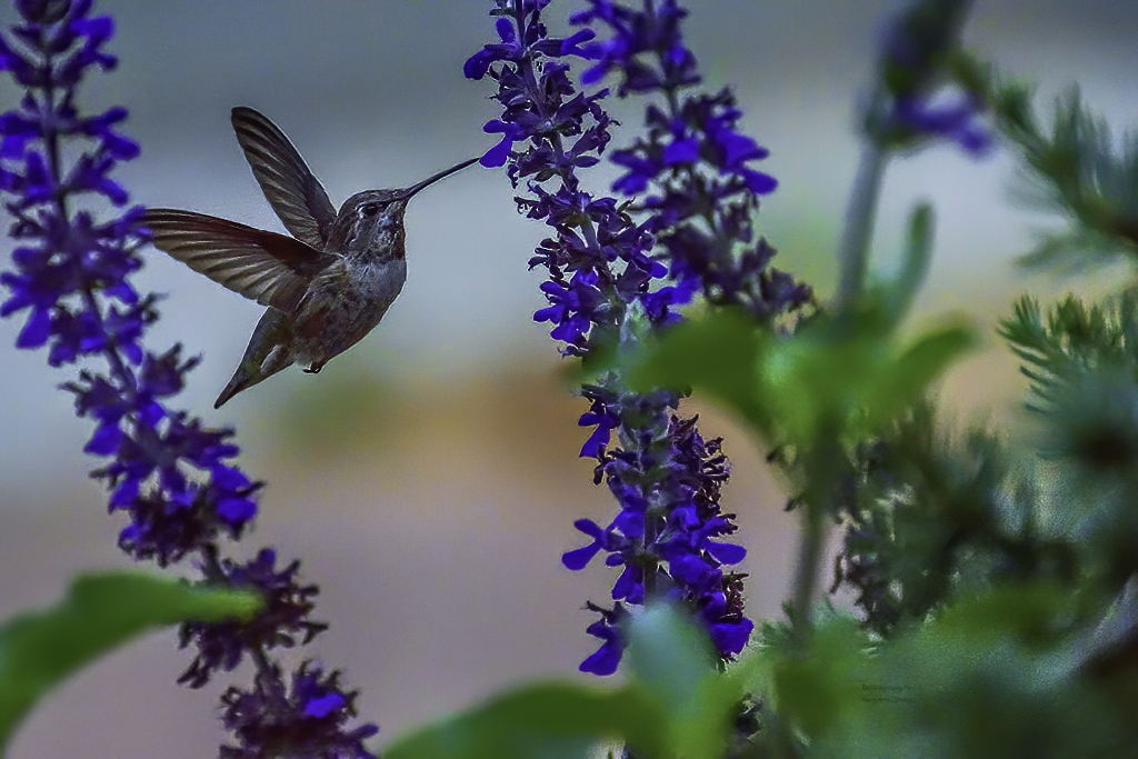
Looking good, Mary Ann!
On this one I used denoise AI Clear, and remove noise set to Hi.
Then I ran it through Topaz Sharpen but selected for Focus tab and set sharpen slider to 25.
I love Topaz suite. I tried a different crop than you. Mine is a square crop.
Love helping you work on this image!
PS: I am working on getting your photo uploaded. I had to call for help.
Best regards,
LuAnn |
Aug 21st |
 |
| 3 |
Aug 20 |
Reply |
The image displays really big, is it sized as a 1024 px? |
Aug 21st |
| 3 |
Aug 20 |
Comment |
Mary Ann,
I have a great video on YouTube by a Steve Perry who is an amazing bird photographer. I used to watch him for details on camera settings when I had my Nikon gear. Check out this video on YouTube: Bird in Flight Photography - Crash Course! It was published May 16, 2020. He talks about shutter speeds based on size of birds and gives advise on all settings. The best part is he has a hummingbird photo that he talks about.
Check it out when you have time.
Best regards,
LuAnn |
Aug 21st |
| 3 |
Aug 20 |
Reply |
Shooting in manual will help with your bird photography.
I believe bumping the shutter speed to 1/8000 was overkill. I suggest starting with the most critical setting, and for birds, it is your shutter speed. So next time, set the shutter first to 1000-2000 for a hummer.
Then try to keep the ISO as low as you can, or you will introduce noise. Lastly, set your aperture to balance the three. It will be the light of the day that will allow you to use your ideal camera settings. Cloudy and overcast days make us more creative with camera settings.
I look forward to seeing your next bird photo!
Best regards,
LuAnn |
Aug 21st |
| 3 |
Aug 20 |
Reply |
Ruth,
A tighter crop is a great idea. Do you have time to share an example of what you are thinking? If she does a tighter crop, will that introduce more noise in the image?
LuAnn |
Aug 21st |
| 3 |
Aug 20 |
Reply |
That's a nicely balanced crop, Lisa.
Randy, what do you think?
LuAnn |
Aug 21st |
| 3 |
Aug 20 |
Reply |
Lisa,
Do you think, in your new crop, that the perspective of the image is off? The ceiling has a look and feel it is tilting towards the window. The right side of the frame is straight, but the right side of the arch was eliminated in the tight crop. I think the sense of balance is off now. What do you think?
Mary Sue, what are your thoughts?
LuAnn |
Aug 21st |
| 3 |
Aug 20 |
Reply |
Ruth,
Can you do a quick edit to show us what you mean when you say to enhance the lights in front of the window and the alter area? If you enhance the window light, won't that stop the viewer's eye from going to the alter area because the window light is so white?
LuAnn |
Aug 21st |
| 3 |
Aug 20 |
Reply |
Lisa,
Are you talking about the flash that comes with your camera or do you mean you use a speed light mounted on a hot shoe?
Do you by any chance have any sample images to share that would put a picture to what you are thinking?
LuAnn |
Aug 21st |
| 3 |
Aug 20 |
Reply |
Larry,
Do you have a sample image you could show us when you used a flash in bird photography? I don't think I have seen a photo with flash and birds. It seems to me it would frighten the bird from returning to a feeding or nesting location.
Secondly, what would your new crop idea look like? It sounds interesting can you submit a sample?
LuAnn |
Aug 21st |
| 3 |
Aug 20 |
Reply |
Kieu-Hanh,
Do you have time to do a quick edit to show our new member, Mary Ann, what you mean a new crop might look like?
LuAnn |
Aug 21st |
| 3 |
Aug 20 |
Comment |
Hello Mary Ann,
Welcome again to Group 3 it is good to have you here!
I tried my hand at editing your image with Topaz Denoise. Tell me what you think of this edit.
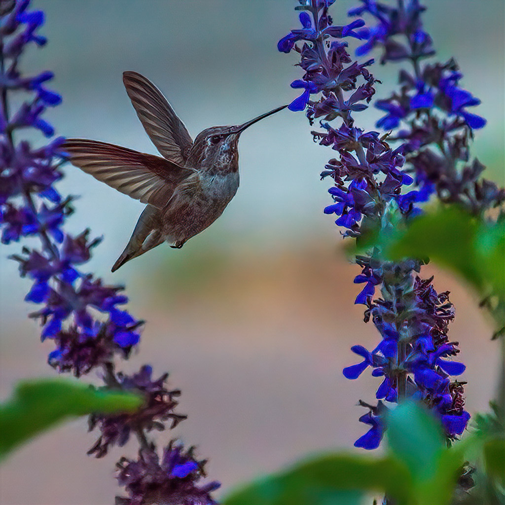
Tell me also about how you set your camera settings when photographing birds. Do you shoot in shutter priority, aperture, or manual? I am curious how you came about with ISO 2000 so help me out and we will figure this out. I am guessing you were in a priority mode and not manual.
I would recommend setting your ISO as low as you can say 100 - 800 depending on the light in the day. Then set your shutter speed to 1/1000 or up to 1/2000. Last, set your aperture to a setting that gives you enough light on your subject. If you can't get enough light with the aperture dial, then raise the ISO. I don't recommend shooting hummingbirds with flash. For one thing, it will frighten the bird and the flash doesn't look natural.
I have photographed a hummer a few years back at 10:30 am. My settings were Nikon D7000, ISO 800, 1/2000, f/6.3 my lens was 600mm.
Lets start our discussion with these parameters and see what we can figure out for you.
Best regards,
LuAnn
|
Aug 20th |
 |
| 3 |
Aug 20 |
Reply |
Thank you, Tom, for your kind words and for visiting us at group 3 today!
LuAnn |
Aug 16th |
| 3 |
Aug 20 |
Reply |
That is an excellent idea, Oliver, to compare the image with and without the texture; thanks for suggesting that!
Kieu-Hanh, do you have time to show us the with and without texture on this image?
It is very beautiful.
LT |
Aug 15th |
| 3 |
Aug 20 |
Reply |
Will do, Ruth, and thanks for helping the group keep our dialog going :-)
LT |
Aug 15th |
| 3 |
Aug 20 |
Reply |
Very interesting note, Bob, about sky replacement and light and mid-tones skies. I did not know that.
My light beam was a simple radial I believe that you can make them in Lightroom. It has been a while since I made this image and I am not a regular LR user so I forgot the steps right now. I know it is on YouTube somewhere.
Oh, adding fog for me is in the bucket with replacing a sky-hahaha! Sorry I had to laugh at myself there. I know I need to learn how to do these things because everybody does them.
Gee, if we lived closer to each other it would be fun to go for a walk and do some photojournalism with you, Bob. I know you are a seasoned pro and if I have questions, you will be the first person I look up for help.
Thanks again for visiting group 3!
Have a great day, my friend,
LuAnn |
Aug 15th |
| 3 |
Aug 20 |
Reply |
Now it's coming back to me about using matrix metering, thank you Bob for your comment.
When I shot Nikon I usually used matrix. But then when I started doing kickboxing tournaments shooting ringside I had to switch to spot metering. After that, I switched to street photography and that is all I use now I shoot manual setting and spot metering. This method helps me focus on the highlights to get the shadows I want.
I will keep those settings you use in mind when I go do a workshop this month on woodland photography. Matrix metering may be the way to go for me then.
Best regards,
LuAnn |
Aug 15th |
| 3 |
Aug 20 |
Comment |
You have a grand photo this month, Randy, and it has an amazing story. It turns out; the sculptor is Timothy Schmalz from Canada. According to his website, he creates a lot of sculptures for churches. He creates them as visual prayers, and he says, "the best compliment these sculptures receive is to amaze and fascinate the cynical youth of today."
I do find it interesting, though, that in the online church brochure, they refer to the body of Christ hanging on a red-oak cross as a Bronze Corpus. The brochure says the image may call to mind the two criminals crucified with Christ or the three persons of the blessed trinity; I have not heard of that version before. Suffice it to say he does have 'Wow' in his sculpture.
Regarding your captured image, we are usually told not to center the subject in the image as it makes it feel static, but as you know there are always exceptions to the rules. I believe you captured the scene well you have the steel arches in the frame, and all is in balance.
The only thing that stands out in this version is the lights in the lower-left corner, and a tiny bit on the right. A new crop may fix that for you.
I do love the 'Original 1' image because of the other elements in the photo and how well they contribute to the whole photograph. I like seeing people in the image even if it is the back of their heads. The candles on the walls are great, the ceiling structure, the pews, statues at the altar, and so on are all excellent elements to tell the story of a modern church. I do not see anything in the 'Original 1' photo that is distracting.
I hope this was helpful, Randy. I look forward to hearing what you think.
Best regards,
LuAnn
|
Aug 13th |
| 3 |
Aug 20 |
Reply |
Thank you, Ruth, for your comments!
Initially, I did put a beam on the light in the lighthouse, and I agree with you it looks like it could use a beam of light. It seemed the right thing to do at the time. But, I was told by an international judge to remove the shaft of light as it was not natural because it did not match the atmosphere in the sky and clouds.
She believed it looked added and not natural; there would be signs of light in the clouds if it was there naturally. I found that evaluation very helpful, though I did feel like a kid in the candy store who just got caught with my hand in the candy jar when I received the critique - hahaha!
I still think about going back up to Lake Superior this fall; it's a long drive from where I live. This lake is the most scenic place in all of Minnesota. I am going up for a one-on-one workshop with a landscape photographer soon, so I am looking forward to learning things about landscape photography that I can then share with the group.
Best regards,
LuAnn |
Aug 13th |
| 3 |
Aug 20 |
Reply |
Hello, my friend Bob from group 62! Thank you for your visit!!
I am curious about your comment to shoot in the matrix mode. Do you shoot with a matrix mode mostly for landscapes? Yes, I probably metered for the lighthouse, which was the star of the show.
Can you explain more for the group, as to why you would shoot matrix and what you would expect for the outcome?
Please do share with me why you would use ISO 400, and how would it capture more details? My settings were: 1/15shutter, f/8, ISO 200, f/8 at 32mm on an f1.8 lens. I was always under the impression of using the lowest ISO on landscapes, but I would like to learn more, so do share.
Yes, I agree the branches could/should be removed-this photo I took three years ago, so I have learned that valuable lesson.
Yes, Bob, I know you would change out the sky, and you are the master, so your sky replacement would be excellent! I lean more towards street photography, so I shoot them as I see them.
I am glad you came to visit and I know we can all learn from your experience. I hope the members of this group get the chance to check out Bob's images in Group 62.
Best regards, my friend,
LuAnn
|
Aug 13th |
| 3 |
Aug 20 |
Reply |
Hello Kieu-Hanh, and thank you for your comments.
I did my editing for this image in Lightroom Classic. I made this photo in November 2017 with my other camera, Nikon D7000. I have learned so much since I made this image, but here goes with what I knew at the time.
The changes I made to the white balance were to increase the temperature by 2,000 kelvin (upped to 8,325) and increased tint by five. This change gave the image warmth.
Exposure and contrast changes were minimal at +35 and +10, respectively, improving the brightness.
Highlights -100 and shadows +100 allowed for the shadows to be open up, and then I increased whites by 59 and subtracted blacks by -23. Clarity, vibrance, and saturation were adjusted minimally; now, the over-all image color looked balanced.
I adjusted the highlights mostly in the tone curve, followed minimally by lights, darks, and shadows; these are the tiny tweaks that help what I did above.
I used all three HSL slider categories (hue, saturation, and luminance) until I achieved the colors I was after, mostly with the red, orange, greens, and blues in the image.
Then I used split toning with 39/63 for highlights and 237/10 for the shadows. Sharpening was only by 51, and noise reduction, though I did not need this at ISO 200, it is set at 35.
I think the one thing that was a big help for me with this image back then was the lens. I had just bought the Sigma 18-35mm f/1.8 lens for Muay Thai kickboxing I was regularly doing at the time. All the photographers around me that night advised me to use f/8 as I did.
Finally, I cleaned the sensor spots; I used a gradient filter on the sky, I used radial filters to dodge and burn on the shore, the rock the lighthouse sits on, and break-water area at the shoreline. I also used the brush tool in one area center-left side of the frame.
I hope this helps you understand how I edited this image. Many things have changed for editing styles in the 2 1/2+ years since I made this photo, but what can I say.
Have a great day,
LuAnn |
Aug 13th |
| 3 |
Aug 20 |
Comment |
Hello Mary Sue,
The lighting in this image looks even, and the interior of the space initially appears well lit. I like how you were able to capture the ceiling, windows, patterned aisle, and pillars to give the image a grand impression.
It is my personal opinion that the POV is more of an architectural image rather than, as the title says, a photo of St Cecila Church Side Alter. What stands out as a subject to me could be the whole space with no particular subject visible enough to capture and hold my attention.
The foreground elements of the aisle and pews standout stronger as the subjects; their color and tonality are rich compared to the faded tones in the windows. The hue of the ceiling is good compared to that of the pews, aisle, and pillars.
The more I look at the image for its lighting (that was your first comment on the image in the description), the more it feels too bright. I notice this when I look at the pillar on the right; low contrast level.
Lastly, the side alter was important enough to you to have it in the title, yet the alter is so small no details can be seen.
These are my thoughts and impressions I hope they are helpful to you.
What were you looking to capture when you took this image?
Best regards,
LuAnn |
Aug 7th |
| 3 |
Aug 20 |
Reply |
Thanks, Randy, for your comments.
I have a link to a story on my website. I wrote a brief blog post telling about the adventure to the lighthouse. It is only open one time a year to commemorate the sinking of the Edmond Fitzgerald tanker that sank on Lake Superior on November 10, 1975. Lake Superior is the largest freshwater lake in the world. They have made the interior of the lighthouse building a museum and gift shop now.
(https://www.luannthatcherphotography.com/travel/split-rock-lighthouse/)
It was a bone-chilling night, below zero, with 30 mph winds off the shore of the great lake (named Lake Gitche Gomee by the Chippewa Indians). We had to take turns walking around as our feet were numb from the cold. It's impressive the cameras worked. There were approximately 1600 people and a ton of photographers to photograph this event. Every year people line up. We were there about 2 1/2 hours early to get a spot for our tripods.
Best regards,
LuAnn
|
Aug 6th |
| 3 |
Aug 20 |
Comment |
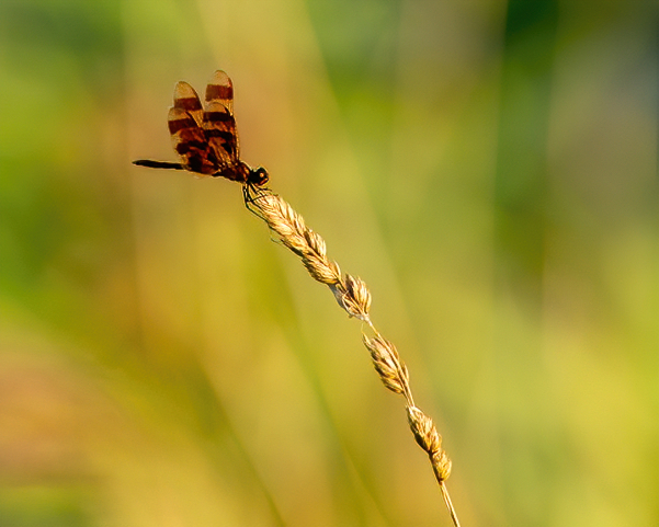
Hi Lisa,
I like how you captured the dragonfly on the tip of the grass stem. This positioning of your subject also makes use of the rule of thirds. The colors are all in a neutral palette, and you have an overall balanced image.
The only thing I added in my sample image was sharpening.
Nicely done for a quick shot, Lisa! |
Aug 6th |
 |
| 3 |
Aug 20 |
Reply |
If you do enter this image in the competition, let me know how you do.
I wish you great success,
LuAnn |
Aug 6th |
| 3 |
Aug 20 |
Reply |
Thanks, Ruth, for noting this is an image for the nature photography competition. That makes sense to leave the log then.
I wish you the best if you choose to enter this image. Do let me know how you do.
Best regards,
LuAnn |
Aug 6th |
| 3 |
Aug 20 |
Comment |
Do you have any concerns or questions the group can focus on as we discuss your image this month? Are going to submit this Lotus Flower image in competition? |
Aug 4th |
| 3 |
Aug 20 |
Comment |
Hello Kieu-Hanh,
I love your image this month it's color is very intense and has a noticeable impact upon viewing; I am captivated by the detail in each petal. I love how you post-processed your image; can you explain what software you used to apply the texture?
The creamy center of the flower is lush and the texture of the veining is very eye-catching. The few water droplets add a finishing touch. I also find the soft bokeh background to be perfect, with only a hint of light in the circles behind your lotus flower.
I have nothing to add; I like your image as you have presented it. The only thing I can think of is, adding a little space above the flower. I sense the photo is ever so slightly top-heavy.
How do you think your image came out? Do you have any concerns or questions about this presentation?
Best regards,
LuAnn |
Aug 4th |
| 3 |
Aug 20 |
Comment |
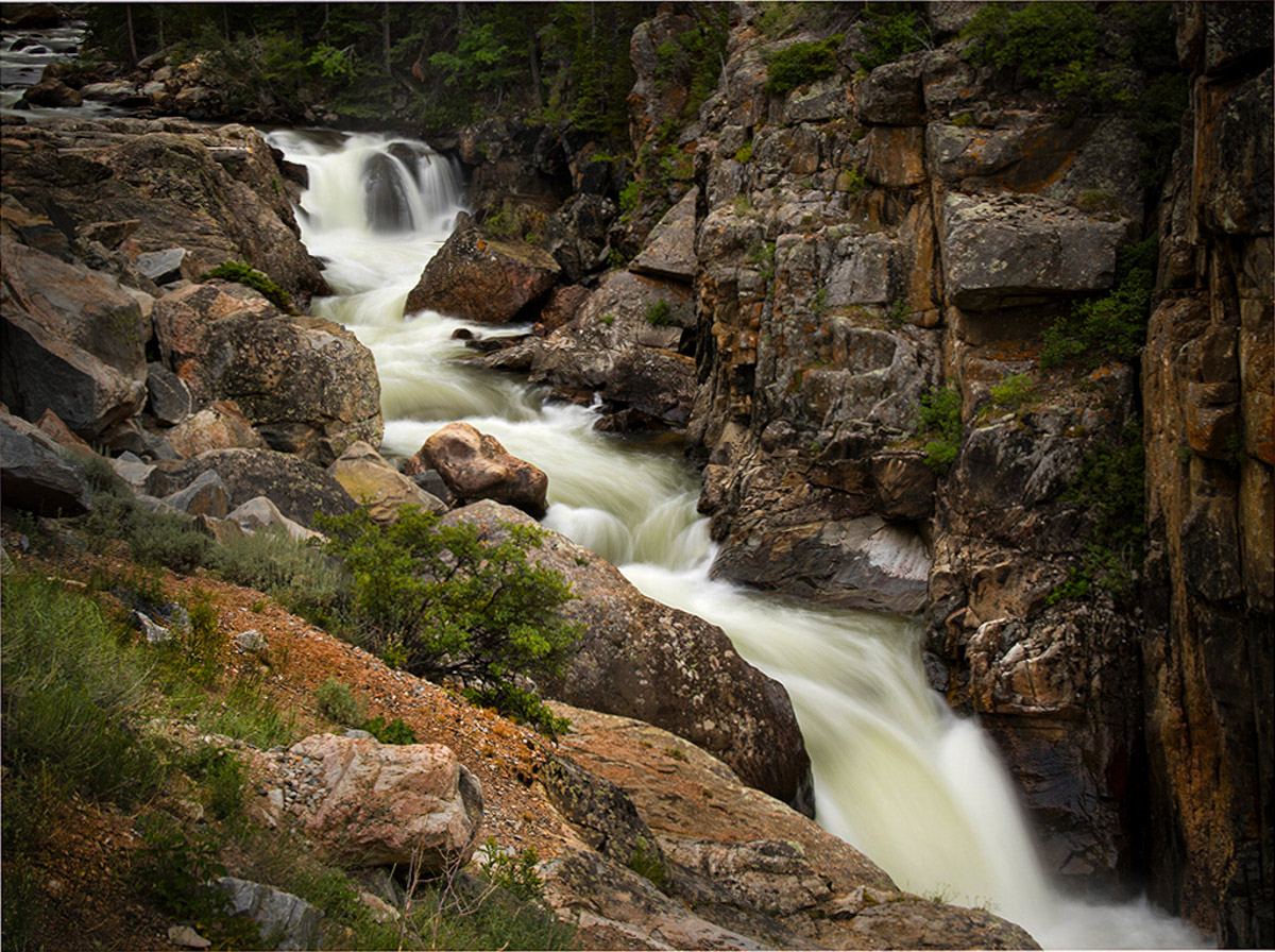
Ruth, did you use a filter on this long exposure? In my opinion, you did capture the silky water with detail as you set out to do.
This image, for me, has an immediate Wow factor. My interest immediately wants to wander around and study all the rocks, the water flow, and canyon walls. Technically you have made good use of the rule of thirds with the diagonal. My eye sees the beautiful flow of the waterfall, you have filled the frame with what is necessary, and you have great lighting. I see good foreground interest with the complimentary red/orange rock and minimal greenery. I agree with your choice of natural editing; it helps this image come alive.
On my sample image, I removed the log that crossed the falls upstream in PS unnecessary distraction and straightforward fix. I used a gradient filter around the top, left side, and bottom left corner. I darkened the upper left corner; I don't see why you would have to remove or crop the upper left corner to remove the water flow; I anticipate some will recommend it. I personally see it as part of the story; remember, it is "ok to break the rules!"
The only other thing I did was very minimal; adjusted highlights -2, texture and clarity +4, vibrance +10, played with the hue on the red, orange, and green a tiny bit to bring out the foreground element noted above and the red in the canyon wall. I also used LR brush tool and darkened some of the streaks in the water just ever so slightly.
How do you think your image came out, Ruth? The edited version is quite different from the original; what software did you do your edits with?
Looking forward to a great discussion on this image this month!
Best regards,
LuAnn |
Aug 3rd |
 |
8 comments - 22 replies for Group 3
|
| 48 |
Aug 20 |
Reply |
The flower color is a pinky purple on my screen. Pink is just a favorite color to me.
Have a great day, Bev,
LuAnn |
Aug 10th |
| 48 |
Aug 20 |
Comment |
Bev,
Is the edited version the same flower as the original? They look different; the spots are different, and the yellow lip is red in the edited image. Just curious.
Pretty flower and the colors in the palette are complementary.
To me, the sky background seems busy and competes for attention with the pretty pattern on the petals. Have you tried a more blurred textured background without a cloud formation? If you notice, the figure-ground relationship between the white in the background on the right and the pink flower is pulling the viewer's eye away from the subject. In addition, the beige tones (lower right) seem to lean to the orange tones pulling the palette in a different direction than needed.
Hope this is helpful.
Best regards,
LuAnn |
Aug 9th |
1 comment - 1 reply for Group 48
|
| 62 |
Aug 20 |
Reply |
I just looked at your edit again, Leah, and the first word that came to mind was 'hamburger.' How crazy is that. But, thinking about your tighter edit, it does take away the fact that the shadows were on a rock. But what does it tell the viewer the subject is now? Yes, an observation is a subjective opinion and I am sure not everyone will see a hamburger, but what do you think of the new implications the tighter crop gives your image?
Just a thought to ponder. |
Aug 21st |
| 62 |
Aug 20 |
Reply |
What a great observation, Oliver. So you are suggesting more of a dodge and burn effect to the edit to bring the flower to the fore front. I can see where using this idea would be helpful in any image where the subject needs more prominence.
Best regards,
LuAnn |
Aug 21st |
| 62 |
Aug 20 |
Reply |
Thanks for that information, Oliver, I will give it a try. I do dapple in Photoshop some I guess I just have to do it more diligently.
You also have the opportunity to refine your selection, correct? I think this is the biggest obstacle that keeps me from doing advanced edits with my photos; the selection tools don't always get the tiny details we are looking for when doing competitions.
Best regards,
LuAnn |
Aug 13th |
| 62 |
Aug 20 |
Reply |
You make a good point, Leah, about how we see things differently in images.
When I look at the tree stump now, it reminds me of a person standing on the shore reaching out to the two posts in the water - silly me.
Maybe I need to get out more.
Have a great weekend!
LuAnn |
Aug 9th |
| 62 |
Aug 20 |
Reply |
I agree with you, Leah, this is a beautiful black and white conversion of a sunflower. Emil has done an excellent job with the details and as you said, allow the viewer to see the flower in a totally different way.
LuAnn |
Aug 9th |
| 62 |
Aug 20 |
Comment |
Yes, I like your edit as well. Now it's your pick. Glad I could help.
LuAnn |
Aug 8th |
| 62 |
Aug 20 |
Reply |
Thanks for your reply, Gary, I always enjoy hearing your point of view.
Best regards,
LuAnn |
Aug 7th |
| 62 |
Aug 20 |
Reply |
Thank you very much for your comments, Bob! I will have to go back to what if I captured any additional frames, a good idea.
LuAnn |
Aug 6th |
| 62 |
Aug 20 |
Reply |
You're cute, Gary, yes getting up nowadays can be a challenge from certain angles - hahaha!
I purposely cut the man's leg off on the right. There was noticeable light by his knee that would be a distraction, so I cropped him that way. He is not a prominent figure in the scene, but he does play a part because of his non-interest in the pig.
You will see a lot of the classic images taken by street photographers like Gary Winogrand (as an example), where he cuts people off on the edge of the frame. Sometimes it's half their face, or all you see is their elbow in the foreground. These old-style photographers saw these elements as crucial to the telling of the story of the street scene. They also contribute to the photographer's style and make him stand out from the rest.
Do you think, Gary, that this edge rule can be broken? I look forward to your discussion, my friend.
Best regards,
LuAnn |
Aug 6th |
| 62 |
Aug 20 |
Reply |
Yes, your clouds do work well in this scene because you have turning waves. They go together to enhance the moment.
No, I am not one to add clouds to my images. I tend to be a more natural style photographer, and I enjoy documenting places as I saw them that day. Neither style is more right than the other it's just what appeals to us is different. We surely wouldn't want to all be the same, so this is all good.
You have a great day, my friend, and I look forward to more of your sky images!!
LuAnn |
Aug 6th |
| 62 |
Aug 20 |
Reply |
Have you ever printed an image? They typically come out darker than they do for screen viewing. So you will have to adjust for printing. Shadows will be darker than on this group site.
LuAnn |
Aug 6th |
| 62 |
Aug 20 |
Comment |
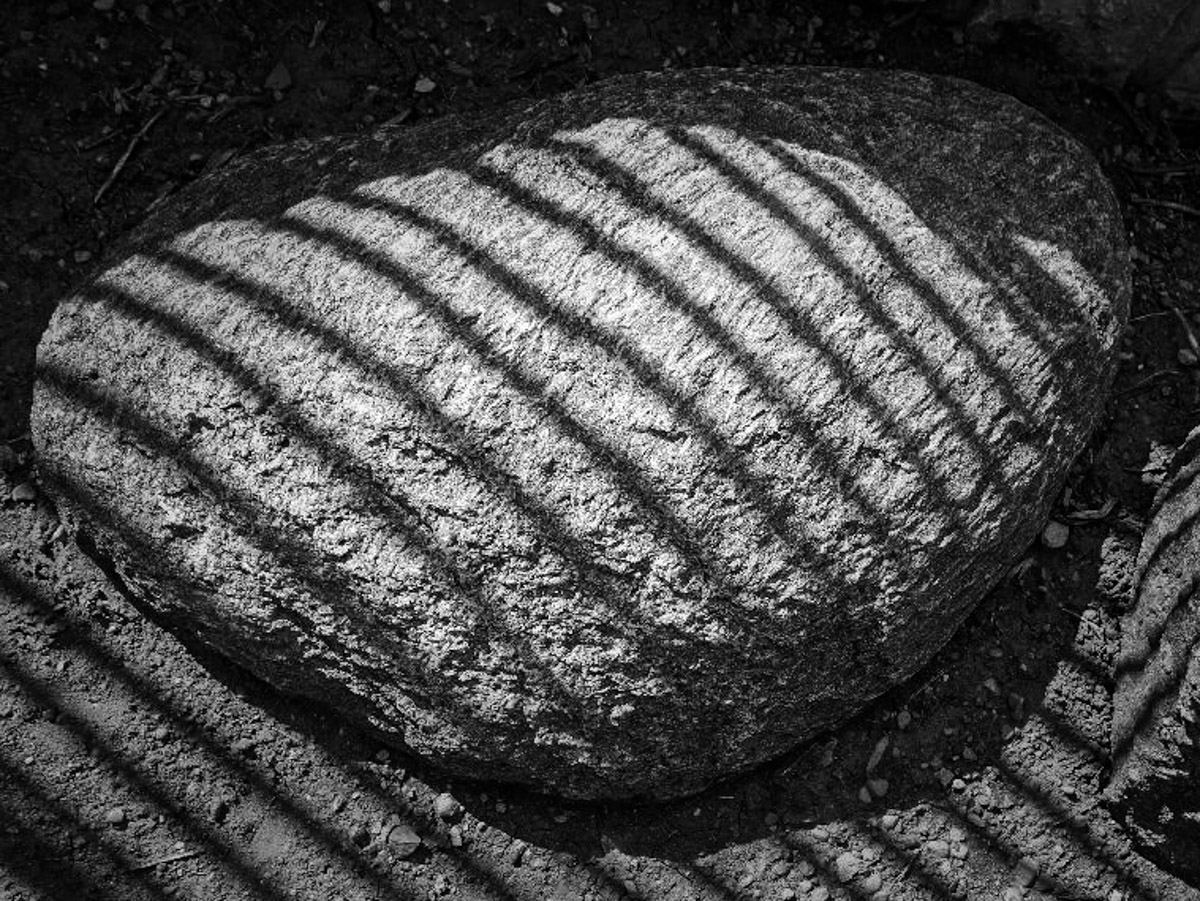
Hi Leah,
Great project idea, photographing shadows of different elements.
I get the sense from looking at this image, that the perspective is off. I also see more elements in the image than are necessary to tell this story of the big rock and its shadow.
Check out my sample edit and tell me what you think.
Best regards,
LuAnn
|
Aug 6th |
 |
| 62 |
Aug 20 |
Comment |
Hi Israel,
I agree with Emil, and your corrected image sample does exactly as he said it would. Wonderful image. I bet when you print this image, it will look awesome in a larger size than what we can view in this group setting.
Best regards,
LuAnn |
Aug 6th |
| 62 |
Aug 20 |
Comment |
Hello Bob,
Love the clouds; you are a master with this technique! Did you notice the faces in the clouds? I watched a workshop not too long ago, and the author was commenting on faces in objects, now I can't stop looking for them - hahaha!
I think the clouds behind the lady help her stand out (figure-ground relationship) and work to your advantage. Love the wall; it is stable in its place and not going anywhere, an essential element to your image.
Well done,
LuAnn |
Aug 6th |
| 62 |
Aug 20 |
Comment |
Hello Gary,
I hope you are doing well-a wonderful image, very peaceful and serene. I have to agree that the viewer's eye is being pulled out of the frame on the left side.
My image does correct the problem, and we all seem to agree with Emil. It is a straightforward fix. I did add more to the right side of the image to give the stump more space.
When you make the correction, take the shadow areas of the posts into consideration when you remove them.
Best regards,
LuAnn |
Aug 6th |
 |
| 62 |
Aug 20 |
Comment |
Hello Emil,
You are a sky lover like Bob, and you have an excellent sky replacement in this image. You have good tonality in the black and white tones. The center of the flower is sharp and detailed very nicely. I even see a face in the sky behind the flower in the top right corner.
The only thing that is standing out for me is the lower section of the flower under the petals. The foreground area seems too blurry. With the sky replacement, the foreground blur doesn't match the background that is in sharper focus. I am sure this will be an easy fix for you to blend them.
Hope this helps.
LuAnn |
Aug 6th |
| 62 |
Aug 20 |
Comment |
Hello Oliver,
Great image this month. Can you tell me more about how you inverted the selection to darken the background? I don't use Camera Raw but I have tried it once or twice. General setting clarification would be helpful.
I do like your image it is minimal with no distractions. The coat behind the sax player works well (figure-ground relationship), making the saxaphone player stand out in the eye of the viewer.
I do not see anything I would change. Bravo for all your hard work!!
Best regards,
LuAnn
Your finishing touches with Nik software are classic to your style. |
Aug 6th |
| 62 |
Aug 20 |
Reply |
Hi Emil,
Thanks for your thoughts. I did note in the 'About the Image' section above that I intentionally left the man walking away in the frame because I thought he contributed to the story. It is interesting what captures the eye of a child was oblivious to this man. Perhaps one has to be a child to understand the attraction of a concrete pig.
What are your thoughts, Emil, for storytelling in a street photography image?
Talk soon,
LuAnn |
Aug 3rd |
7 comments - 11 replies for Group 62
|
16 comments - 34 replies Total
|


