|
| Group |
Round |
C/R |
Comment |
Date |
Image |
| 3 |
Jun 20 |
Reply |
Thanks, Lisa, for your edit!! I really like how you envisioned this image to a horizontal versus vertical perspective. I am glad you had time to post this edit I really like it!
Best regards,
LuAnn |
Jun 30th |
| 3 |
Jun 20 |
Reply |
Hi Lisa,
I use Topaz Sharpen AI software. Because I like using textures, I have found that Topaz has a lot of software that is improved. My favorites include denoise AI, Gigapixel AI to increase the size of your image, and Sharpen AI. They use artificial intelligence somehow in these tools, and I am amazed at the Sharpen AI, how well it does sharpen images.
LuAnn |
Jun 30th |
| 3 |
Jun 20 |
Reply |
I have never done architectural photography but have several friends that do. I am glad I could offer some help.
LuAnn |
Jun 24th |
| 3 |
Jun 20 |
Reply |
It is ok, Mary Sue, if this image is not of your taste, I understand.
PSA Digital study groups do include this genre, and they call it Creative, also known as Altered Reality. When you have time, check these study groups out on this website to get a feel for what others are doing in PSA Digital groups (group 18, 20, 21, 34, and 41).
This genre is new to me also.
Have a nice day,
LuAnn
|
Jun 24th |
| 3 |
Jun 20 |
Reply |
Thanks for your thoughts, Stephen. This is a very interesting way of looking at an image that I would say many or most of us never think of considering. We look for rule of thirds, straight horizons, minimalism but really don't put any weight to the hidden story or petential of a story such as you noted.
I will definitely make note of your comments as I review images in the future. Thank you for bringing this to our attention.
Have a good day.
LuAnn |
Jun 24th |
| 3 |
Jun 20 |
Comment |
To all Group members,
Because all the buildings in this image are sharp and at the same saturation level, do you think this takes away from the subject, the little girl? I keep going back to this image to ponder the scene.
If the little girl is the subject, then she is actually too small in the frame. We can not see any details on her face though we can assume she is happy. Maybe a different crop to give her more prominence would be the answer or at least something to consider.
I would suggest cropping the yellow building and tree trunk away for starters to see what that does to bring the little girl forward.
What do you think group?
LuAnn |
Jun 23rd |
| 3 |
Jun 20 |
Reply |
Thank you, Kieu-Hanh, for your thoughts. Altered reality (or creative alteration as some say) is not everyone's cup of tea but that is why I am curious about doing it. I love change and believe nothing ventured nothing gained.
Have you ever used overlays? Perhaps this image needs a textured overlay to further it creatively, what do you think?
Best regards,
LuAnn
|
Jun 23rd |
| 3 |
Jun 20 |
Reply |
Randy,
What do you think about the color saturation of the people in the background? Do you think raising the saturation on them as Lisa did helps the image in any way?
Could you explain your vision on why you say to darken the stone lions as opposed to darkening the background if the lions were the subject?
I am just lookings for ways to keep this discussion going. It is with brainstorming that we can find new ways and ideas to enhance photographs.
Have a great day, my friends!
LuAnn
|
Jun 23rd |
| 3 |
Jun 20 |
Reply |
You are right, Randy, this is a great image.
But what could you suggest for her to enhance it even more?
Do the leaves in front of her hat bring tension into the image for you?
What about the brightness level in the background, do you see it being too bright?
What about a tighter crop? Does anyone think this would enhance the image?
Best regards,
LuAnn
|
Jun 23rd |
| 3 |
Jun 20 |
Reply |
Randy did capture a good composition here, Kieu-Hanh, as you noted. But what about the sharpness, do you think his image is sharp enough? What could you recommend he do to even further enhance this image?
These answers will help all of us in this study group to look beyond what we see even when we produce great images. I look forward to the groups discussion on this great image!
Best regards,
LuAnn |
Jun 23rd |
| 3 |
Jun 20 |
Comment |
Hello Mary Sue,
Interesting architectural image. Are you submitting this photo in competition?
What do you, Mary Sue, see as the focal point?
My initial thought is the image has nice curved lines running front to back. The subdued lighting leads my eye to the blue area in the background.
For me, I do not think the image as it is currently edited has enough weight to hold my attention because I am looking for a focal point. The histogram shows the color weight heavy in the black section.
The other point no one else has noted above is with regard to the bright lights in the foreground on either side of the bridge. These lights appear very bright almost too bright. My eyes seem to keep coming back to them instead of going through the image to background.
What do you see when you view this image?
Best regards,
LuAnn
|
Jun 22nd |
| 3 |
Jun 20 |
Reply |
Thank you, Mark, for the visit and your comments! I am simply experimenting with other options from the standard we all do. Variety is the spice of life sometimes.
Have a great day, my friend!
LuAnn |
Jun 15th |
| 3 |
Jun 20 |
Comment |
Fatih,
Your image is amazing. I love the story. You captured the little girl in mid-air in perfect timing and also captured her hair go up to emphasize her speed. The woman walking into the building seems calm so it must be a good day.
The hue of the building colors look natural and not oversaturated. The sky has detail and no blown highlights. I like the two cats too! Whatever you were trying to convey it comes across as a great day filled with peace.
Best regards,
LuAnn |
Jun 10th |
| 3 |
Jun 20 |
Comment |
Hello Kieu-Hanh,
I have to agree with Ruth on this image. You did a great job capturing the motion and the flag. The only thing I would add is adjusting the brightness. It appears to be mid-day and it is just a little bright. You could try using a radial filter and just darkening the background and leave the feeling of brightness on the rider.
Great job!
LuAnn |
Jun 10th |
| 3 |
Jun 20 |
Comment |
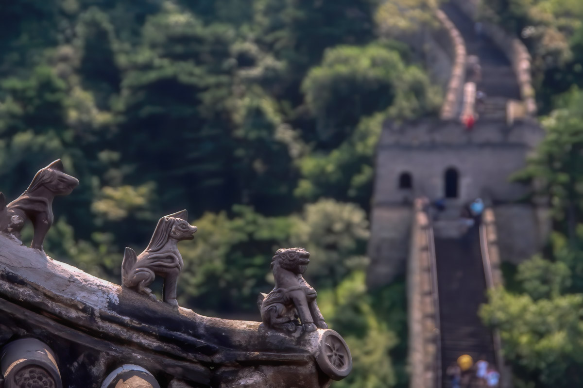
Hello Lisa,
China is a beautiful travel destination. The countryside has a spectacular view. The Great Wall, I have read, is more than 2,300 years old!
I am hopeful that you took lots of photographs from this location, both with a wide aperture and narrow aperture, so to have one with the wall in sharp focus for your travel competition.
The sample image I have attached I ran through Topaz denoise, sharpen, and added an Orton effect to it just for fun. It's just a suggestion.
The definition for PSA Travel says the image has to express the characteristic features or culture of a land as they are found naturally. With that said, my suggestion shows less saturation. The definition also says, close up pictures of people or objects must include features that provide information about the location. So with that, you have the wall. For me, I would want the wall in focus because it is the "Great Wall" of China, and because of its age, over the sharp focus on the little lions for a competition. But that is my subjective opinion. You will probably find judges with both opinions. In the end, it will come down to what your competition submits. I would lean towards the wall in focus.
In my image, I did not emphasize the color of the people on the wall because they are out of focus, and to saturate their colors would draw your eye to something blurry.
If you have entered travel competitions before, I would love to hear your thoughts on this idea.
Best regards,
LuAnn
|
Jun 10th |
 |
| 3 |
Jun 20 |
Comment |
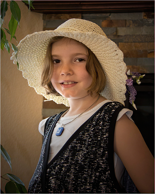
Hi Ruth,
Your granddaughter is beautiful, and your photograph came out great! Your image is well composed, and you selected a nice complimentary background.
The only thing I would suggest is to watch for things that overlap your subject. As an example, the leaf on her hat. The green leaf is in front of her hat, causing a small but noticeable distraction. That is just being picky, but tiny details are essential.
I like the plant next to her as it contributes to the story of being in a homey environment. Her skin tone shows the image was taken in natural light. You could use a radial filter to brighten her face a tiny bit. Double-check your white balance to make sure you have that in check as well.
In my sample image, I just added sharpening in Topaz Sharpen.
Best regards,
LuAnn |
Jun 10th |
 |
| 3 |
Jun 20 |
Comment |
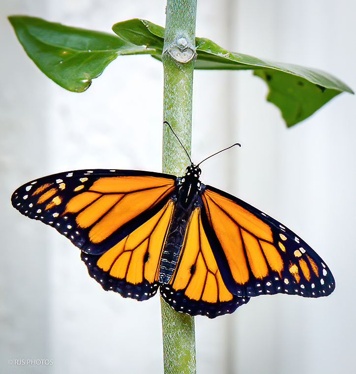
Hello Randy,
Love your butterfly. Nice POV, good color, limited distractions in the background. You did a fine job with this little beauty.
I am sharing a version I added some sharpening to but I do not see anything else that you need to do.
Best regards,
LuAnn |
Jun 10th |
 |
| 3 |
Jun 20 |
Reply |
Your comment was perfect, Ruth. It gives me things to look for when I figure out this type of photography.
Thanks for the help,
LuAnn |
Jun 8th |
| 3 |
Jun 20 |
Reply |
Hi Ruth,
Thanks for the comment! I did not mention it in my description but I am experimenting with altered reality so that is why the reflection doesn't look real.
help me out, can you further explain what you mean by "flower is too regular to look realistic?" This is good feedback for me.
Look forward to your reply.
LuAnn |
Jun 7th |
| 3 |
Jun 20 |
Reply |
Hello Stephen, That was the title Fatih gave to the image he sent me last month. I have not heard from him this month.
LuAnn |
Jun 6th |
7 comments - 13 replies for Group 3
|
| 5 |
Jun 20 |
Comment |
Love this image, Mark, very creative. I agree with the comments above about the color, mood, and effects used to create a photo with mystery. The duo toned color reminds me of something Peter McKinnon does on Instagram. Peter is big on YouTube photography videos as well. It's kind of a cinematic color effect.
Be brave and continue your explorations!
Best regards,
LuAnn |
Jun 15th |
1 comment - 0 replies for Group 5
|
| 62 |
Jun 20 |
Reply |
I just recently learned about paint hot spots with color as you described. It is amazing what you can fix in photoshop with a little time and patience and finding these cool techniques!
Have a great day!
LuAnn |
Jun 23rd |
| 62 |
Jun 20 |
Reply |
Thanks for sharing the groups you visited. I did go and checked them out to find wonderful discussions especially with Bunny in group 77.
LuAnn |
Jun 23rd |
| 62 |
Jun 20 |
Reply |
When I originally wrote the reply above I tried to explain the child's face I saw in the sky had CURLY hair. But this software wouldn't let me spell out the word CURLY in lower case letters. It wasn't till later I figured it out. Just thought I would clarify.
I came back to take another look at Oliver's edit and the child and dog's face really pop for me. Not sure if that is what you want to hear, Emil, great image.
LuAnn |
Jun 23rd |
| 62 |
Jun 20 |
Reply |
Thanks for your comment, Beverly.
I am not a Luminar user at this time. I have so many software packages that I use now adding one more may be the straw that breaks the camels back - LOL!
Why would you choose to replace the sky in this image? I am curious why that is the first thought of some photographers.
Do you think there is ever a time, in your opinion, that a white sky is black and white would be good to use?
I look forward to your opinion.
Best regards,
LuAnn |
Jun 23rd |
| 62 |
Jun 20 |
Reply |
Your color image, Oliver, pops for me! I like the serene feeling it gives. The added mist on the pond all contribute.
I agree with Bob a b&w version doesn't work as well and probably because of the details.
LuAnn |
Jun 23rd |
| 62 |
Jun 20 |
Reply |
Oliver,
I like what you did! My image was not intended to be a finished image I just wanted to show that you could alter the focus more to the subject and I am glad you saw my point. The image has potential and with some creative work you can makes this your vision!
Have a great day, my friend.
LuAnn |
Jun 7th |
| 62 |
Jun 20 |
Comment |
Hello Leah,
You have an excellent discussion about your keyboard going in this thread. In your reply to Emil above, you noted what you liked about the photo was the ragged-edged key. You said you also liked the dusty, abandoned, and forgotten feel the instrument gave you when you found it in the back of an antique mall; that was why you captured the image, and that is a great story.
I suggest you play with your crop from the original and see about bring out the elements that initially drew your attention. Maybe you don't need so much of the blurred area in the back, perhaps a tighter crop (square crop), try to use the dust, brokenness, and forgotten elements as your guide.
You asked a question about why blurred foregrounds get such bad reviews. I did some research, and what I concluded is, like anything in photography, it is subjective, and it all depends on what you are photographing. Be brave; you are the artist; don't be afraid to break a rule.
With landscape photography having an interesting foreground for the eye to focus on can add depth. It can immerse the viewer into the scene. A foreground can put a subject into context (often the job of the background, I read), but sometimes it can be used to highlight the subject.
The foreground introduces the subject, helps set the stage, and the biggest thing I learned is it adds to the rest of the photo. It's the first thing to grab your attention, so having it in focus in those instances is essential. But we also see a blurry foreground in portraiture, and floral photography to frame a subject with the surroundings and zoom in on the subject. Sometimes, the point I liked hearing is sometimes a blurry foreground can change the story being told.
I like your blurred foreground in this story.
Best regards,
LuAnn |
Jun 7th |
| 62 |
Jun 20 |
Comment |
Lovely B&W, Emil. I have never been to St Louis; this must have been exciting to photograph.
Wow, looking at the clouds, do you see the two faces? I can see a child with y hair with a dog's face and its open jaw next to him. Amazing how beautiful clouds in the right frame can look so different in B&W.
I like the narrow arch in mid-frame, and how I can see the two sides, it gives depth to the arch. I am not bothered so much by the tree, though I do see Leah's point because I am strongly drawn to the clouds; the brightness of the sky is holding my attention there.
Nicely done.
Best regards,
LuAnn
|
Jun 6th |
| 62 |
Jun 20 |
Comment |
Excellent once again, Israel!
I too like your second edit. What a beautiful sun star and nice texture on the face of the sunflower. Brightening up the leaves, as Emil suggested, was a great idea. I also like your clouds in your image they really are important in this setting as a black and white.
Best regards,
LuAnn |
Jun 6th |
| 62 |
Jun 20 |
Comment |
Beautiful image, Bob!
I agree with you that it needs to be a vertical shot as that is where you are drawing the viewer's eye, and the trees are upright. You did a good job of only including the necessary elements. I like your choice of crop, and you did get lots of detail in your post-processing.
I lean more towards Leah's edit as I tend to shoot darker black and white photos. In her image, I feel more enclosed or guarded if I were to walk down the path between the trees. With your photograph, I feel more carefree, strolling through this mid-day scene unafraid.
Excellent post this month, Bob, I look forward to more scenes from this woodland area.
Best regards,
LuAnn
|
Jun 6th |
| 62 |
Jun 20 |
Comment |
Hi Gary,
Great idea for an at-home photo op and a subject that is not only beautiful but willing to stand forever for you!
I like the pencil sketch filter you used for a different effect; I can see the details it brings out and I can barely see the beautiful tip on the top edge.
As I look at the shell, I am quickly curious about what is on the other side. I am getting a glimpse of texture that may hold the viewer's eye longer than the smooth and soft side of the bottom view shown. I am also sensing the shell feels suspended in the image. Are there any details in the shadows you can open up to bring out some depth in the image?
This is a wonderful subject and with your macro lens, you have great opportunities with this one subject.
Best regards,
LuAnn
|
Jun 6th |
| 62 |
Jun 20 |
Comment |
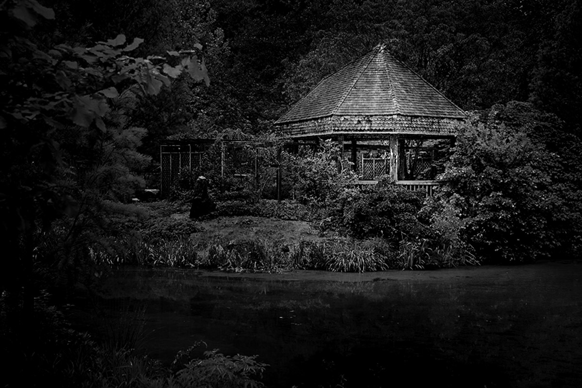
Hello Oliver,
I love your image. It gives me a sense of peacefulness; I wish I could go there.
I agree with Emil and Leah that the tones are close in comparison, the tea house is a great subject, and perhaps the adjustments were done on a global basis and could be corrected with dodging and burning in certain areas.
My sample image may be too dark for you or most people. But it is just a "quick example" of what you could do to emphasize the tea house. I used radial filters, graduated filters, and brush tools in Lightroom. I think a dose of strong patience will also be on your side to help the house stand out. I saw these tools and techniques done by Yuri Fine Art Photographer - YouTube channel. Yuri explains the technique well and is amazingly fast at changing an image into a dynamic B&W.
I am curious about what you think.
Best regards,
LuAnn |
Jun 6th |
 |
| 62 |
Jun 20 |
Comment |
Thank you again, everyone, for participating in this dialog as I think it is helpful for all of us whether we love clouds or want to experiment without clouds. I watched an interesting video on YouTube this morning that I want to share.
If you are a YouTube viewer, check out Ted Forbes video: The Art of Photography - Photography Composition Simplification :: And Negative Space.
As you may already know, Ted is a very knowledgeable person when it comes to photography. He has worked in museums, galleries and studied art professionally. In this video, he gives examples of how Micheal Kenna (Silent World) - my favorite, Josef Hoflehner (Oigawa River, Japan), and Henri Cartier-Bresson (France, Brie) images all make use of negative space. I see now I didn't explain myself well in my image description. This is all a learning experience for me, so I am glad I have this group and can have this discussion. Whichever way your POV falls, it is valuable none-the-less.
Thanks also go to Gary here in the group for pointing me to Alex de Steiguer. Though most of her images have faint clouds, she still shot what was before her eyes. My scene didn't have the clouds nor a clear view of the horizon.
Best regards,
LuAnn |
Jun 6th |
| 62 |
Jun 20 |
Reply |
Hi Gary,
I agree with you, "anything goes" works for many photographers and we need to be watchful for their needs as well. I never got the opportunity to get into film as you did, Gary, but I have a film camera now and just need to find time to use it. I have a half-used roll of Ilford HP5 in it now just waiting to be used up.
I did watch several of Alex de Steiguer on YouTube. She is a very brave black and white film photographer and amazing woman to spend the winter months alone on Star Island (between New Hampshire and Maine) 7 miles out as a caretaker of the buildings and property. She said she knows the risks but finds great peace in doing the job. Amazing! Her work is very inspiring to me.
I am glad you enjoyed my image, Gary. You are actually one of the people I think of who doesn't lean towards competition as much as others. You have also taught me to appreciate sepia tonality in images as well. Keep doing what you're doing, my friend, and have a great day!
LuAnn
|
Jun 4th |
| 62 |
Jun 20 |
Reply |
Hello Bob,
Thank you so much for this dialog and for explaining your point of view. I believe this discussion is of value to everyone who submits to camera club salons on both sides of the debate though I am sure I am in the minority on this issue.
Let me explain a bit as to why this point is so important to me as a photographer. I do not have the longevity in camera clubs as you do, Bob, but I do respect every point of your opinion. I understand, too, when you say a rage builds up as a camera club competitor that pushes you past your artistic style for the chance at a winning image. For many/most photographers, I see that is the sole reason they are in a camera club; for the competition and year-end points they receive. That drive is evident, and I see many, many award-winning photos that just take my breath away when I view them.
But for me, after taking several years of workshops from internationally acclaimed professional photographers, I have learned something that resonates with me and is pushing me to the style of photography I want to do. I want to tell a story of what I saw that day when I capture my photographs.
As a camera club board member, I listen to many members who say they just want to take good images. Many are reluctant to submit to competition because they feel they aren't good enough; how sad is that.
As a salon judge, I was schooled through two organizations to not show a bias in what I judge. Because of what I learned in class from seasoned judges in their own right, I want to be a champion to look hard at an image and try to understand what the photographer had in mind the day they took their photo (competitive or noncompetitive). Not everyone enters a salon, and many just want to capture good images.
I hope to be a better observer myself when I look at photography, but it is something I have to be conscious of to recognize it, and I don't always catch the signs.
Have a great day, my friend.
LuAnn
|
Jun 4th |
| 62 |
Jun 20 |
Reply |
Hello Emil,
Thank you for your two comments. I hope you are doing well in this more than crazy world we are living in.
I will consider your suggestion to crop some of the skies and see if I can make it work better. My only concern is the horizon line will come too close to the center. I am curious about your idea to darken the bay water some to show more tonal contrast. I think I just need to be careful it doesn't overpower the rocks and ship. I will give this a try!
Best regards,
LuAnn |
Jun 3rd |
| 62 |
Jun 20 |
Reply |
Hello Bob,
Thank you very much for your eye-opening opinion on my photograph. I agree I got lucky when I clicked the shutter and got excellent separation between the three elements in the image. I also agree with you, Bob, that I like the tree in the photo as well.
My choice for using the texture was because the sky was void of clouds, moments after a storm. I loved the scene so much that I needed to finish the photo as I saw it, as the artist. I am also trying to create my personal style in my images, so that is another reason I chose not to replace the sky. For me, the texture is different from what other photographers would do, so it makes the photograph unique to me and my style. I also believe the sky texture compensates for the lack of clouds and makes a white sky more appealing and useful.
My heart is sad to hear that you found it necessary to change my sky. I can see why you made that choice, but by doing so, it is now your story being told, not mine. What I saw that day was a beautiful black and white scene with only the three elements (lighthouse, schooner, and rocks) standing out against a white sky. That was the vision I had that day. That is what caught my eye.
Your comments are valuable to me; thank you for sharing your thoughts.
Best regards,
LuAnn
|
Jun 3rd |
7 comments - 10 replies for Group 62
|
15 comments - 23 replies Total
|


