|
| Group |
Round |
C/R |
Comment |
Date |
Image |
| 3 |
May 20 |
Comment |
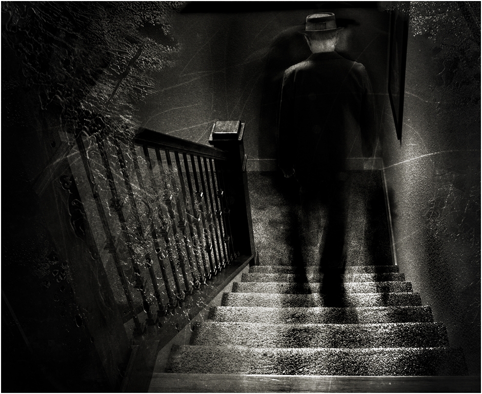
Here is another suggestion, Ruth, this I did quickly in Nik Analog. There are so many ways to be creative one could spend days trying all the possibilities. I believe you will find the key to creating mystery in your images is in directing and controlling the light. Whether you like film grain or scratches on your images, these elements are all subjective and personal choices only the artist in you can make.
One of my favorite artists for mysterious black and white photography is Olga Karlovac. I have two of her books. She will often use things over her lens like nylon or thin fabric to distort what she shoots. She also frequently distorts the person's face and body shape, so they only look like a human, but the details (hands, faces, ears, eyes) are obscured.
Check out her website: olga-karlovac-photography.com
I am looking forward to your comments; I know you can do this.
LuAnn |
May 19th |
 |
| 3 |
May 20 |
Comment |
Fatih, you have received wonderful responses to this lovely image. I personally, like the darkness to the lighting on her face. Perhaps she lost a child and the thought of the juice on her hands symbolizes that or reminds her of something that touches her heart.
This image, for me, has a great impact, creativity, and a heart-gripping story. I look forward to seeing more of your images from your portfolio.
One thing I would like you to consider is the darkness of her hair on the right side of the frame. I fear in competition the lack of detail in the shadows will not award you with what this image deserves.
Best regards,
LuAnn |
May 15th |
| 3 |
May 20 |
Comment |
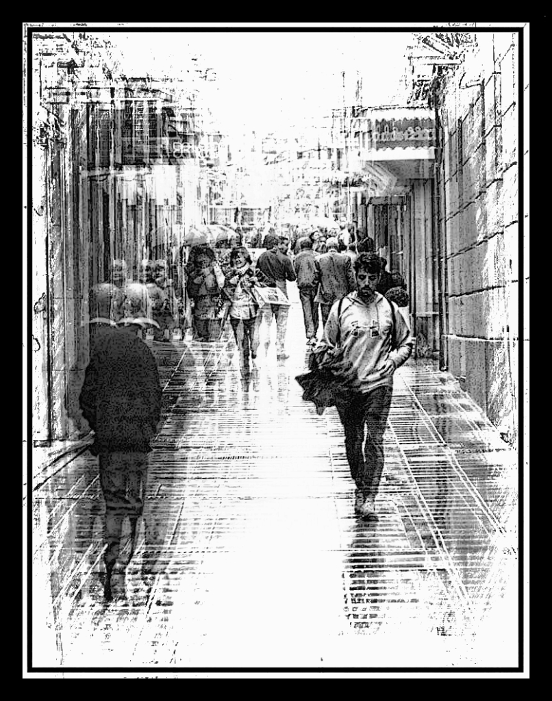
Lisa, you did a great job with your cellphone image! I have been thinking about doing more with my cellphone, but I just struggle to get a shot. You have inspired me.
I agree with the comments above about the sharpening. You did a great job capturing the image, and using the rule of thirds balances the image. I love that you used the vanishing point of the buildings to help draw the eye into the frame. The angle of view also has eliminated the distractions that were probably on the ground around the statue.
The only thing I would add is some dodging and burning to fine-tune and identify what your subject was, the umbrellas, or the statue. Right now, the lighting is even over the entire image. Creative lighting will draw out the subject.
I wish I were there, maybe someday. I bet you had a wonderful trip to Paris!!
Best regards,
LuAnn
PS: Lisa, though I am not a worldwide traveler, do you check on the legalities when photographing other people's artwork in foreign countries? A camera club I attend had a Creative Artists lawyer give a presentation on legalities in photography, and she brought up this point. Today I also read online that it is illegal to photograph the Eiffel Tower at night. The article said because of the light show it is protected under France's copyright law as an artistic work. I find these things very interesting and thought I would share. Because the statue was prominent in the frame that is what caught my eye. |
May 14th |
| 3 |
May 20 |
Comment |
Your story of the scene you photographed, Kieu-Hanh, makes me want to never buy leather shoes again. What an amazing image and story.
Considering the angle the photo was taken from, you have done a nice job of using the rule of thirds with your subjects. I think you could remove the bag in the foreground of the image without too much effort; it's just not necessary to the storyline like the white bag is.
Thanks for sharing this image and the impactful story behind the work these people are doing.
Best regards,
LuAnn
|
May 14th |
| 3 |
May 20 |
Comment |
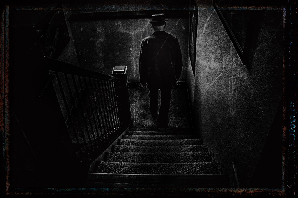
Hi Ruth,
You are off to a good start! Your story of the man walking down the stairway is interesting. When I look at your photo, it makes me think of an old film movie about a man in a hotel. I also see the handrail as a valuable element to this story.
I agree with Randy; the windshield glass isn't working. Nor is the white molding on the landing area at the foot of the stairs and the modern texture of the carpet; the carpet is at the forefront of the frame, and the first thing you see entering.
In my opinion, the way to add mystery to a photograph is through dark shadows. Control your lighting and have it in only the essential areas that contribute to your story. My suggestion is to look for an old film, grungy, graphic, or pencil-type textures instead of the windshield glass because it doesn't seem to go with the scene. Then I suggest changing the color or darkening the white baseboard molding because it is drawing my eye to that part of the frame; it doesn't add to the mystery. If you put a texture on the carpeting that would help age the scene you photographed.
Lastly, I did a quick edit with old film-like texture. It is just a suggestion to help you. I hope you persevere with finding your vision for mystery in photography.
There is still time this month to submit another image! You can do it, Ruth!!
Best regards,
LuAnn
|
May 14th |
 |
| 3 |
May 20 |
Comment |
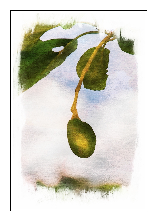
Hello Randy,
I love your image this month! It sure does bring us a promise of what is to come. I like that you captured this image in a simple framing from the branch above and the tree line behind this fruit. You also have a nice soft light on the fruit that is just the right amount of light.
I have nothing to add to your image as far as correcting. I do, however, offer a sample of what you could do with your image if you like to add textures and borders. In my sample, I added a simple watercolor texture with a white border. Sometimes a simple border is enough to complete an image.
Best wishes,
LuAnn |
May 14th |
 |
| 3 |
May 20 |
Comment |
Hello Mary Sue,
You have a beautiful portrait of a woman. For your first attempt at portraiture, you did a great job! I think your lighting worked well for you, and I see no unwanted dark shadowing. Also, you have nice texture and visibility of the twists and turns of her hair. You have a catch light in her eyes, and she looks comfortable.
For me, what I see that could enhancing your image are two things; your crop and the highlight on the cheek. Her right eye seems to be aligning too close to the center of the photo. She seems to me to feel small in the frame (too much space on top). I think a tighter crop would help ease that tension. Lastly, I agree with Ruth toning down the brightness of the light on her cheek just a little would help.
Something for the future to think about would be the smile. This woman seems to be losing her smile I am noticing in the corner area of her mouth.
You have made this look easy for a first go-round. Keep up the good work!
Best regards,
LuAnn
|
May 14th |
| 3 |
May 20 |
Reply |
Thank you, Stephen, I love your edit and conversion to black and white! What a great idea.
Best regards,
LuAnn |
May 8th |
| 3 |
May 20 |
Reply |
Thanks, Ruth, for your comment. You are right with your idea of having the spaces be equal; that is one way to do it and your option of choice.
When I chose the square crop for this image, I considered the weightiness of the black at the bottom, which for me gave weight in that area of the photo. With the faint purple at the top, I felt it balanced the weight of the image within a square frame and provided a hint of light at the top (depth).
Lastly, I research other painters and artists that frame with a square frame. I saw a mix with how they cropped; some have their subject in the center, some with weight on the top of the square (low-key images black on top of the frame with a glimmer of light under a bowl of pinecones), and still, others that had the weightiness of the image at the bottom all within a square framing.
I, personally, am always looking for ways to challenge the rules in my photography to try to find a way to present something different, along with discovering my unique style. I don't always get it right, but I am trying.
Best regards,
LuAnn
|
May 8th |
| 3 |
May 20 |
Reply |
Thank you, Beverly, for the visit and the feedback. I will see what I can do about adjusting the background, good point.
Best regards,
LuAnn |
May 3rd |
| 3 |
May 20 |
Comment |
Thank you, Fatih, for your comment. Yes, the flower was alive when I photographed it; but this variety of flower was very fragile and did not live long.
Could you please clarify what you said, "the body part of the flower as flu" for me? I just want to be clear what you mean. Are you saying the backside of the flower might be the better view? If so, I would agree that sometimes it is.
I am glad you too enjoy macro photography and look forward to your responses!
Best regards,
LuAnn |
May 2nd |
8 comments - 3 replies for Group 3
|
| 41 |
May 20 |
Comment |
Hello Lisa,
I am visiting from group 3 and 62. I absolutely love this image! It reminds me of Dale Kincaid's work I recently saw online.
I like the raised matte and the color choices. I also like the theme, Wabi Sabi, in finding the beauty in ordinary things. Like Henry I too watched and loved your webinar. Congratulations on your successes! I will look forward to viewing more of your work and partaking in a workshop when available!!
Best regards,
LuAnn Thatcher |
May 19th |
1 comment - 0 replies for Group 41
|
| 62 |
May 20 |
Comment |
Israel, your image is a perfect 10!
You have excellent attention to detail in this image. I agree with darkening the leaf on the right, but other than that it is beautiful!
Best regards, my friend,
LuAnn |
May 13th |
| 62 |
May 20 |
Comment |
Hello Bob,
A wonderful image with a story to tell, well done. I love the reflection and the nice calm water. I see good details in the reflection and I like that the reflection is a little darker than the boat it reflects to allow for details to come through. You have a good foreground, midground, and background so the image shows depth. I appreciate seeing the things in the back of the boat as they contribute to the story of a fisherman's boat.
If I were to add anything it would be to see a little bit more of the background height if the original image was cropped. This could be why the boat is a little high on the upper horizontal rule of thirds. The top of the frame just feels a little tight. With your artistic touch, I sense you are comfortable with the tones, so I agree with you they are good.
I think this would be a great photo to frame!
Best wishes,
LuAnn |
May 13th |
| 62 |
May 20 |
Comment |
Hello Gary,
I love your image, great motion, and creativity! I love that you, too, are trying something different.
I agree with the comments above regarding the highlights. I would like to add to that, that I feel the image is leaning to the flat side in tone. Try some dodging to bring out more dark tones in the image, or adjust the basic sliders in Lightroom to bring out more dark tones. I looked at the histogram in LR and it has a lot of midtones, and the highlights have peaked, but there are no blacks.
Here is a creative sample I came up with. After working in Topaz Studio and studying peoples work online with textures and overlays I too have become curious with different types of editing. I used a graphical overlay on your image, added a border, and some HDR effects to bring out the details. I am curious about what you think.
To see my experiments with the floral creativity I have been working on, check out my Facebook (LuAnn LePage Thatcher) and see what I have been up to. I am using flowers as my subjects and I am really working on getting better with my macro lens. My Facebook page is just for photography so friend me!
Best of luck,
LuAnn |
May 13th |
 |
| 62 |
May 20 |
Comment |
Hello Leah, and I give you yet another, welcome, to group 62!
I am so glad that we have this excellent discussion going on with your image.
For me, I like the story of this finial, and I am not bothered by some of the subtle bright spots in the background. I do not recommend taking anything out of the image that contributes to the story. As an example, the light area on the left, to me, could be a passageway. I can make out a bookshelf and chair also in the background. These are all necessary elements that build on your library story. If you darken them too much or eliminate them, then what is left to tell your story. Not every image is a candidate for minimalism, so just take care with your edits.
My suggestion to enhance this image is to work patiently with your dodging and burning. Also, if your highlights are too bright and toning them down doesn't work, you can try to paint in color/tone with a brush in Photoshop. I have seen Aaron Nace, the PS YouTube expert retoucher, edit this way to overcome borderline harsh highlights. I just looked him up, and it looks like he uses color range, color balance, and opacity in PS to correct these areas. Every situation is different, and not every fix works with every image challenge.
You have lots of advice from the group, so you are well on your way to having a successful image!
Best regards,
LuAnn |
May 11th |
| 62 |
May 20 |
Comment |
Emil,
I have to say I find something unique about how you edited your flowers above. There is something about the softness of the color and texture that is very striking. I see the soft light petals but the light is not harsh or too soft. The leaves and stem are darker in tone but not dark or over texturized. This is a beautiful image.
Could you please tell us a little more about how to achieve this soft elegant look and feel with flowers? Would I be correct to say it is the attention to detail in the dodging and burning?
Best regards,
LuAnn |
May 8th |
| 62 |
May 20 |
Reply |
Hi Gary, and thanks for your comments. I agree with you about Aron Nace - he is so fun to watch doing PS edits; he makes it looks so easy. I have heard of Kloskowski recently but haven't followed him; I will check him out. And yes, do check out Emil's website he is an excellent fine art photographer whom I think we will learn a lot from him; so glad he is with our group.
Take care,
LuAnn |
May 8th |
| 62 |
May 20 |
Reply |
Thanks, Emil, for your comments. I agree and can see why it is good to have the light at the center of this image; it draws the eye to the subject - the center of the flower. One can never give this advice too often; I frequently forget.
Best regards,
LuAnn |
May 8th |
| 62 |
May 20 |
Reply |
Thank you, Bob, for your thoughts. I agree I too love the color version and have kept copies of both. I really am enjoying macro photography right now while I am at home.
Best regards,
LuAnn |
May 8th |
| 62 |
May 20 |
Comment |
Yes, I second Oliver's welcome to our Group 62, Emil, I am glad you are here!
You are a fantastic photographer, Emil; I checked out your Fine Art Photography page online. I love your black and white work, especially Monterey Surf. Looking at that images makes me feel like I could just walk right into those waves; the highlights are at a perfect level of brightness for me --beautifully done.
I look forward to learning from you, and I am glad to have you a part of our group. I want to study your image you submitted to this group, and I will come back with my thoughts.
Best regards, LuAnn Thatcher |
May 3rd |
| 62 |
May 20 |
Comment |
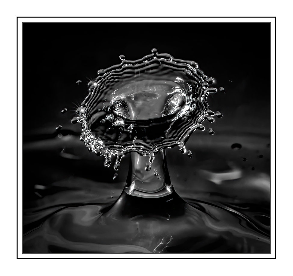
Great experiment, Oliver, I love your photo! You will have to explain more about how you did this and your recommended tools. If I have to be quarantined more, I need more projects; house cleaning just isn't cutting it, hahaha!!
I enjoyed the refreshing feeling while viewing your splash. I like how the subject is tipping forward towards the viewer as if to allow us to peer inside. I like the border of the splash that almost shows it vibrating the water as it splashes upwards. There is a nice smooth texture to the image as I would expect from water.
I would like to suggest something to enhance this photograph, I would try to remove some of the droplets around the splash like the one on the near left front corner, and some on the far right side of the image.
I added a white border to help give the photo a classic finish, what do you think?
PS: Coming back and looking at the edited version I think the border adds structure to the smoothness of your photo; a nice balance.
Best regards,
LuAnn
|
May 2nd |
 |
| 62 |
May 20 |
Reply |
Hello Oliver,
I have been doing a lot of macro photography lately; it's something I can do at home, and I appreciate the use of a controlled environment. I do use Capture One Pro 20 regularly now instead of Lightroom. I only use LR if I am editing an older image I took when I used that software. I use PS now a lot more than I used to, still trying to figure it out, though.
I do like your edit of the flower. When I edited my image originally, I was trying to balance the fragility of the tulip with a softer tone of contrast. Frequently I love the dark and dramatic use of contrast and texture. I find it challenging to find floral subjects that work well in black and white because the contrast takes away the softness of the flower. But, some flowers do work wonderfully with heavier treatments of contrast.
I am looking forward to May! Spring is here and almost in full bloom. My husband is mowing, and the windows are open with a great breeze coming through the windows. I have been out with friends on nature walks at local parks and just loving being outside.
Have a great day, my friend!
LuAnn |
May 2nd |
7 comments - 4 replies for Group 62
|
16 comments - 7 replies Total
|


