|
| Group |
Round |
C/R |
Comment |
Date |
Image |
| 62 |
Dec 19 |
Comment |
Gary,
I really enjoyed viewing your image, Gary. What a lucky traveler to visit the Greek isles.
I agree with Julie on the circular imprint in the sky area. I also see the circular lines in the original. I would just be careful not to over-process the sky because of that.
I prefer your original edit to darken the sky. I have heard a lot of judges in salons say that a vignette should be felt but never seen in an image. Unless you like that look, then, by all means, go with it-- it's a personal preference at that point.
Other than that, I would temper the whites on the top of the ship they do seem a little hot. Perhaps by toning them down, you can recover from the circular imprint in the sky and then you'll have a perfect image.
Best regards,
LuAnn
|
Dec 25th |
| 62 |
Dec 19 |
Comment |
Hi Julie!
I love this image. It reminds me of what Brooke Shaden does with her conceptual photography. I have always wanted to try that style for something different.
I think you have a great start going with this image. I like the simplicity of a few basic elements that tell the story: black background, trees, woman, trunk and umbrella--she is thinking she is prepared and nothing will stop her.
I would probably adjust the brightness but that would depend on how sinister you want your image to be. My imagination could run wild at this point, but that is just me and this is your image.
What mood do you want to tell in this image--that is not clear for me in what I see. If you are thinking sinister (which is what I think when I observe your photo, then maybe some depth to the background to imply someone in the woods could help. Or, if you want to simply show innocence (which might be your true idea) then the dark black background is pulling my thoughts away from that idea just because of the darkness.
I hope this helps. I look forward to seeing more work like this from you, Julie!!
Best regards,
LuAnn
|
Dec 25th |
| 62 |
Dec 19 |
Reply |
Hello Israel,
I just wanted to reply to your edit after I posted my original suggestion. Whatever you decide about the finished photo, the final edits have to please you in the end.
I had to go to the internet to find a photo so I could understand exactly what the stone of anointing was. I found it is a flat slab and it lies flat behind the woman and child. There is no way I could tell what it was as you described it. No problem there though. It just means that the stone is not obvious to the unknowing eye of the observer unless they know the location.
So, with that said I just think a tighter crop does the best for the scene you photographed. The man in the background does absolutely nothing to add to the image. I think he makes the photo look more like a snapshot, do you understand what I mean and why I say that? He is simply just a distraction and does not contribute to the message you want this image to portray -- holiness.
You are so lucky to have the opportunity to visit such a truly holy country.
Best regards,
LuAnn
|
Dec 25th |
| 62 |
Dec 19 |
Comment |
Thank you, Israel and Julie, for your comments! I have corrected the hat and I agree with what you suggested.
The biggest challenge I have is with my new computer. My highlights do not register as being blown in the white areas, but, people say they are. I do calibrate my monitor and Datacolor (the company for Spyder pro calibration) says my photos are just fine. Do any of you calibrate your monitors?
Best wishes!
LuAnn |
Dec 25th |
| 62 |
Dec 19 |
Reply |
Thank Gary, Bob, and Oliver!!
I have taken your suggestions and darkened the background. This change does make a difference!
LuAnn |
Dec 11th |
| 62 |
Dec 19 |
Reply |
What software are you using to edit with, Bob?
LuAnn |
Dec 8th |
| 62 |
Dec 19 |
Reply |
I was looking at the skin on her chest. The B&W looks blotchy compared to the original. This was why I was saying maybe to erase the effect from the skin area you know like we do when we dodge and burn.
LuAnn |
Dec 3rd |
| 62 |
Dec 19 |
Reply |
Hi Bob,
Yes, I will give a try at shooting snow-covered scenes real soon. I just bought a film camera to shoot black and white so I am very excited. I got the Olympus OM 1n, do you shoot film?
LuAnn |
Dec 3rd |
| 62 |
Dec 19 |
Comment |
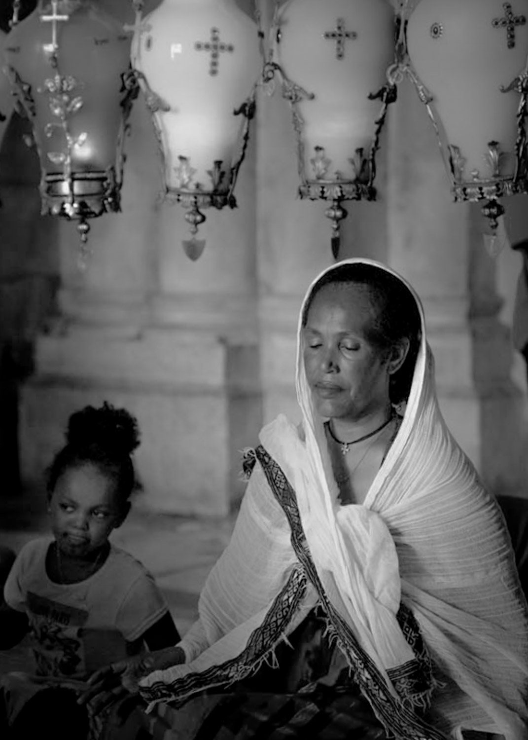
Hello Israel,
A very lovely image taken in a very blessed place I did not know they allowed cameras in there.
I think this image looks lovely in both color and black and white. I wish what she was looking at, the Stone of Anointing, was visible as it would tell a bigger part of the story and perhaps tell the viewer where this woman and child are; currently I would not have known had you not mentioned the place in your dialog.
The only thing I could think of to enhance this image was a tighter crop. The candles hanging above need to be included as they contribute to the story. I just gave it a tighter crop and made it a 5x7 in size. Oh, I also used BW 10 for conversion in Lightroom I think this is a softer look more becoming to the woman.
I hope you had a wonderful Thanksgiving, my friend!
Best regards,
LuAnn
|
Dec 1st |
 |
| 62 |
Dec 19 |
Comment |
Hello Bob,
I like your landscape image this month. You have a nice minimal scene with the 3 basic elements of foreground, midground, background. I like your tree it has a nice size and shape. I also like how you enhanced the light on it giving it depth and dimension. I sense restful autumn feel to this image as well.
What caught my eye when I first looked at the image was the brightness of the moon; my eyes zoomed directly to the moon. I don't think the brightness is in balance with the light on the tree and ground. The light on the ground is also in front of the tree yet the moon is in the back of the tree and the ground there is in shade. Something is not right with that. There is a tonality difference of the moon compared to the light on the ground. The moon looks more cool white, and the ground and tree more warm white.
The other concern I have is there are clouds in the sky but none on the moon. I see this as giving the image the impression the moon was added after the fact. I am all for composites but not when they are obvious to the eye; for me that detracts from the quality of the photo. The quantity of light on the ground tells me also that the sky is too dark. If the sky is dark then where is the light coming from; hence an added moon.
Bob, this is my subjective and humble opinion. I hope my thoughts are helpful. I love this image and think it is just a few adjustments away from an even better photo.
I hope you had a wonderful Thanksgiving, my friend.
LuAnn |
Dec 1st |
| 62 |
Dec 19 |
Comment |
Hello Oliver,
I haven't been to a parade in many years; good for you to have attended this one. I hope you, too, had a happy Thanksgiving, my friend!
For a portrait, I like how you captured this woman with a nice tight crop. You have her full attention with her eyes looking at the camera, nice bokeh in the background, I like her hand at her neck as it tells me she is happy being at this parade. I also appreciate that you have no other distractions to deal with, and that makes this a pleasing image.
I am going to take a guess that you edited and converted this image to black and white in Nik Silver Efex Pro 2? I like the software for conversions and effects, but sometimes it makes the HDR effects too harsh. Perhaps this effect would be good if it could be used selectively on certain areas of the portrait versus globally. The areas I am having difficulty looking at include her mouth, eyes, skin and bow. I do, however, like the effect on the hair.
There is one more thing to consider, and that is the black and white filter you used in the conversion. The original image she has a black mouth and eye makeup, and that now has been reversed. Makeup colors are essential to a woman's looks, and I think if you were to give her this photo, that would pop out to her, and perhaps she would wonder why you changed her makeup. The tonality on the skin is also appearing blotchy for some reason.
I know you are a master of these tools and that they are easy adjustments if you choose to make them. The final look is subjective and this is only my personal and humble opinion.
Best regards,
LuAnn
|
Dec 1st |
6 comments - 5 replies for Group 62
|
6 comments - 5 replies Total
|


