|
| Group |
Round |
C/R |
Comment |
Date |
Image |
| 62 |
Sep 19 |
Reply |
Thank you Hattie for your comments!
LuAnn |
Sep 26th |
| 62 |
Sep 19 |
Reply |
Hi Julie,
There is so much to think about when using your camera and when you said you didn't adjust your camera settings when you moved to the next station I had to chuckle; I was doing the same thing up to this point myself. I am finding for me shooting every day is helping me with this thought process.
I checked out a video on YouTube by Lindsay Adler and she explained using the aperture range 1.4 to 7.1 so I see now why it is done in portraiture.
I look forward to your next portrait; you're doing an excellent job!
Best regards, LuAnn
|
Sep 24th |
| 62 |
Sep 19 |
Reply |
Thanks for your comments, Gary. I like your idea of using the word indecision over chaos. I will take your improvement ideas into consideration.
Kind regards,
LuAnn |
Sep 24th |
| 62 |
Sep 19 |
Reply |
Thank you, Julie, for your comments!
Yes, I too love the tonal range and the gritty look in photos. I see this look from photographers like Sean Tucker (London based portrait and street photographer) one of my favorites to follow. I enjoy his black and white and how he captures the light and shadows in his work.
How you described the scene is what this scene expressed to me when I took the photo; it was a story in my eyes. I have never photographed a fair with this intend; to photograph the human experience. But I am hooked now. I enjoy this type of candid photography.
Best regards,
LuAnn |
Sep 24th |
| 62 |
Sep 19 |
Reply |
Israel, have a safe trip to Jerusalem. I am glad you found the advice that works for you from this study group. There are many ways to edit photos and many points of view as well. In the end you got what you needed and I am glad.
Best regards
LuAnn |
Sep 23rd |
| 62 |
Sep 19 |
Comment |
Julie, I am so proud of you to have such an interest in doing black and white portraiture! It has been my dream, but I can't find anyone to teach a class locally.
I look at your image of beautiful Georgia; I immediately thought of the Renaissance period for some reason. Maybe it was her face, hair, and the pattern on her dress. She is lovely.
You said your settings were all wrong. I agree with you the ISO should have been 100 because you were using studio lighting. Your shutter was at 1/200s (I assume that is what your camera uses for flash requirement), but I wonder why you would want to use f/8 for a studio portrait rather than staying with the f/4--your reason? With one person portraiture, I believe f/4 is good. I look forward to your feedback from Scott's class on this.
The lighting appears to come from an overhead angle (45 degrees) because I see a backward "J" shape on her forehead in the original image. The B&W image processing seems to have blown the forehead highlight out a bit. I also get a sense of harshness with the editing because the hair on her arm is much more evident than in the color photo. In my opinion, this style of editing can come across as a little too masculine, but it is also subjective to the artist's view. If you can control the contrast slider, start at +/- 15 and work up from there; this is an option but go slowly.
I like her eyes. I believe they are well lite and the focus is directing my eye to her eyes.
Placement of her hand. I agree with Gary; there is a concern with her hand. I see an arm coming from her body at the shoulder, moving up towards the chair. Then her palm is out of view by the chair back until I see partial fingertips only creeping over the back of the chair. For me, I would like to see the continuous line of her arm to her fingertips without interruption.
I hope this feedback is useful to you. Thank you, Julie, for submitting a portrait!
Best regards,
LuAnn Thatcher |
Sep 22nd |
| 62 |
Sep 19 |
Comment |
Lovely image, Israel.
I don't have a problem with the gentleman on the left (he's on a different plane in the image, and you used your widest aperture which caused the effect).
In this scene, I see a couple, and two women equaling three subjects. Cloning him out is an option, yes, but as I see it, I don't care for the look of the woman's hand after cropping her friend/husband out of the scene; that is a tall order for retouching in Photoshop.
In my humblest opinion, I think sometimes 'we' (generally speaking) remove distractions for the sake of eliminating distractions that really don't need to be removed (my personal subjective comment).
I love the scene and the emotion this image brings to the peoples faces. If I had to give one area to correct, it would be to next time watch your exposure to account for the brightness of the candles. It would be nice to have some details in the flames. That is a tough one to do but practice with a candle to perfect your technique when you do return to Jerusalem again.
A fine white border on this image would do nicely to finish it off.
Kindest regards,
LuAnn |
Sep 22nd |
| 62 |
Sep 19 |
Reply |
Hello Bob,
I compared your two versions together and I (my humble opinion in how I see this image) still have an issue with the blur. Comparing the two photos the only difference I really see is with the tonality. Your second image seems a bit more gray-toned than the original edited image which appears to me to be more black (darker shadows). I think the blurring issue is with the Topaz adjustment or style you chose because the blur is still heavy on the eyes.
Kindest regards,
LuAnn
|
Sep 22nd |
| 62 |
Sep 19 |
Comment |
Hi Hattie,
I agree with Oliver, job well done!
I really like how you captured the motion in the image. You also captured split-second placement of the right foot of the child at the top of the frame; his shoe does not intersect with the girl's head riding the bike below--perfect!!
The only change I can see is to fine-tune the tonality; the image seems a little too gray.
What a classic image. Thanks for sharing!
Best regards,
LuAnn |
Sep 13th |
| 62 |
Sep 19 |
Comment |
Hello Bob,
You have an exciting photo this month; something I have not seen here before. I recently purchased the Topaz Suite to try my hand at ICM (intentional camera movement) style photography. I am not familiar with the style you have chosen, but perhaps it is sketch?
When I look at the original photo, the shadows come across a little dark. On your second original, it appears to me you did some edits to brighten the photo up a bit. I think this was helpful.
The area I see as needing some work on the black and white version is the masts. If you notice there seems to be dark haloing on the lines of the masts to me. I see this happening on both original #2 photo and the final version.
Secondly, the blur on the black and white photo has me struggling to look at the image. It does feel more comfortable to step back from the photo to view it. But on my laptop, the distance of view is closer, and the blur does seem to bring high tension to my eyes because of it.
I do like the processing of the black and white image. The crowded port challenges the color photo I think. But in the black and white image, the busy port doesn't seem as distracting.
On the right side of the frame of the B&W, I think the shadows could be raised some to reveal more of the details of the boats in front.
I look forward to hearing your comments. I live in the dairy and corn belts of Minnesota, so I never see ports with sailing vessels. This looks like a fun place to do photography.
Best regards,
LuAnn Thatcher
|
Sep 13th |
| 62 |
Sep 19 |
Reply |
Thank you, Bob your comments are very helpful.
LuAnn |
Sep 13th |
| 62 |
Sep 19 |
Reply |
Excellent reply, Oliver!
With that said, maybe chaos is not the right word to be used to describe the setting of my image. In a busy state fair type environment, you don't usually have (by its definition) a scene as shown in your excellent cartoon of chaos. So, maybe the problem I have is with my choice of word(s) used to describe the photo.
This process is similar to the difficulty one has with creating a name for an image.
That was helpful; thanks again, Oliver.
Best regards,
LuAnn |
Sep 13th |
| 62 |
Sep 19 |
Comment |
I enjoyed viewing your butterfly photo, Gary, it is lovely!
I appreciate your choice of using the sinister diagonal in this instance; moving from upper left to lower right. For me, this angle allows my eye to enjoy the butterfly longer than if you used the opposite diagonal the baroque diagonal. The baroque diagonal would make me feel as if the butterfly was flying away from me and out of reach of my viewing eye. I find it interesting how these two angles can make such an impact on an image.
We have seen in your past photos that sepia is your favorite tone and you have done an excellent job with this image with this choice. This tone brings out the earthy and warm tones, and I can also see how it brings nostalgia to the photograph.
Your shutter speed for this image is 1/40s, and your lens was at 120mm. When I look at the detail of the wings I do see a little shake or movement. My suggestion would be to try a shutter speed equal to or higher than your focal length (125, 250, 500); this helps with the minor shake. On the other hand, if you prefer motion in your photos, by all means, make that choice. These are rules that can and should be broken; you are the artist; it is your choice first and foremost.
Thanks for sharing this image with us this month, Gary.
As always
Best regards,
LuAnn
|
Sep 13th |
| 62 |
Sep 19 |
Reply |
I am glad the suggestions will work for your photo, Oliver.
One last note, do watch when you edit the areas of his left cheekbone, bridge of his nose, and the top of his brows as they will tip to being blown out quickly; maybe tone those areas down just a touch.
Best regards,
LuAnn |
Sep 13th |
| 62 |
Sep 19 |
Reply |
Thanks for the edit, Bob. Unfortunately, now the crowd of people has been cropped at the waist--don't crop at joints I believe is the rule. I believe a tight crop like this one can be interpreted as a bad crop. I see this on the lower edge of the frame; the people feel stuffed into the image to me.
On a side note, I am retired. I don't work for an editor. I am here to learn in a positive environment. When I took the Image Analysis class through PSA, the instructor I worked with was very adamant about being sensitive in our feedback to the photographers' whose images I critiqued. People at all skills levels are in our groups, and sometimes the photos they submit have an emotional attachment which isn't always obvious. It was a good lesson for me to be sensitive to understanding what level photographer they were and what they said in their introduction about their photo gave clues. Some people submit photos with no intention of ever doing a salon through a photo club, so for some of my critiques, I had to look at them from both perspectives. It was a good lesson for me to learn to be sensitive with each and every photo I critiqued--this was not easy then and still is part of the challenge today.
I am still curious what your opinion is of chaos in an image. This info would be valuable for all members of this group going forward.
Have a great day, my Yankee friend, and thank you for your thoughts.
Best regards,
LuAnn Thatcher
|
Sep 12th |
| 62 |
Sep 19 |
Comment |
Could someone expound on what your subjective opinion would be to depict chaos in an image? |
Sep 11th |
| 62 |
Sep 19 |
Reply |
Hello Bob and thanks for your thoughts on my photo!
Yes, I see your edited version as an option. Let me explain more though about my assignment that day and see if your thoughts change. I was with 10 photographers on a mission to document the human experience at our state fair. Now mind you we broke records for attendance which were each day between 150,000 to 210,000 people-that's a lot of visitors! But that was also a big part of the story of going to the fair-the chaos, the crazy crowds! Also, I was with an editorial photographer and this was his plan for the group.
With that said, and from your comment perhaps I did capture the chaos to tell my story on this day. In your edit you suggested to remove the sky and move the top of the frame down to eliminate some distracting elements on top of the building. Yes, I agree in normal photographic moments but maybe not in this situation as I then lose the Americans Flag which is a big part of fair going.
The people going every which way, don't you think, tell the part of the story that says-chaotic day at the lager building during the Minnesota state fair? Perhaps I could keep the people in the scene and maybe work on dodging and burning to put emphasis on the man talking to the lady in the middle. This edit could then tell the viewer that within this crowd these two people were the subject and that is where the eye should go.
I look forward to your comments and those of others. This is not a typical style of photograph submitted for review and that is a good reason to give it a try. Maybe this photo is more journalistic-that genre I have never done but am interested in learning.
Many thanks
LuAnn |
Sep 10th |
| 62 |
Sep 19 |
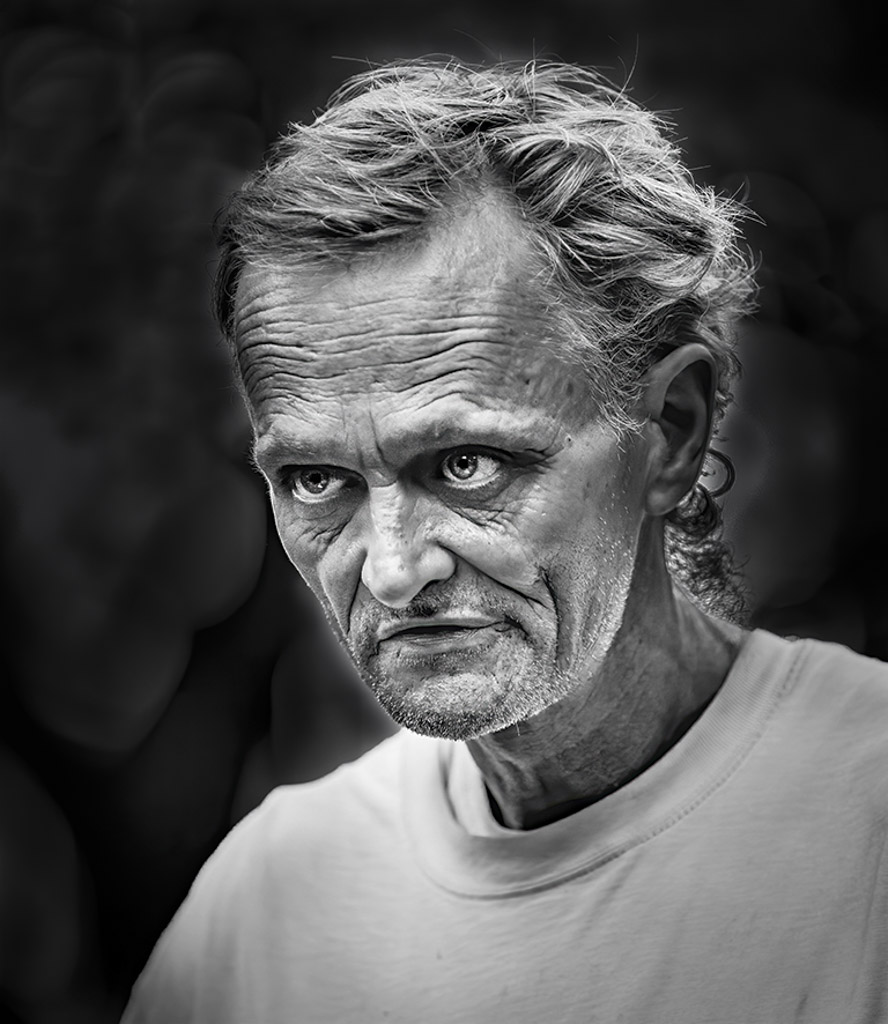
Comment |
What a great opportunity, Oliver! Love the character in his face. The f 3.2 did an excellent job in making the bokeh in the background. Your edits in Nik bring out the detail in his skin, and his eye is nice and sharp.
My suggestion to enhance an already great photo would be to work on the bokeh in the background. To me, it is competing with the man's face, especially the spot behind his head.
I attached a 'very' quick suggested edit. In the original photo, the bokeh looked a bit bright, but darkening it is an option.
I sense your great compassion for this man and his situation. We will always have people like this man in the world. Some prefer their circumstances as they are, while others struggle and desire change. There are places to help those in need, but in the end, it is their choice as sad as it may be.
His mumbled 'thank you' may have been mumbled for a good reason; just judging by the logo on his shirt.
Best regards,
LuAnn |
Sep 7th |
 |
7 comments - 11 replies for Group 62
|
7 comments - 11 replies Total
|


