|
| Group |
Round |
C/R |
Comment |
Date |
Image |
| 62 |
Jul 19 |
Comment |
Thank you everyone for your thoughts and ideas. I will work on the crop idea and the 1x1 frame size. I agree the 1x1 will be more appealing.
Best regards,
LuAnn |
Jul 22nd |
| 62 |
Jul 19 |
Comment |
Hello Israel, it is good to meet you in group 62. Welcome!
I like the scene of this photograph. I see staggered tree trunks that help draw the eye deep into the frame. You captured nice depth and dimension. I also like the moody feel of the image. You captured your model well, her arm is bent and I see she is on tip toes. The experts say in posing models, if you have a joint (elbow, knee, waist) bend it. I think you have done this with this model.
I like Oliver's idea to tone down the highlights in the field beyond the trees. But, I would suggest not to do a global adjustment with highlights. I suggest adjusting only the highlights in the background and not to include the white of her dress. In my opinion, including the white of her dress takes away from the dreamy feel of the photo--it's too contrasty.
Lastly, I am struggling with the smoke. I really like the idea of using smoke, but as it is now with this photo, it appears as though the tree stump is on fire and doesn't seem to me to go with a calm model walking by. Perhaps my struggle is because I can see where the smoke starts from as opposed to a misty forest type scene where you don't see its origin.
I hope this is helpful. All my comments are solely of my subjective opinion. I offer them to you as an aid to help and never to offend anyone at any time.
Best regards,
LuAnn |
Jul 22nd |
| 62 |
Jul 19 |
Comment |
Hi Gary,
Lovely image. I really enjoyed the calm and dreamlike surreal feel I get from observing this photo.
I do like Julie's crop idea, but when I open her image the tight crop is almost too tight when I study it. I feel a slight strain on my neck to look up at the birds, and perhaps the boats up close aren't as appealing to me but look more fitting as a landscape style setting when the crop isn't so tight.
Comparing her image to your crop I feel more relaxed and that tension to look up at the birds isn't as strong. So my humble opinion is that your crop is good.
Perhaps the only edit you could try is to remove the rocks in the front right foreground area. They aren't contributing to the scene and without them the subject really stands out.
Nicely done!
Best regards,
LuAnn
|
Jul 22nd |
| 62 |
Jul 19 |
Comment |
Hello Pandula,
Congratulations on your new position with PSA! Sounds like this is perfect for you.
I like the minimalism in this photograph. Subtracting the 2 people really helps to focus the view on the subject. The waves in the background have nice bokeh that helps the viewer to envision where the photograph was taken. I like the bubbly waves in the foreground as they help hold my eye on the model.
My concern is with the models body. Because she is parallel with the camera she looses depth, dimension, and appears flat in the frame. I agree, the haloing is a concern but it appears to me to come from the post processing so that is an easy fix. I also see blotchy tones in her skin and this does not add to a woman's beauty for me. Her torso has unusual black dots which again for me detract from her feminine body.
You have diligently worked hard on all the portrait photos you have submitted. I have enjoyed your work and praise you for your determination. Best wishes on your new adventure with PSA, my friend.
Best regards,
LuAnn |
Jul 22nd |
| 62 |
Jul 19 |
Comment |
Love, love, love this image as well!!
You captured the expression and I think, as the others have said, that you should give it a go at competition.
Take a look at the background just above his head on the right side I can see a bit of the original background still. What do you think about putting a tiny pencil line around image in white to give set the edges?
You do know that for your next step you can submit the photo to PSA-Photo/Education/Image Evaluation. I have used this service, its part of your membership, several times. An international judge will give you a critique.
Best regards,
LuAnn |
Jul 22nd |
| 62 |
Jul 19 |
Comment |
My first glance at this photo was to see a wonderful street photograph; my favorite genre--I love this!!
I am partial to street photography and I like the details in the store behind him. I like looking at the shelves and seeing what is on them, I love the backward neon lighting, the bakers rack, the marble counter top and the ambiance.
If you think you need to adjust anything, you could play with the tonality; selective dodging and burning. Darken his apron to make him stand out more, or brighten the white shirt and hat, you know, subtle things like that.
I don't care for the darkening of his face, sorry Oliver. To me it draws me in and really brings out his intent look and concentration on his face with what he is making on the table. In my humble opinion adjustments to facial features should be ever so slight that you can not tell they are made.
I like how you signed the photo; very professional logo.
Best regards,
LuAnn |
Jul 22nd |
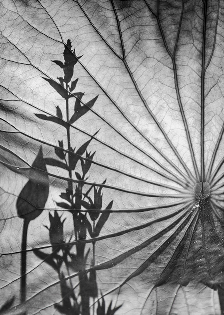
| 62 |
Jul 19 |
Comment |
What a lovely photo, Oliver! Was this lotus flower upright?
I have to agree with Gary and his cropping suggestion. I like the shadow leaves on the left because they contribute to the geometry (lines, and shapes) in the image.
You could play with the tones in the image to play up the shadows to your liking. I submitted my idea of a crop which is a little tighter than Gary's. I tried to eliminate the dark vertical line on the right so the attention stayed with the shadows on the left.
Well done, Oliver.
LuAnn |
Jul 22nd |
 |
7 comments - 0 replies for Group 62
|
7 comments - 0 replies Total
|


