|
| Group |
Round |
C/R |
Comment |
Date |
Image |
| 62 |
Feb 19 |
Reply |
Thank you, Paul, for your comments! You're right I did take a chance. I am amazed at the results and will continue to look for more opportunities to shoot more like this. I am grateful for the comments and tips as they are very helpful.
Best regards,
LuAnn |
Feb 26th |
| 62 |
Feb 19 |
Comment |
Excellent capture, Paul, I love the motorcycle and setting-sun in this scene. The desert, the dust, and the cactus all add to the story of this photo for me.
The part that I am struggling with is the sky. The darker patch of clouds on the left I think is distracting my eye from the motorcycle. I see the dark clouds also as being too dominant in the photo so I would recommend toning them down a bit-this will make the motorcycle stand out more as your subject.
My husband last year bought a new bike and drove it out to Colorado from Minnesota. He loves his bike as I am sure you and your friend do too. Were you both on bikes?
Best regards,
LuAnn |
Feb 24th |
| 62 |
Feb 19 |
Comment |
Lovely photo, Pandula. I like the texture in the sky, the motion of the water, and her outstretched arms. I also like that her right-hand does not intersect the rock formation. These elements all make for a great composition.
The one thing I would change would be her stance. I am a little bothered by the fact that her legs are spread apart in an unfeminine way and her torso is tilting forward. I would like to see her hips on more of a diagonal angle, so her back is not so straight on to the camera. I get a feel that she is going against the flow of the image.
A little dodging and/or burning to help her stand out as the subject from the tonality of the background would also compliment her.
Nicely done!
Best regards,
LuAnn |
Feb 24th |
| 62 |
Feb 19 |
Comment |
Nice work, Gary! This is a lovely nostaligic shot. Their expressions are perfect and the sepia is a great choice. I like the crop-the image seems to fall into the rule of thirds nicely. I also like the elbow room on the right-any closer and I think it would look too tight since the left hand side is a tight crop.
The only thing I could offer is dodging and burning to make them pop from the background. Not a lot just a skosh. Then if you could put some texture back into her right hand that would be good as well-it looks a little blown out but I feel it can be recovered.
Thanks for sharing this very awesome shot!
Best regards,
LuAnn |
Feb 24th |
| 62 |
Feb 19 |
Comment |
Nice work, Hattie, I agree with Oliver on this shot. I like the crop, it looks good in B&W, there is a story, and the DOF is good.
The only edits I think you could do would be some dodging and burning to put some emphasis on the person being in the forefront giving separation in tone from the background. You could darken the suit, brighten his face and book all the usual steps to make the subject pop.
As far as a title goes I would take into account his facial expression along with the pointing finger. There is a story in his face maybe this will help you find the right word.
Nicely done.
Best regards,
LuAnn |
Feb 24th |
| 62 |
Feb 19 |
Reply |
Thank you Oliver! I try. |
Feb 24th |
| 62 |
Feb 19 |
Comment |
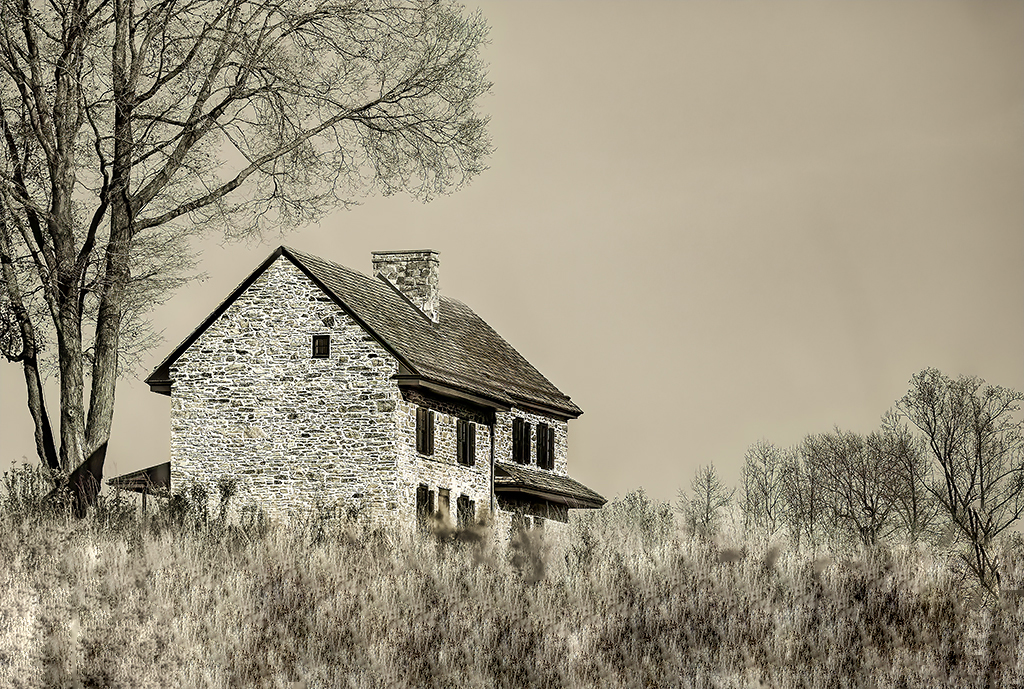
Oliver, I really like your image. I like the sepia tone and the story. The image is also minimal and does not have any distractions beyond the foreground weeds.
Here is my take on fixing this image. I tried using a filter in PS but to no avail. I tried clone stamping and that didn't work. Then I tried the healing brush and I think with some patience and practice this may be the tool that will help you the most-in my humble opinion. I am not a master of PS nor the healing brush but I think it can take that blur out and give the image some potential.
What do you think?
Best regards,
LuAnn
|
Feb 24th |
 |
| 62 |
Feb 19 |
Reply |
Thanks, Gary for your comment. I agree I haven't achieved the end result but it was just a first step. I don't see this type of photography much where I am in Minnesota but that must be why I like it-it's different.
I think Olga said she uses fine fabric to cover her lenses in some of her shots. This image was my one and only attempt. Olga has her work on display in a gallery in London so the style must be well received in Europe. I love things that are different.
Best wishes!
LuAnn |
Feb 6th |
| 62 |
Feb 19 |
Reply |
Thanks for the edit, Oliver. I think you are right to have added more structure to bring out the dark tones more to define the shape better. I like it!
LuAnn |
Feb 4th |
5 comments - 4 replies for Group 62
|
5 comments - 4 replies Total
|