|
| Group |
Round |
C/R |
Comment |
Date |
Image |
| 62 |
Nov 18 |
Reply |
I would leave the door, Gary, it goes with the story in this photo of a bygone era.
Happy Holidays my friend!
LuAnn |
Nov 24th |
| 62 |
Nov 18 |
Comment |
Pandula, you are amazing! What a beautiful photo and I love your creativity. The layering does give the image dimension as the title says.
I do see what Hattie referred to- the face is floating. Since you enhanced the face may be all you could do is tone it down a tiny bit.
Other than that I have nothing to add. Excellent composition, well executed and lovely presentation. Bravo!
Regards,
LuAnn |
Nov 13th |
| 62 |
Nov 18 |
Reply |
It is fun to have a photo where you have several options to change its point of view and perspective. I agree showing the shoes is a great option. Now you have two options!
Best wishes,
LuAnn |
Nov 13th |
| 62 |
Nov 18 |
Comment |
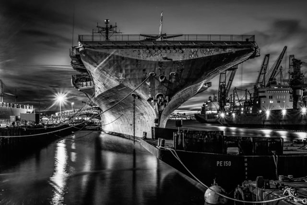
Paul, I have to agree this is an amazing shot! The black and white is, in my humble opinion, the best choice. I like how you captured the ship at an angle to give it depth and dimension. The light starburst on the left helps to draw the eye down the length of the ship moving the viewer through the scene. You captured it well and it is very sharp with nice detail of the PE150.
I have a suggestion to add some dodging in a couple areas of the ship to give it a little brightness on the side with the starburst. Other than that I like your post-processing. A very impressive long exposure.
Kind regards,
LuAnn |
Nov 12th |
 |
| 62 |
Nov 18 |
Comment |
Ok, I am going to try something a little different than what everyone has suggested.
I love antiques and I love this room. Your exposure was perfect as you captured nice detail in the white curtain. Sure wish I could have had an opportunity to sleep in a room like this!
With my suggestions, I put a medium contrast on in the tonal curve section of LR. I also put a partial graduated filter on the corner where the bed is lower right. The bed seemed to distract my attention from the window so I made it a little darker so its form wasn't so noticeable. I looked at straightening the closet door on the right, but that didn't work. Let me know what you think.
You say it's not a good image but I think it is a snippet in time of a place someone called home. It's beautiful with the simple charm of an uncluttered room that has just the right amount of elements, bed, light, chair, wash basin, and curtain. What more could one want?
Thanks for sharing this photo to our group, Gary!
Regards,
LuAnn
|
Nov 12th |
 |
| 62 |
Nov 18 |
Comment |
Lovely shot, David. One of my favorite elements in a photo is atmospheric perspective. I like Oliver's idea to add more mist, perhaps that is subjective but I can see it working both ways.
I like those frame options in Nik, but I do hear more people say no to them-that's unfortunate. I guess they were something from the film days that hasn't quite come back. I have used them in some of my boxing shots.
I like where you cropped the photo. Sometimes photographers would put the center line just above the lower left corner as opposed to directly on point but I like how you have it.
If I was to suggest anything it would be to dodge and burn a bit. The histogram doesn't show much in the midtones. You wouldn't have to do much but by adding some midtones it would add to the overall tonality and give the photo some depth and dimension.
That might be along the lines of what Hattie suggested when she said to add some light. Placement of the light is from the artists perspective-good idea.
Nicely done my friend.
Regards,
LuAnn
|
Nov 12th |
| 62 |
Nov 18 |
Comment |
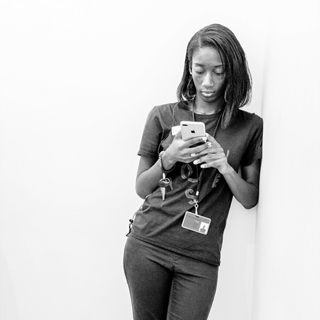
I like this photo, Oliver! I love the simplicity. It gives the viewer a chance to get to know the subject. You have an opportunity to examine and find out more by observing what she is doing. I cropped it in a 1:1 ratio and I think it makes it easier to really see what she is doing and to notice the key and card she carries. I also took Hattie's advise and darkened the clothing. I checked the histogram, and it was pretty flat in the blacks to midtone area so adding some black may have helped-this is a personal preference.
Great idea and well nicely done.
Regards,
LuAnn |
Nov 12th |
 |
| 62 |
Nov 18 |
Reply |
Thank you, Paul, for your kind words.
I was a little apprehensive to stand up and shoot from the table, but I like your idea of getting peoples heads in the foreground lower border area. I feel like I am obstructing someone's view, I guess. But if I plan it out next time I will give that a try.
Regards, LuAnn |
Nov 12th |
| 62 |
Nov 18 |
Reply |
Thanks, everyone for your thoughts! I agree that the area in front could use some darkening good idea. And Hattie, I like your idea to add more space to the left side.
Thanks to everyone for checking out my canoe photo-Errant Voyageur! In my local camera club, I took first place at years end for the color print of the year with that photo. It looks so beautiful in print. The mist on the water made for a perfect mood. I have never won anything in competition before like this; I am just getting my feet wet with the process.
Have a great day my friends!
LuAnn |
Nov 12th |
| 62 |
Nov 18 |
Comment |
This is an amazing photo, Hattie!
Looks like Fr. Redemptus Short was ordained back in 1947 and died when he was 92. Here is a link to the write-up about him.
https://www.legacy.com/obituaries/jsonline/obituary.aspx?page=lifestory&pid=146718599.
He was well received by all who know him. I love to do research and couldn't resist.
I really like Oliver's suggestion. And, Hattie, I agree with you about the aperture. Maybe next time take multiple aperture settings and then decide at home which you like the best. That is a great tip I have learned from workshops. Also, take photos from various angles.
I agree with removing the center top stone, and the one on the right that is half outside the frame. Your cropped image looks good as well, and you were careful not to crop at her knee area which is good.
If I had to add anything, it might be to try a vignette around the edges. This would bring the focus on the little girl and the prominent stone of Fr. Redemptus. Maybe just on the bottom and the right side. Vignette's don't have to be on all sides.
Kind regards,
LuAnn
|
Nov 12th |
| 62 |
Nov 18 |
Comment |
Many thanks to you both, David and Oliver, for the critique! I am humbled.
I have never shot an indoor concert before. Right now I see it as an alternative to shoot the night sky in the winter. I like being warm!
Kind regards,
LuAnn |
Nov 9th |
7 comments - 4 replies for Group 62
|
7 comments - 4 replies Total
|


