|
| Group |
Round |
C/R |
Comment |
Date |
Image |
| 62 |
Sep 18 |
Reply |
Thank you, Hattie, for your thoughts. I am just going to have to take some time and see if I can utilize all the feedback and get this photo figured out. Otherwise, this has been a great learning moment and now it is off to the next photo!
Kind regards,
LuAnn |
Sep 30th |
| 62 |
Sep 18 |
Comment |
Thank you, everyone, who commented on my photo this month. It was a tough shot to edit.
David, I also like Oliver's sky edit.
Oliver, I just can't get past that crazy halo.
Paul, your thoughts about fashion shot versus model shot are very interesting. I just purchased a book by Jeff Rojas titled: Photographing Men. He is also on Youtube and you should check him out he has posing men down to reading body language. There is an art to photographing men.
I agree with you, Gary, the halo kills the shot in my estimation.
Pandula, good point on the sunglasses in black and white versus the color photo.
Excellent feedback everyone, thank you all very much! I will have to get this model to pose again for me. He is very photogenic.
Have a great day my friends! LuAnn
|
Sep 27th |
| 62 |
Sep 18 |
Comment |
I agree with Paul and Oliver! This boy tells a great story.
LuAnn
|
Sep 6th |
| 62 |
Sep 18 |
Comment |
I second that WOW! Incredible shot and love that you too use Fuji!! Which lens did you use?
There is nothing more appealing in photography than a child's smile.
My suggestions are to lessen the contrast when you work in Nik especially with a child's skin tones. I think I am beginning to see some white fringing too. Maybe try some PS layers, curves or levels as an optional way to bring in contrast. I think there is too much contrast on her hands, neck, and face areas. She is a beautiful and innocent little girl so the contrast should bring that out about her (my humble opinion).
Secondly, I would bring down the top of the photo's crop to remove the white edge of the hood of the other child's jacket. And I agree with Oliver and David on the hand. If you could remove it that would be good.
But, if you look at this photo as street photography, you could leave the hand and the jacket hood and just add a vignette and see how that looks. Leaving these elements in for street photography contributes to the story. She is a happy child and mom's hand is right behind her.
So there are a couple scenario's to consider.
Thanks for sharing a great shot!
Regards,
LuAnn
|
Sep 4th |
| 62 |
Sep 18 |
Comment |
Great street shot, Hattie I love this one! The only thing I would correct is the vertical alignment with the pole to the upper left side of boys head. I tried it in LR and it snaps in perfect.
I agree with Oliver's comments on the sign. This is the scenario I look for in street photography. And yes, you have an incredible camera being able to crop as you did.
Optionally, you could add a vignette. When I tried this in LR the brightness of the sign seemed to draw the eye to it more than the boy. So you could work on balancing the brightness of the sign and the brightness of the boy giving the boy the emphasis.
These are really easy things to play around with and will make an already great shot even greater!!
Regards,
LuAnn
|
Sep 4th |
| 62 |
Sep 18 |
Comment |
Wow, what a shot! Pandula this is a great composition. You have captured the moment perfectly and I like how you framed it. One could ponder the thoughts of this soldier for a while. There is great expression and emotion in his face. All attributes we as photographers strive to capture.
The only critique I have is to brighten the highlight on his face similar to what it is in color photo. Be careful of the highlight in the water droplet running down his cheek as it is bright enough.
Bravo my friend!
LuAnn |
Sep 3rd |
| 62 |
Sep 18 |
Comment |
Lovely capture, David! Shots with people in them are my favorites lately. I really see why they are so appealing.
I like your crop and how it gives the photo a more intimate feeling. The bokeh is great in the background and not distracting. The balance of light and dark tones between the woman and the background are perfect. The eye can settle on the woman and ponder her thoughts.
I use and love Silver Efex Pro 2 myself but it sometimes makes shots feel a little heavy or oversaturated in dark tones. On portraits, this can be a balancing act. In addition, it is also an artistic perspective point where some like B&W tonality darker and others lighter.
The only 2 things I would address is the highlight on the side of her face being too bright. Secondly, drop the opacity of the highlight on the front bottom edge of the frame. When I look at her face my eyes are drawn back to the bottom edge of the frame.
You have inspired me to go out and find someone to photography!!
Kind regards,
LuAnn
|
Sep 3rd |
| 62 |
Sep 18 |
Comment |
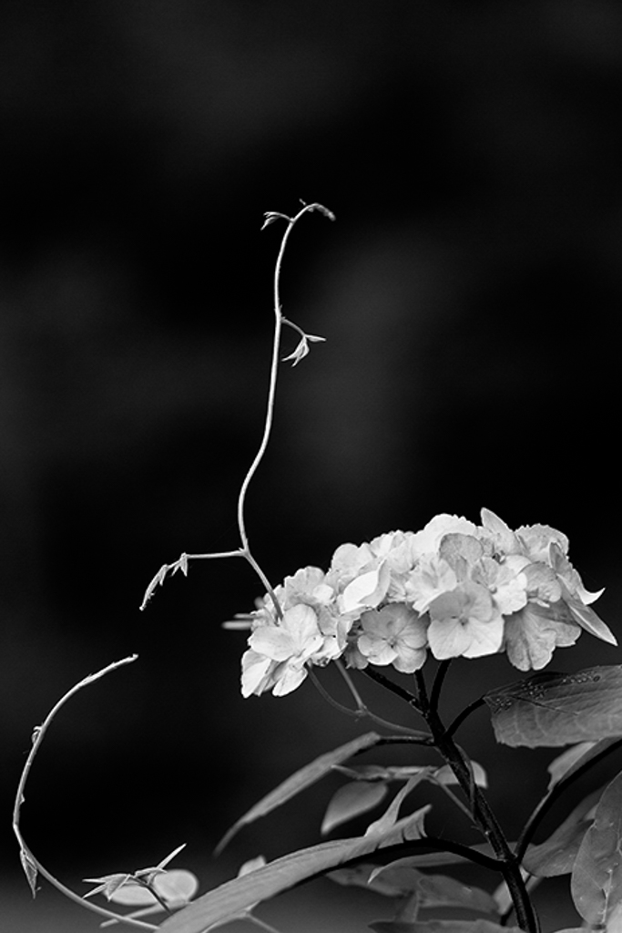
I love this beautiful photograph, Oliver! The vine, to my untrained botanical eye, looks almost like a walking stick insect. At first glance, I did not think the vine could be the subject because the flower was so much bigger. But with a quick attempt in LR this is what I came up with.
I think you are right about the vine being a possible subject. I see a potential forming of an arabesque shape appearing in this photo. The curves of the vine and the stem of the hydrangea all play into this beautiful shape.
You like the balance of the flower and vine and I do as well. But now I see there are many possibilities in this photo for a couple different subjects. Bravo on this point!
I did remove the spots on the leaves in the lower right corner so as not to detract the eye from its subject. The black background and space above the vine give a little more breathing room and space to show itself off!
What do you think?
Kind regards,
LuAnn |
Sep 3rd |
 |
| 62 |
Sep 18 |
Comment |
Amazing shot, Gary! Don't you love it when things just happen like this-the elusive moment captured from a distance so perfectly.
The only thing I would suggest deals with the overlay. I suggest you bring down the opacity on the overlay to a point where you can feel it and not see it so dominantly. I say this because the boy does not have any of the overlay on his body or limbs and it looks unbalanced. This approach is something I learned when adding vignettes. They should be felt and not seen.
Maybe this is the gray area of artistic creativity, I don't know. I offer this as a suggestion only.
Nicely done my friend,
LuAnn |
Sep 3rd |
8 comments - 1 reply for Group 62
|
8 comments - 1 reply Total
|


