|
| Group |
Round |
C/R |
Comment |
Date |
Image |
| 62 |
Jul 18 |
Comment |
I read your description of your photo. You say this is a documentary photo. With that said, I went out to PSA Photo to get the definition of this style (included in photojournalism) before I offered my opinion.
This is the definition I found:
Techniques that add, relocate, replace or remove any element of the original image, except by cropping, are not permitted. The only allowable modifications are the removal of dust, scratches, digital noise, restoration of the existing appearance of the original scene, sharpening that is not obvious, and conversion to greyscale monochrome. Derivations, including infrared, are Not eligible. It goes on to explain Human Interest images but I don't think this falls into that category.
If you are interested in that style of photography, maybe that is how this shot should be evaluated. Even if you are not, this is interesting information.
Since we are in a B&W group, I think adjusting the tone of the 2 primary subjects is the way to go as Oliver suggested. There isn't a lot of sky in the photo, and it doesn't contribute to the photo so replacing it doesn't seem to apply this time, unfortunately. Don't get me wrong, who doesn't love a beautiful cloud-filled sky!
The photo has lots of people so to replace the sky might only add more chaos, what do you think?
I am assuming you shot RAW. Have you ever researched color presets in camera? I have been using presets in my Fufji camera and shoot RAW and JPeg.
It is amazing how you can capture dynamic detail when using presets. This would be to adjust highlights and shadows in camera and use color presets. I shoot Nikon too and I just checked, it is called Picture Control. Choose a Picture Control then adj the highlights and shadows say +/- 1 depending on how your camera jpeg's look.
I found someone in the Fuji group that had predefined presets on YouTube and I used his settings. Then when I shoot I have both RAW and Jpeg so if they don't come out I can use the RAW file.
I like to find ways to shoot nowadays that has the least amount of editing.
Love your photo capture. You're almost there!!
LuAnn
|
Jul 22nd |
| 62 |
Jul 18 |
Comment |
Thats odd, the edits I did in LR and PS don't seem to be coming across on the photo I submitted. I added contrast with those edits. When I compare the version I see I submitted here to the one side by side in my LR they are different. Why would that be?
The one uploaded is more muted.
LuAnn |
Jul 22nd |
| 62 |
Jul 18 |
Comment |
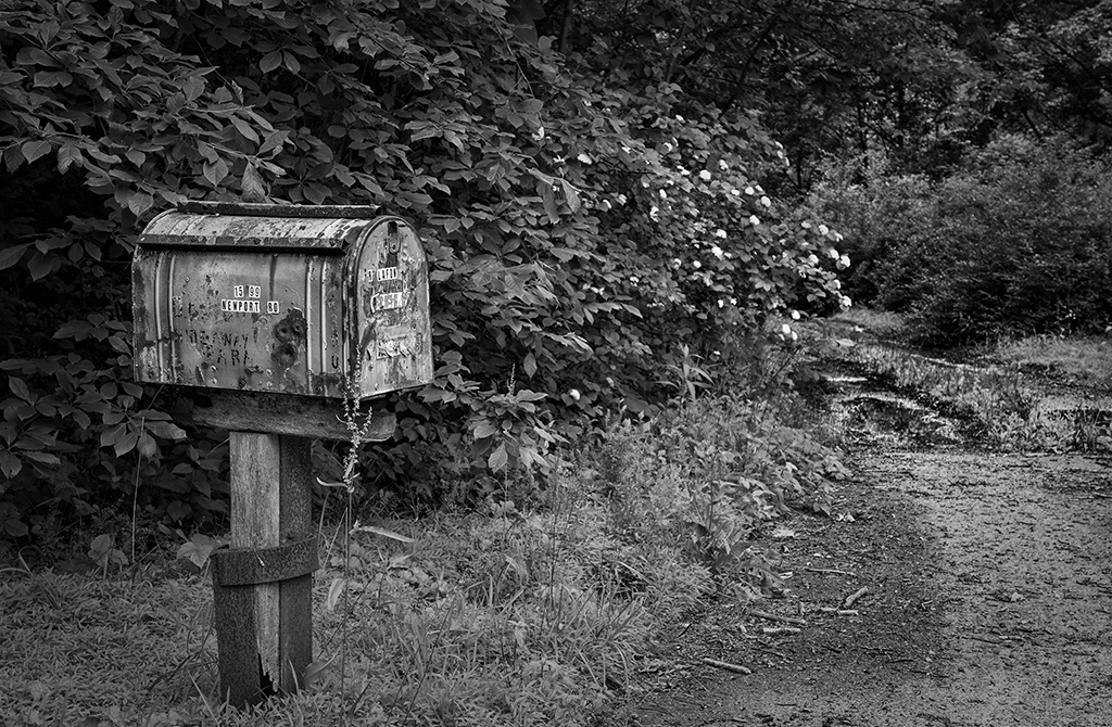
I love your photo, Oliver! I too like to find these cool mailboxes with character.
I tried my hand at editing with dodging and burning. I also tried to add some curves adj. in PS and levels. Your the expert here I only dabble in PS. I see the road defined in the color shot. How about more dodging and burning in the road area to bring out the details a bit more might help.
I think to balance the tones a little more is all the photo needs. The photo tells a story. Walking a path to the mailbox. Makes me wonder about a cabin in the woods or a boathouse up ahead on the path. A very calm feeling, in a very relaxing environment. Summer at the cabin.
Nicely done. |
Jul 22nd |
 |
| 62 |
Jul 18 |
Comment |
Hello Oliver,
I have something I need to share with the group with regard to evaluating photographs. I am using your last critique as a tool to get my point across because I am not finding the right term to use to describe what I mean. So here goes this is positive feedback on your critique, Oliver.
Something is very different from how you changed my photograph. My artistic style, as you know, is more dark and moody. The edits have now taken the "artists style" and made them pleasing to Your eye, not mine. The tonality that I as the artist of this photo is now gone.
We need to be sensitive to this mood and understand the artists "style" in our critiques so as not to offend or change what all of us have created. This is difficult and I find myself doing it as well. I have to make a conscious effort to notice it. I am trying to think about this element more as I go along.
I picked up on this thought from a judge I met a while back. His simple comment I summed up was artistic style is not an element or part of the judging criteria and it should be. He felt there are many artists, himself included, that are getting by-passed in salons. He encouraged me to continue to hold true to my style and keep submitting in my personal artistic style--whether you win or lose.
So that is my point. This will also help us grow in our ability to see beyond the simple forms of critique and see beyond middle gray, the rule of thirds, and standard guidelines for photography.
I Love How You Changed The Photo! Don't get me wrong, Oliver. I want to discuss "artistic style" maybe that is the word I am thinking of, or maybe not. Tell me what you think about this. I would love to hear from others!!
Kind and respectful regards,
LuAnn |
Jul 22nd |
| 62 |
Jul 18 |
Comment |
Thanks, Oliver that looks pretty good! I like how it gives nice light to his face. Do you think there is enough black tonality in the shot?
LuAnn |
Jul 18th |
| 62 |
Jul 18 |
Comment |
Paul, I love this shot! Do you call it street photography?
If it is street photography, then I would leave the table legs in the background as they would then tell part of the story. A street area with tables and chairs where people can have coffee, play a game or converse with each other. That is a very important element in street photography that usually isn't present in other styles of photography.
The only critique I have for you is the fingers of the person moving the chess piece seem to be glowing. Tone down the light area just a tad and it would be fine!
Have a great day my friend! |
Jul 17th |
| 62 |
Jul 18 |
Comment |
Beautiful capture, Pandula!
The only thing I can suggest is to brighten the highlights for stronger contrast. A little bit on the face so as not to blow them out, and definitely in the beard to help it stand out more and be more dynamic.
Well done my friend! |
Jul 17th |
| 62 |
Jul 18 |
Comment |
Nice black and white landscape image, David!
I am a fan of dark and moody photography myself. I like the detail in the reeds/grasses and think that there should be at least some detail in the trees behind if ever so lightly.
Or, maybe if you could lift the shadows on the black areas of the clouds you could still maintain the moody feel but the clouds could be more realistic. Thinking this through, this is probably the fix I would recommend.
There is something about absolute black in clouds that causes me to wonder about them. I think if they could be more dark gray as they are in real life, then the silhouette trees would be fine. Then the balance would feel better.
I hope this helps. Have a great day my friend!
|
Jul 17th |
| 62 |
Jul 18 |
Comment |
Thanks, everyone for the feedback! I do have a question about darkening the sitting area and toning down the arms. If I do that, where are my highlights coming from? I need to have balance with light and dark otherwise the scene is all darker tones. Great conversation! |
Jul 17th |
| 62 |
Jul 18 |
Comment |
Thank you, David and Paul, for your comments. I have to work on that cup its a good idea. I will also look at brightening the man's eyes. You are right this is a delicate area.
LuAnn |
Jul 9th |
| 62 |
Jul 18 |
Comment |
I will have to crop that drink out, Oliver. I too thought about that when I was editing it. Thanks! |
Jul 1st |
11 comments - 0 replies for Group 62
|
11 comments - 0 replies Total
|


