|
| Group |
Round |
C/R |
Comment |
Date |
Image |
| 65 |
Nov 20 |
Comment |
Thank you all for your kind words and suggestions. |
Nov 30th |
| 65 |
Nov 20 |
Comment |
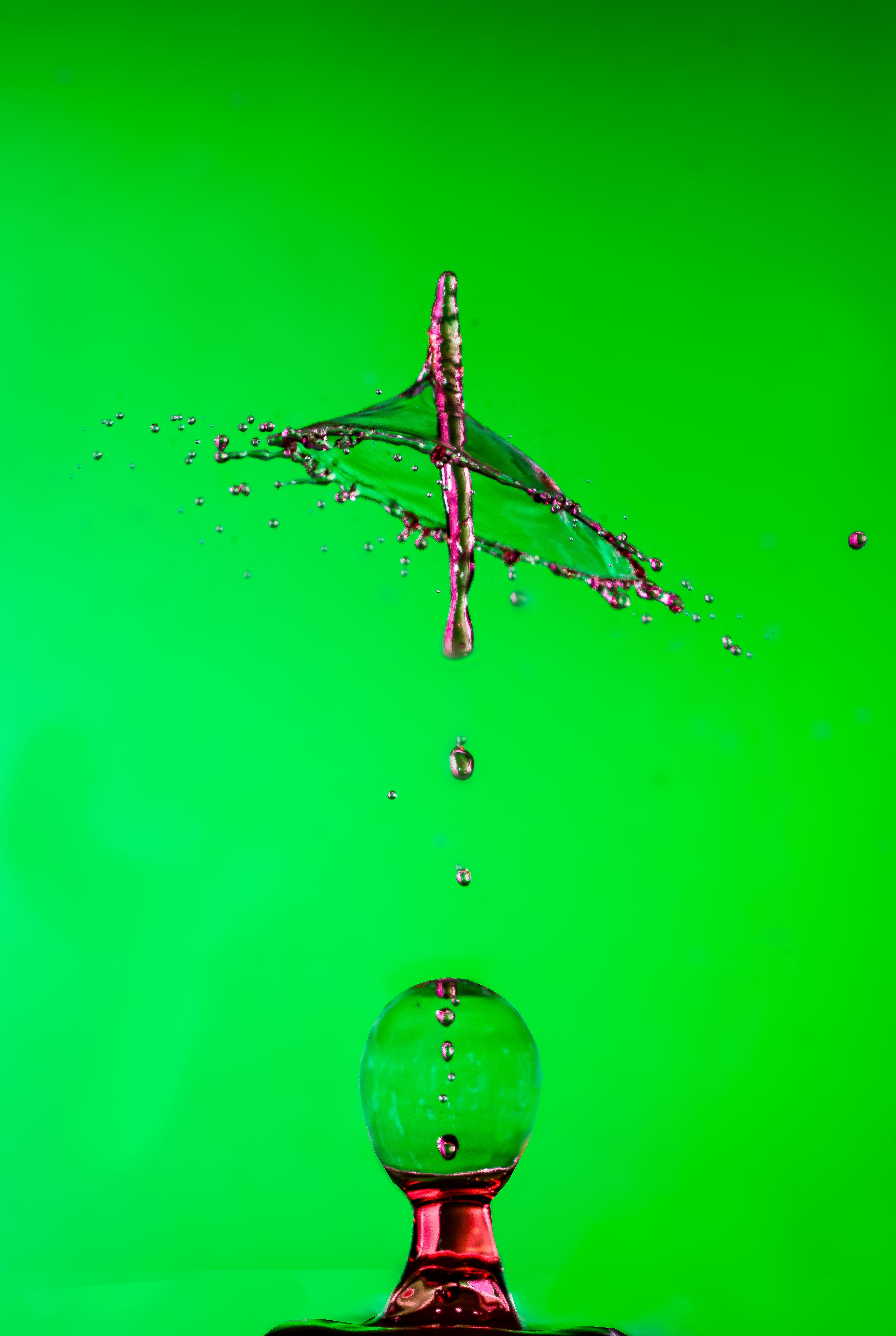
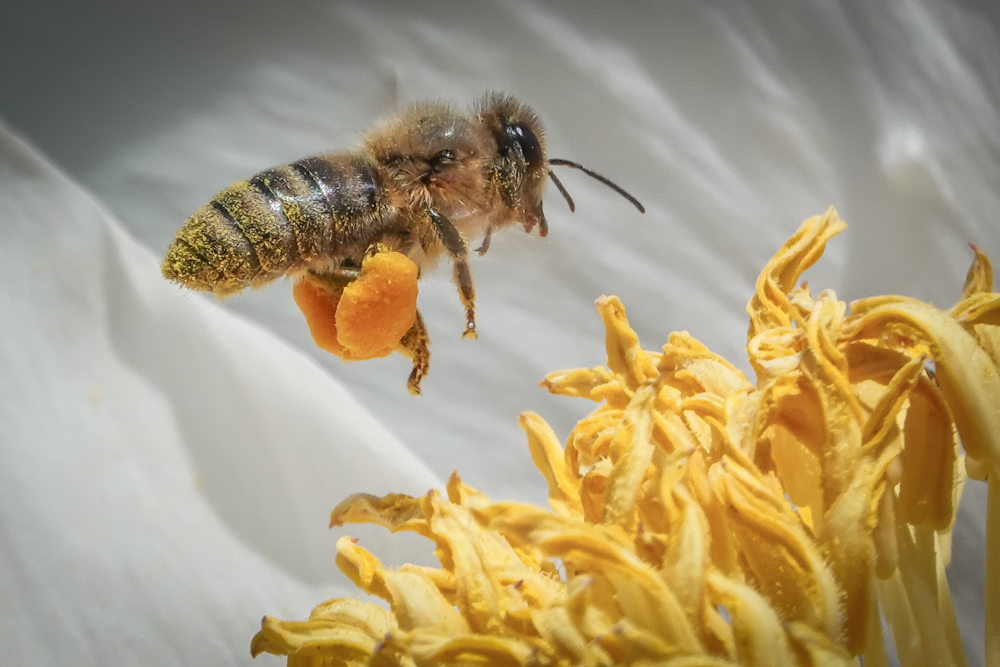
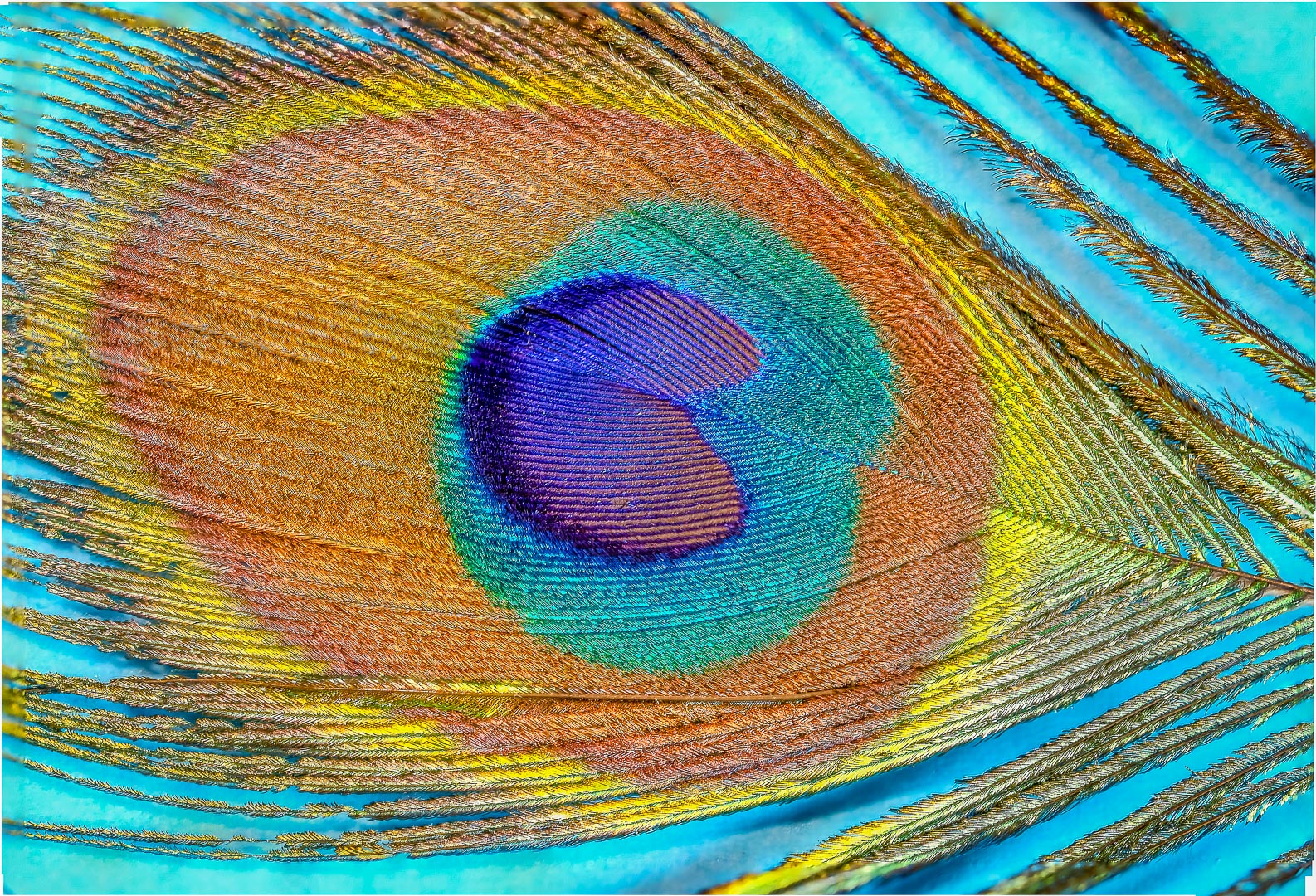
I enjoy this image.
I think that it show me the contrast between warm and cool tones, lines and loops; and depth created by selective focusing.
I think that the 2 different blues tie up the rainbow colors really well.
Texture of the yarns in focus are good too.
I appreciate the placement of the brighter color red at the back and blurred in relation to the darker and tamer colors to be in the front and in focus too.
To me : this shows that there are lots of different elements in the world that have lots of differences in everybody and everything but somehow we all merge into a bright, harmonious community.
Thank you for sharing. |
Nov 16th |
| 65 |
Nov 20 |
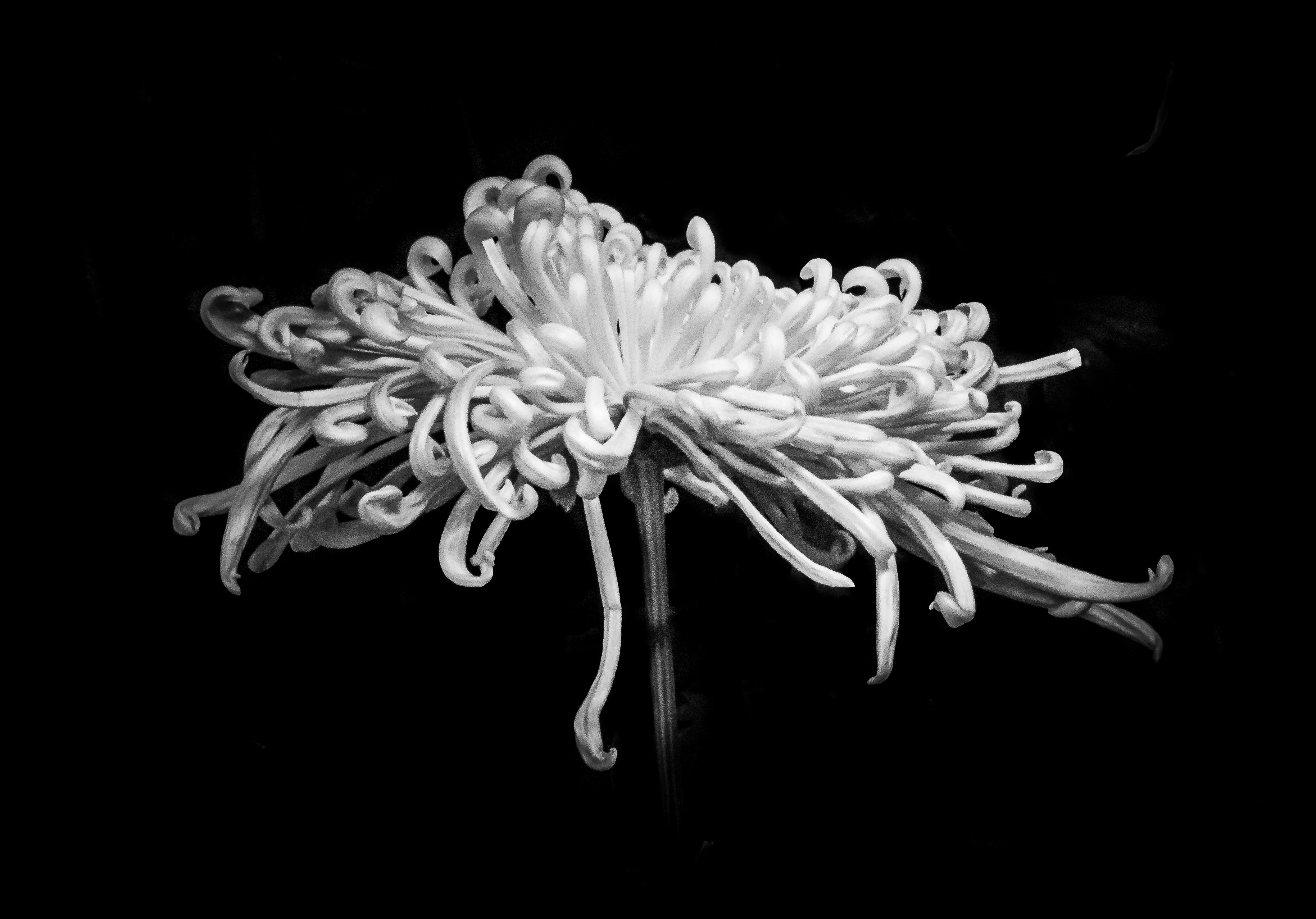
Comment |
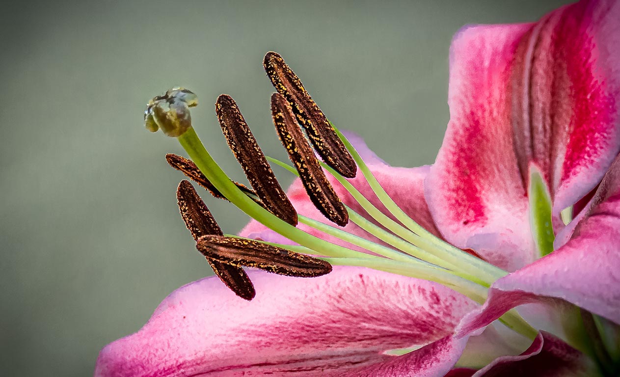
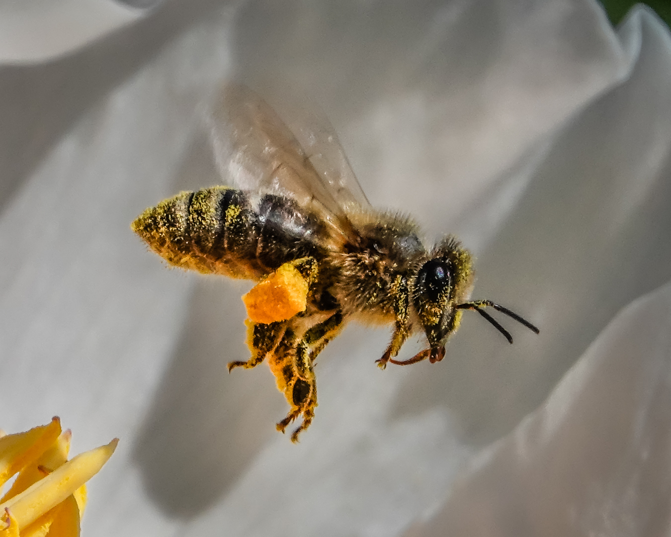
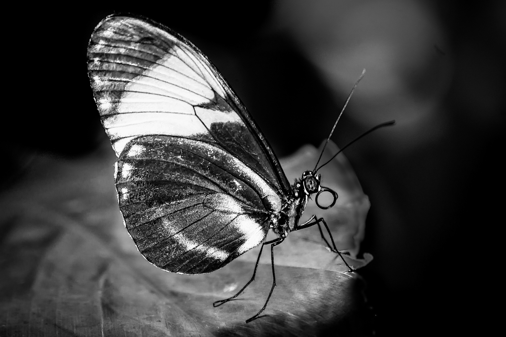
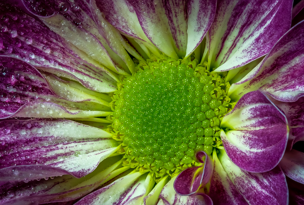
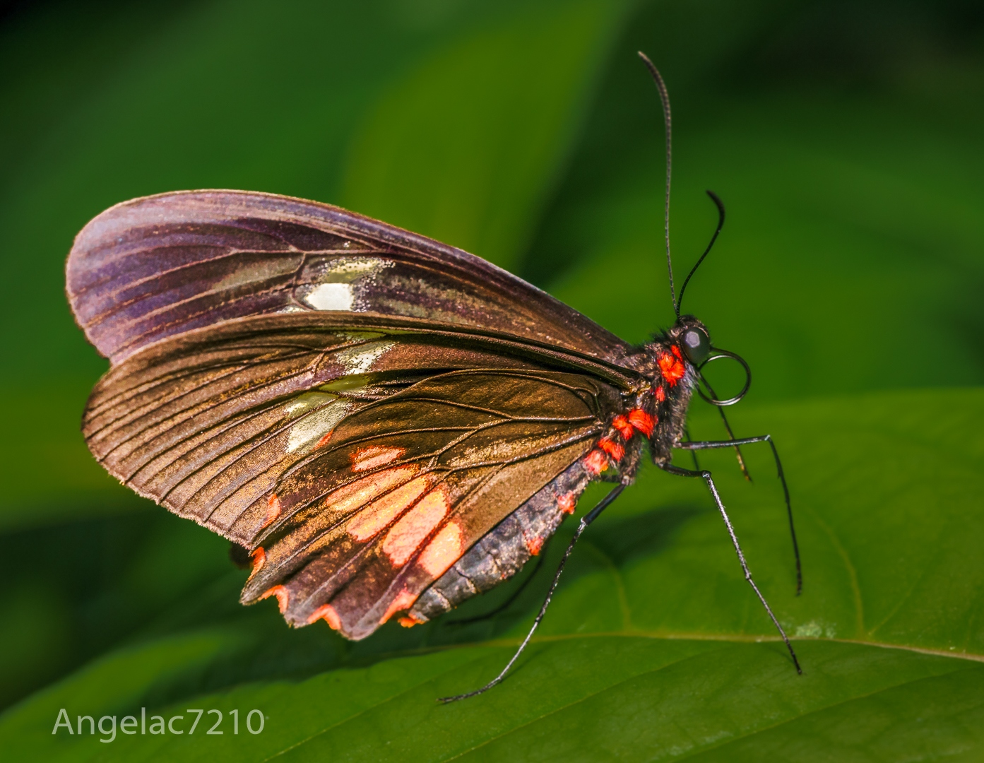
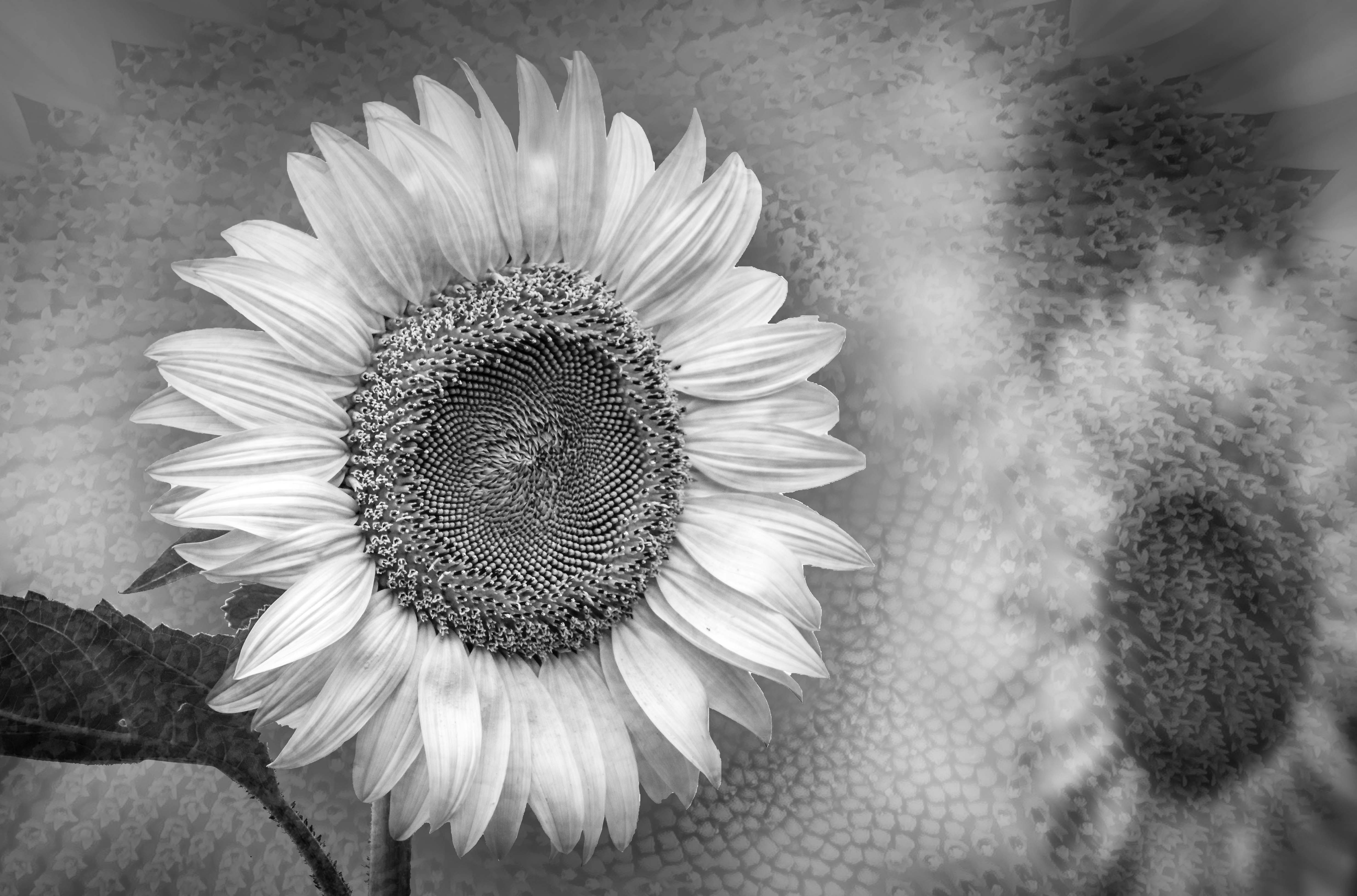
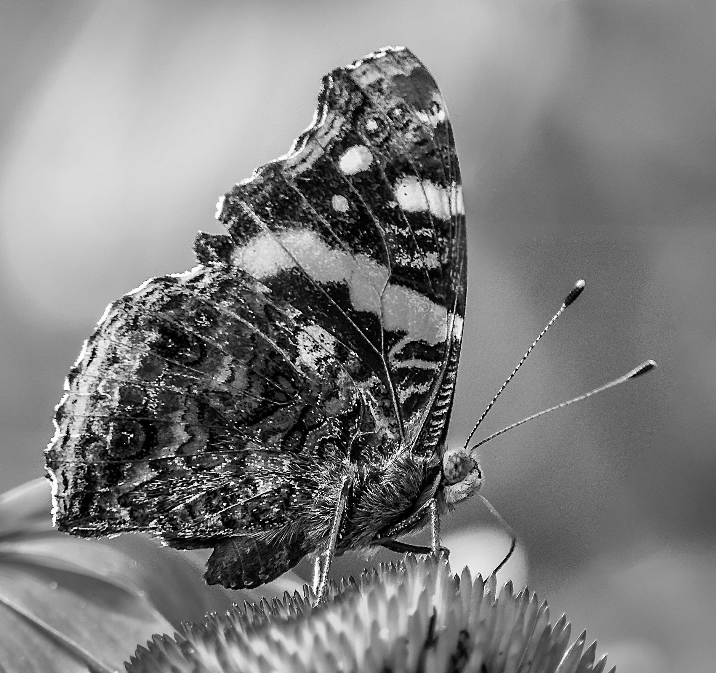
Love the texture and pattern.
This is a good monochrome image too. I think that this image include all the grey in the spectrum. ( I also belong to a monochrome group )
I just took an "Artistic Floral Photography" course that favor blurring part of the subject and it's stem.
My friend had called my first focus stacked bloom a "specimen piece"....The point is : As long as you like it, we all can have our own artistic choices.
Personally I still like a large percentage of my image to be in good focus and am only trying to blur in post instead of spending money to buy lenses to do in-camera blurring .
If we are looking down the artichoke, it is perfectly good for the stem to blur a bit when it is not in the same plane as the top.
Great shot. Thank you for sharing. |
Nov 16th |
| 65 |
Nov 20 |
Comment |
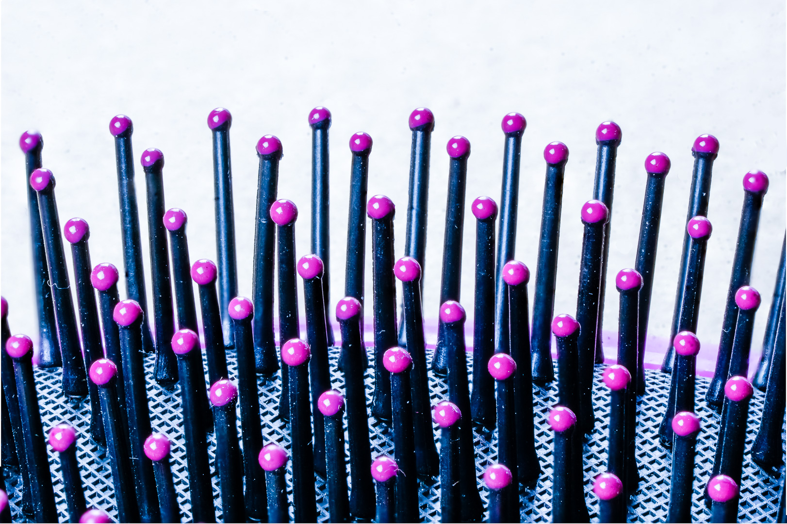
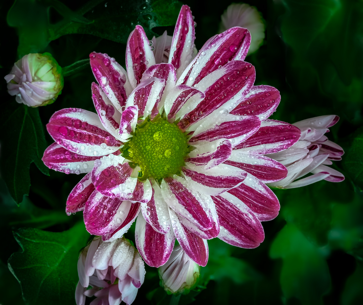
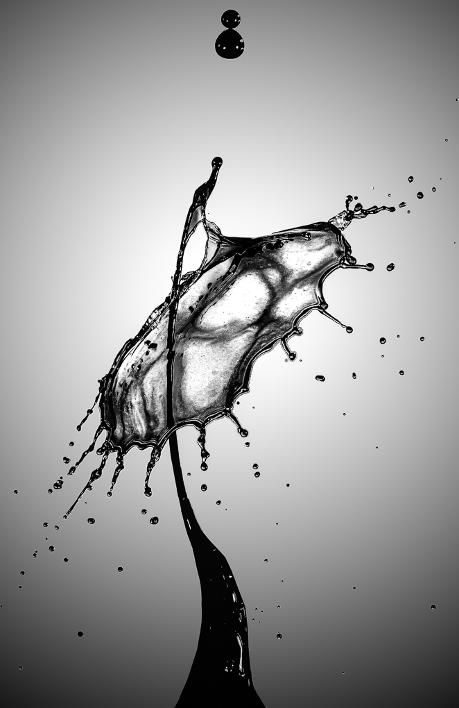
Great orientation and lighting.
The reflection is darker than the original which is exactly what it should be.
The decrease of sharpness from front to back is great too.
Usually I lower the white point until I can see texture if I am working on organic subject such as an orchid...I would lower the white until I can see shimmer on the petal because if texture is not seen than people will think that the area is over exposed.
However, in this image the white is just fine because I do not always expect to see texture in those areas.
Thank you very much for sharing. |
Nov 16th |
| 65 |
Nov 20 |
Comment |
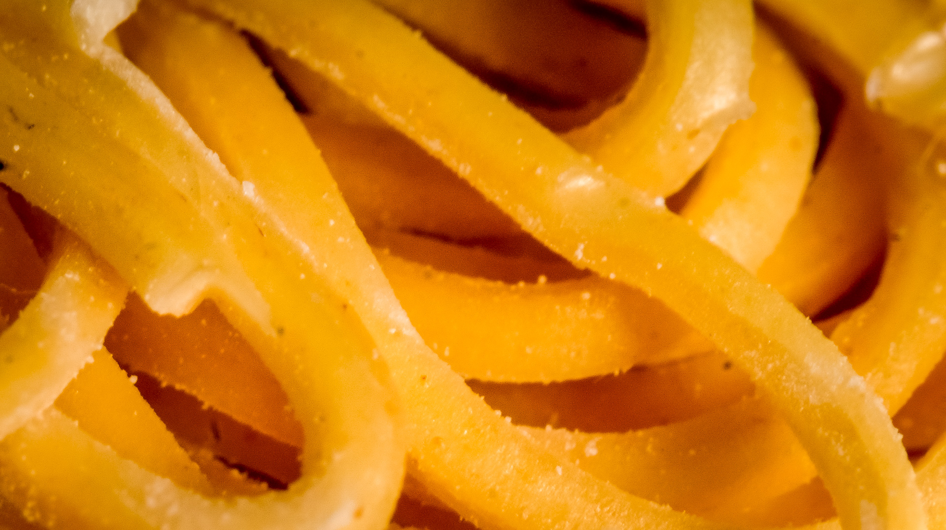
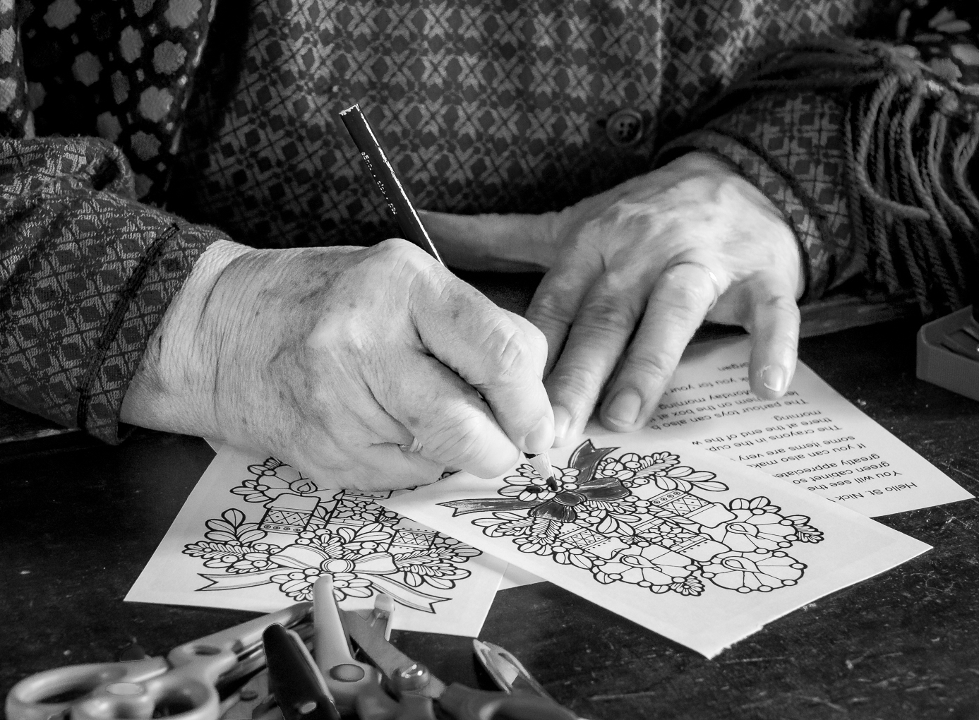
Hi Nancy, welcome to the group.
What a delicious choice.
The other friends had made some good suggestion and I would only want to say my two cents about cutting right under the skin at the top.
There is nothing wrong about cutting a piece off but I would suggest to cut off a big chunk or to include the whole edge.
Let your viewer know that it is not an accident and you really mean the cut. In portraiture we frequently say that it is best to either include the whole head or really amputate.
Really enjoy the texture of the juicy fruit. |
Nov 16th |
5 comments - 0 replies for Group 65
|
| 74 |
Nov 20 |
Reply |
Thank you for your kind words and suggestions. |
Nov 30th |
| 74 |
Nov 20 |
Reply |
Thank you for your kind words and suggestions. |
Nov 30th |
| 74 |
Nov 20 |
Comment |
Thank you for your kind words and suggestions. |
Nov 30th |
| 74 |
Nov 20 |
Reply |
Thank you very much for your kind words.
There is always something new to learn and something different to experiment with.
Let us all have fun together ! ! ! |
Nov 30th |
| 74 |
Nov 20 |
Reply |
Thank you for your kind words.
Artistic floral photography is different from regular floral shots.
I still prefer the majority of my image to be sharp verses the mostly soft images.
It does take some getting used to. LOL ! ! |
Nov 30th |
| 74 |
Nov 20 |
Reply |
Thank you for your kind words. |
Nov 30th |
| 74 |
Nov 20 |
Comment |
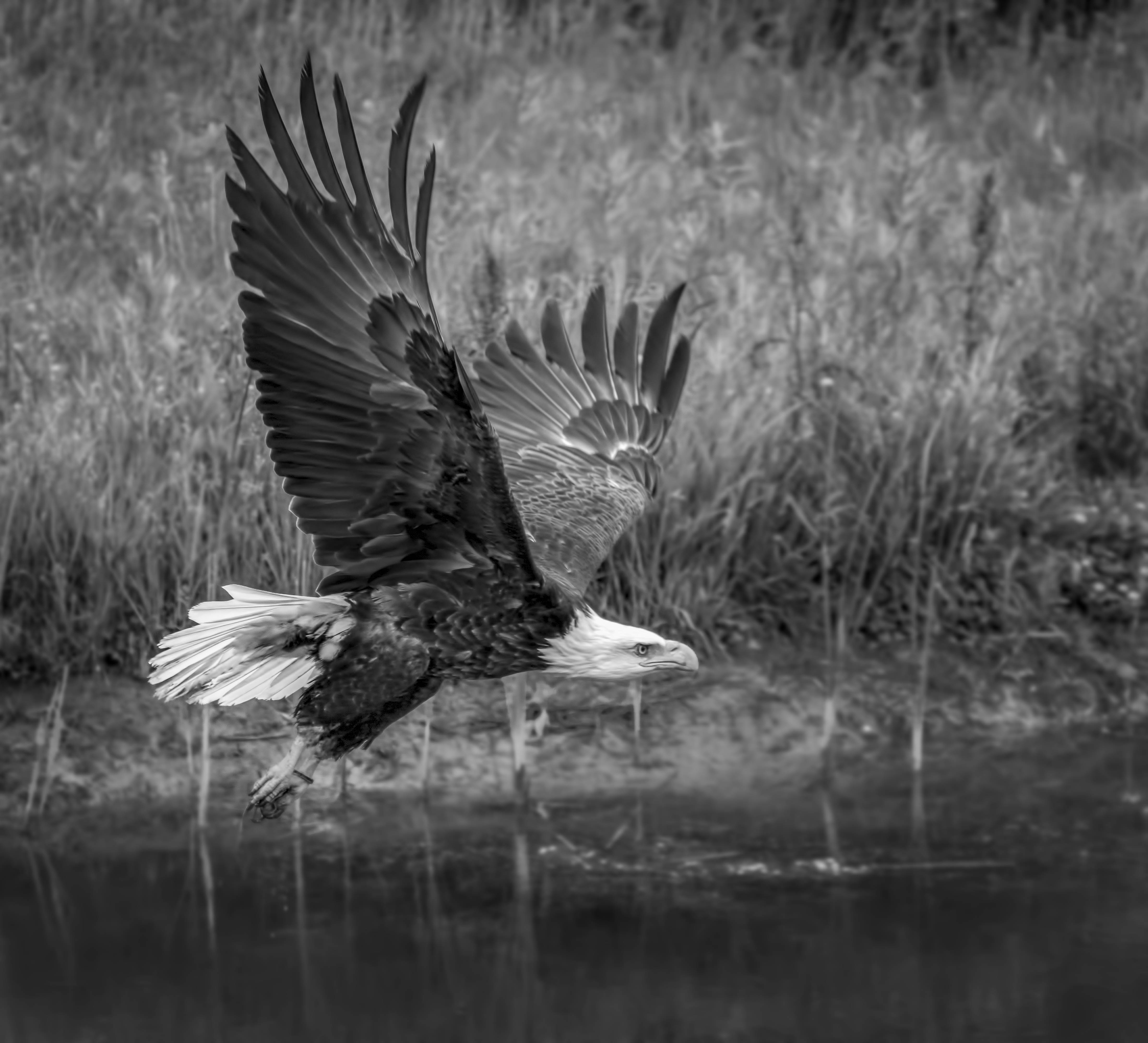
Love the BW version.
I was expecting a sunset sky when I saw the long shadow but was surprised with the blue sky.
The cropping emphasized the subject and the water fountains .
Great story and action.
Thanks for sharing. |
Nov 30th |
| 74 |
Nov 20 |
Comment |
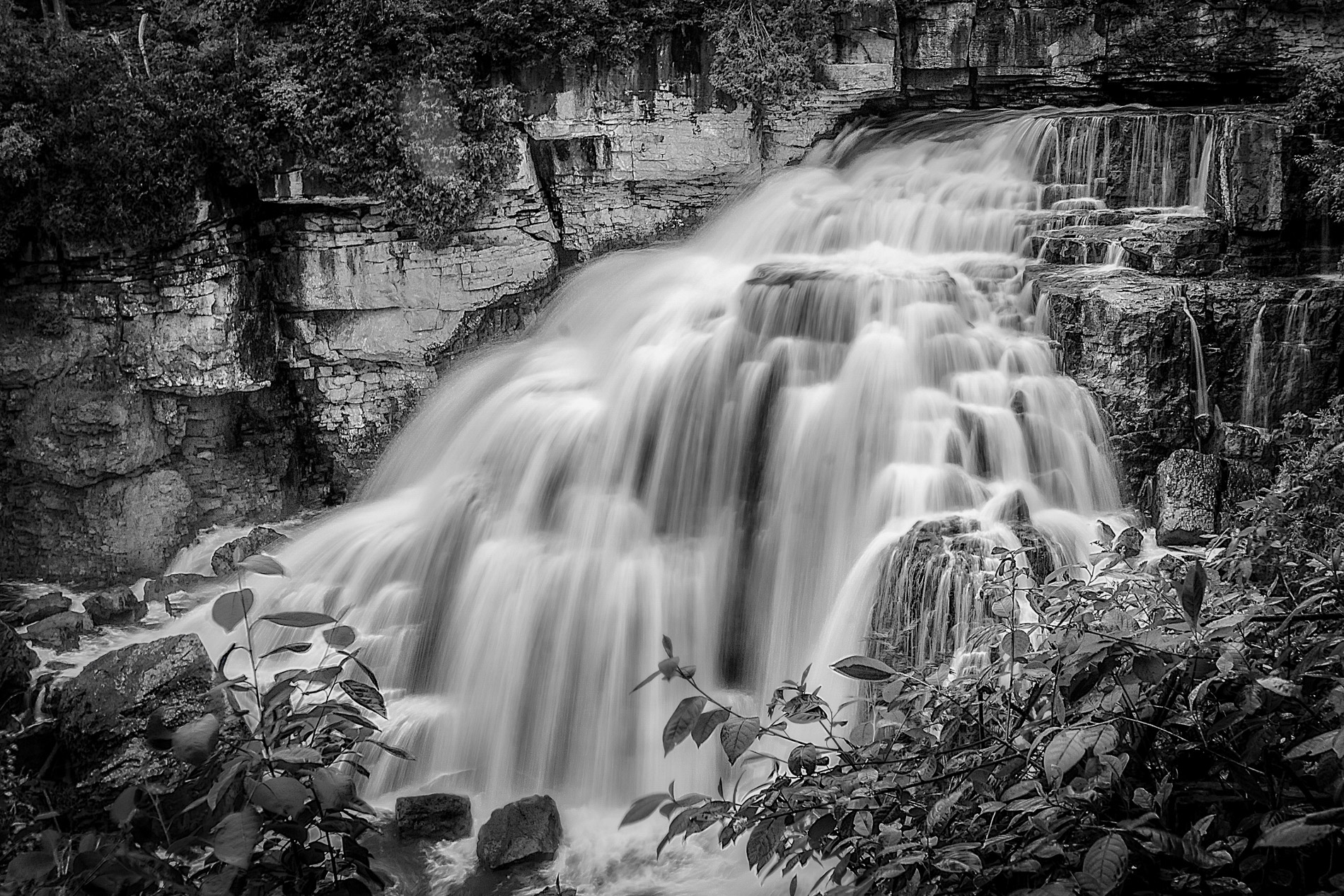
Great shot !
Composition is fine .
I see the swirl that Arne mentioned is actually in the "Golden Ratio" line. ( Close to 5 or 7 on a clock face). You do not need to adhere strightly to composition rules but these rules are suggested because most people find that they appeal to the eyes.
One further thought about composition is the flow . Flower arrangement are best to flow from the left to the right and we usually read in the same direction.
If this is my image I might try to flip it to see which way I like it better.
I like the BW version better because if the focus is the water then the yellow vegetations would be distractions.
For milky water I really use a longer shutter speed . I can achieve that with a higher aperture number and/or a neutral density filter.
Thank you very much for sharing. |
Nov 30th |
| 74 |
Nov 20 |
Comment |
Another good story teller.
Oddly enough, the first thing I see is not his hands but the mask on his neck. That is really the sad sign of the time.
I actually like how one hand is stationary while the other one is in motion.
His forlorn expression make me think that his heart is not in the music he is playing but some other sad thought .
Hope that this scene will not last much longer.
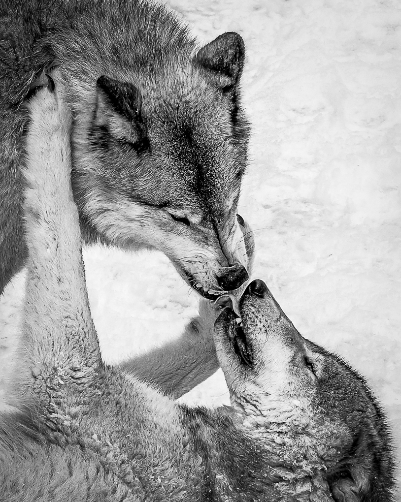
Thank you very much for sharing again. |
Nov 30th |
| 74 |
Nov 20 |
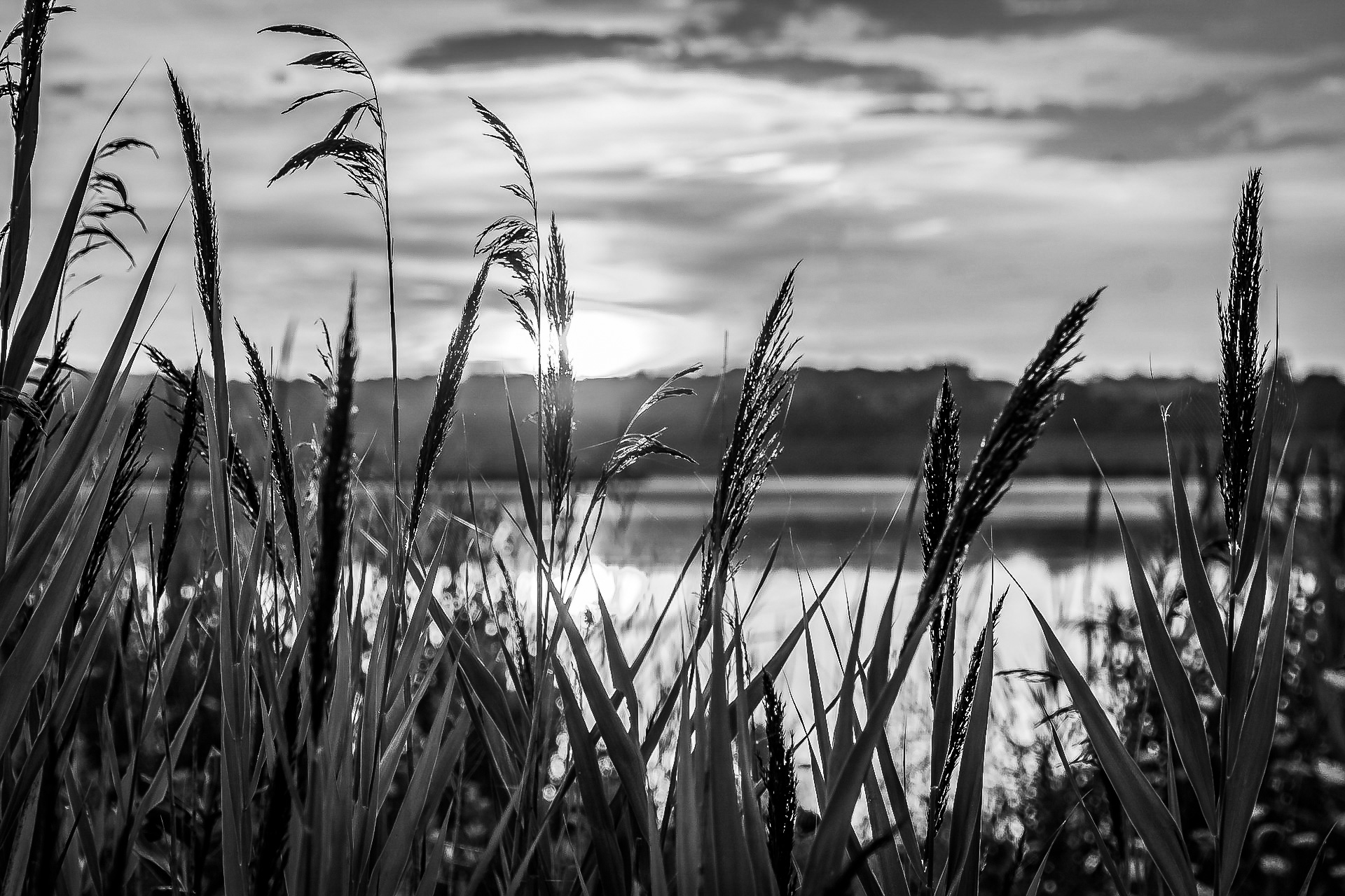
Comment |
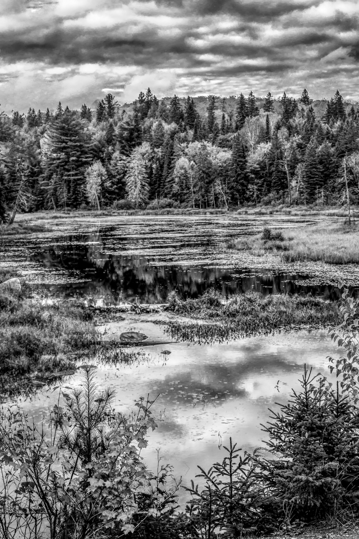
A lone tree that stand tall on a land with no bound to witness the passing of life and time ! !
Very poetic and invite us to the investigate the past, the future and meaning of life.
To me, simple is always stronger than busy scene .
I would like the time to be longer so that I can see more movement and the implication of longer time...however, that is only me.
I would enjoy more texture in the sky for the same reason.
Blue is a color that can yield many different tones so it would mean that our preference are different because we interpret the scene in different ways.
Thank you very much for sharing.
|
Nov 30th |
| 74 |
Nov 20 |
Comment |
Love the colored version.
To me, a church is a bright place because of the love of God regardless of its luminosity.
I can really feel the warmth and hope in the colored version .
The chandeliers, the altar and images show me beauty and hope.
As the kind of person who always try to look at the sunny side I agree with Arne.
Thanks for sharing. |
Nov 30th |
| 74 |
Nov 20 |
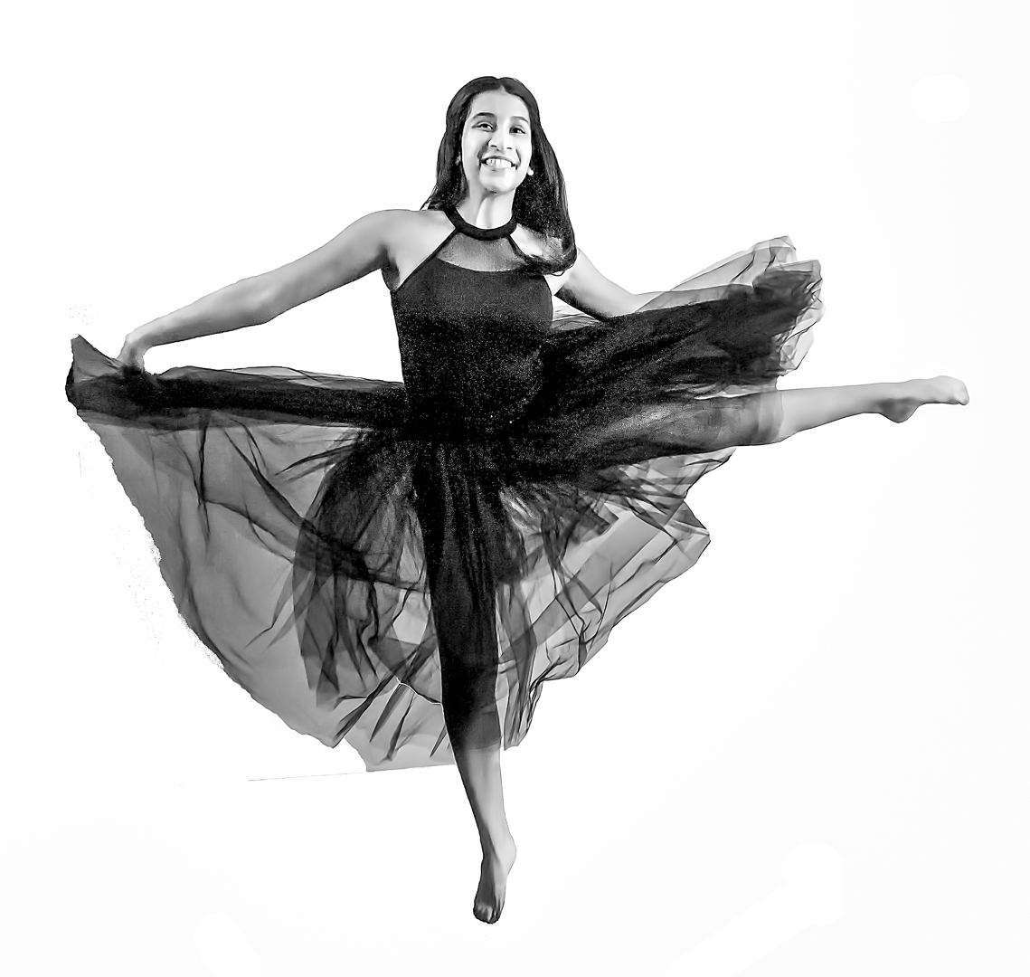
Comment |
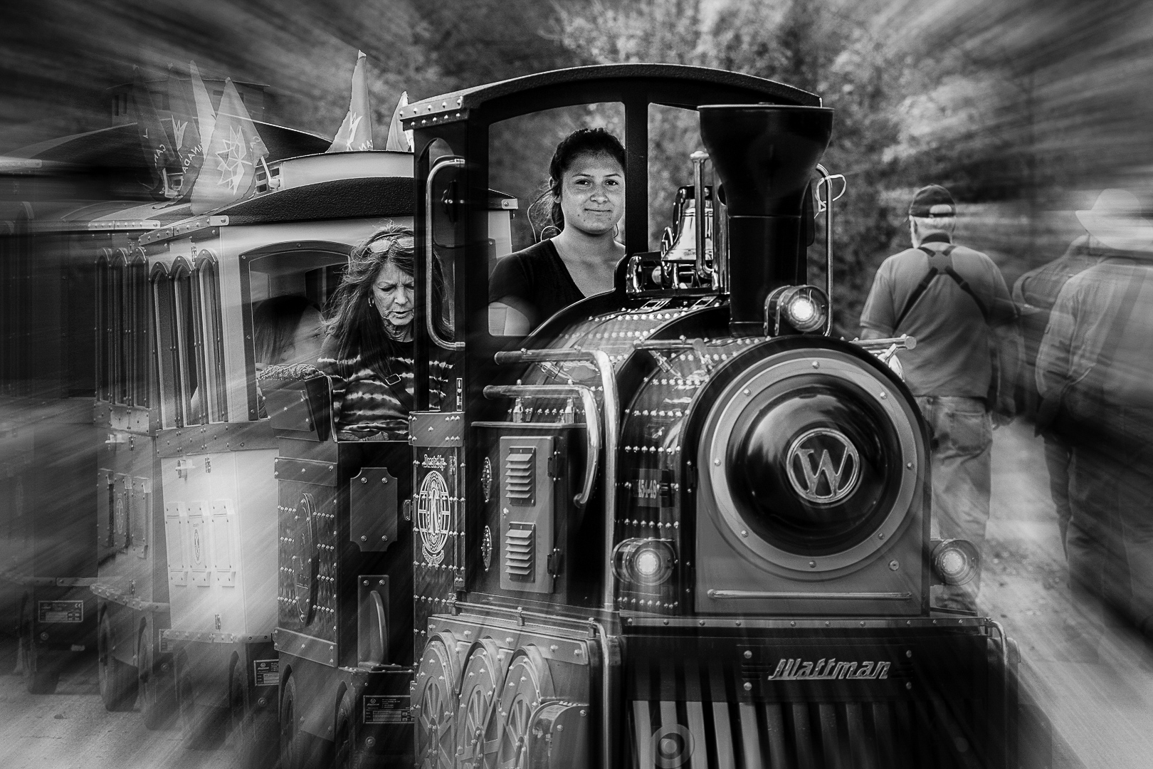
Great panning shot .
The speed is just right so that the main subjects are sharp while the feet are a bit blurry to imply motion.
Composition is wonderful too since you allow room for the subjects to move into.
BW version eliminate the distraction caused by the colors.
You even captured great smile on mom's face.
Bravo ! ! ! |
Nov 30th |
7 comments - 5 replies for Group 74
|
12 comments - 5 replies Total
|