|
| Group |
Round |
C/R |
Comment |
Date |
Image |
| 65 |
Oct 20 |
Comment |
Thank you very much for all your nice words. They certainly give me lots of encouragement. |
Oct 26th |
| 65 |
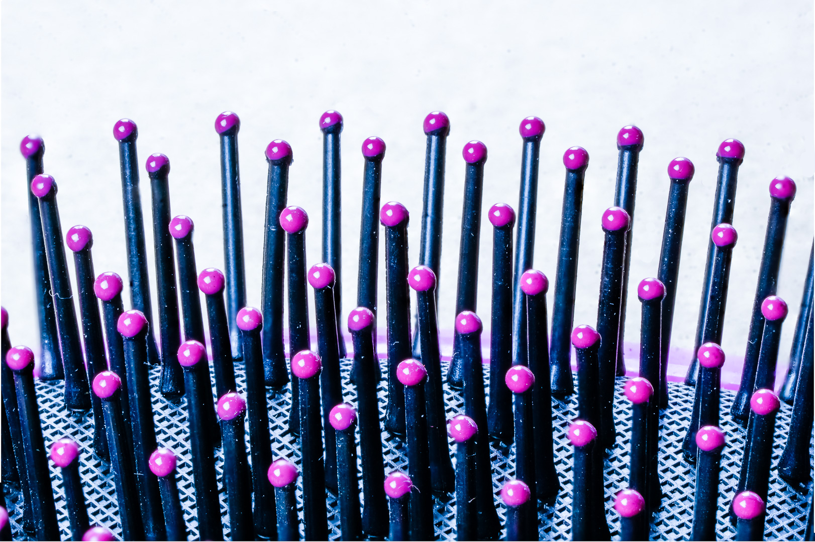
Oct 20 |
Comment |
Wonderful image as usual ! ! !
Oh My..You certainly had done lots of work in cleaning up.
Luckily I think that darkening all the bavkground would not be too hard in Lightroom . In PS I would replace the background right from the start.
The mirror image of the nail at the right does not look straight. May be it is due to the angle of the camera or the distortion of the lens >
In PS, if you go into Transform, then distort. You can pull the lower right corner until the reflection is at an angle that you like. |
Oct 26th |
| 65 |
Oct 20 |
Comment |
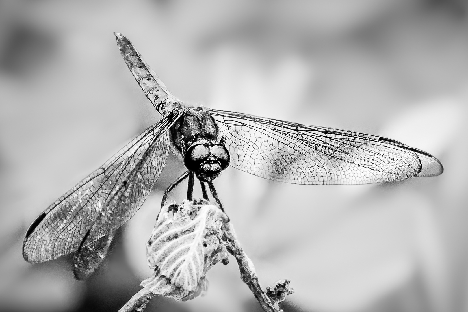
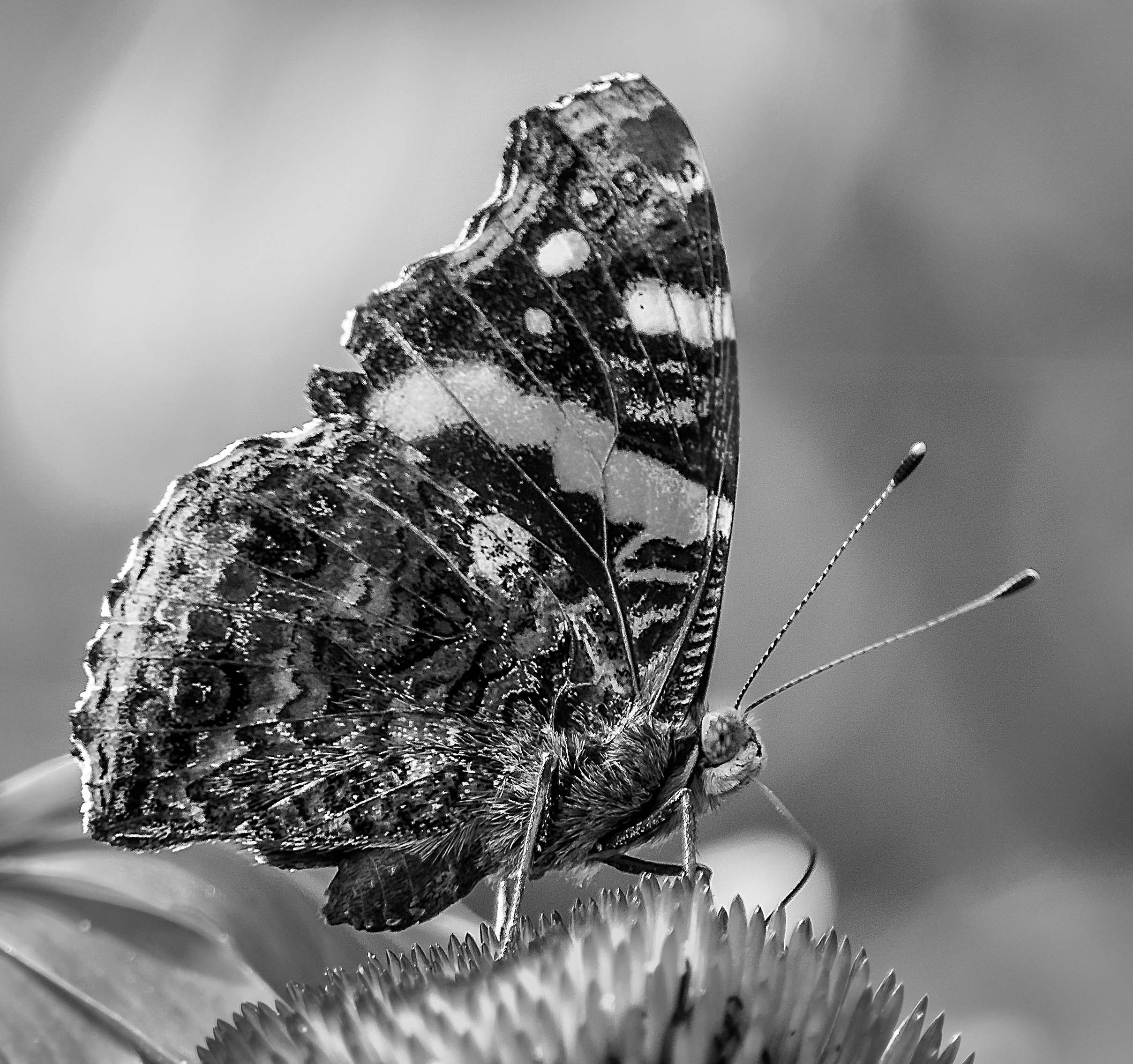
Wonderful display of textures,colors and lines.
I like Peter's suggestion about tilting the leaf .
Diagonal is stronger than straight line in images.
The landscape orientation or straight line give the feeling of serenity while diagonal or portrait orientation implies tension and danger.
I would also suggest showing more of the apex of the leaf vein because that is very interesting to me too.
I am too lazy to use my tripod most of the time.
However, if I set up my tripod I would try to use a lower ISO.
In this case I would take one at ISO 100 to see whether the speed is very long. If the image is not tack sharp I would increase my ISO ( so that the speed is decreased to avoid shakiness ). Of course these would not work if there is any chance of wind blowing at the leaf.
|
Oct 26th |
| 65 |
Oct 20 |
Comment |
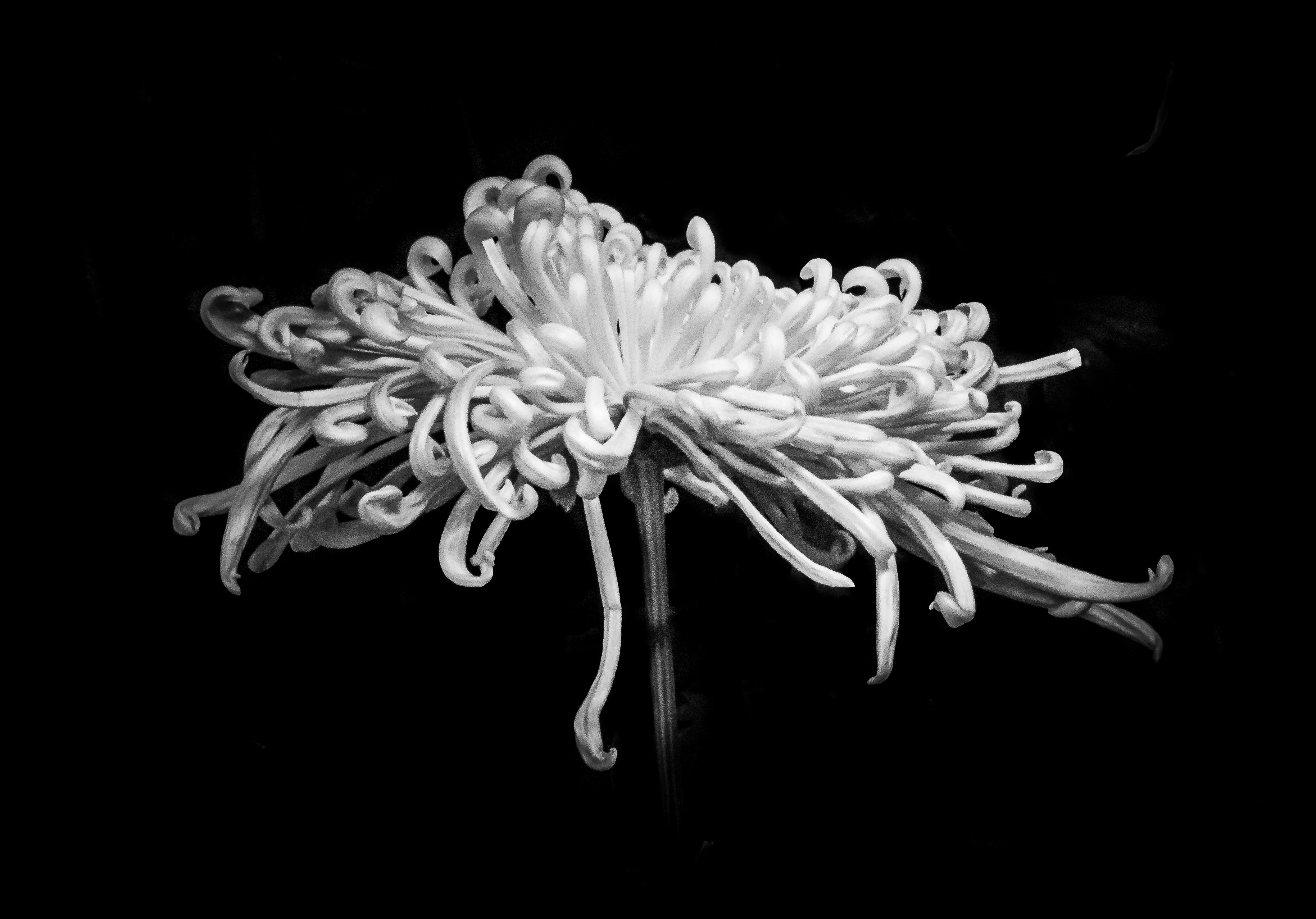
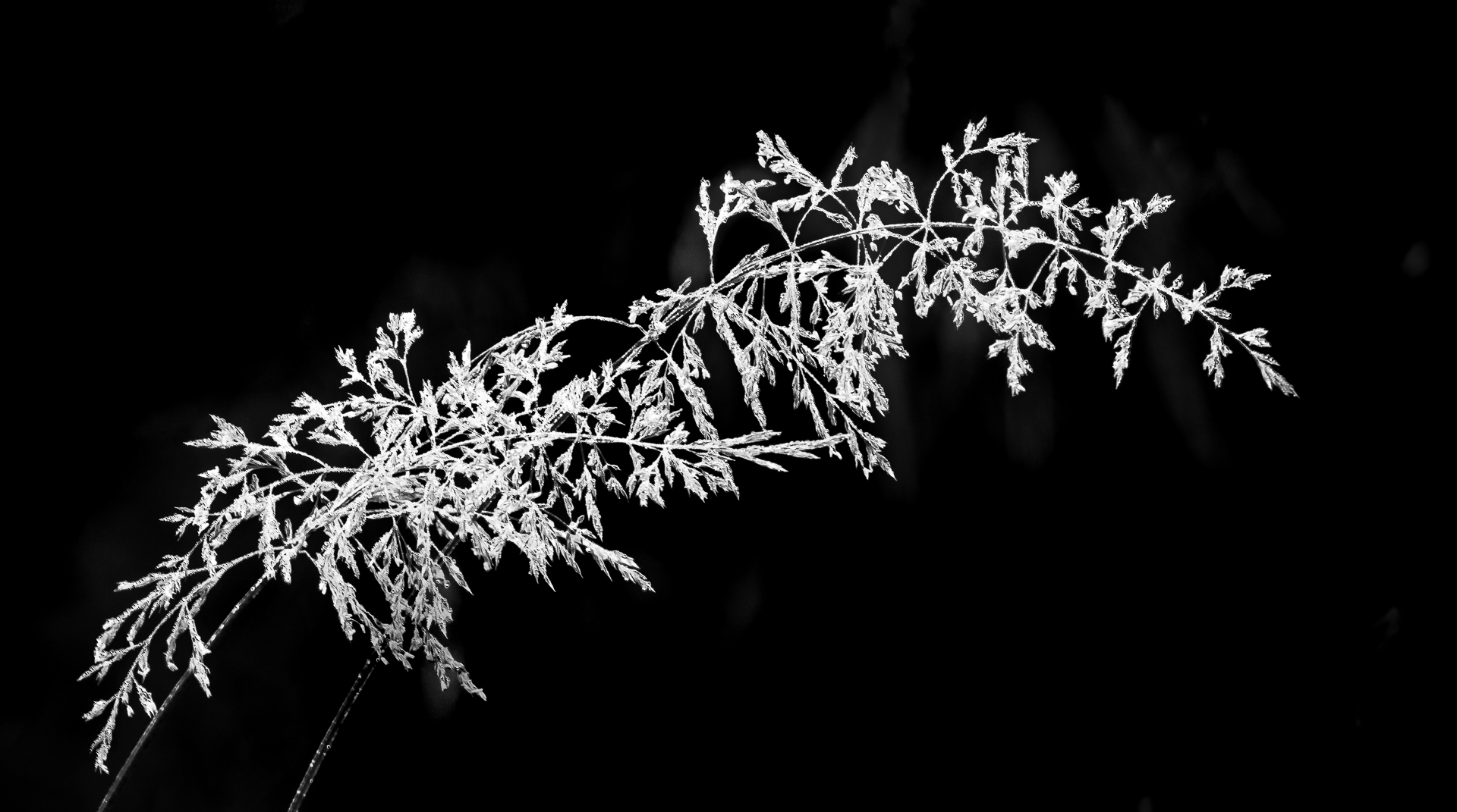
What an interesting process ! ! !
It is very interesting to see the texture of ice surfaces.
Thank you for taking the time to do so much for an image.
Being very sticky with composition ( as you have known for quite a while) I would suggest to extend the image to include the whole chunk of pineapple. I was told long time ago that it is much better to be in or out... not almost...OR..to cut the image before we can see the pineapple chunk at the top.
Another idea is to set the fruit on its side or the freeze them in green Jello ..Sorry, I frequently let my imagination go .
Seeing that you talk about Topaz frequently, I went into the site to see how much the AIs are because I really do not want to pay much since I have the old set plus Topaz Studio....Found out that I only have to pay a very very low sum to upgrade to both packages. Thanks to you I can play again. Thanks.
|
Oct 26th |
| 65 |
Oct 20 |
Comment |
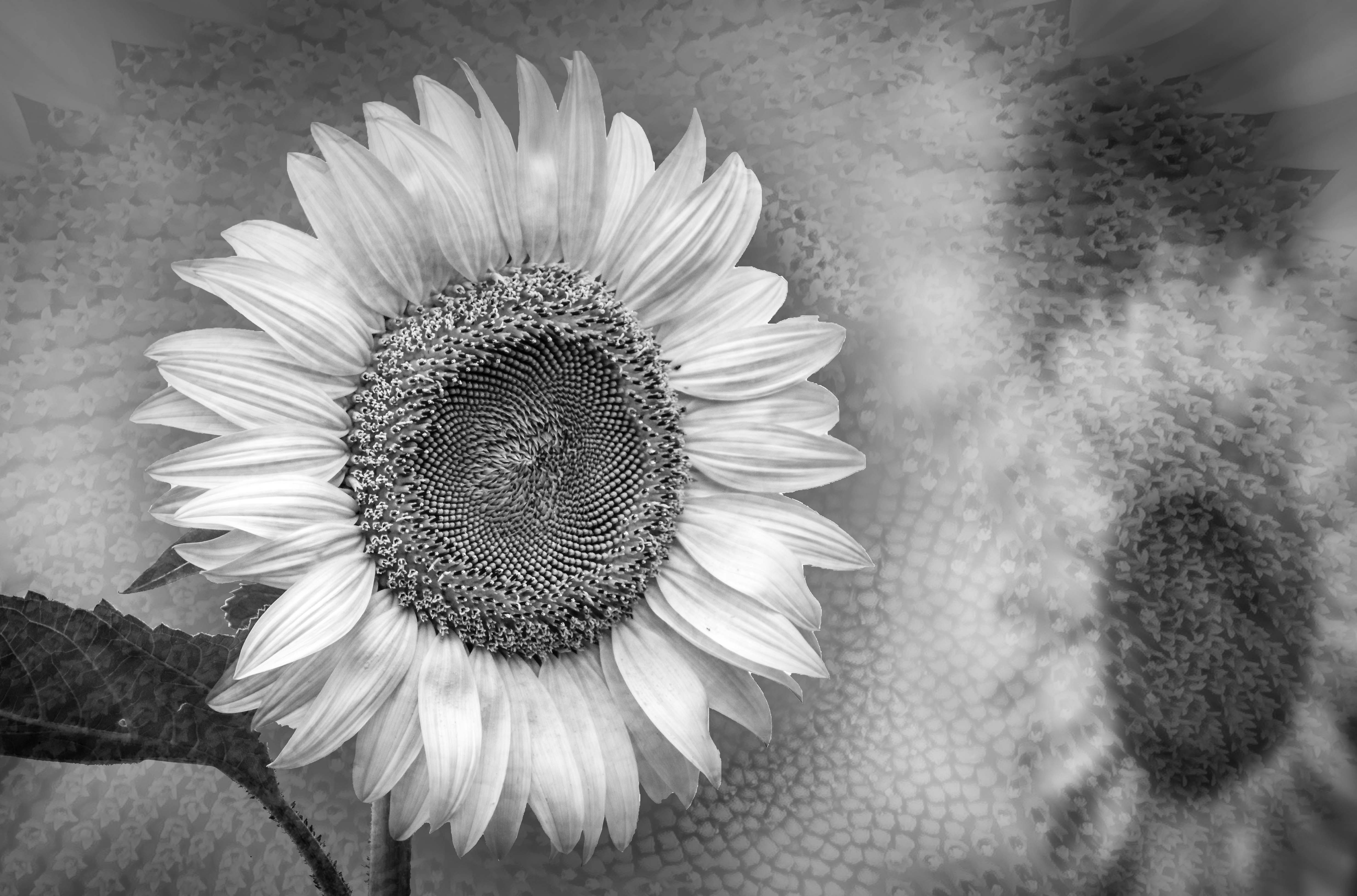
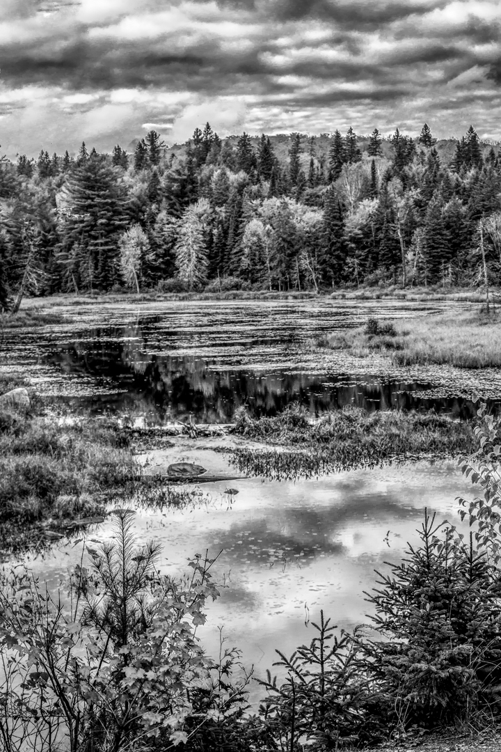
Thank you for sharing the rich colors and textures of a fall scene. The diagonal line of the leaf helps as leading line to draw our eyes into the picture. The lines of the texture of the leaves and tree trunks contrast with the round mushrooms and dots on top . The drop in focus at the top is a good way to show depth of field although I am expecting more of a drop in height in the background to achieve the result.
One question I always ask myself is : where do I want my viewers to look at first = what is my focus ?
If this were my image I would include more from the left so that the 2 mushrooms are about the same distance from the edge.
Like the green dots left in the red leaf. Nature is beautiful in all stages. It is the viewers who need to learn to appreciate them...
.and this is what photography has shown me. |
Oct 26th |
5 comments - 0 replies for Group 65
|
| 74 |
Oct 20 |
Reply |
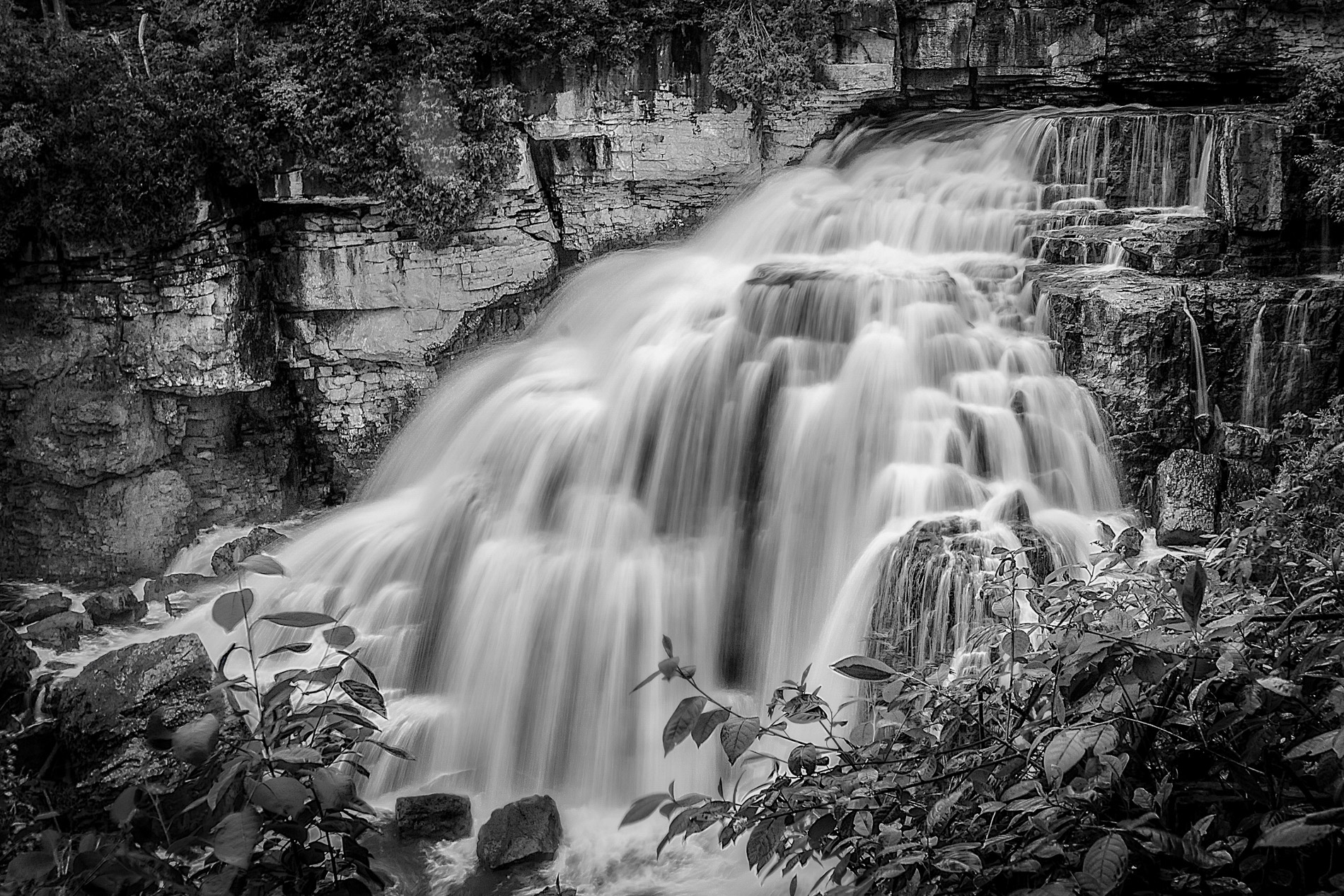
Usually I prefer images that are simple but this one works for me. I like where you put the waterfall because this is close to the ( Golden Ratio) . However, I do recommend to change the angle you look at the water fall so the the water do flow into the image. ( If the placement of vegetations allow ).
Thanks for sharing.
|
Oct 27th |
| 74 |
Oct 20 |
Comment |
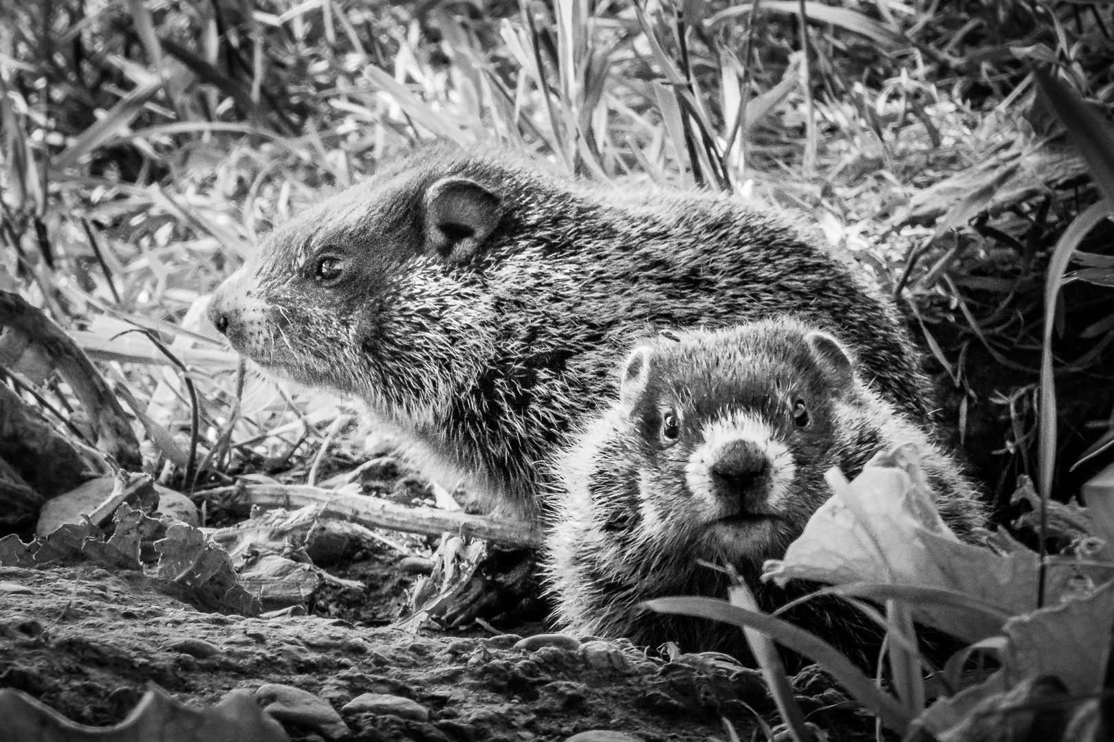
Another very good story,
I like how you focus on your subject and let the front and back fall out of focus so that we know where you want us to look.
With the second crop I can see the story without too much extra.
When you edit in PS, do you go into ACR ( Adobe Camera Raw) ?
My workflow in Lightroom or ACR are 1. Straighten 2. set black and white point..remember that anything that does not show texture will be interpreted as too bright ( or too dark). Bright areas tend to attract the eyes . Light tone and yellow will convert to brighter areas during BW conversion.
When we do portrait the face should be the brightest area of the image...less so in this kind of image but we still want attention to be drawn to the subjects instead of all the brighter areas.
Thanks for sharing. |
Oct 27th |
| 74 |
Oct 20 |
Comment |
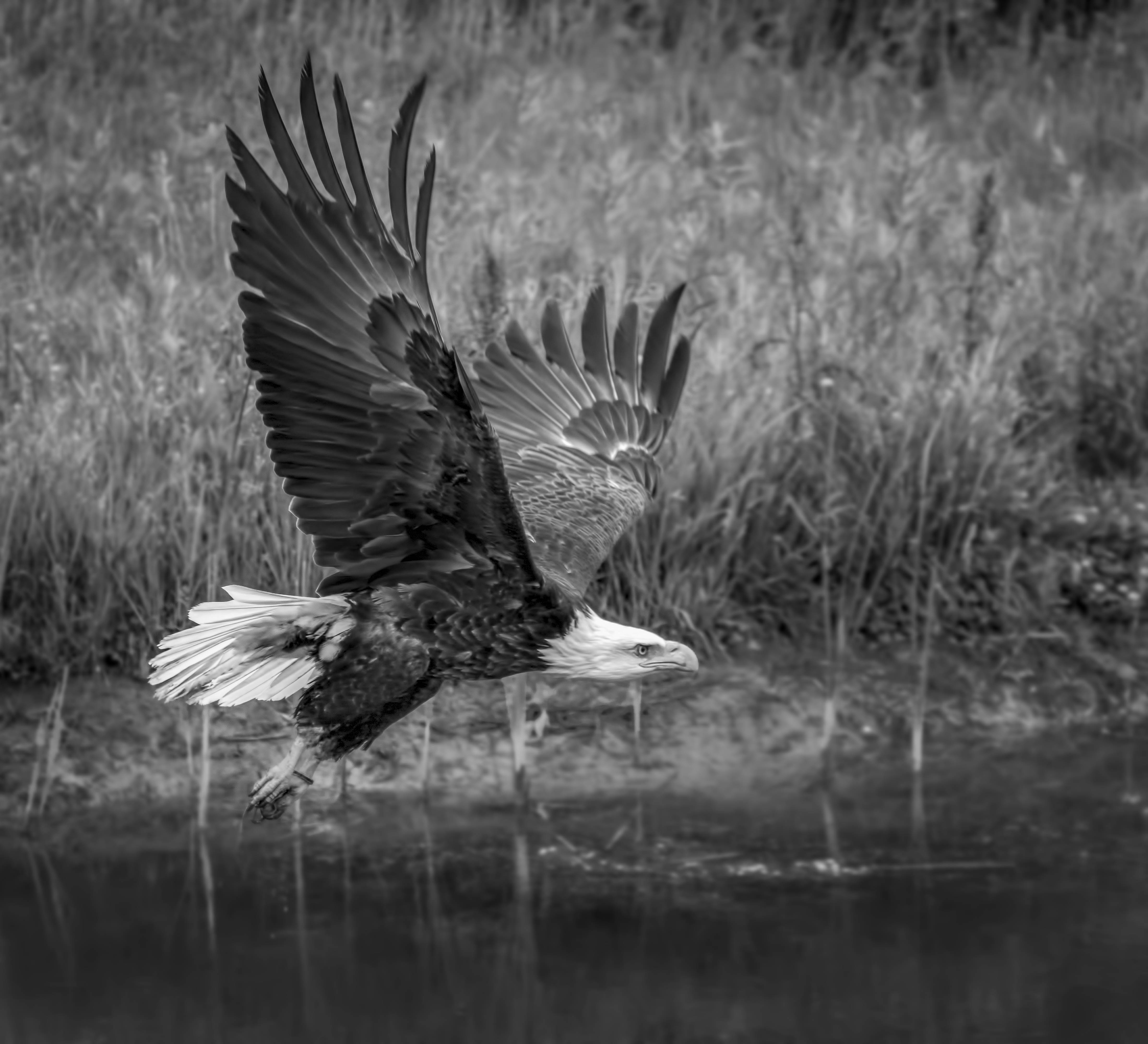
Beautiful image and I agree with the suggestion of cropping from the left.
Personally I love the colored version with rich golden tones.
The BW version convey a different message that is more dramatic.
I can fully understand why your speed and ISO are both high. I would casually snap images like this in between flying birds or running animals and it is too much work to be switching setting all the time. ISO of less than 1000 usually does not bother me.
There is a thin line that coat the tree and vegetation..cannot decide whether they are backlight or artifact ?
Thanks for sharing |
Oct 27th |
| 74 |
Oct 20 |
Comment |
Love the crop and fresh BW version.
The murkiness of the brown had been eliminated and removal of the wall at the left really open the scene .
I actually like the front of the court to be out of focus because that force our eyes to focus deeper in the image.
Architecture is not my favorite but I do appreciate the different textures , lines and shape. Usually we do not look for drama in this kind of photography. To me, the style and form of architecture is interesting enough for me.
Thank you very much for sharing. |
Oct 27th |
| 74 |
Oct 20 |
Comment |
Great image with rich texture and lots of detail.
BW conversion is wonderful with rich and wide tone range.
Love the translucent quality of the caps and many different shades created by the greens.
My taste call for a bit more room at the top but if you like it this way then it is fine. |
Oct 27th |
4 comments - 1 reply for Group 74
|
9 comments - 1 reply Total
|