|
| Group |
Round |
C/R |
Comment |
Date |
Image |
| 65 |
Jul 20 |
Comment |
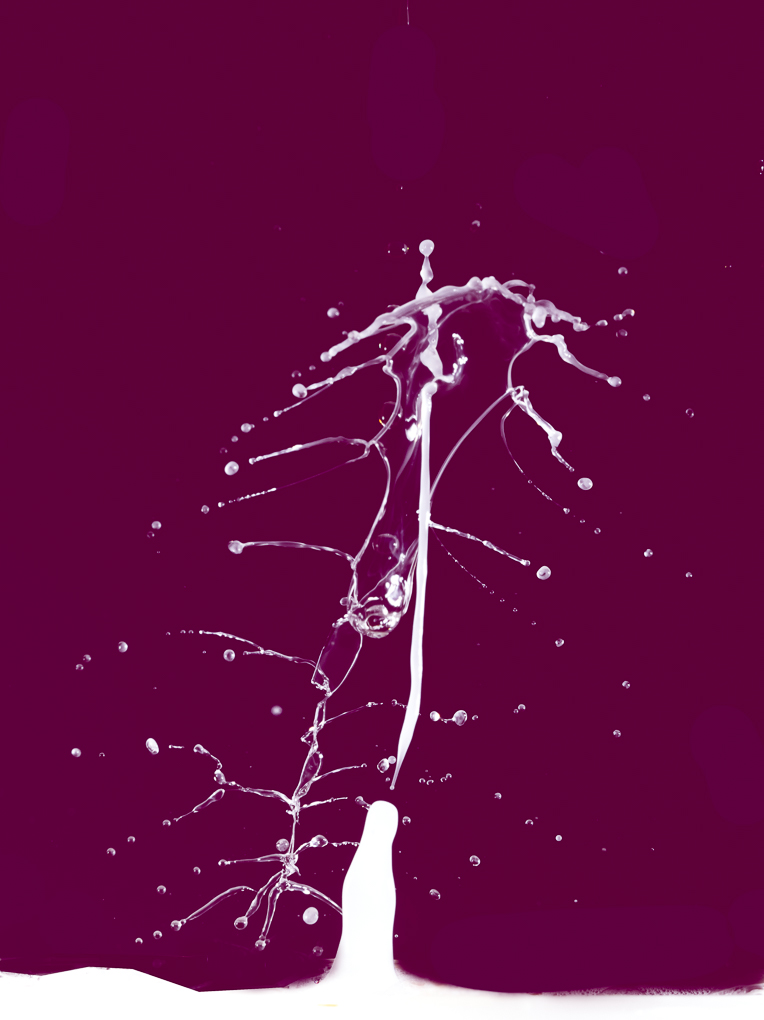
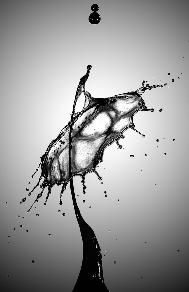
Thank you very much for all your comments.
The last few months I had concentrated on learning Portraits shooting so these are all old work.
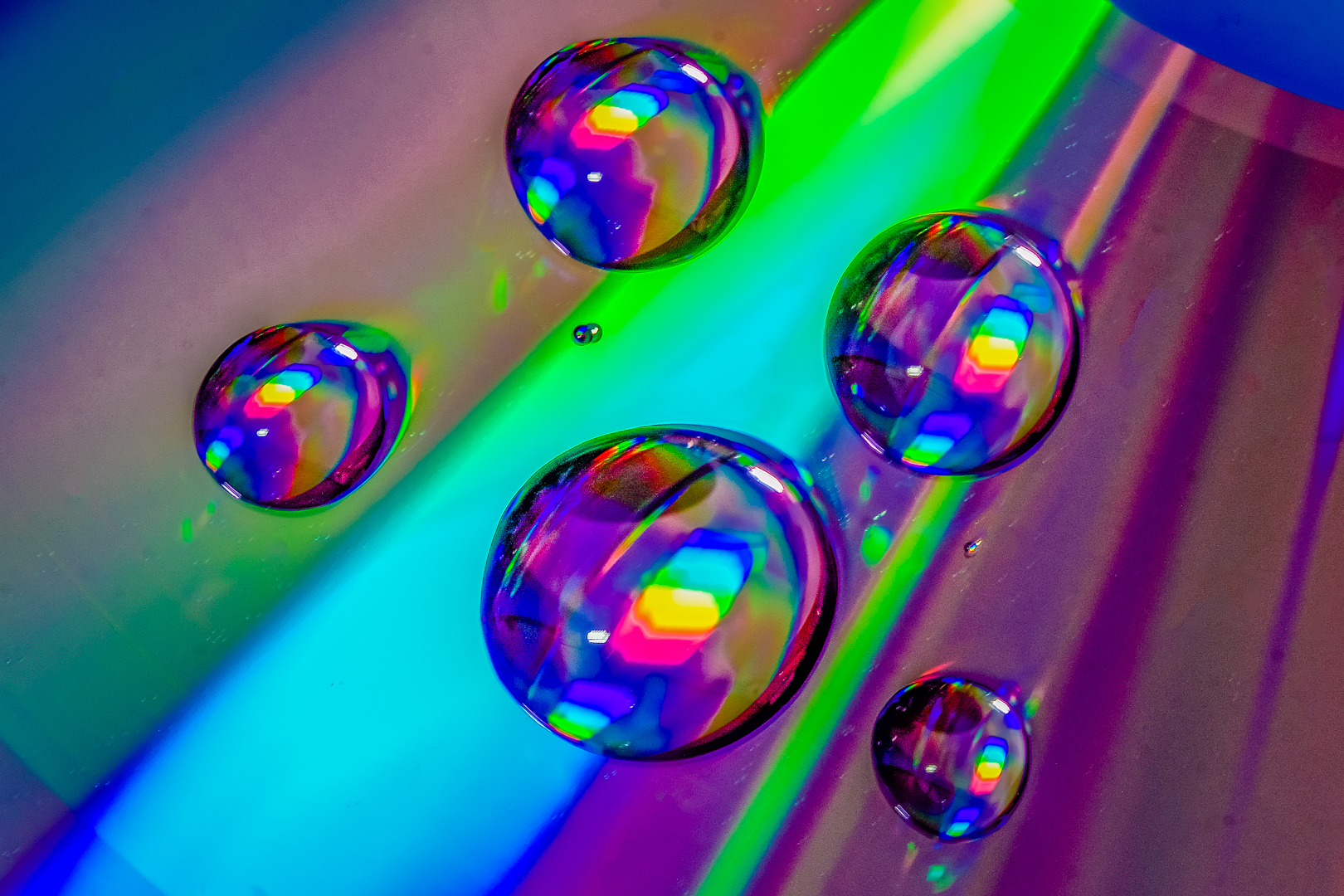
I had got on with some new water drops shooting and think that I had made a major breakthrough.
( Got the drops dancing to my liking and found a good position for the camera to capture better shots )
Looking forward to sharing next month.
Thank you very much for all your encouragement again. |
Jul 25th |
| 65 |
Jul 20 |
Comment |
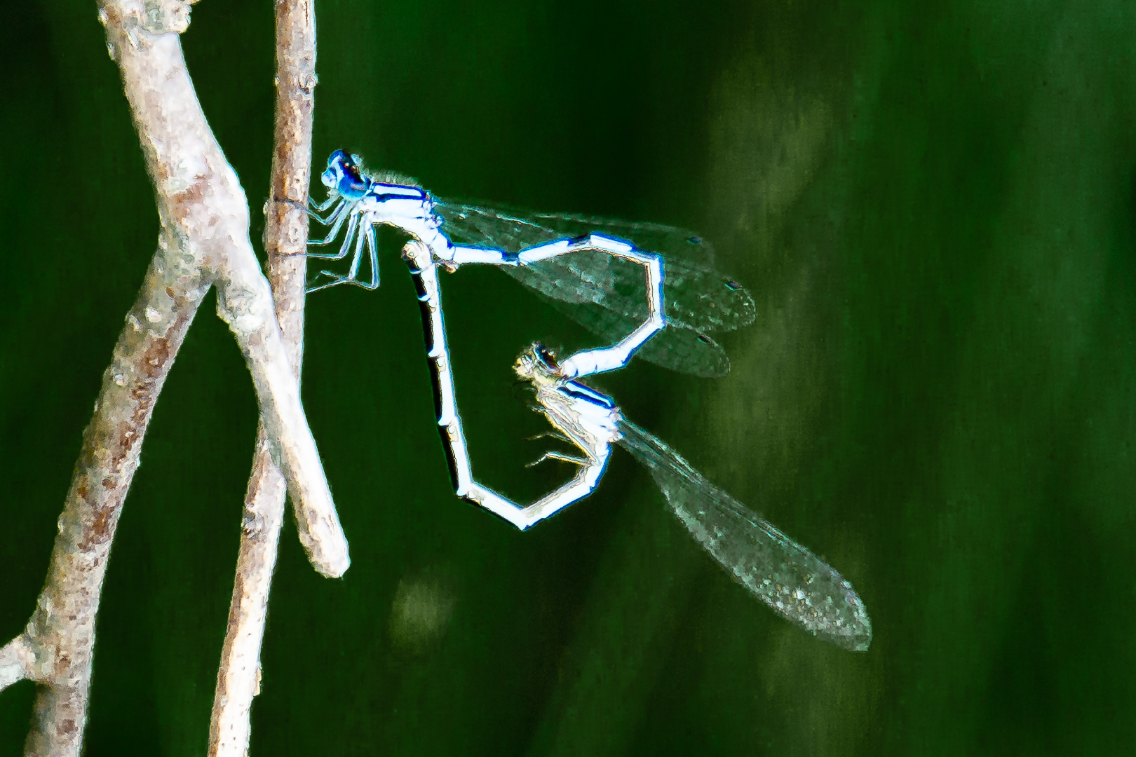
Great shot !! I really enjoy the great focus and texture.
I agree with Peter about cropping in .
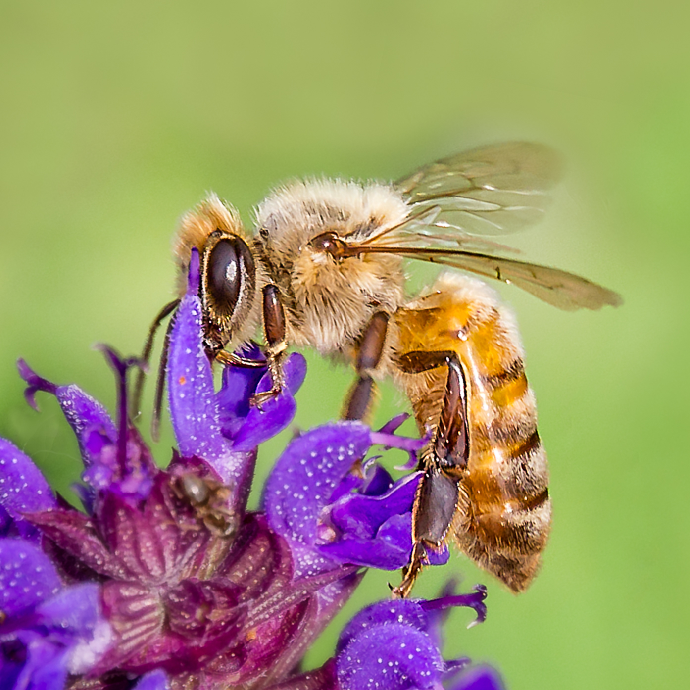
I usually like to shoot insects but in here I agree with the other ladies that I would like to back off a bit.
Ha! Ha !
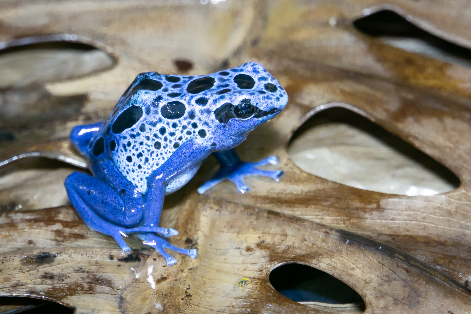
You enjoy seeing these jumping spiders and that is the most important point.
Keep up the good work and enjoy yourself. |
Jul 25th |
| 65 |
Jul 20 |
Comment |
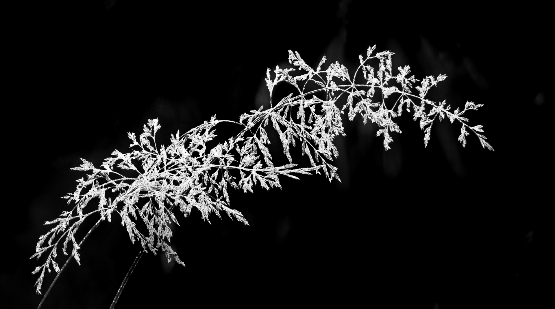
love these magnificent shells, Peter.
The 2 two opposite Nautilus shells seems to have their center very close to the (Golden Spiral =Fibonacci Spiral).
Usually having a golden spiral is a very strong composition but two of them might be too much. It might work if it is in symmetry but the third shell stick out as being squeezed in .
The third shell will point to the rule of odd but the middle one should be the focus which add up to an "odd" image here.
Another way is to look at the different areas to see whether the density of each section create balance . Negative space can be use to balance another busy part but a lot of negative space is needed.
This is only my two cents and hope to give you some ideas. |
Jul 22nd |
| 65 |
Jul 20 |
Comment |
This is a lovely shot, Lynne.
Your hard work have really paid off.
The composition and background are very classy.
Agree with Charles about leaving some space to breathe .
I am a flower arranger and does not like to cut off ends of any plant if possible. If there is not way to extend the background at the top, I would prefer to clone the end of the twig so it looks like we can see the end .
One idea is to arrange the twigs in Ikebana style .
Swing the lowest branch (second tallest ) to the left and spread out the remaining two buds more...you will get the configuration of Heaven, man and earth. I find that it is more pleasing to my eyes...but it is only me.
Really enjoy this lovely image. Keep up the good work.
|
Jul 22nd |
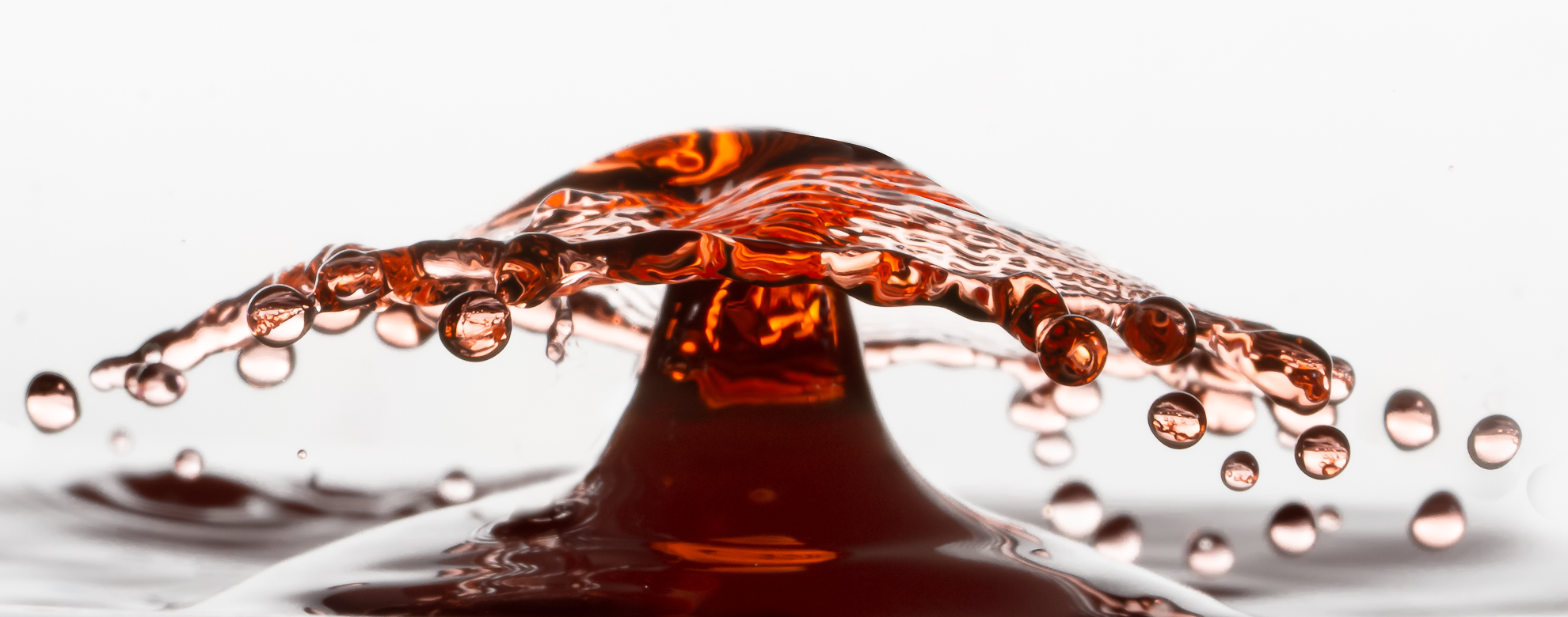
| 65 |
Jul 20 |
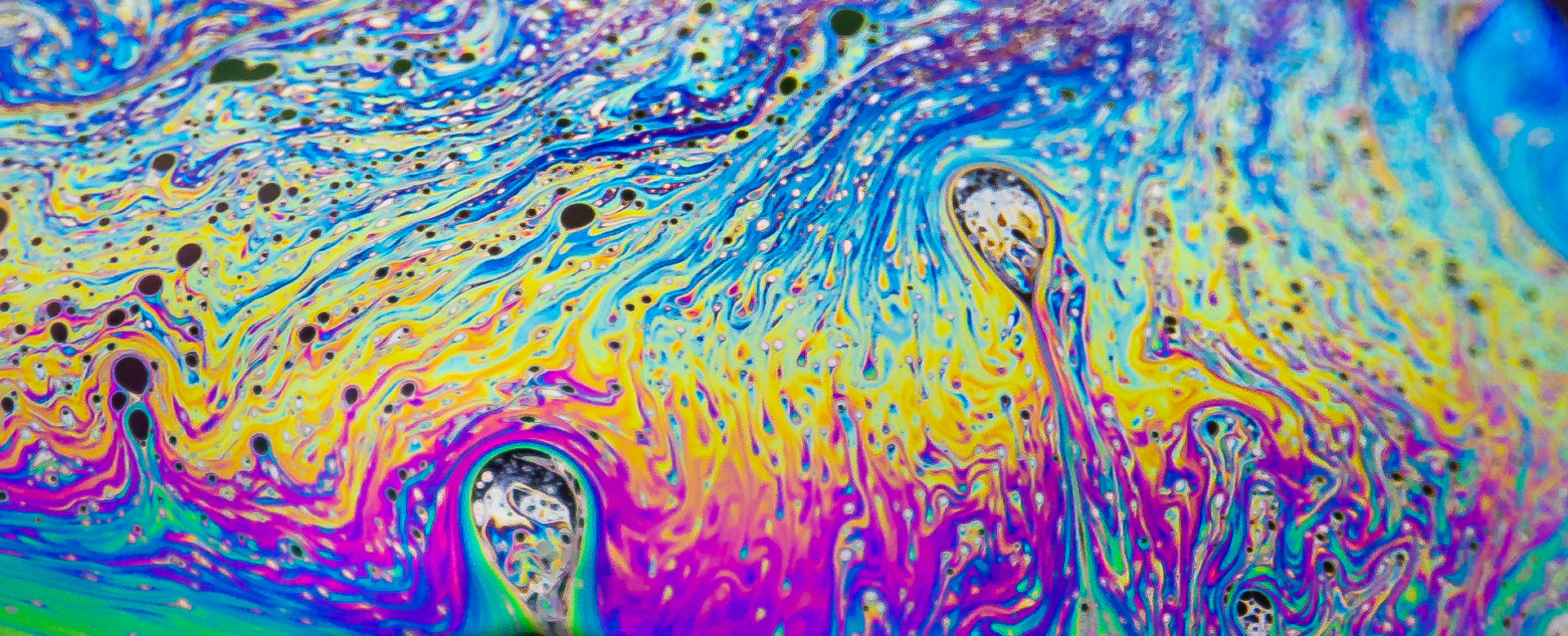
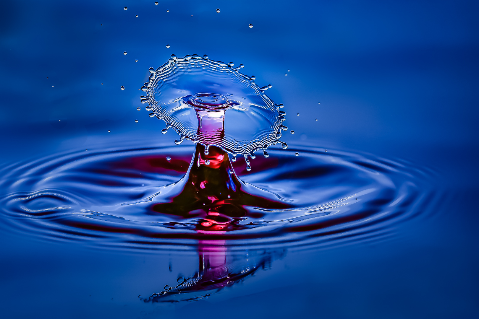
Comment |
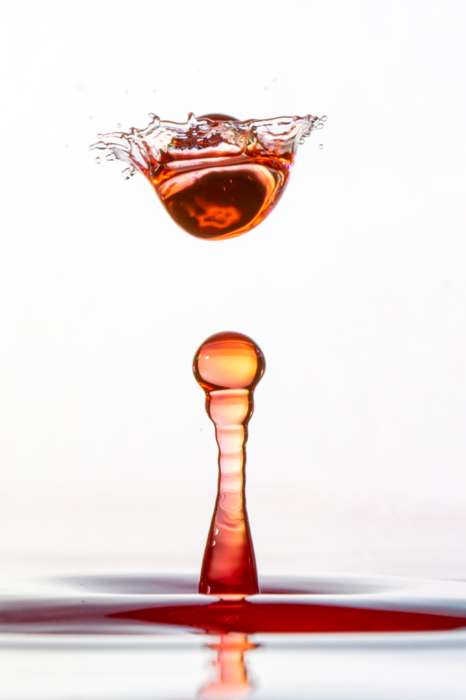
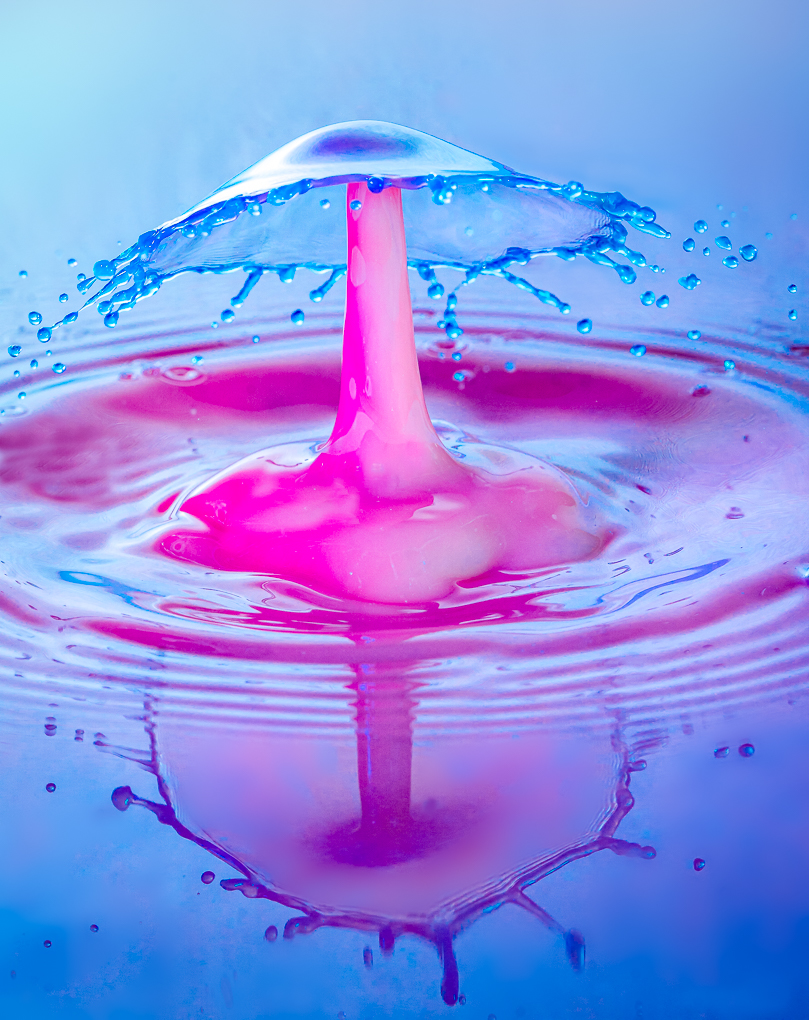
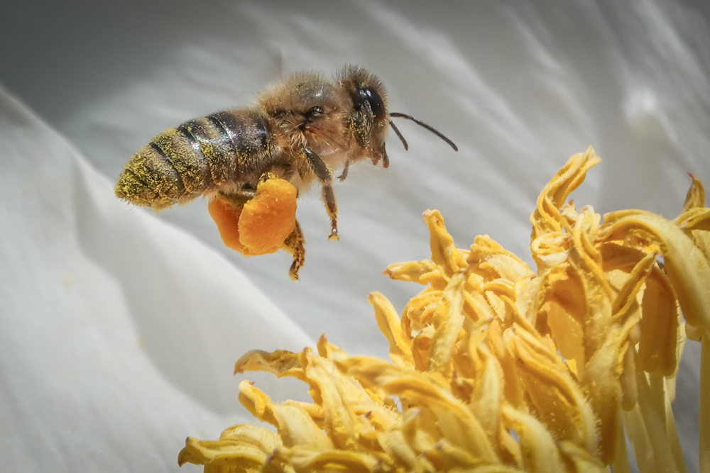
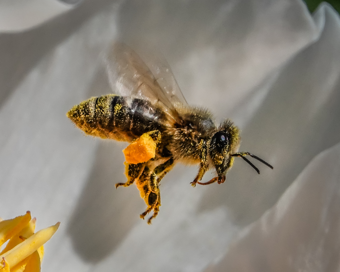
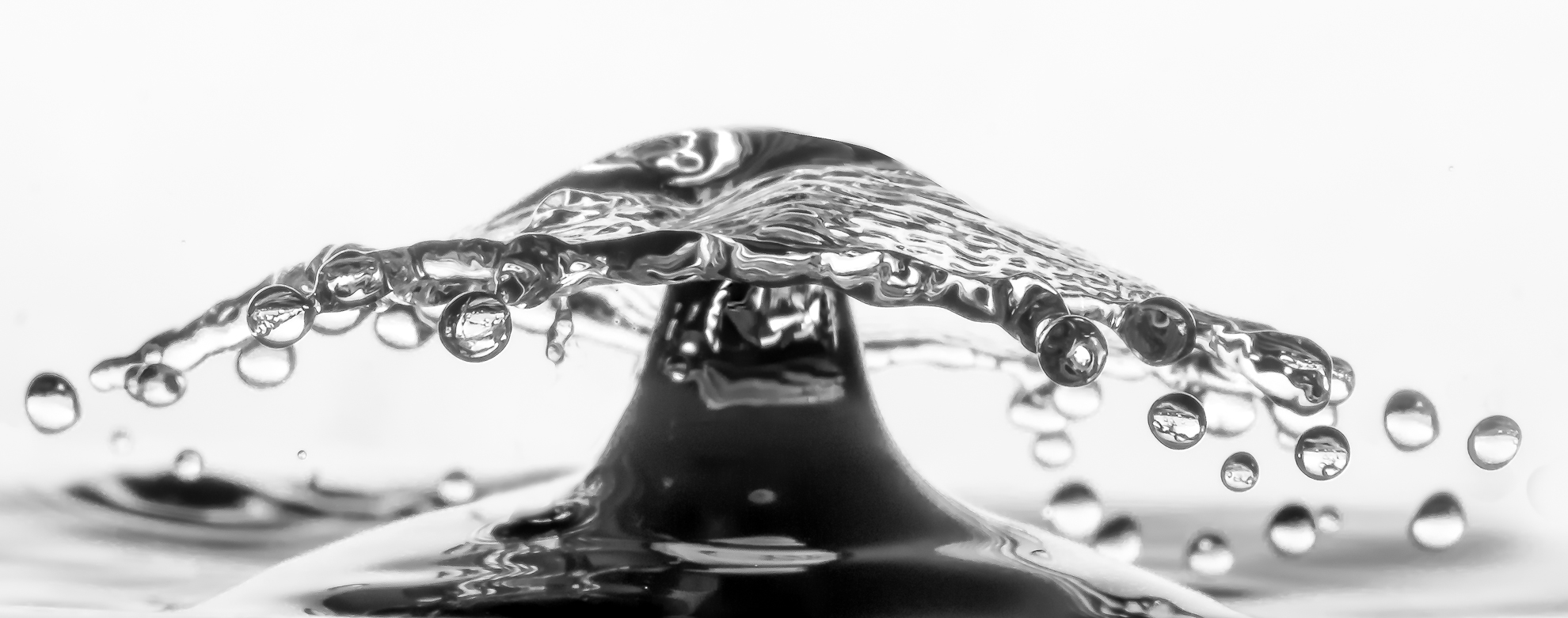
Great subject and good result , Elaine.
It is very brave of you to do focus stacking hand held.
I usually use my tripod and take lots and lots of slices.
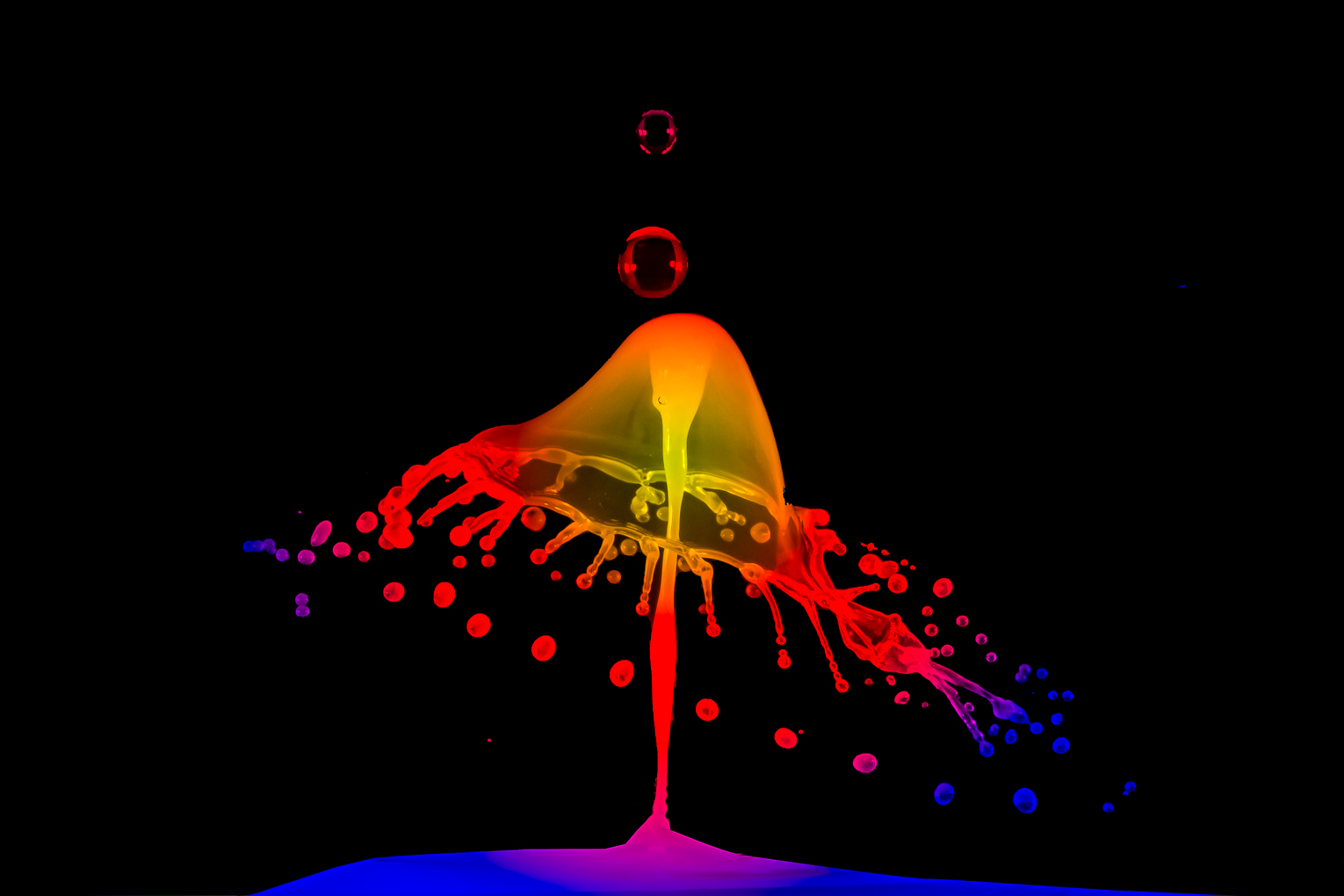
Don Komarechka came to my Camera Club several times and I took a macro workshop with him. He is Canadian and close to my town. He does use hand hold his camera and move in focus manually when he shoot water drops macro but your subject is way more complicated than his.
Great job and keep up the good work. |
Jul 22nd |
5 comments - 0 replies for Group 65
|
| 74 |
Jul 20 |
Comment |
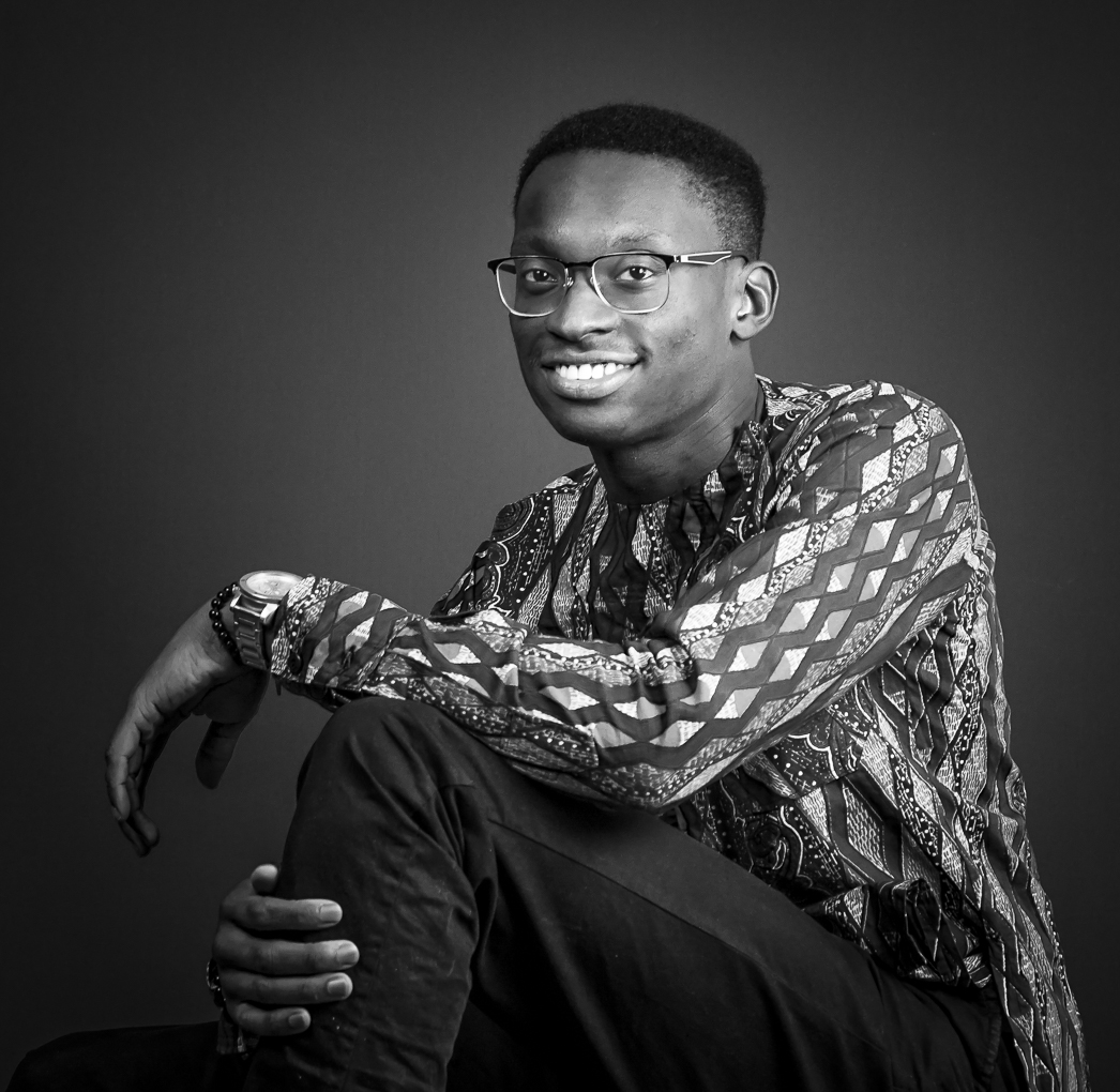
Thank you very much for all your help.
Shall do more dodge and burn on the face before I use it anywhere. |
Jul 25th |
| 74 |
Jul 20 |
Reply |
Ha ha !! Thanks for the funny remark.
I work with a small studio group of friends.
I definitely notice that that my Caucasian friends have a harder time in accepting the natural posing ability of my oriental friends. I bought a set of hand posing cards from Lindsay Adler.....one of my partner said that he cannot see anybody doing those poses. My friend walked in and made similar poses without help.
We are all very different; that is what make the world so interesting. Right ? |
Jul 25th |
| 74 |
Jul 20 |
Comment |
Very interesting interpretation of an Iris ! ! !
I also belong to a macro group so am used to seeing petals.
The white part of Iris or Orchid petals frequently has a shimmer in them which I can see a bit in the darker part .
I would recommend to decrease the tone so that you can see more detail in them. I know that technically they are not blown out but if you cannot see texture, then the viewer will get the feeling that the areas are too bright.
Yes, definitely cloning out the grass at the bottom would help.
One easy way to do that is this : In ACR or Lightroom, use the adjustment brush to paint in the areas, then decrease the exposure to your liking .
Wonderful way to express your imagination. Keep creating . |
Jul 25th |
| 74 |
Jul 20 |
Comment |
Great story that really show us how the man feel.
The wall to the left drew my first attention so I would tone it down to decrease the distraction.
I understand that in street photography it is not always possible to move to the best position to capture the subject . However, I would like to take a shot as you do as an insurance and then move to a better view since the subject is not looking at you.
Great environmental portrait. |
Jul 25th |
| 74 |
Jul 20 |
Comment |
Great image and conversion.
You probably had decrease the visibility of the fur at the side of body in purpose but I am the kind of person who like to see the hair there a bit more.
Another easy way to change the highlight ( without luminosity mask ) is to go into Adobe Camera Raw, adjust the tone curve and then only mask the effect into the area you want.
Great shot. |
Jul 25th |
| 74 |
Jul 20 |
Comment |
Very good subject matter and story as Ying said.
I would crop just below the vegetation at the top .
You can crop off a large chunk of window ( or head in portraiture ) but you must amputate, not just to take off a tiny piece. Make your viewer understand that you mean to cut the top off, it is not a mistake.
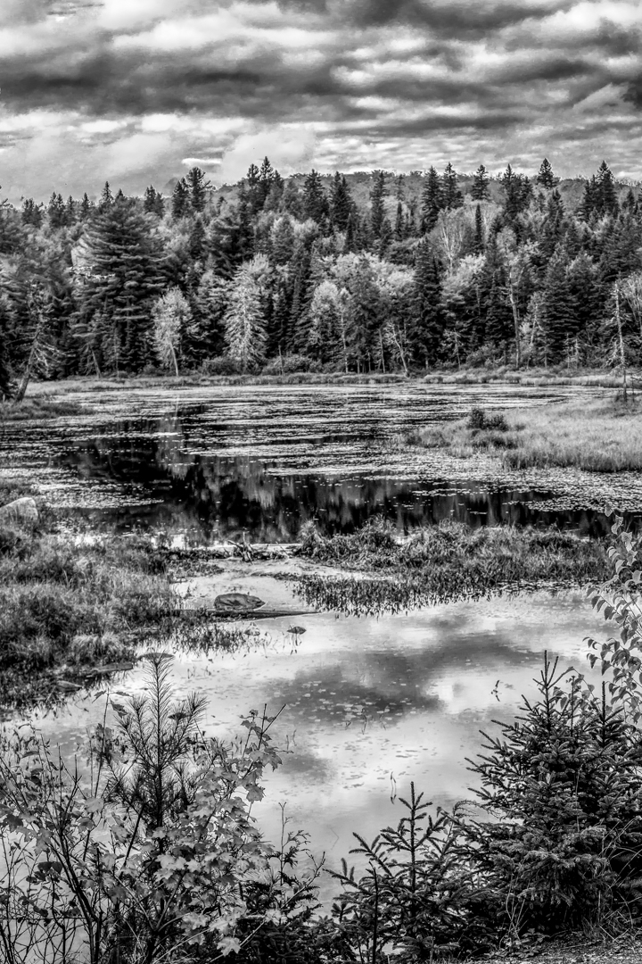
Love the reflection and agree that darkening the reflection will decrease the distraction.
If I can clone out both the boat at the back and the front you will have much more freedom in making lots of different nice crops.
Thanks for sharing. |
Jul 25th |
| 74 |
Jul 20 |
Comment |
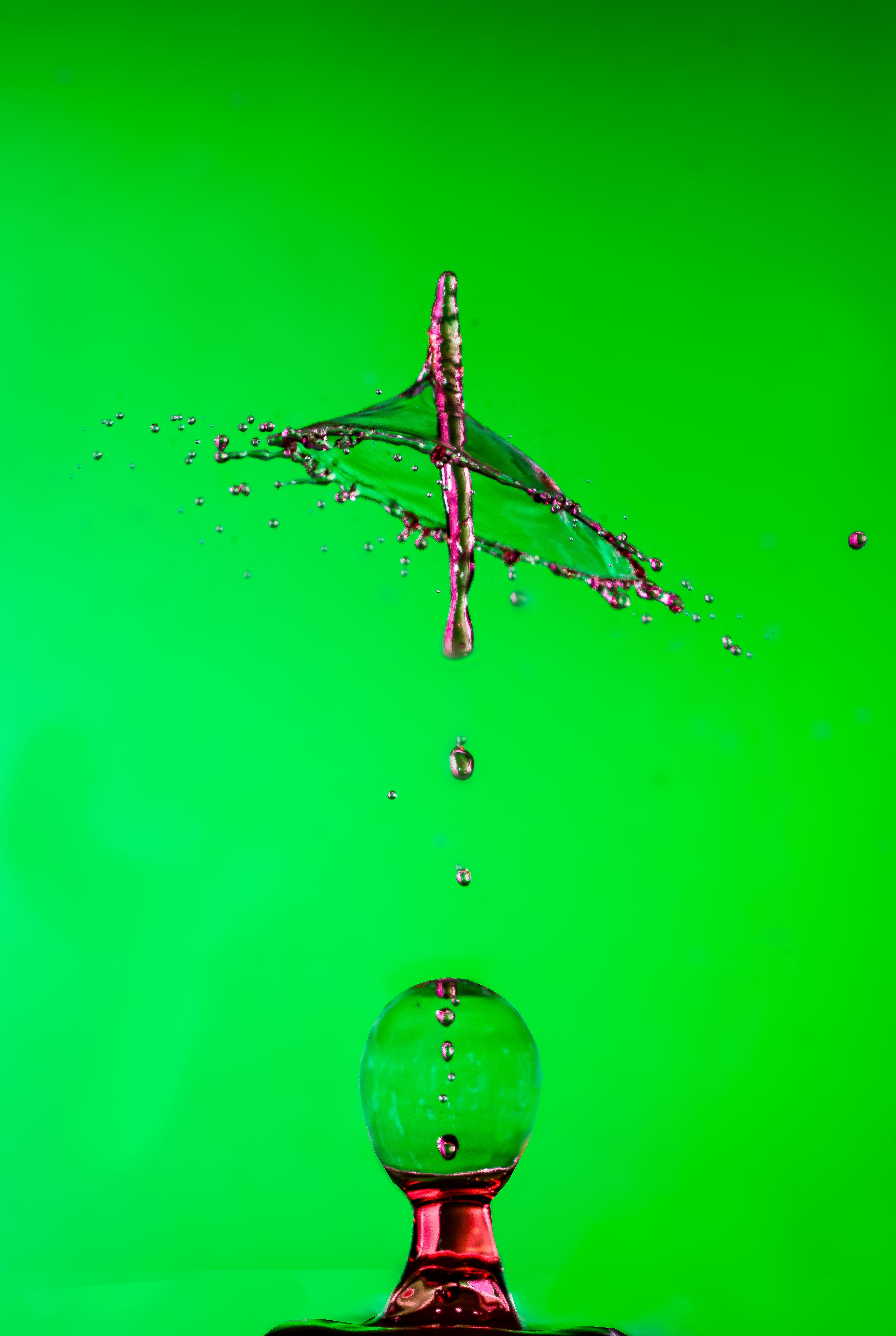
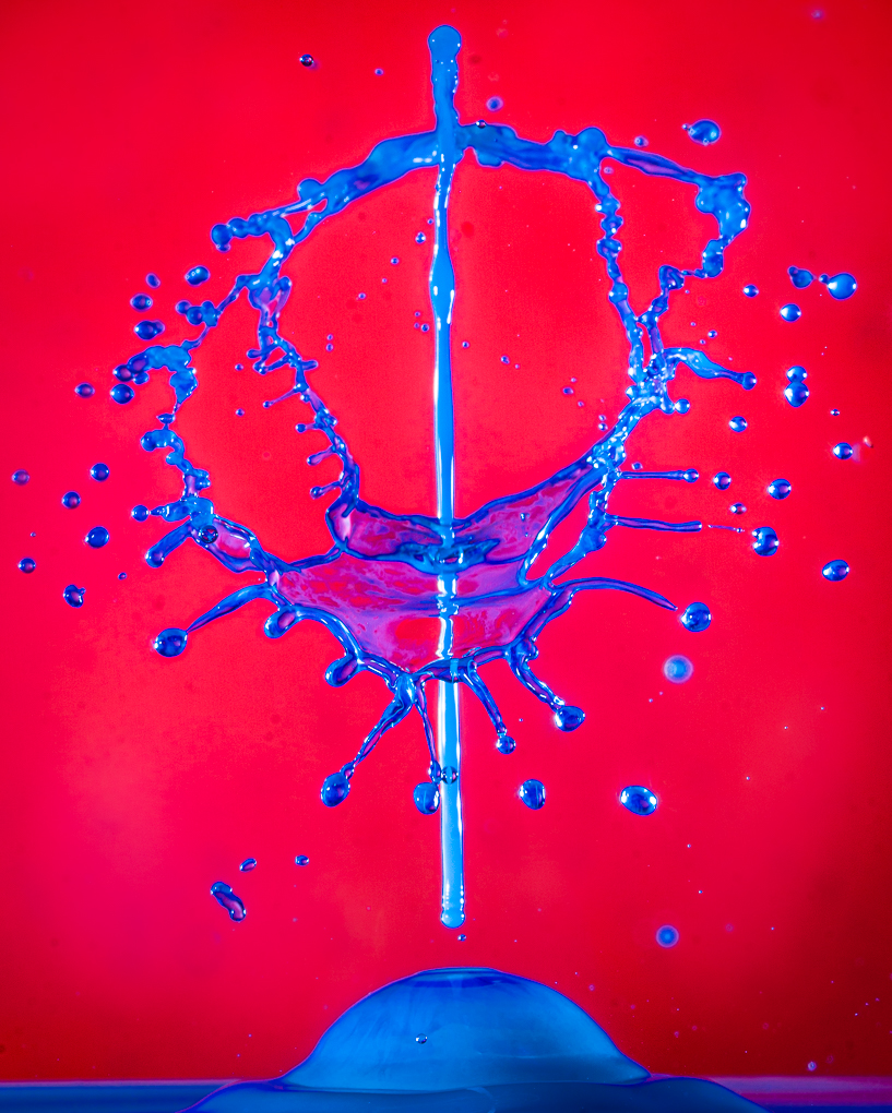
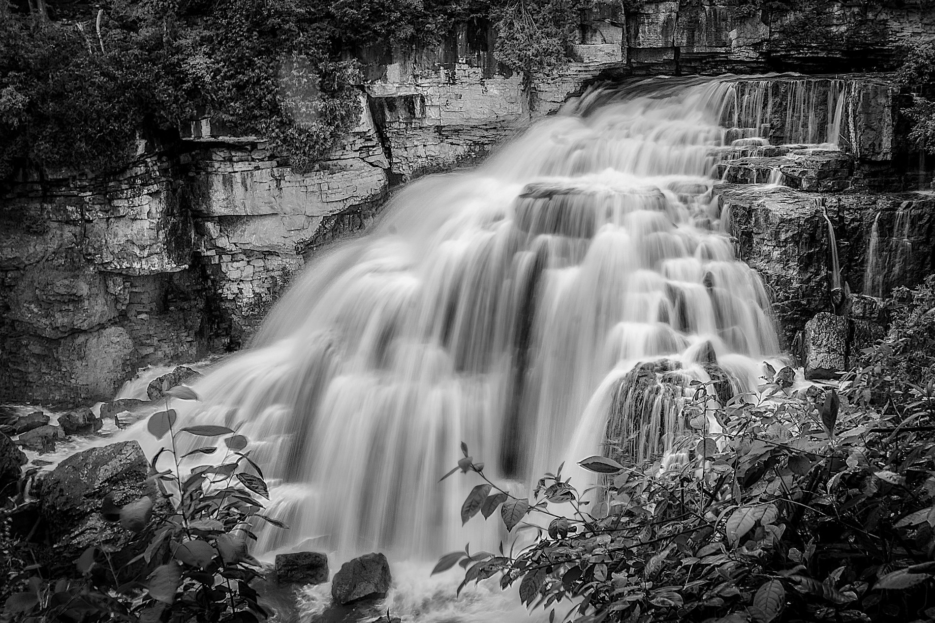
Great shot ! !
I like both versions because of the textures but I like the color contrast in the colored version more because blue and orange are opposite colors and always love to see them in the same image.
I think that this image fit the rule of third and is in good balance.
The heavy middle rock is in golden ratio compared to the large less dense area to the left .
If the focus is at the splash so that the foreground is not as sharp the the subject will be shown more clearly.
It is only my opinion so how you see the scene is more important. Great job ! ! |
Jul 25th |
6 comments - 1 reply for Group 74
|
11 comments - 1 reply Total
|