|
| Group |
Round |
C/R |
Comment |
Date |
Image |
| 65 |
Jun 20 |
Reply |
Thanks for the suggestion.
I think that changing the aspect ratio only make in camera crop.
I tried to shoot in 16:9 because I do a lot of videos but find that it is better to crop in editing.
Shall look into it more. Thank you very much. |
Jun 28th |
| 65 |
Jun 20 |
Comment |
Thank you very much, Lynn and Charles.
Once again the tightness if not crop choice but the whole image.
This is an old image and I had been struggling with the correct position of the camera. It is a balance between capturing more detail vs getting a bigger image.
I shall take your suggestions and keep trying.
|
Jun 23rd |
| 65 |
Jun 20 |
Comment |
Wow !!!
Thank you very much for opening up another area for me to experiment in.
Found some polarization sheets on Amazon and they are not expensive.
This look like a lot of work but the result is well worth it. |
Jun 23rd |
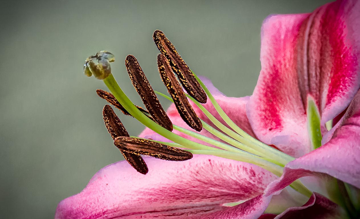
| 65 |
Jun 20 |
Comment |
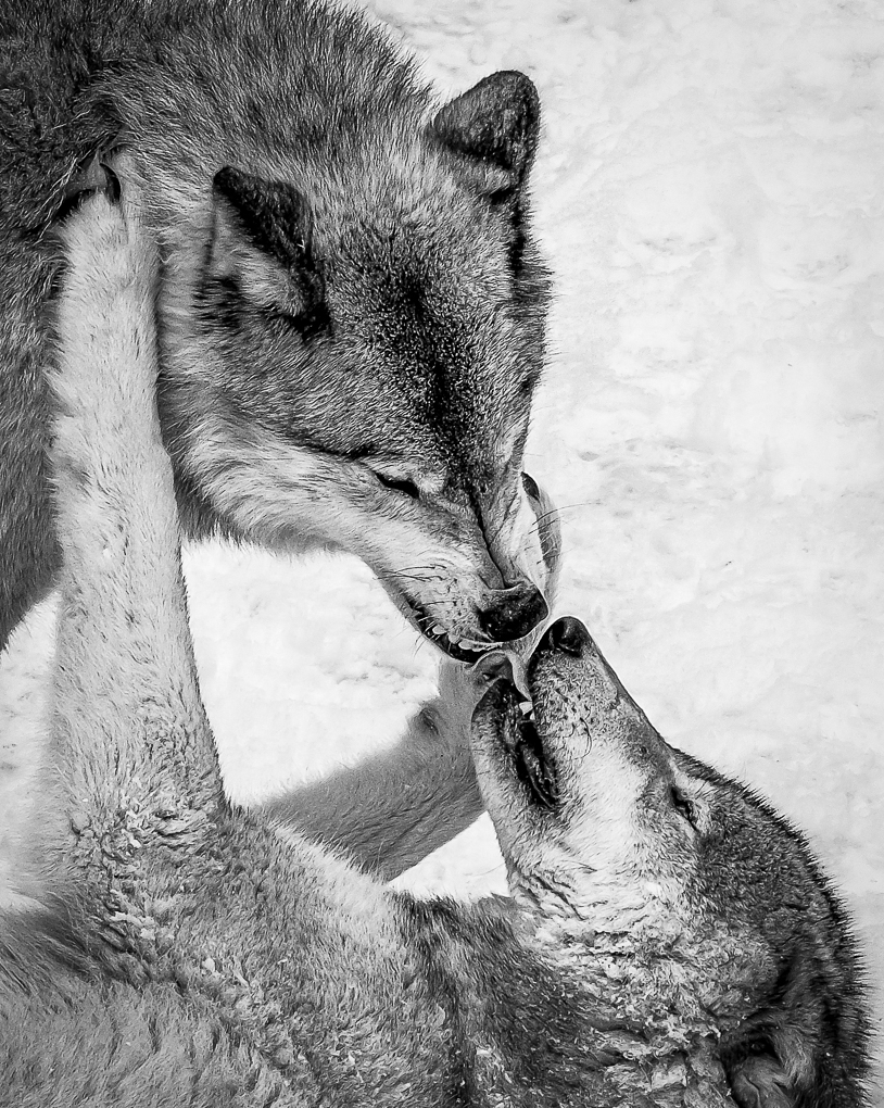
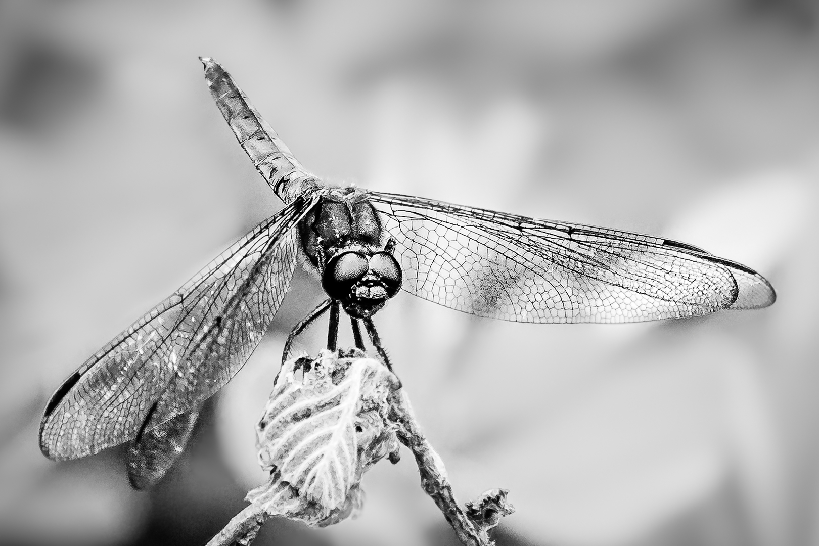
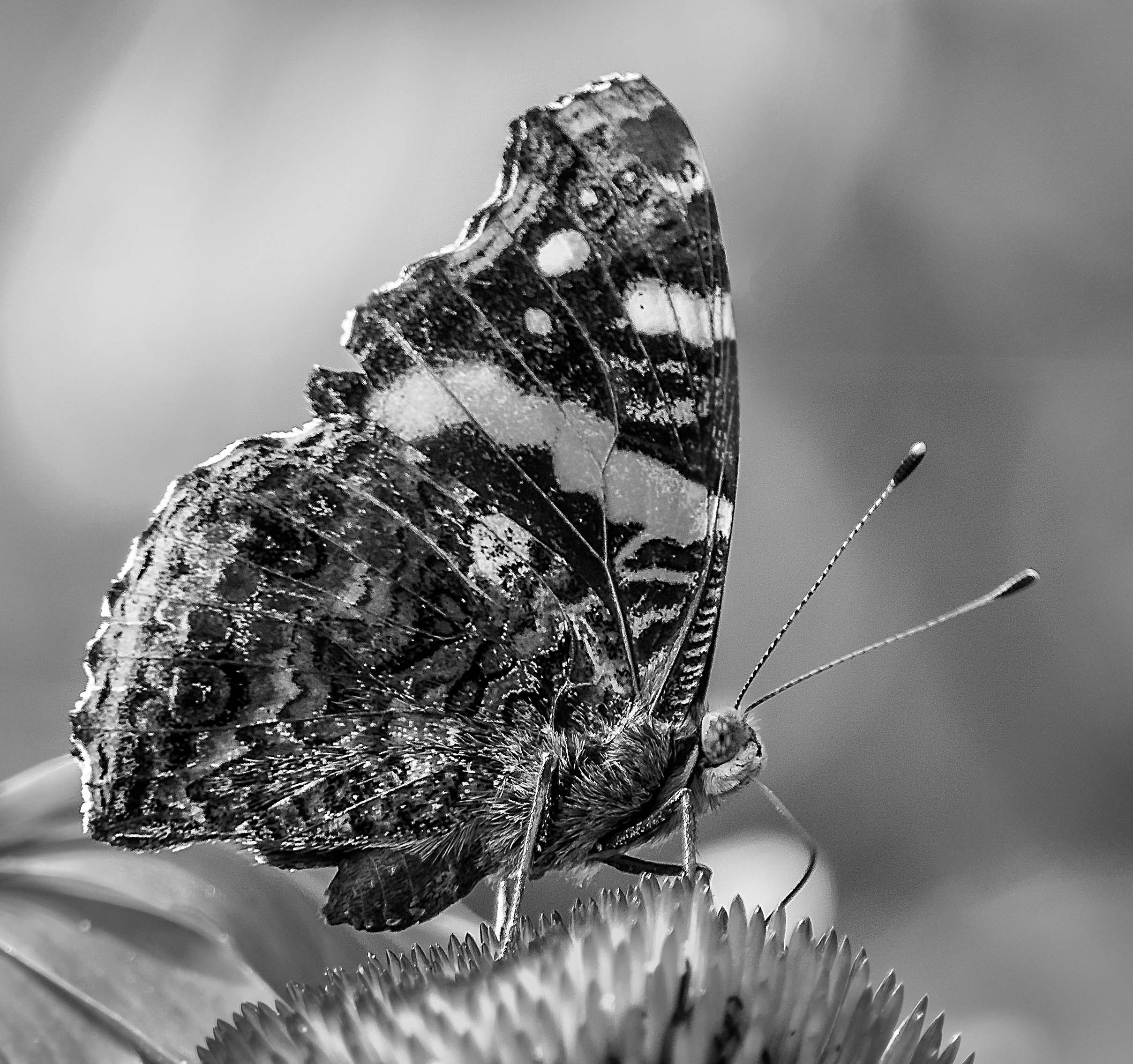
The plane of focus is exactly right and captured good eye contact.
Thank you very much Charles for showing us what we can aim for to enhance the image.
My Fuji can scan up 20 slices at a time but I find that to cover all the hills and valleys the final number of slices is over 100. I still prefer to manually choose critical points to create my slices by changing the focus points on the LCD screen without moving the camera. A rail will change the composition produce slices that will be hard to merge ?
Thank you very much for sharing such an interesting image. |
Jun 23rd |
| 65 |
Jun 20 |
Comment |
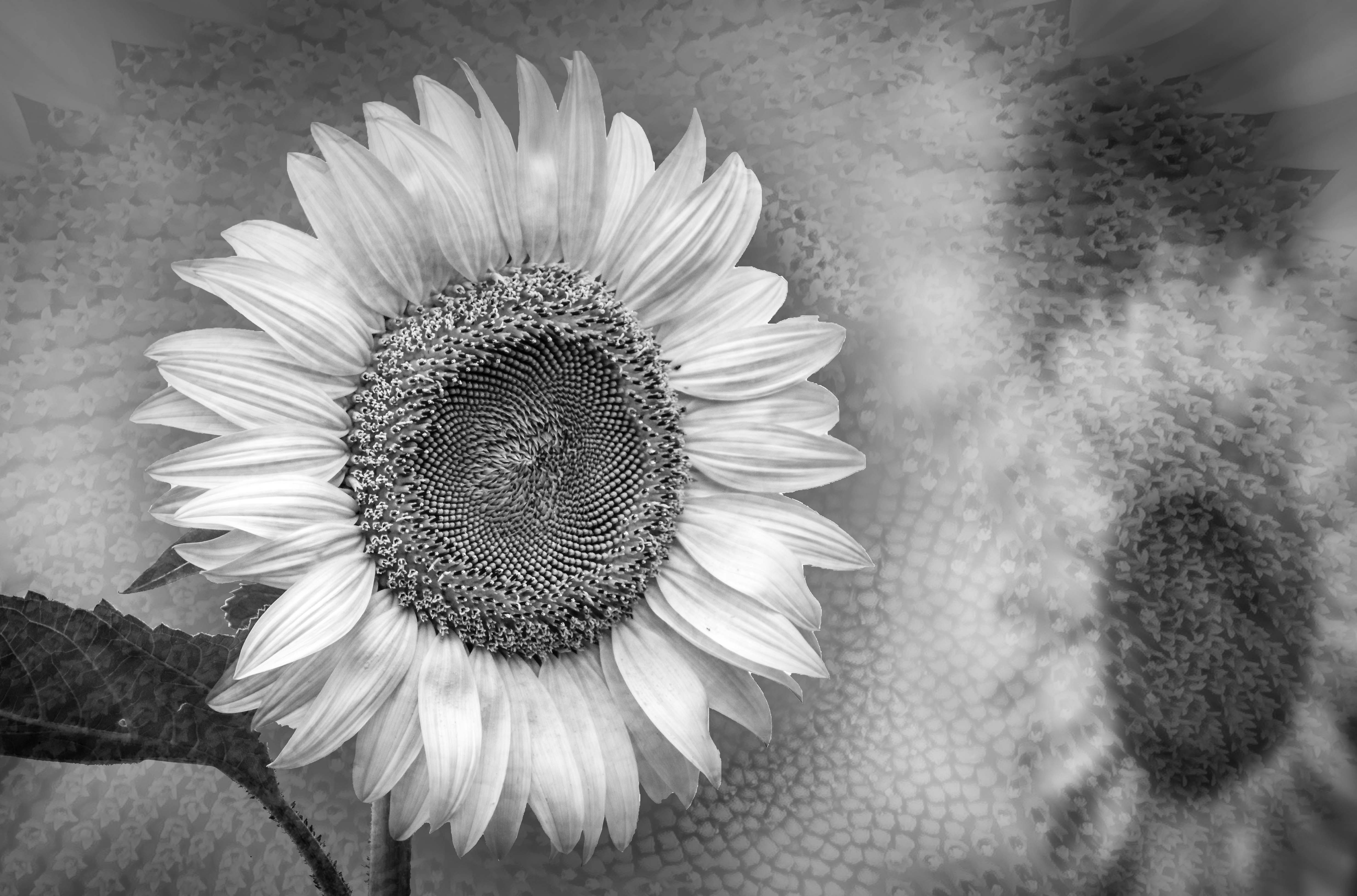
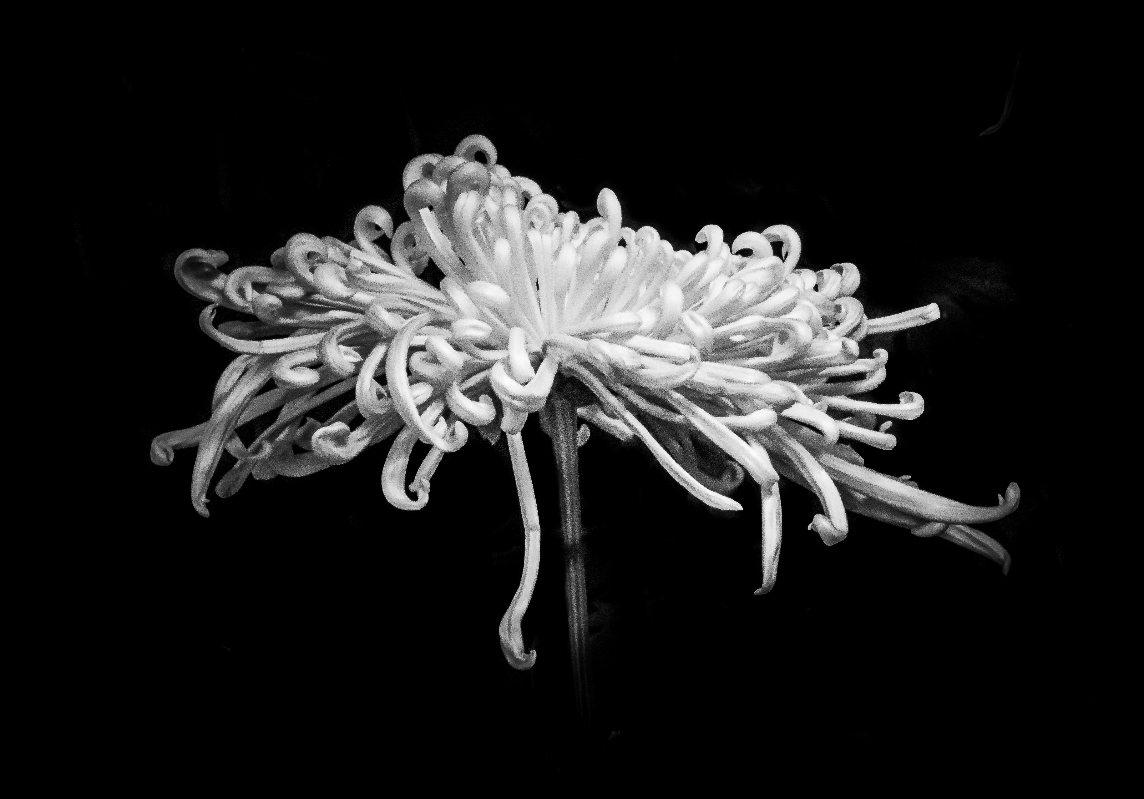
Starting with a nice image you have created a nice piece of Art .
I agree with the final orientation of the bloom as a flower arranger. It is better to have a higher left curving to lower right.
Personally I would leave the same amount of space between the upper and right petal to the margins.
Interested to find out what you think you gained in LAB that cannot be achieved in RGB ? I had played with LAB before when I tried to change colors.....White cannot be change in RBG but LAB will get the job done.
Besides the nit picking, I really enjoy your work of art . |
Jun 23rd |
| 65 |
Jun 20 |
Comment |
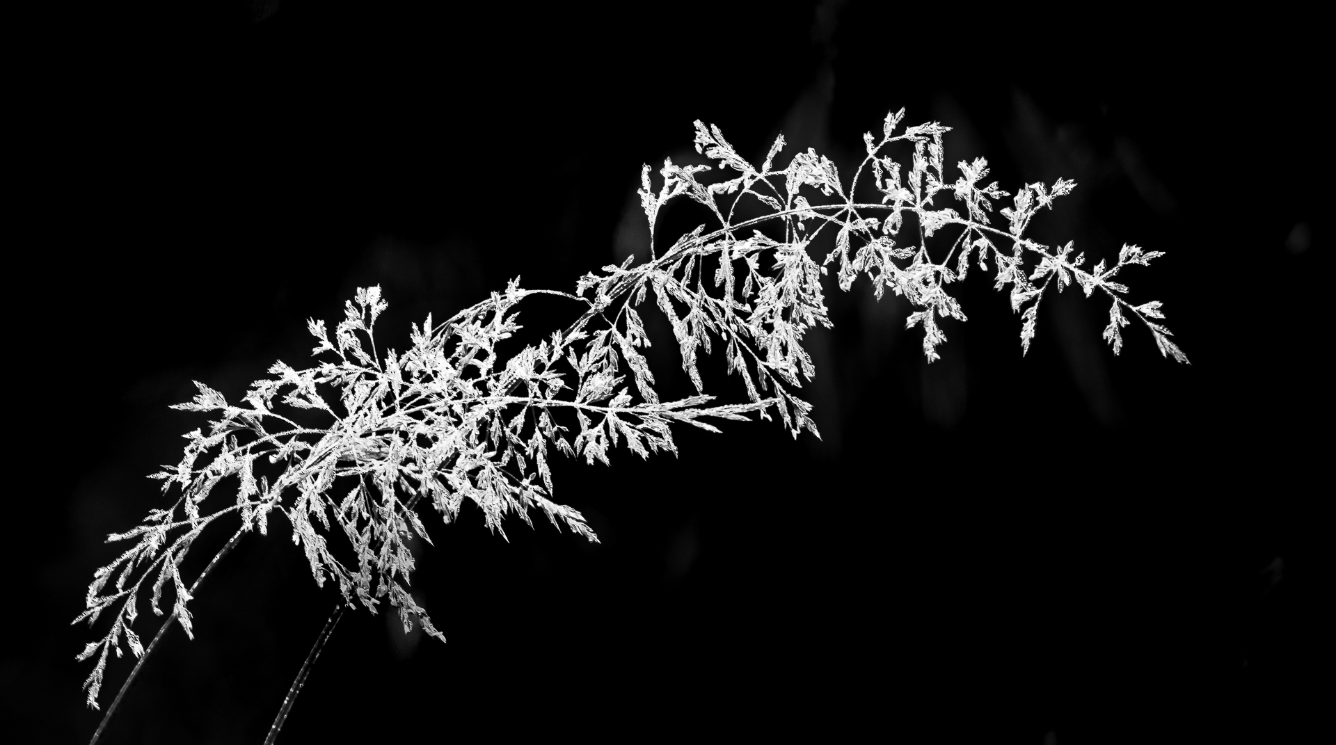
Thank you all for the feast presented.
I enjoy all three versions because they are similar yet very different.
Am I too greedy to wish for a combination of Charle's version plus a clear tendril by making some slices with the foci (focuses?)...{My PC told me that foci is wrong but my highschool Latin tell me that it is correct..LOL ! !}
on the tendrils ?
I feel that the tendril does add lots to the image if it is in good focus. |
Jun 23rd |
5 comments - 1 reply for Group 65
|
| 74 |
Jun 20 |
Comment |
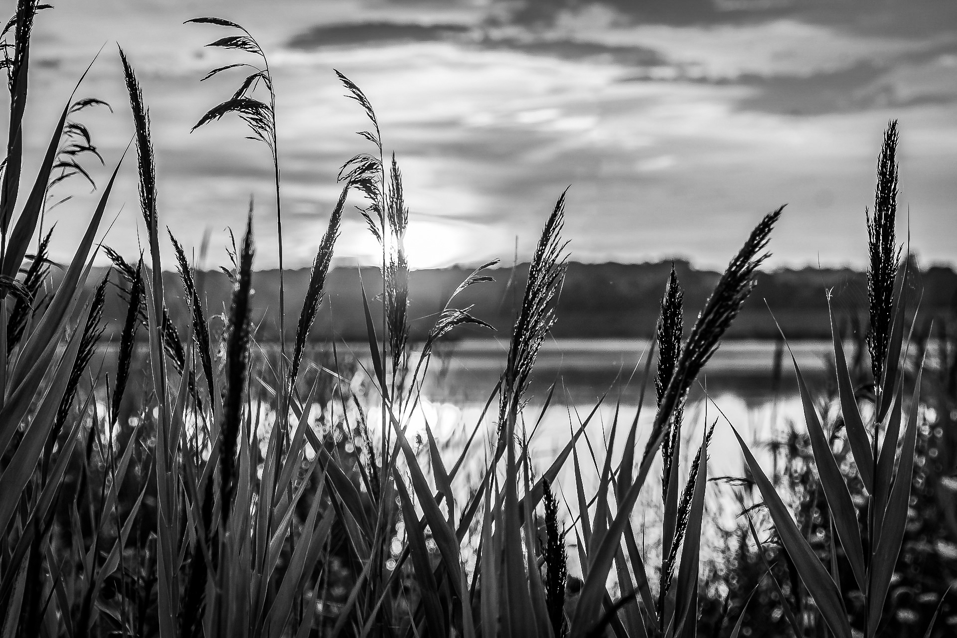
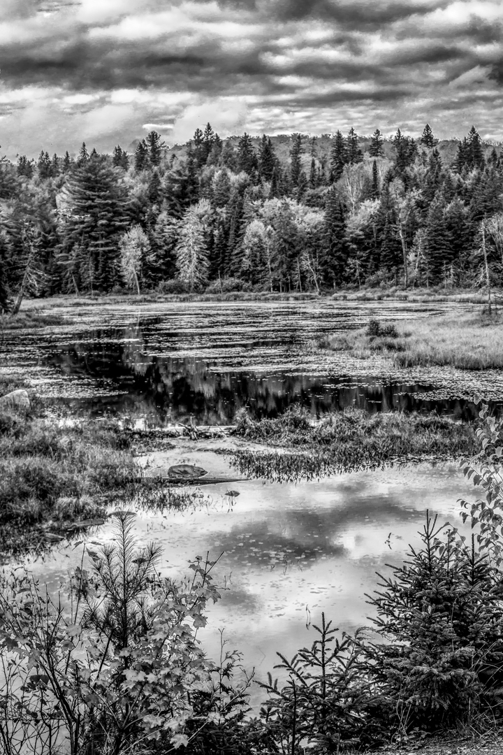
Magnificent trees and very calming.
I agree with Arne about cropping the cloud out.
My first impression was that the picture is very long and take me a while to get to the structure underneath .
Another view is that without the top of the tree, how much more is up there is left for imagination, right ?
Thank you very much for sharing. |
Jun 23rd |
| 74 |
Jun 20 |
Comment |
I like both your capture and your crop.
Your story can be easily seen too.
Blue is such a versatile color that if you wish to make the modern man's jacket brighter it can be esaily done.
Looking at the original image, I see a motorycle to the left and a traditional man sitting down to the right.
I feel that if you expand the crop to the same extent on each side this is a different view but will express the same theme. |
Jun 23rd |
| 74 |
Jun 20 |
Comment |
Thank you for sharing such a great shot.
Like how the dust and smoke show us motions.
I like Bill's crop but would suggest to make the Zebra on the left the lower third line so that the one at the bottom does not feel cramped.
Envy you for all the adventures you had shown us. |
Jun 23rd |
| 74 |
Jun 20 |
Comment |
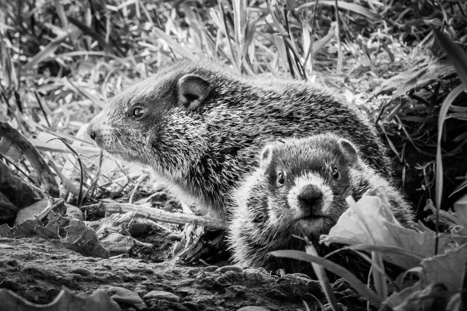
What a magnificent tree.
Is this image on a slope ?
I read somewhere (Blake Rudis ?)who said that the first thing to do in editing is to straighten the horizon because if you do this later on the pixels in the image will shift .
I am the one who like to see bright images .
To increase contrast, if this were my image I would not darken the top so much and make the circular background of the tree about the same brightness. Blue can be converted to many different tones in BW so many experimental versions can be created before a final vignette to show the result .
Thanks for sharing. |
Jun 23rd |
| 74 |
Jun 20 |
Comment |
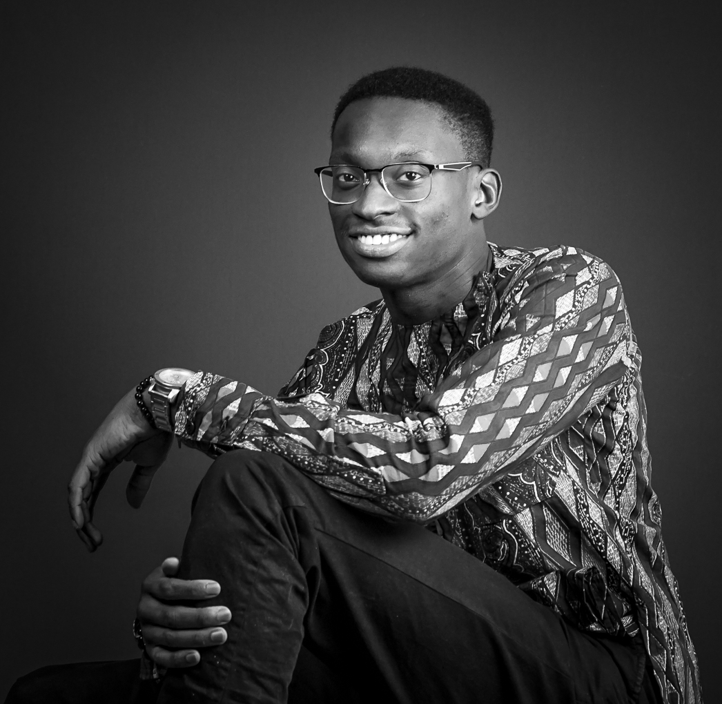
Love the great capture and monochrome conversion.
He is a man who know what he is doing and in great control.
I feel that the monochrome version draw more attentions to his eyes and made the story more alive. |
Jun 23rd |
5 comments - 0 replies for Group 74
|
10 comments - 1 reply Total
|