|
| Group |
Round |
C/R |
Comment |
Date |
Image |
| 65 |
Oct 19 |
Comment |
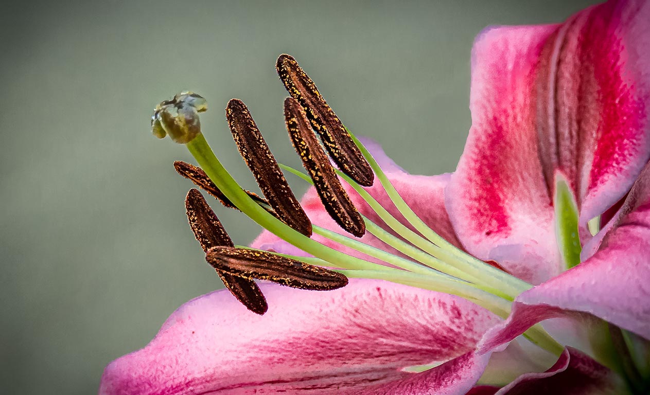
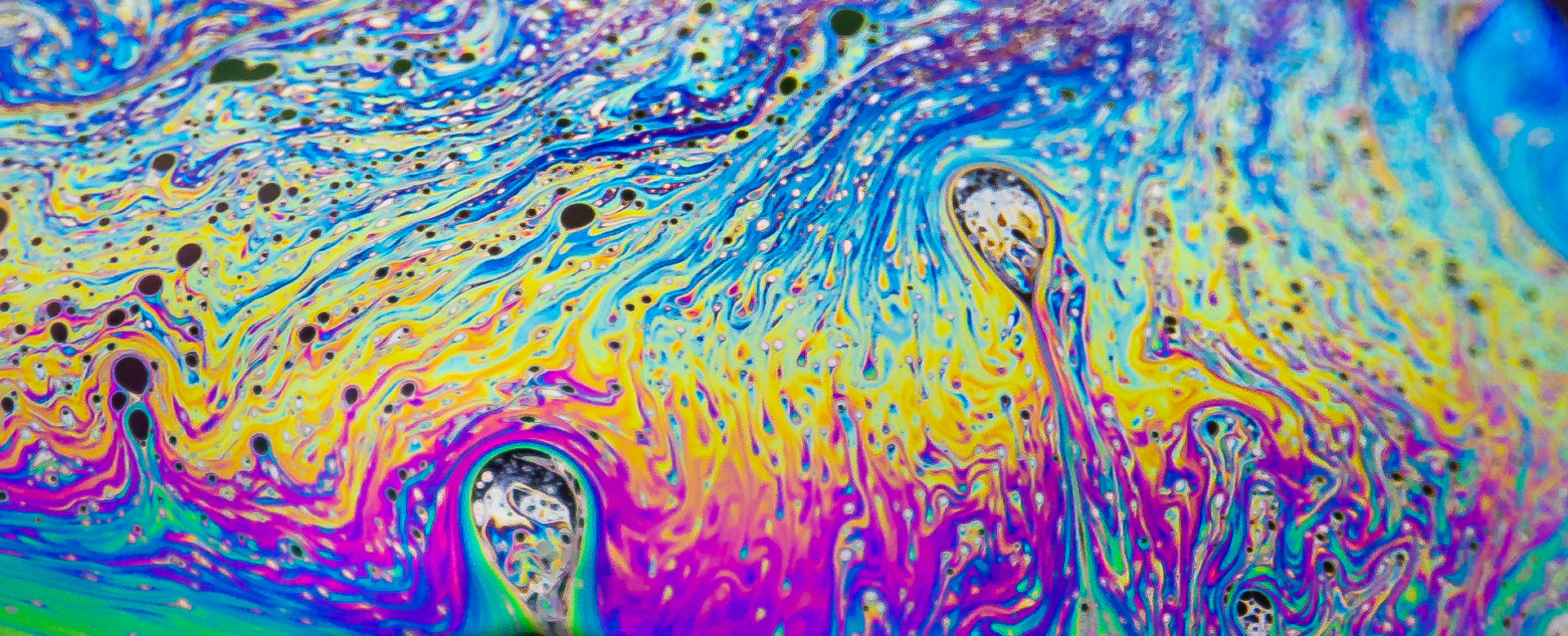
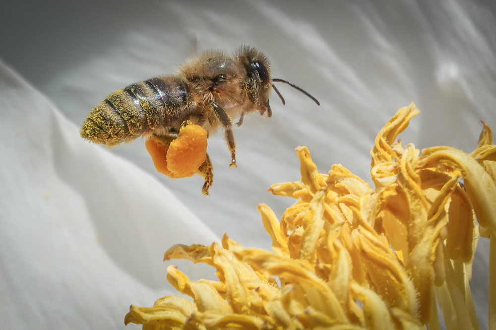
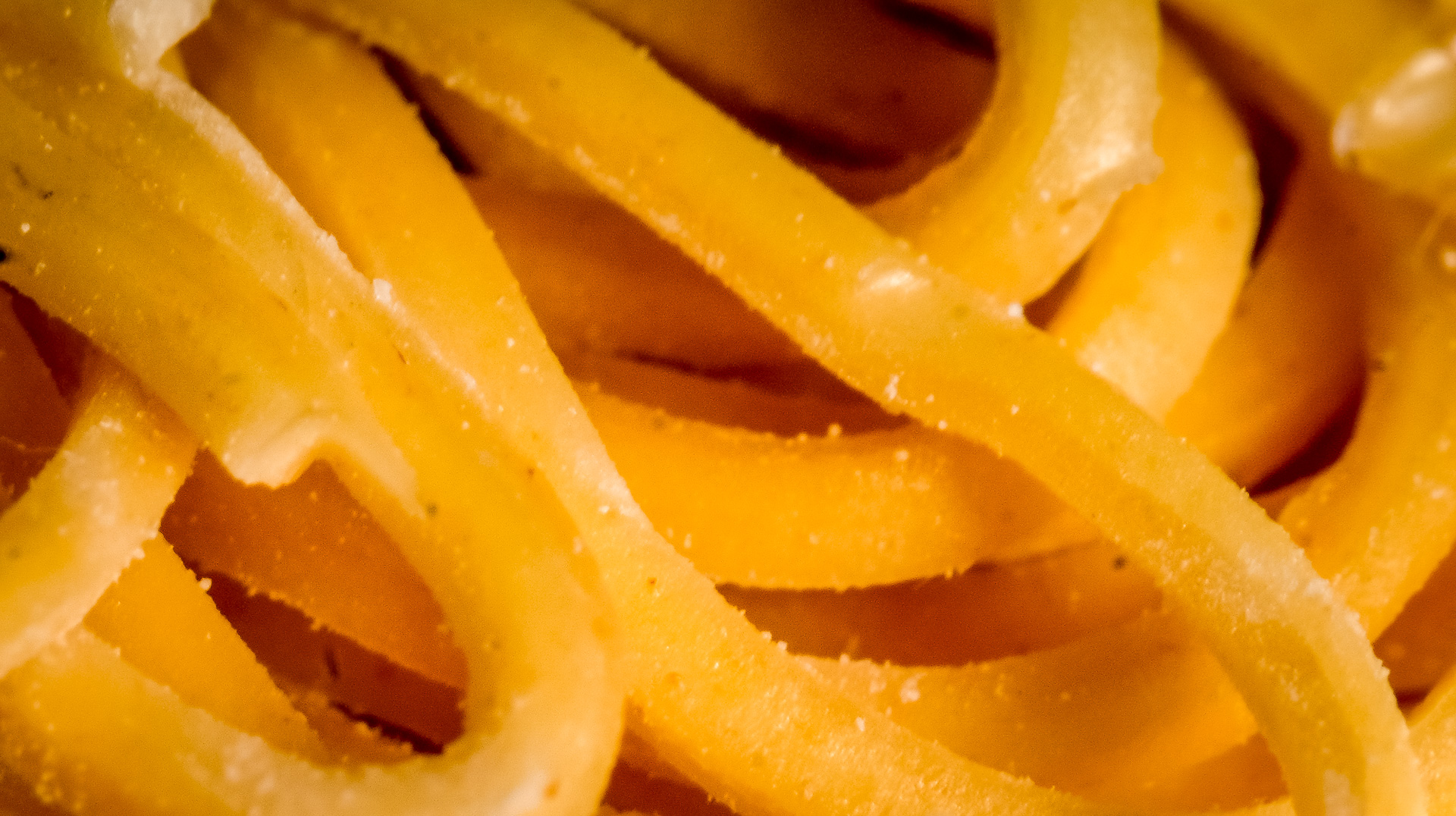
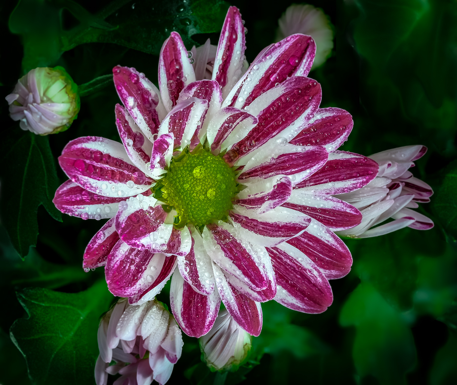
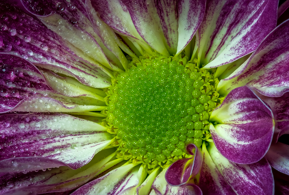
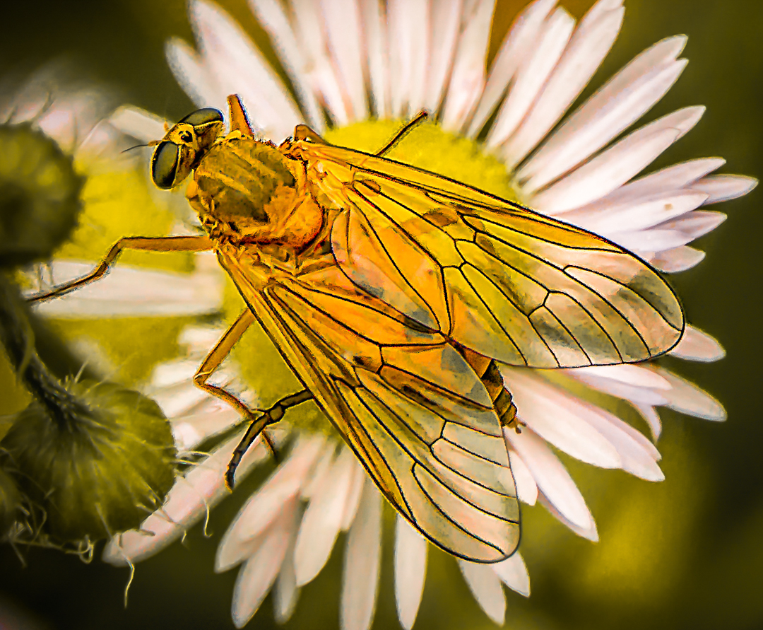
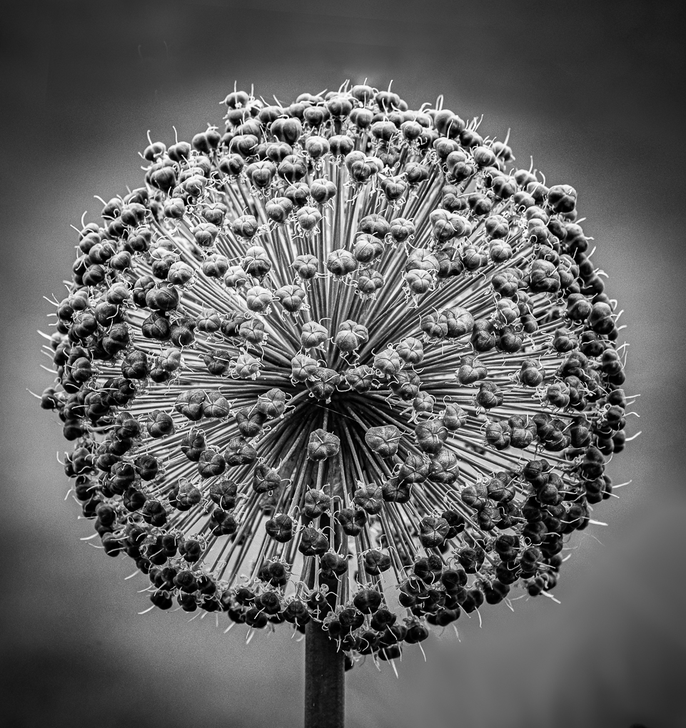
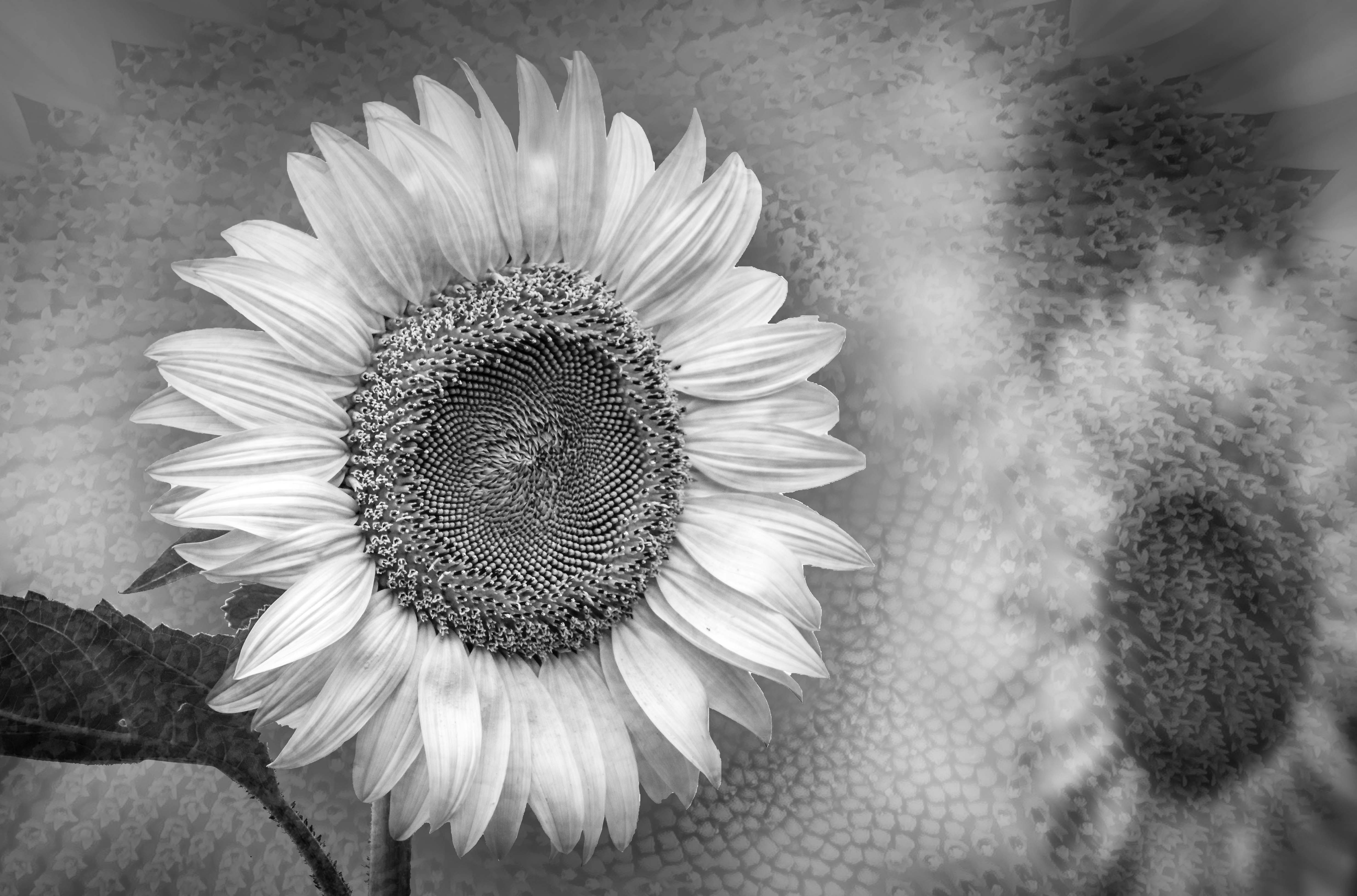
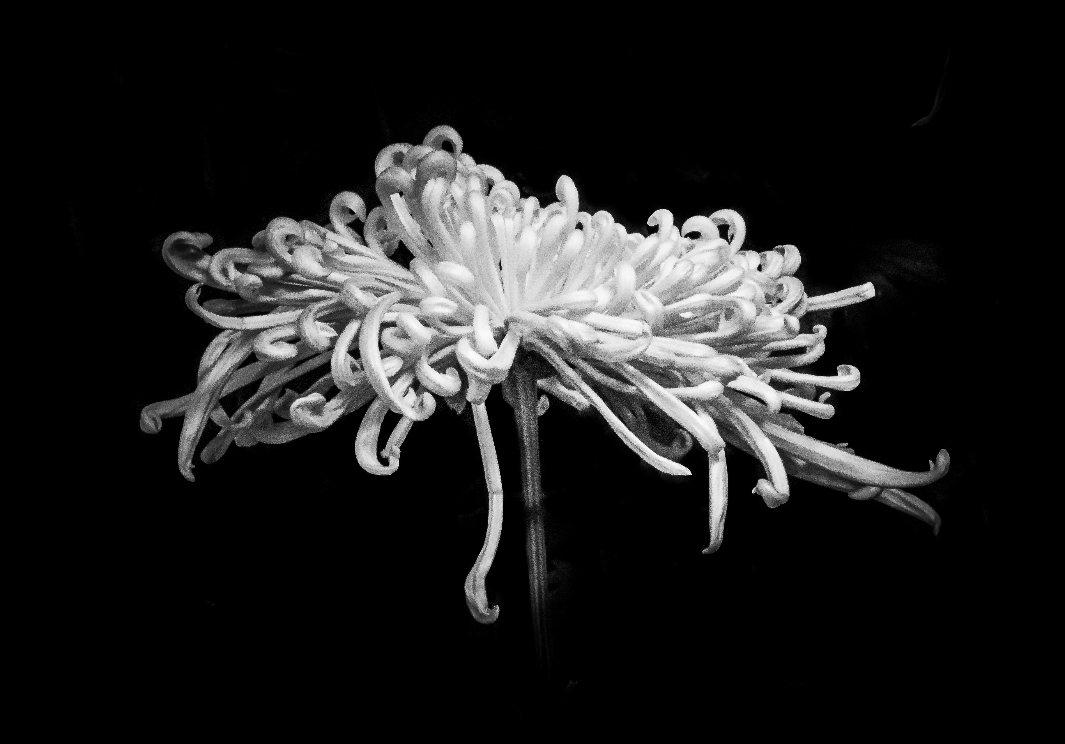
Wonderful detail and an alternative view of the bloom.
The multiple shades of yellow and green really add depth to the images. |
Oct 24th |
| 65 |
Oct 19 |
Comment |
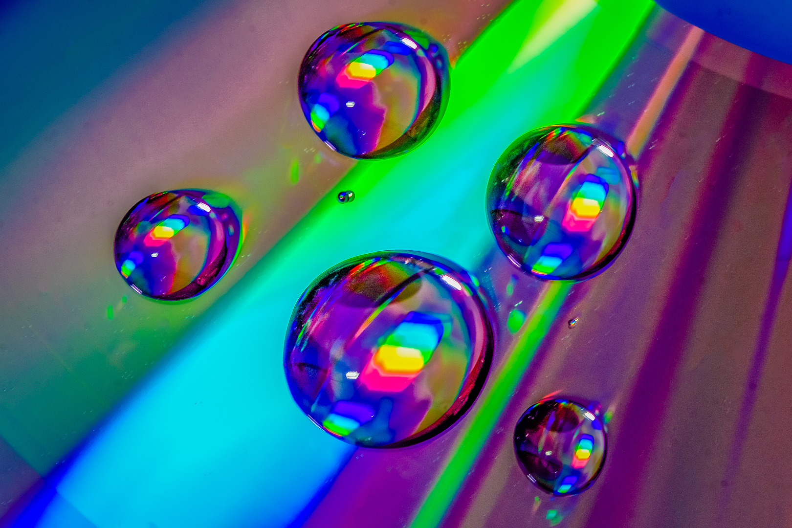
Very nice colors, patterns and textures.
Different light and shadow also add to 3D effect .
Diagonal lines contrast with curves to make this a very interesting subject.
This feel like it should be an image for the Analysis course PSA offers.
Great job ! ! ! |
Oct 24th |
| 65 |
Oct 19 |
Comment |
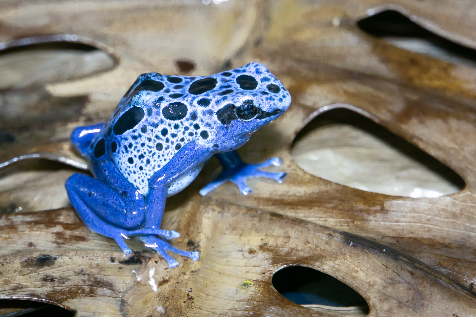
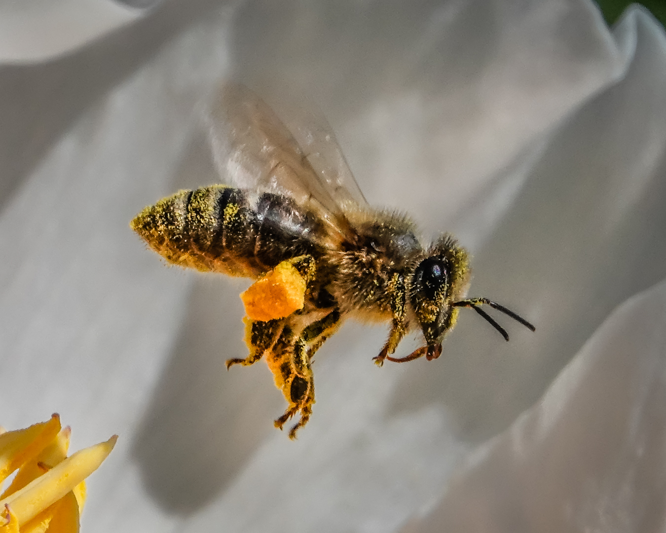
Interesting observation and effective cropping to show your subject.
To remove yellow, it is an idea to do it in Lightroom....HSL..decrease saturation and increase luminance of yellow...Or to use adjustment brush...teeth whitening preset and adjust intensity of the sliders.
Great subject .
|
Oct 24th |
| 65 |
Oct 19 |
Comment |
Thank you very much for the suggestion, Oscar.
This was not taken with a macro lens on a curve surface so I do not have much area in focus to work with.
Shall try to make flat film and use my macro lens next time.
|
Oct 24th |
4 comments - 0 replies for Group 65
|
| 74 |
Oct 19 |
Comment |
Love the texture and detail.
I think that David's second point is to increase contrast.
In my eyes, the easiest way to do it is to increase contrast of the image in basic adjustment if the change is global .
I do not know ON! but in Lightroom and PS you can move sliders in the tone curve so that you can adjust Hightlight, light, dark and shadow individually . |
Oct 24th |
| 74 |
Oct 19 |
Comment |
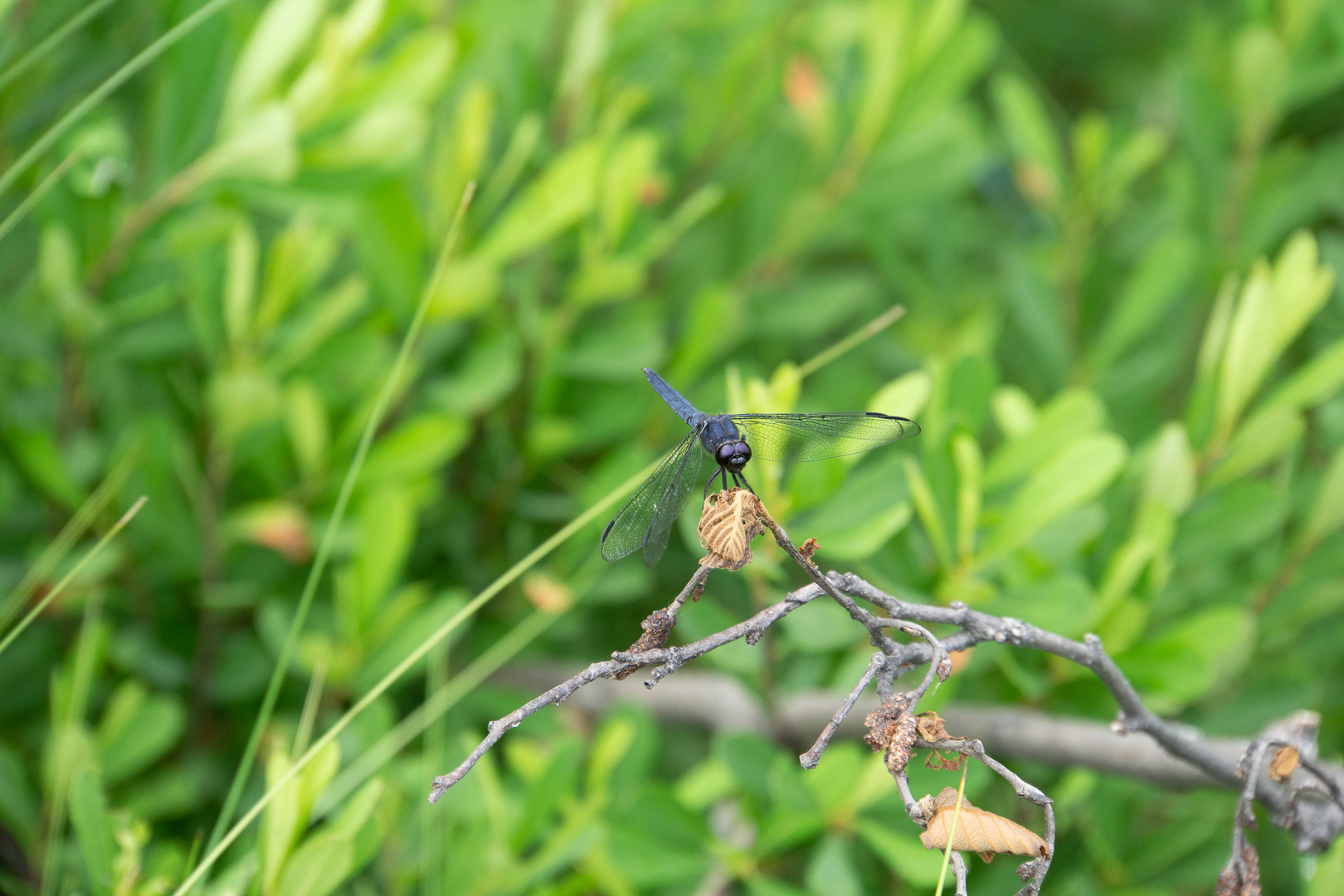
Very interesting image and comments.
Seeing that the image had already been taken and the chance to take it again is not great ( may be ?)
How about making the front of the image blurry so that only the middle is in focus ? ( Tilt shift effect ).
This will direct attention to the model ship too .
A dark vignette will help to decrease the brightness and distraction at the border of the image . |
Oct 24th |
| 74 |
Oct 19 |
Comment |
To me, the colored version show an entirely different
mood than the monochrome version.
The beautiful yellow sky, various colored rocks ( barnacles ?) and different shades of green sea weeds show me life !!!
It surely show that we all have different tastes and there is no right or wrong in whatever we see.
The B&W version is definitely more dramatic. |
Oct 24th |
| 74 |
Oct 19 |
Comment |
Thank you very much for all your great suggestions.
Will put those to work for my next image . |
Oct 24th |
4 comments - 0 replies for Group 74
|
8 comments - 0 replies Total
|