|
| Group |
Round |
C/R |
Comment |
Date |
Image |
| 65 |
Sep 19 |
Comment |
Very interesting image. The look reminds me of what I call a still life-light painting. We would turn all the light off and illuminate one part of the image at one time with a flash light. The one directional light create lots of contrast of light and shadow. A lot of fun . |
Sep 29th |
| 65 |
Sep 19 |
Comment |
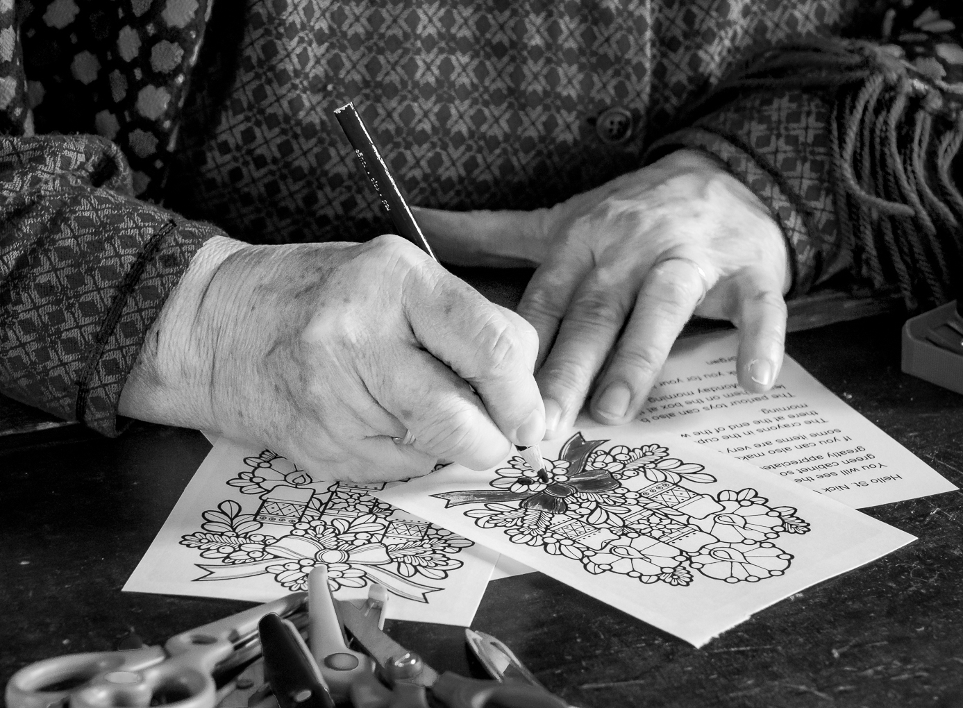
Very interesting image, Oscar.
The first thing I see is that the pen is not being used in writing at the moment the picture was taken because the tip is not tilting downward . Is the writer taking a rest ? Why did he leave the pen on the paper instead of putting it to the side like most people ( such as I ) do ?
The shadow seems to be from a light to the right . Most sunshine come from the front so does this indicate an artificial light at night ?
This image certainly stir up our detective juice . |
Sep 28th |
| 65 |
Sep 19 |
Comment |
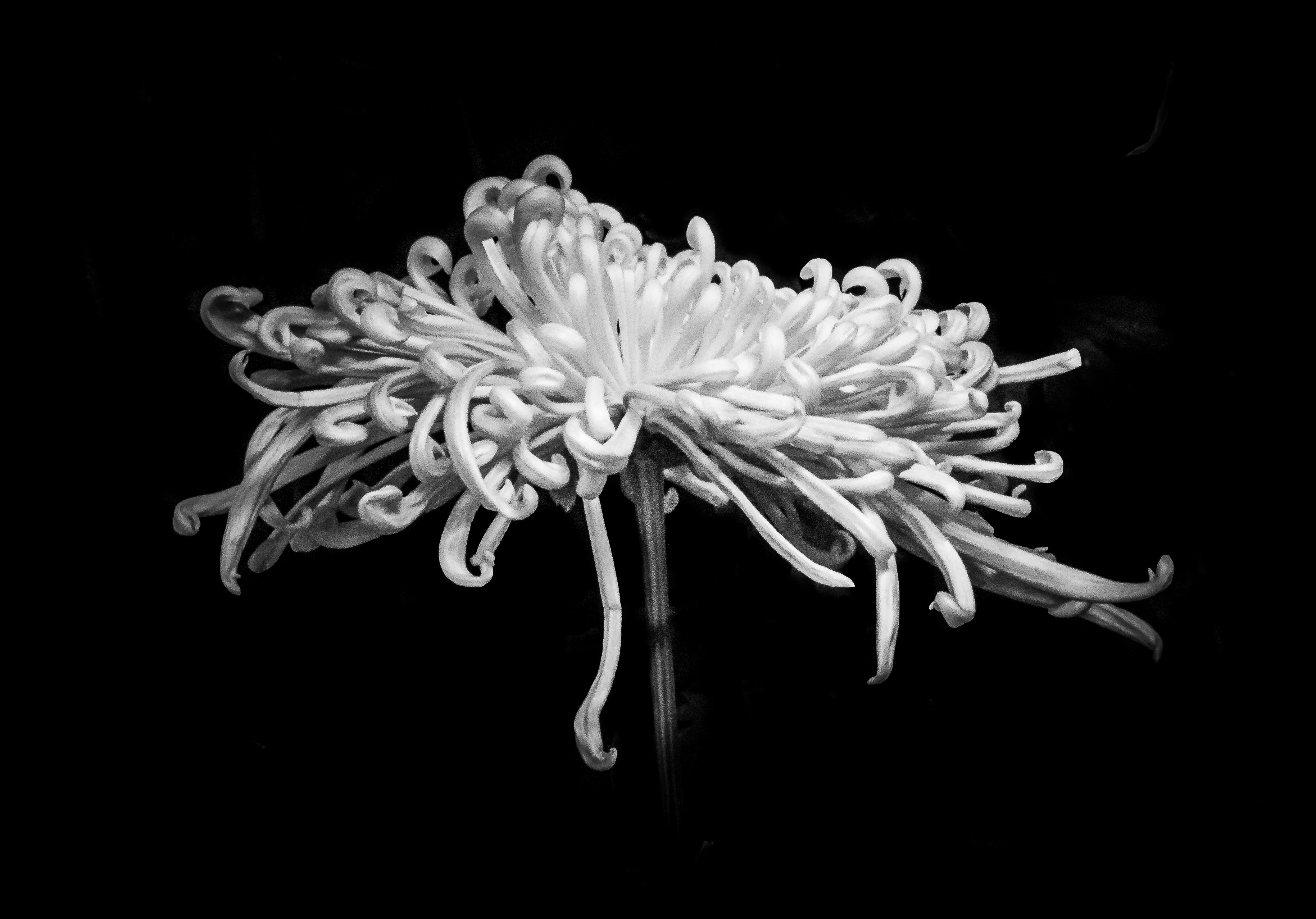
Hi Lynn, I love orchid and this is a very lovely one.
I like how we are seeing the plant behind the light that come from the other side. Shadows add texture and mood to the image.
In the first version I probably would brighten less of the root ( left side ) so that it look a bit slimmer.
I like Charle's crop better. My favorite crop is actually golden ration instead of rule of the third if my focus need to be a little bit more centralize than a third . |
Sep 28th |
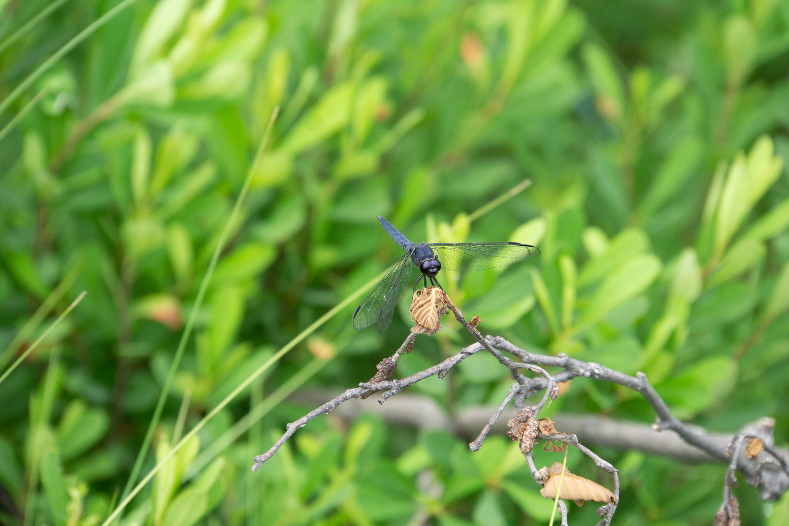
| 65 |
Sep 19 |
Comment |
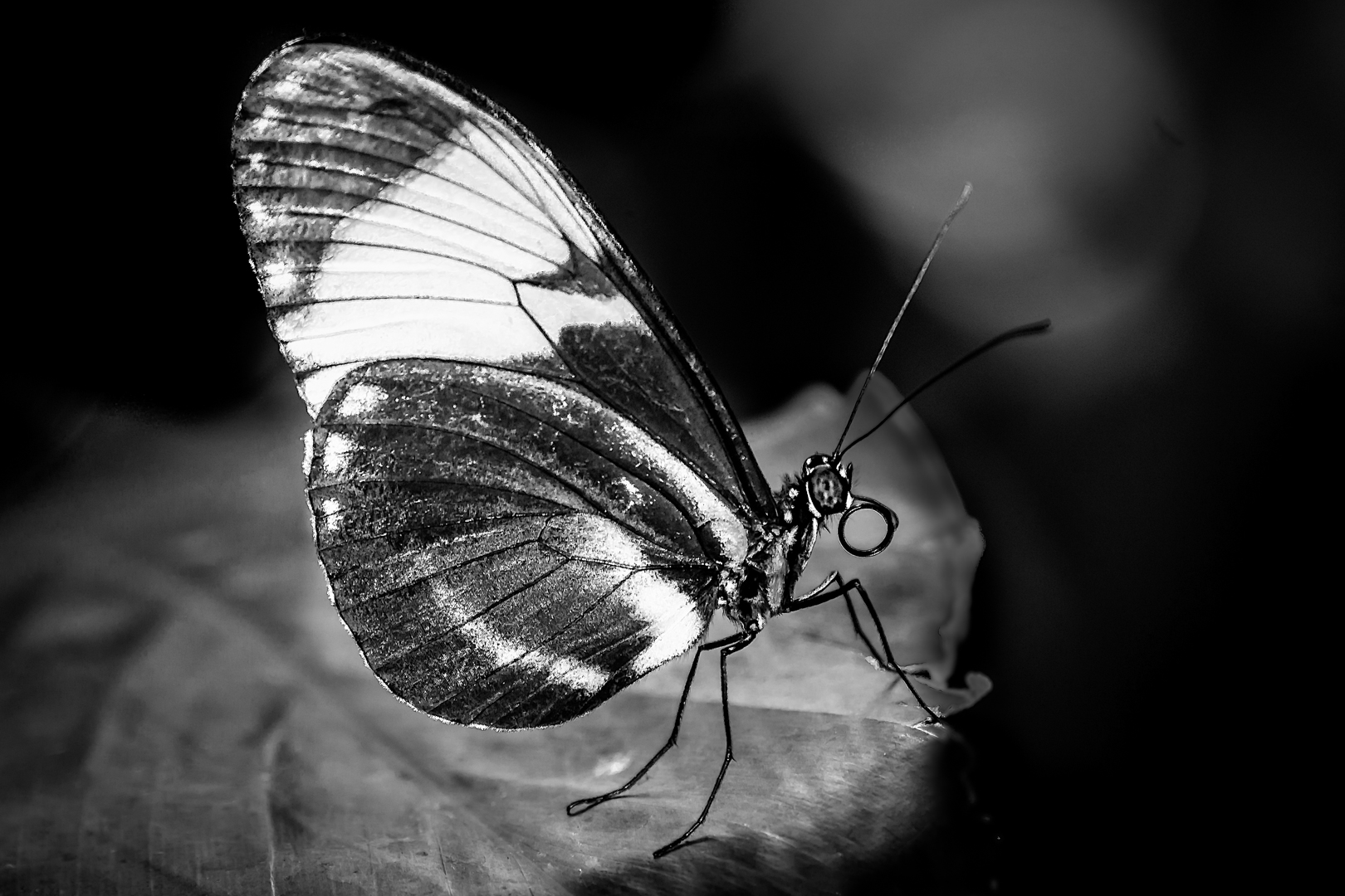
Thank you very much, Charles.
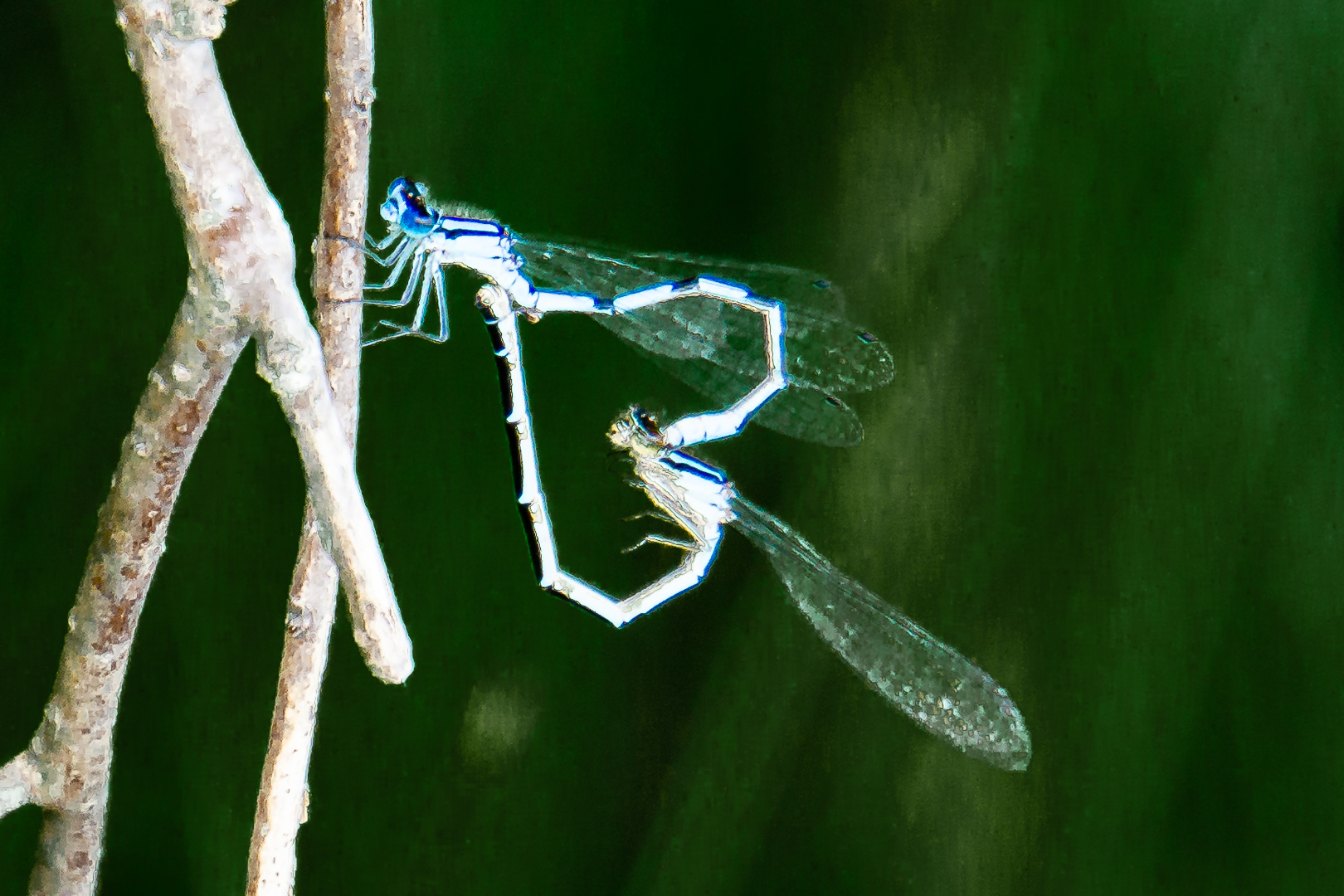
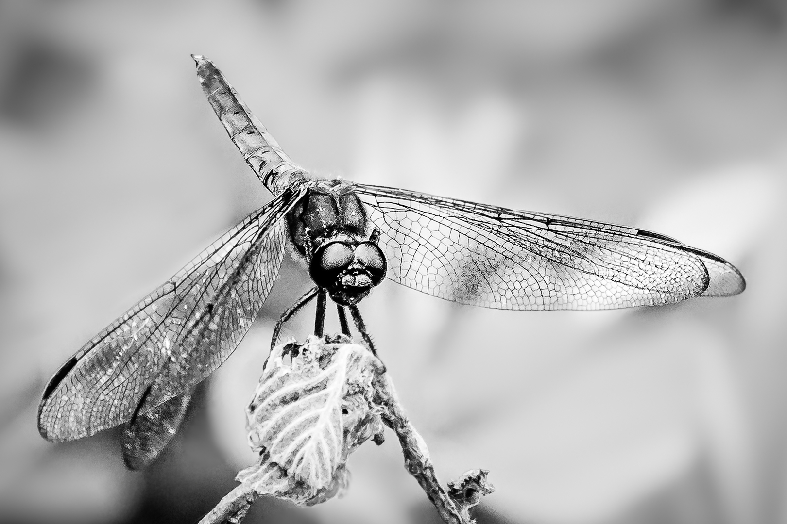
I had cropped this image closer and converted it into monochrome. To de-clutter the busy background I blurred the background; then put a black mask on the dragonfly so that the subject stay nice and sharp. A black mark on the right wing require either luminosity mask or zone system to select. I had not use neither for a long time and had not install them in my new computer..too lazy to look those up now. Just selected the dark area and (brighten the shadow part but not the dark part in tone curve of camera Raw ) twice.
May be I should have altered the green part before the black and white conversion ? |
Sep 18th |
 |
4 comments - 0 replies for Group 65
|
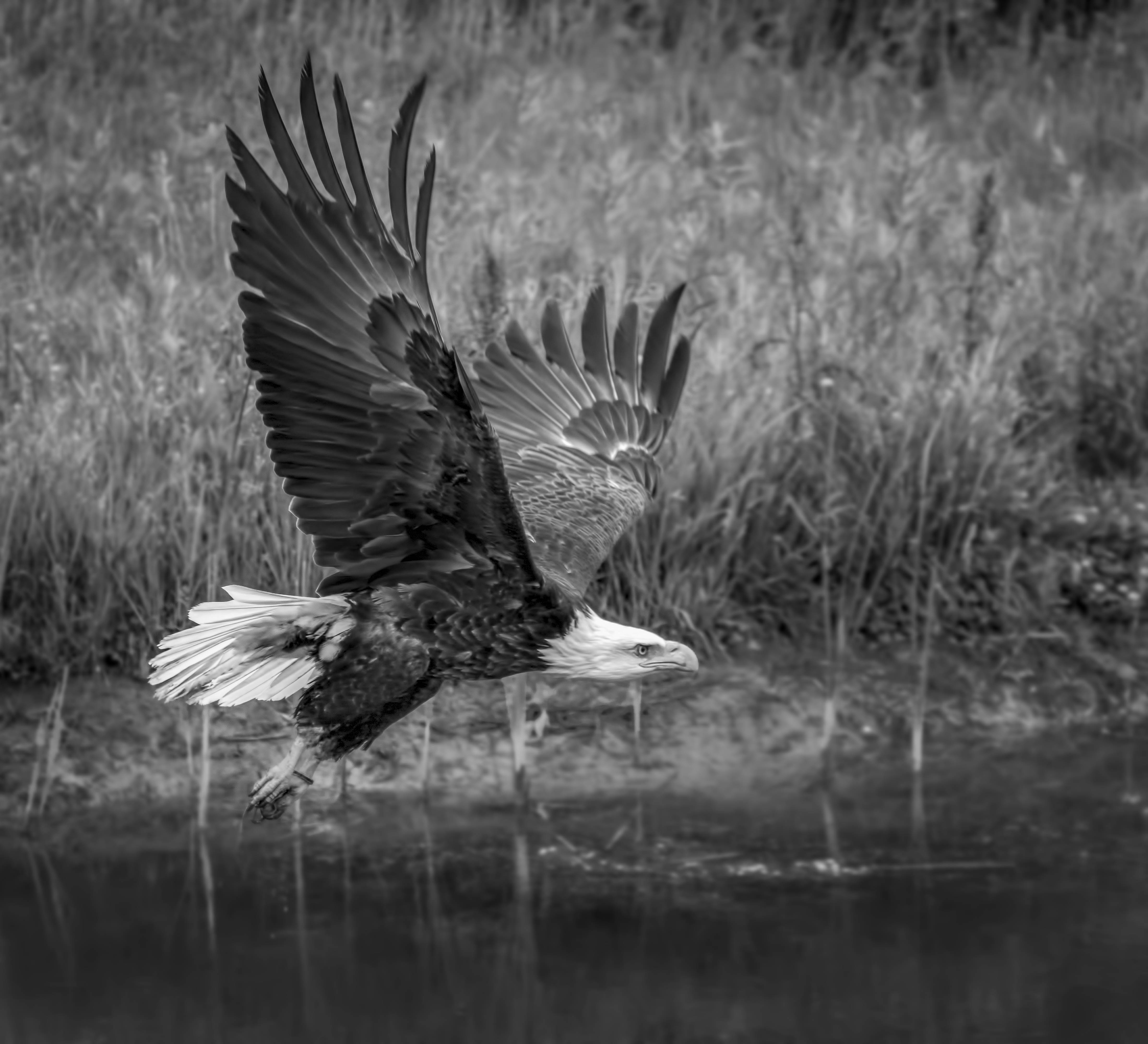
| 74 |
Sep 19 |
Comment |
Good action shot. I would keep the same aperture...may be go down to f8 but not lower than that. In taking action shot like this it is hard to predict the plane of the subject. If the animal is at a slant ( not parallel to the camera such as in this instant ) then the higher depth of field is needed. It is easy to blur out the background a bit in light room using an adjustment brush. |
Sep 29th |
| 74 |
Sep 19 |
Comment |
Love the texture of the feather and the composition. During the conversion I might try to change the slider of each color so that the red, blue etc show up as different tones because they are highly adjustable . Thank you for sharing such an interesting bird . |
Sep 29th |
| 74 |
Sep 19 |
Comment |
Very good detail and texture despite the darkness of the overall image. |
Sep 29th |
| 74 |
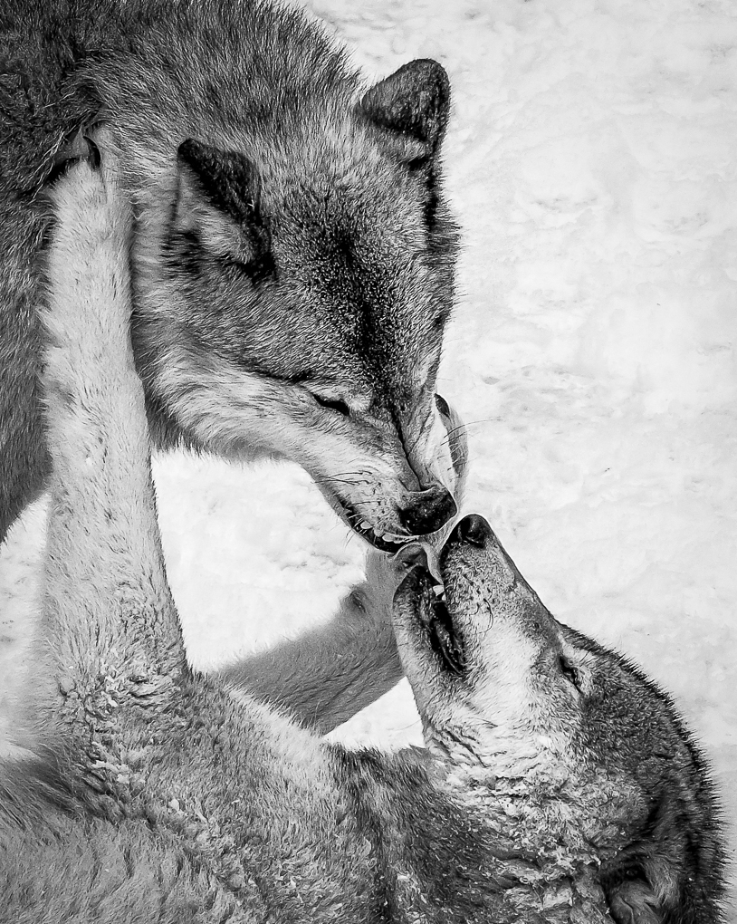
Sep 19 |
Comment |
Great image.
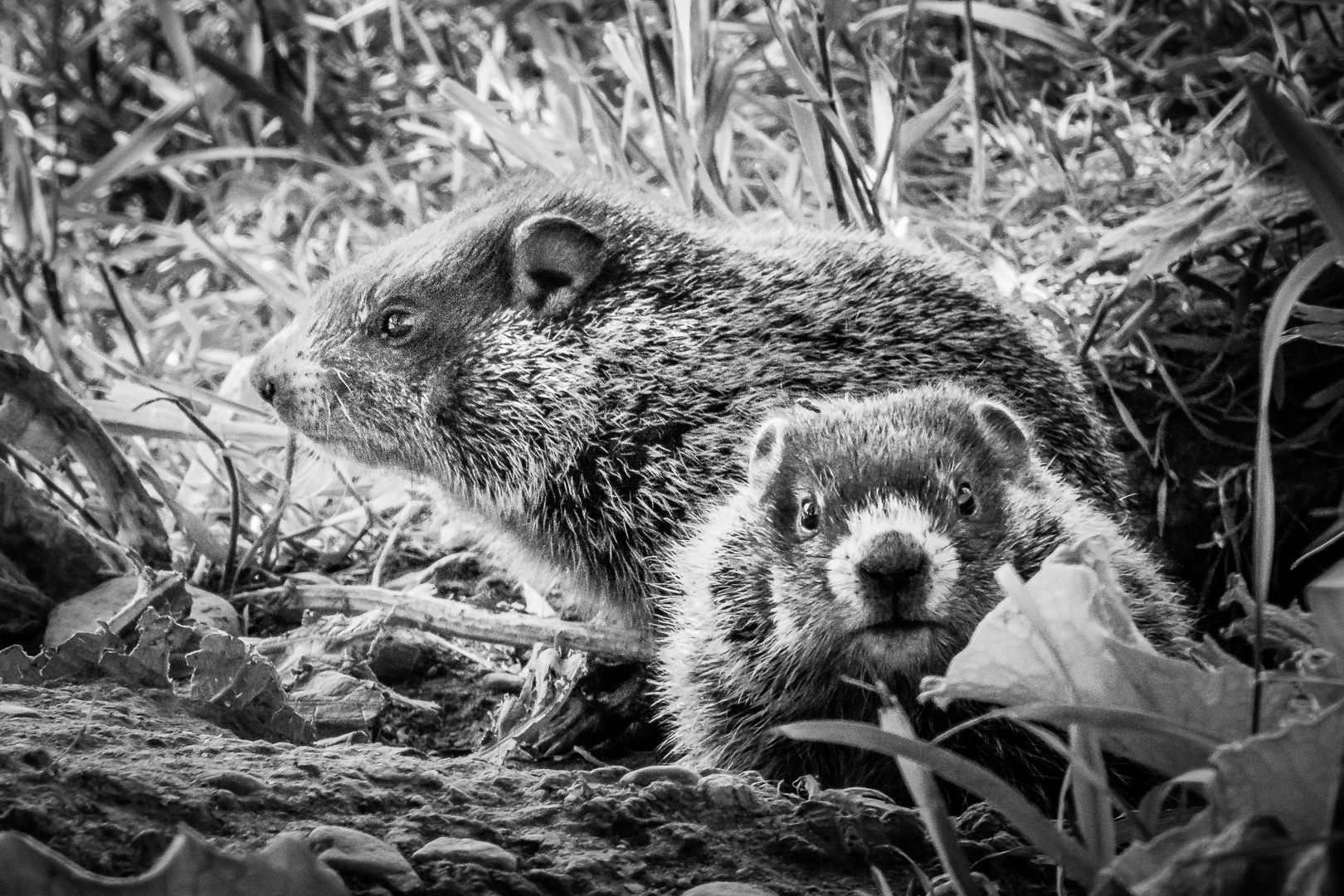
Our club used to only allow global editing to the nature category. We had just changed the rule so that local editing is allowed as long as the images seems natural to " trained eyes ". Love the detail of mother and cub. |
Sep 29th |
| 74 |
Sep 19 |
Reply |
In Lightroom ( Or Adobe Camera Raw inside PS)it is even easier to dodge and burn.
Use adjustment brush to paint on areas you want; then adjust highlight or shadow first. If that does not do the job, adjust exposure as last resort. White and Black slider can be use to fine tune too . Using a new adjustment brush for different area will give much better fine localized control.
You can also change clarity, noise and saturation etc at the same time. Do not forget that there is a section to add color to a brush ; this will change tone of the area too ) Although this is much more useful in a coloured image ) |
Sep 8th |
| 74 |
Sep 19 |
Reply |
Thank you very much, Dave, Arne and everybody for your great comments and suggestions.
I use this method of Dodge and Burn frequently too.
One note is to make one layer to darken ( Burn ) and a different layer to dodge ( Lighten ). { brush black on 50% grey to darken, brush White on 50% grey to lighten } .This way, it is easy to decrease opacity if you decide to change the intensity of the effect. To increase the effect, duplicate the layer and change the opacity of the duplicate layer to fine tune the efffect . If the effect is only needed in specific area, use a black mask to mask out all other areas.
|
Sep 8th |
5 comments - 2 replies for Group 74
|
9 comments - 2 replies Total
|