|
| Group |
Round |
C/R |
Comment |
Date |
Image |
| 65 |
Apr 19 |
Comment |
Love the wonderful texture of the cork and opener.
The contrast of the straight lines and the circle and curves really add interest.
I would prefer that the area outside the cork to be solid black too . |
Apr 26th |
| 65 |
Apr 19 |
Comment |
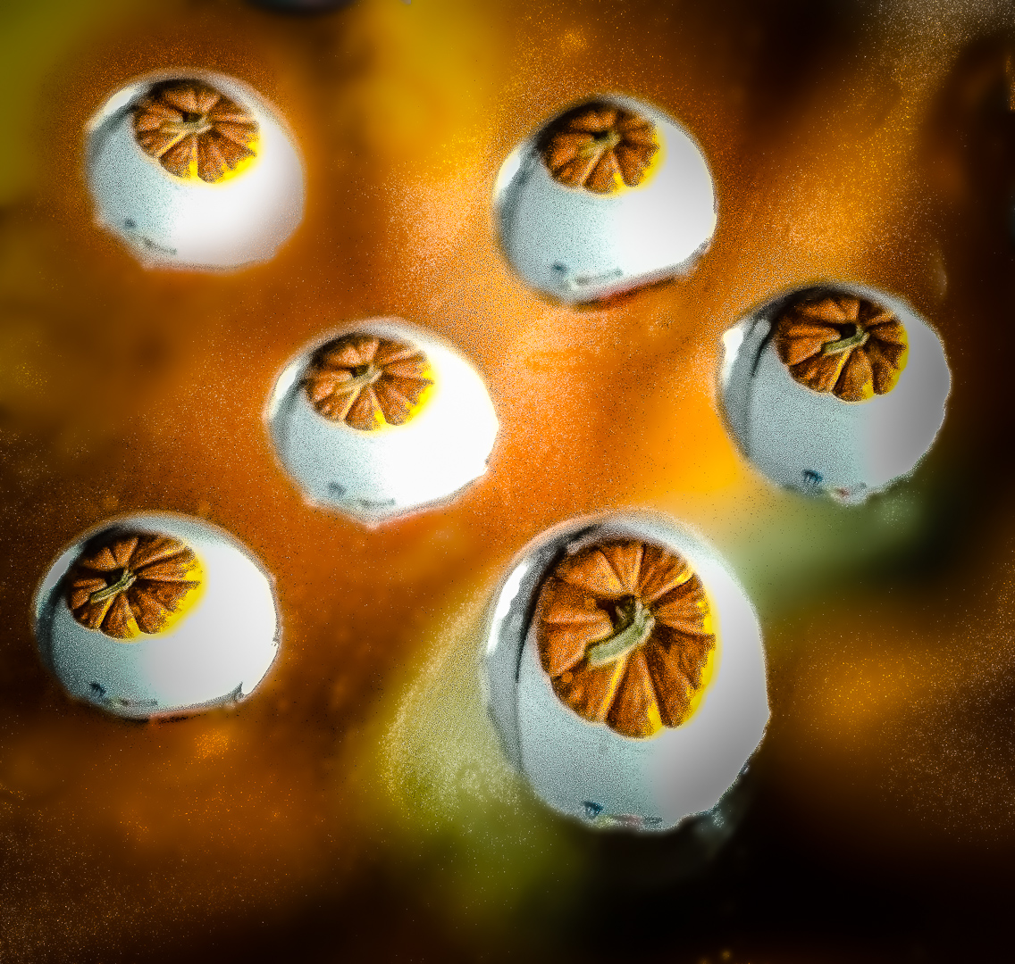
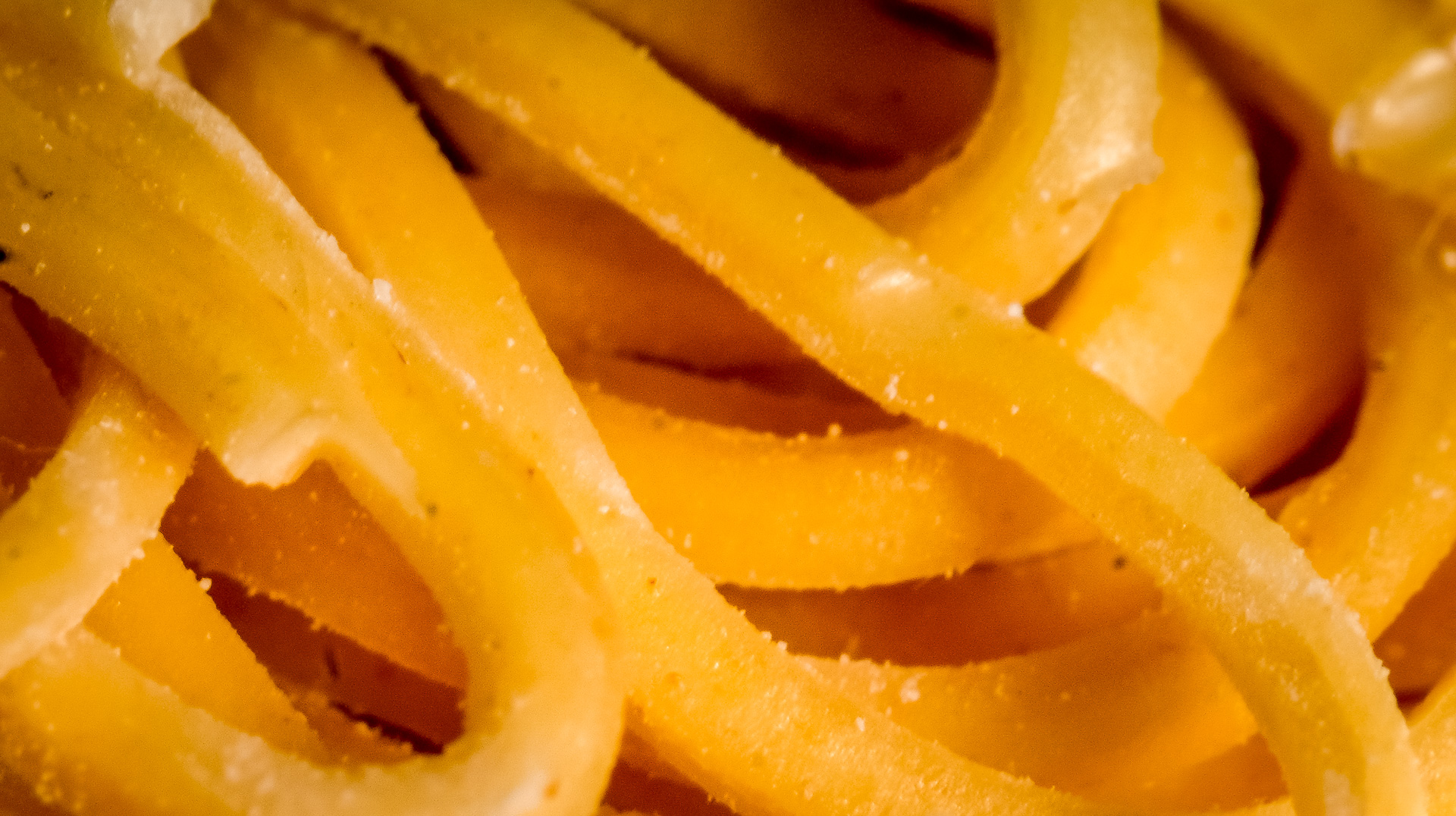
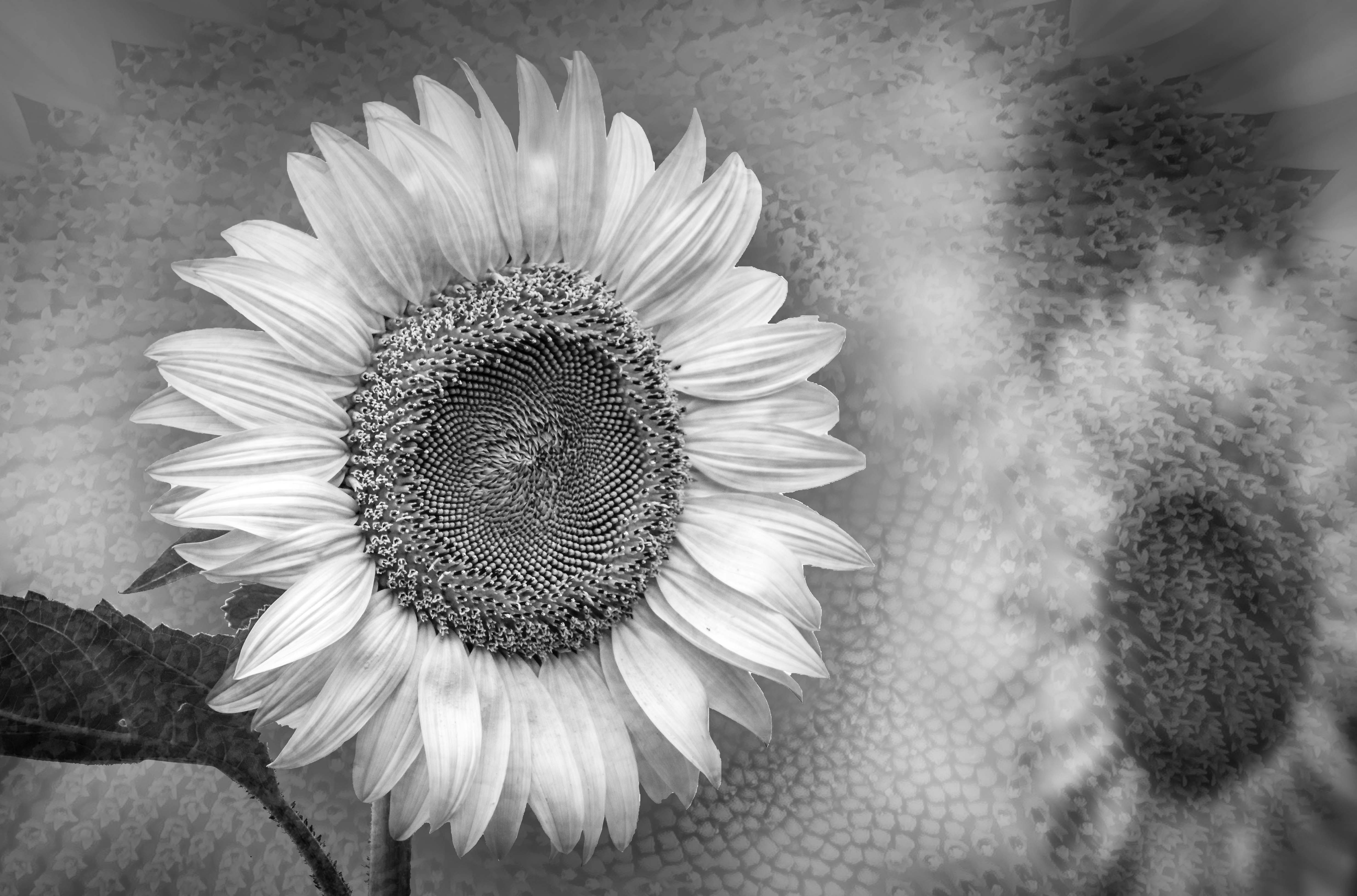
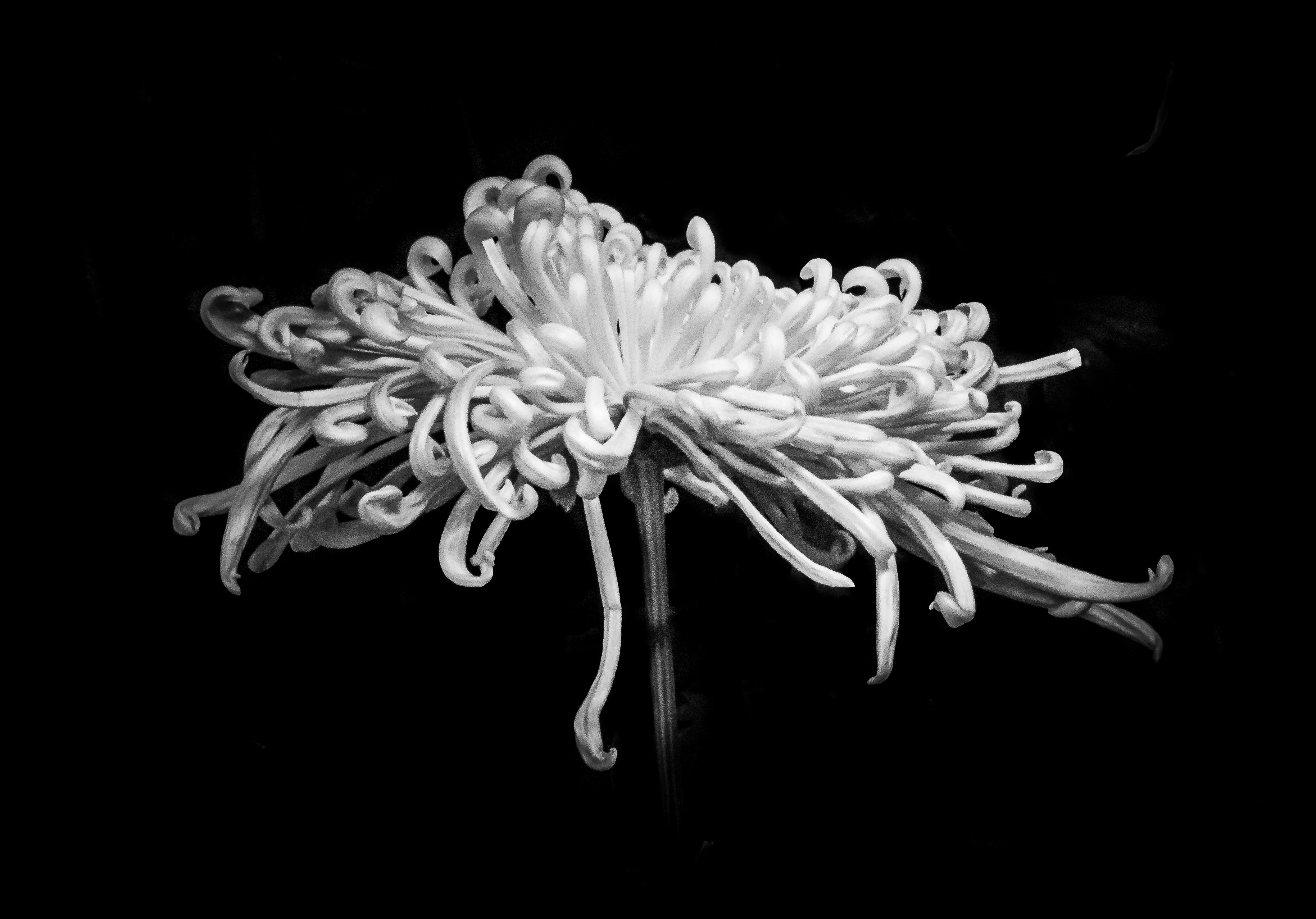
Like the texture of the cheerios.
I understand your point of trying something new and to your taste. I do not care whether my club like my images or what the score is anymore ( as long as you know that your basic principle and techniques are correct )
2 items of similar but different themes ( onion rings and texture) seems to be hard to blend in this case.
In my eye I would either use a simple background ( Less is
more )or use a completely different background....such as a checkered tablecloth .
|
Apr 26th |
| 65 |
Apr 19 |
Comment |
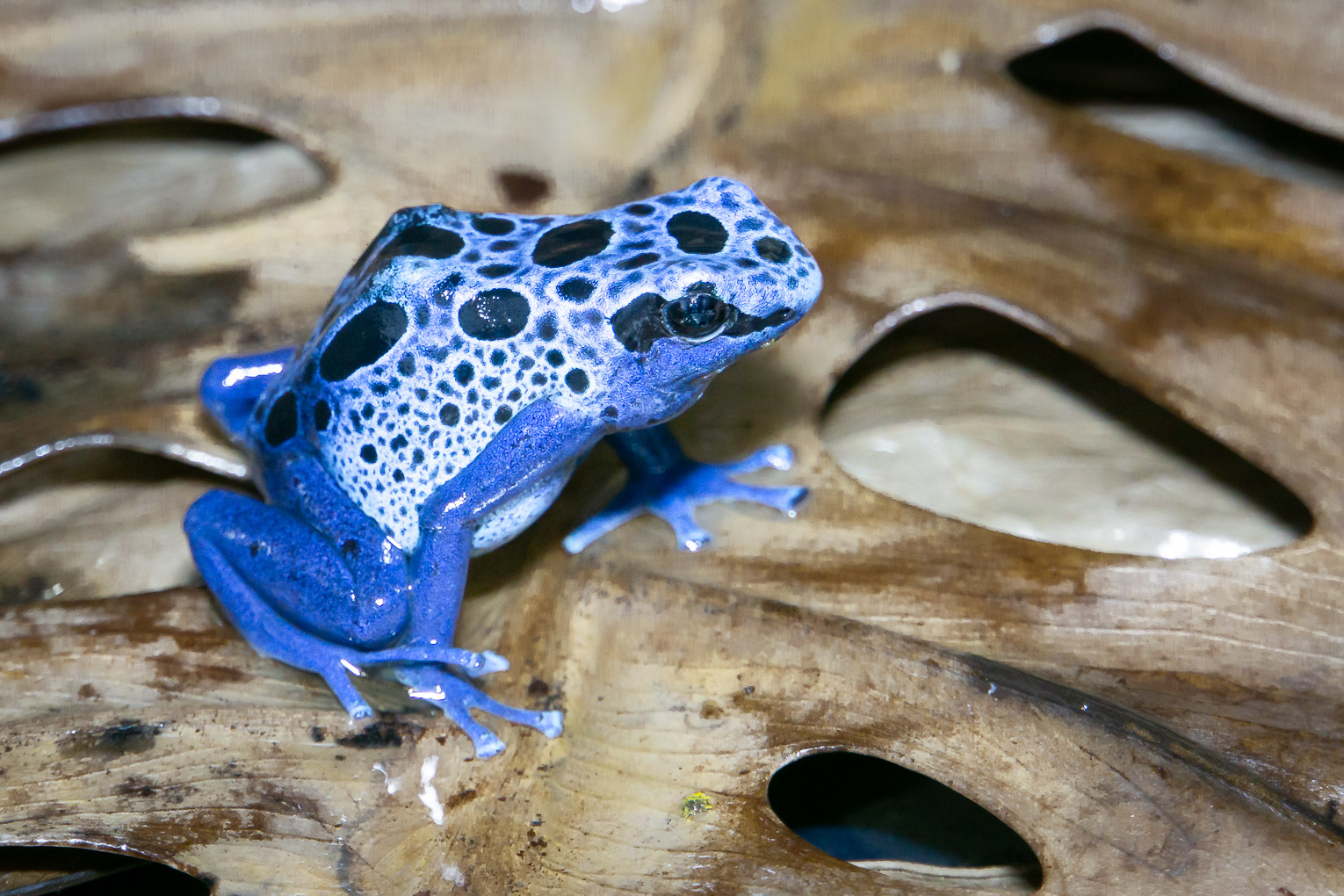
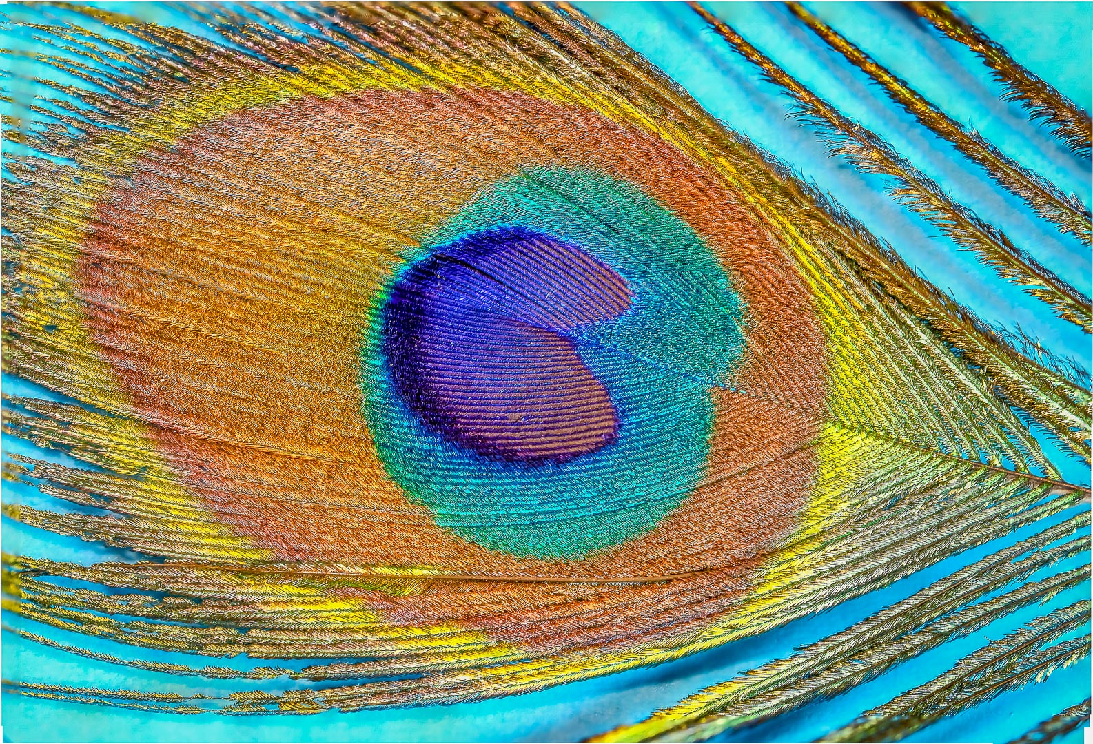
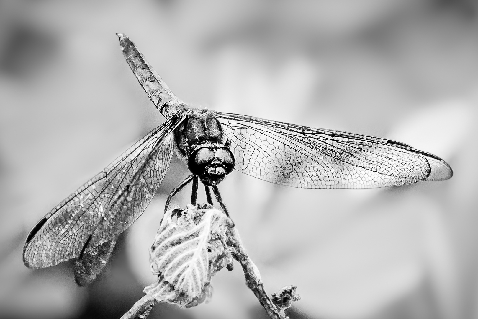
Wonderful detail and textures.
This is an excellent subject choice.
I wonder whether putting a scrim such as the inside of a diffuser will soften the light a bit . |
Apr 26th |
3 comments - 0 replies for Group 65
|
| 74 |
Apr 19 |
Comment |
Thank you very much for all your great suggestions. |
Apr 26th |
| 74 |
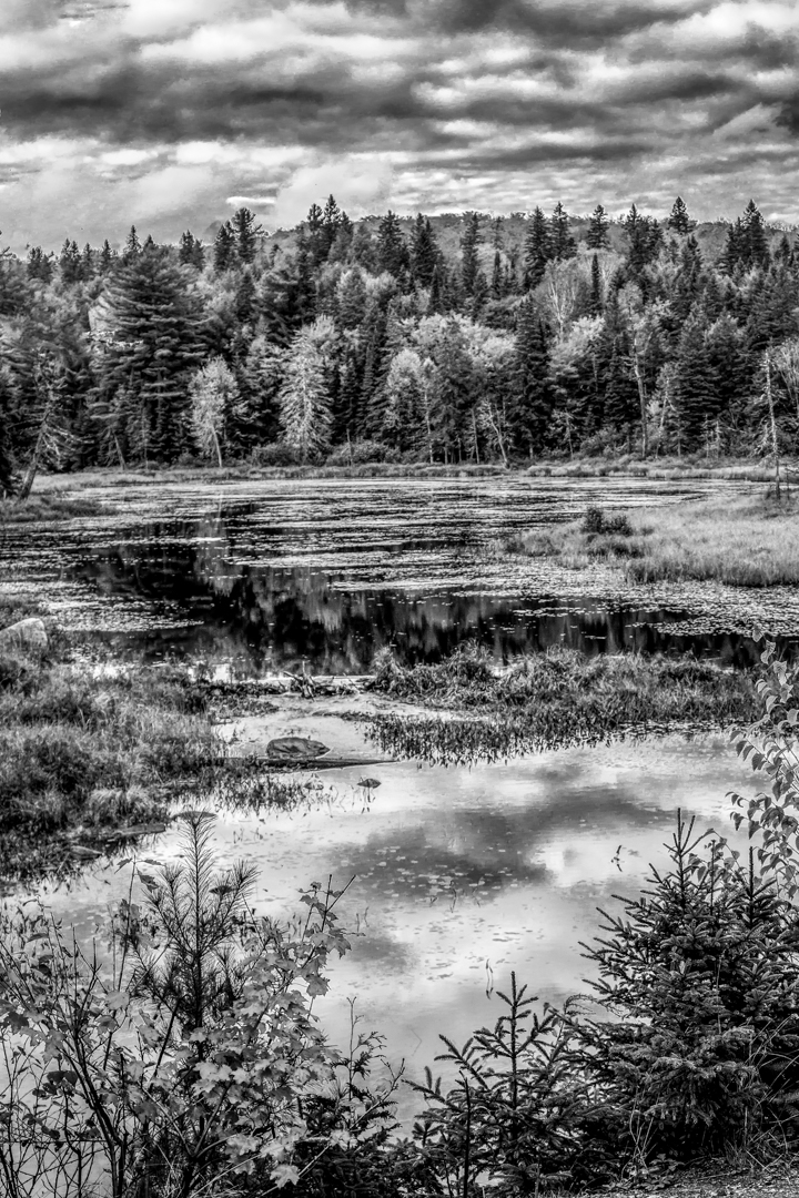
Apr 19 |
Comment |
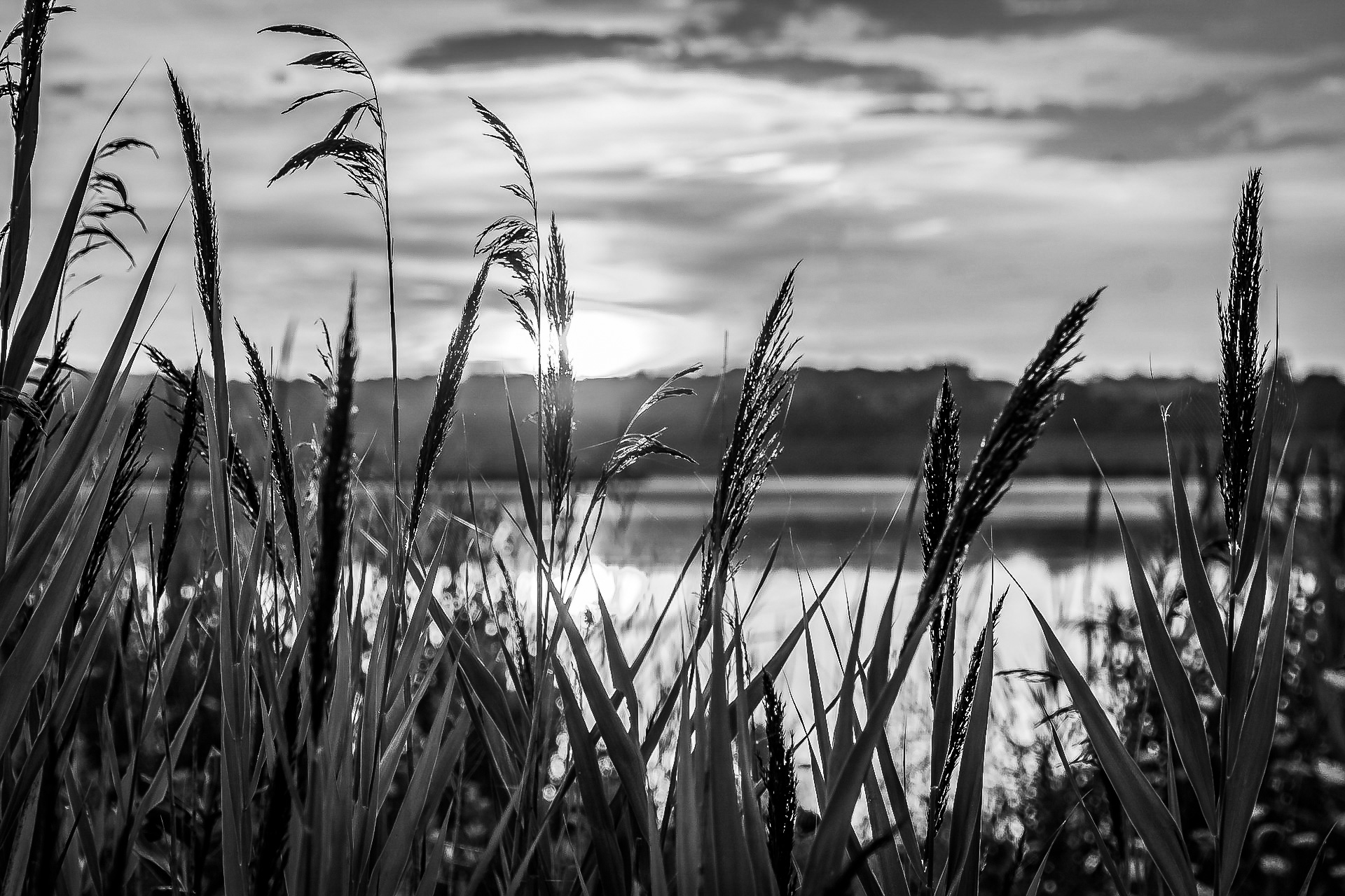
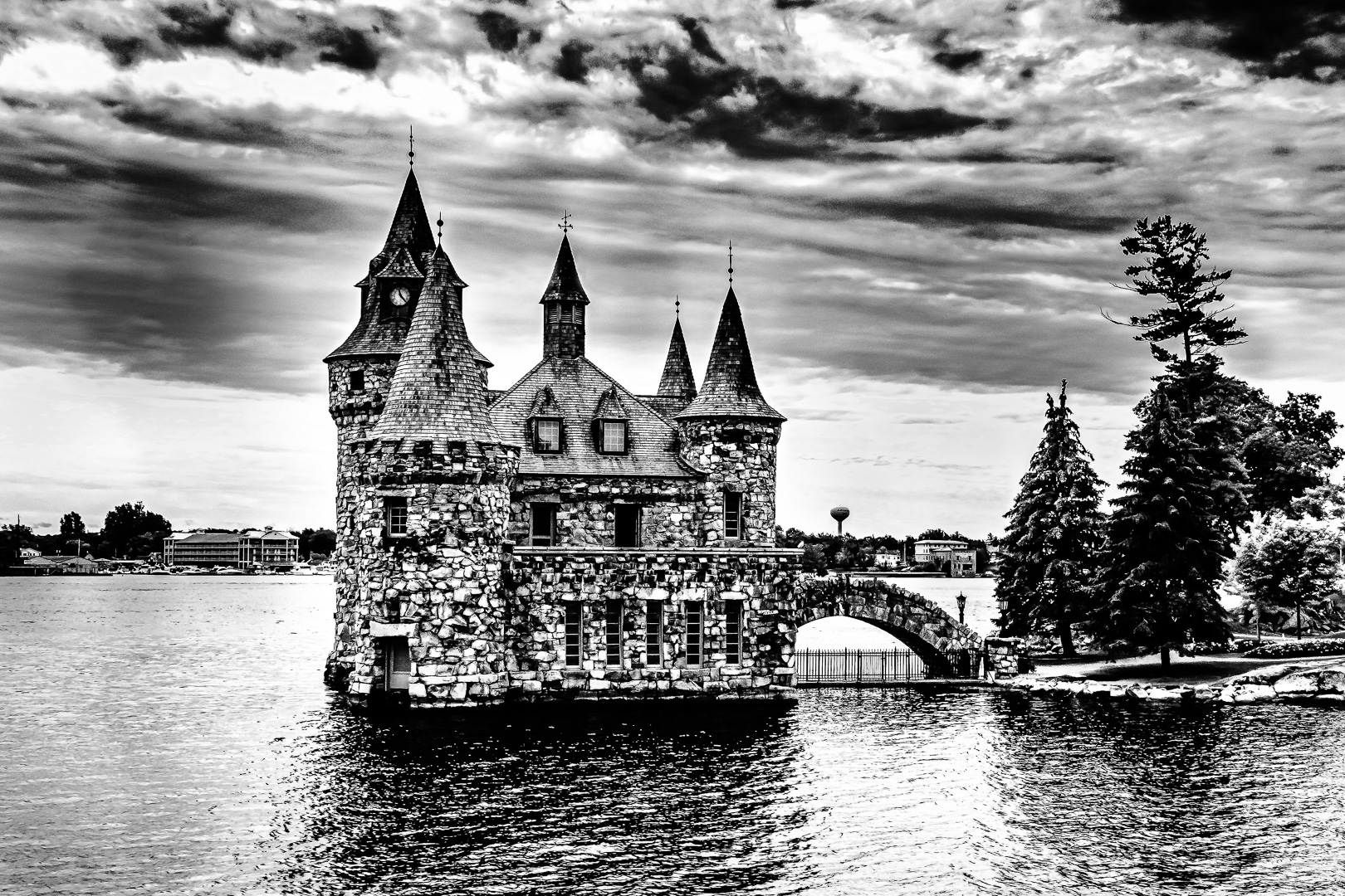
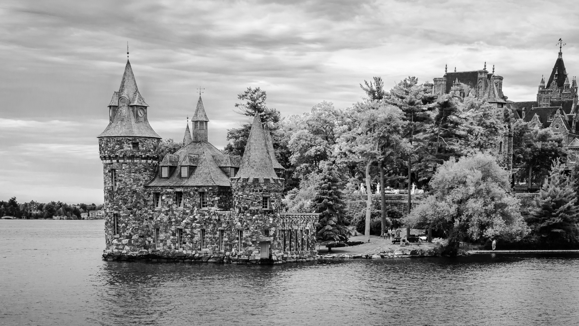
Wonderful sharp focus, reflection and detail.
The wide tonal range is perfect for B$W .
I enjoy the interesting detail in water but would also like to see a little more of the sky.
The cropping is new to my eyes which are used to seeing structures at the line of the third or golden ration.
May be I am just old fashioned but I would like to decrease the feeling of ( Top heavy ) too.
How about keeping the same length of water but add more to the top so that the horizontal bars range from around the top third to golden ratio ?
An unusual dimension of the image will also creates interest . |
Apr 26th |
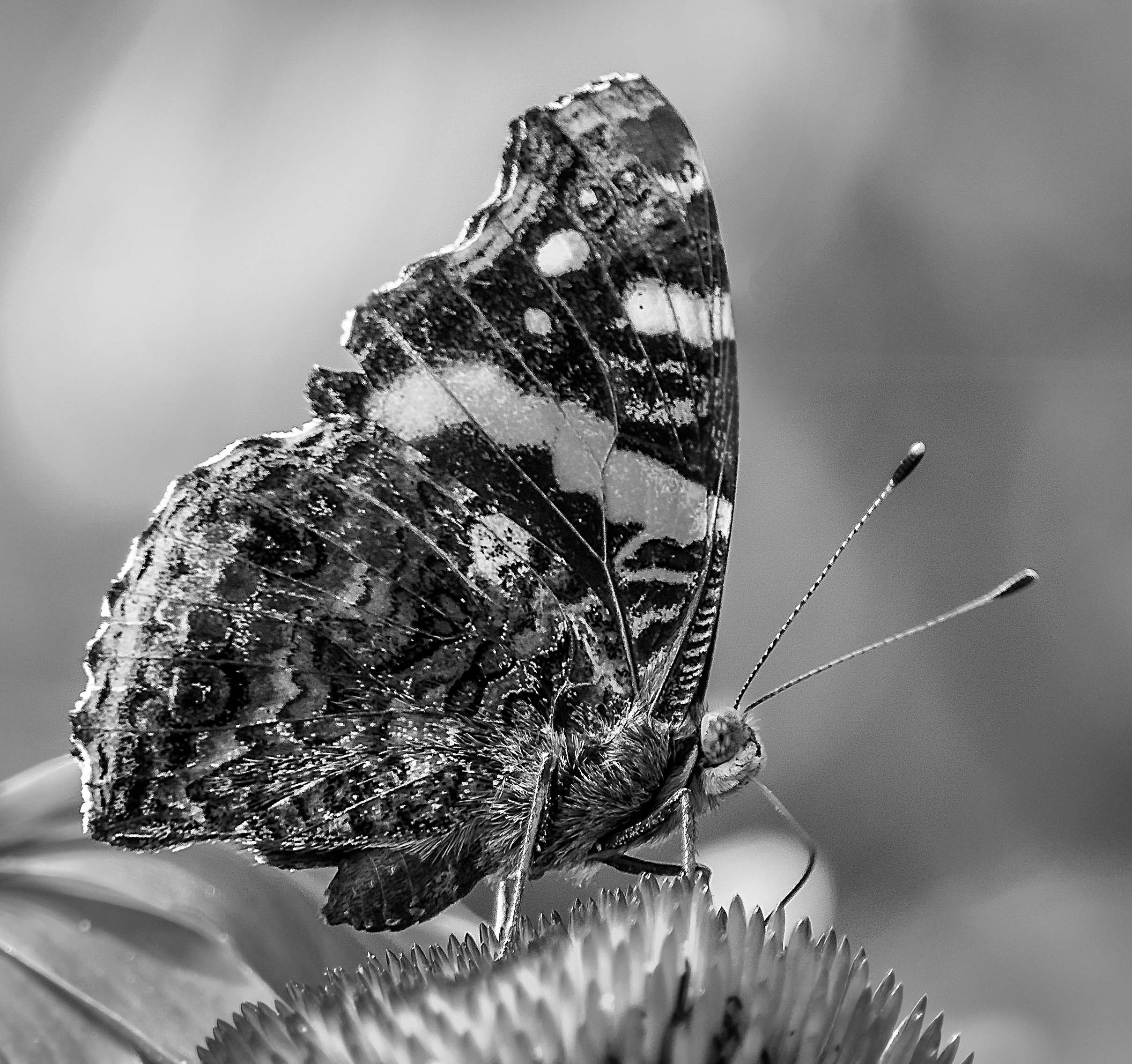
| 74 |
Apr 19 |
Comment |
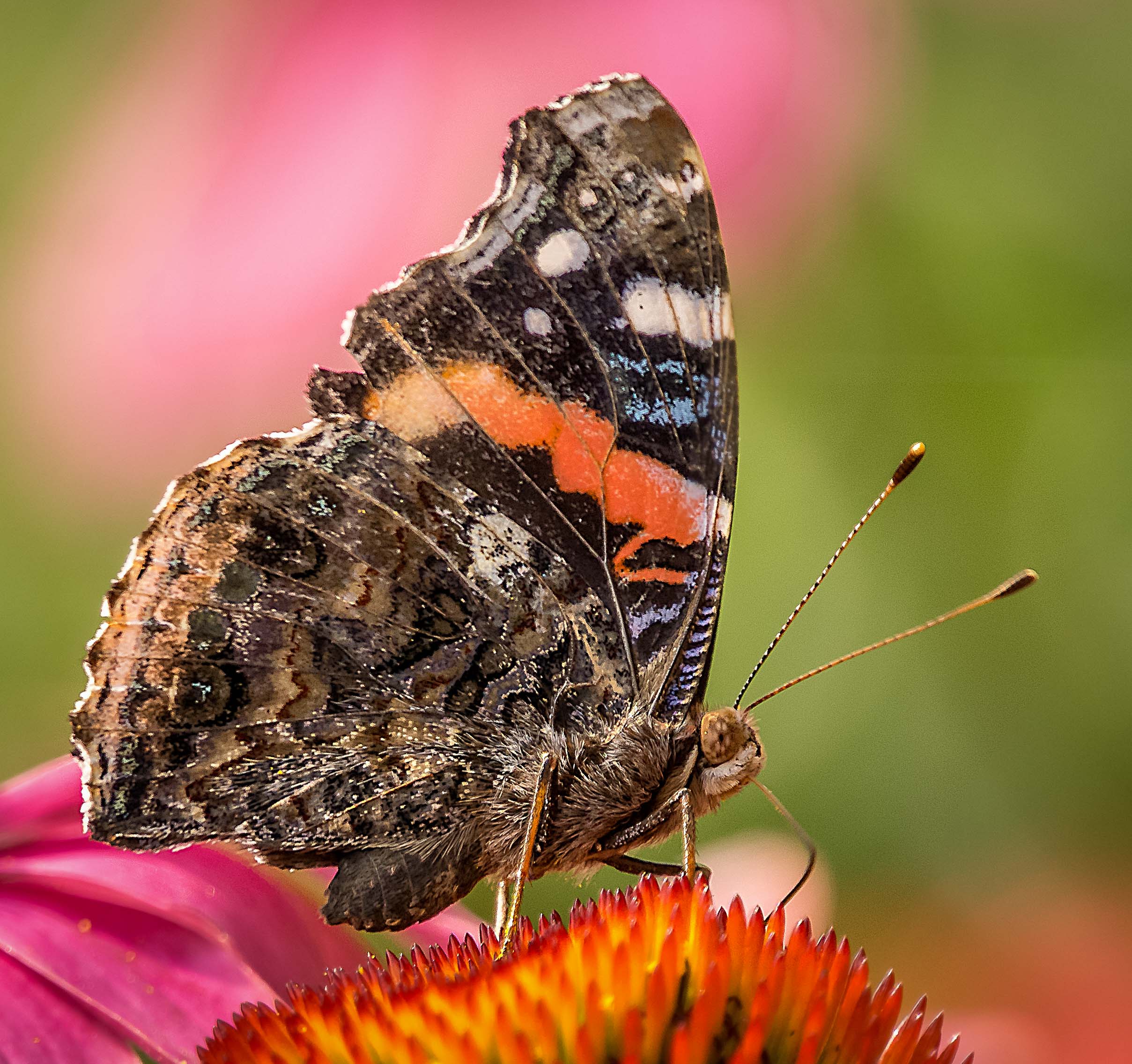
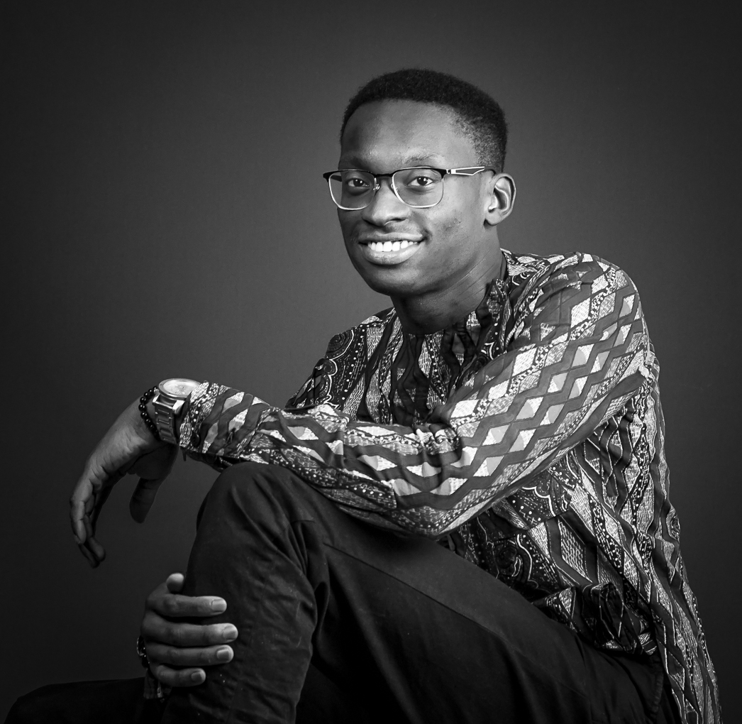
What a great dynamic portrait !! Love the nice skin texture.
The original image is a bit dark but the B&W is bright enough for me. I had been working hard at my amateur portrait studio the past year and I agree with your editing to leave only the face . Sometimes less is more and it is very true in this case. |
Apr 26th |
| 74 |
Apr 19 |
Comment |
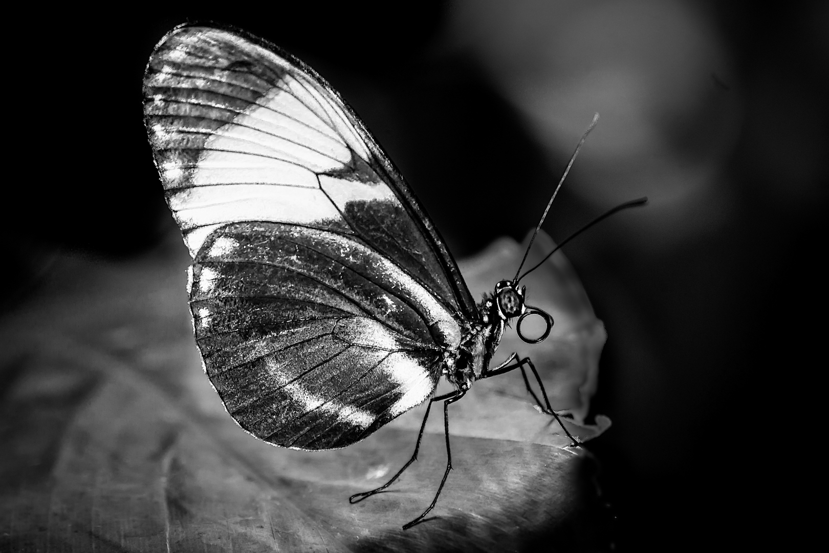
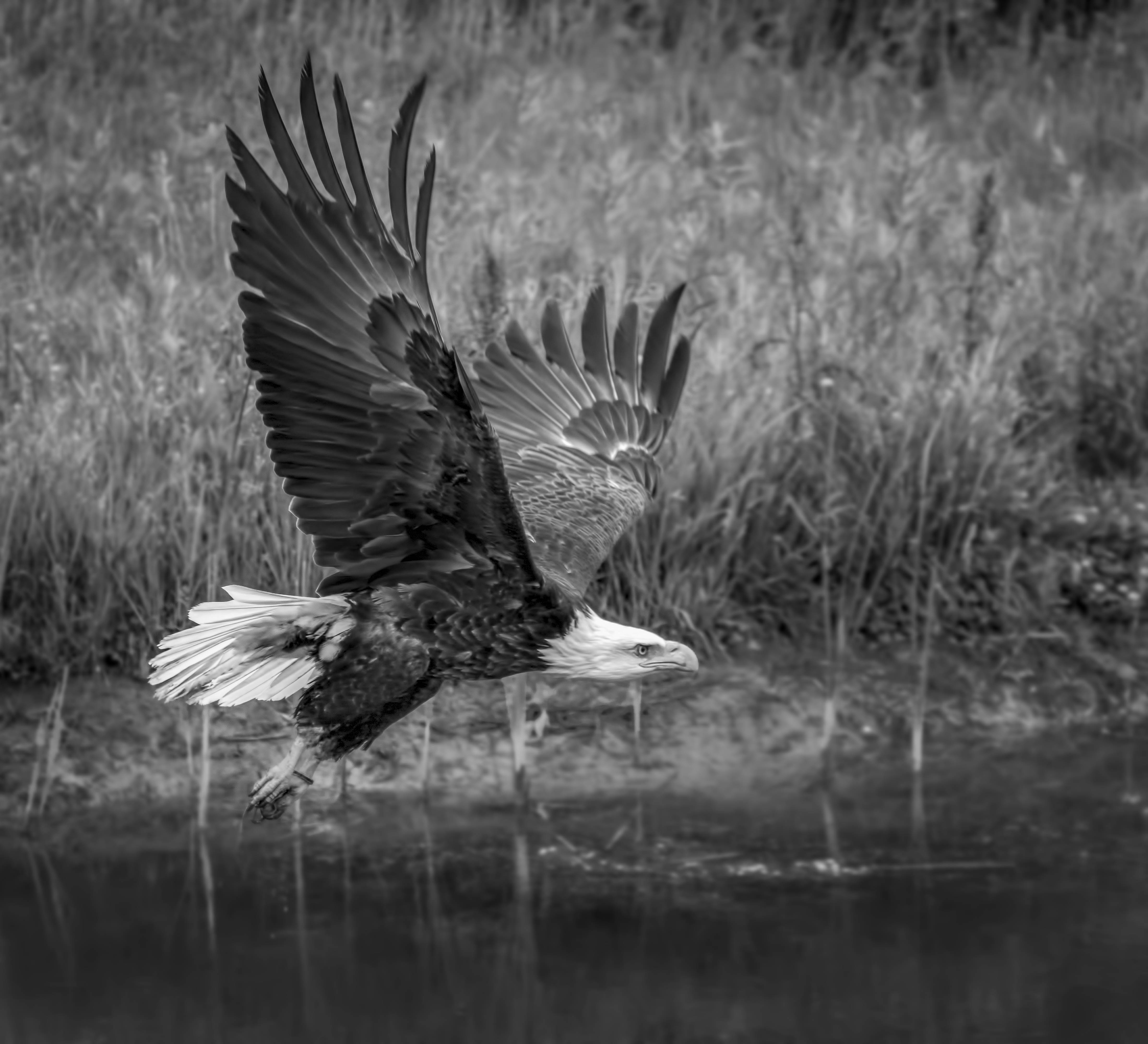
Great action shot ! At the Galapagos islands we need a distance of at least six feet (two meters) from wildlife . I was there last year and thoroughly enjoyed the trip too. Most wildlife I captured there are not bright color so B&W are very logical choices ( Except for the red throated frigate bird at mating season ). I really enjoy this sea lion playing in its element.
|
Apr 26th |
| 74 |
Apr 19 |
Comment |
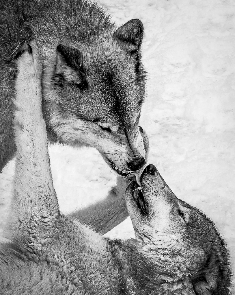
I feel that monochrome really increase the atmosphere of serenity . He is looking up into the sky..trying to see his future ? |
Apr 26th |
| 74 |
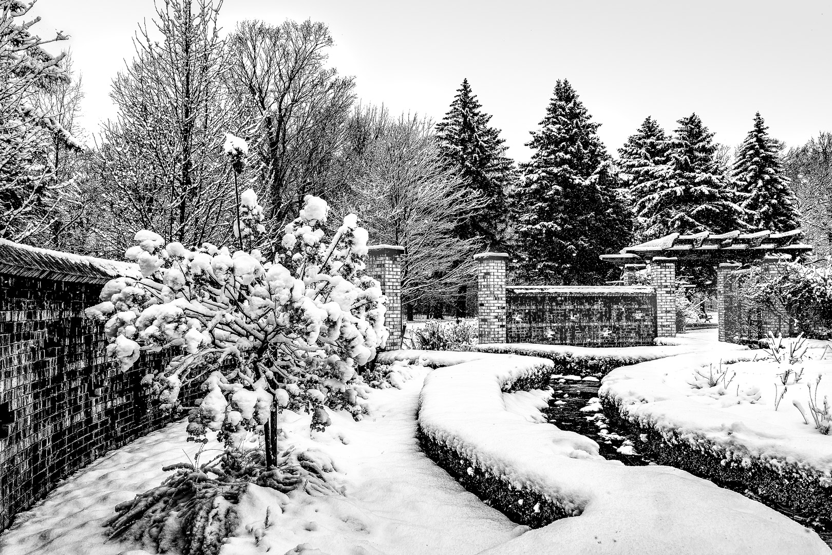
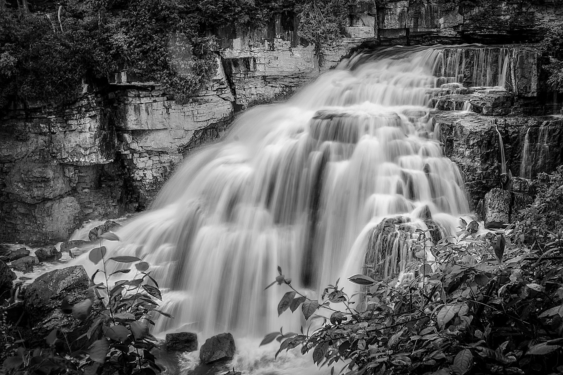
Apr 19 |
Comment |
Lovely waterfall in monochrome. To me the white water look much better than yellow. I like the cropping and the angle of water in the foreground. The diagonal water flow under the waterfall also contrast nicely with the downward flowing water.
The wide tonal range is very nice too. Yes, I would have increase the exposure of some of the trees . |
Apr 26th |
6 comments - 0 replies for Group 74
|
9 comments - 0 replies Total
|