|
| Group |
Round |
C/R |
Comment |
Date |
Image |
| 65 |
Dec 18 |
Comment |
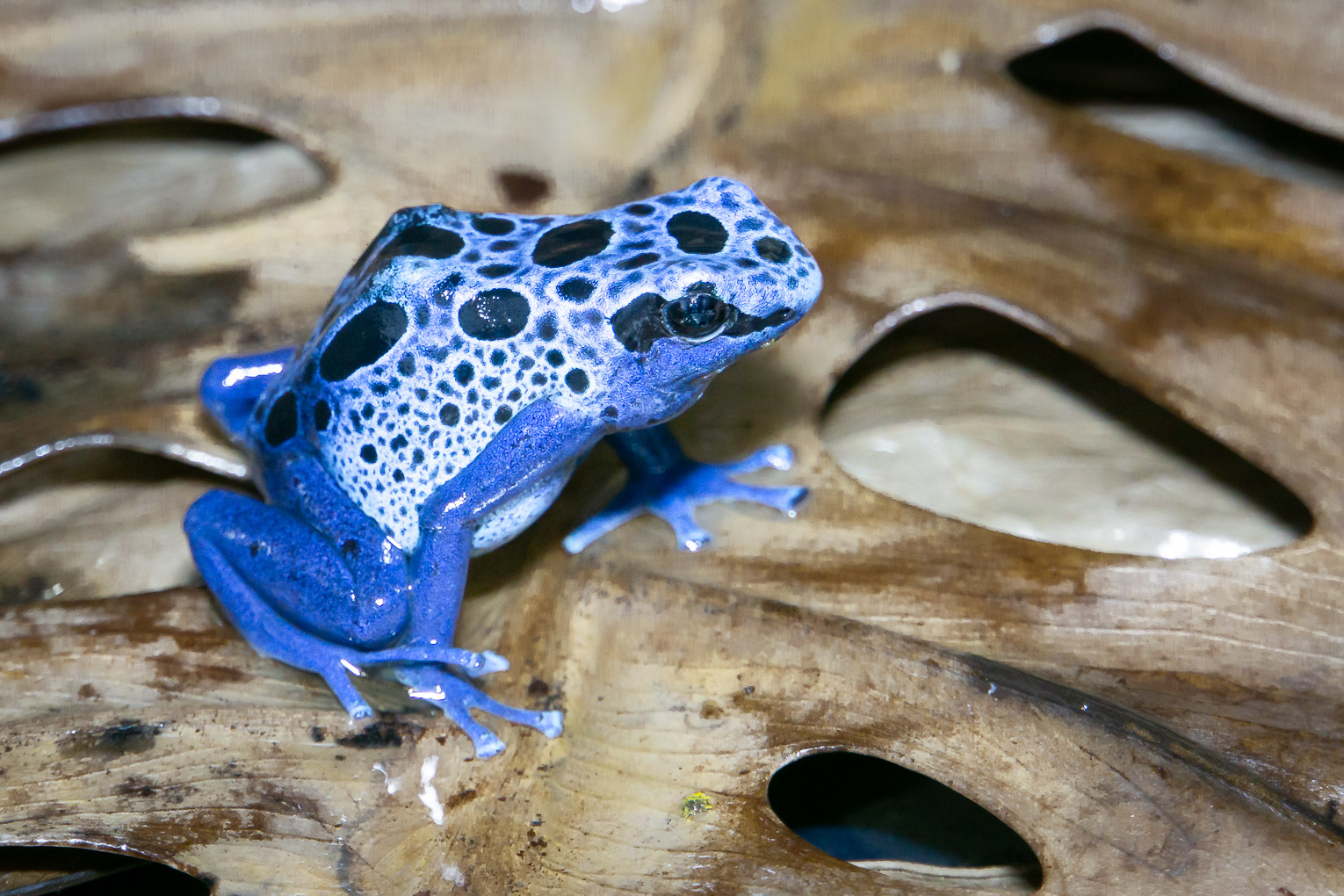
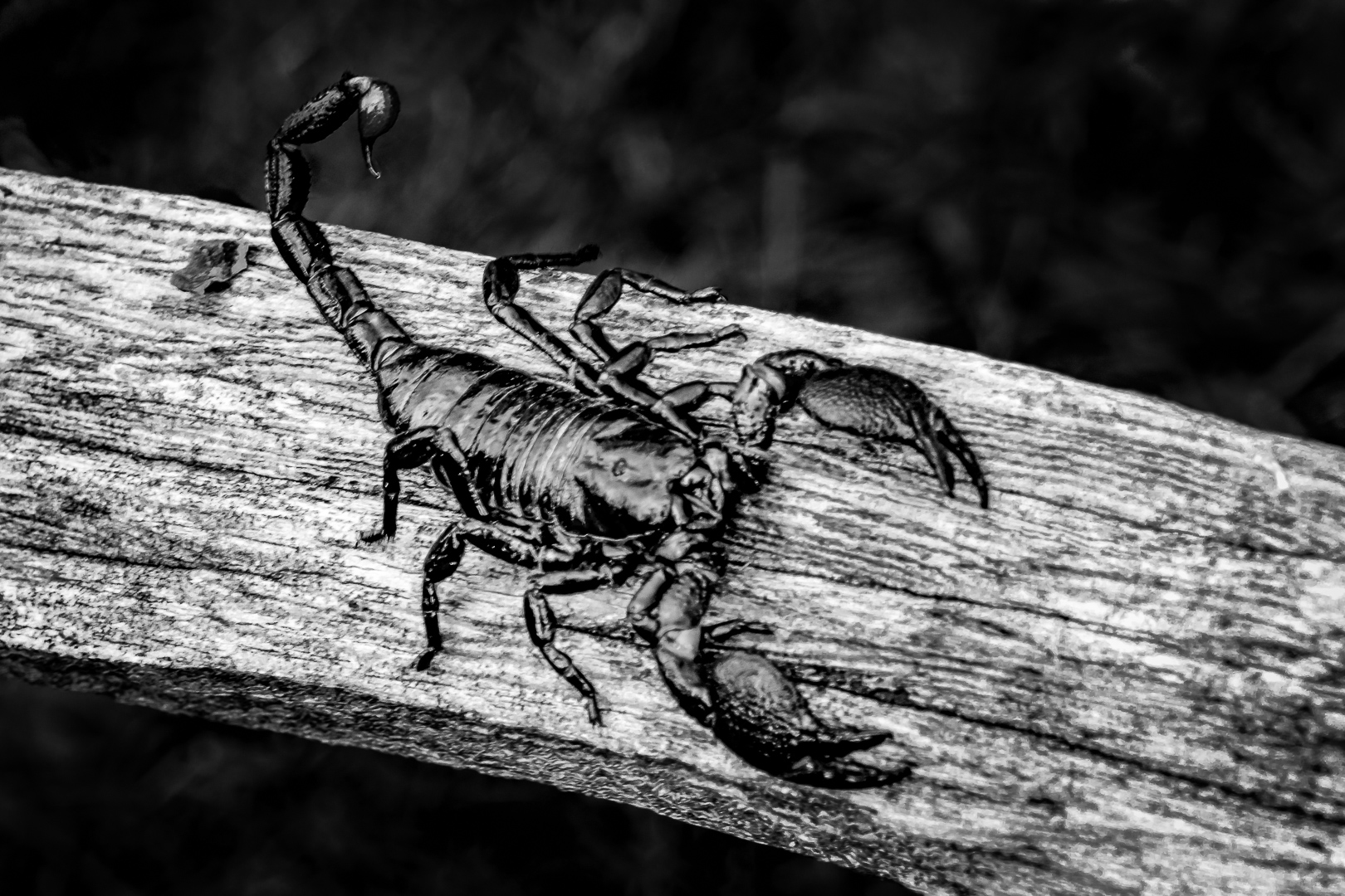
Great shot as always.
This really emphasize our major gain as a photographer :
we learn to appreciate all subjects and find beauty in ( almost) everything....I can appreciate the beauty of snakes but still cannot overcome the feeling of " Zero in the bone "
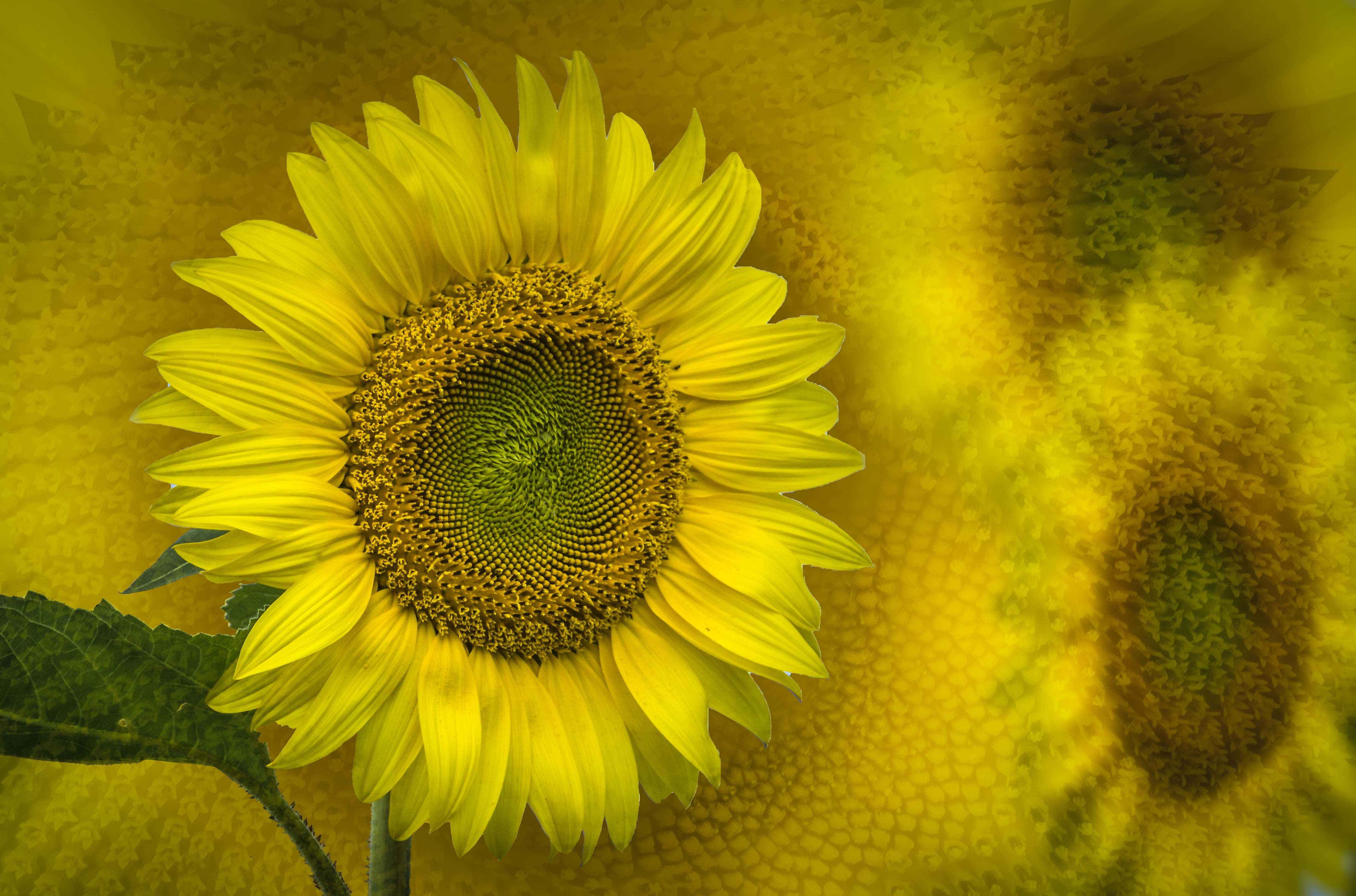
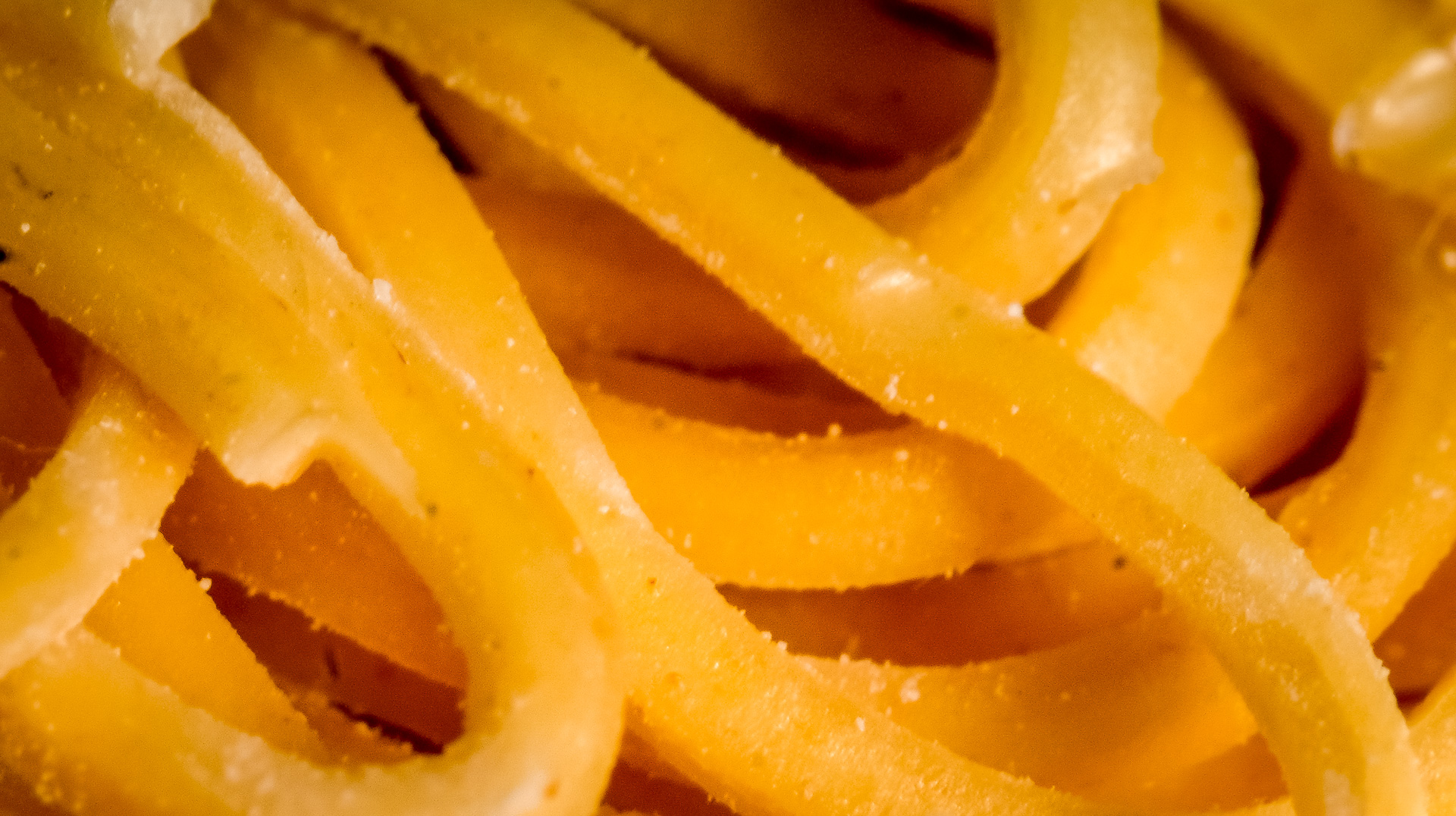
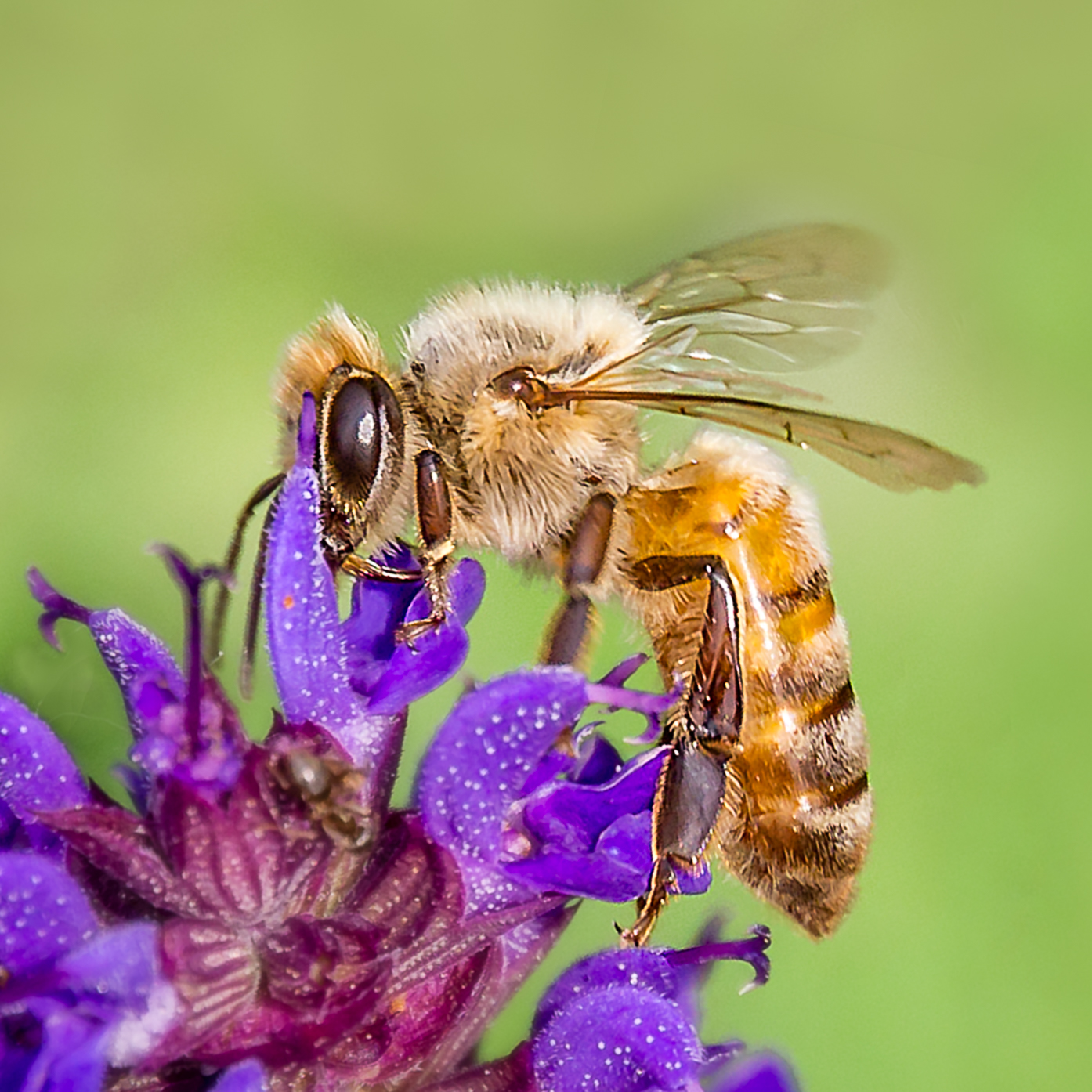
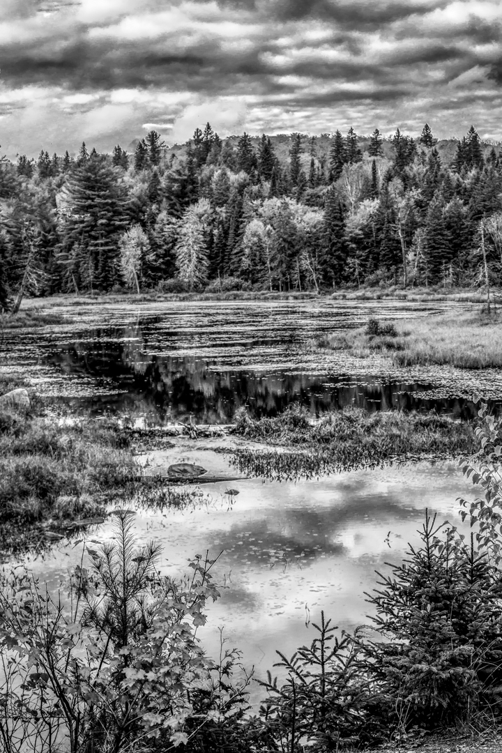
I am also in a Monochrome group. Yellow shows up light in monochrome. I like this conversion.
What do you think ?
|
Dec 20th |
 |
| 65 |
Dec 18 |
Comment |
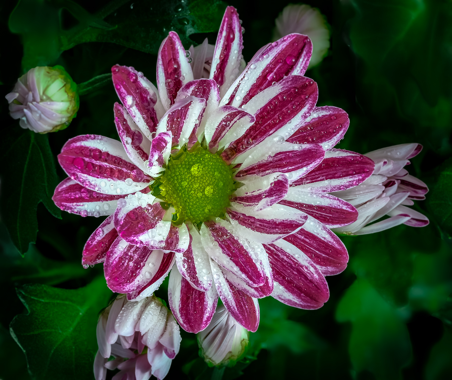
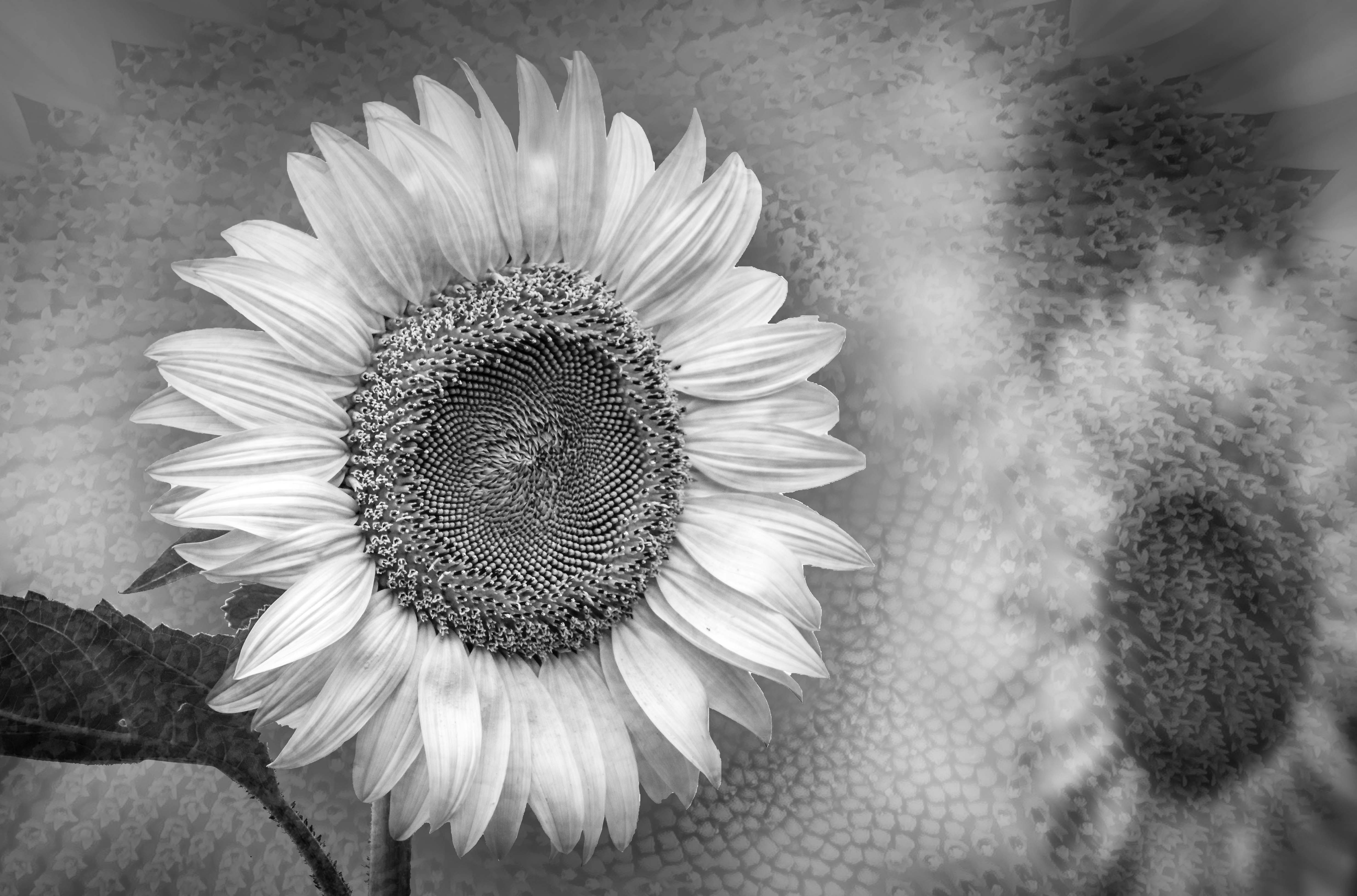
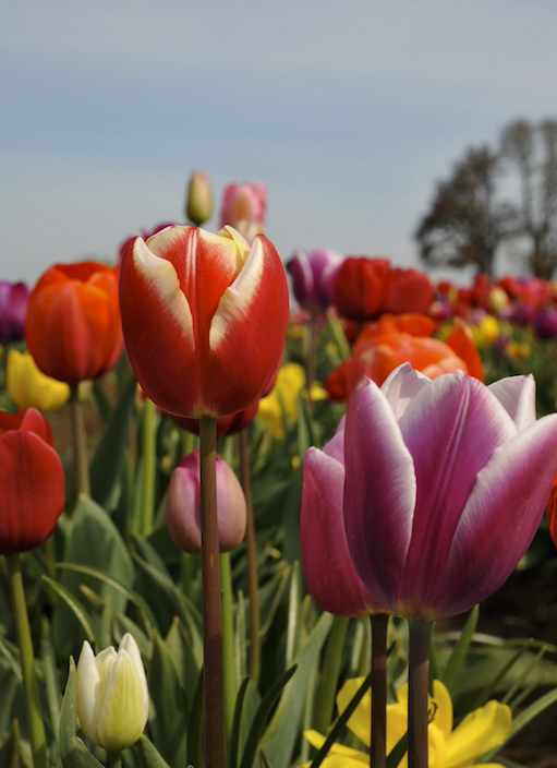
Welcome to our group, George.
Flowers are my passion. I had been a member of a Botanical Gardens for years.
There are many ways to crop an image according to what you feel is the most important subject that you like to show.
Personally in this image I would put the 2 larger blooms closer to the interaction of rule of thirds.
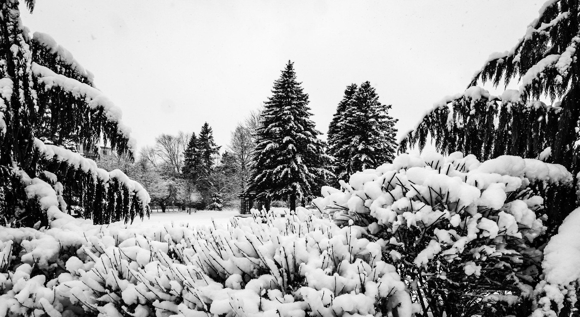
I downloaded this image and cropped down the sky a little bit.
I also like to add a tiny bit of dehaze in Adobe Camera Raw .
The present crop is great for adding text so that it can be use as a greeting card.
It would be great if you can include your metadata : camera make, speed, aperture and ISO in the image background.
Thank you very much for sharing this uplifting image. ( I am in Canada where there is snow outside ) This really make me look forward to spring ! ! ! |
Dec 20th |
 |
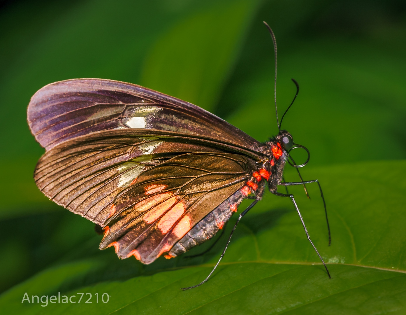
| 65 |
Dec 18 |
Comment |
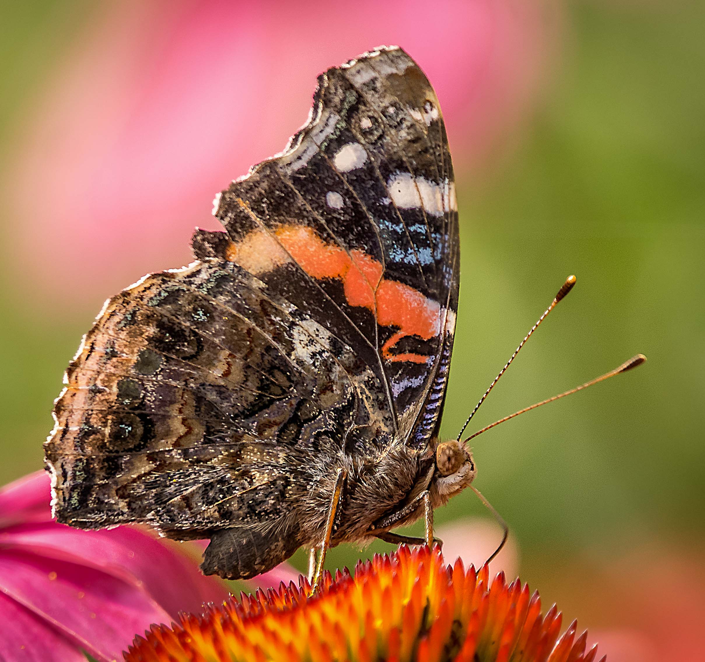
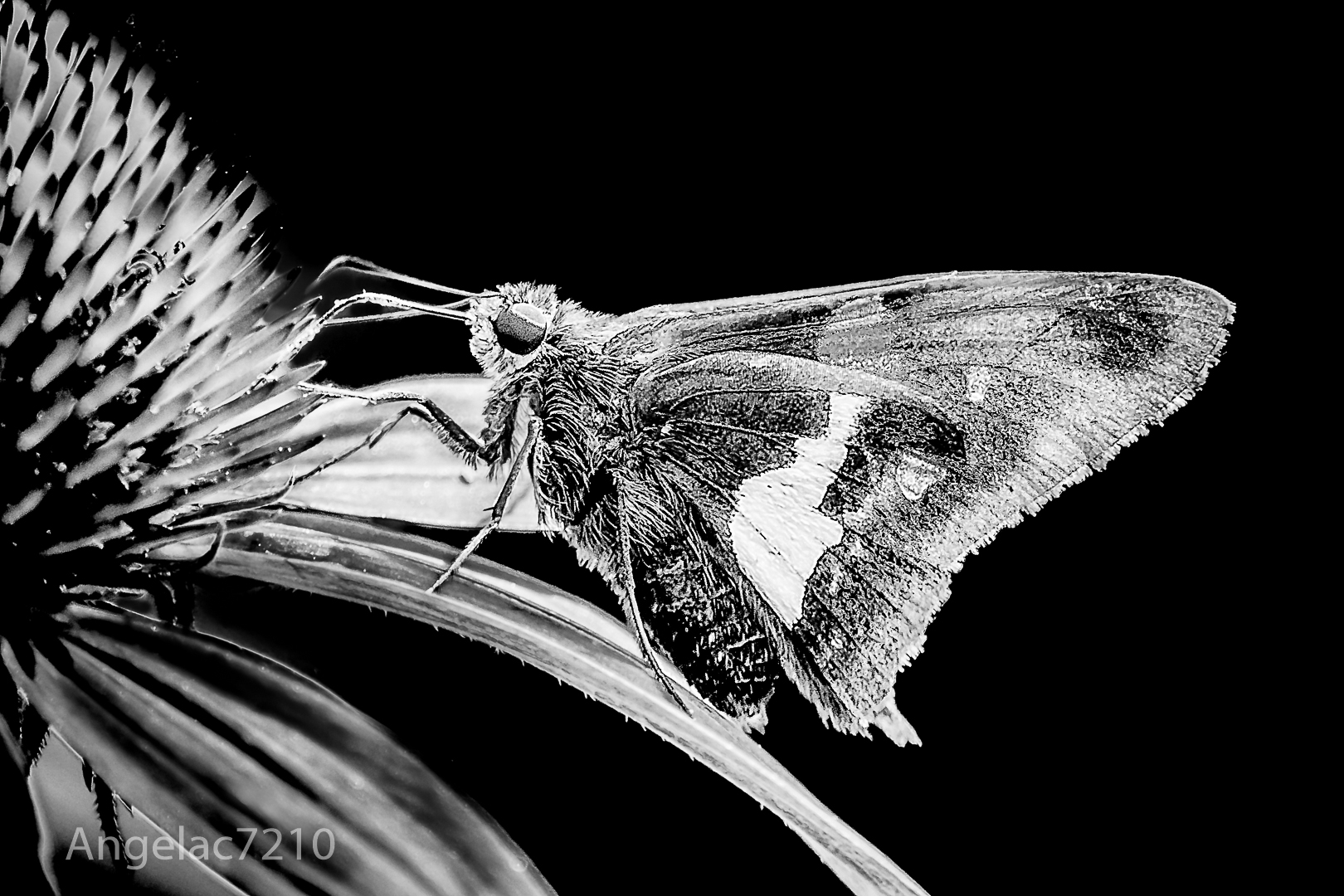
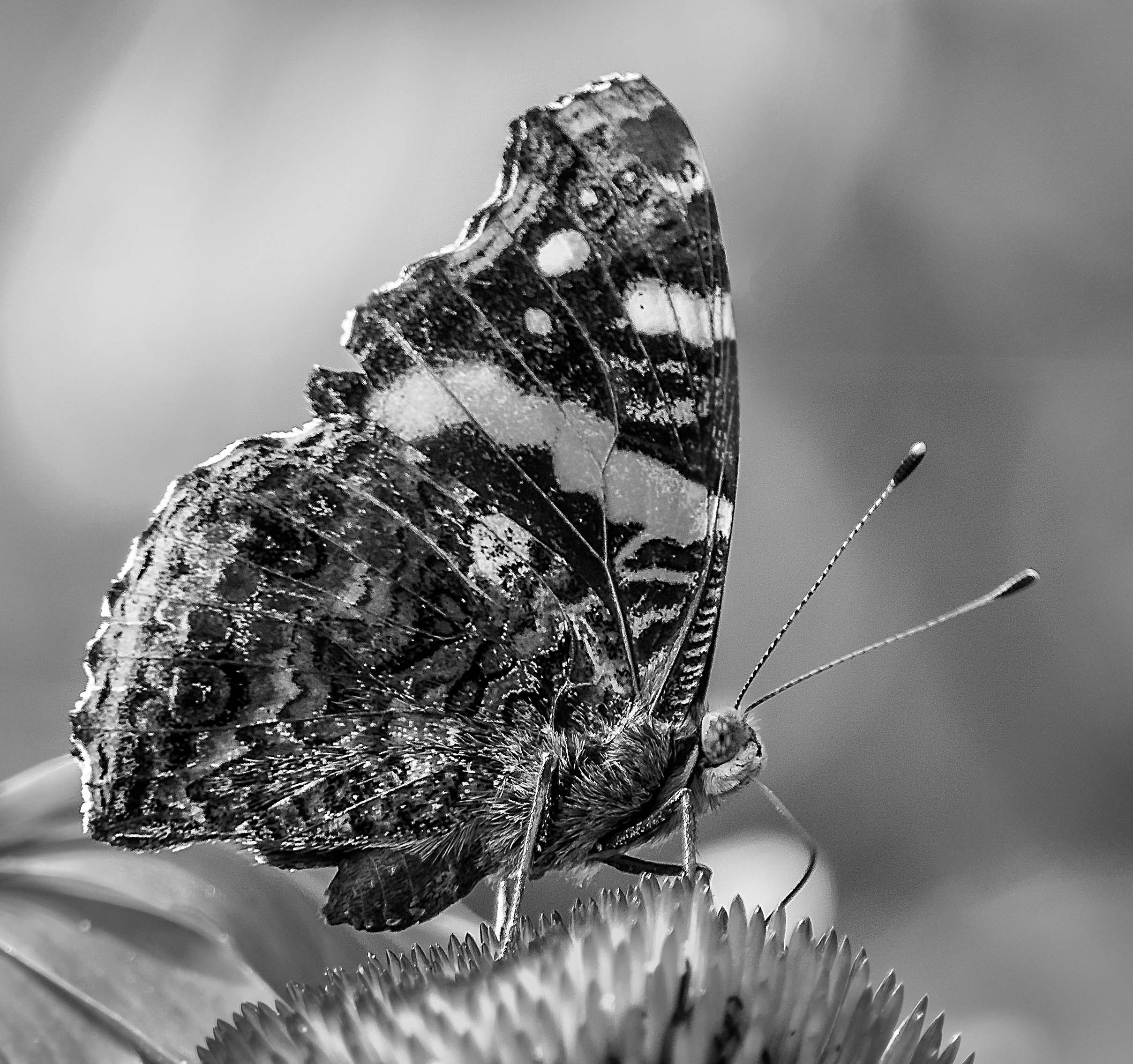
What beautiful, vibrant colors.
Thanks for showing us the original image.
In my opinion you made a very good choice of cropping when the eyes of the butterfly is not in focus. This open the use of a lot of my images.
It is nice to leave some space for text but I would tone down the highlight a bit because I was told that bright spots really attract the eyes.
Great shot ! ! ! |
Dec 20th |
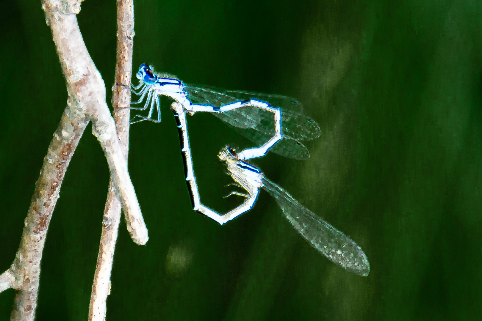
| 65 |
Dec 18 |
Comment |
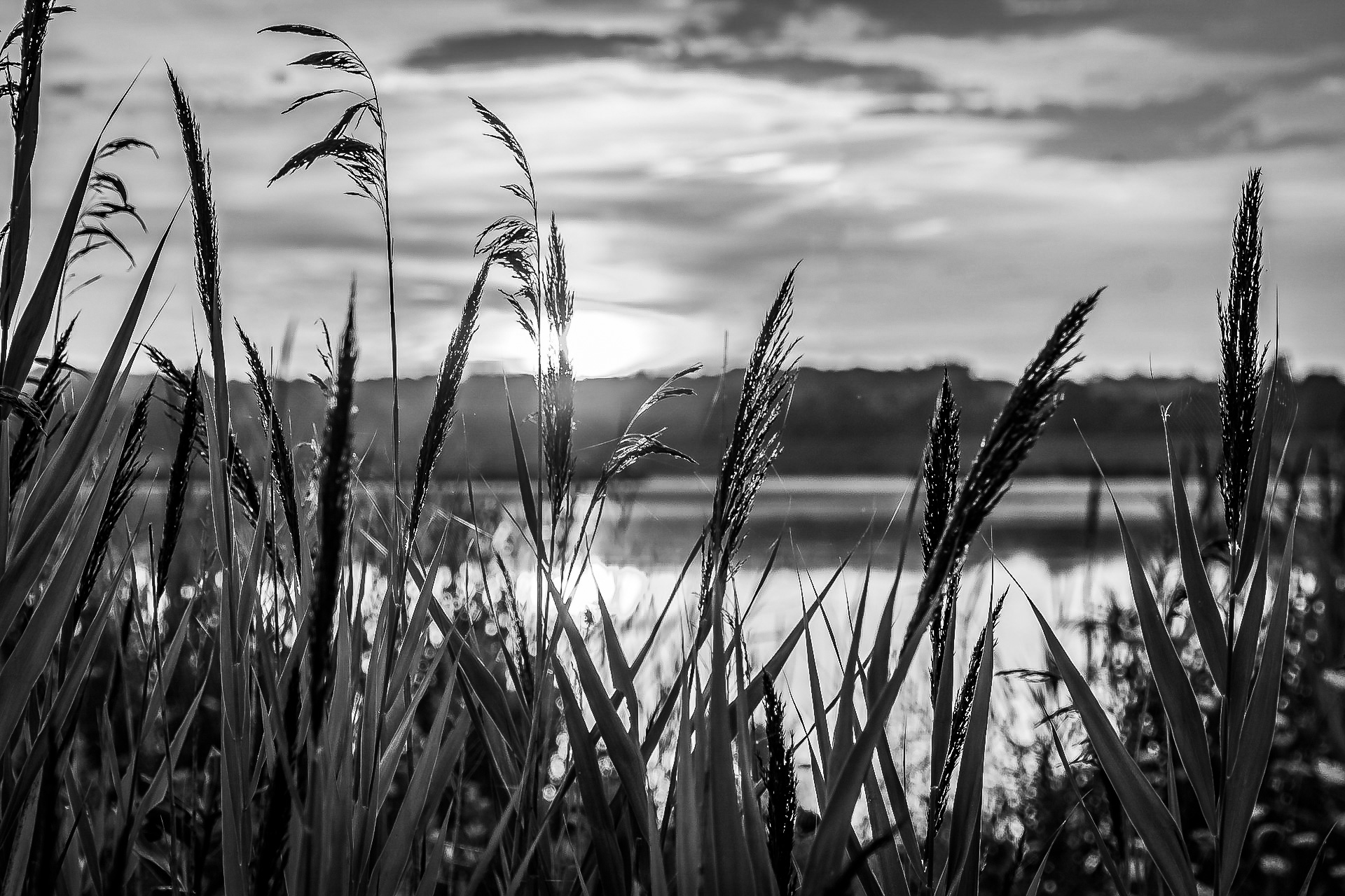
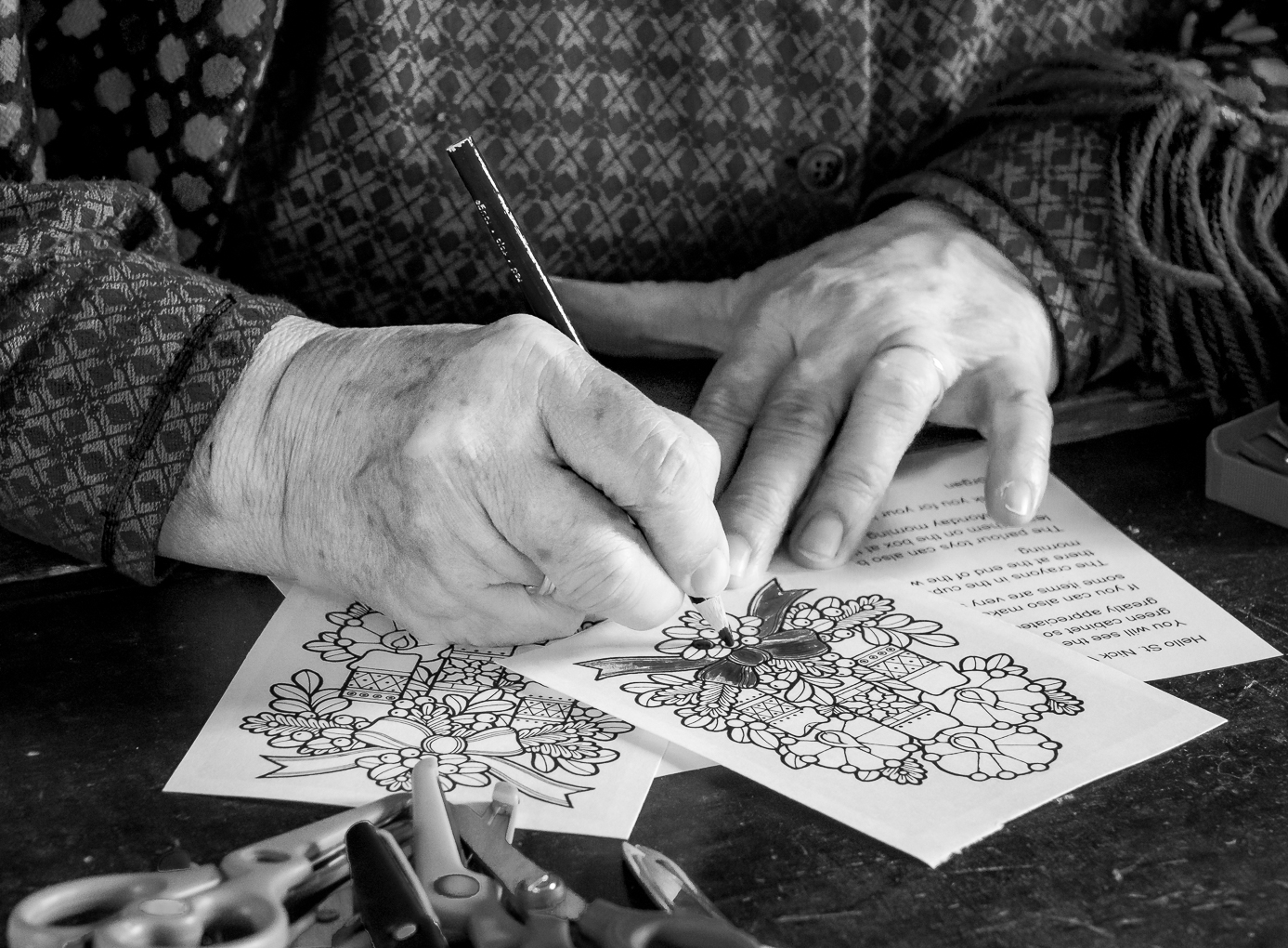
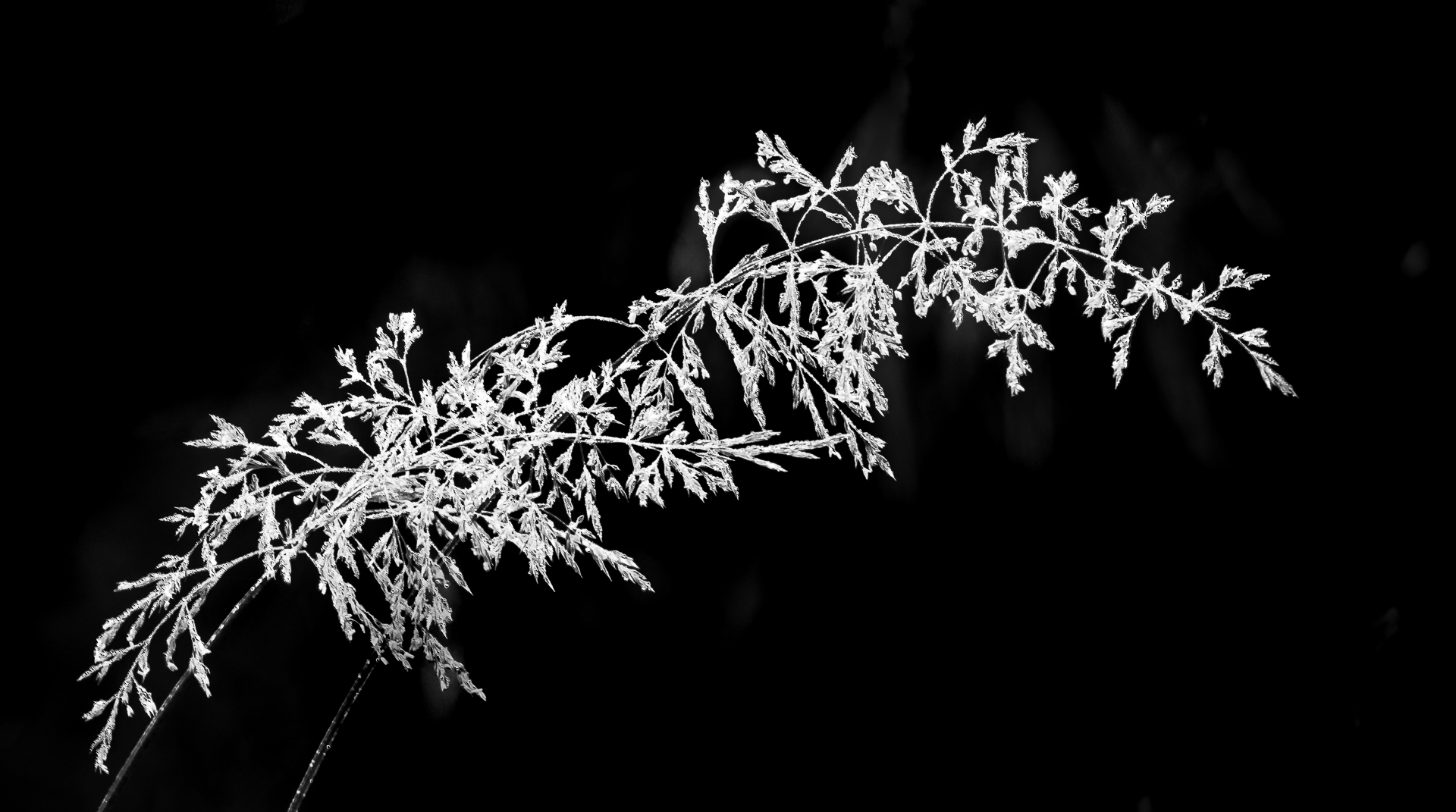
Love the clean, crisp spider and some of the web at the right .
The different light and shadows add depth to the image.
I do not know whether this is a crop. If there is more room for a different crop I would crop the spider at a slant instead of straight up and down for more dynamic .
Great capture ! ! ! |
Dec 20th |
4 comments - 0 replies for Group 65
|
| 74 |
Dec 18 |
Reply |
Thanks for your reply, Bill.
Yes. it is nice to appreciate what nature will give us.
Most people feel that editing is time consuming and it should not be.
I always tell those who ask me whether they need to do post processing is that : All you need to do is to set your highlight, shadow, black point and white point, then the dynamic range will usually improve a lot. For monochrome, I put a hue/saturation layer and gradient map layer on top of the original and just move a few sliders around. The whole process should be 2 minutes max .
Nothing in life is perfect. Beauty is in the eye of the beholder. Have a wonderful holiday season
|
Dec 26th |
| 74 |
Dec 18 |
Comment |
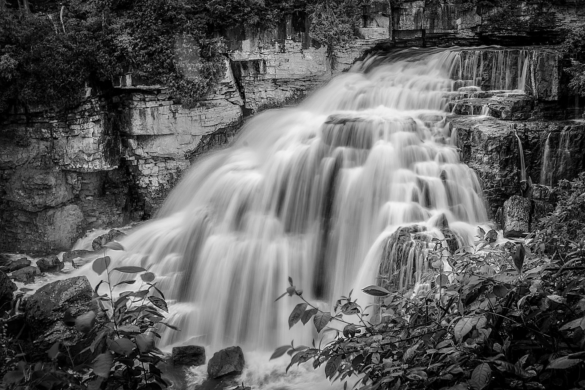
This is a very interesting choice of subject and mood with lots of texture.
When I downloaded the image and put in in Adobe Camera Raw it was quite far away from the white point.
To me , the 2 most important factors in black and white is dynamic range and contrast...of course, there are images that these are not appropriate.
This is another video I like. https://www.youtube.com/watch?v=XPp6JGClOcE&t=247s |
Dec 20th |
| 74 |
Dec 18 |
Comment |
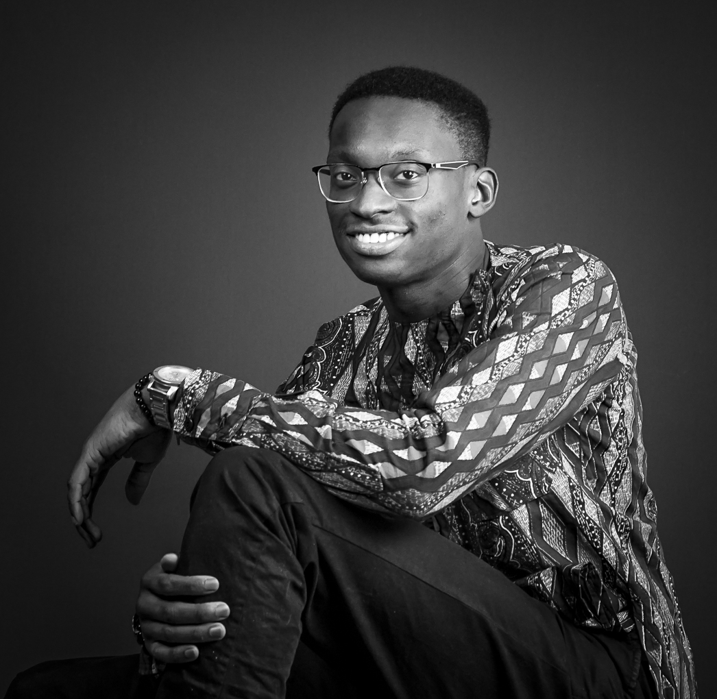
Great shot and love the BW conversion.
Without the bright red scarf and the colored jewels my eyes are drawn to the face of the man right away.
This is a prime example of letting the position of the eyes to show his emotion or to set the mood . It is not necessary to have the eyes open or to look at the camera to be a good portrait.
|
Dec 20th |
| 74 |
Dec 18 |
Comment |
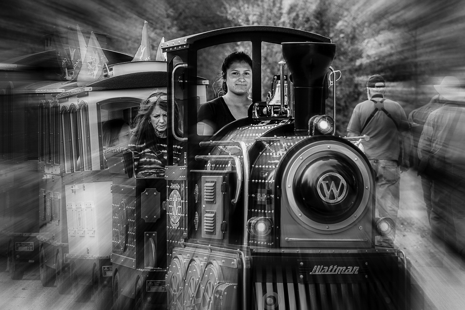
Great night shot.
I have a Fuji XT2 so I should use it in the evening more.
Just as an experiment : if the shot was made in color, then there would be more choices of tones to convert the clothing of the people in the right side ?
Some people might say that manipulation in post processing is cheating but I am always inspire by Ansel Adams's multiple processes in dark room and his zone system .
What are your thoughts ? |
Dec 20th |
| 74 |
Dec 18 |
Comment |
Great shot that really tell the whole story.
Happy bride and groom, with happy, well wishing guests.
The bride's dress and the groom's shirt are off white in the original image ( may be that is the color of the dress ?) so the white balance might be a bit warm..very common in indoor night shots.
These "white" areas show up much better in monochrome.
The shade is excellent because you can see detail in the bride's dress .
Lovely shot ! ! ! |
Dec 20th |
| 74 |
Dec 18 |
Comment |
Thank you very much for the kind words and suggestions. |
Dec 20th |
5 comments - 1 reply for Group 74
|
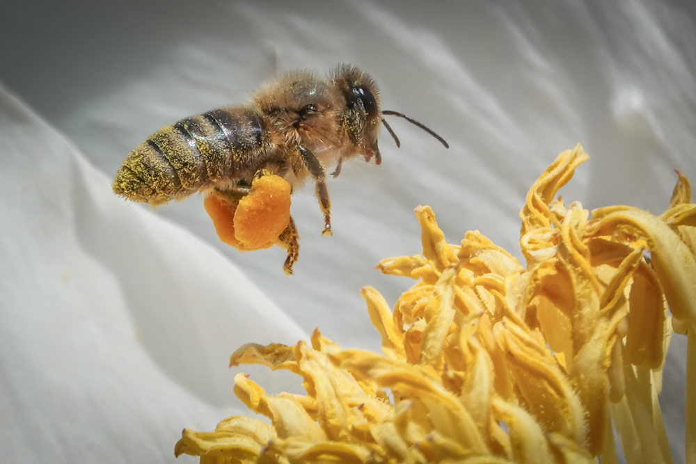
| 83 |
Dec 18 |
Comment |
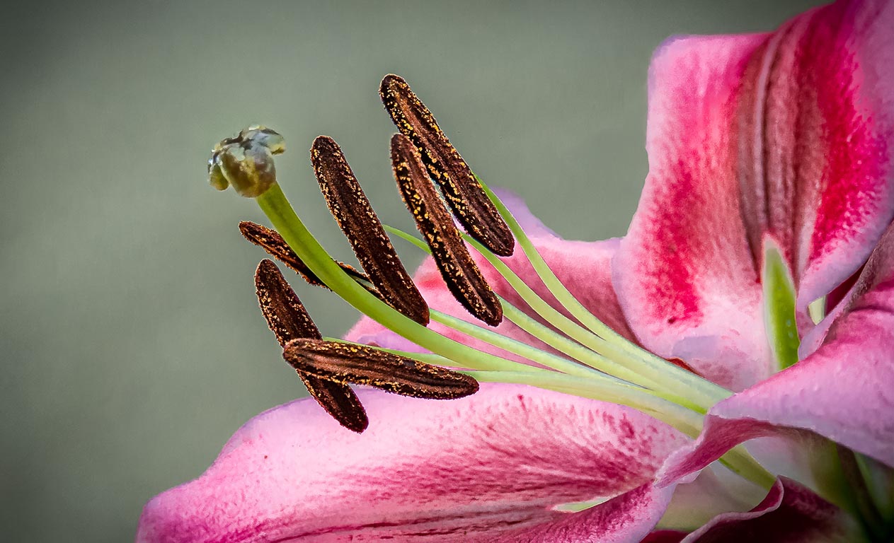
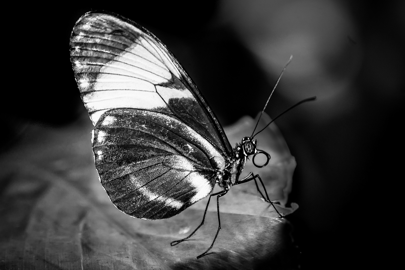
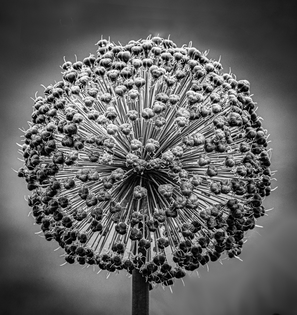
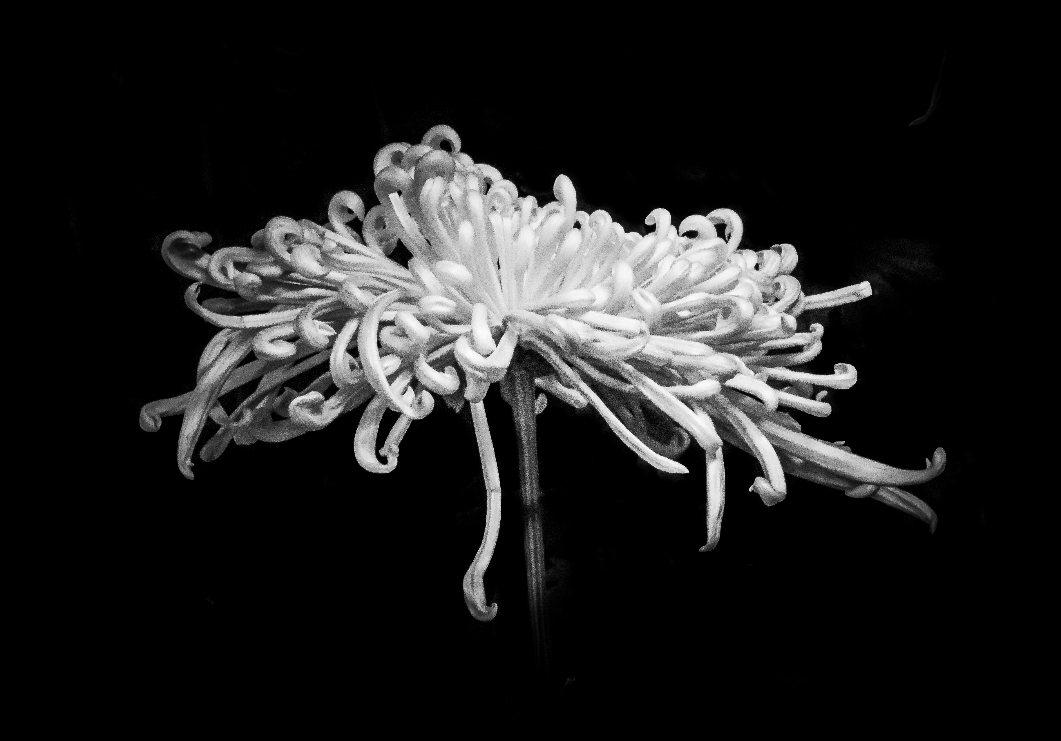
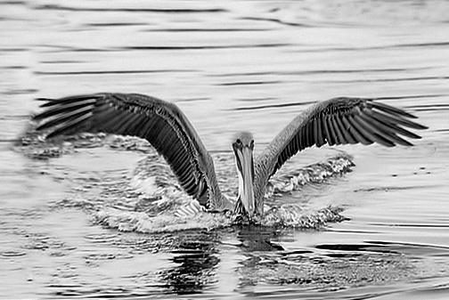
Hello, I am visiting from Macro group 65 and Monochrome 74.
What a beautiful image to show so much texture and motion.
I like the detail of the face and beak very much .
In my very early days of learning monochrome ( not that long ago), I was told to compare a colorful image to its monochrome counterpart so that I can ( try to )look at a colorful scene and visualize its B&W effect . Red will be dark in monochrome, yellow will be light and blue can be either.
After editing, I would recommend looking at the final product and dial down the effect if textures looks to crisp. If the effect is on a separate layer then it would be easy to dial down its opacity.
I downloaded the color image and tried to work on the head of the bird. Since yellow become too light and linked to the rest of the image, even using a hue/Saturation adjustment layer with a layer mask did not do the job. My second try is to paint the head of the bird in a empty layer with black..then bring the opacity very low just to give the head some definition. Since the final product is only around 100 pixels the texture is a far cry from the original BW image that Peter has.
It is wonderful to see that this new group has so many members who are enthusiastic and willing to share.
Thank you for letting me join in the fun. |
Dec 13th |
 |
1 comment - 0 replies for Group 83
|
10 comments - 1 reply Total
|