|
| Group |
Round |
C/R |
Comment |
Date |
Image |
| 69 |
Dec 18 |
Reply |
It is not tack sharp where I mentioned. I sharpened it to tack sharp, but the file is too big to upload in a comment. When I reduce file size the image loses the sharpness when enlarged. His original image is only 82KB. I am assuming this is because the files must be small to upload here. I still feel uncomfortable with your crop. The original crop is better in my opinion. |
Dec 12th |
| 69 |
Dec 18 |
Comment |
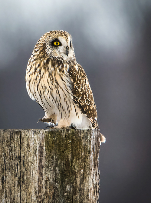
First Welcome. Your first post is very impactful. The target is the eye and the hook is the claws. Neither are very sharp and need to be carrying such visual weight in the image. Also, the crop is rather odd. |
Dec 12th |
| 69 |
Dec 18 |
Comment |
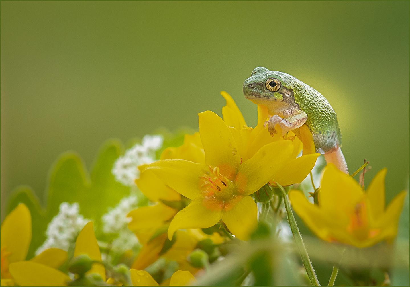
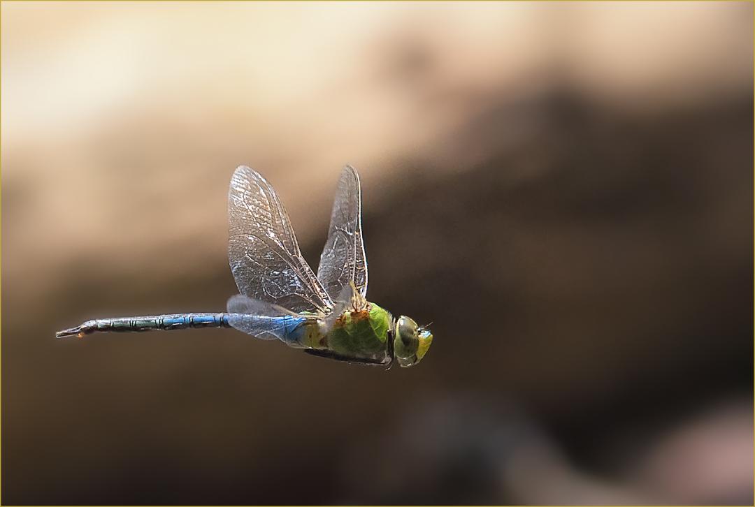
I like the diagonal composition and sense of habitat surrounding them. It is blurred enough but not too much so the plants are still identifiable. It shows why the Monarchs are there in numbers. |
Dec 11th |
| 69 |
Dec 18 |
Reply |
Noisy? The opposite would be creamy, as they say in the other group. Bird the only focus. |
Dec 8th |
 |
| 69 |
Dec 18 |
Reply |
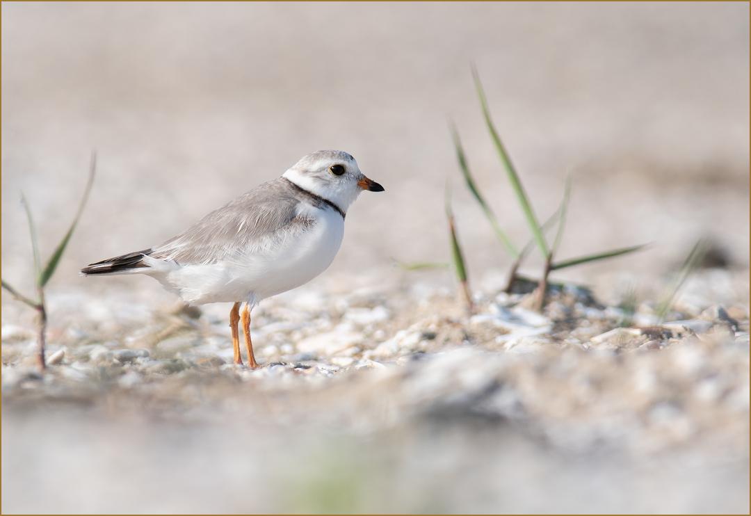
Will do. I will lighten the eye. I wish I lived where we had hundreds of them. |
Dec 8th |
| 69 |
Dec 18 |
Reply |
Thank you Pierre. |
Dec 8th |
| 69 |
Dec 18 |
Reply |
I wish I did Brenda. I want to get to FL myself. |
Dec 8th |
| 69 |
Dec 18 |
Reply |
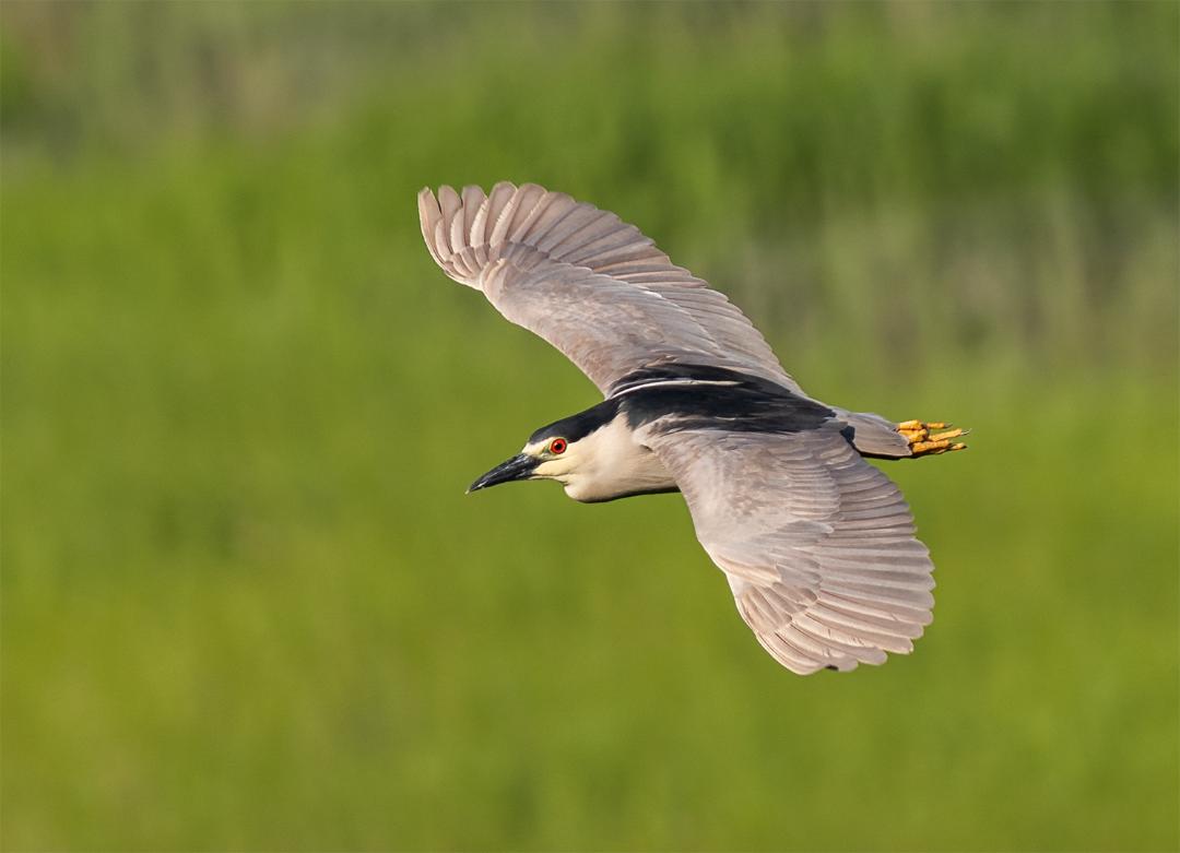
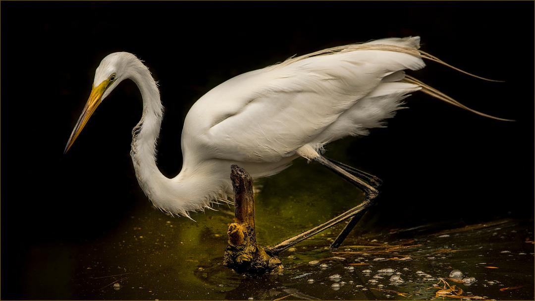
I believe you mean distracting. I have hundreds of bird pics with the creamy background. The background here was intentional in this shot. It is not vegetation you are likely to see this bird. It says something about the bird and where it was found. I will try to only put in those with the creamy background since ironically, in another group, this was much appreciated seeing it in such a place nesting. |
Dec 8th |
| 69 |
Dec 18 |
Comment |
Strong subject, nicely composed, good contrast of light. |
Dec 5th |
| 69 |
Dec 18 |
Comment |
I really like the diagonal movement of the whole image. Very nicely done. I might brighten the eye and around the face just a little. |
Dec 5th |
| 69 |
Dec 18 |
Comment |
I agree the leading line is nice. It does look over saturated though. HDR is a bit much. |
Dec 5th |
| 69 |
Dec 18 |
Comment |
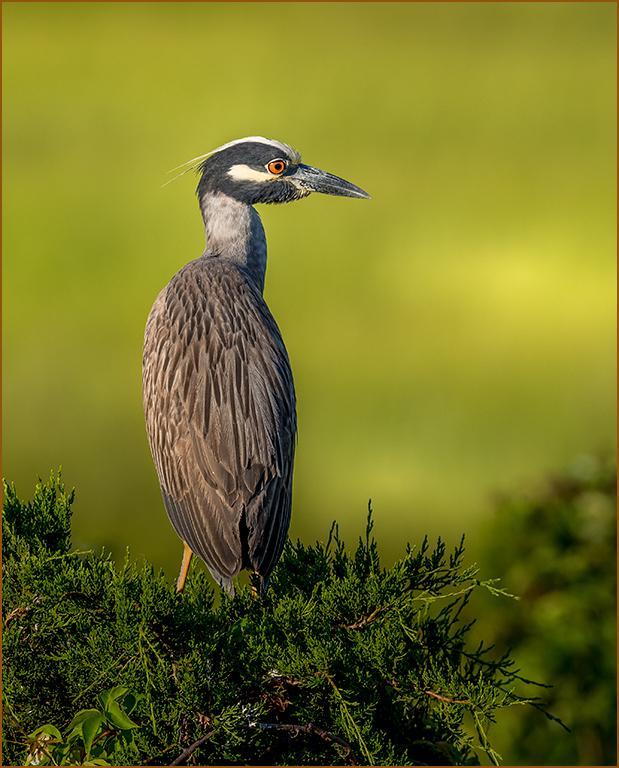
It is a nice portrait. The one tall blade of grass in the front should be removed. It looks too tall and placement is across the body. And the twig coming out of the ear also. A little hotspot on the left could be toned down. |
Dec 5th |
6 comments - 6 replies for Group 69
|
| 77 |
Dec 18 |
Reply |
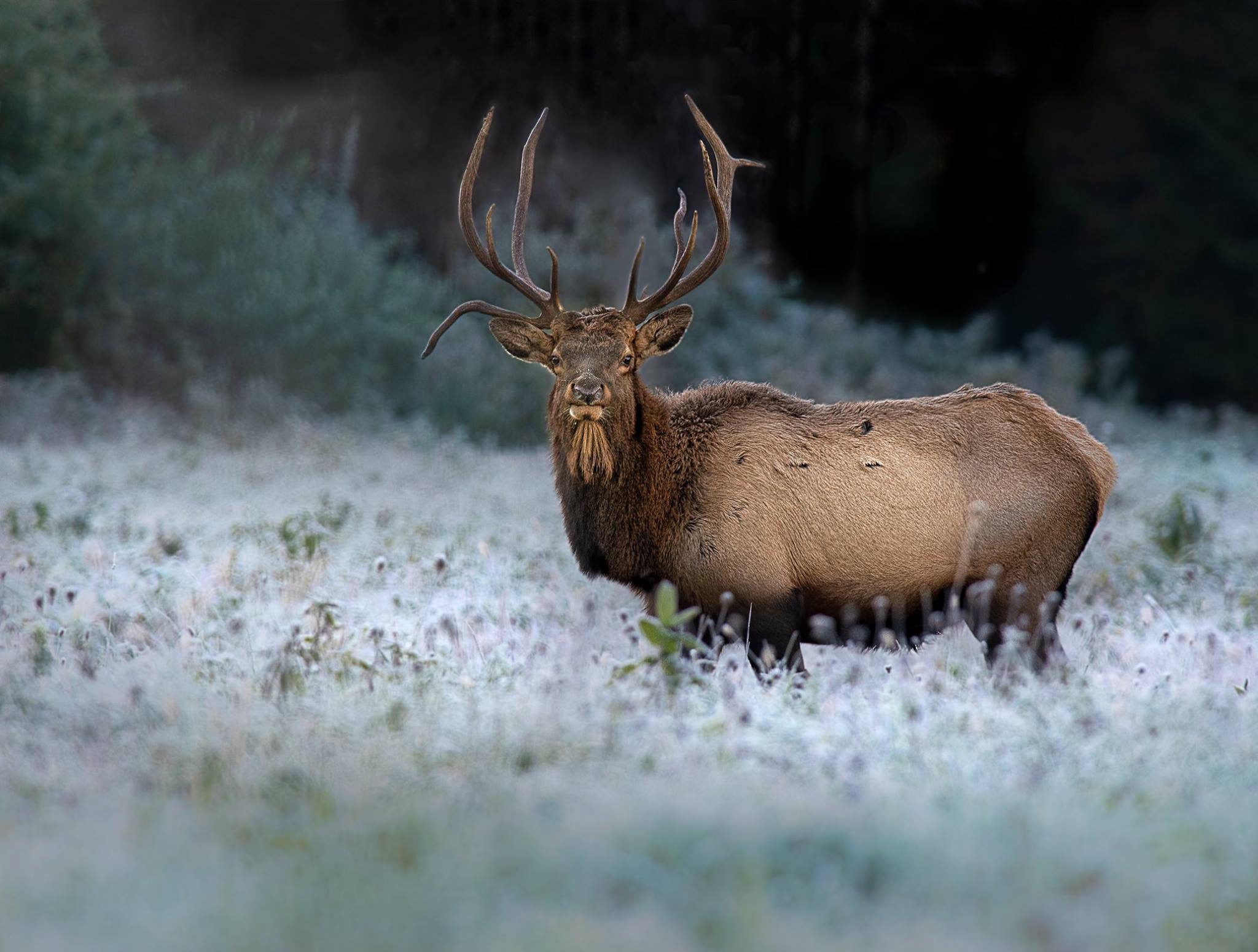
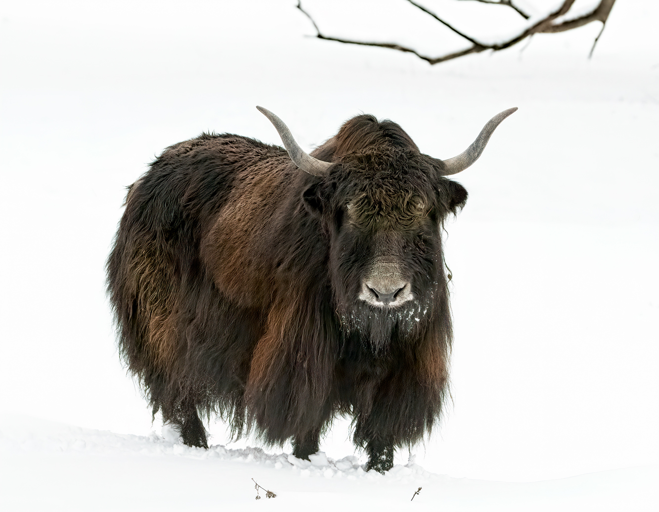
Thank you for your visit. The yak are very dark in color, and don't have that bright of fur. I brought out what I thought still kept the animal realistic to what I saw in the field. As for the branch, I too was unsure to keep it in. Nothing is evident of the habitat, so I left it in for context. I exposed to the right to blow out the snow and give some shadow detail. By doing this, the image looks too sterile, so I left in the branch. |
Dec 14th |
| 77 |
Dec 18 |
Reply |
For that camera and lens, yes it is sharp. My 300mm 2.8 is my sharp lens. Thank you. |
Dec 7th |
| 77 |
Dec 18 |
Reply |
Thank you, a difficult exposure. |
Dec 7th |
| 77 |
Dec 18 |
Reply |
No, there is a farm south of me. The herd of yak were sold after I made the shot. Thank you. |
Dec 7th |
| 77 |
Dec 18 |
Reply |
That is a very creative approach Vo Dao. I looked at it as two images, and you did solve an issue I had with this shot, being far too much for the mind to take in with its complexity. I looked at it as lacking visual contrast. Visual contrast is the distinction between tones or colors, where our eyes are drawn to areas of high contrast, like the flow of the water. It pulls us into an image. There is a black point, but it falls off on a white point. The best contrast of color is the rays of light. |
Dec 1st |
| 77 |
Dec 18 |
Comment |
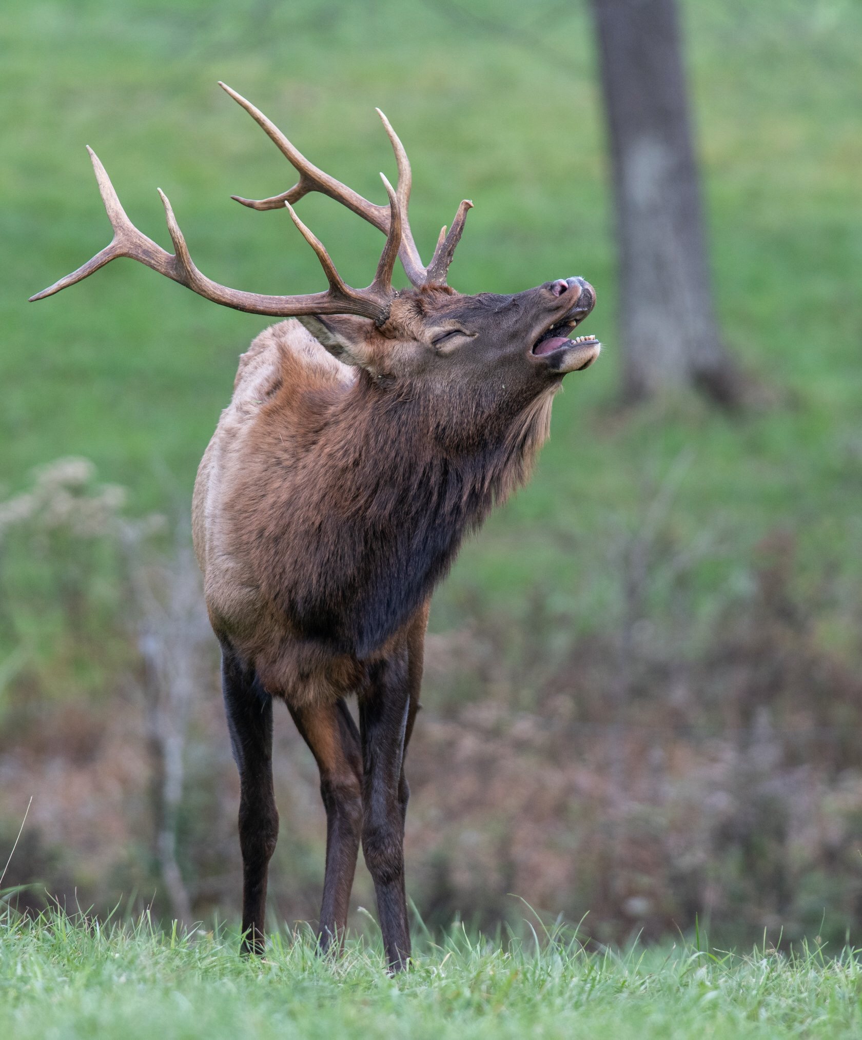
Thank you. He was walking right to me from where he was in the woods. He also followed me around. I heard he was mean, but he acted like a big puppy following me. There was a fence between him and me though. |
Dec 1st |
| 77 |
Dec 18 |
Reply |
Maybe a slight bit of over saturation. Our lotus are less green. |
Dec 1st |
| 77 |
Dec 18 |
Comment |
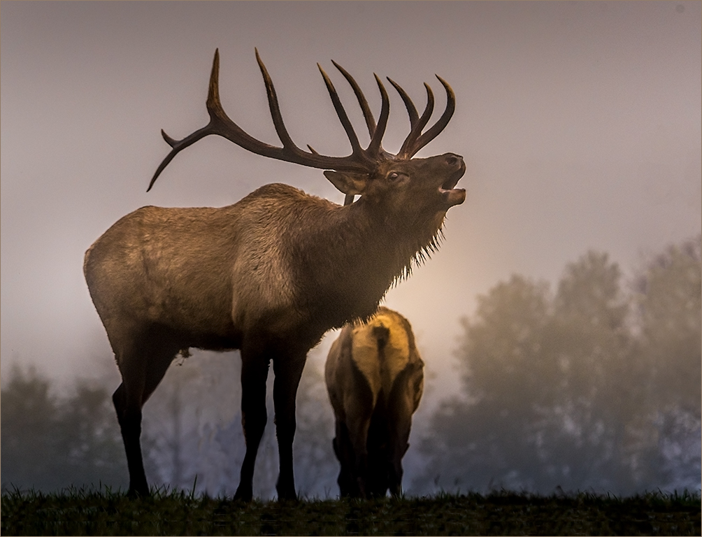
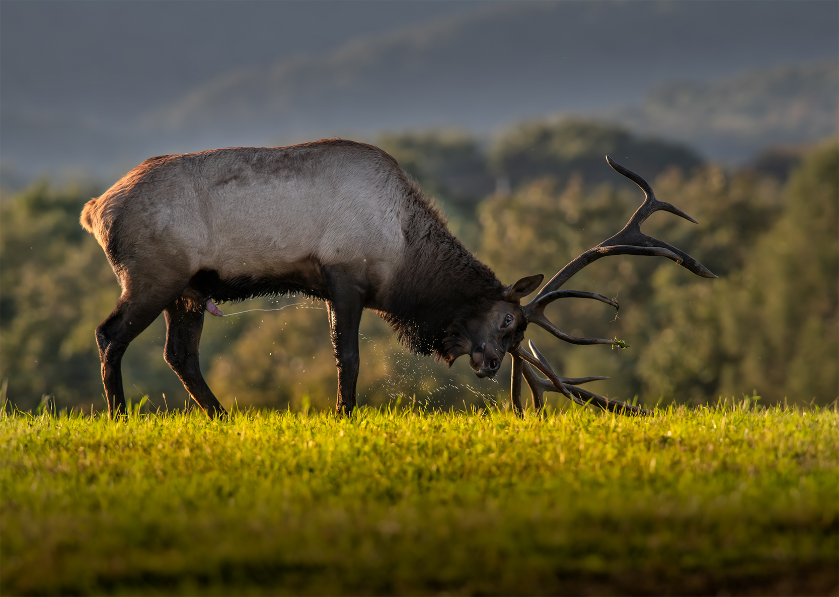
The pleasant scene has a lot of potential. What I think could help is taking it at a later time of day. The lighting flattens the image and the background is very distracting. Better lighting might have helped, bringing the eye right to the deer. |
Dec 1st |
| 77 |
Dec 18 |
Comment |
Lovely POV in the shot. Colors are very pleasing, but maybe a bit too saturated and sharp throughout the shot. It gives it a little "sameness" look, where there is a lot of depth in the image otherwise. Maybe the strength of color, brightness and sharpening could be more selective so there is more focus on the water and valley. The water draws the eye into the image, yet the eye bounces around looking at everything. Just one way to look at this shot, the other is how you took the shot. |
Dec 1st |
| 77 |
Dec 18 |
Comment |
Expressive and creative eye to see this in the image. Very dimensional too. |
Dec 1st |
4 comments - 6 replies for Group 77
|
10 comments - 12 replies Total
|