|
| Group |
Round |
C/R |
Comment |
Date |
Image |
| 68 |
Aug 18 |
Reply |
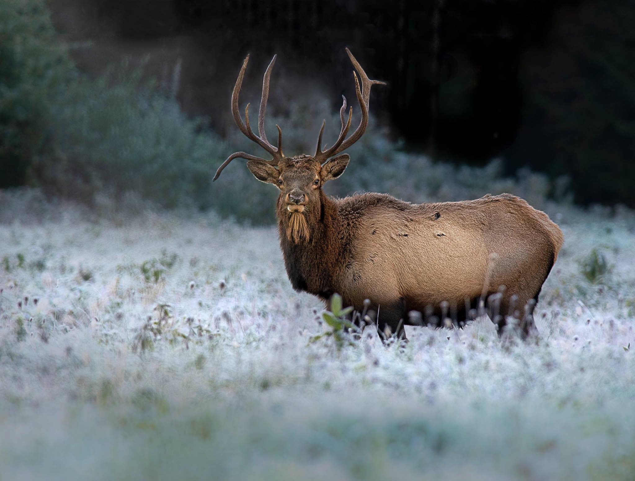
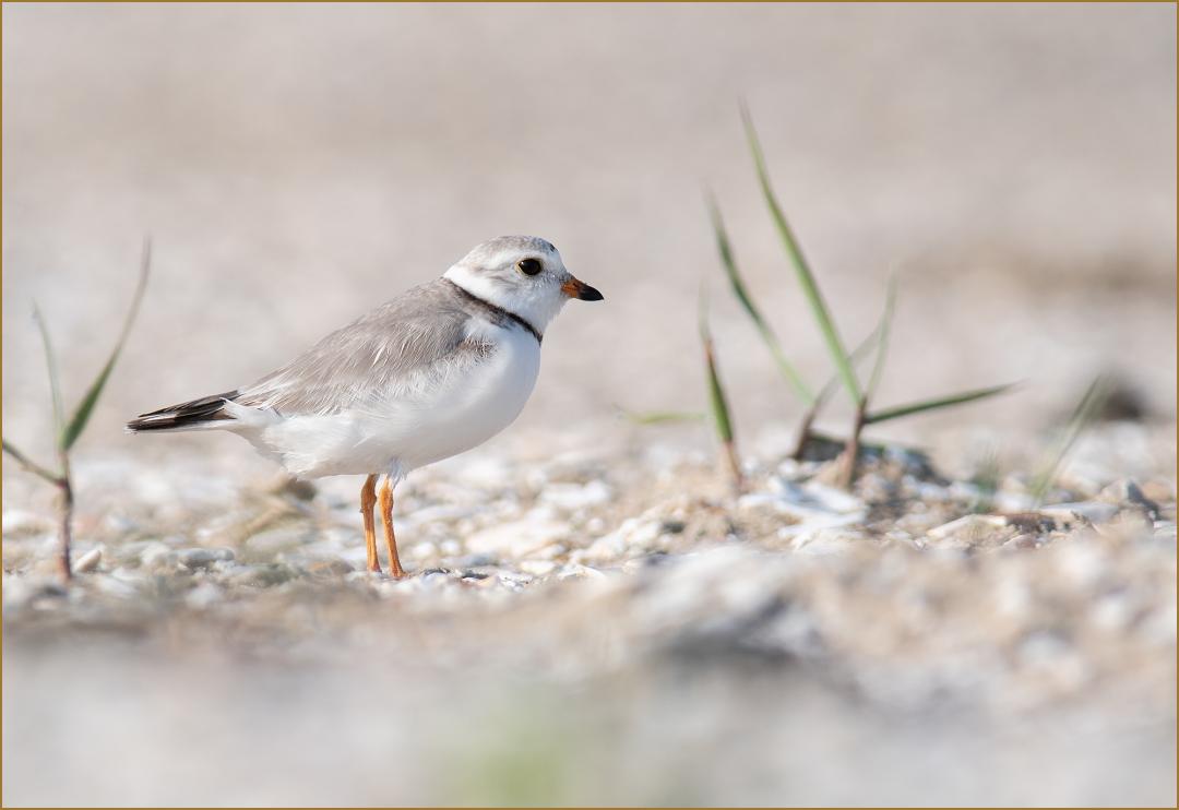
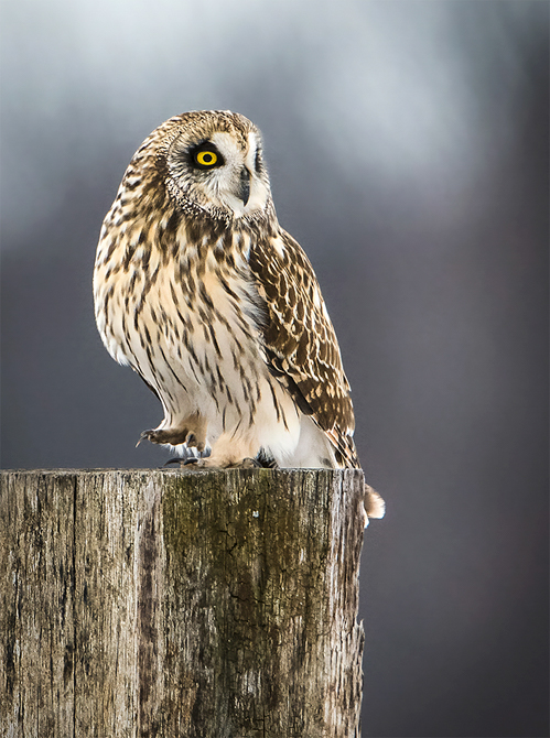
I think the image has drama with the POV. I would rather see it shot at a better time of day with the sun low in the sky. It would be more engaging in better light. I agree, keep the tower where it is. Better light if the sun is correct it might make that roof more interesting or else throw it into shade. I am from Group 77 Wildlife. |
Aug 18th |
0 comments - 1 reply for Group 68
|
| 69 |
Aug 18 |
Reply |
It looks good cropped. I did crop slightly and repair the blur in PS. It adds a little breathing room at the bottom. |
Aug 7th |
| 69 |
Aug 18 |
Reply |
I agree on the last image. |
Aug 7th |
| 69 |
Aug 18 |
Comment |
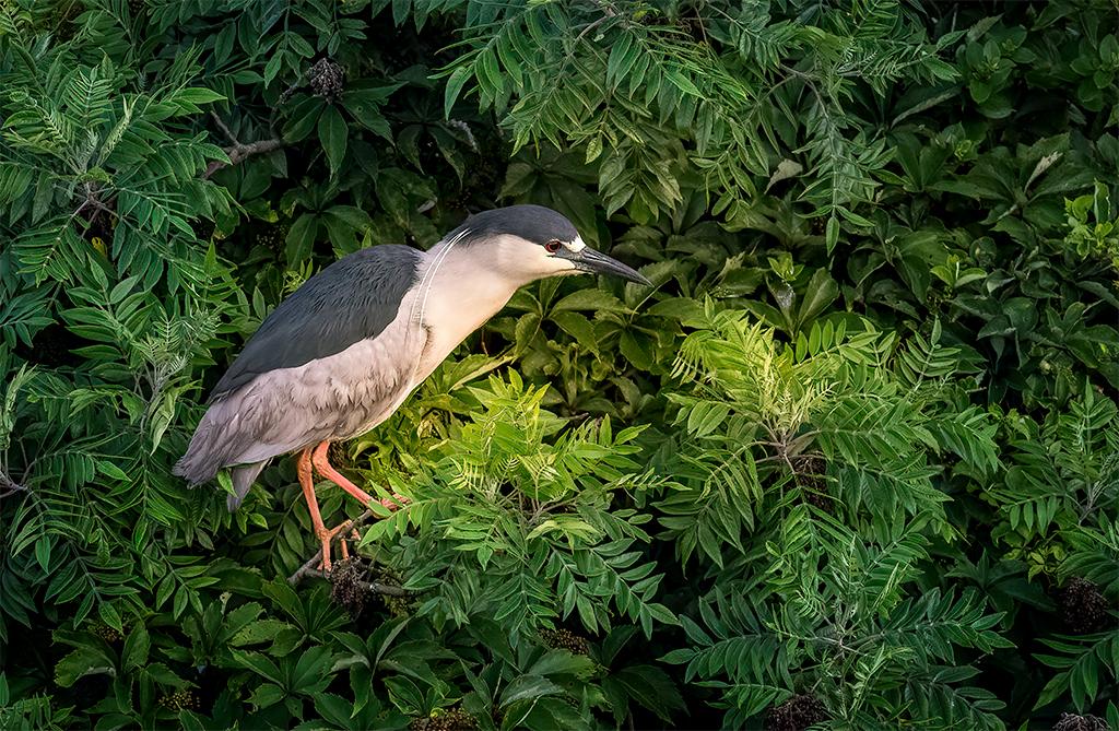
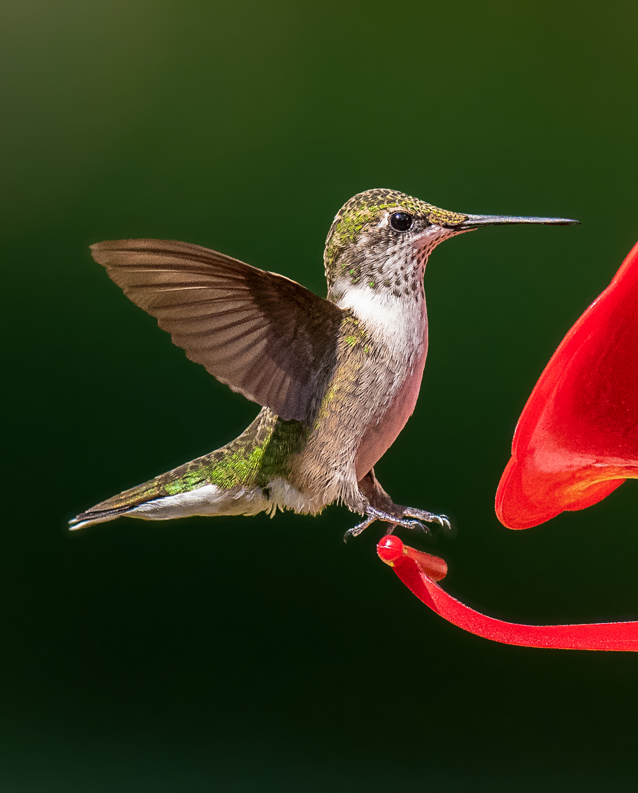
A very nice looking bird with good catch light. It is in a bit of a busy, unattractive location though. I really like the attitude and pose. The image is sharp and exposed pretty well, except the white areas have lost some detail. |
Aug 7th |
| 69 |
Aug 18 |
Comment |
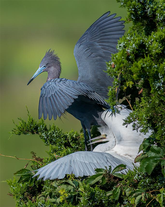
I remember your explanation of cropping this image where you wanted it not to appear as if in a zoo. I have read tigers occupy a variety of habitats from tropical forests, evergreen forests, woodlands and mangrove swamps to grasslands, savannah and rocky areas, so this vegetation might look similar to some of their haunts. It is not thoroughly convincing though. I think I would darken and blur the foreground and background so as to not emphasize it. It would also draw more attention to the main subject and make a more dramatic image which works well with the drama the subject brings. Very nice capture. |
Aug 2nd |
| 69 |
Aug 18 |
Comment |
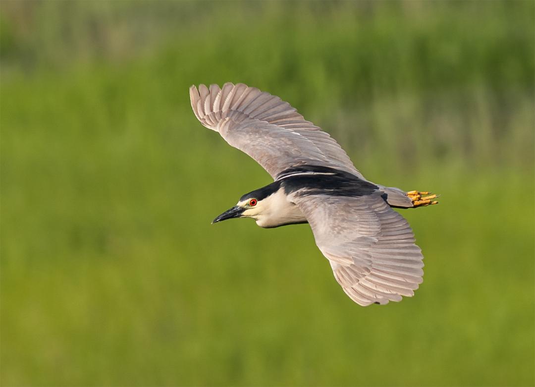
Back lighting is a hard technique to master. I like that you tried it, especially with it in the golden light. You may have opened your shadows too much though. With backlit images, it is expected to see a darker, crisper subject. Most times what is in shadow and what is lit is planned for by photographer positioning. I suspect that 1/800 was not fast enough for this quick action. The heron is soft with little feather definition, that I would expect to see this closely cropped. |
Aug 2nd |
| 69 |
Aug 18 |
Comment |
Focus here is in front of the bird, leaving the eye and head slightly unfocused. I prefer more breathing room in the image. While the head is turned to the right, the body remains turned to the left. The image is heavily weighted on the left. More space should be included on the left side, while still having the room to the right as is. The bird does stand out in the clean background, yet there is heavy banding in the background. Banding is common in skies such as this, but pushing values too much during post-processing can cause it as well. |
Aug 2nd |
| 69 |
Aug 18 |
Comment |
I agree with Brenda. It is not advisable to show wildlife from behind unless there is a creative reason to do so. The lighting is harsh as well, not worth flattening the image by recovering shadows. Color is a bit dull too. You did freeze the action relatively well at 1/500. |
Aug 2nd |
| 69 |
Aug 18 |
Comment |
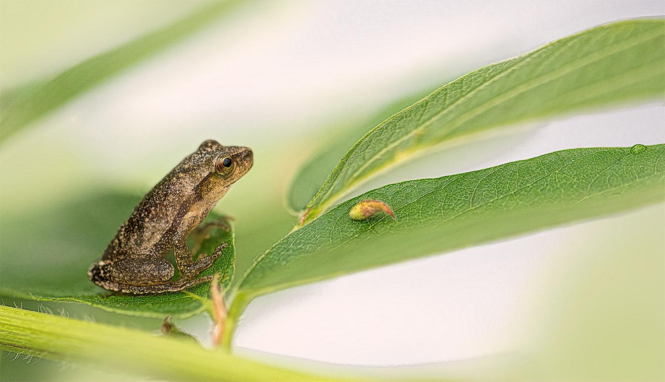
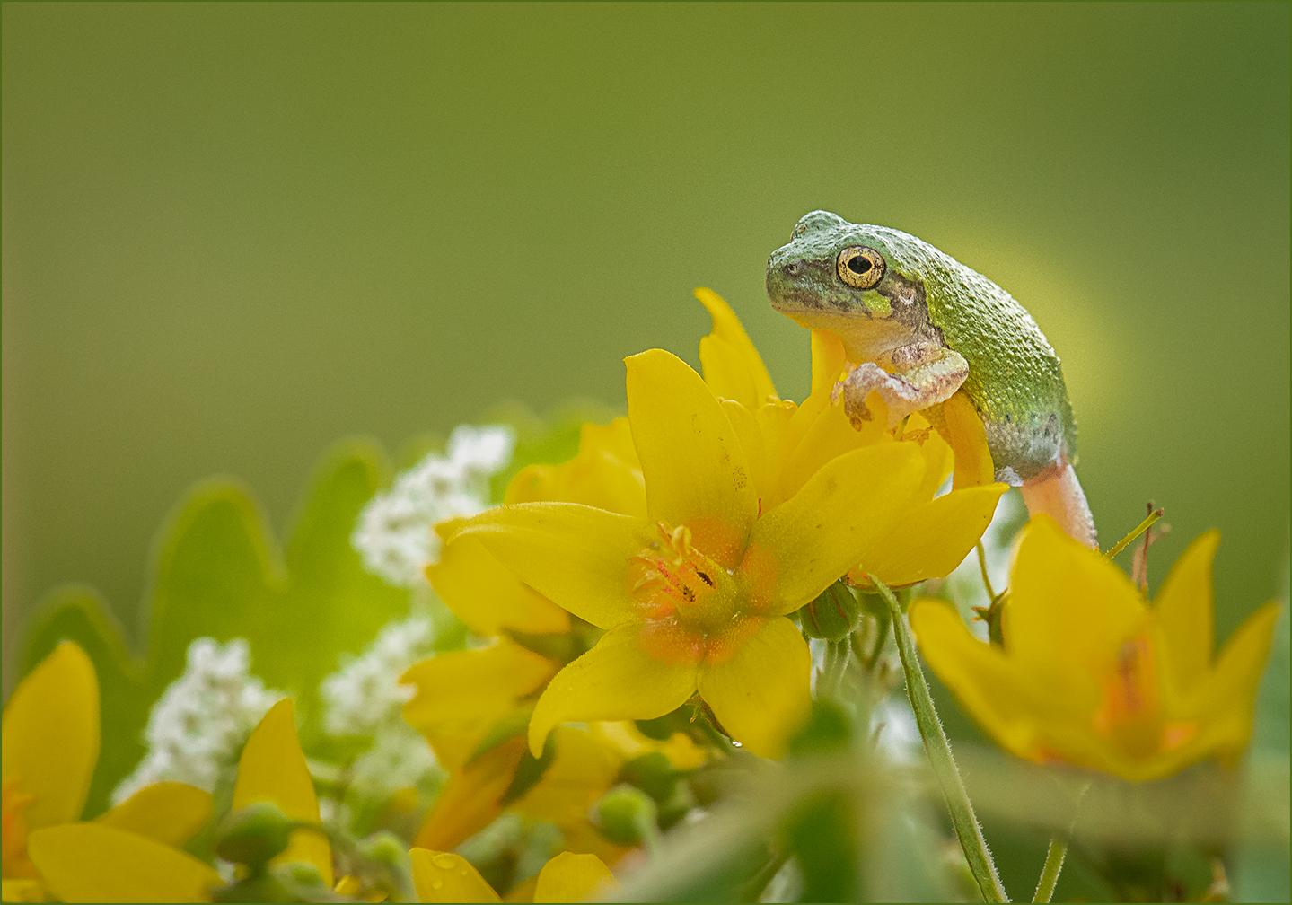
These are natural flowers in the park. Queen Anne's Lace is the white. This frog was moved to these flowers though so the background would be more pleasing. I think all the other ones I have been posting were photographed where the frogs were found. I prefer not handling them. As for the foreground grass, I did not crop it out because this was a really closely photographed frog, maybe one foot away. If you try to clip it out, the frog will hop away. I did try moving some grass blades and that is what happened. Once they hop, you don't get them back. I could easily clone this area and it would not be evident, but I usually post to these groups unedited. Thanks Brenda.
|
Aug 2nd |
6 comments - 2 replies for Group 69
|
| 77 |
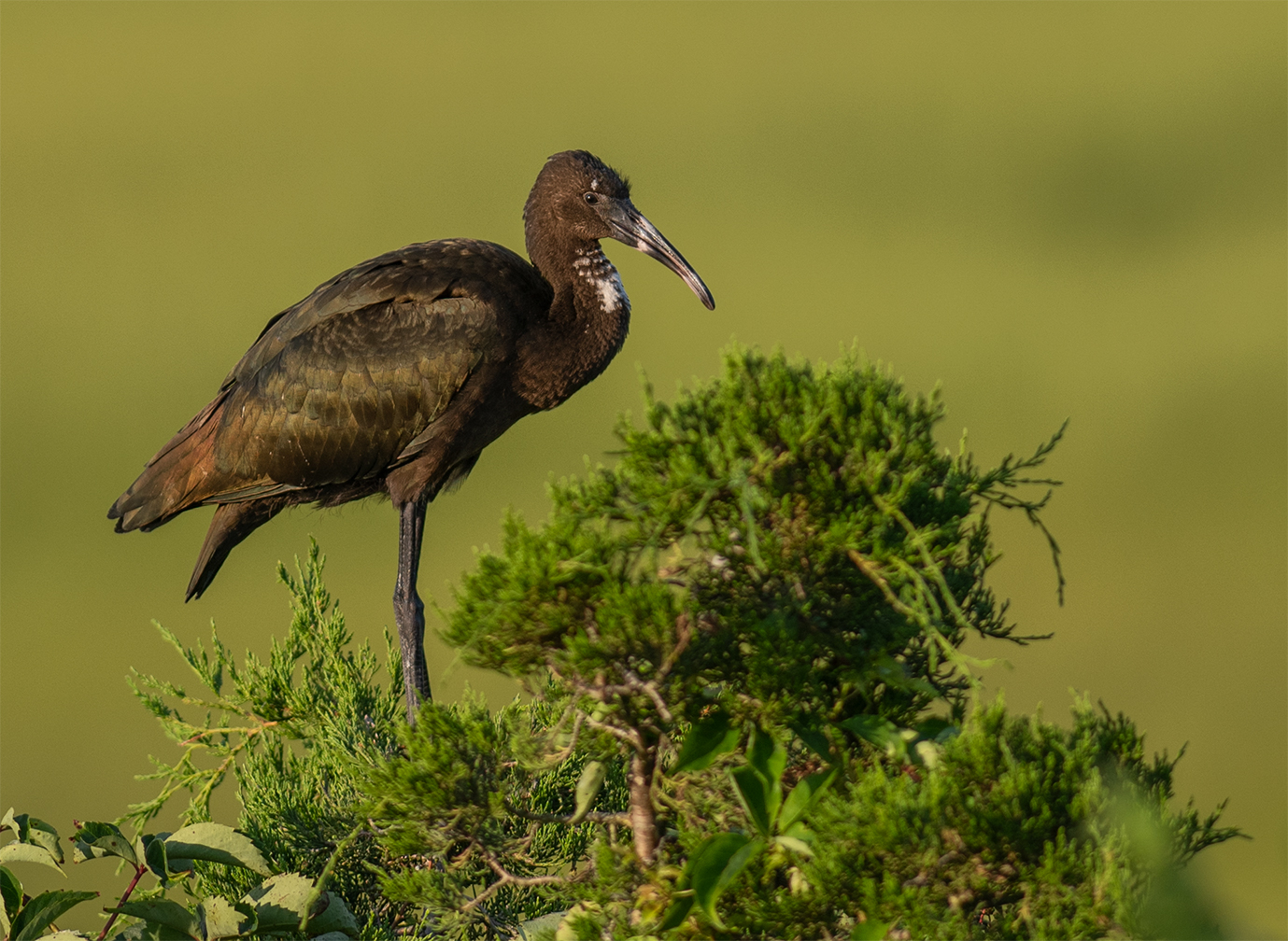
Aug 18 |
Reply |
I agree about the original crop. It is better balanced. |
Aug 7th |
| 77 |
Aug 18 |
Reply |
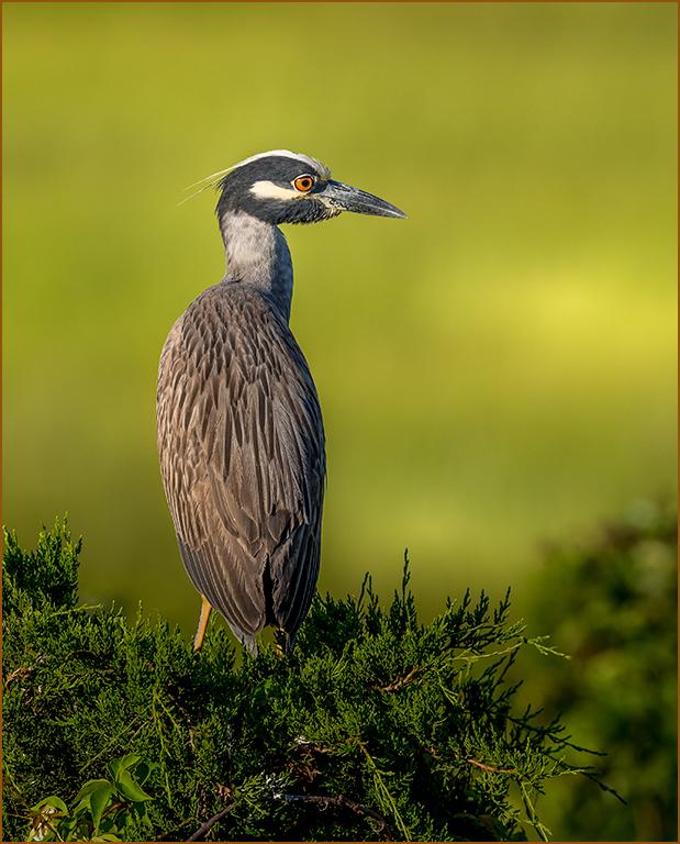
Thank you for checking it. I am not sure the image needs to be brightened. It looks a little washed out and not the lighting that was witnessed. I even thought the original image was a tad too bright. It really is a personal preference I guess. These birds are very dark in color. |
Aug 5th |
| 77 |
Aug 18 |
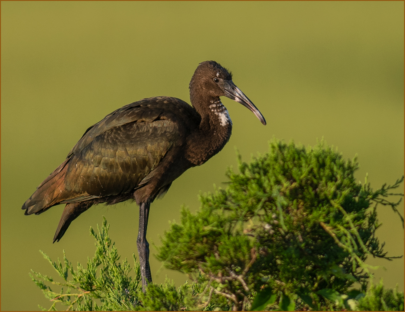
Comment |
I just realized this was not the shot that was to be posted here. I knew the crop was wrong. Here is how it would be cropped had I posted the right one. |
Aug 2nd |
 |
| 77 |
Aug 18 |
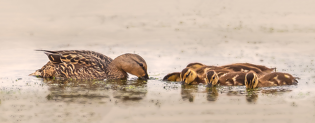
Comment |
You captured a very nice moment between hen and ducklings. I like you tried a creative crop. My first impression was it was too severe a crop and it needs some room to breathe, top and bottom. Add some breathing room back in. You did not have optimal lighting and I am assuming, chose to overexpose the background which is a very wise thing to do when in bad lighting conditions with a darker subject to bring lightness and focus to the subject. You mentioned turning the grey to brighter in post in the description. Also an alternative if you don't compromise the image quality. What seems to jar the eye a bit is the contrast, mainly because there is a lot still in the water with debris floating. My suggestion would be blur your background some and give the background a warm tone. It would balance the image since the ducks are already a warmer subject. |
Aug 2nd |
 |
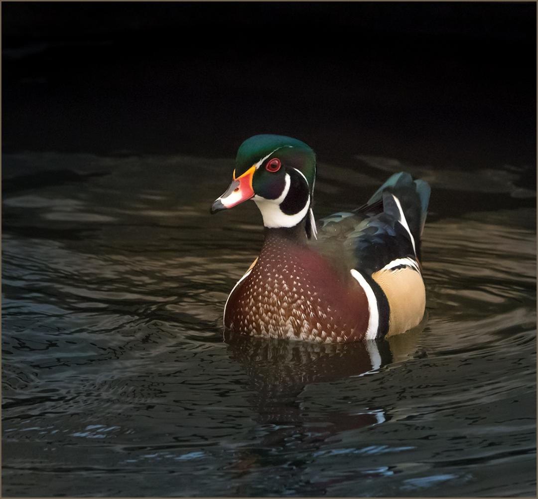
| 77 |
Aug 18 |
Comment |
The green is actually the iridescence of the bird. They are a dark colored bird and that is why I increased exposure to balance it out some. I agree about space at the bottom. You are very right on that. |
Aug 2nd |
| 77 |
Aug 18 |
Reply |
Perfect. |
Aug 2nd |
| 77 |
Aug 18 |
Comment |
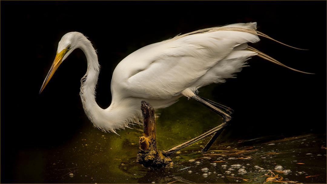
I really like the depth in the image. You have a nice foreground wave grounding and framing the image. The background wave also keeps the eye in the frame. It is nicely composed with the heron on the right looking left. Having the heron's head in the smooth water was a good decision of placement. My only suggestion is it could be a tad sharper. I do realize your soft lighting is adding softness to the image, but the eye and head should be sharper. This is a very nice capture with a wading bird in rolling waves. |
Aug 2nd |
| 77 |
Aug 18 |
Comment |
Your image is exposed very nicely in decent light. The action is wonderful and interesting to see. You have a smooth blurred background which is pleasing to the eye. The scene is well composed and without competing elements. My only suggestion is to tone down the bright pink flower in the left corner. Being pink, it draws the eye. Also the white waterdrop, if that is what it is, above the lower Kingfisher should be removed. It seems out of place in the image. Overall, it is a stunning capture. |
Aug 2nd |
5 comments - 3 replies for Group 77
|
11 comments - 6 replies Total
|