|
| Group |
Round |
C/R |
Comment |
Date |
Image |
| 6 |
Jun 18 |
Reply |
Thanks much Tom. I think you did a splendid job on this shot. |
Jun 26th |
| 6 |
Jun 18 |
Comment |
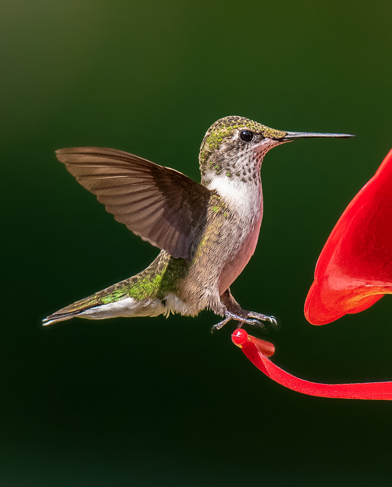
I think you did a wonderful job staging this shot. I would suggest removing some space on the left and leaving some space on the right. I don't think the image needed a boost in structure, nor do I feel swapping out the black background. The black, red and green are striking and add drama to the composition. I do agree with Salvador in adding the brightness along the edge of the leaf. It gives the composition more depth. While I am not in your group, this caught my eye. |
Jun 21st |
1 comment - 1 reply for Group 6
|
| 69 |
Jun 18 |
Reply |
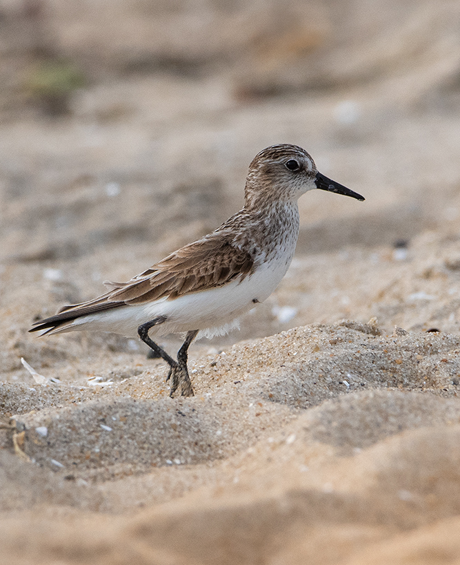
Not a difficult capture at all. My specialty is BIF which are more difficult. Birds standing are a cinch. Blur behind, blur in front = lots of blur. The subject stands out in lots of blur since that is all that is there. I am sure since art or photography is subjective, you can't look anywhere but the foreground blur. I understand from that the subject to you is not strong enough to pull the eye and see and study. Since the image gets such strong response (good or bad), I can infer that is a successful image in that regards. |
Jun 23rd |
| 69 |
Jun 18 |
Reply |
Thank you for your comment. It was one I much appreciate. |
Jun 23rd |
| 69 |
Jun 18 |
Reply |
Thank you Brenda. I am not really trying new things per say. I have been a part of the pro group for many years. It did take me a while to love the blur and if you saw their shots, we are talking a large percentage blur in comparison to a tiny subject. This group would most likely not like their newest work. I kinda compare it to the master Picasso. He could draw and paint anything in any style. From pure realism to any number of artistic styles that garnered criticism throughout his lifetime. Yet his body of work is hanging in museums and in private collections worldwide. While these folks are not "Picassos" they follow a path of criticism for the many different artistic styles in which they work, but are gaining a huge following. People love their work. These people are well published. They are well known. If you become my Facebook friend, you would likely see their images looking into who are my FB friends. They for the most part are far better photographers than me. Candy may be one in this group that has convinced the group to try new things. I find textures work best in composites and that is where I use them. I suppose I am trying to convince this group to "try new things". I can tell from the very beginning in this group I have had a hard time fitting in. My critique style is different, yet I have many years of critique experience. I was trained far differently than those in this group most likely. I have a heavy art background which influences my photography critique style. I also had photography in college, which also had critiques. They were harsh, and very to the point. Always heaping compliments on a photo does the maker no good. |
Jun 20th |
| 69 |
Jun 18 |
Reply |
I just have to say there is a great difference between what is suggested on this site compared to what is on another wildlife site where I participate. It is a great difference between what Camera clubs see as faults and what pros that sell their work believe as faults or see as acceptable techniques. To answer Pierre, inches higher is not what they would suggest. It would be a fault shot that way. Reducing or eliminating blur and creating additional sand is something that would be considered a fault and frowned upon. I understand this is how this group critiques. I got the email on how to offer CC better. Not sure how to process that in regards to how I critique and offer advice. My advice here is maybe look at pro sites and see if techniques I used here are found elsewhere. I humbly accept your critique, but find my photos will likely take a different path. |
Jun 20th |
| 69 |
Jun 18 |
Reply |
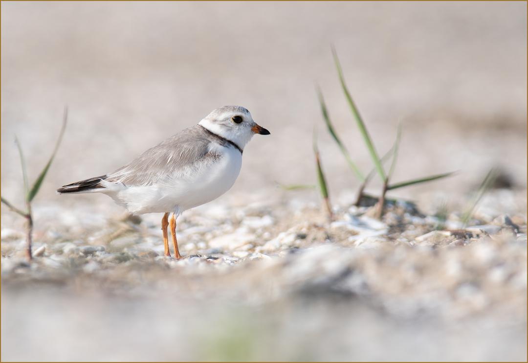
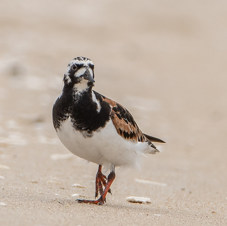
Odd you would find it distracting Brenda, but I understand it is subjective. In a pro wildlife critique I participate, this is a highly admirable technique, pulling focus to the subject. Shooting wide open allows for this. I agree less of it would be more appealing. I had in my description that this is an unedited shot, allowing folks here to offer maximum suggestions. Thank you for your suggestion. Here is one with minimal blur. |
Jun 13th |
 |
| 69 |
Jun 18 |
Reply |
Yes agreed, thank you Candy. The pros I work with often eliminate the feet completely with blur. I do like this technique making the image unique and interesting. Is this image more what you were thinking? |
Jun 13th |
 |
| 69 |
Jun 18 |
Reply |
Do you feel in this instance it works? I wish you could look at the pros work. It takes some getting used to working with a pro lens for this type of blur. I have a 300 2.8 and it is heavy to use shooting at these low angles. I have set it on a towel on the ground for these shots. |
Jun 13th |
 |
| 69 |
Jun 18 |
Reply |
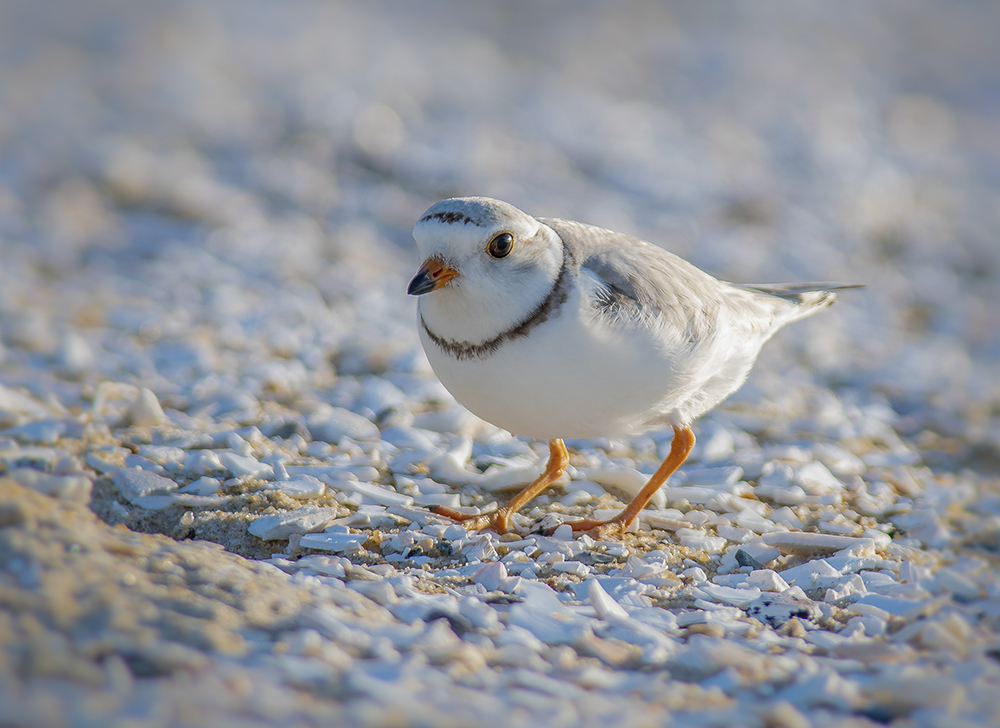
Thank you Melvyn. Since it is SOOC, I expected some would dislike the foreground. As I mentioned, on a pro site where I also post and critique, this is a highly desirable technique. It took me a long time to subscribe to it, but have "drank the Kool-aide" on it finally. Where it works best is when there are no other elements in the frame, nothing but blur, front and back. Thanks for reworking it for another option. |
Jun 11th |
| 69 |
Jun 18 |
Reply |
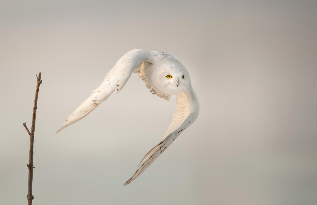
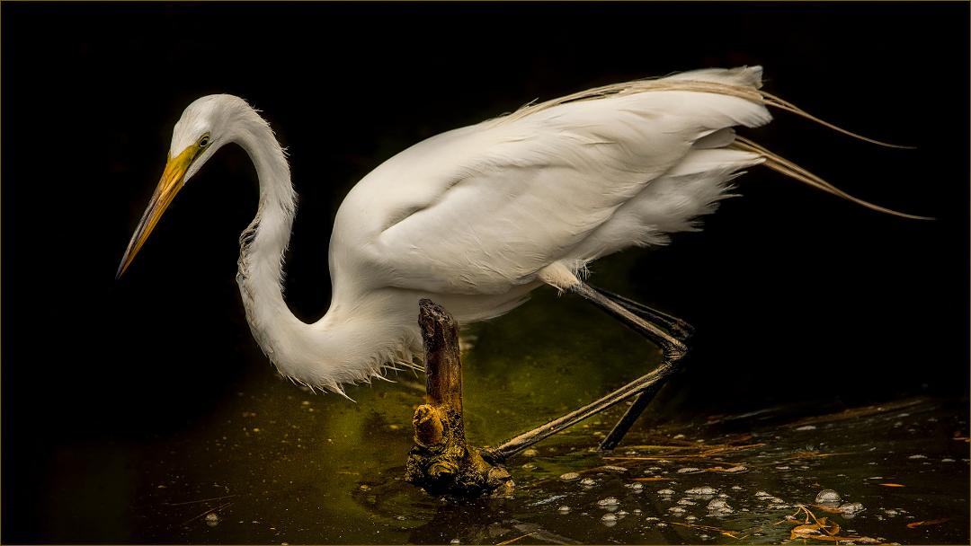
I absolutely love the high key effect. Beautifully done. It suits the subject matter very well. The contrast makes the scene. As for cropping, I think since two are looking to the right, that is where the most space should be. But, I would not be opposed to this shot centered. The triangular position of the birds lends itself to this solution. They also appear sharpened being so highly contrasted. |
Jun 5th |
| 69 |
Jun 18 |
Comment |
Odd you would find it distracting, but I understand it is subjective. In a pro wildlife critique I participate, this is a highly admirable technique, pulling focus to the subject. Shooting wide open allows for this. I agree less of it would be more appealing. I had in my description that this is an unedited shot, allowing folks here to offer maximum suggestions. Thank you for your suggestion. |
Jun 4th |
| 69 |
Jun 18 |
Comment |
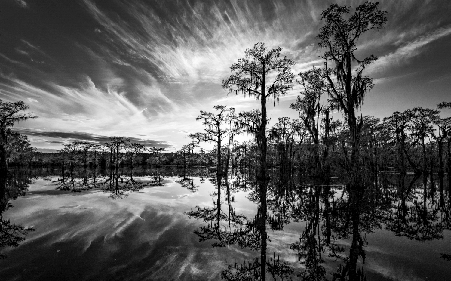
In my opinion, it could be cropped to get the horizon lower in the frame. It is a wonderful scene with much drama. The bottom corners of the image is very dark and not necessarily adding to the image. You don't need all the reflection at the bottom to know that is what it is, hence cropping it does not lose the impact of the scene. Also the small branch of leaves in the upper right are not adding to the image. |
Jun 4th |
 |
| 69 |
Jun 18 |
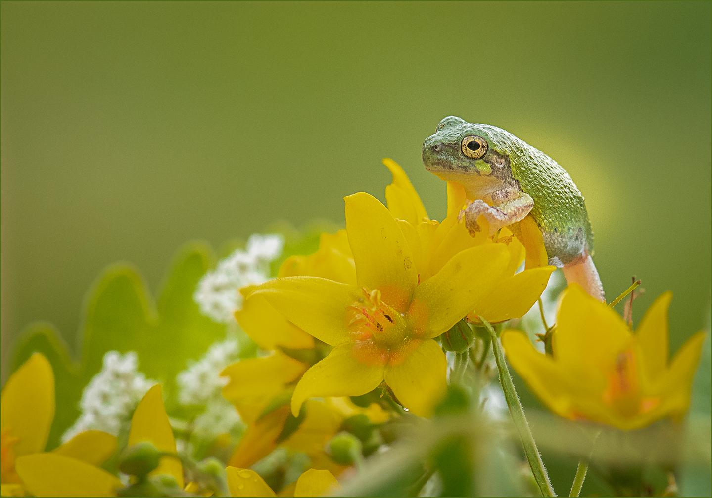
Comment |
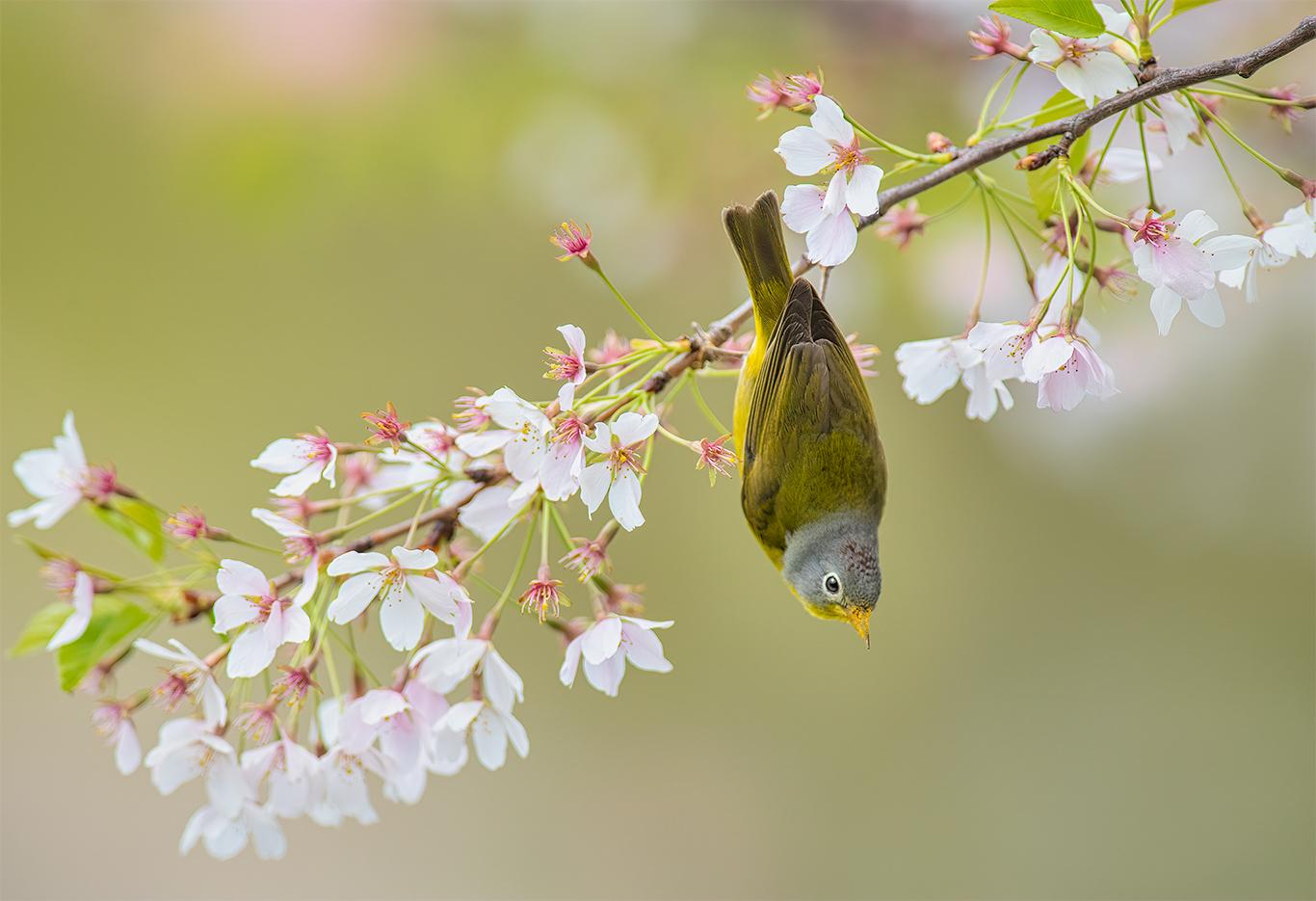
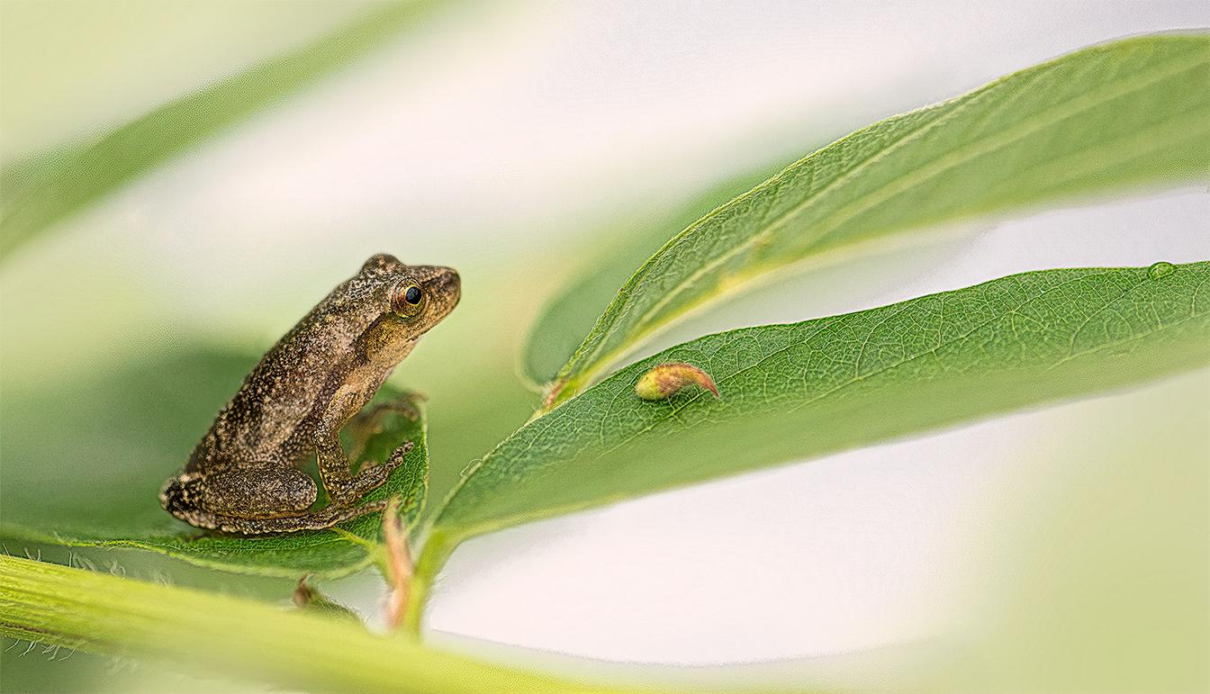
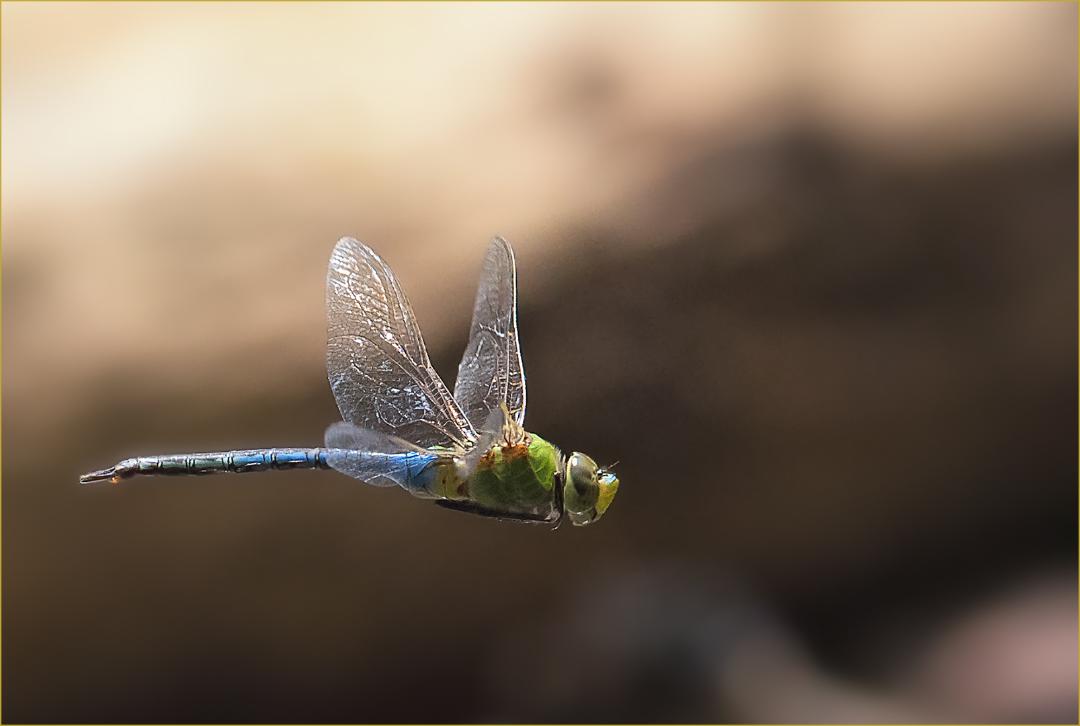
I very much like the complementary colors of the red and green. The image has a pleasing textural background. Focus appears to be on the stamens, and just slightly off the grasshopper. This image has two subjects and works well as such. |
Jun 3rd |
| 69 |
Jun 18 |
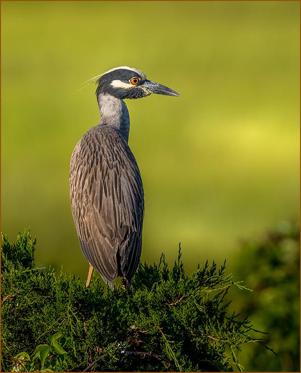
Comment |
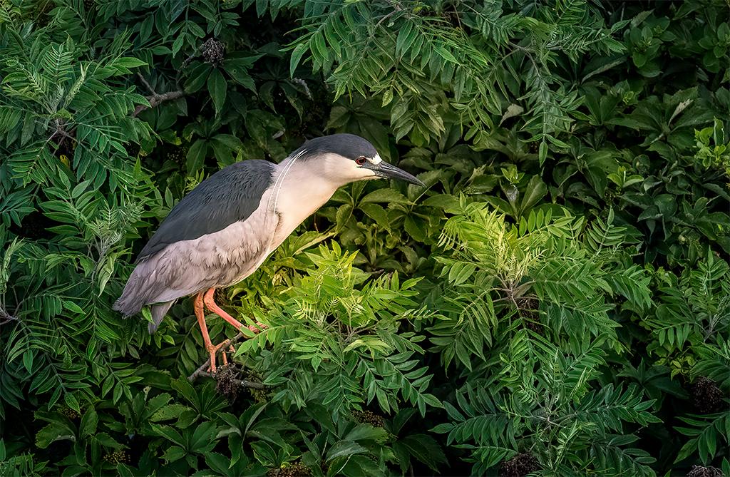
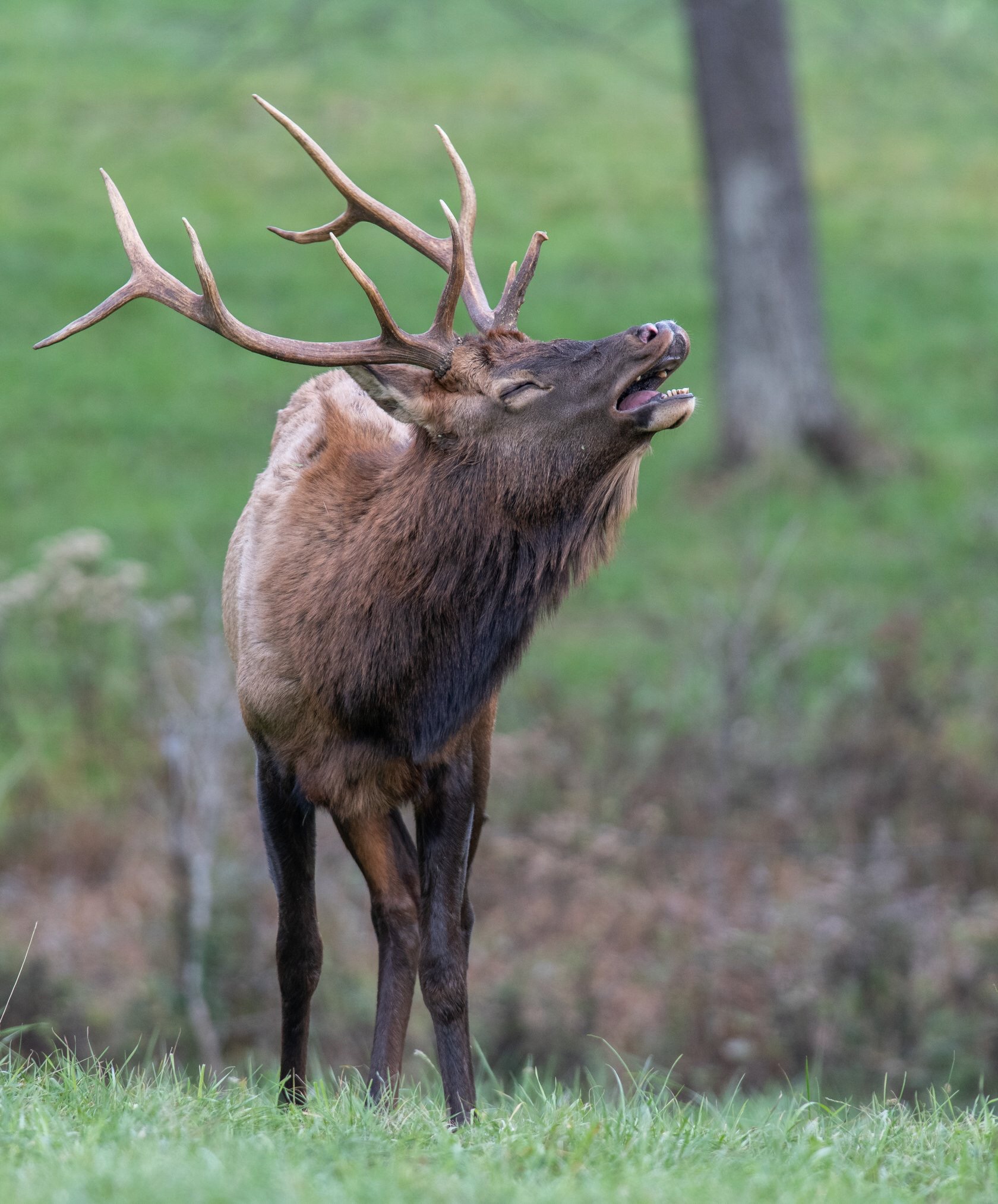
Overall, very nicely done Rob. The bird is sharp and has emotion in the expression. What does give me pause, is the bird is looking right. I feel the crop should have been to remove the two small trees on the left and extend the view on the right. The background is blurred adequately, but I would suggest burning down or cloning out the bright areas of the two lines of branches. |
Jun 3rd |
| 69 |
Jun 18 |
Comment |
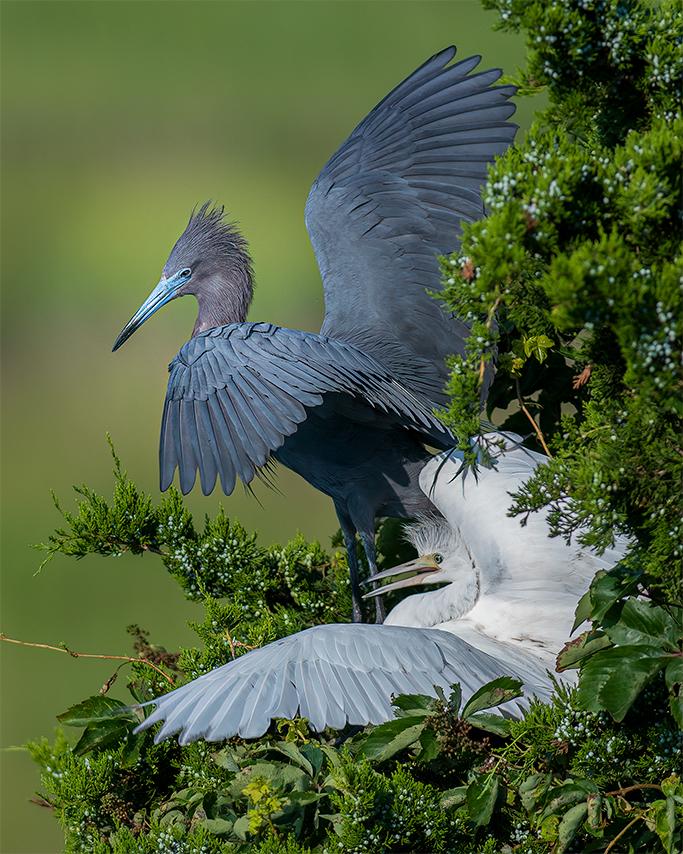
I like that you have three subjects in that orientation. Compositionally, the birds are nice, but there is too much unnecessary negative space where the birds feel unbalanced in the frame. I feel that the birds are not sharp and underexposed in the original. Using a texture on them does not increase the appeal. |
Jun 3rd |
| 69 |
Jun 18 |
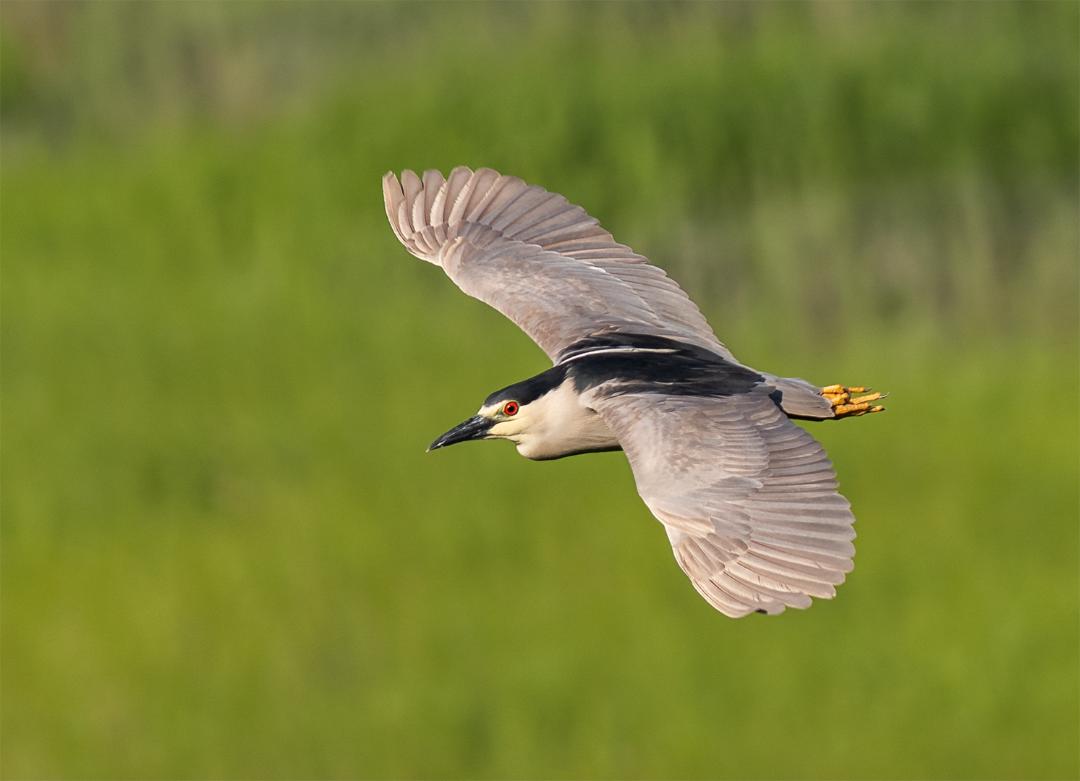
Comment |
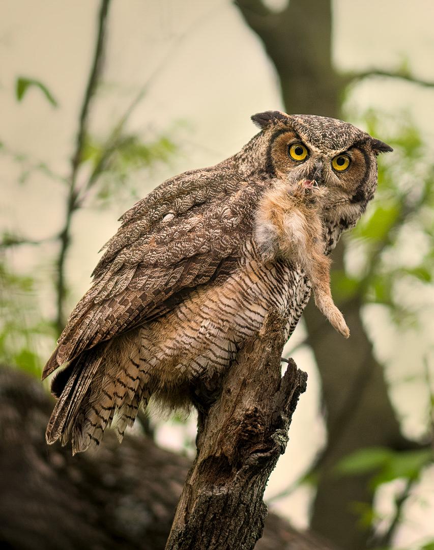
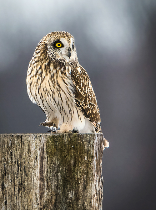
You captured an interesting pose. The lighting is nice and the bird well exposed. I do prefer the original though. I find this background incongruent to the subject. |
Jun 3rd |
| 69 |
Jun 18 |
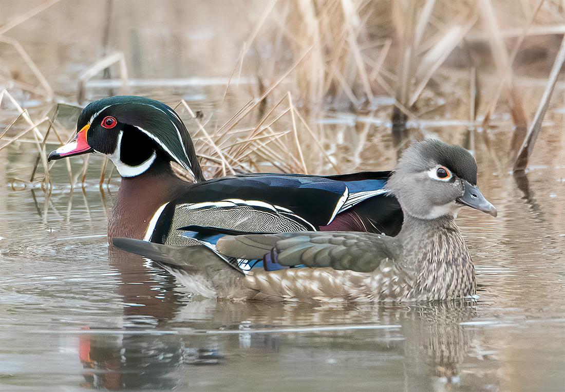
Comment |
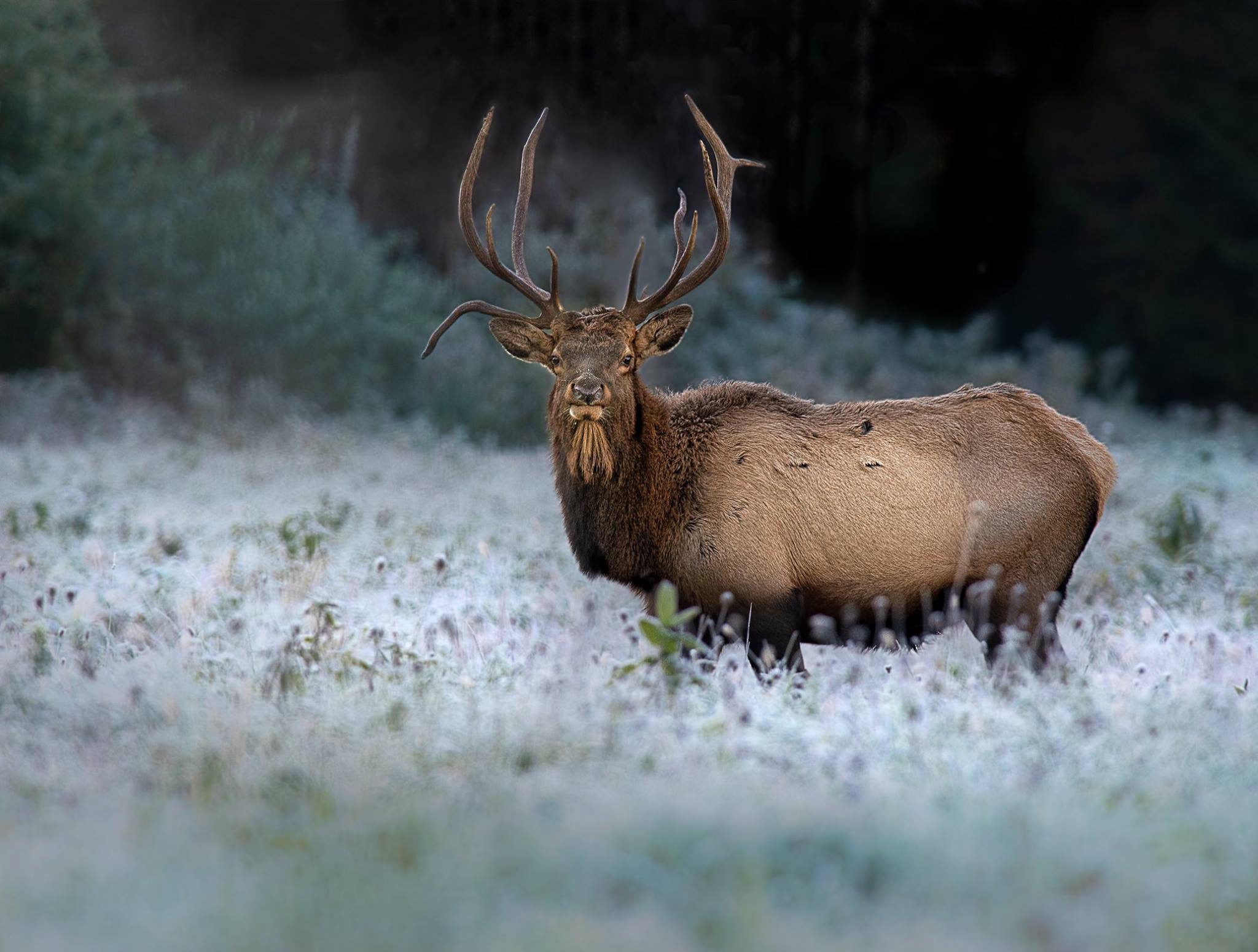
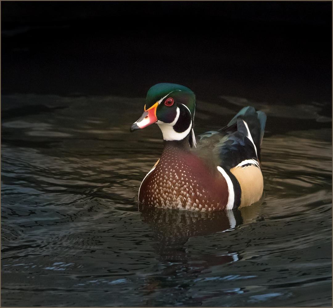
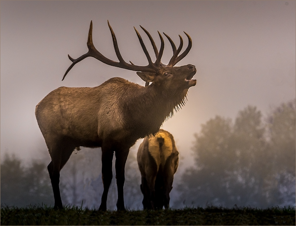
A very touching moment Pierre. It does have a look back from the male. Viewing it on my iPad Pro, it appears soft, especially around the face and eyes. DOF is nice for the background and the sunlit reflection is a nice touch. Overall, lighting is even and works well. |
Jun 3rd |
7 comments - 9 replies for Group 69
|
8 comments - 10 replies Total
|