|
| Group |
Round |
C/R |
Comment |
Date |
Image |
| 49 |
Nov 17 |
Reply |
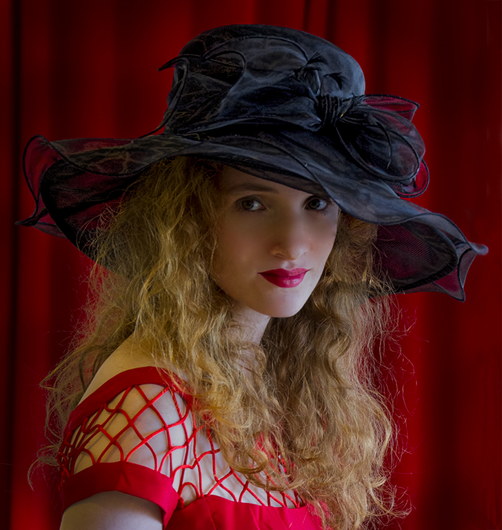
I agree with you about the shadow on the face, but since this image was processed for a competition about hats, I did not want the face to compete with or draw the eye away from the hat. Otherwise, I would have dodged the face area a little, or perhaps burn in the highlights on the chin to even out the exposure on the face. I also think I would de-saturate the yellow cast on her shoulder. |
Nov 22nd |
| 49 |
Nov 17 |
Comment |
Well done. I wouldn't change a thing. I especially like the detail in the reflections. |
Nov 11th |
| 49 |
Nov 17 |
Comment |
Nice composition and the sepia tone suits the subject matter well. I like the white vignette except for its effect on the top of the building. Perhaps doing the vignette manually with the dodge/burn tool or choosing an oval shape that would have less effect on the top center of the image might help. |
Nov 11th |
| 49 |
Nov 17 |
Comment |
Great composition and very sharp for a hand-held image. I might try Nik Detail Extractor or Topaz Detail to bring out more detail in the feathers. |
Nov 11th |
| 49 |
Nov 17 |
Comment |
Great subject. On my monitor, the brim of the hat seems to be a bit blown out. I don't use Aperture so I don't know what it is capable of doing. With Photoshop, I would try making a selection of the hat and reducing it's exposure. I would also burn in the other people in the background, especially the woman on the far right, The highlights on her face draw the eye away from the subject. |
Nov 11th |
| 49 |
Nov 17 |
Comment |
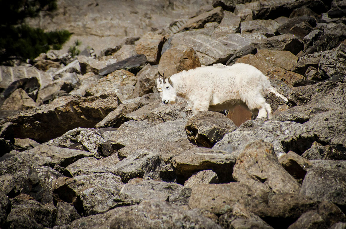
I agree with your personal assessment about the background. An easy fix would be to reduce the exposure a bit then make a selection of the sheep and using layer mask in Photoshop, increase the exposure back on just the sheep. See example. |
Nov 11th |
 |
5 comments - 1 reply for Group 49
|
5 comments - 1 reply Total
|