|
| Group |
Round |
C/R |
Comment |
Date |
Image |
| 35 |
Sep 24 |
Comment |
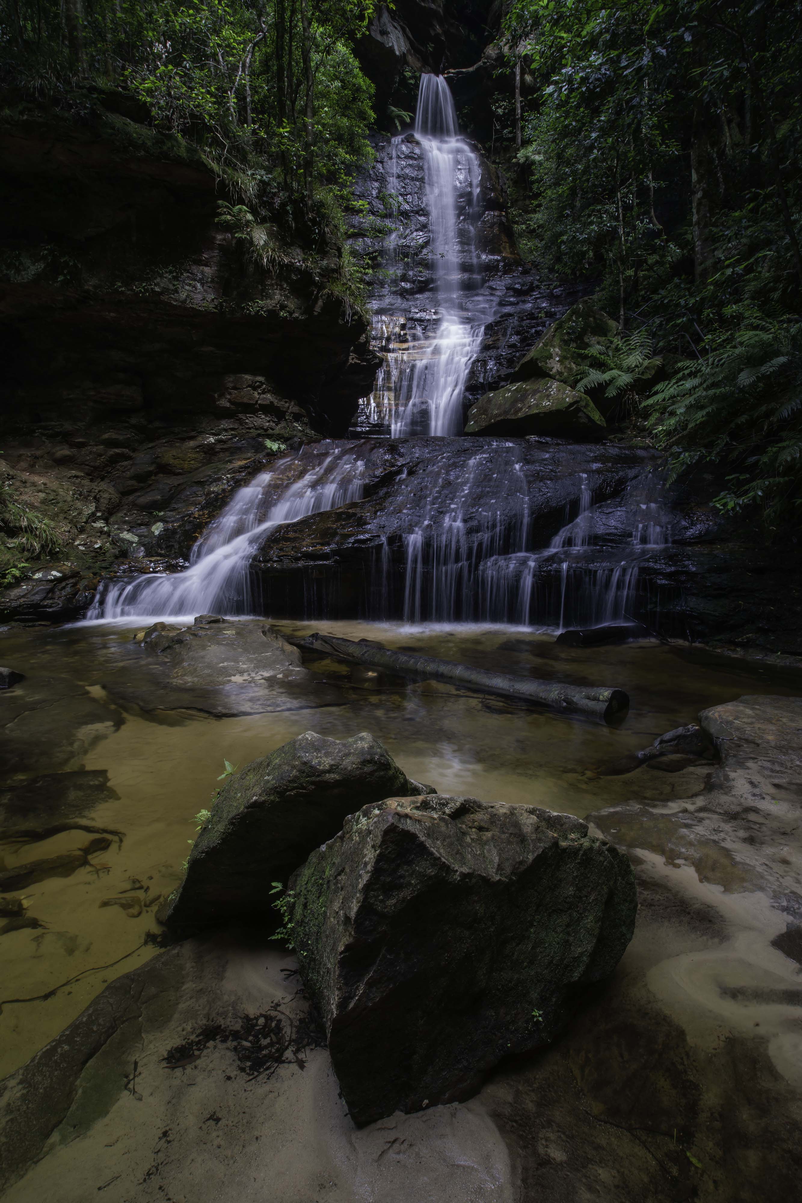
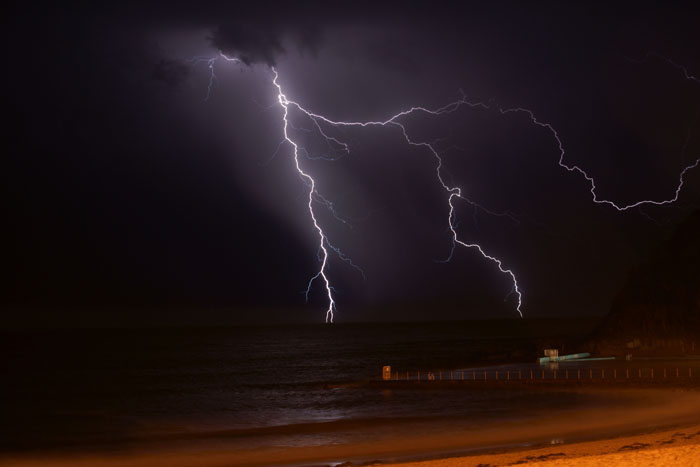
A great image Nelson, congratulations. |
Sep 26th |
| 35 |
Sep 24 |
Comment |
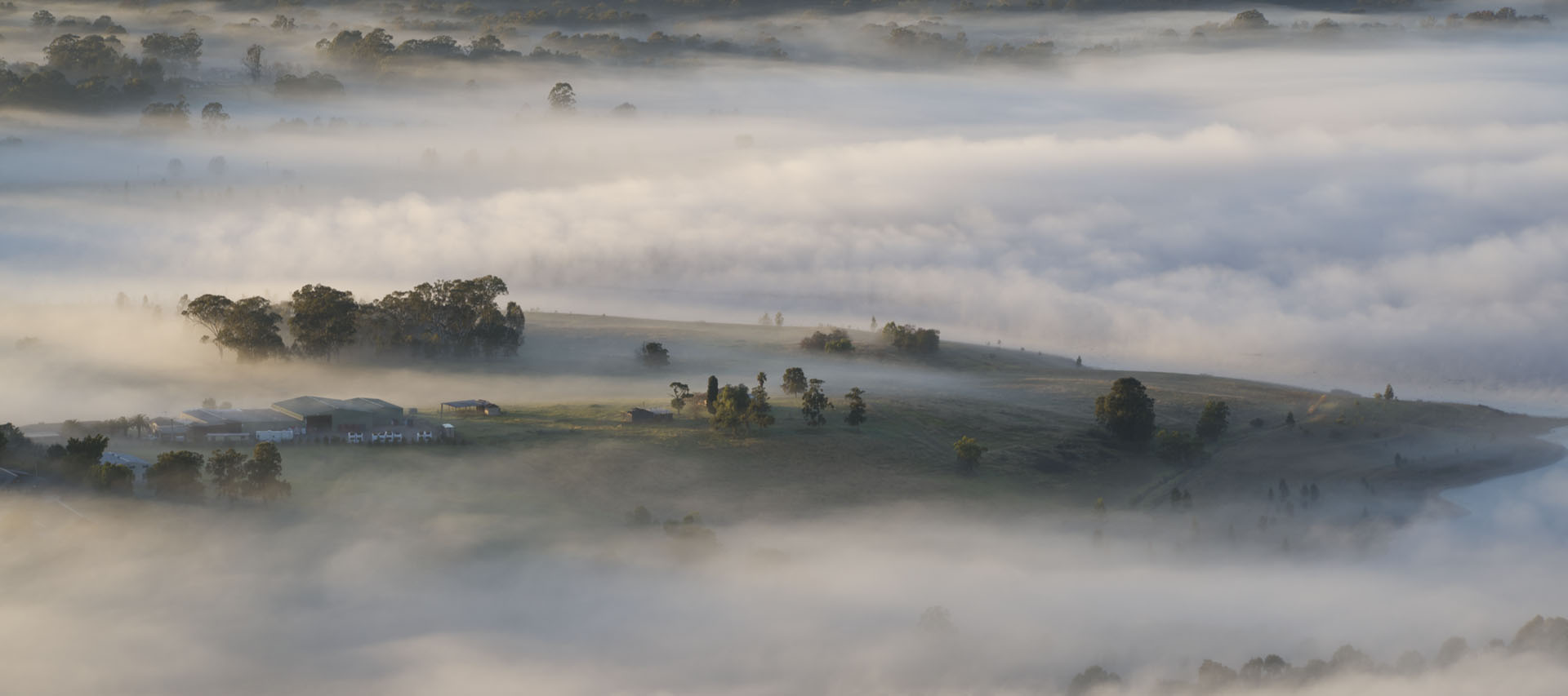
A very strong image Stuart. Well seen, processed and presented.
Well done. |
Sep 26th |
| 35 |
Sep 24 |
Comment |
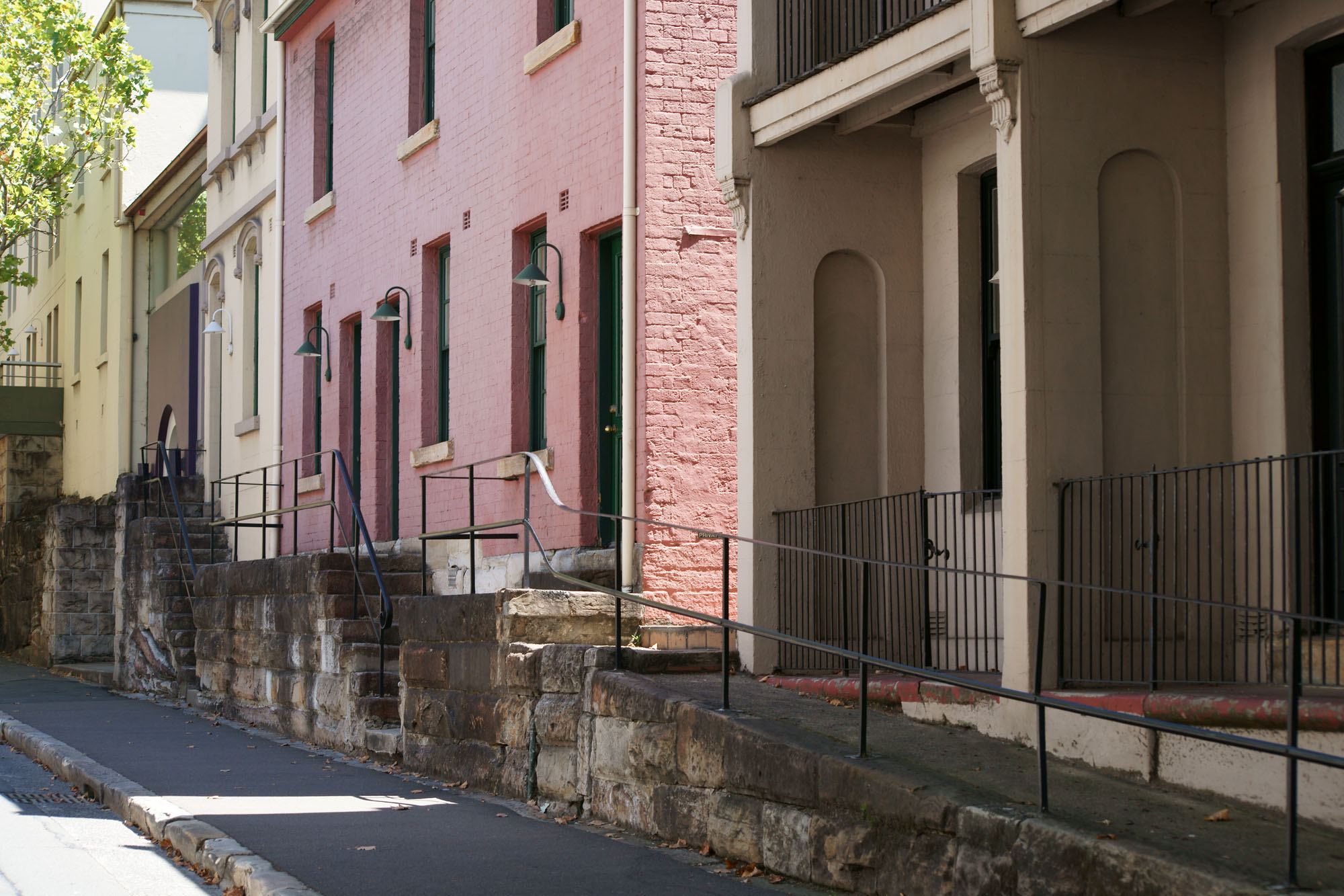
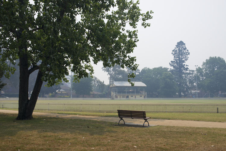
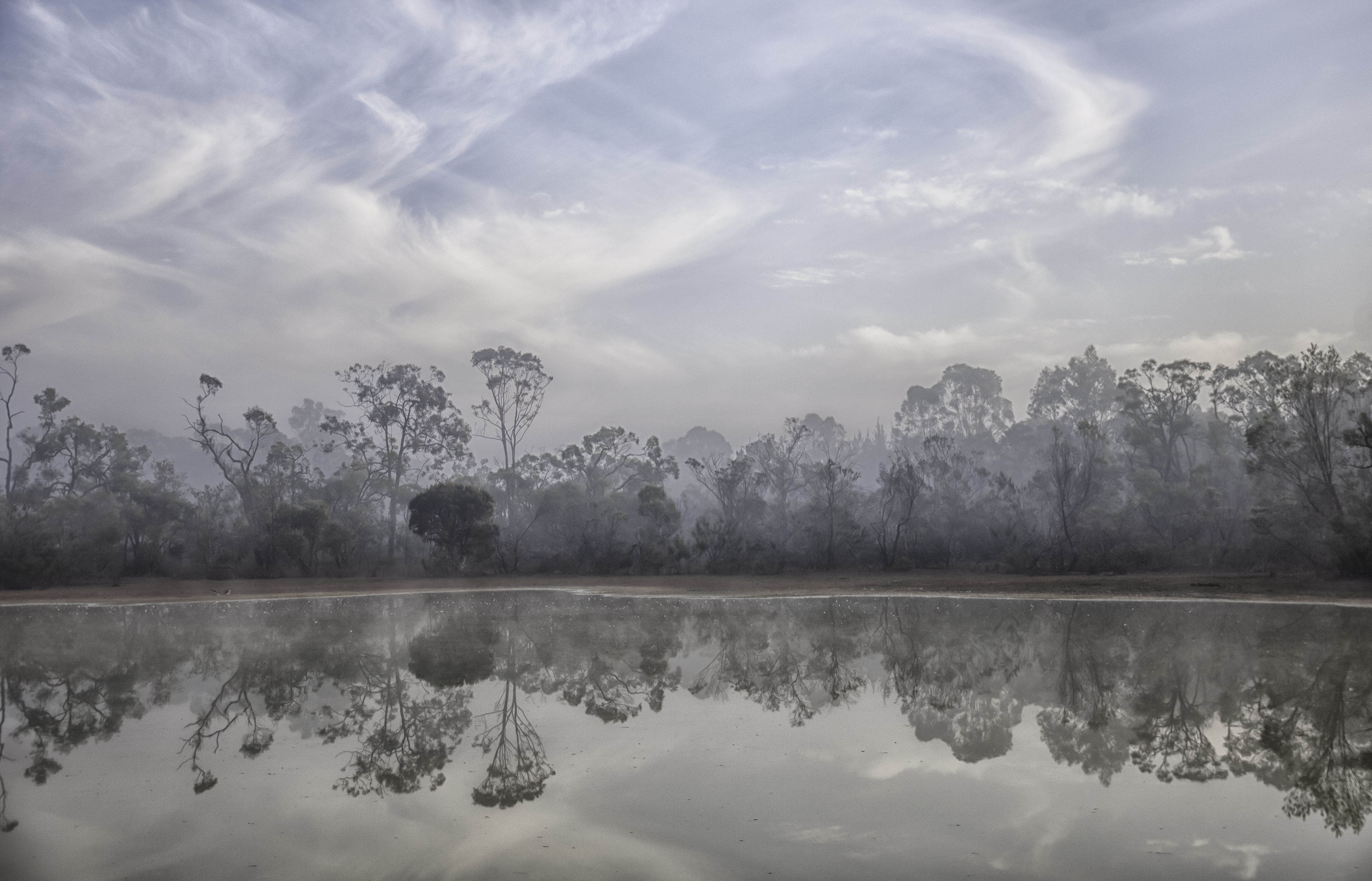
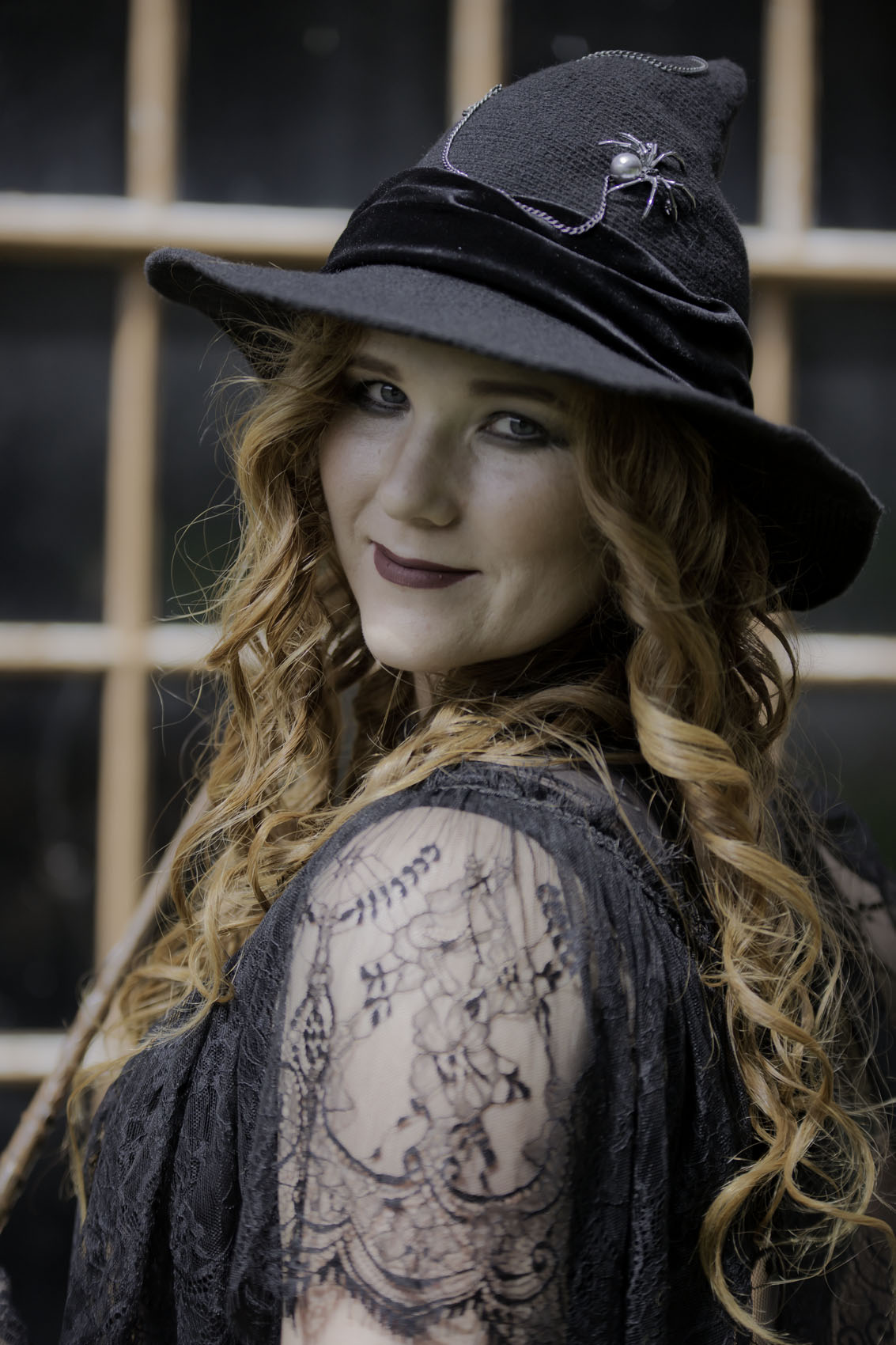
Congratulations Lauren on your great use of line and pattern. One of my favourite photo formats is a pano and this would also work well as one, if you crop off half of the foreground. Of course that's not necessary, I'm just pointing out an option. |
Sep 26th |
| 35 |
Sep 24 |
Comment |
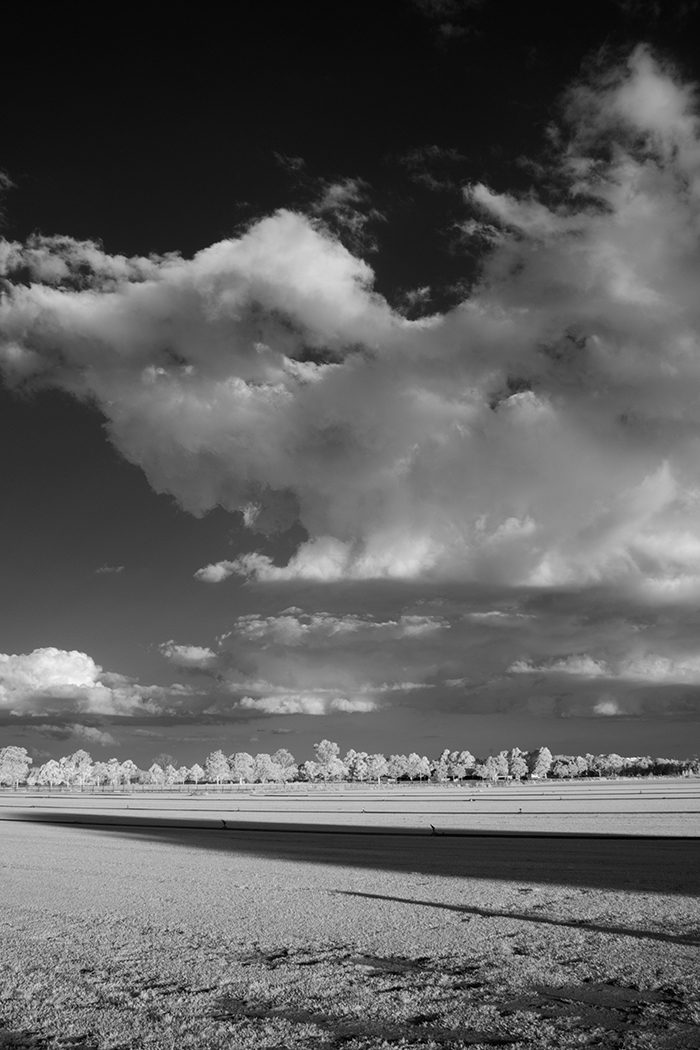
A fine image Tatu. While I appreciate your overall composition of this scene, I do agree with the others, a darker sky and stronger contrast could give this image more impact. |
Sep 26th |
| 35 |
Sep 24 |
Comment |
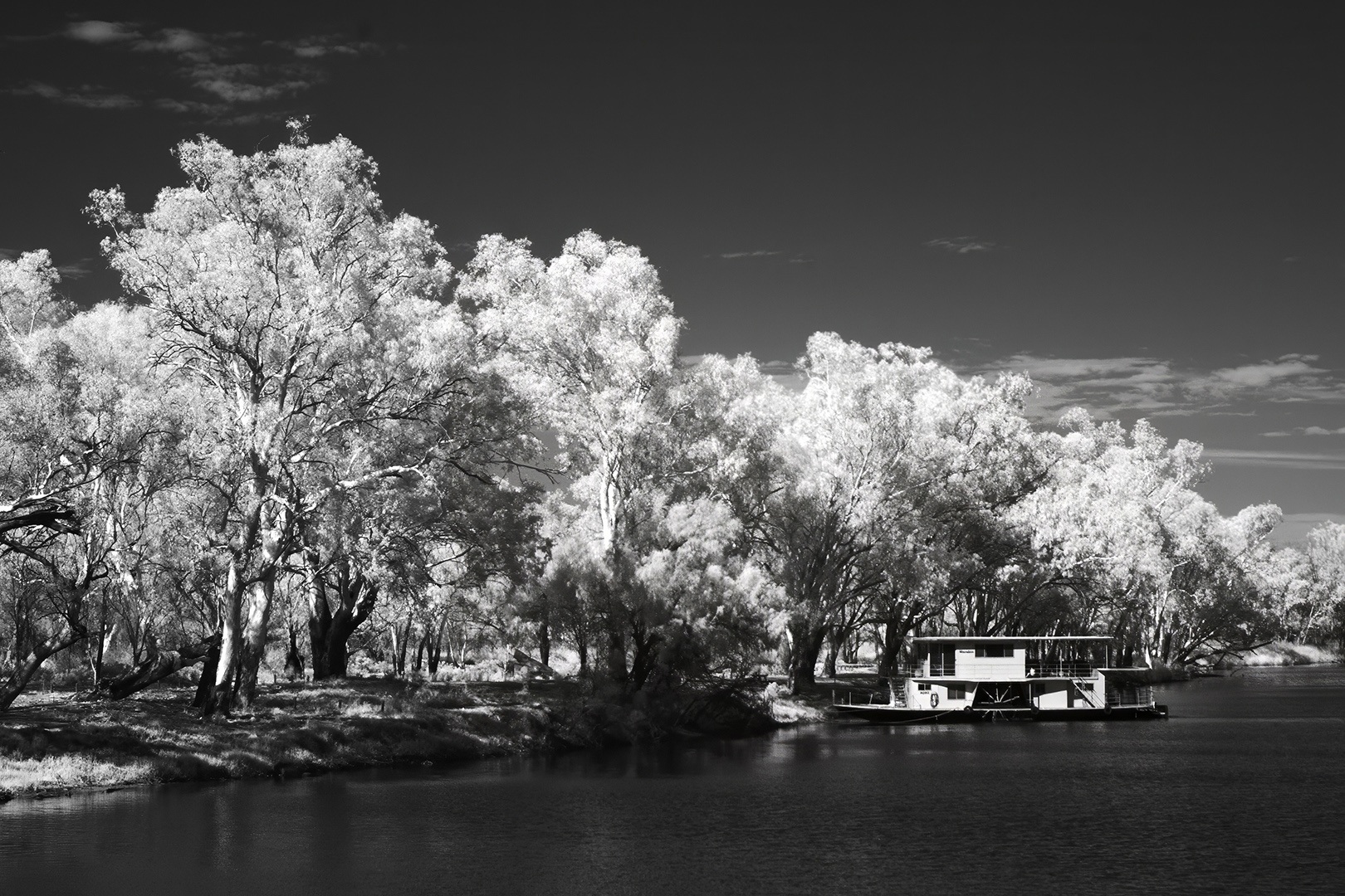
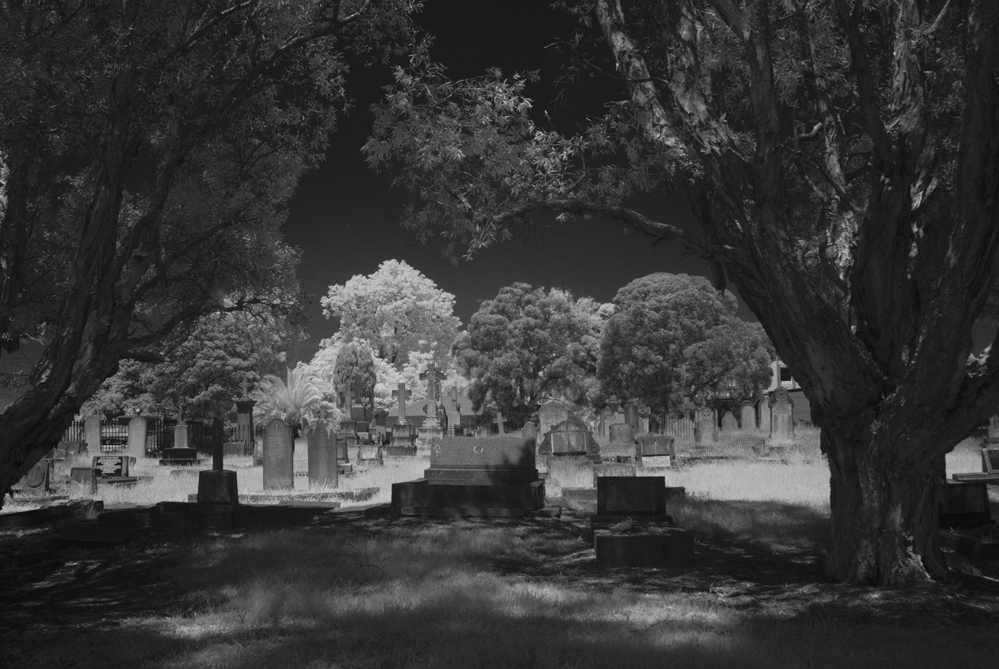
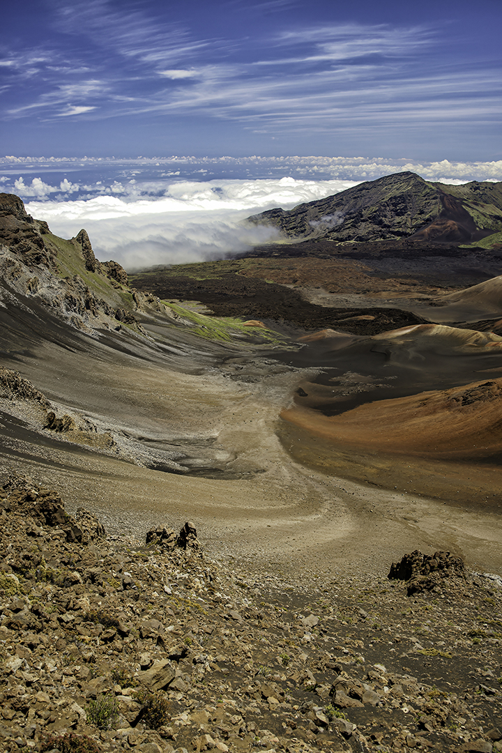
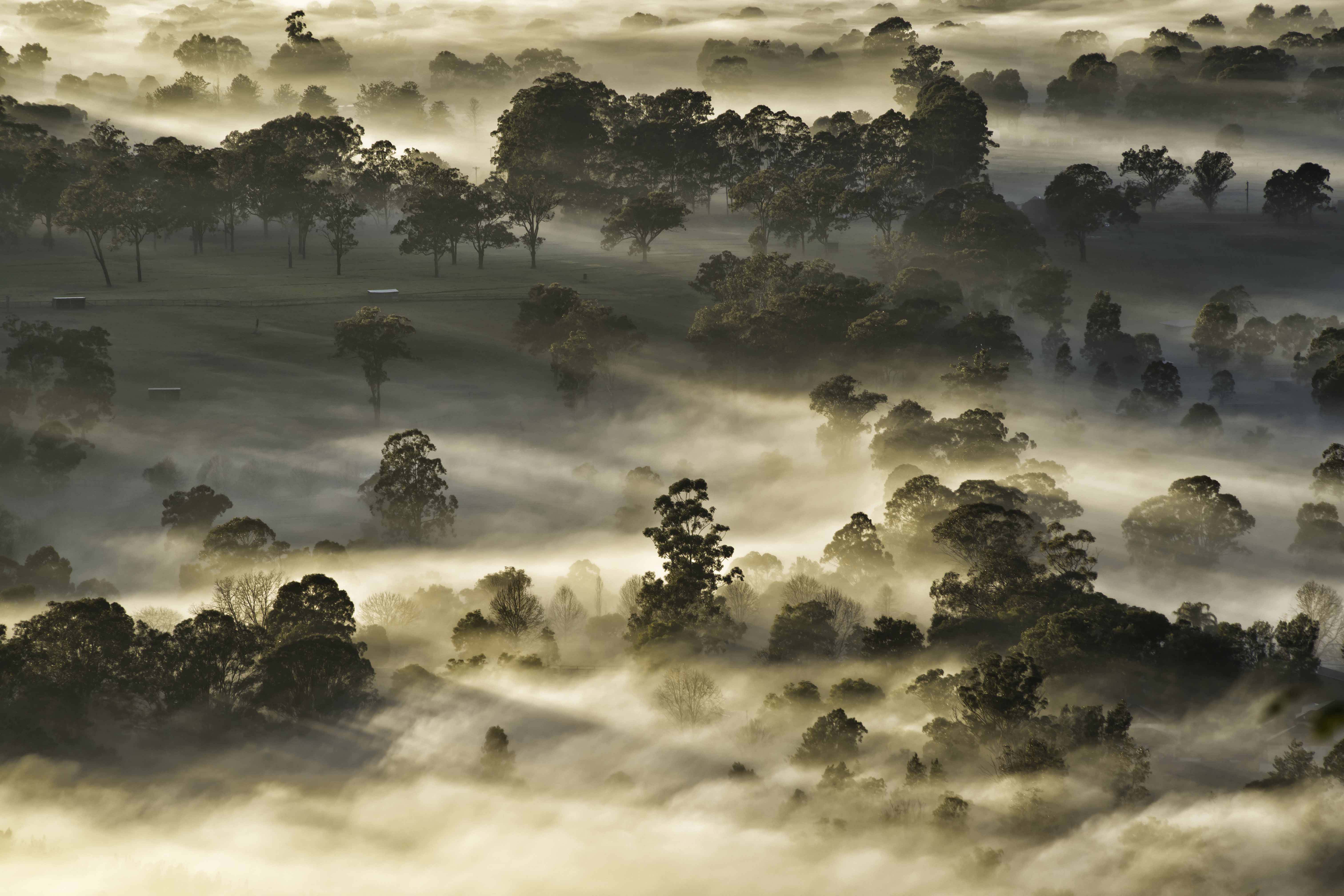
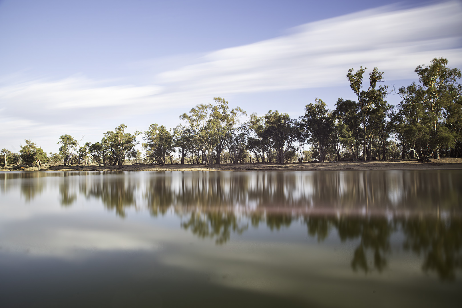
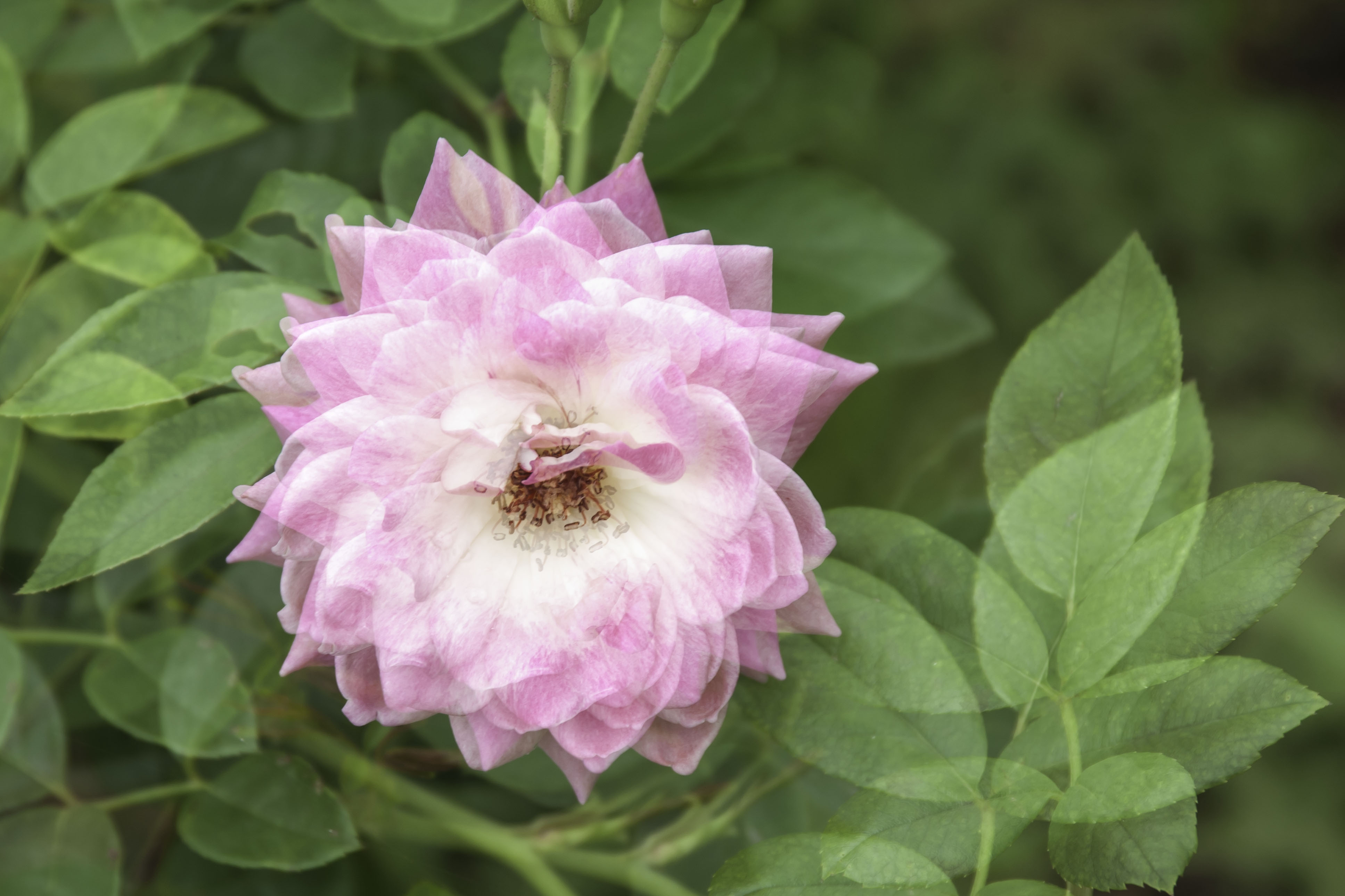
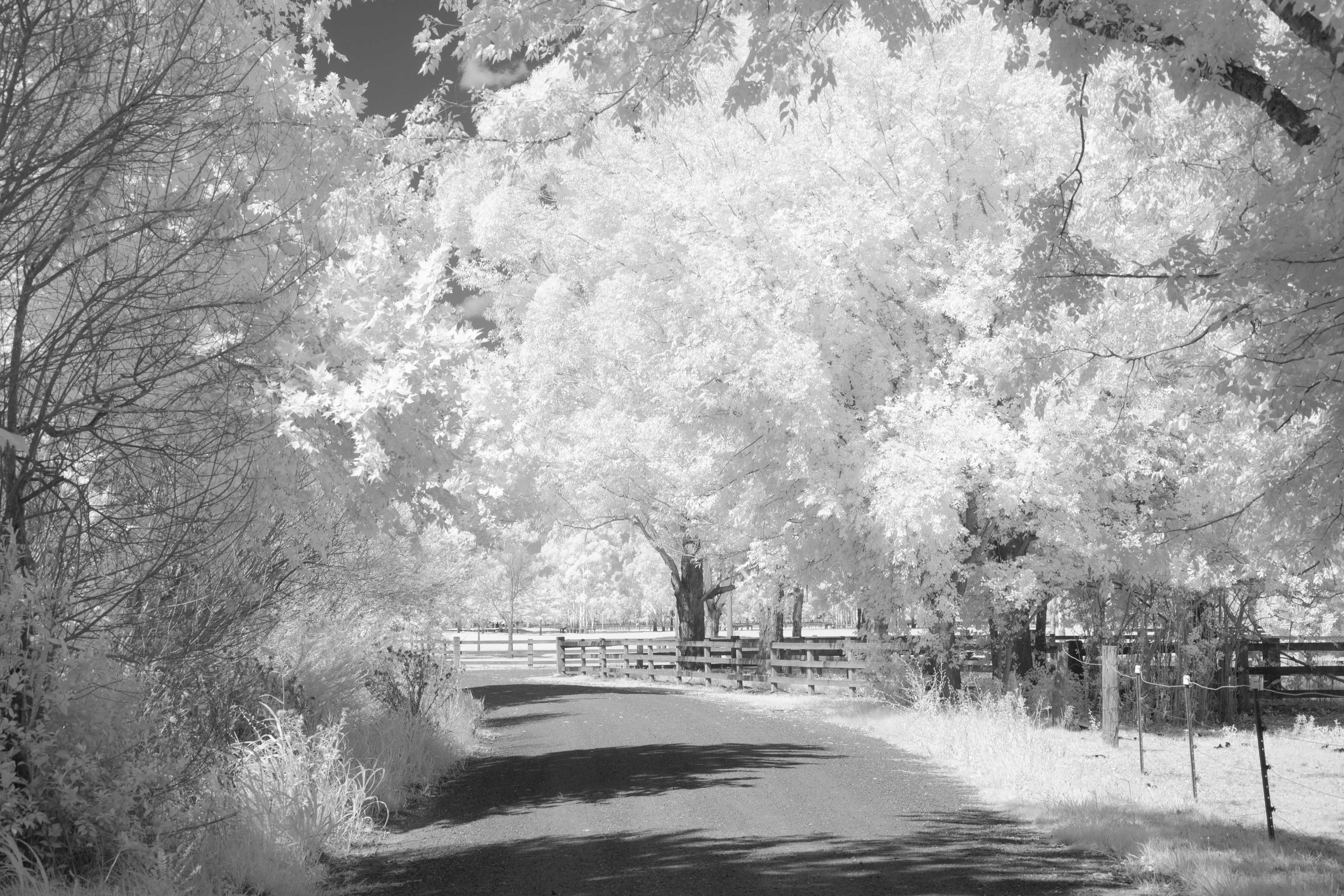
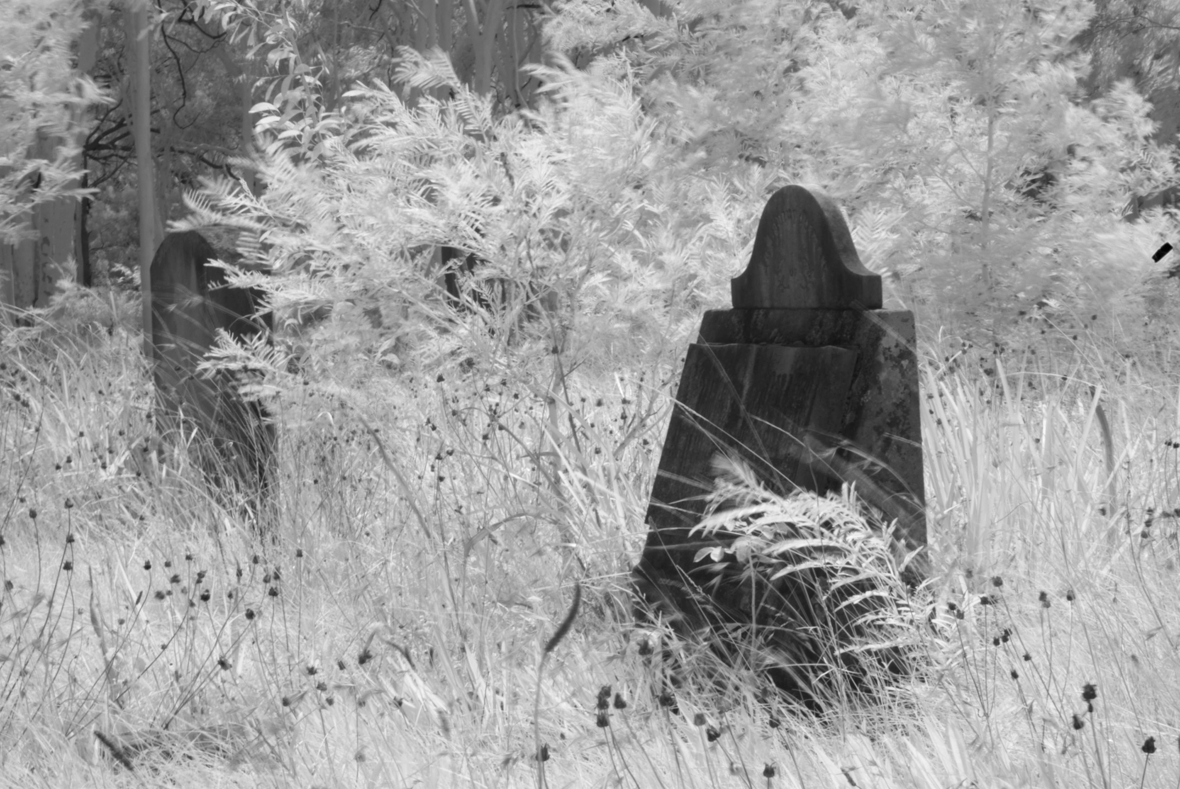
A great image Debbie. I find colour IR very interesting indeed. Your composition and use of all the elements in the scene is very good. I agree with Nelson about that area of bright ground. If it could be a little more green there, it would be more comfortable to my eyes. |
Sep 26th |
| 35 |
Sep 24 |
Reply |
Thanks for your comments Nelson. |
Sep 26th |
| 35 |
Sep 24 |
Reply |
Thanks for your thoughts Debbie. |
Sep 26th |
| 35 |
Sep 24 |
Reply |
Thanks for your comments Lauren, yes it never hurts to look up. |
Sep 26th |
5 comments - 3 replies for Group 35
|
| 73 |
Sep 24 |
Reply |
I don't like to appear picky Sherry, as you know I'm just trying to give helpful and reasonable feedback. |
Sep 26th |
| 73 |
Sep 24 |
Reply |
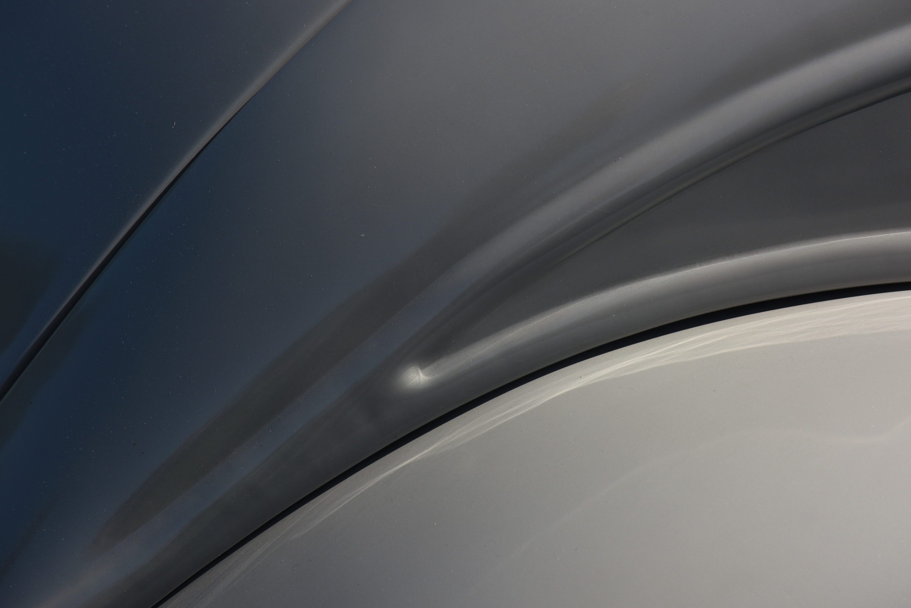
My processing skills are very sadly lacking and I'm unable to find my way to annotate and the arrow in either my desktop or PS. I apologise for that. I have provided an image showing just the small detail that is giving me grief. I acknowledge that it's only a very small percentage of the image, but to me it's like a dust spot, a distraction. Once I see it, I can't take my eyes off it. So I point it out, for the only purpose of removing a distraction, should you, or any other photographer wish to take an image further into competition or exhibition. Regardless of everything that has been said, it's a great image Butch and I'm just trying to improve it by removing a small detail, that in my eyes is an un-necessary distraction. |
Sep 26th |
 |
| 73 |
Sep 24 |
Comment |
|
Sep 24th |
 |
| 73 |
Sep 24 |
Comment |
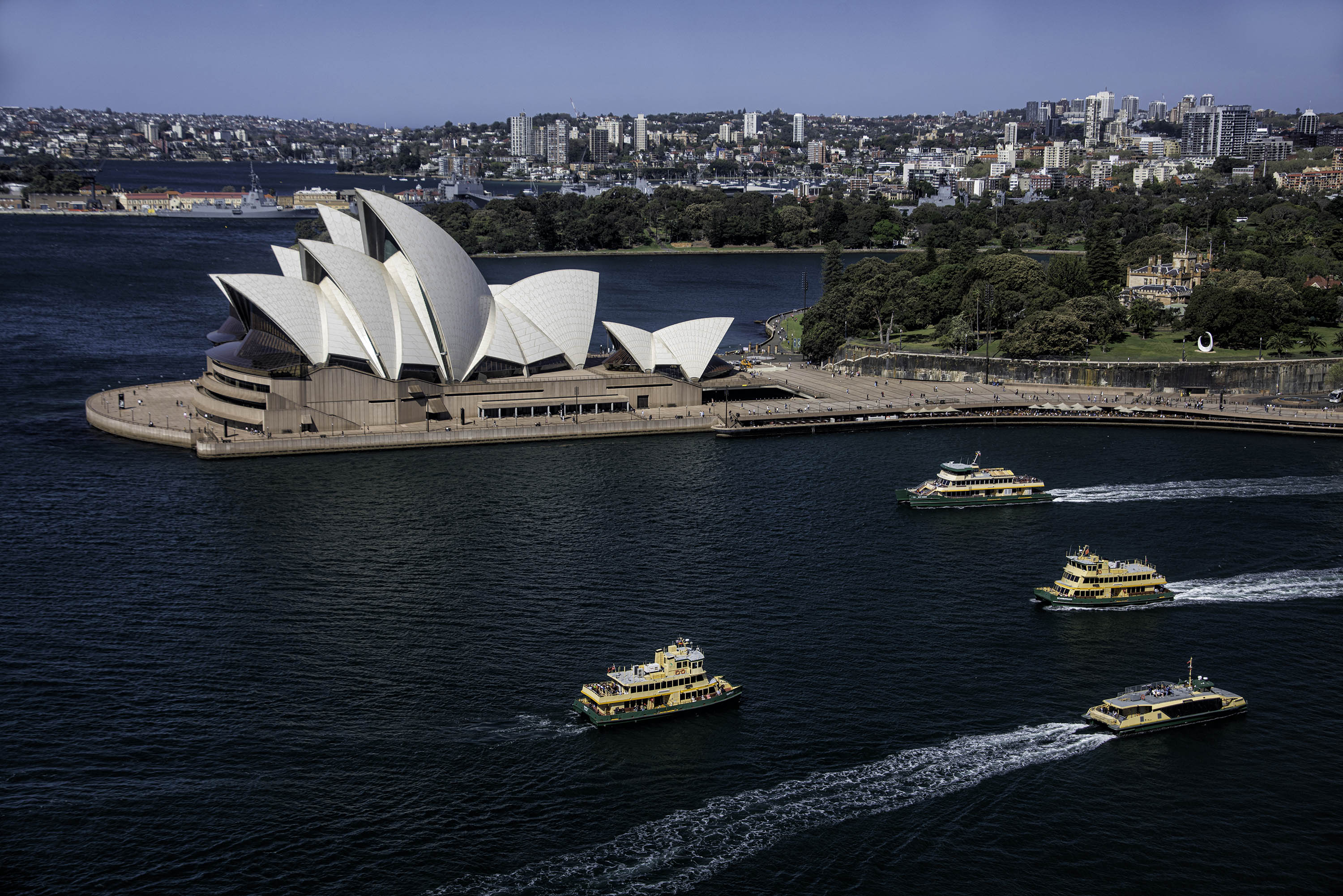
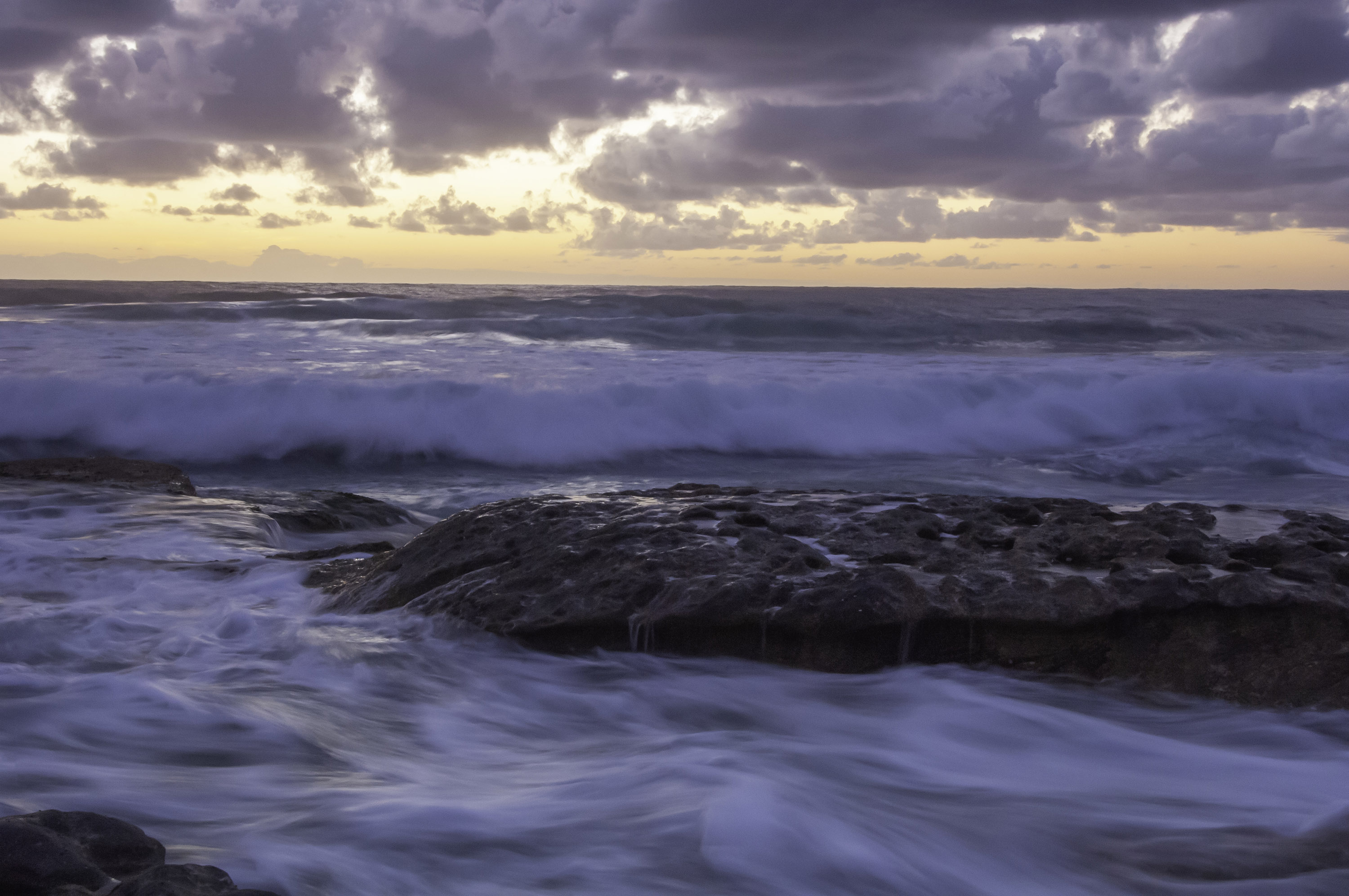
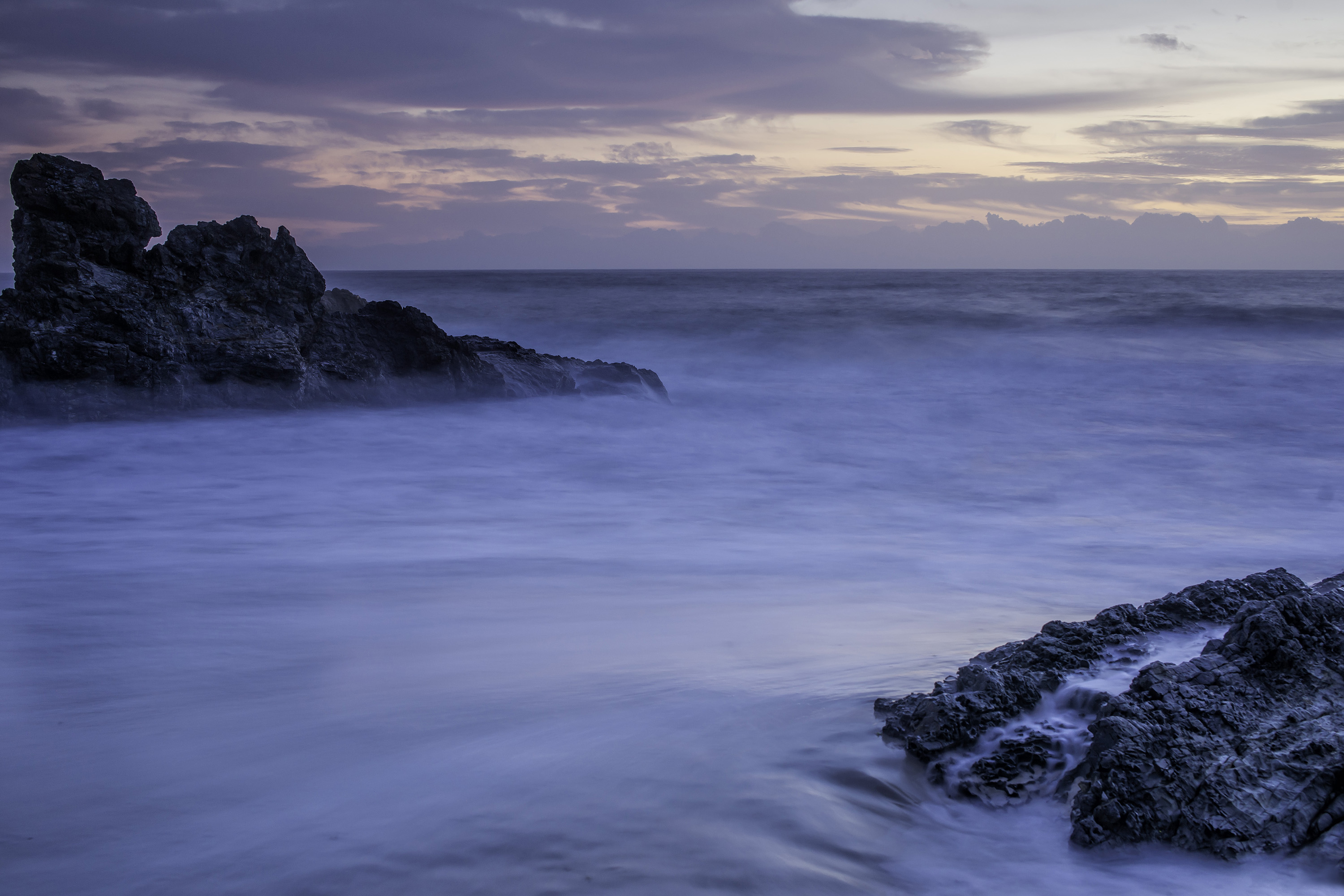
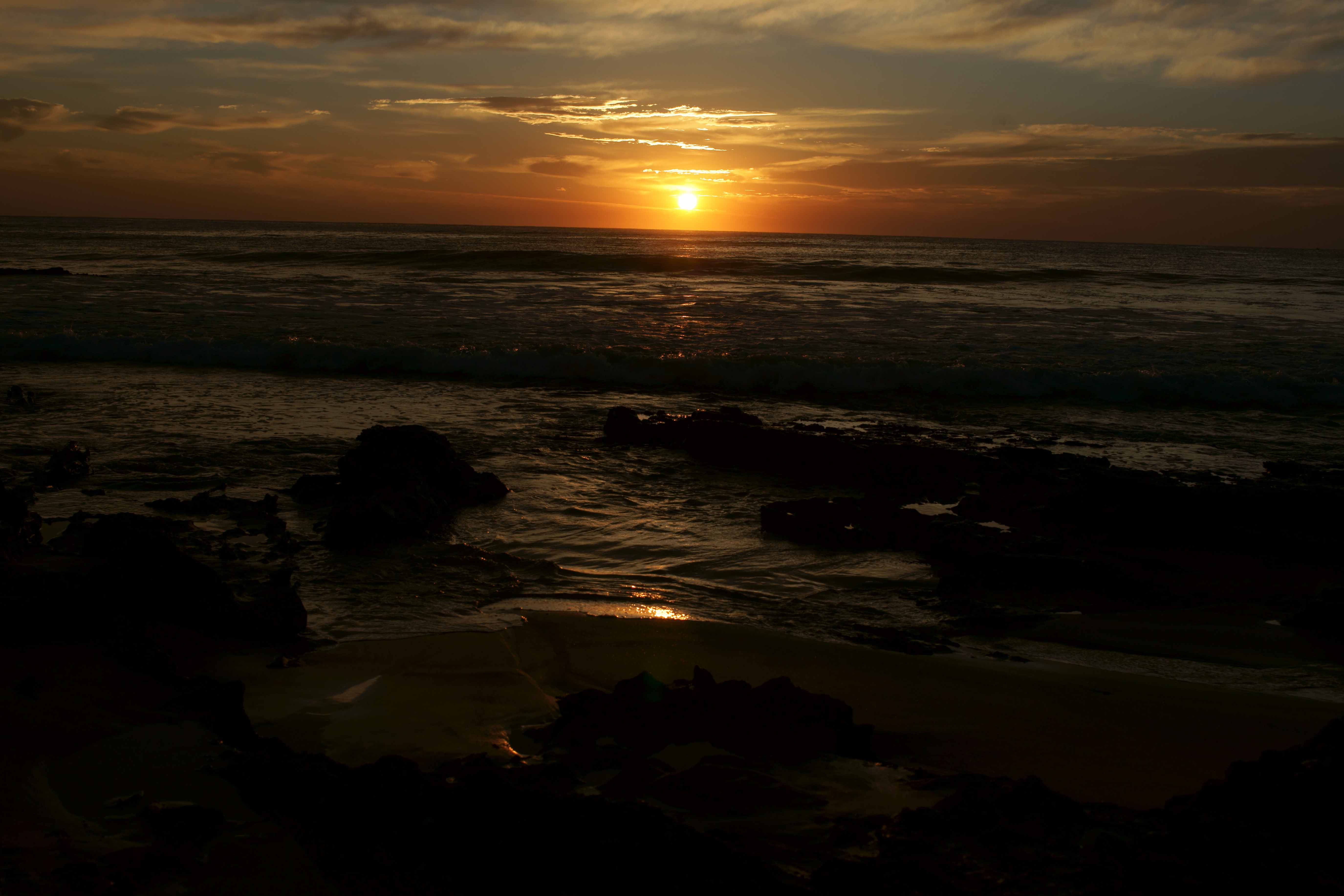
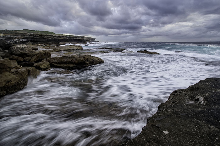
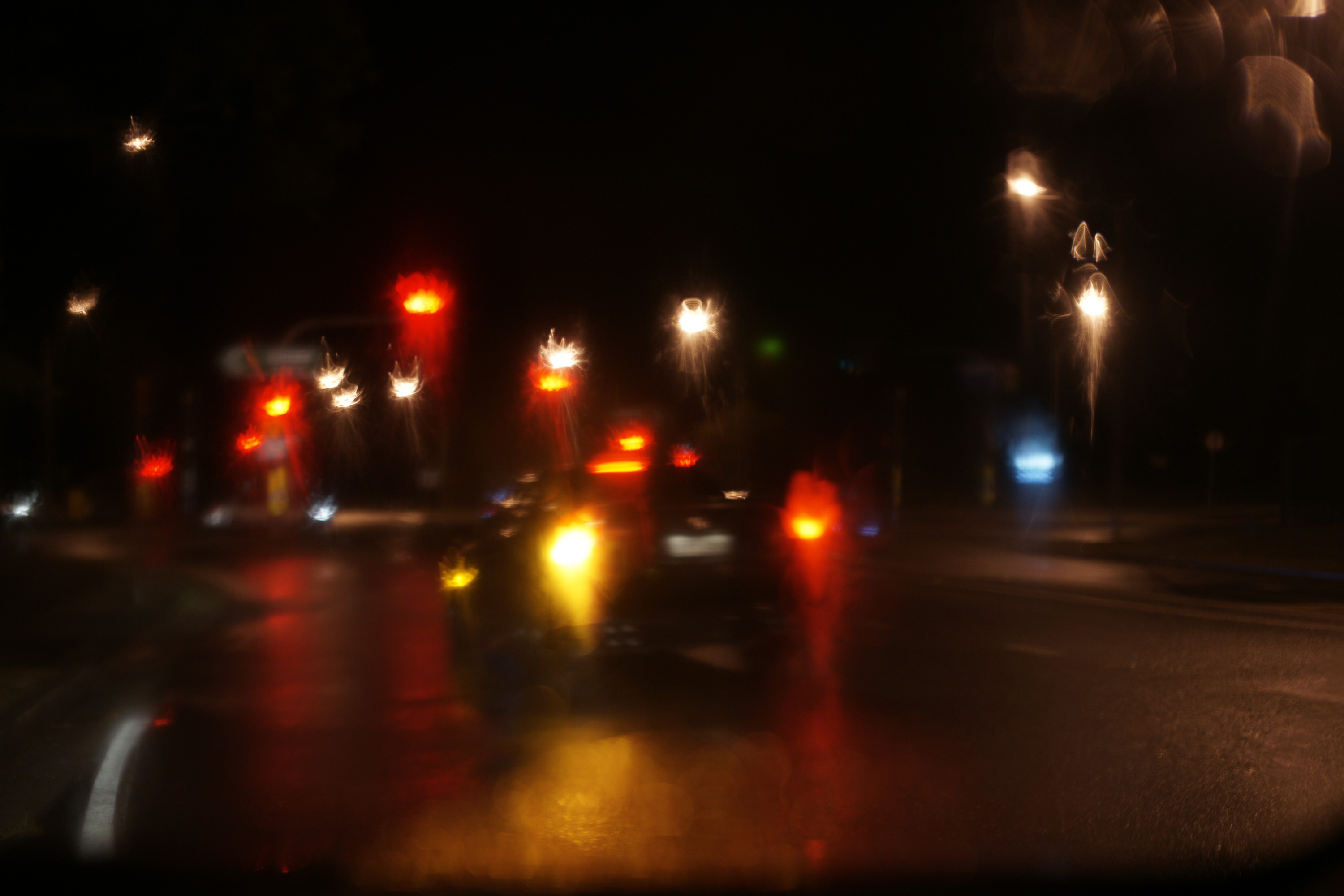
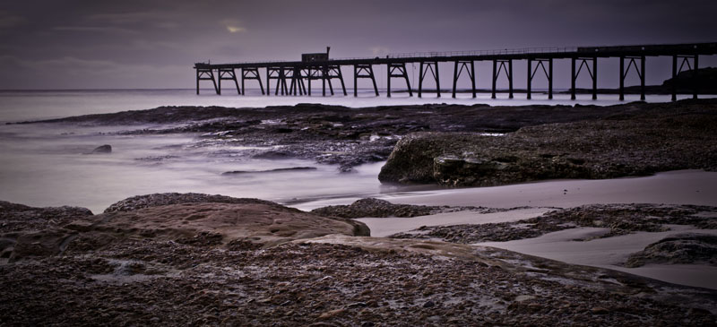
Forgive me if I'm wrong and I tried to circle the item I mean, but can't. So I've provided a cropped version for reference.
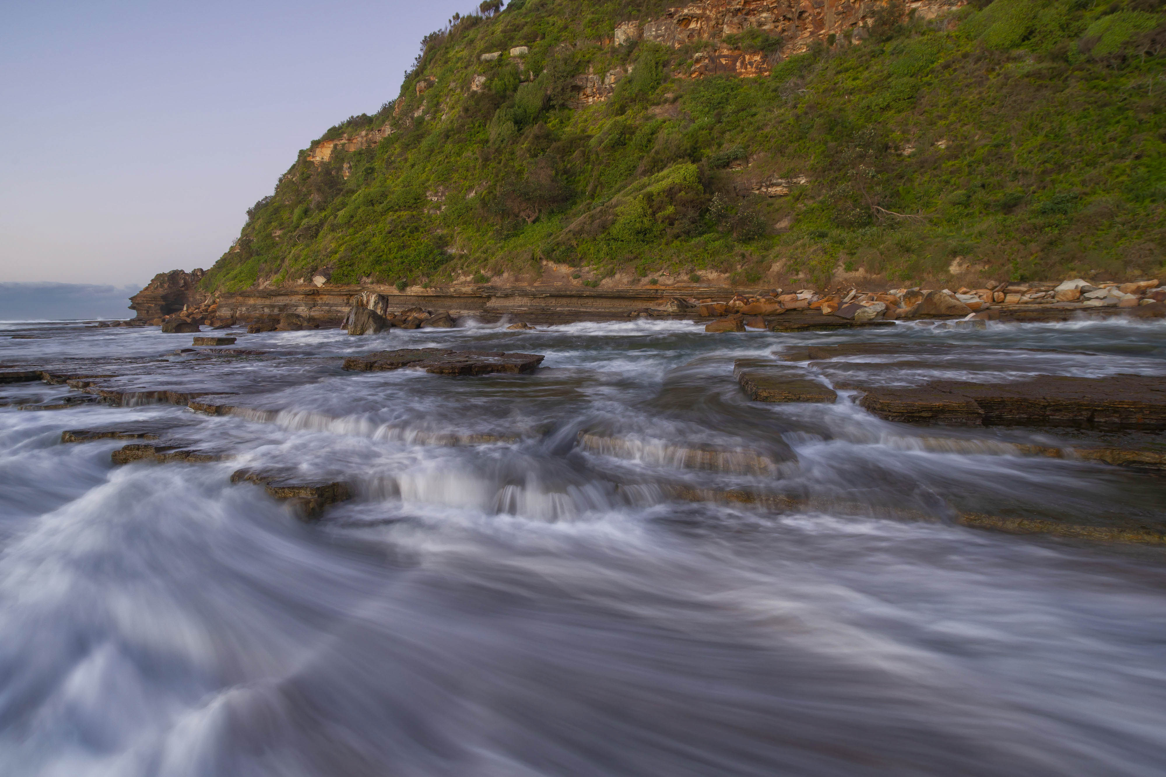
The "sign or marker I refer to is near the bottom left corner. The water surface area away from the ocean lead me to think it was like a marina sheltered by the rocks. There's also a roof type structure to the right near the palm trees that lead me to think it could possibly be a registration point. I commented on it because it's almost in the middle of the whole image. |
Sep 24th |
| 73 |
Sep 24 |
Reply |
Thanks for your comments Gary. |
Sep 23rd |
| 73 |
Sep 24 |
Reply |
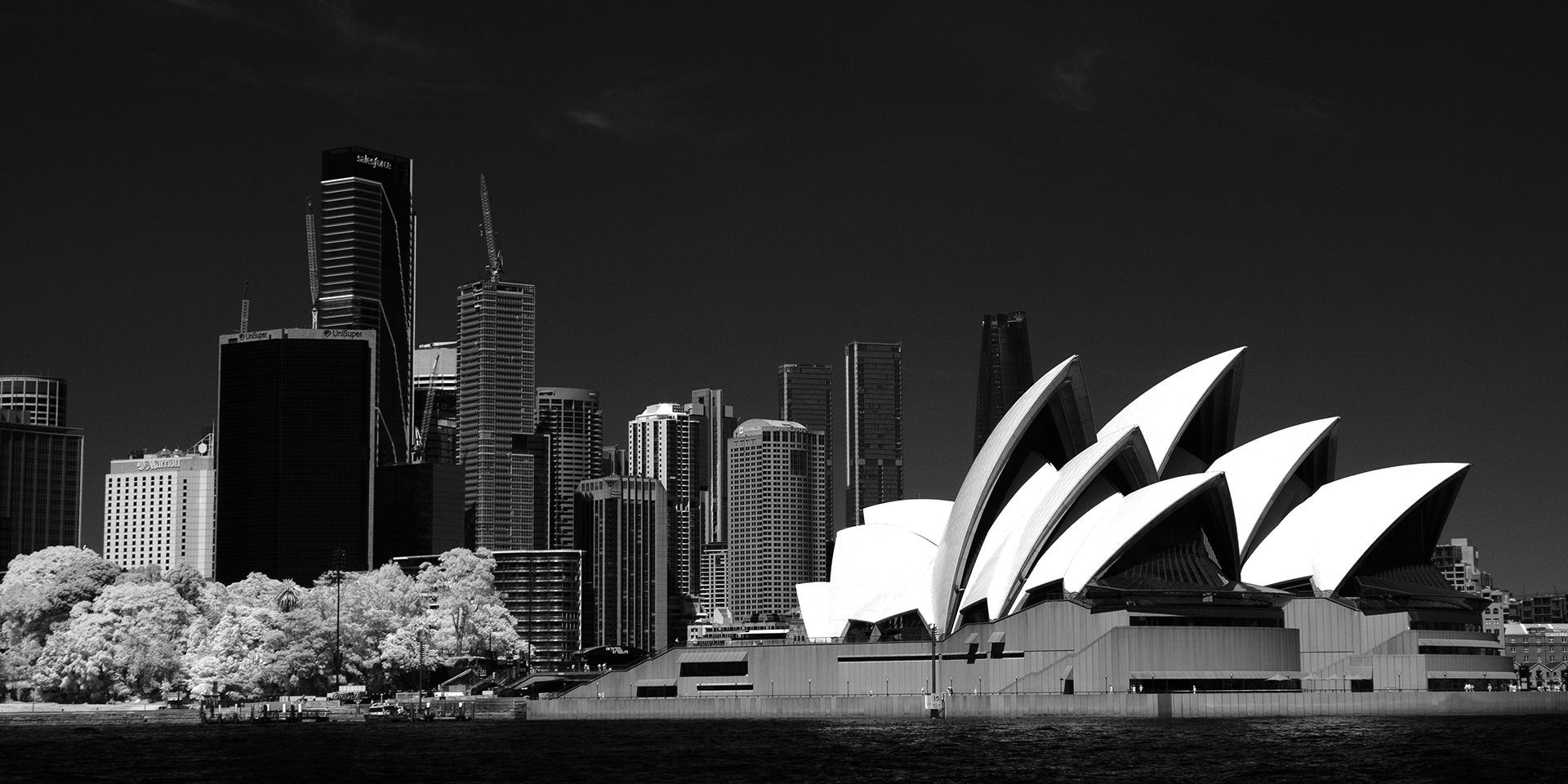
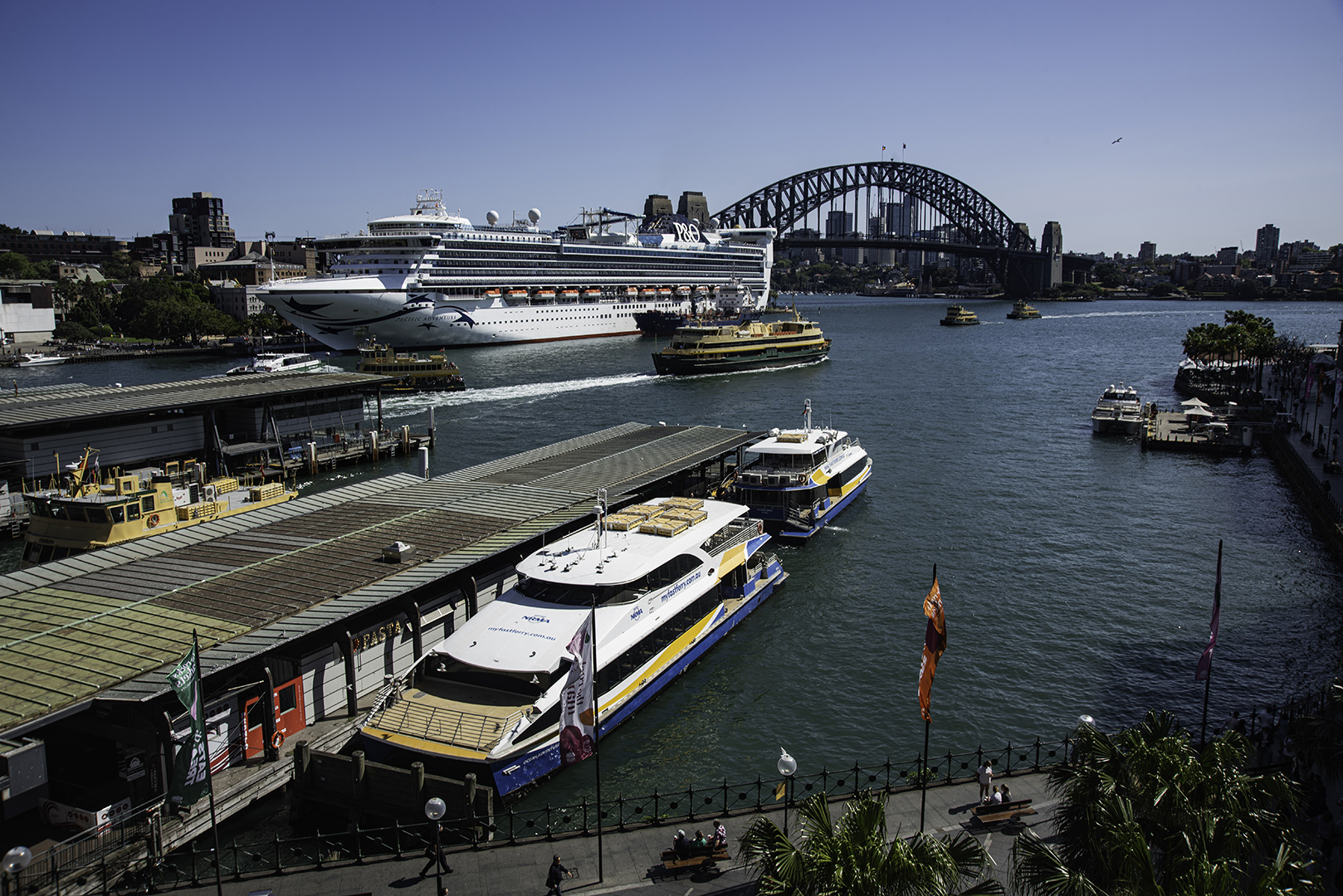
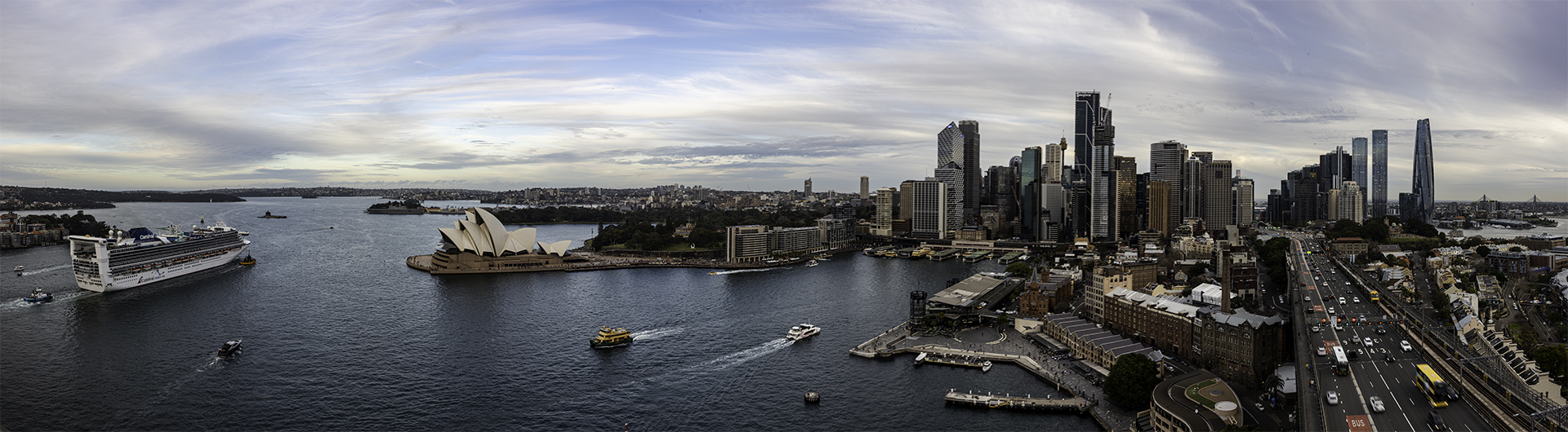
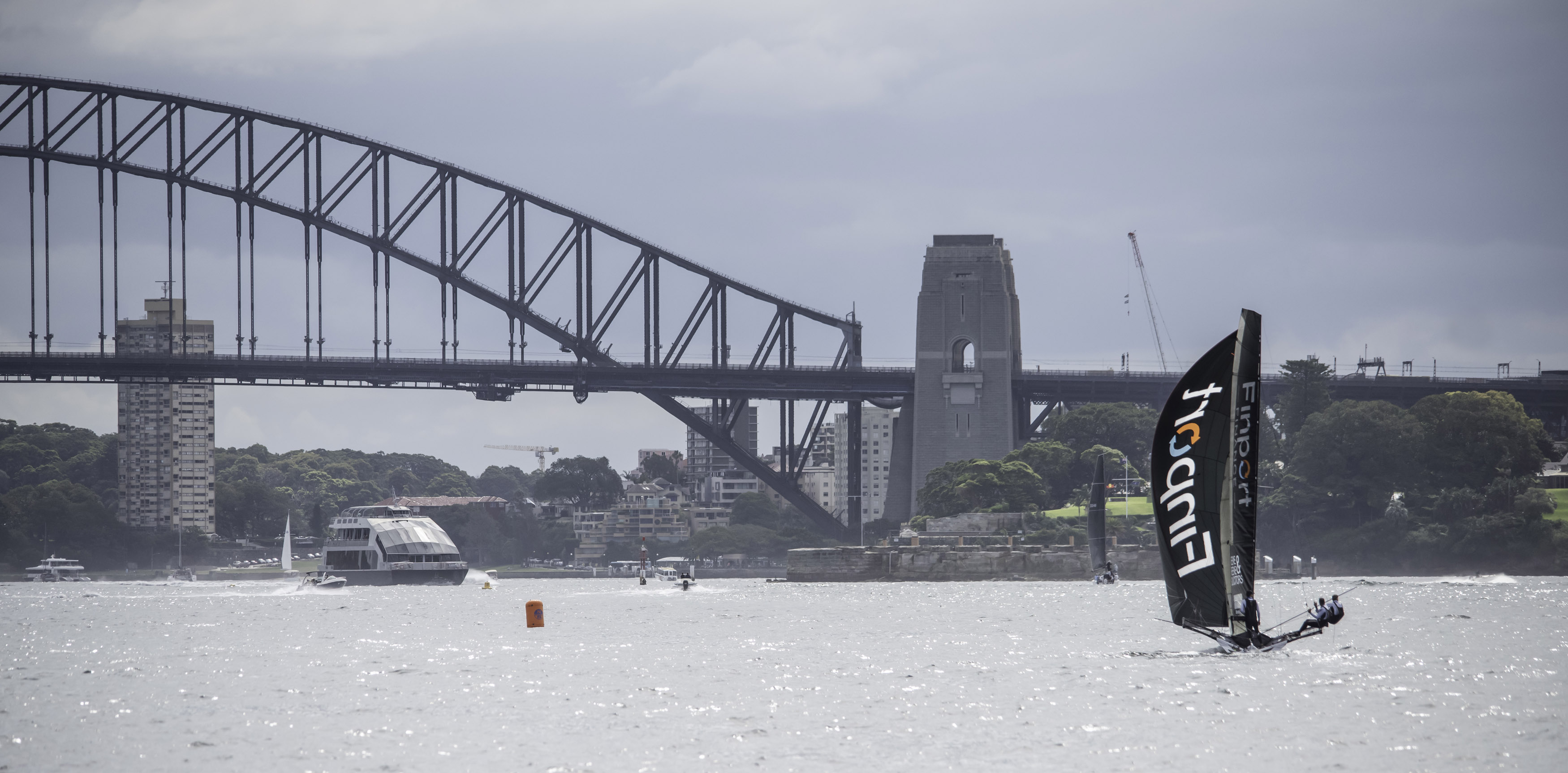
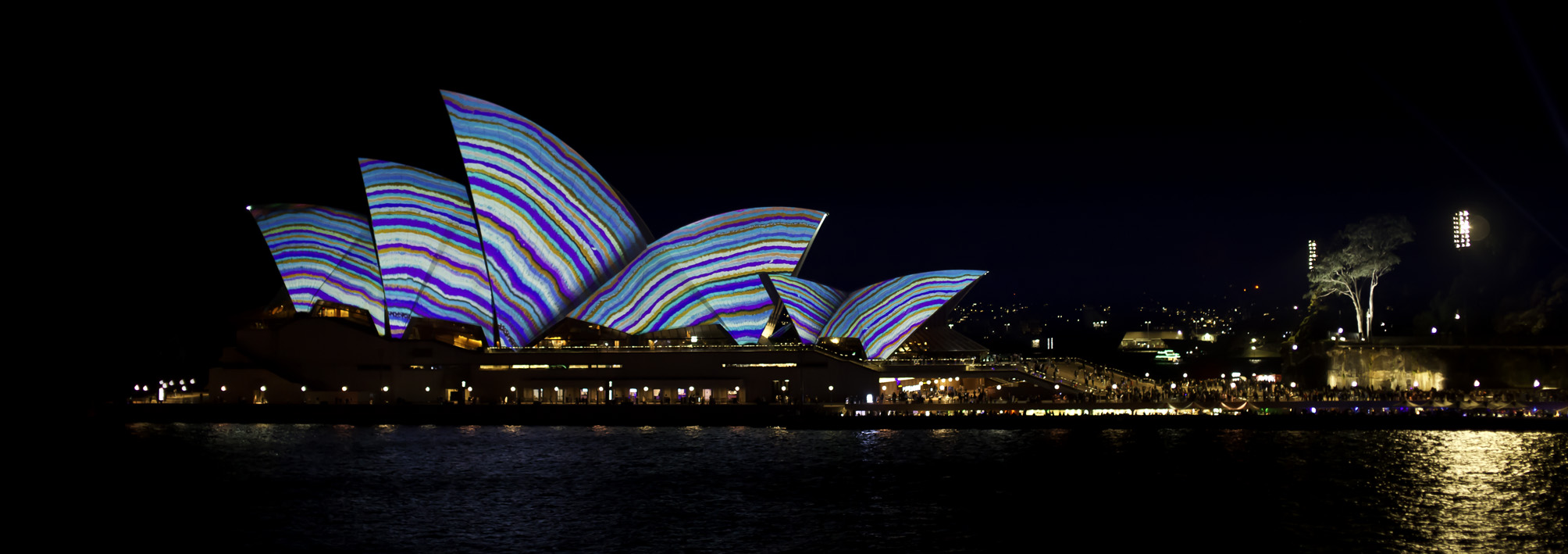
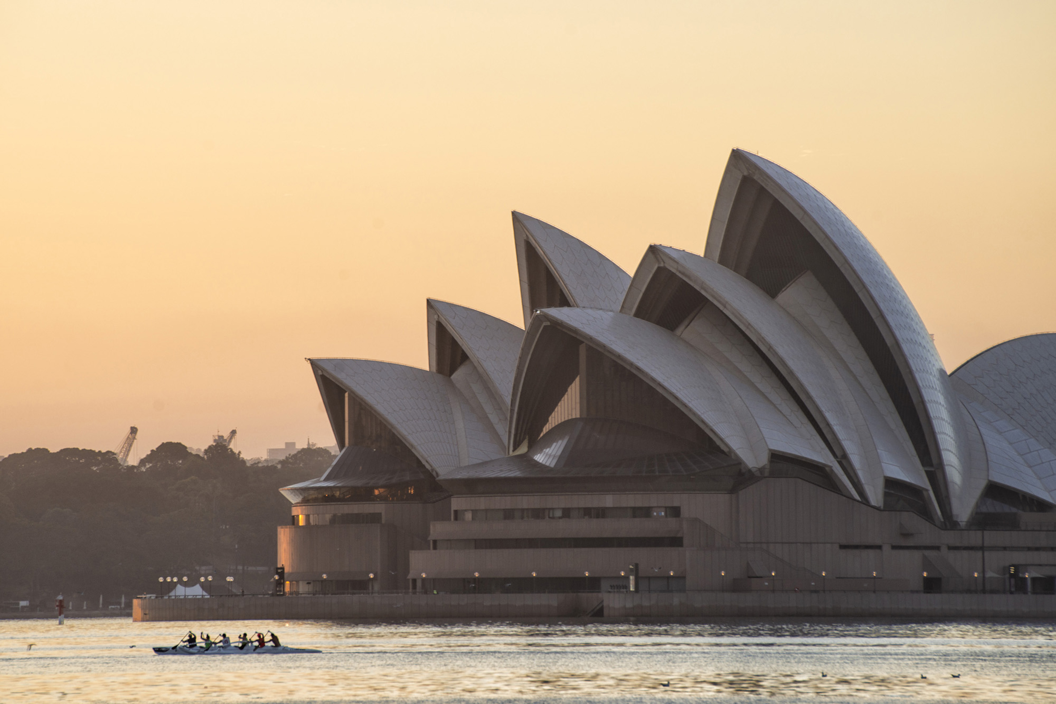
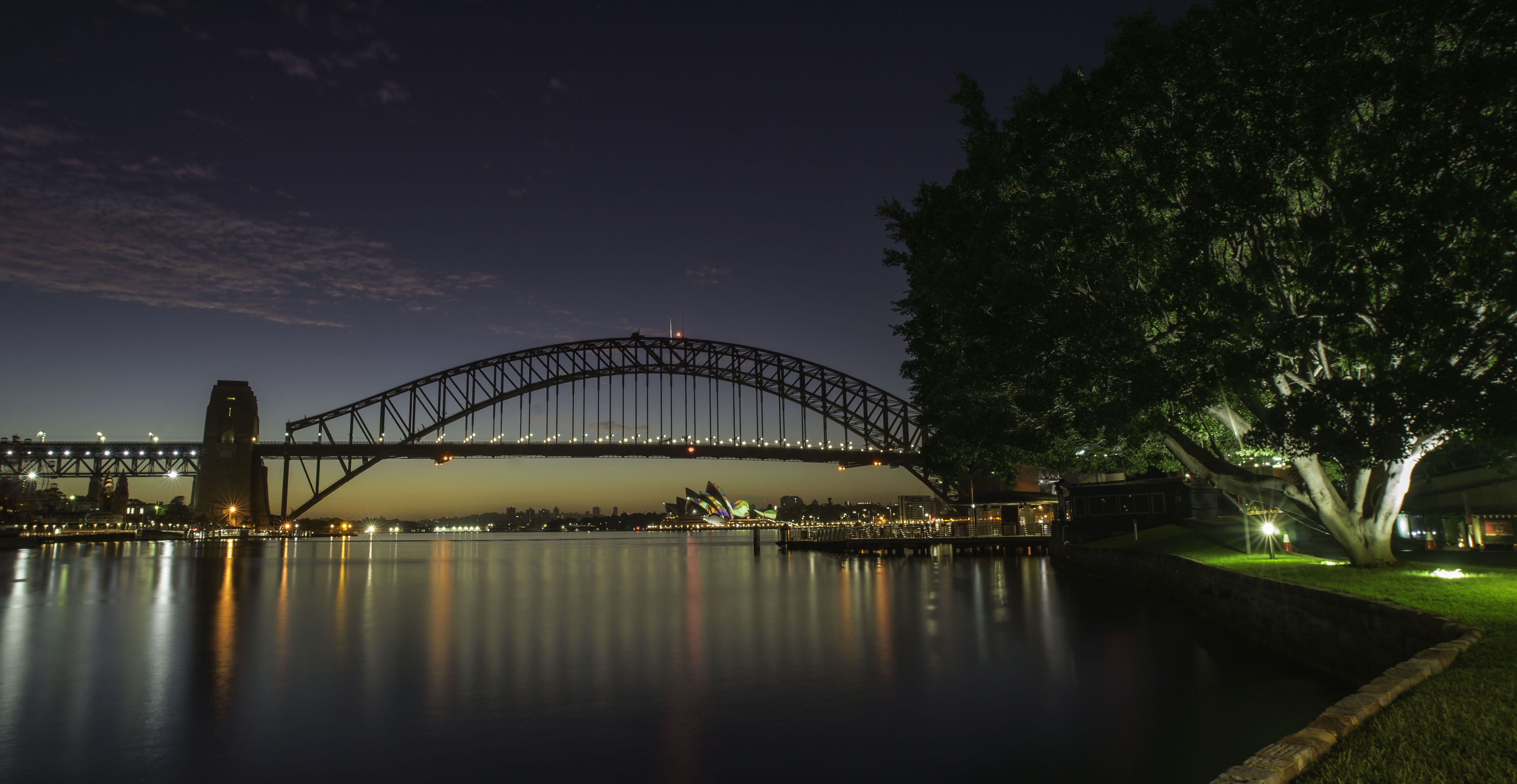
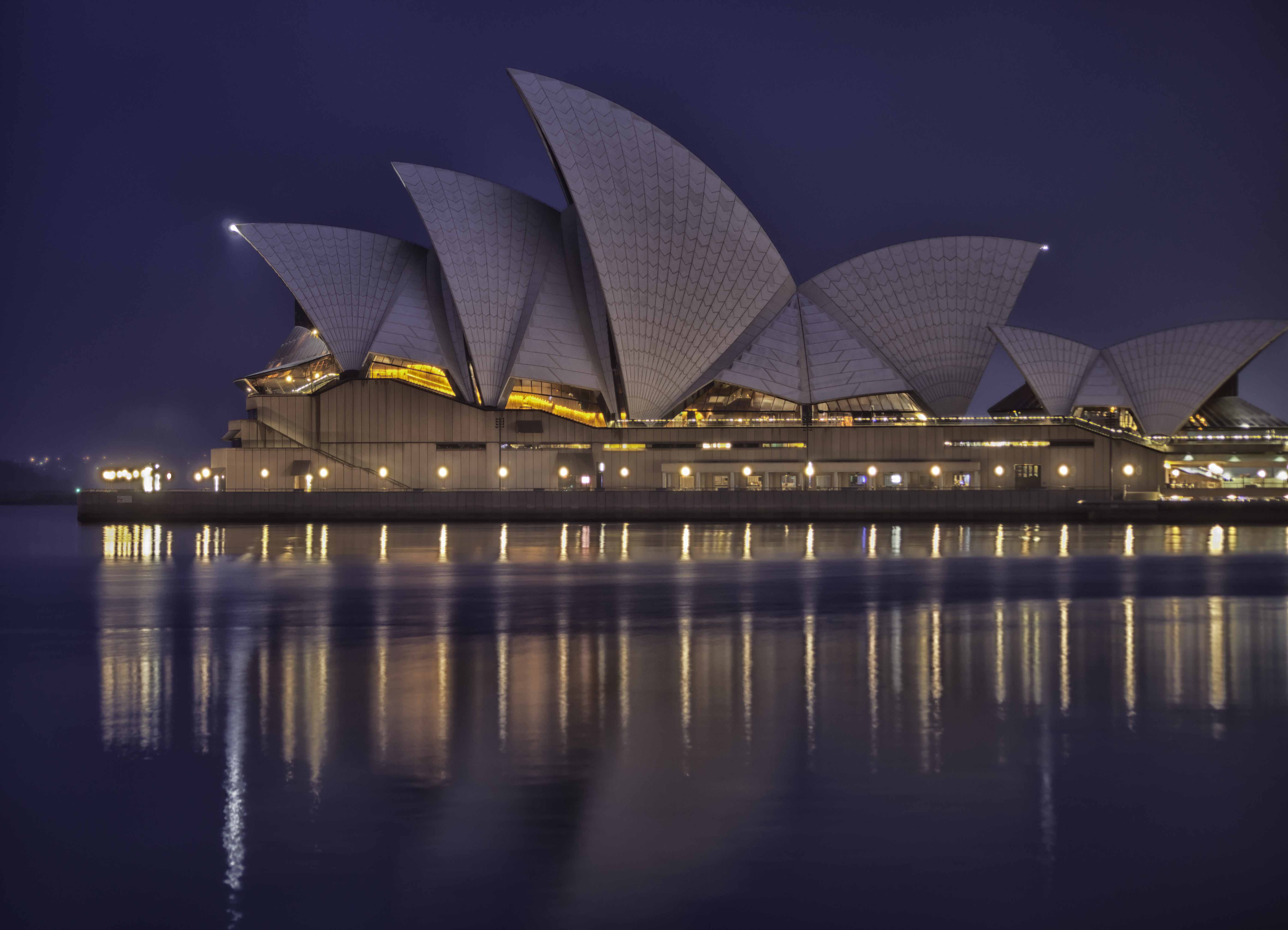
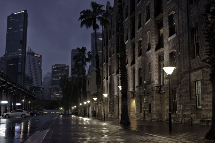
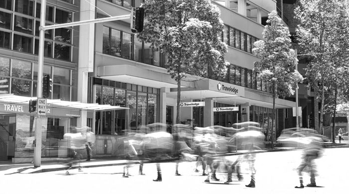
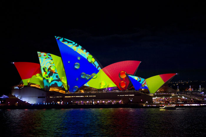
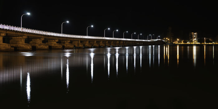
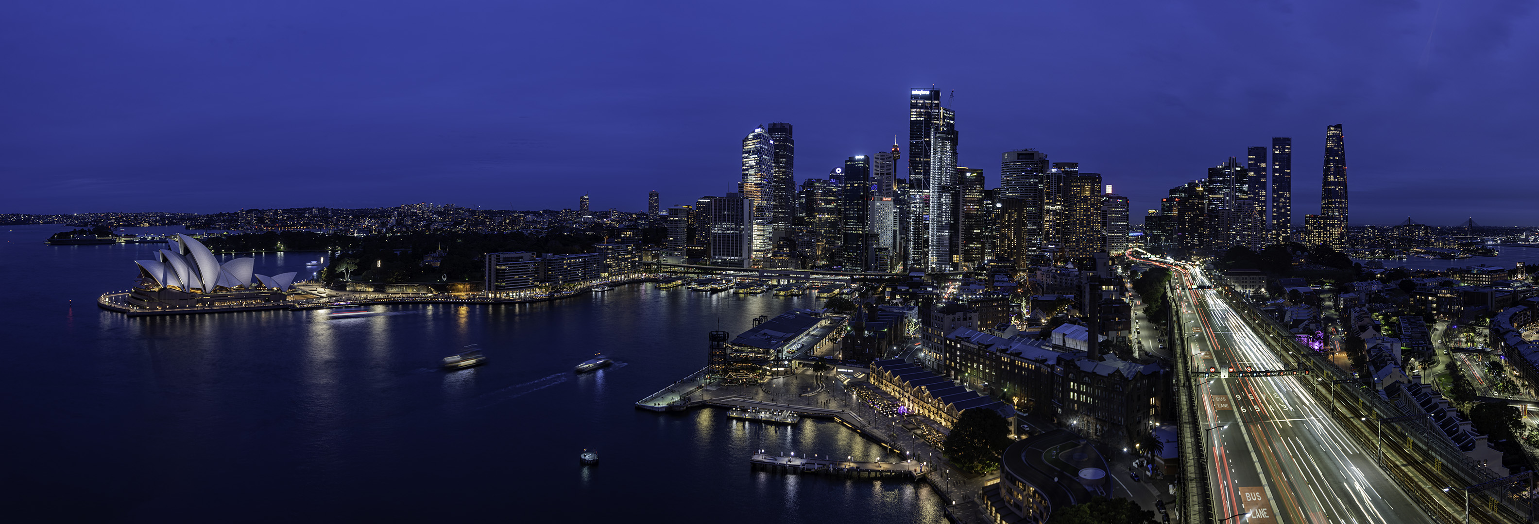
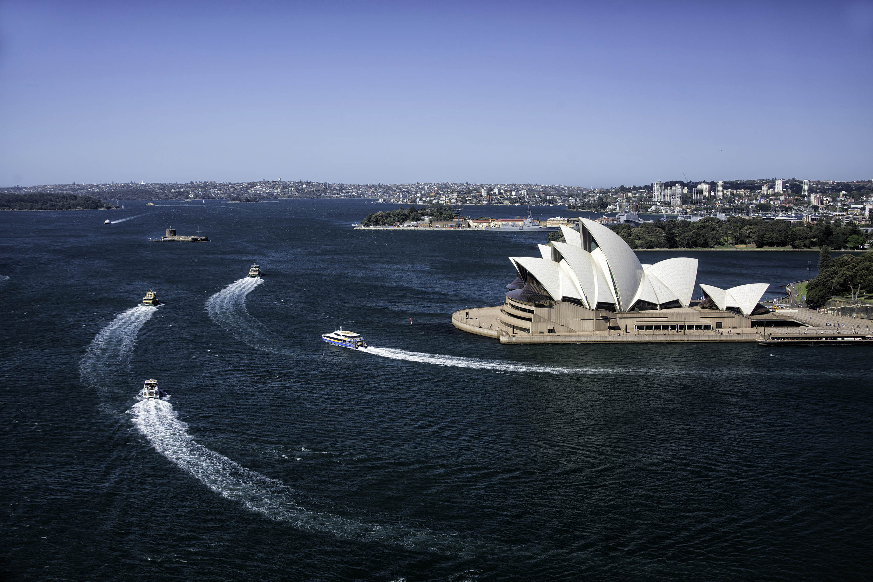
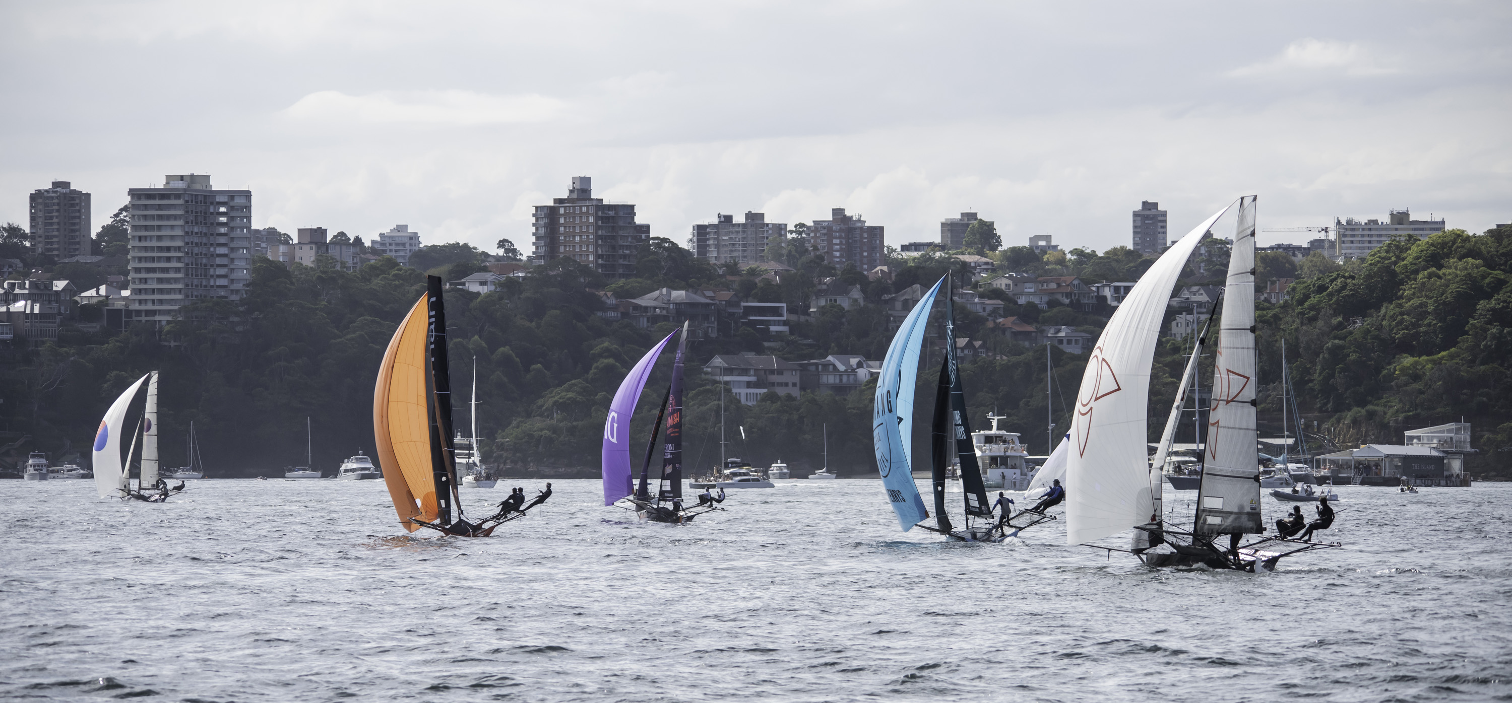
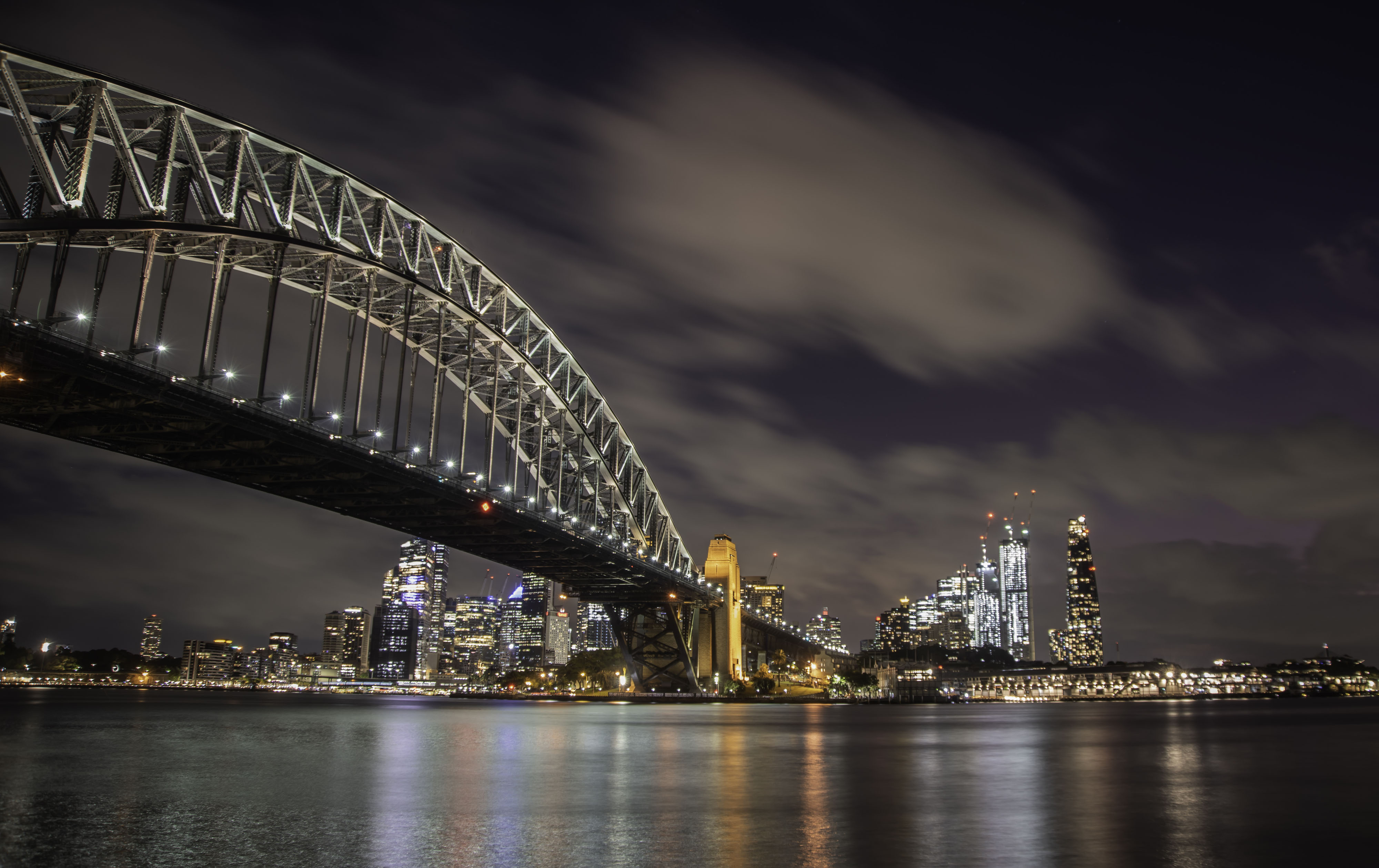
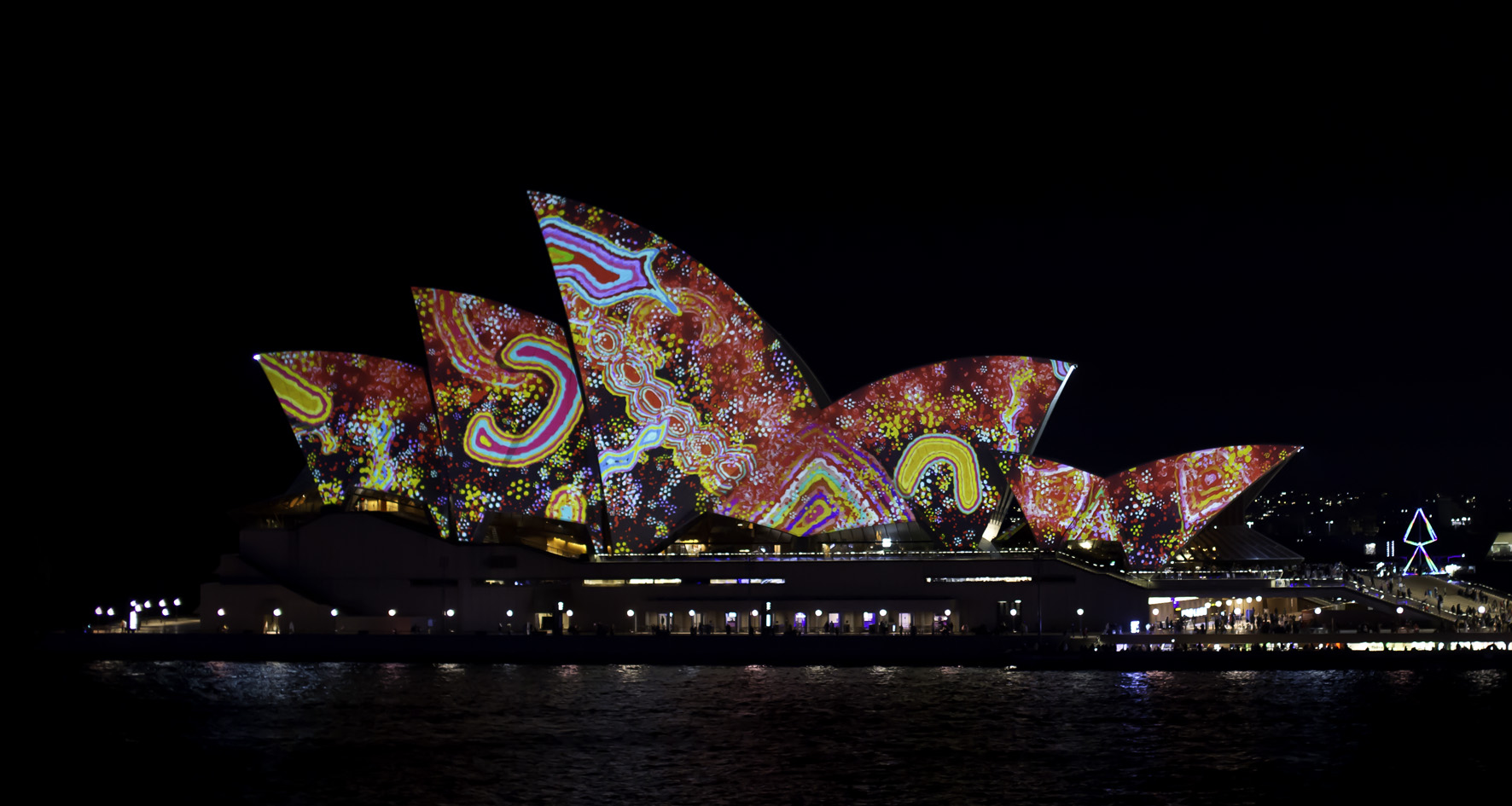
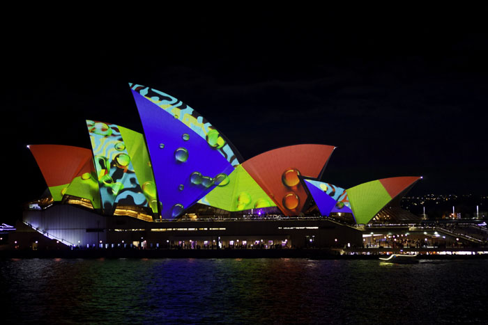
Thanks for your comments Sherry. The trip to the top is relatively easy. The staircase is inside the pilon and begun from the pedestrian walkway on the bride surface. It's just 165 steps up. Yes breezy up there but the only danger is to the hairdo. While I was there that day I had my first attempt at taking some photos to be stitched together. Not too bad for a first attempt, but I will return in the near future to have a better attempt. The park behind the opera house is a very small part of Sydney Botanical Gardens which go quite a distance back into the city. That crescent moon is a sculpture but I'm not sure what it represents. It seems I've succeeded with my mission with this photo, that is showing a little more of our city and harbour than is usually seen. |
Sep 23rd |
| 73 |
Sep 24 |
Reply |
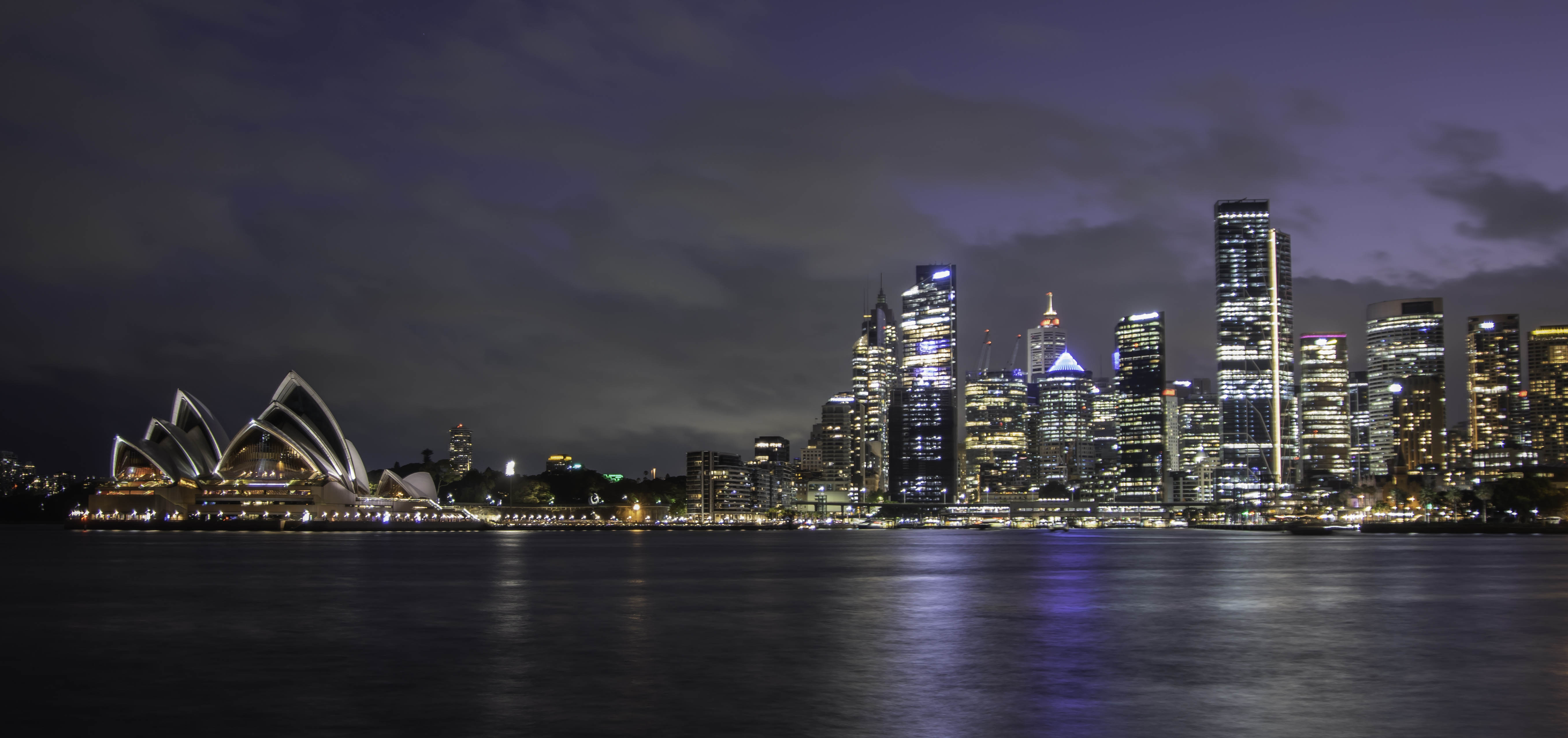
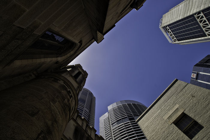
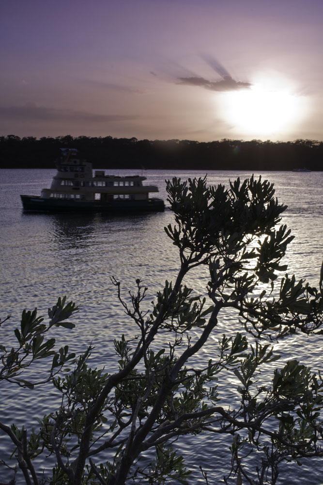
Thanks for your comments Butch. This is an example of why our art/craft of photography is so subjective, with no one being correct.I don't mind a plain blue sky, when it doesn't dominate an image. The sky here is less than 15% of the total image area and serves to show the horizon and "ending" of the city in this scene. In my eyes, your clouds don't sit well colour wise. They look like they have been added, which is what they're not supposed to do. The ferry without the wake makes me ask "Why is it waiting? What's happening out of shot to the right?" Contrast, texture and clarity have already been added, I just believe in "less is best" and not over-doing it. The temperature is as the day was. I'm not a fan of vignettes, I can take them or leave them. I do appreciate your comments. |
Sep 23rd |
| 73 |
Sep 24 |
Comment |
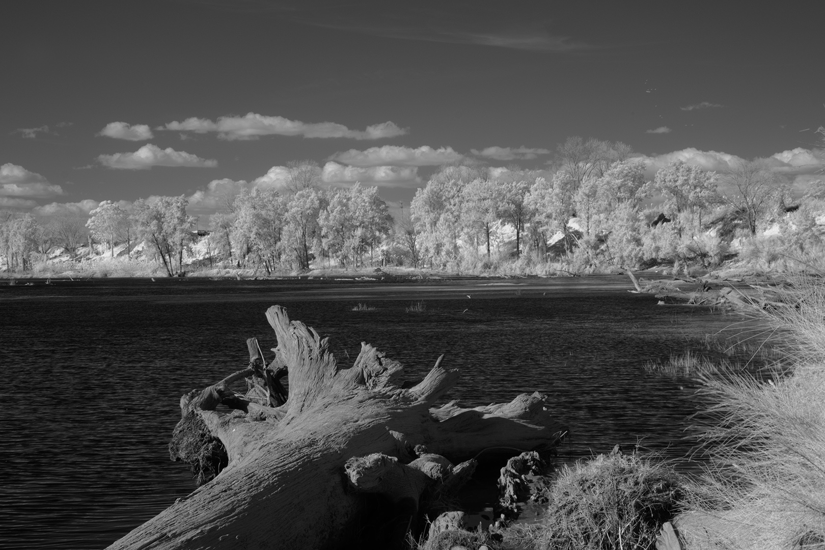
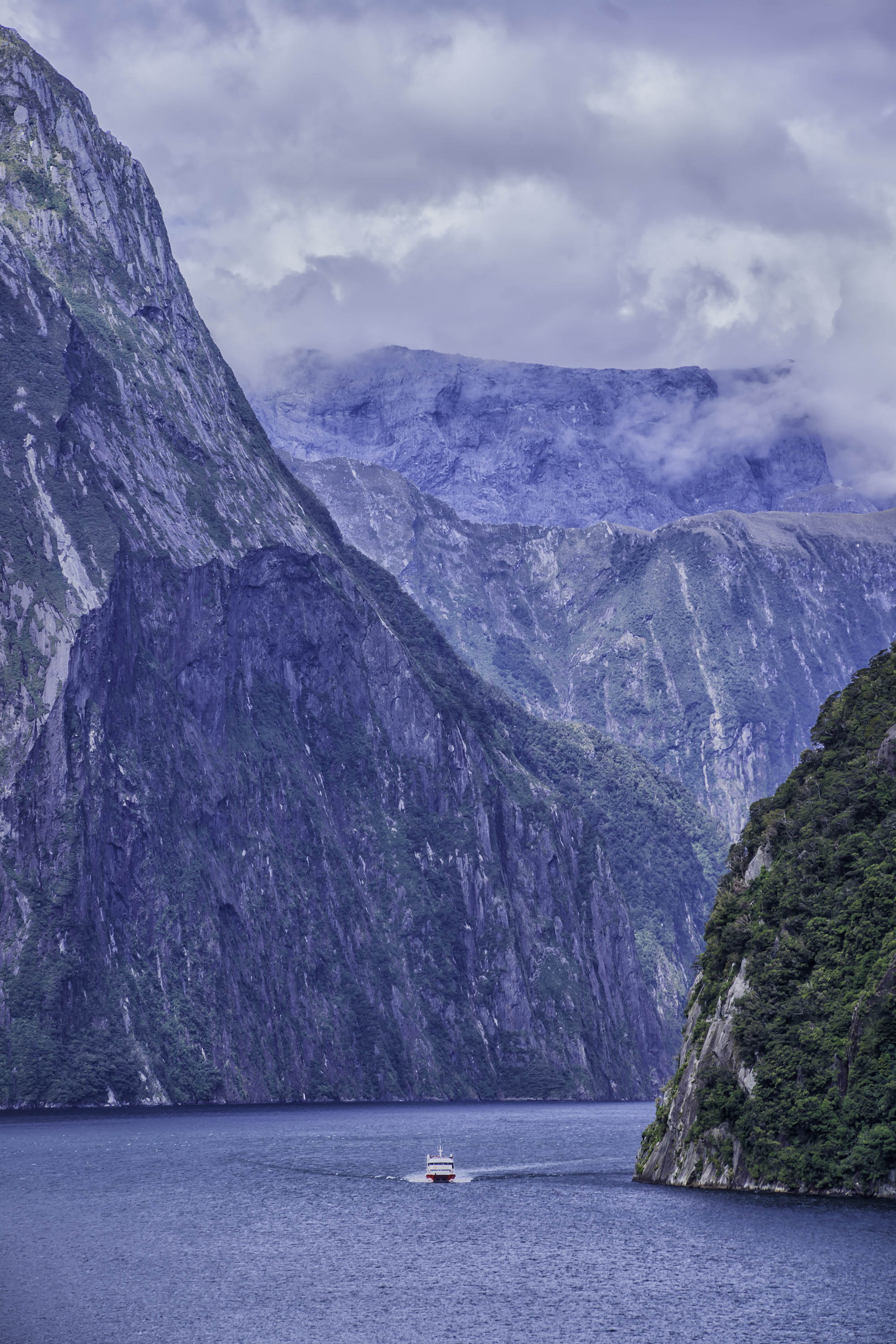
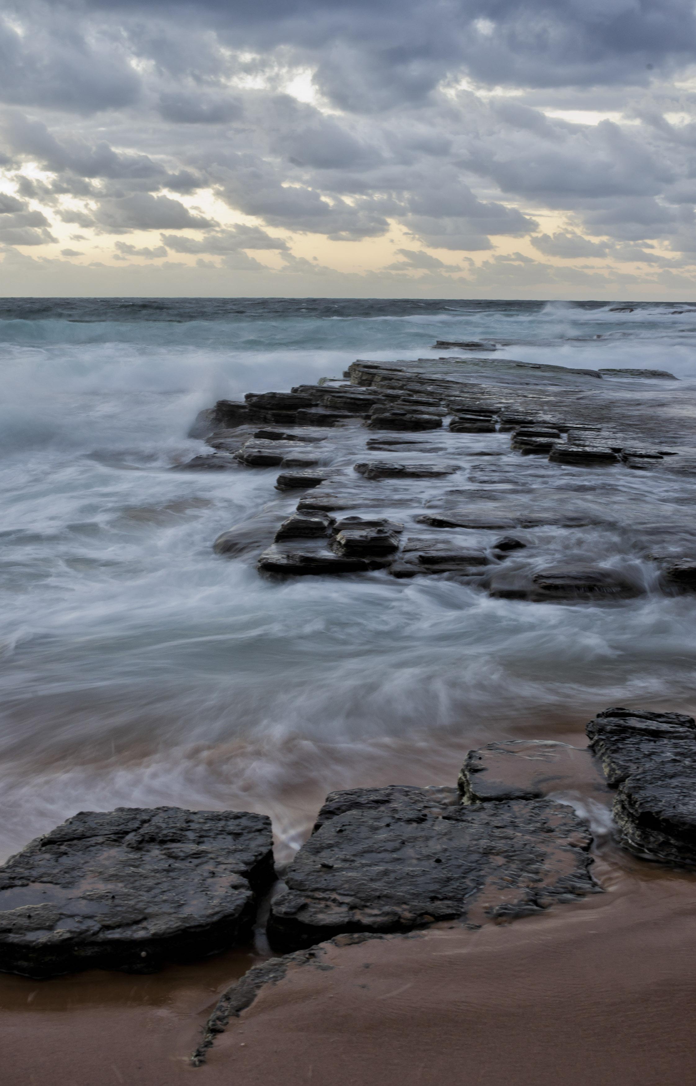
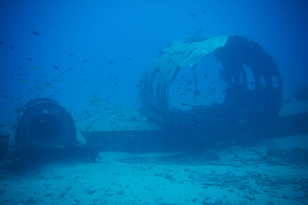
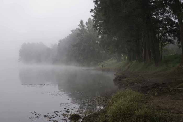
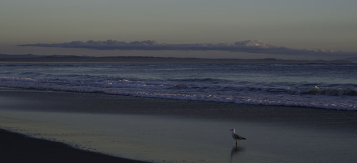
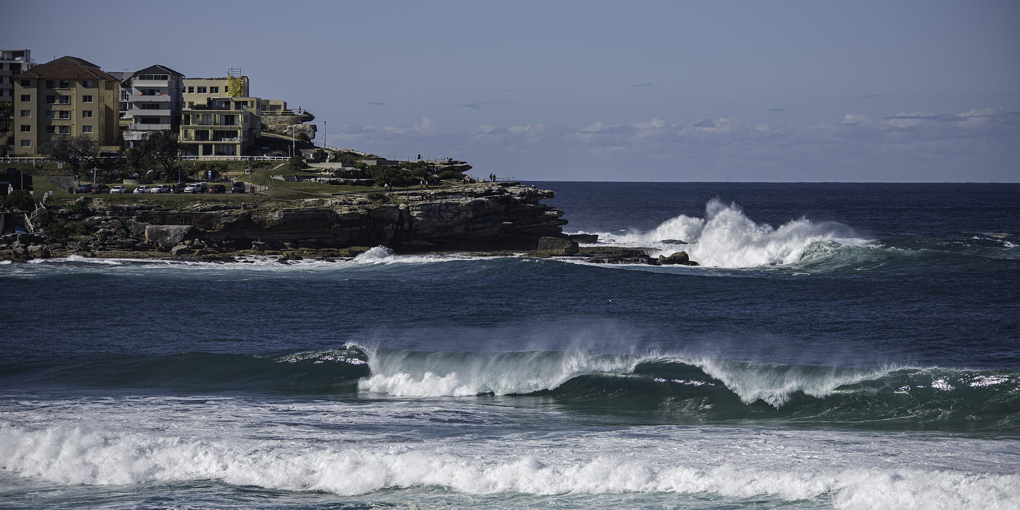
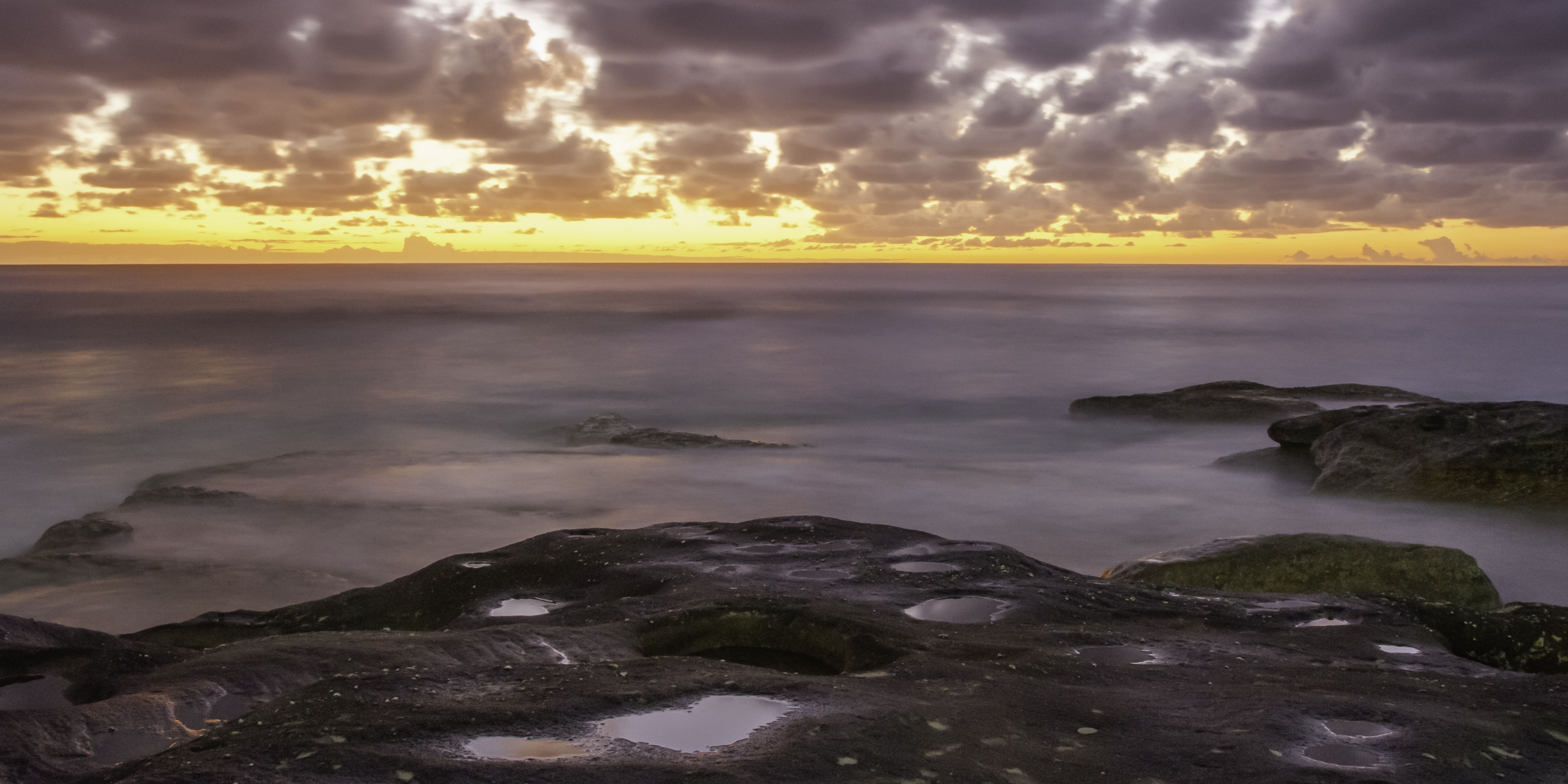
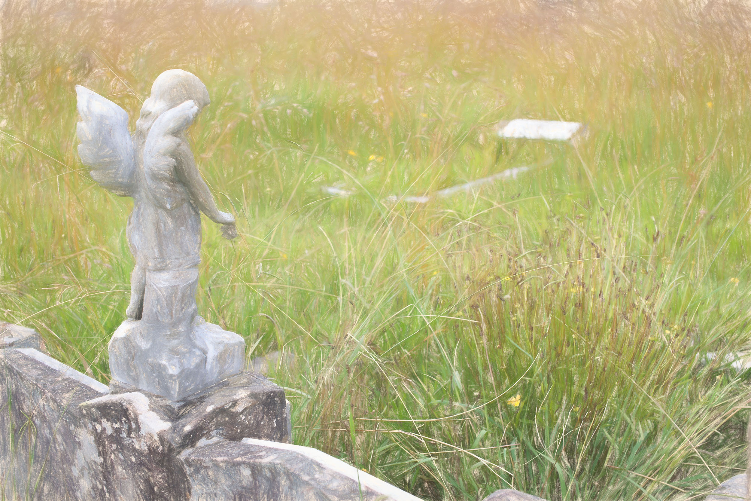
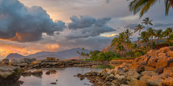
A very strong image Butch, up there with the best and one to be proud of. But can I ask a question please? You tell us this is a lagoon and I'm reading this image as being a location where boats can shelter away from the open ocean. Just left of centre and just below the horizon line, I see a sign / marker. While I appreciate its use for navigation, maybe as far as this image is concerned, it could be removed.That's just me thinking out loud. |
Sep 23rd |
| 73 |
Sep 24 |
Comment |
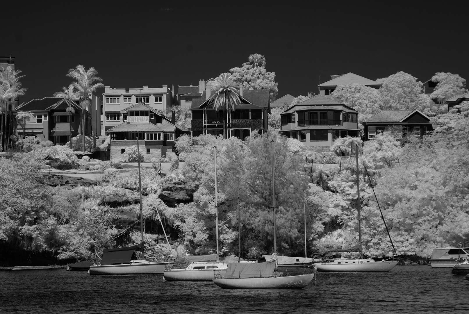
This is a great image Gary. I fully appreciate the difficulties of taking photos when in a group, particularly when others are not photographers. While I personally don't mind the greenery in your presented image and I can't see Butch's vf image, I do see where he's coming from. |
Sep 23rd |
| 73 |
Sep 24 |
Comment |
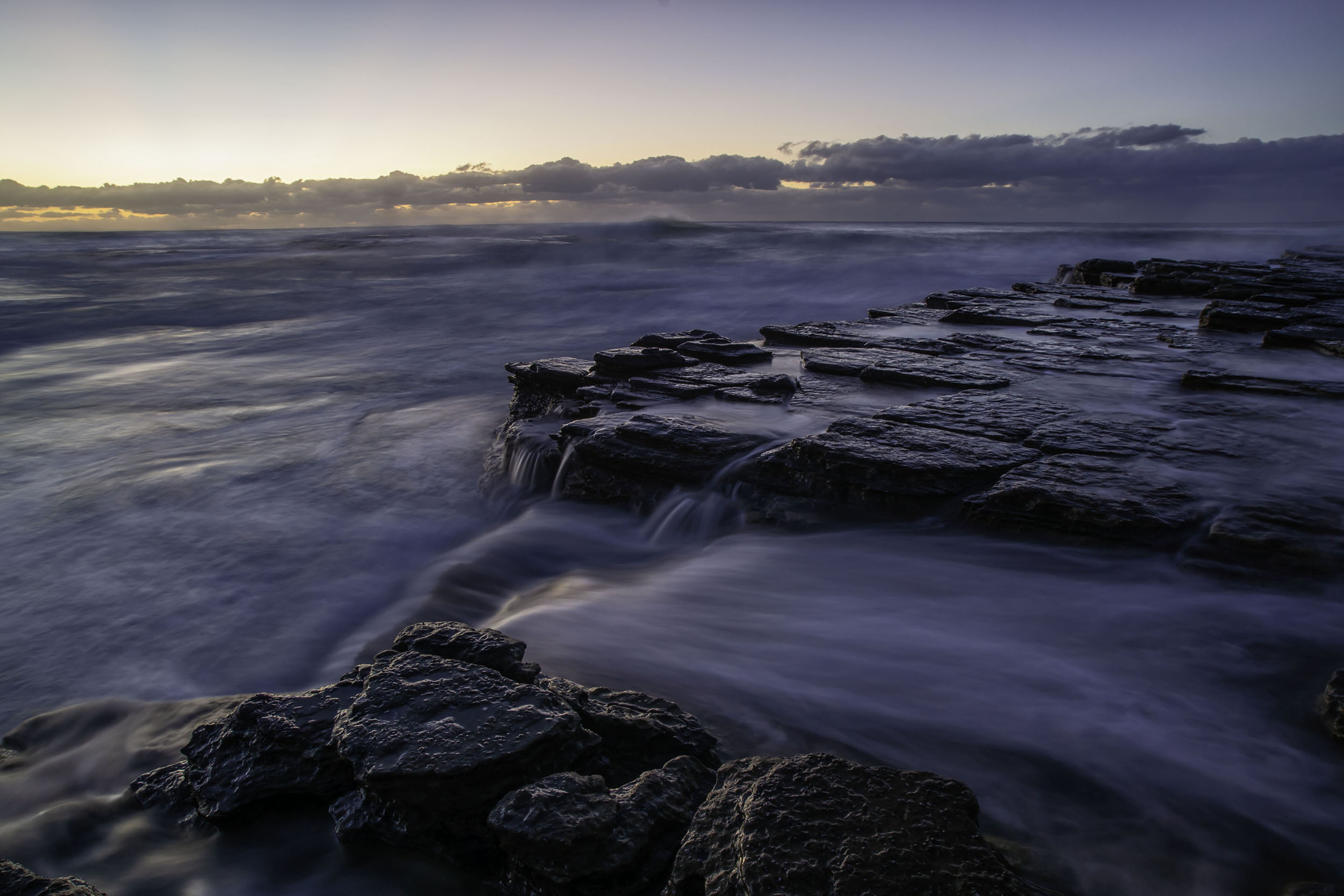
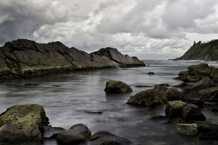
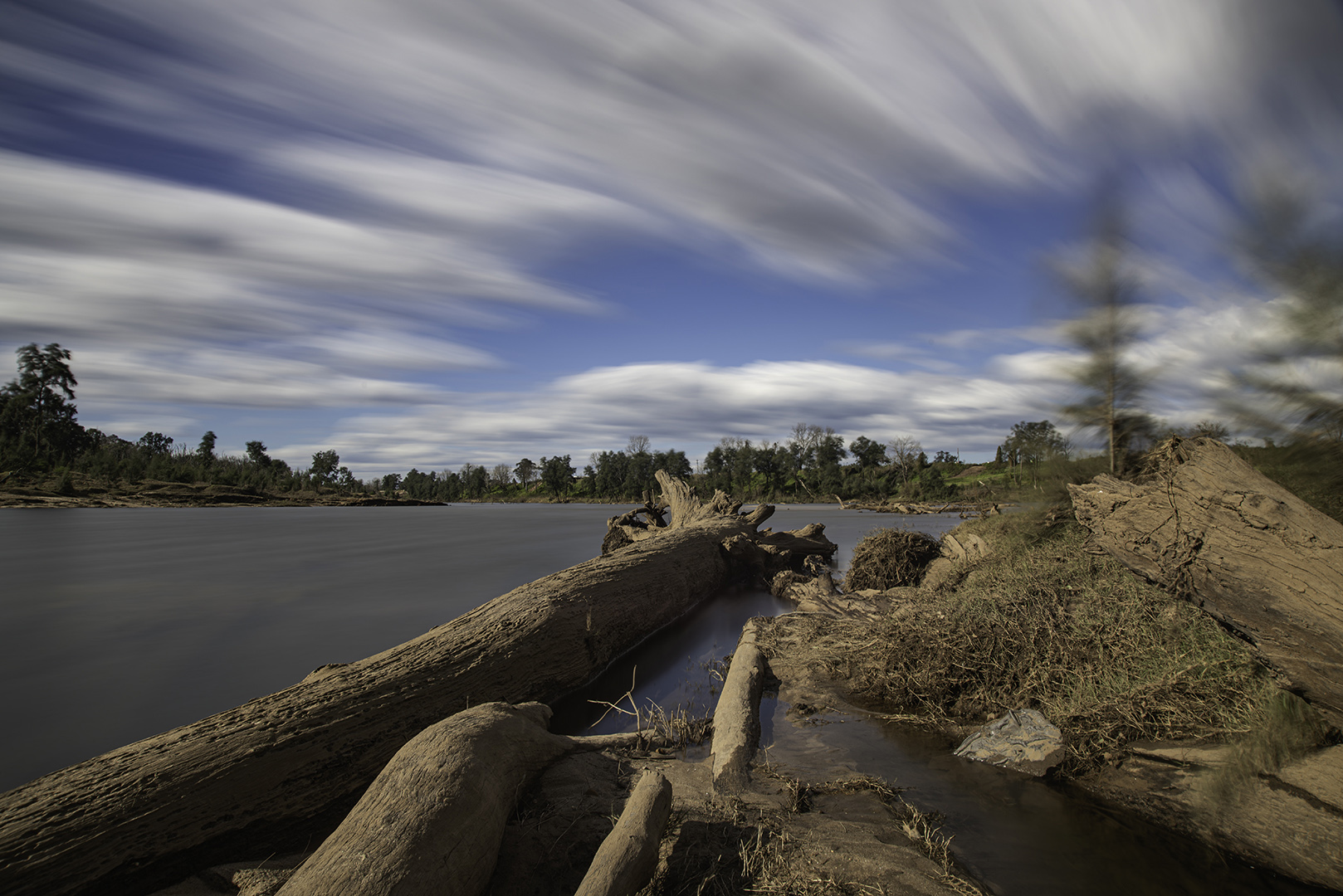
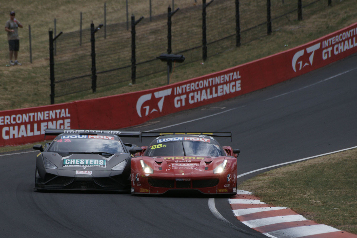
A great image Peter, as we're used to seeing from you. But, we don't often see B&W. Your use of 12 stops of ND is excellent and has great effect. |
Sep 23rd |
| 73 |
Sep 24 |
Comment |
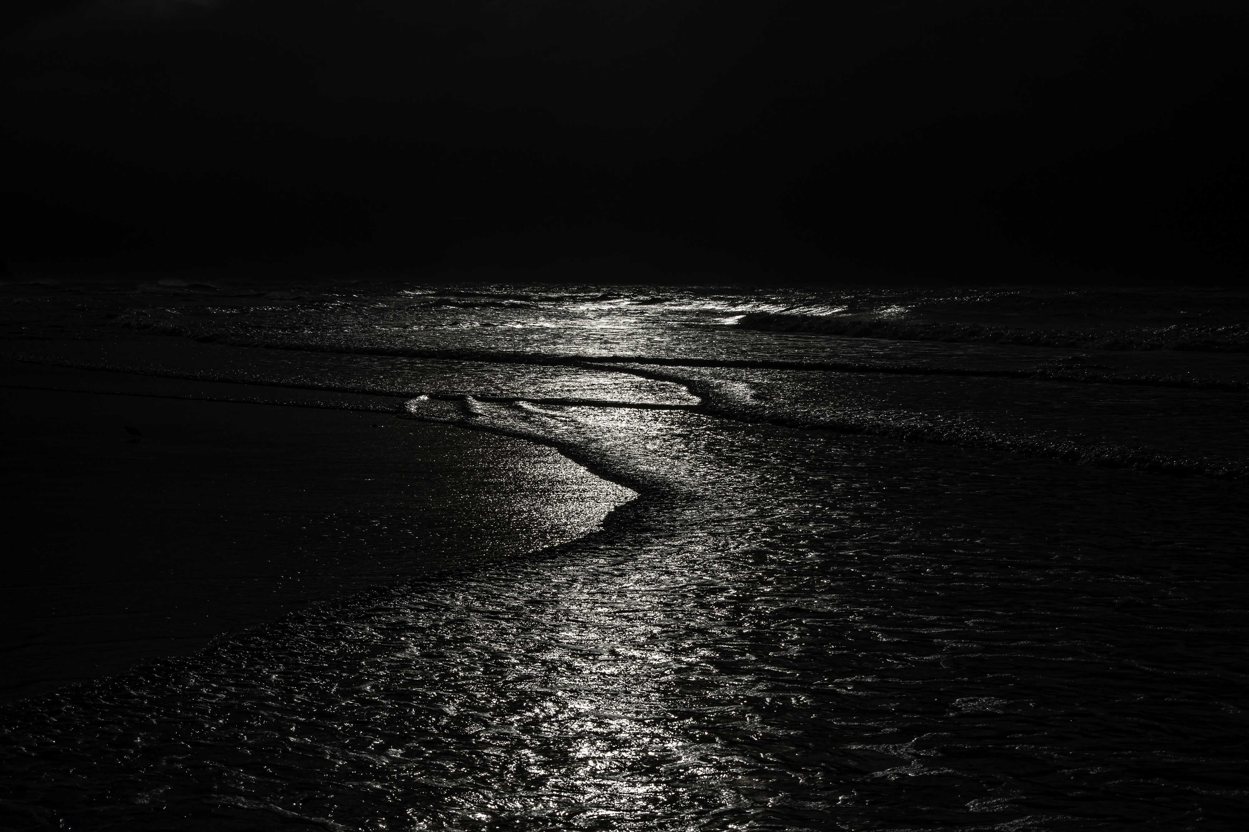
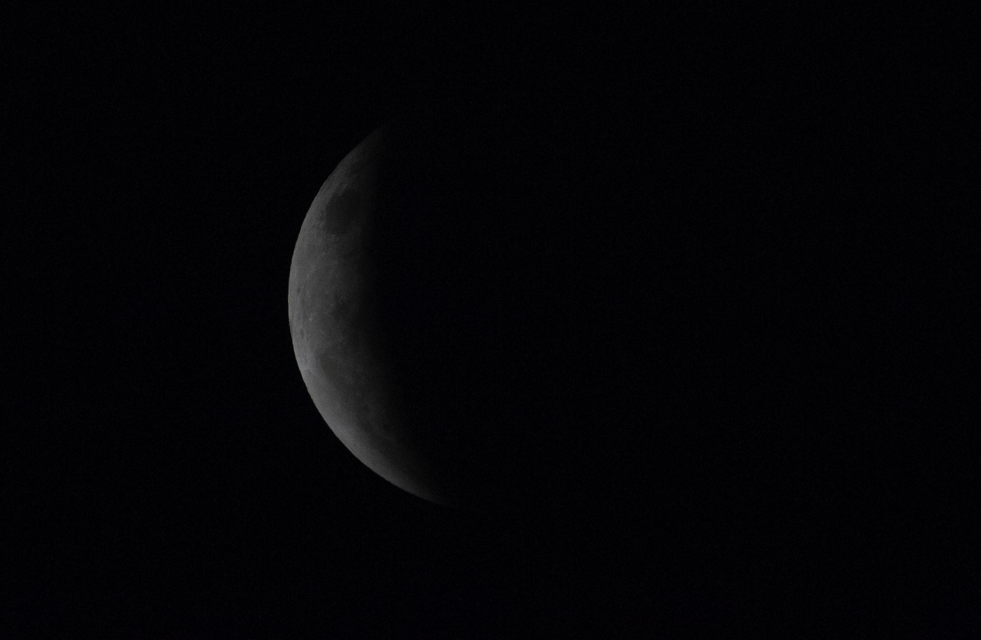
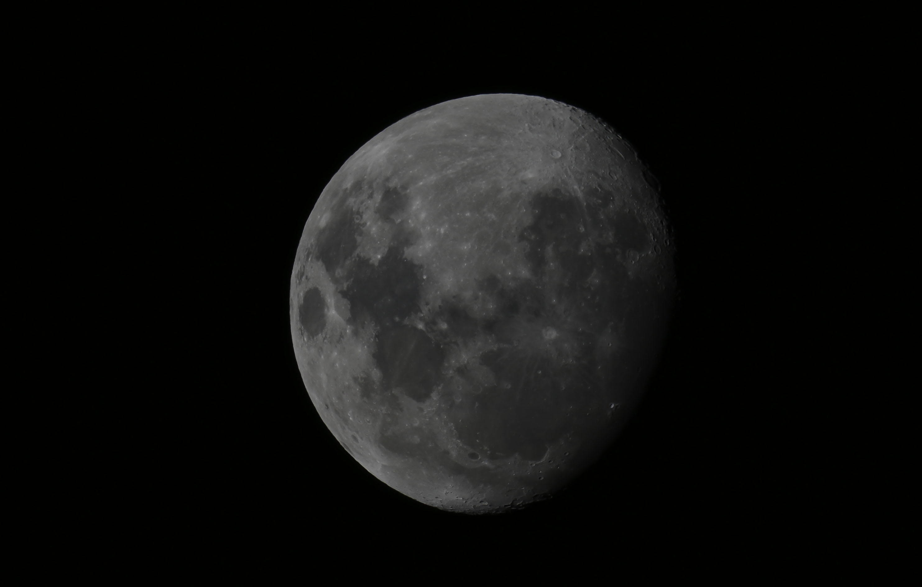
When I first saw this image Sherry, I thought WOW, what a stunner. Your thinking, capture and processing technique are all excellent (almost). Can I just ask a question please? And I'm looking at this with friendly but questioning eye. When I see an image of the moon like this and its reflection, I would expect to see the moon "directly" above its reflection. In this image, am I seeing it just a little off its reflection? I know you will take this question in the constructive manner that I intend it to be, and with a view of taking any external criticisms before they come. |
Sep 23rd |
6 comments - 5 replies for Group 73
|
| 76 |
Sep 24 |
Reply |
Thanks for your comments Gordon. There were quite a number of good "moments" while I was up there. Just as a very minor detail, I was only at the public viewing area of one of the bridge's pillons. The cost to get there is $25AUD. If you want to pay close to $300AUD you can join a guided tour that takes you to the very top of the arch, almost twice as high from where I was. I also believe you are NOT allowed to take cameras up there, because if you drop it, you could cause some grief to the road traffic below. That's understandable. I'm hoping to get back up there tomorrow to try some stitching. My very first attempt on that day was a successful failure, in that I learnt some good lessons. Watch this space. |
Sep 18th |
| 76 |
Sep 24 |
Reply |
Thanks for your comments Henriette. It was a great hour or so I was there and got a good selection of photos, all with the ferries in various states of coming and going. (See group 73). |
Sep 18th |
| 76 |
Sep 24 |
Comment |
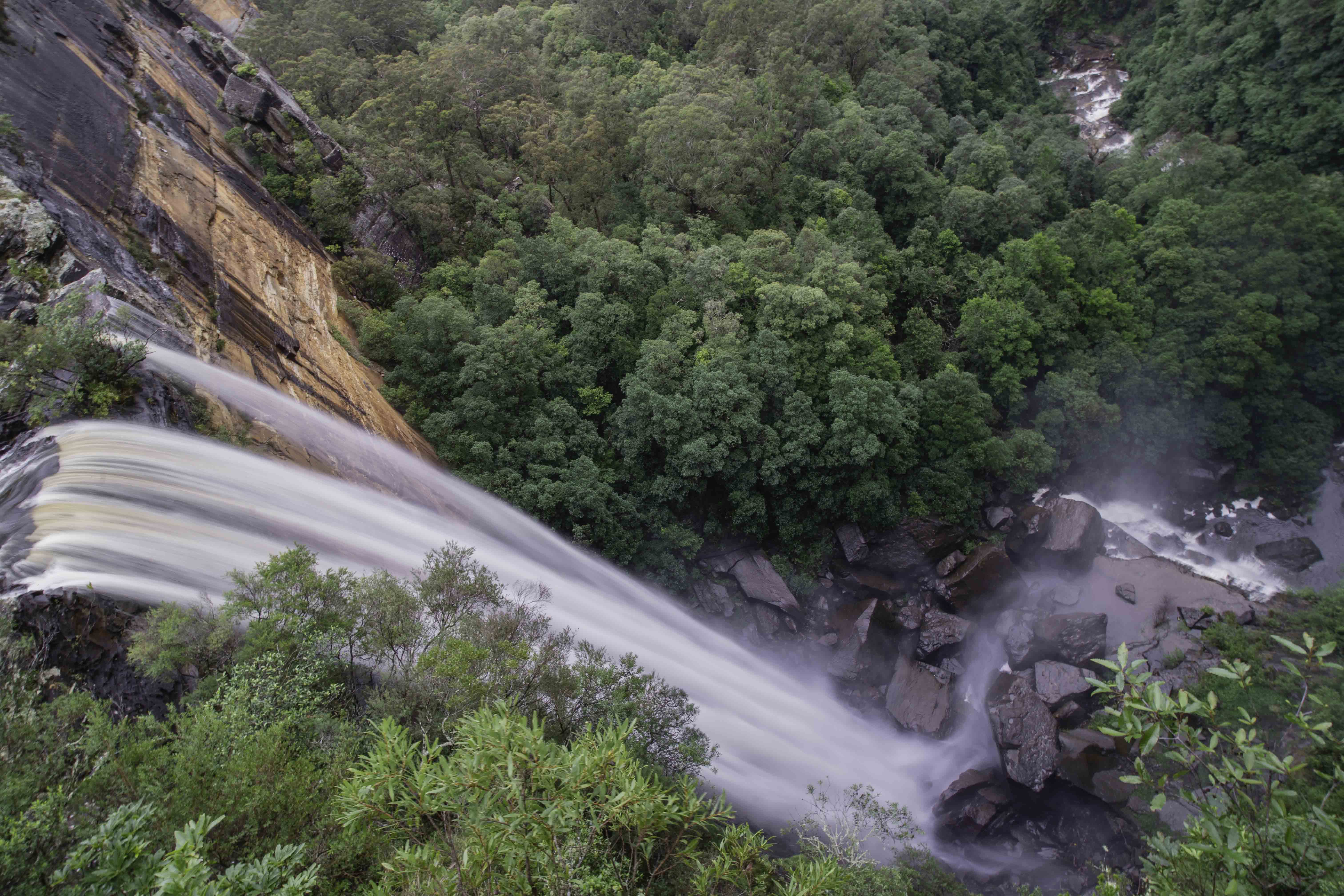
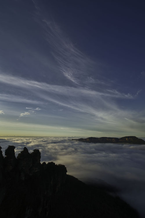
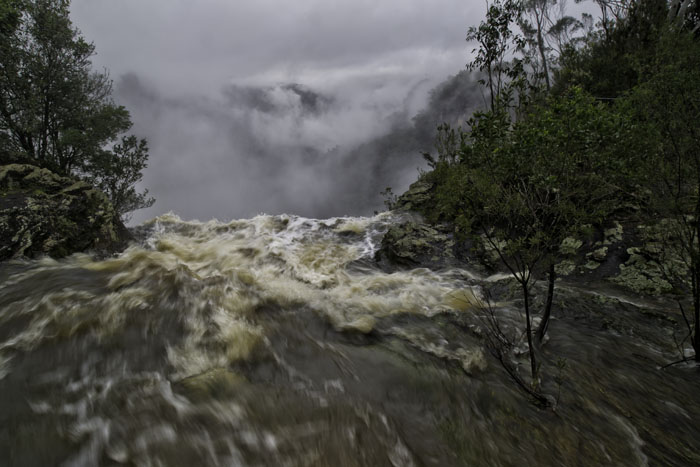
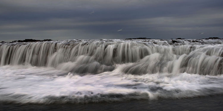
A fine drone image Sanford, keep working with it. I can only comment on the image itself and I ask that although I appreciate the vastness and ruggedness of the Icelandic landscape, is there any way you could have positioned the drone to show the sheep and waterfall more prominently in your image? A change of angle perhaps? I believe they have live view. Please keep at it Sanford, because your results will improve and you have the means to show us some very different viewpoints and wonderful landscapes. |
Sep 18th |
| 76 |
Sep 24 |
Comment |
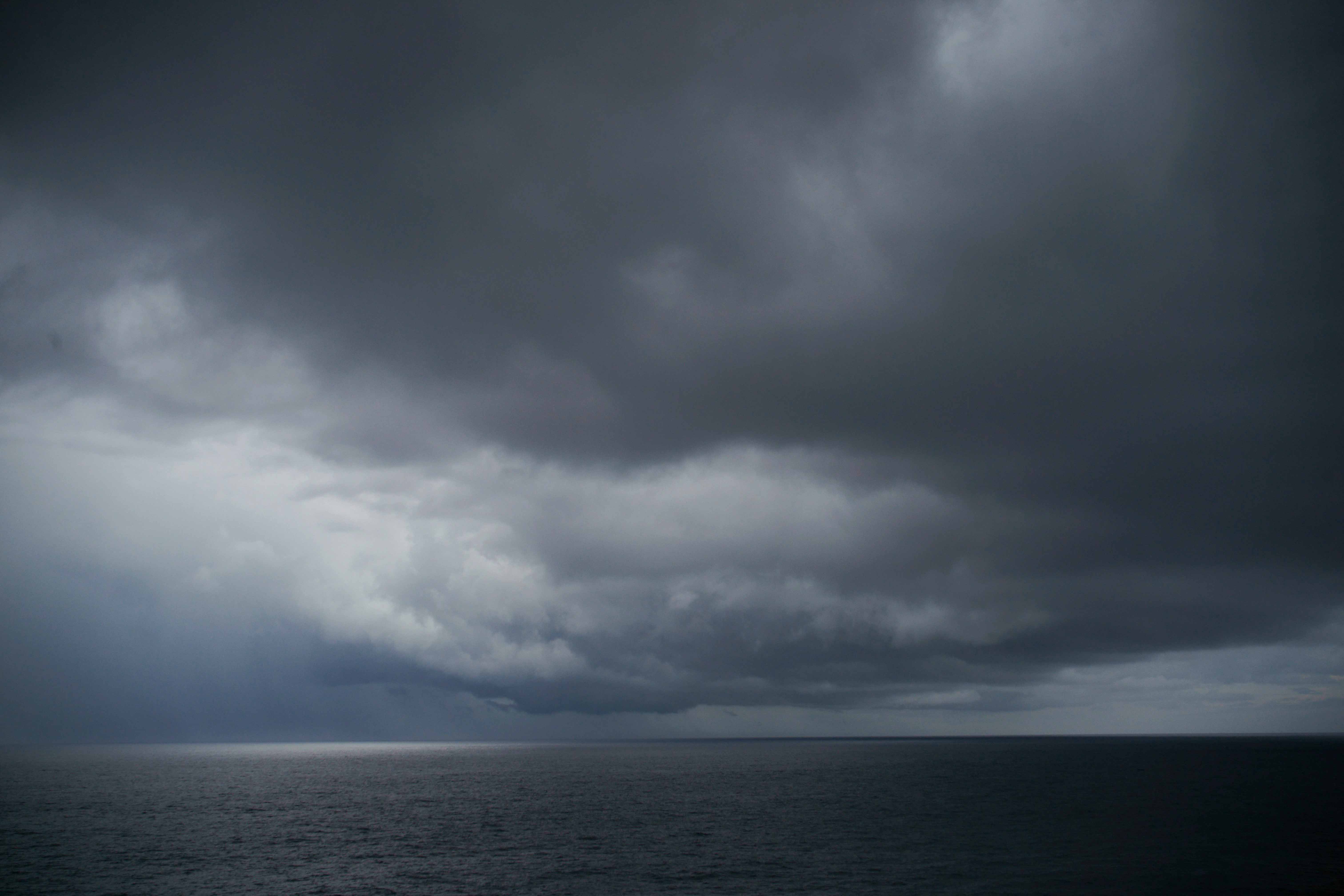
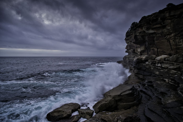
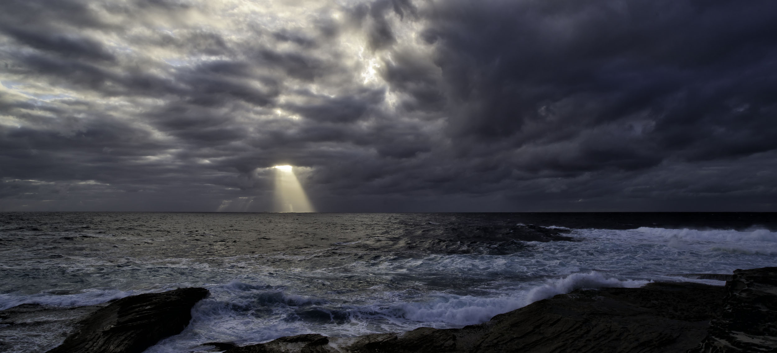
A great image Trey, from vision, through capture and processing to presentation. I don't have any issues with the colours myself, although I ask if it's possible to take a little of the blueness out of the sky? Perhaps a bit more grey might add to the drama of the approaching storm. But still, congratulations on a very strong image. |
Sep 18th |
| 76 |
Sep 24 |
Comment |
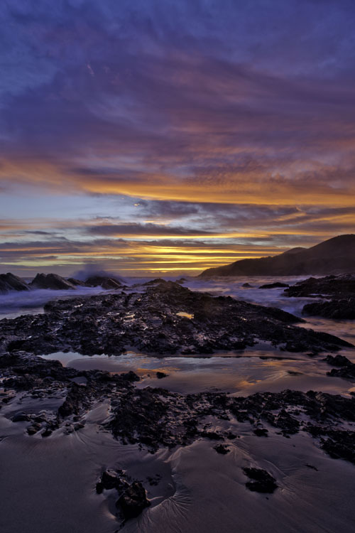
Stay in your backyard as long as you like Jay. This is a great image and I fully agree with Gordon, not too much water at all. If you think that, then you're way over thinking it. The final tight crop is excellent and focuses our attention right where you want it. Now go spray some flowers and go in close. Focus stacking is a very good option and not as scary as it seems. |
Sep 17th |
| 76 |
Sep 24 |
Comment |
A superb image Henriette. While you can basically say I'm allergic to camera club competitions, because I find all their rules monotonous and restrictive, I do agree with Gordon that all work should be the photographer's. Again, this image could easily be seen hanging on a wall. It's calming, soothing, romantic with enough detail for the viewer to keep looking at it time and time again. Very well done.
Now all you have to do is go photograph your own texture library. Rust, walls, tree bark and sand are good to start with. Who says they all have to be in focus and perfectly exposed? Try various amounts of under and over exposure, and then varying amounts of deliberate out of focus. Nothing to loose and everything to gain. |
Sep 17th |
| 76 |
Sep 24 |
Comment |
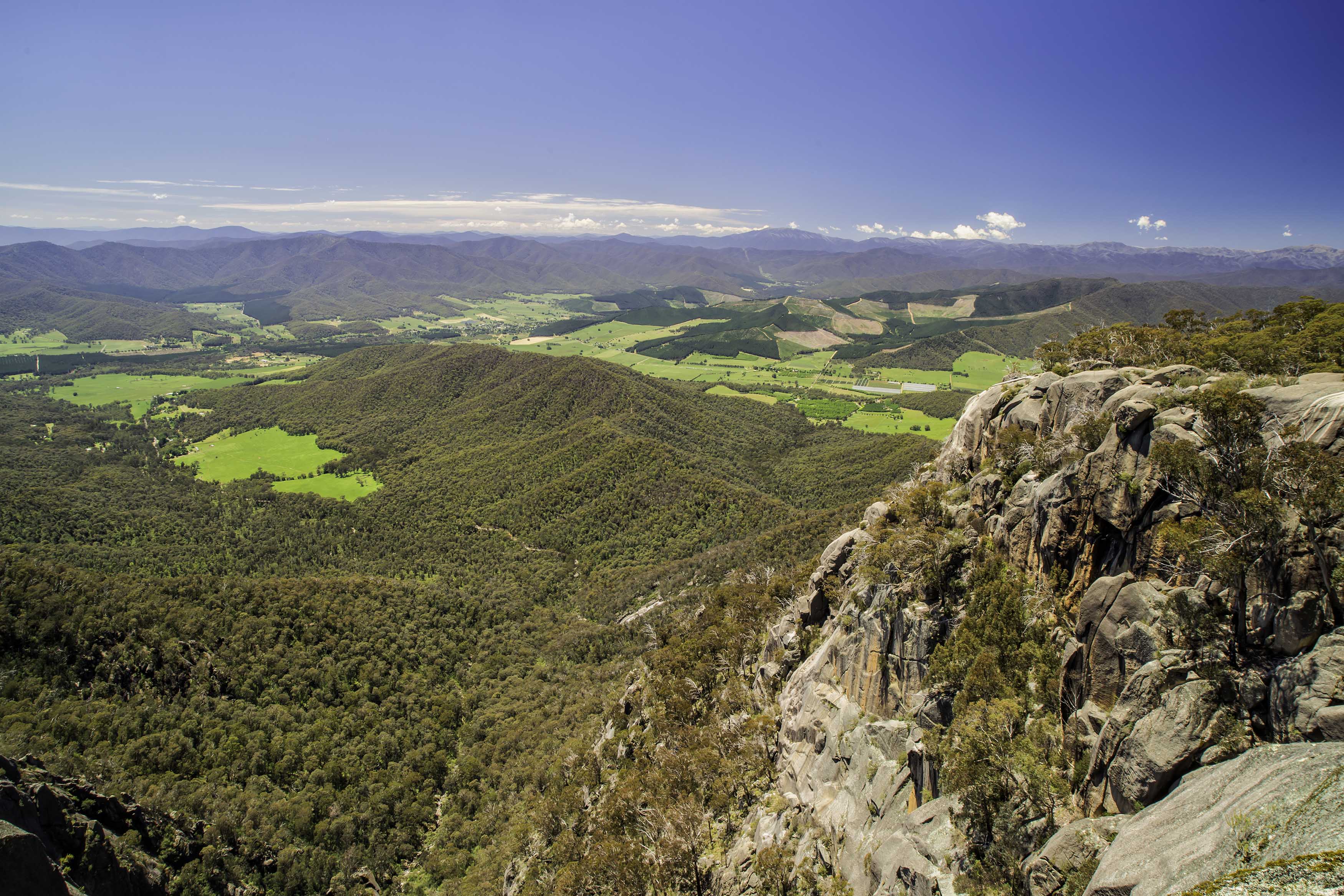
Congratulations on another great studio photo Gordon. I always think it's great when a photographer and subject are on the same page and want to produce good images. Your forethought in positioning the flashes and selecting their strength. The shadows on the background provide good separation of Paul from the background. Your conversion to mono and use of the vignette also work very well. |
Sep 17th |
5 comments - 2 replies for Group 76
|
16 comments - 10 replies Total
|