|
| Group |
Round |
C/R |
Comment |
Date |
Image |
| 76 |
Jan 23 |
Reply |
This option also works well. Just shows some images can be made to suit any format, normal landscape or square. |
Jan 29th |
| 76 |
Jan 23 |
Reply |
Thanks for your comments Trey and also your vertical option. We all see things differently, while at the same time none of us are right, nor wrong. I look forward to possibly seeing some of your new ideas. Happy shooting. |
Jan 29th |
| 76 |
Jan 23 |
Reply |
Thank you for your comments Sophie. As I mentioned above, there is no wrong or right, just our own personal preferences. Thanks for your alternate suggestion, it is appreciated. |
Jan 19th |
| 76 |
Jan 23 |
Reply |
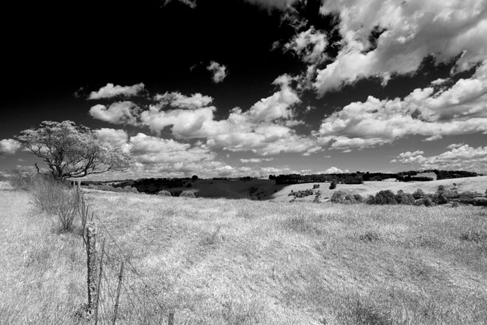
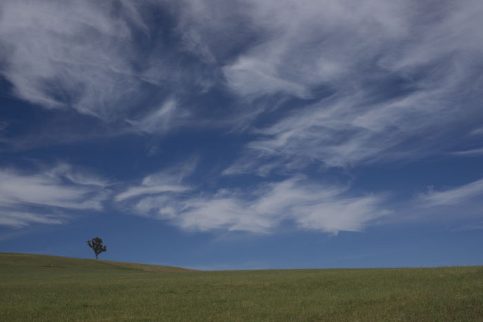
Thank you for your thoughts and comments Jay. I also like the colour version, but am also thinking in B&W as well. Sometimes they work and sometimes they don't. |
Jan 19th |
| 76 |
Jan 23 |
Reply |
Yes, it's good that models get feedback for their efforts. But I would be interested in hearing what she herself, thinks of this image. |
Jan 19th |
| 76 |
Jan 23 |
Reply |
Thanks for your comments Sanford, they are always greatly appreciated. One thing I always maintain is the diversity in this thing we call photography, we all have our different thoughts and none of us are wrong. |
Jan 13th |
| 76 |
Jan 23 |
Reply |
Thanks for your comments Gordon. I have revisited the colour version, altered the contrast to -20 and increased the greens +20. |
Jan 13th |
 |
| 76 |
Jan 23 |
Reply |
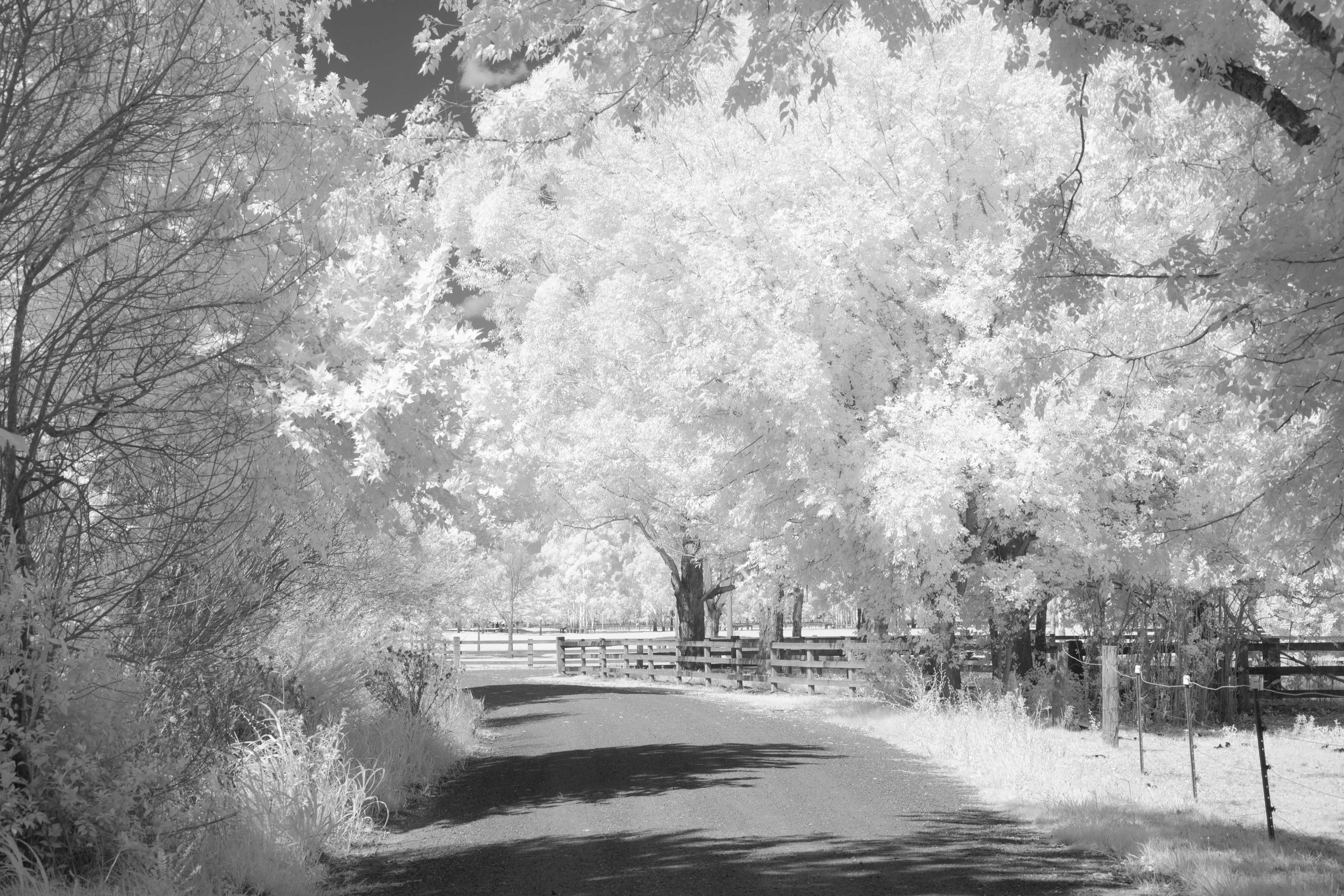
Thanks for your comments Henriette. I seem to be spending more time thinking about and looking through images from the old masters such as Ansel Adams. I then think how they would have seen the scene I'm looking at. So then I just play a little and see what happens. Please don't think I'm comparing myself to him, no way. |
Jan 13th |
| 76 |
Jan 23 |
Comment |
Jay, when I look back to your (and other's) previous images, I feel your photography has, especially in recent months improved greatly. Forgive me if I'm wrong, but from your image info, I get the impression that you are now mentally planning your final images, before you press the shutter. I really applaud that approach, rather than just snapping away at whatever is in front us all. After that conception, comes the capture, then the processing, followed by the presentation. You have done really well in all these steps. Both, your final image and Gordon's adjusted image are great, it all just comes down to blue you want the blue. Your portrayal of the autumn colours, use of backlighting and introduction of the starburst are all excellent. Very well done indeed. |
Jan 13th |
| 76 |
Jan 23 |
Comment |
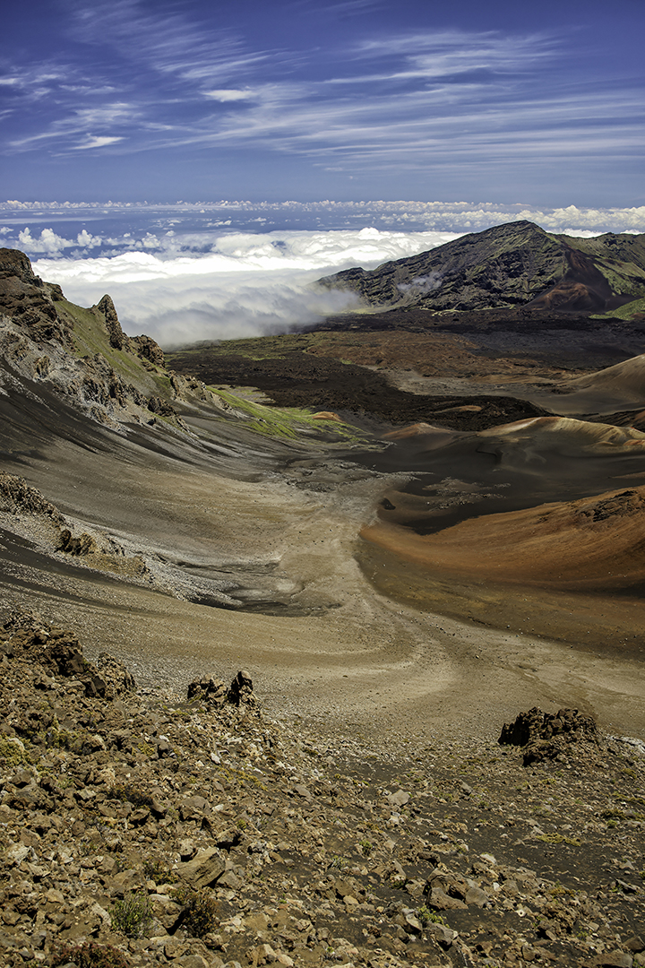
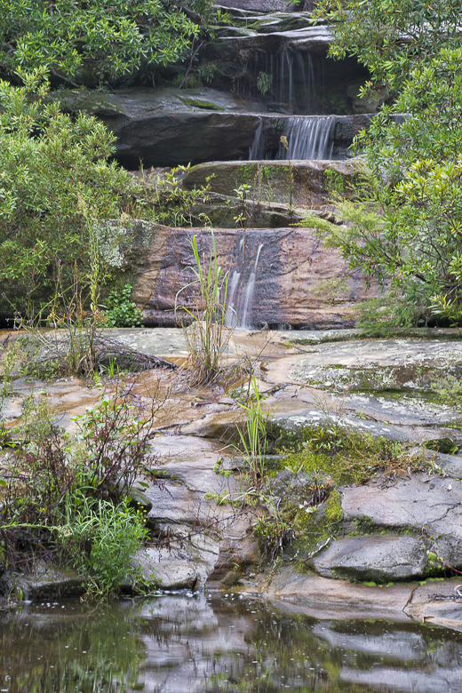
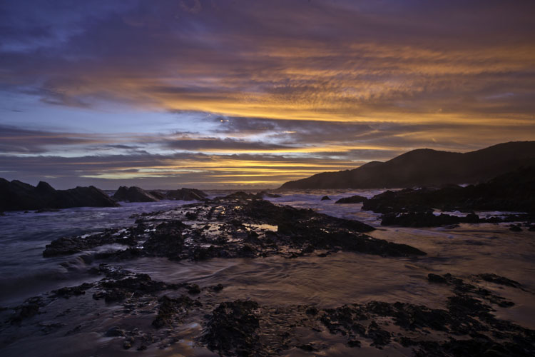
Very well done Sanford, your final image, to me, is all about the vastness of the area. So it's entirely up to the photographer to decide if he/she wants to portrait the camel and rider, or the vastness and solitude. Your processing has enhanced the colours and your composition, viewpoint and use of shadows and background enhances the depth of this image. My role and aim as admin is to help improve images, so I agree with Gordon about the removal of that dust spot, but I will go further and ask about those two spots just above the ridge line, near both edges, even if they are birds, I think they should go, as they serve no purpose to this image. A great image Sanford, none the less. |
Jan 13th |
| 76 |
Jan 23 |
Comment |
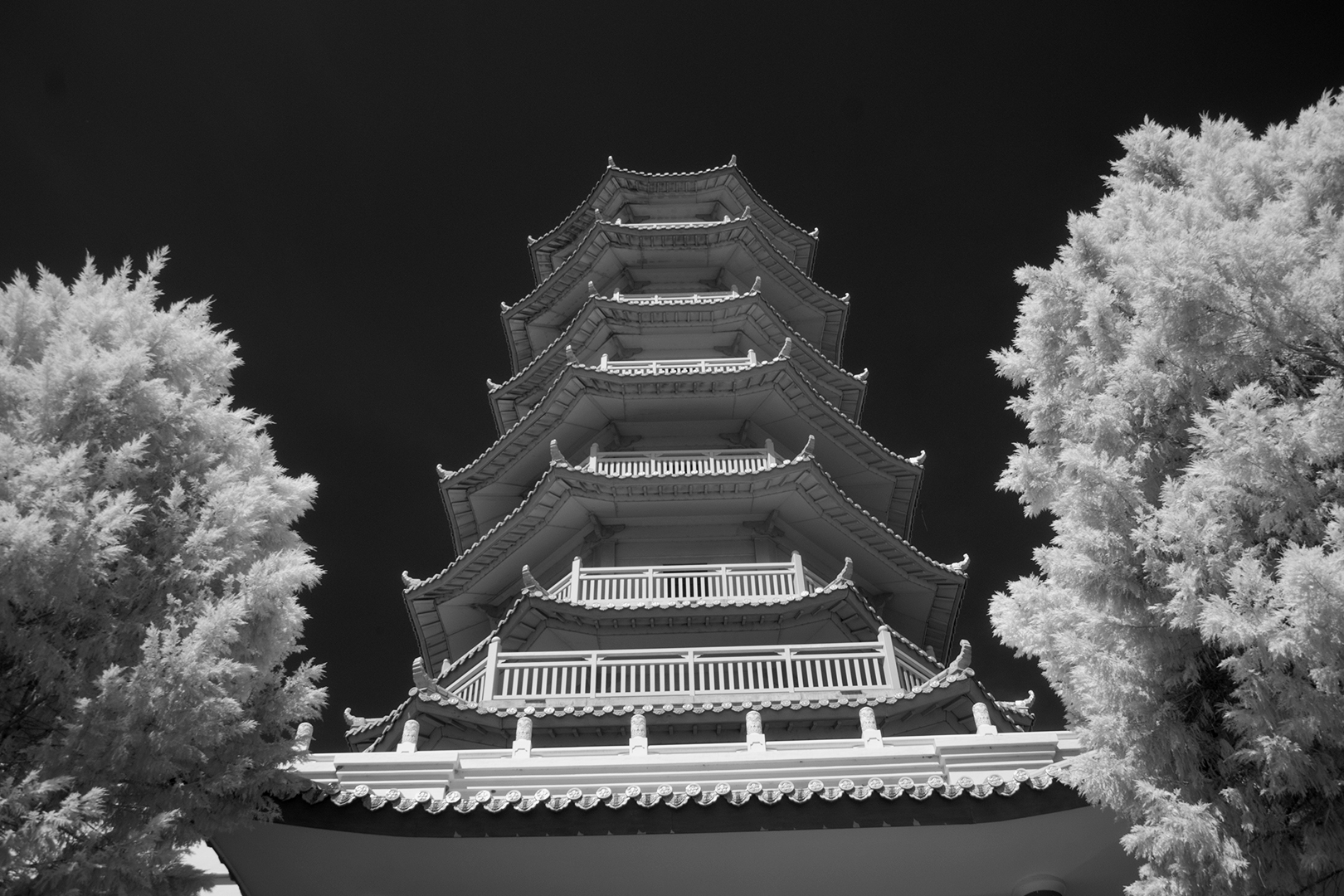
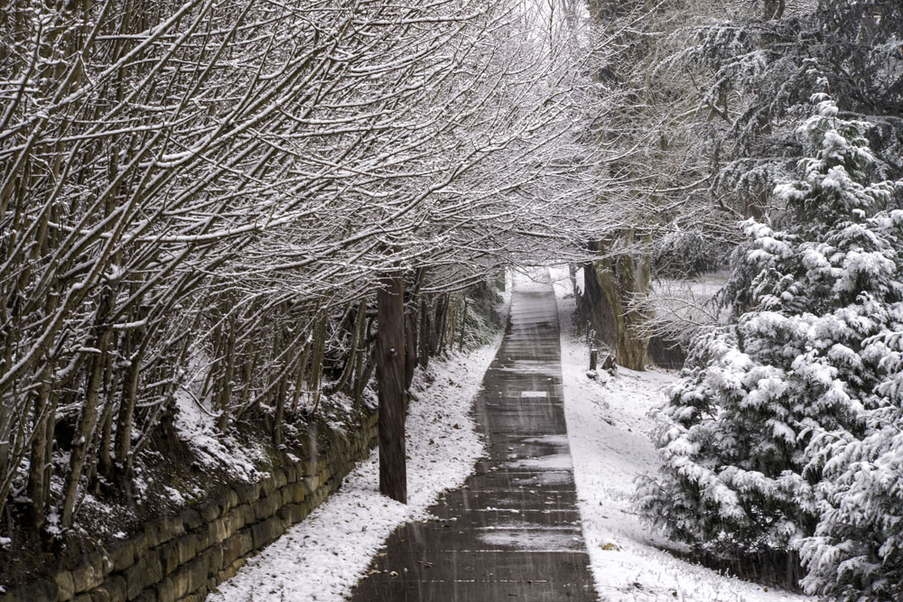
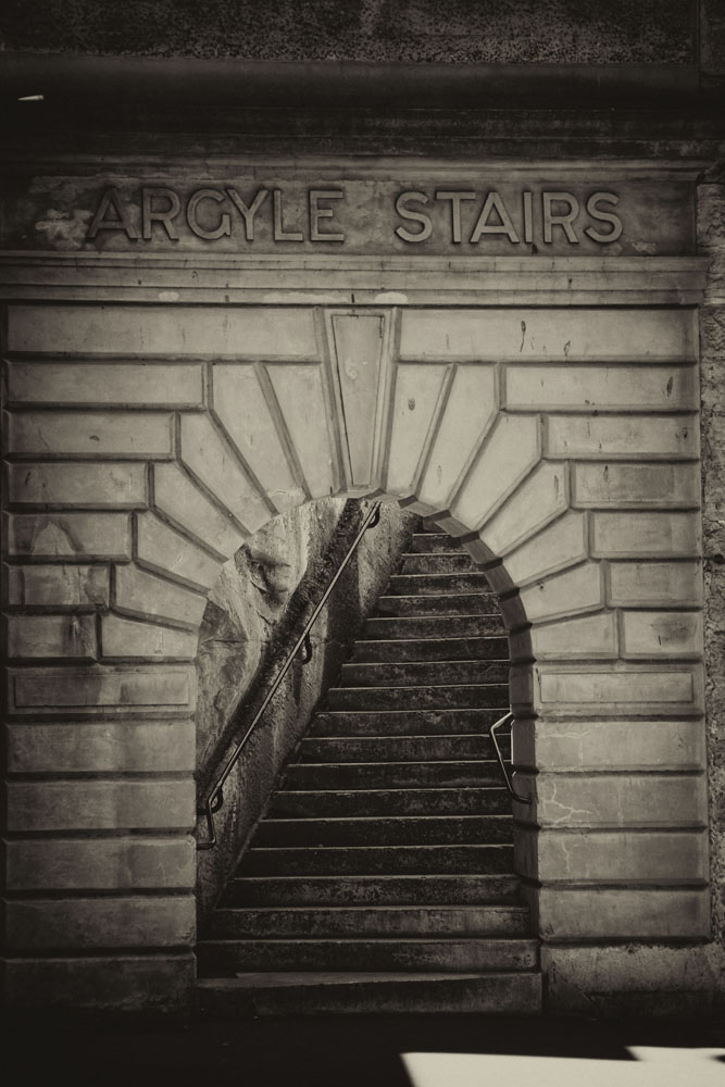
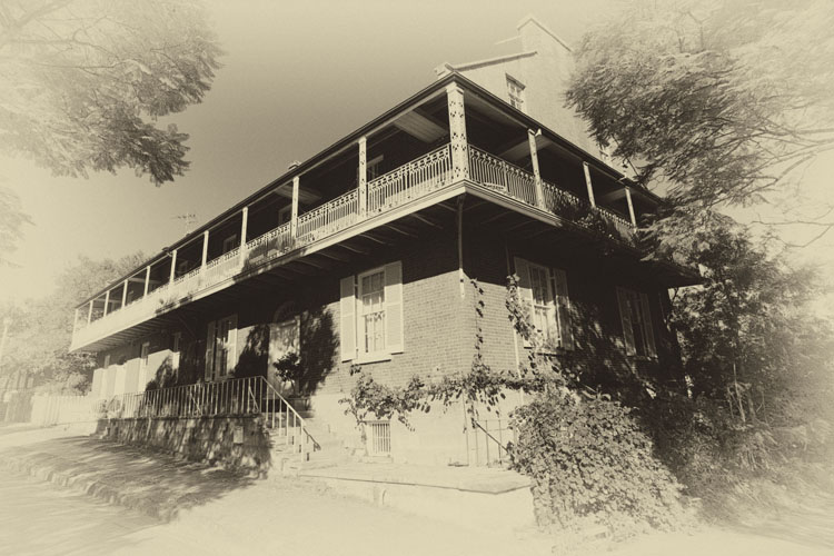
Congratulations Trey. A wonderful image. Captured, processed and presented extremely well. Compositionally, your final image is spot on, your cropping has focused our attention on the important elements. The story is strong and the vignette effect enhances the snow on the roof and colour on the facing wall. I can think of no way this image could be improved, but, an interesting and alternate image could be if you darkened the whole scene down to a dusk/twilight effect and put a yellow glow in the windows the resultant image could also work. Something to ponder, off you go. |
Jan 13th |
| 76 |
Jan 23 |
Comment |
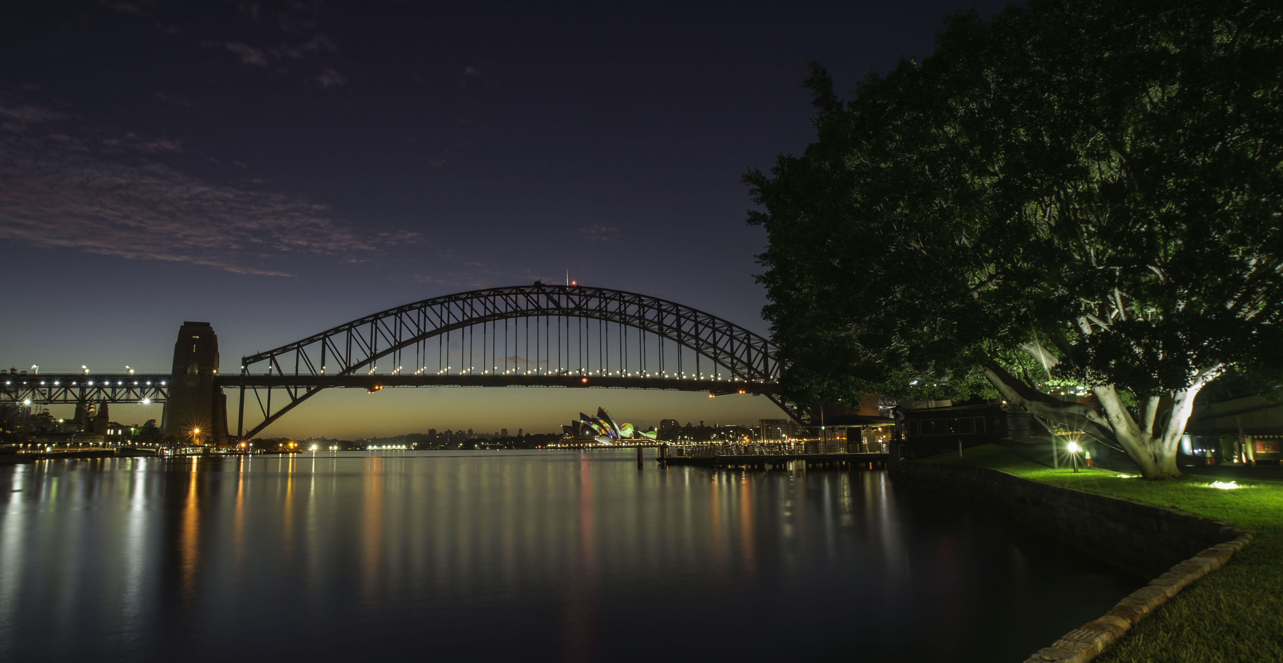
Congratulations on a simply stunning image Gordon. Superb in every way. Mood and colour palette are very strong. Your posing of Holly is perfect. She has been captured and lit outdoors, and then been moved indoors, so the lighting "could" have become an issue, but your highlighting her in the interior works really well. You question the use of the shaft of light and cropping closer to Holly. Please remember that our art of photography is very subjective, many viewers will have many thoughts and always want to voice them. In my humble opinion, the shaft of light definitely adds to the image, it provides "that other element" and shows us the subdued, possibly sad interior, while the exterior is happier and brighter. This leads to the question "Why is she in here and not out there?", which is what this image is all about. The staircase gives good location and provides depth to the image. Working with the original image? Possibly. Interior vs exterior? The building and environs suit and support your aims, but of course you would have muted it down as well. I think this would do well in any competition that you chose to enter it in. It's one thing for all of us photographers to voice our thoughts, but I would really love to know the thoughts of the most important person, Holly herself. Have you shown her? What did she say? |
Jan 13th |
| 76 |
Jan 23 |
Comment |
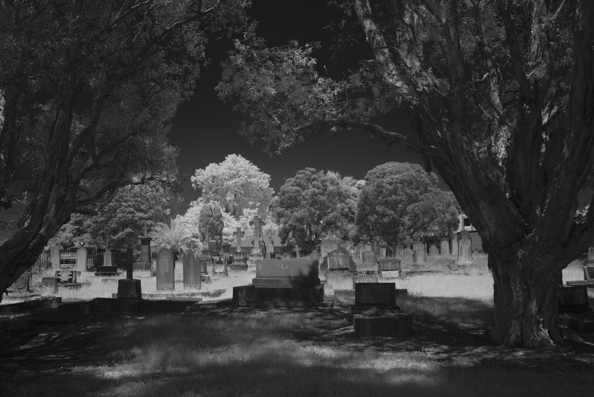
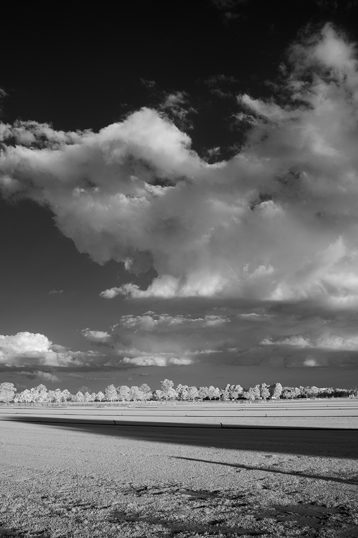
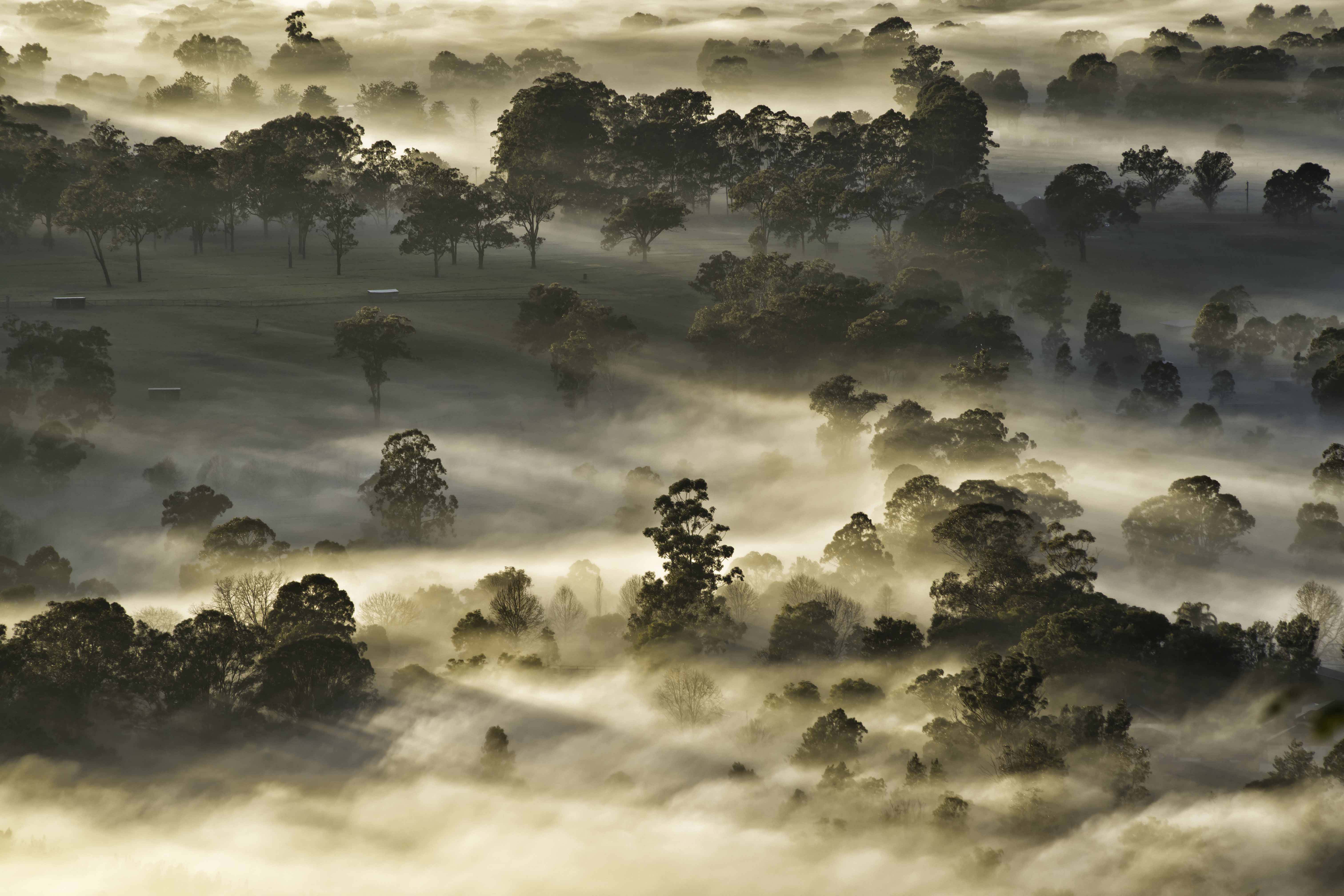
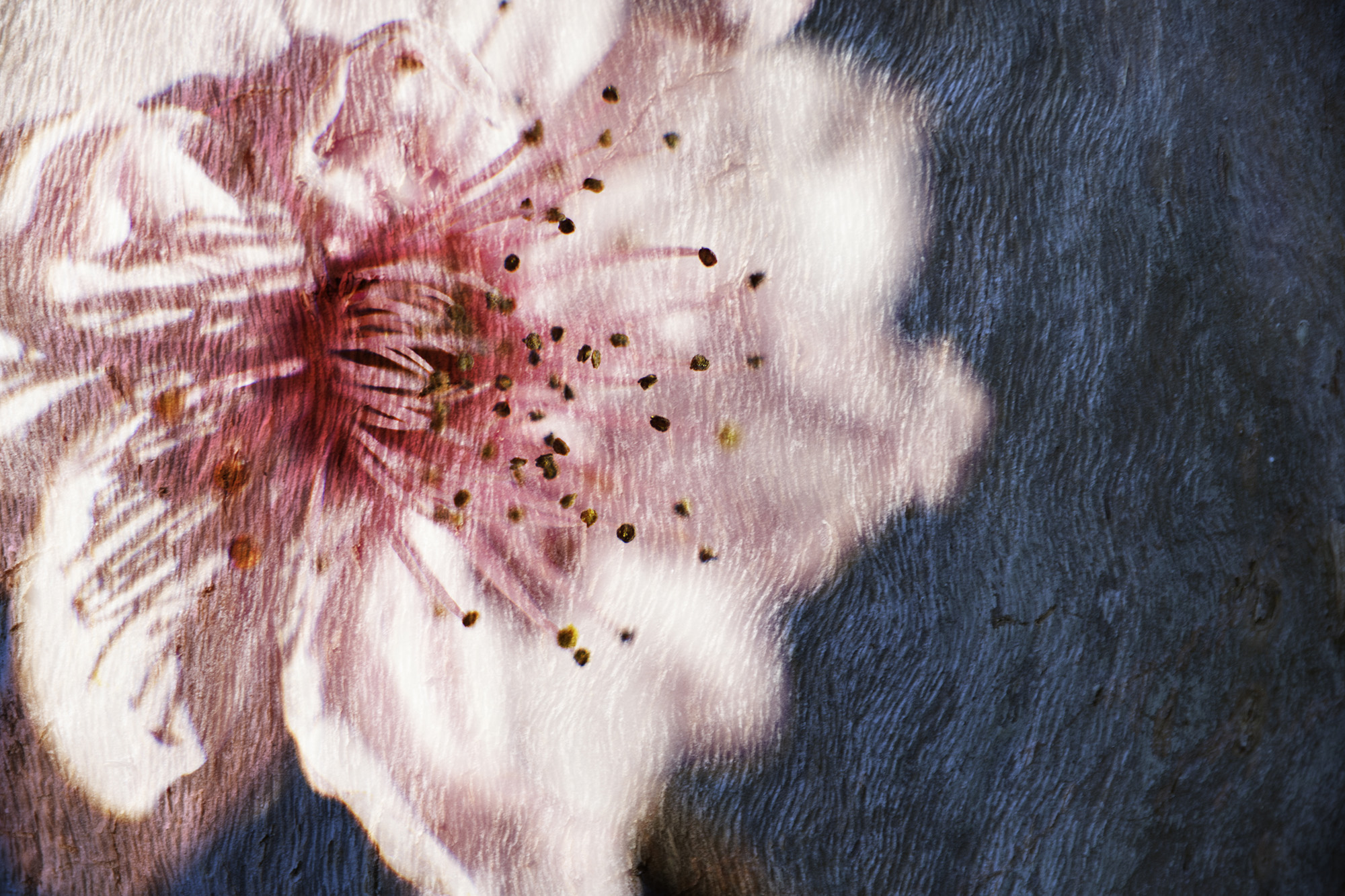
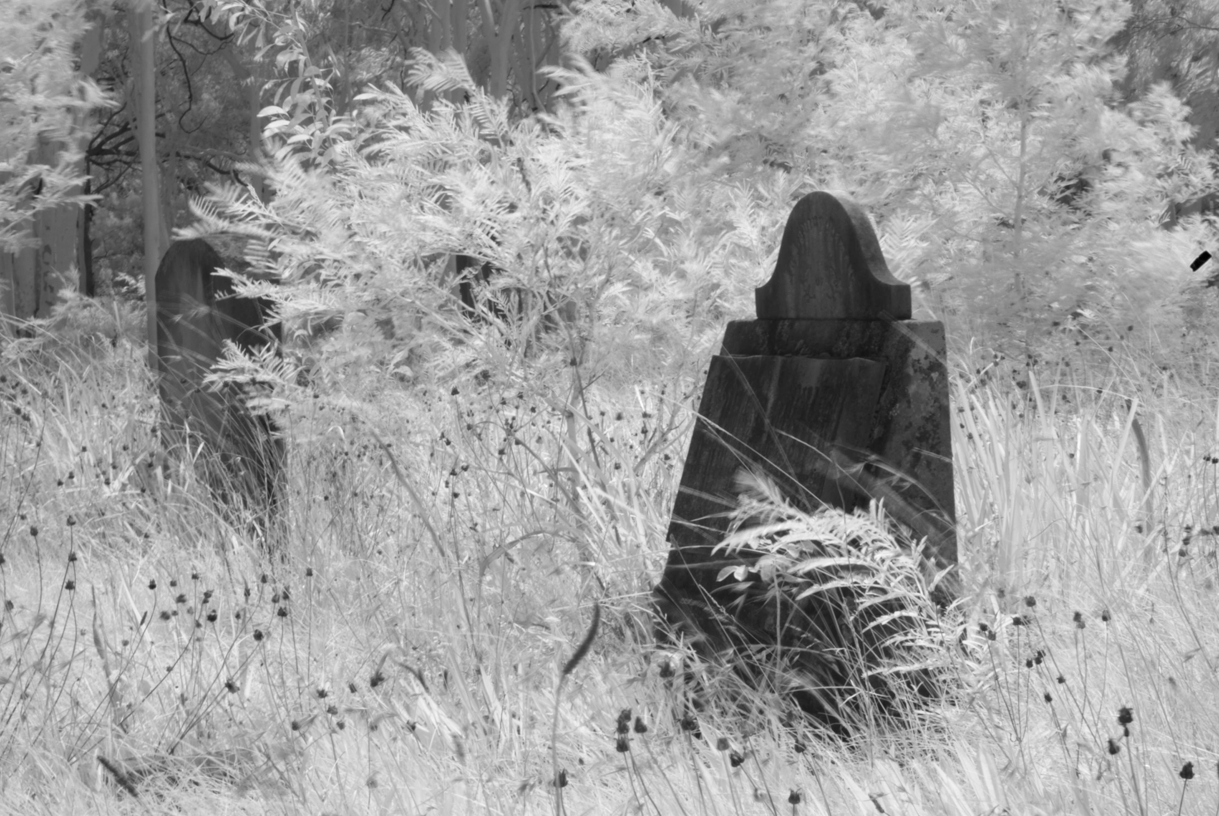
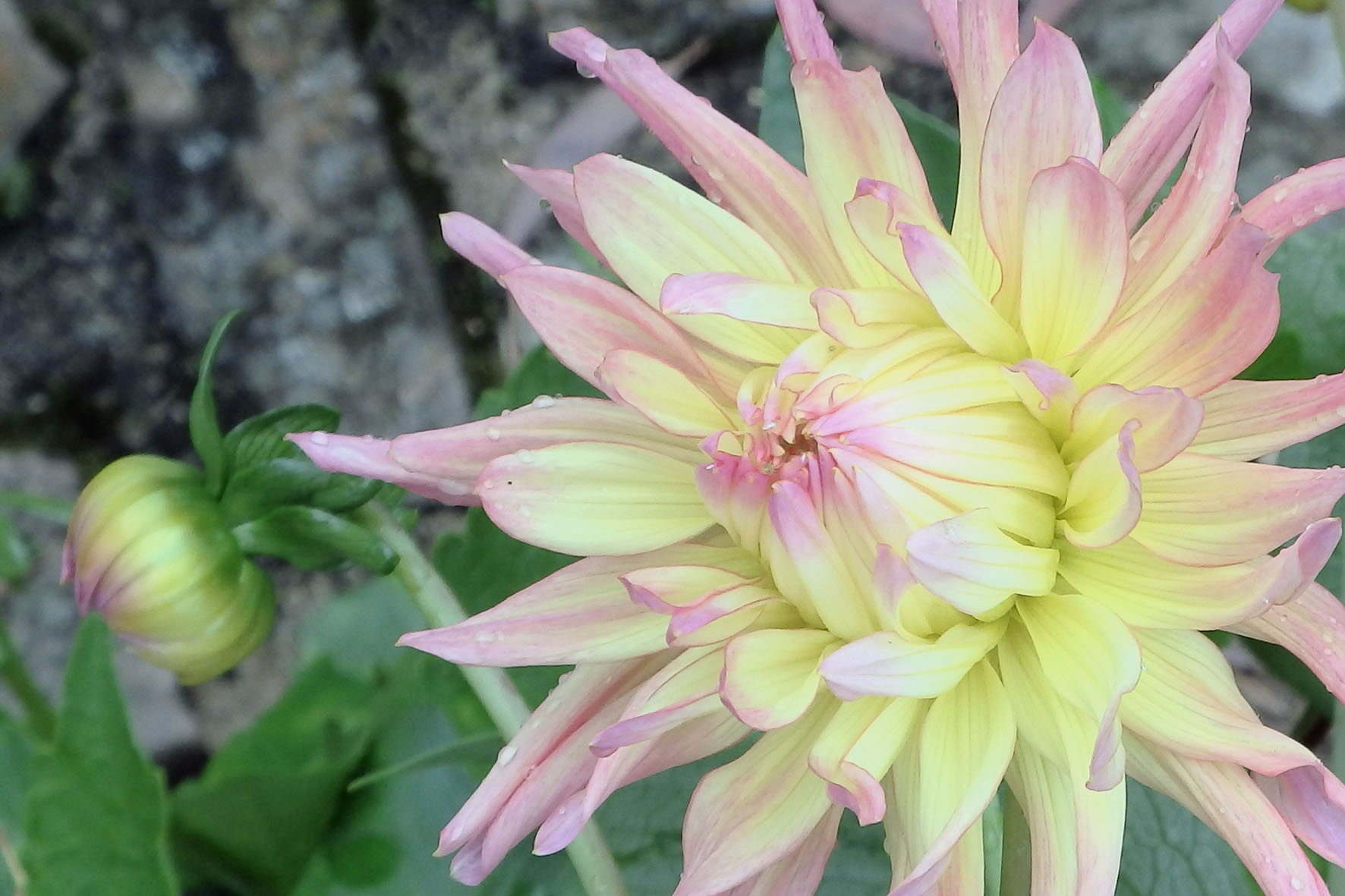
What a wonderful celebration of colour Henriette. I'm all for creative photography and applaud you and all others who wish to try going down this path. But it is not for everyone, some people will love it and some won't. That is a great thing about the diversity of our photography. I'm now going to play the devil's advocate, only because I want to see your and all our member's (including mine) photography grow and improve. Minor flaws in any image can and will detract its appeal. Some here are dust spots, one dead center about 1/3 down, another almost directly below it 1/3 up from the bottom, 3 others also 1/3 up way over near the left edge and 1 in the green, towards bottom left corner. I only point these out so that if you wish to submit this image, or any others, we all need to step back and look closely for any imperfections. This is the type of image I would expect and do see on walls in and around offices and waiting rooms. Great image Henriette. |
Jan 8th |
| 76 |
Jan 23 |
Comment |
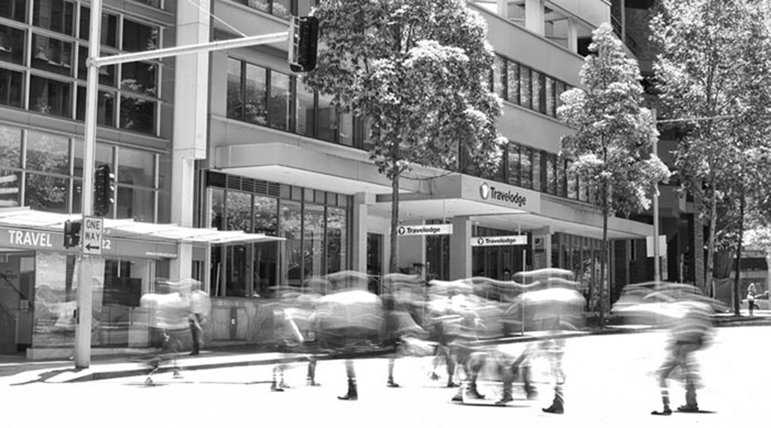
You have constructed this image very well Sophie. It is a very interesting and thought provoking image. I really like the lighting and the depth in this image caused by the tunnel. The cyclists give the image a very strong story. They are beautifully placed in the image and spaced apart to give good separation. The nearer cyclist, moving across the scene, more than the second one who is coming straight at you provides good dynamism that you said you like. I would expect this to be a part of this image that will make your viewers stop and discuss. The ability to produce an image that make people stop, look and discuss is a thing to be valued. Congratulations and very well done Sophie. |
Jan 8th |
6 comments - 8 replies for Group 76
|
6 comments - 8 replies Total
|