|
| Group |
Round |
C/R |
Comment |
Date |
Image |
| 73 |
Jul 22 |
Reply |
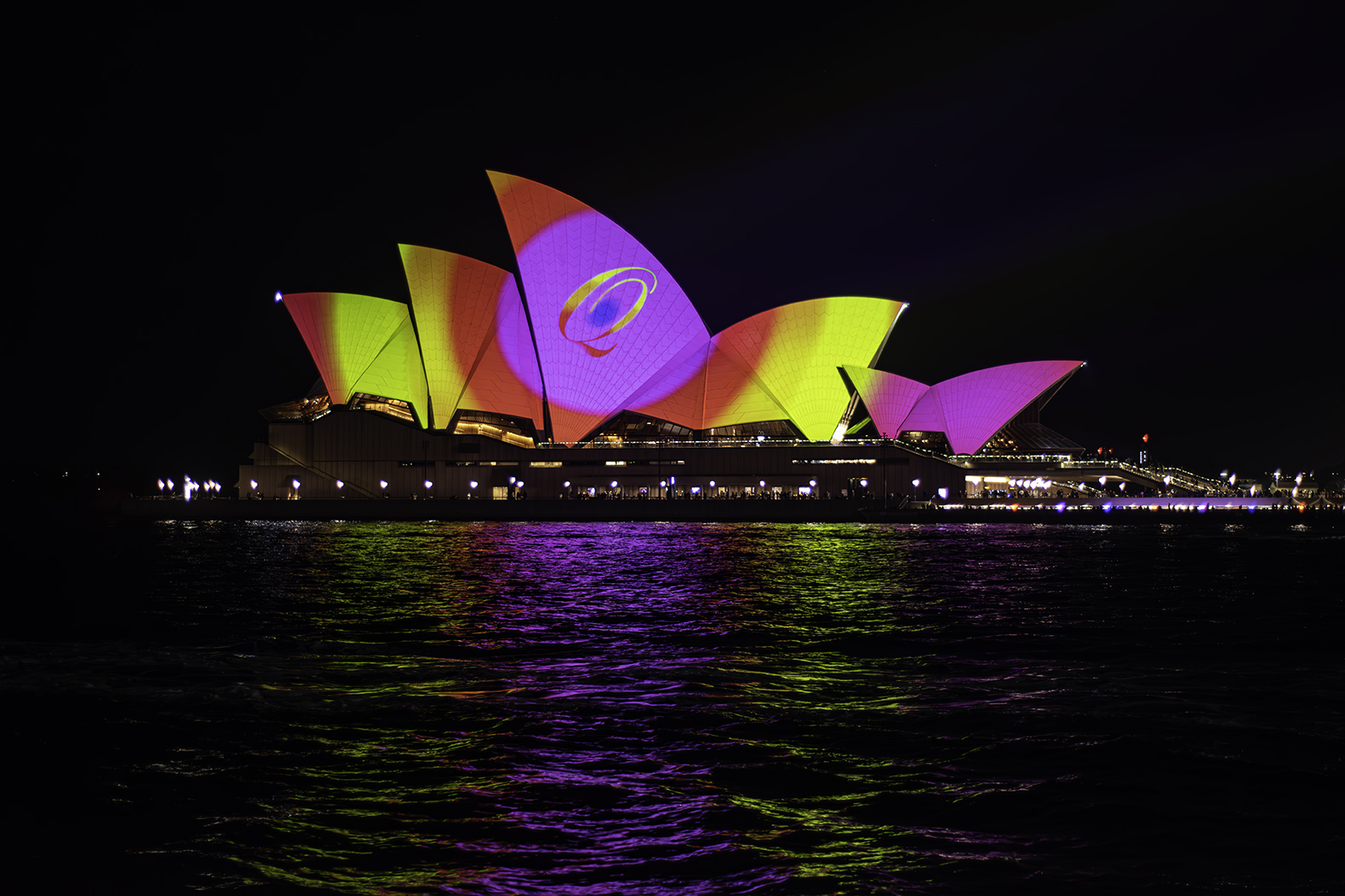
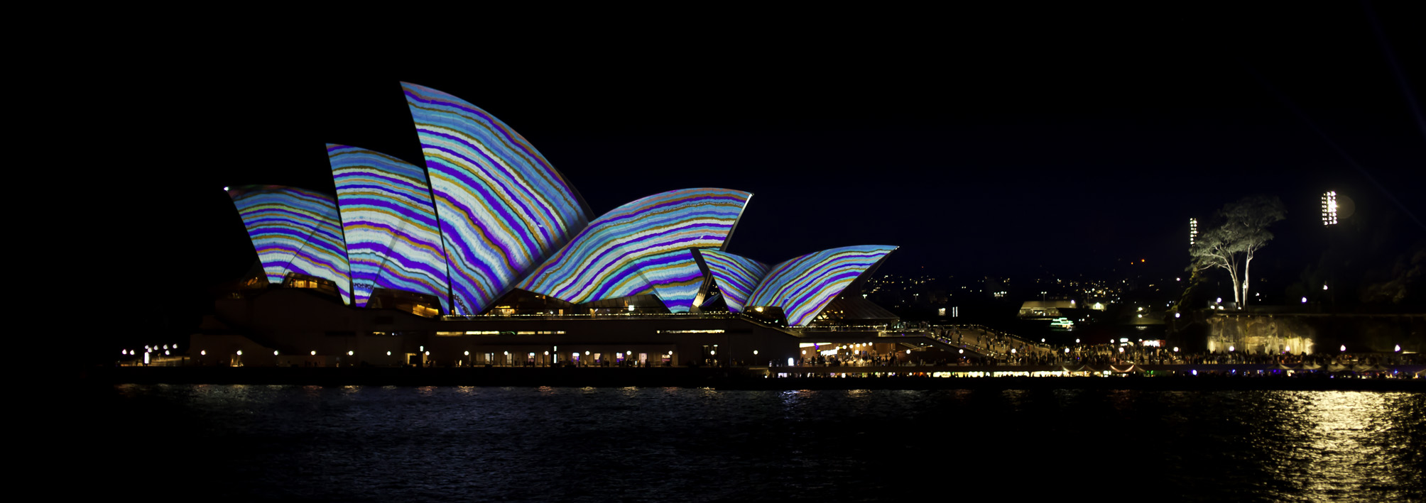
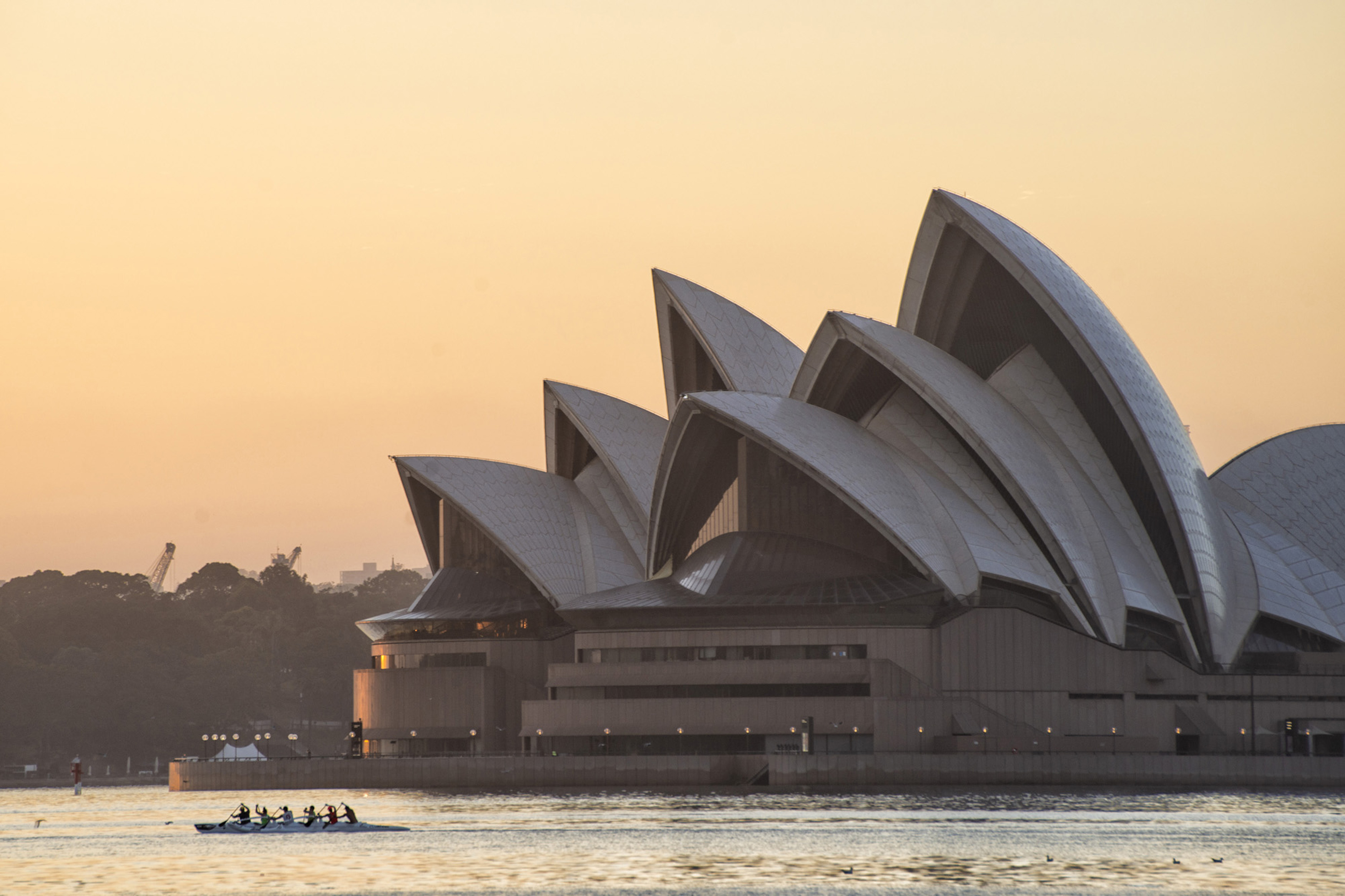
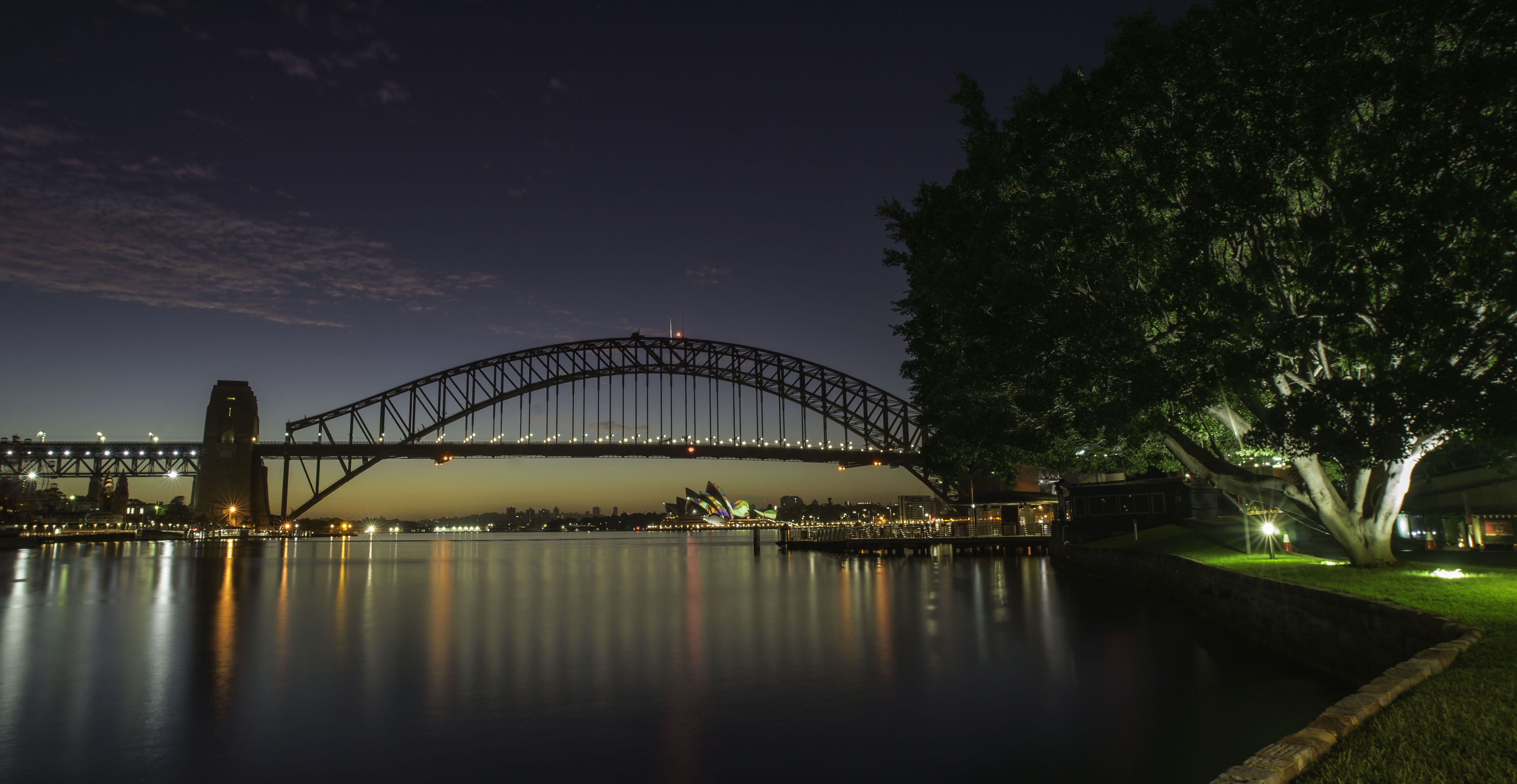
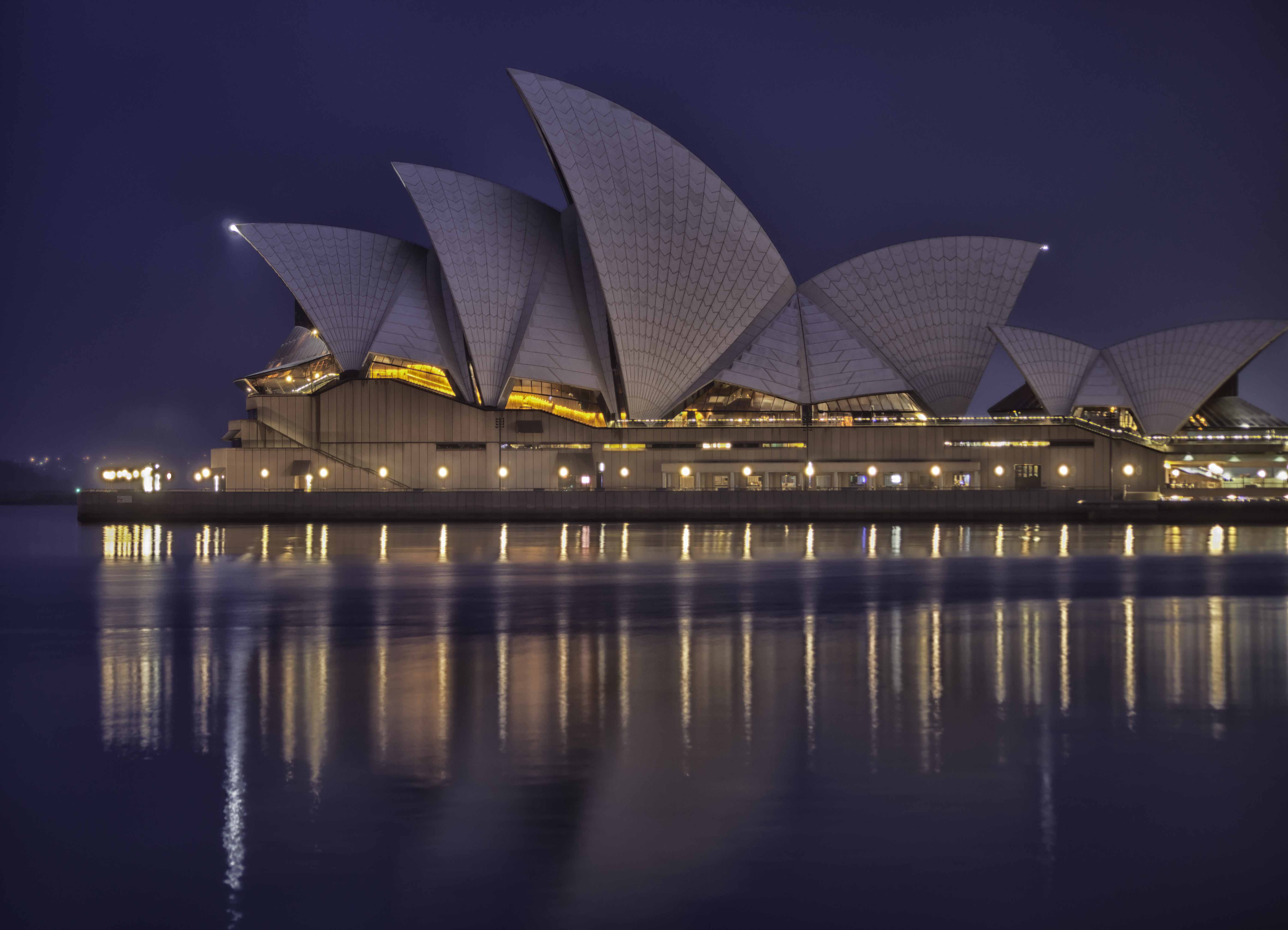
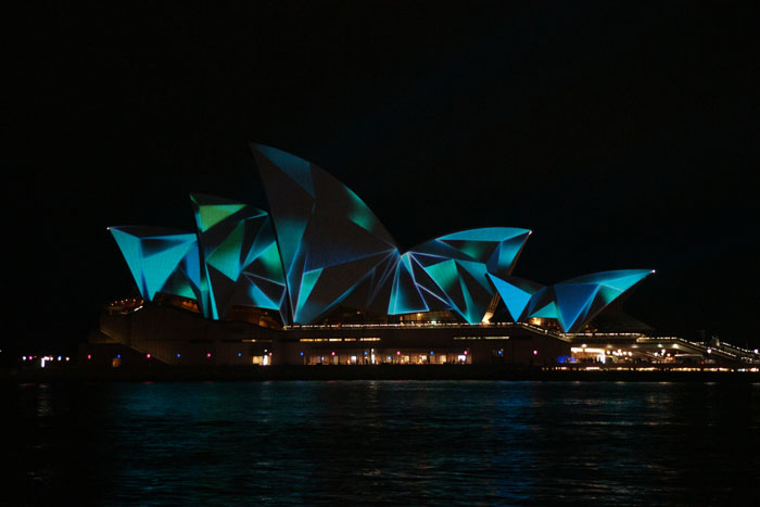
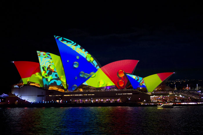
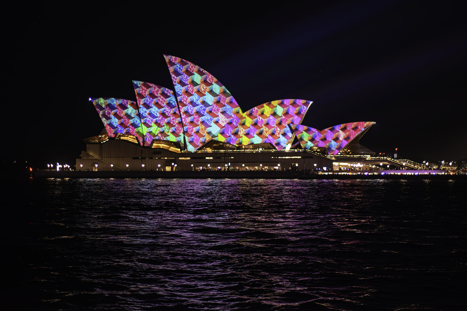
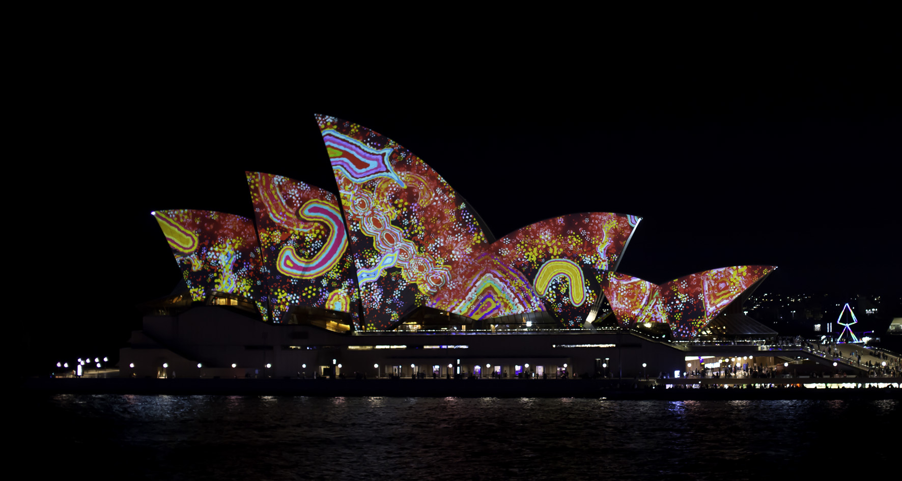
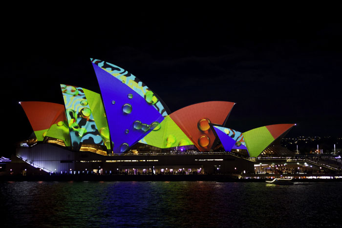
Thanks Sherry, this is the first time those stadium lights have been there, there is nothing on the far side of the opera house except more water, so I'm thinking they were there temporarily for safety, lighting up the steps and forecourt. That tree is a permanent resident and always lit from below. I like panos and that tree just adds a nice element to that side of the image. My thoughts anyway. |
Jul 11th |
| 73 |
Jul 22 |
Reply |
Thanks for your comments Tom. I took many images this night, many with the tree and many without the tree. |
Jul 11th |
 |
| 73 |
Jul 22 |
Reply |
Thanks for dropping by Stuart, to both our group and Sydney, and your comments. It's scary to think just how many photos have been taken here, much like your Mt Rushmore or The Eiffel Tower. |
Jul 11th |
| 73 |
Jul 22 |
Reply |
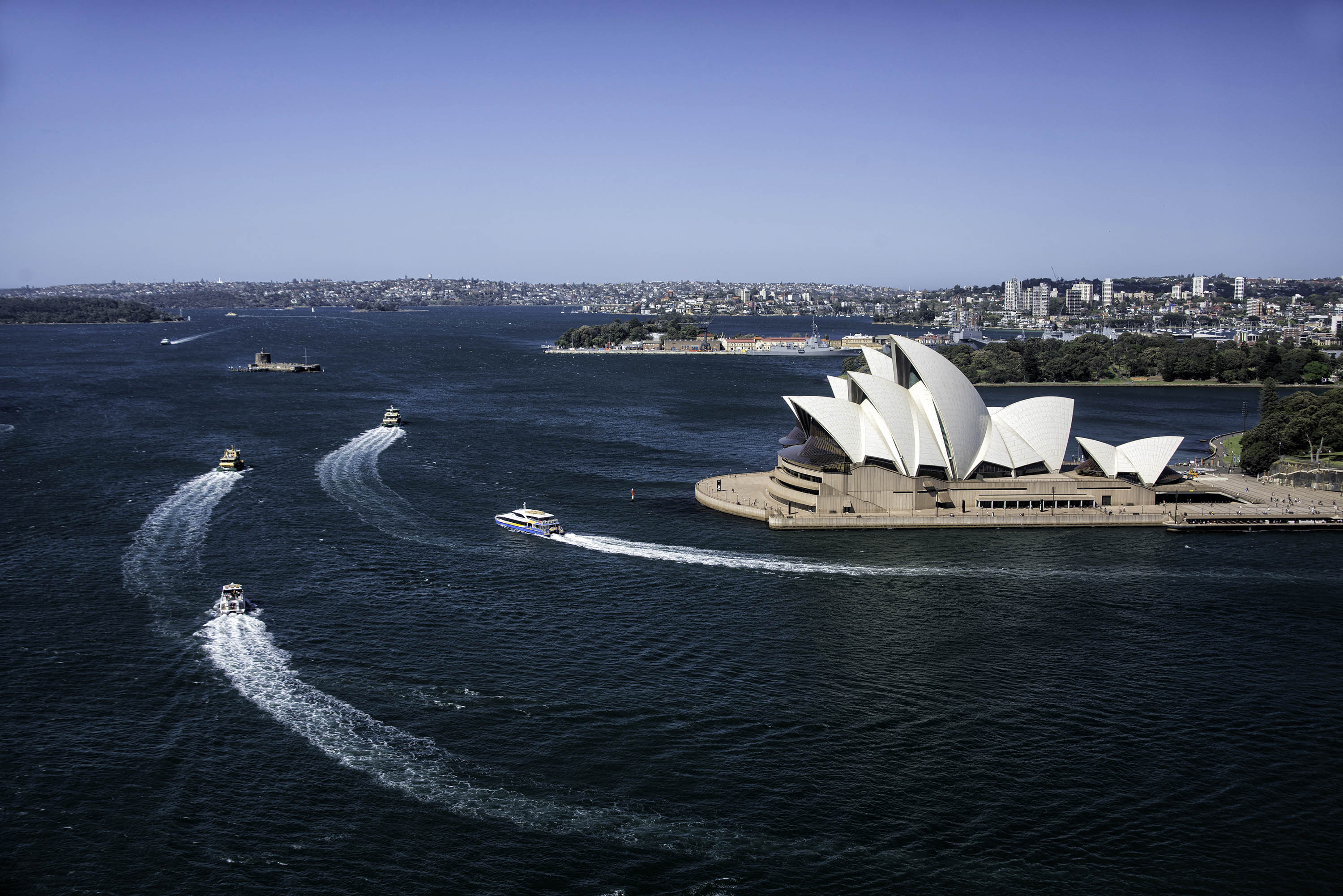
Thanks for your comments Dhananjay. Sadly the light displays are quite fast moving. While a slower shutter speed would keep the opera house sharp and alter the water a small amount, the displays themselves just become a blurry unrecognizable mess. |
Jul 11th |
| 73 |
Jul 22 |
Comment |
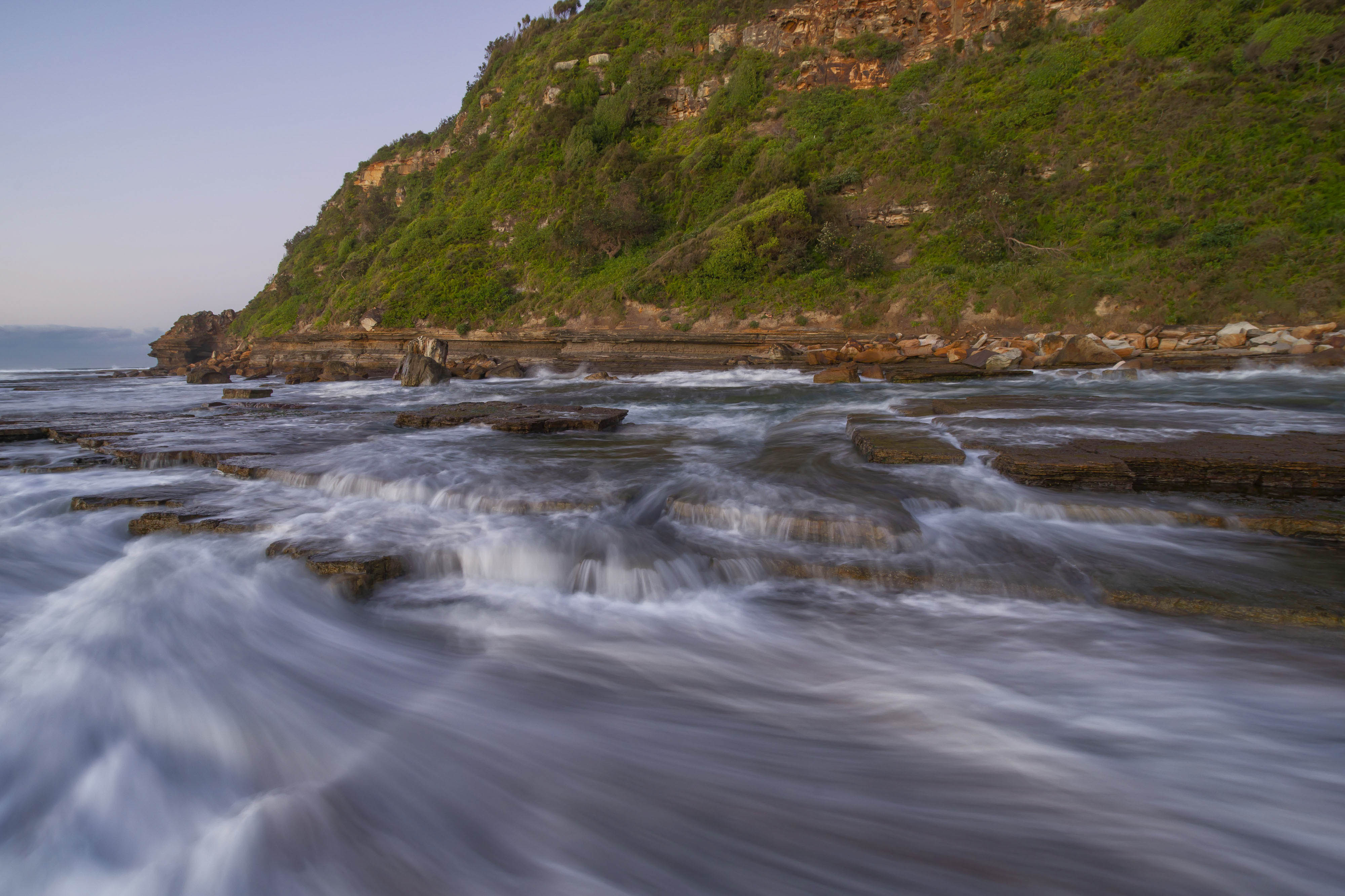
A great image Dave. Great image showing how well images can be stitched to show great landscapes as panos. Very well done. |
Jul 11th |
| 73 |
Jul 22 |
Comment |
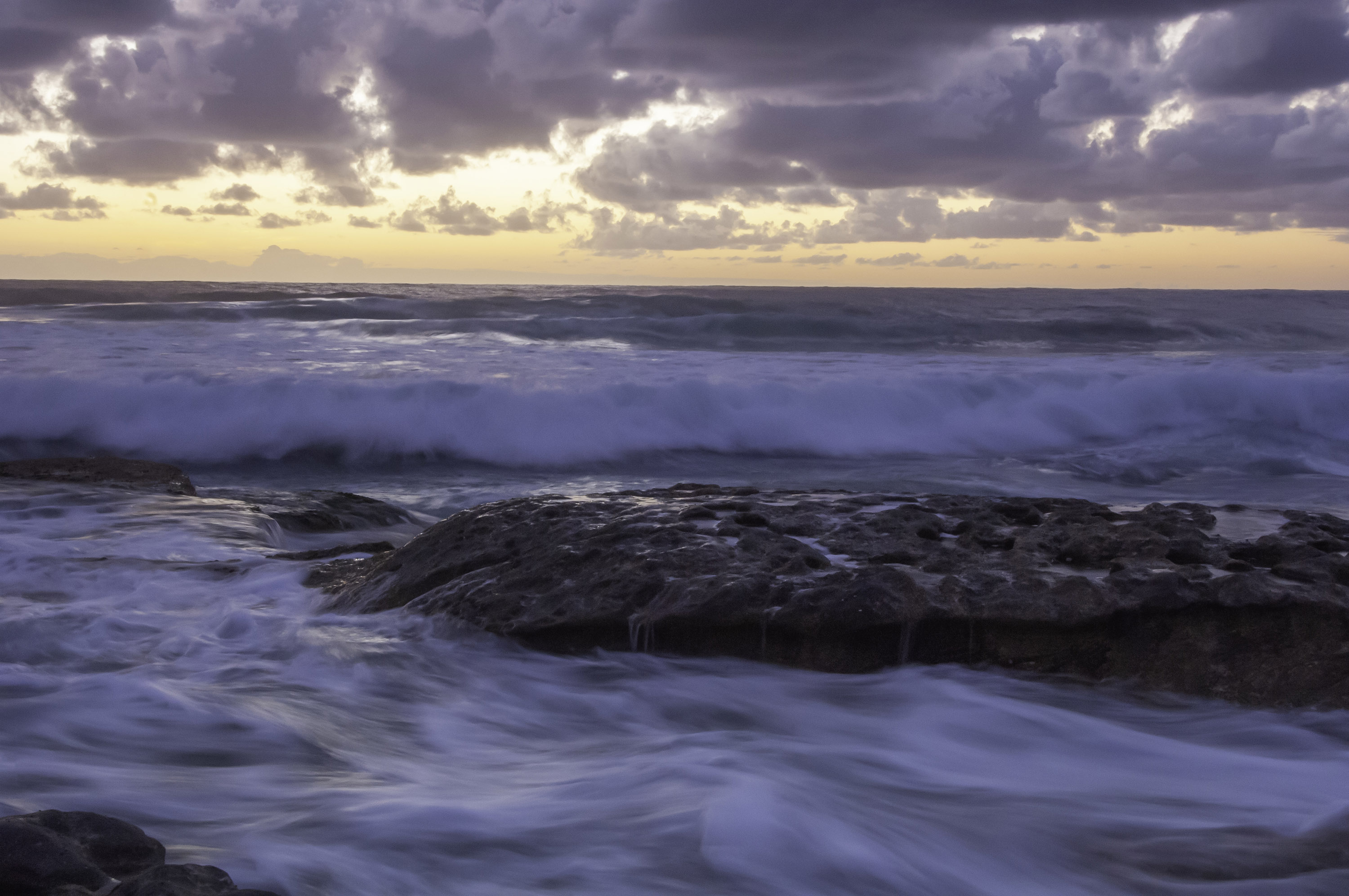
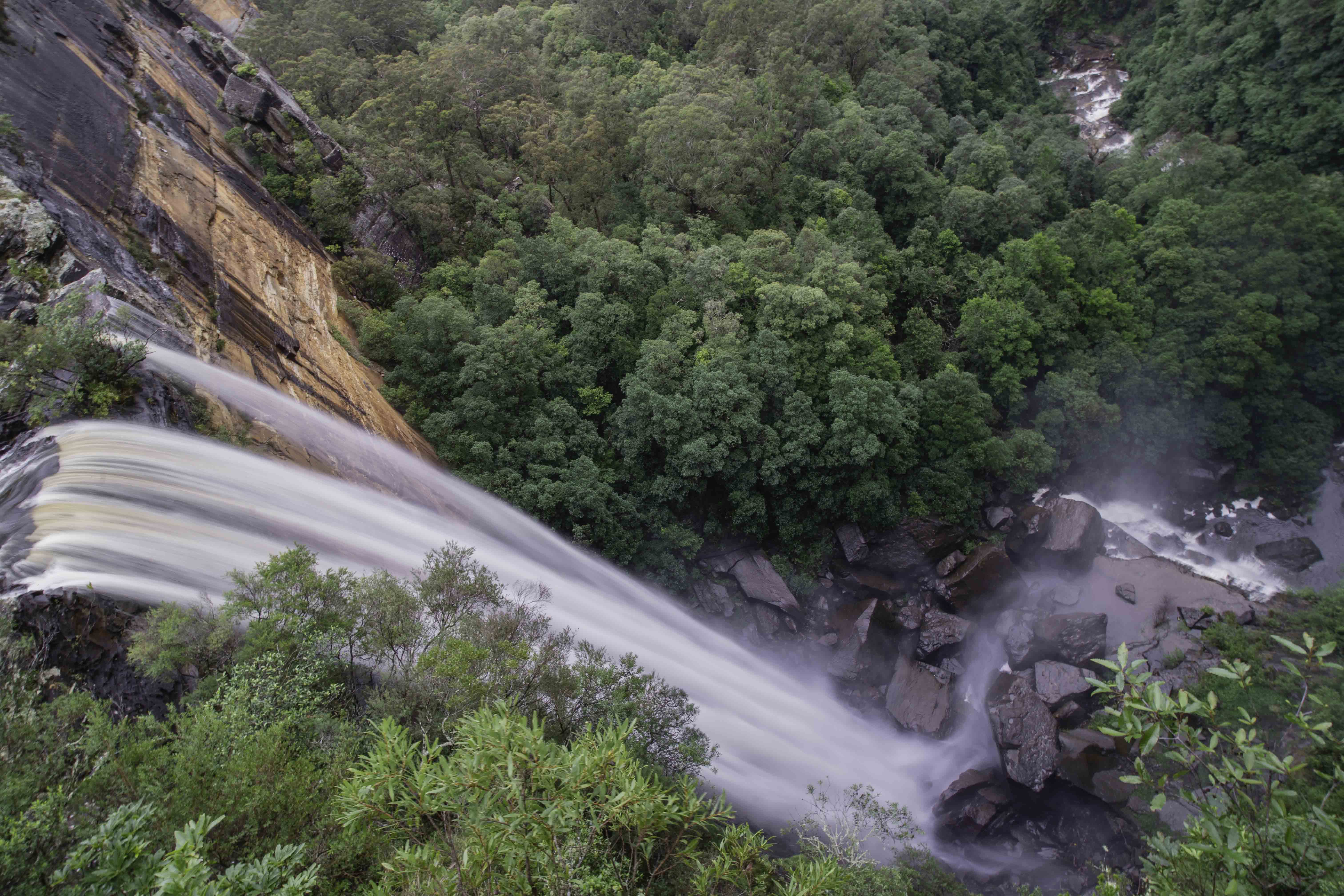
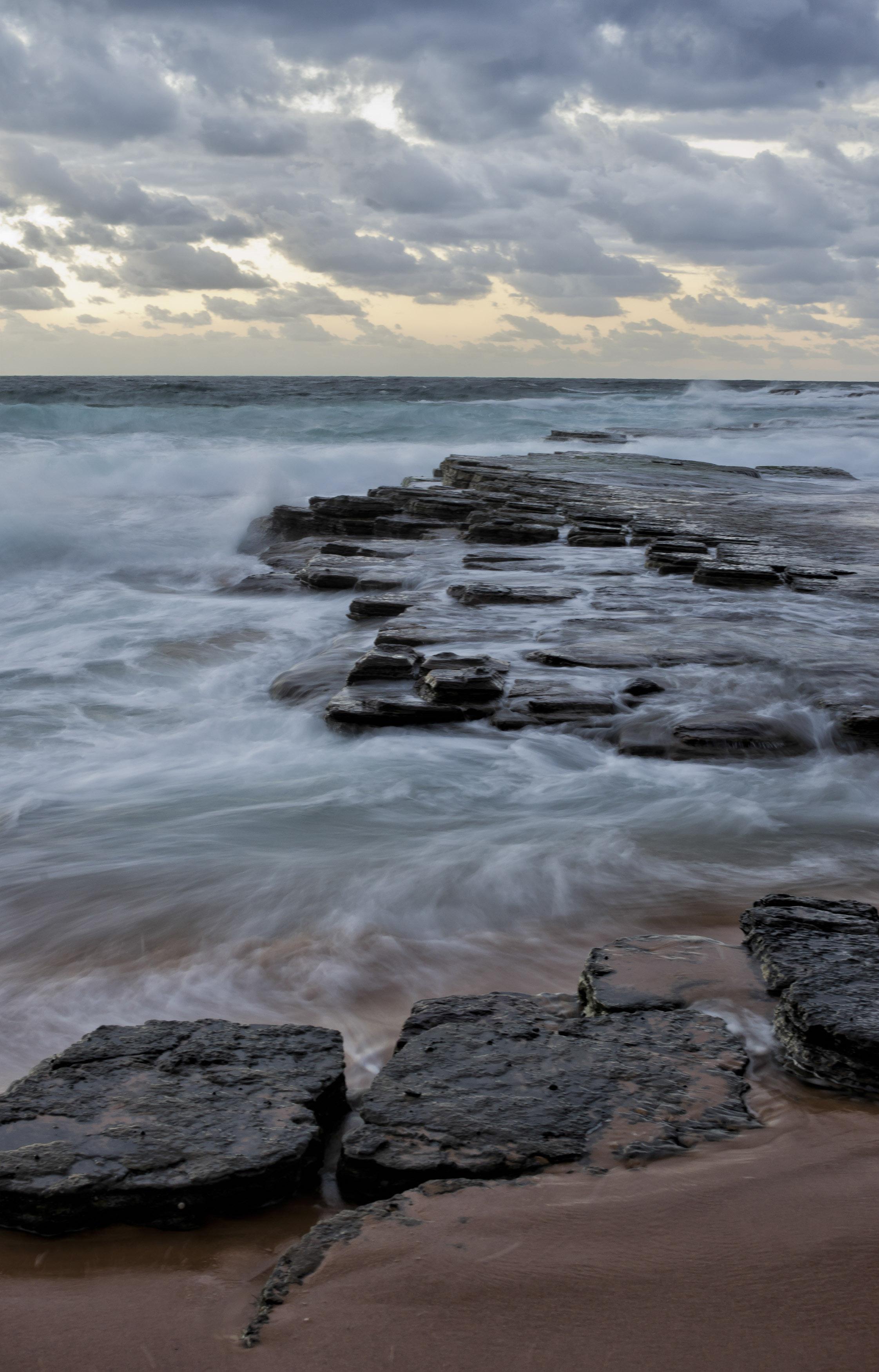
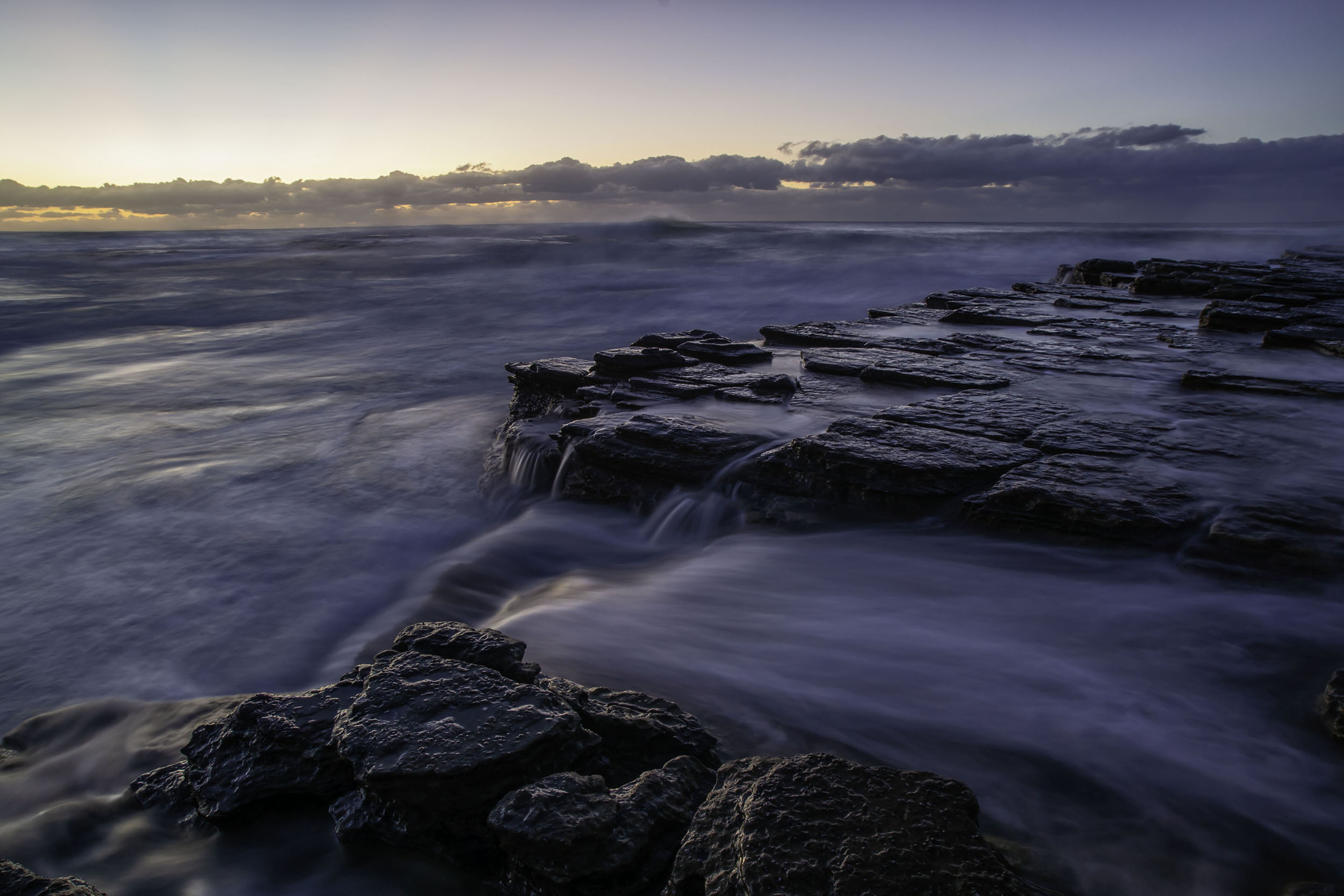
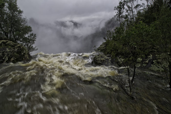
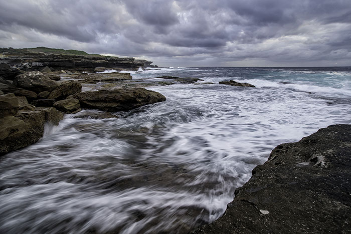
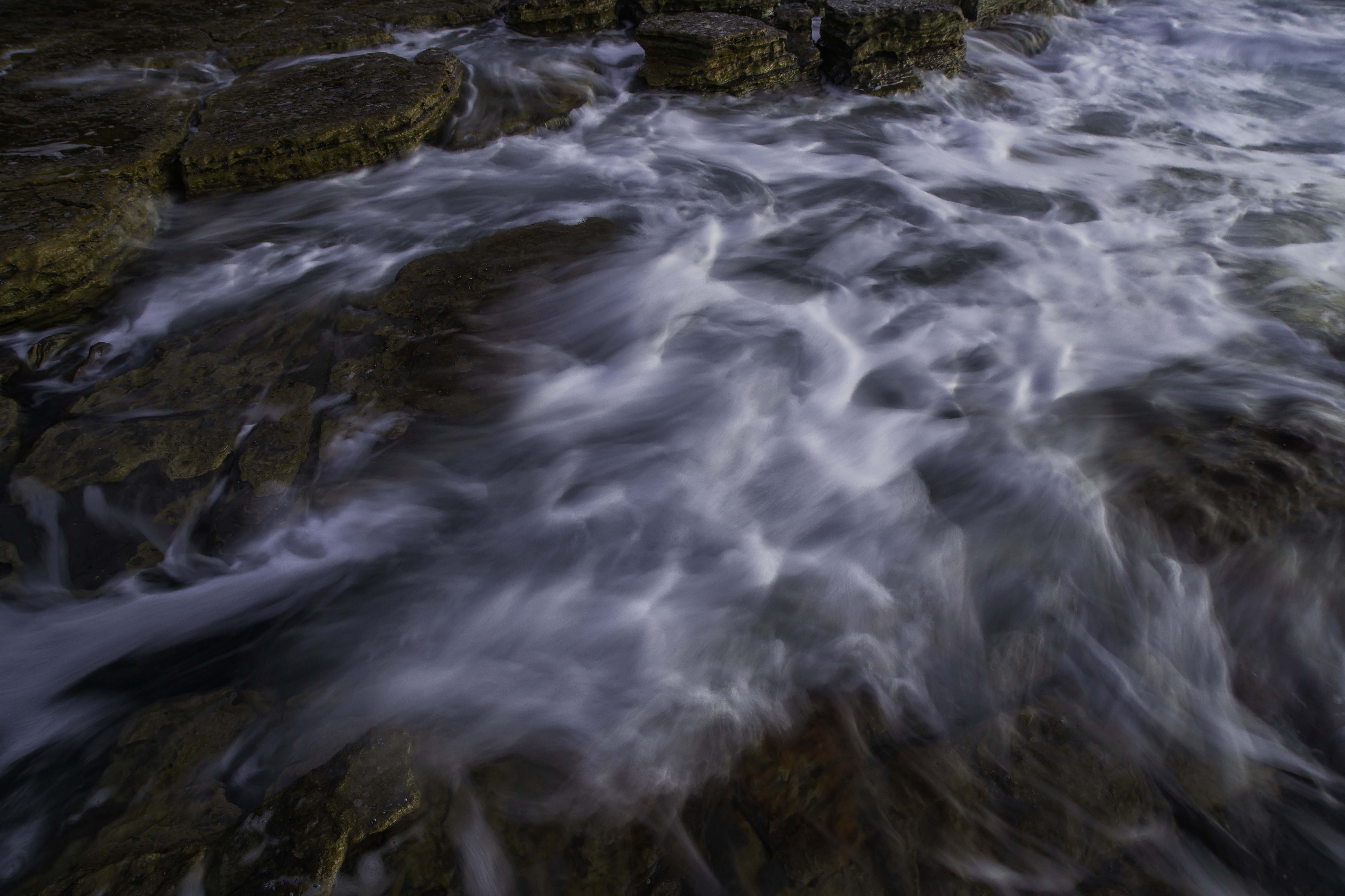
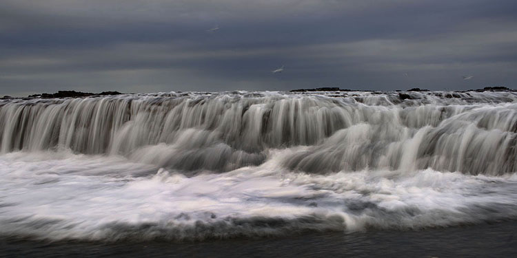
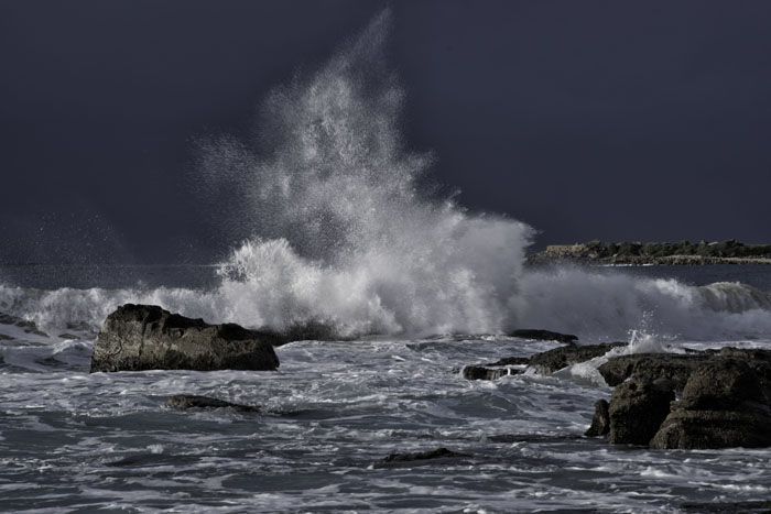
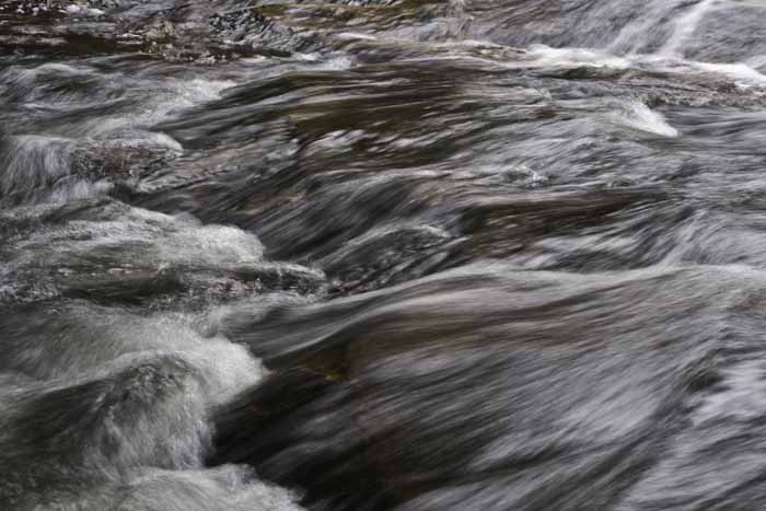
A very strong image Dhananjay. Compositionally it's great and presented very well. Like Sherry, I love good movement in water, but my only concern are those 5 or 6 areas that are starting to blow out. My personal processing skills are very lacking and I'm being kind to myself, actually they are pretty dismal to tell the truth. I'm thinking if you had just used a slightly faster shutter speed, just a touch, the overall image would be a fraction darker, bringing down those highlights, while still having good movement in the water. Just thinking out loud, but still a good image. |
Jul 11th |
| 73 |
Jul 22 |
Comment |
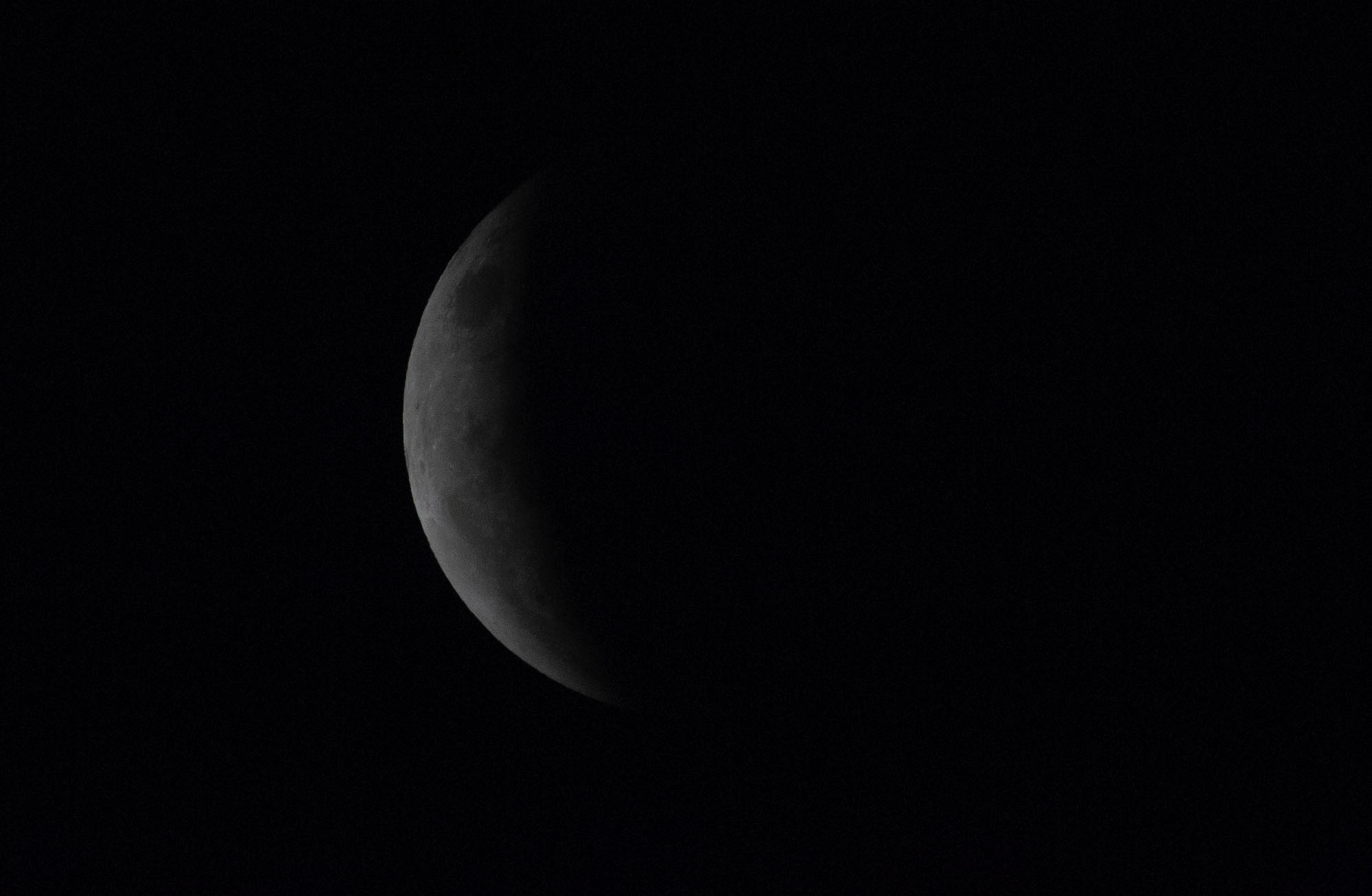
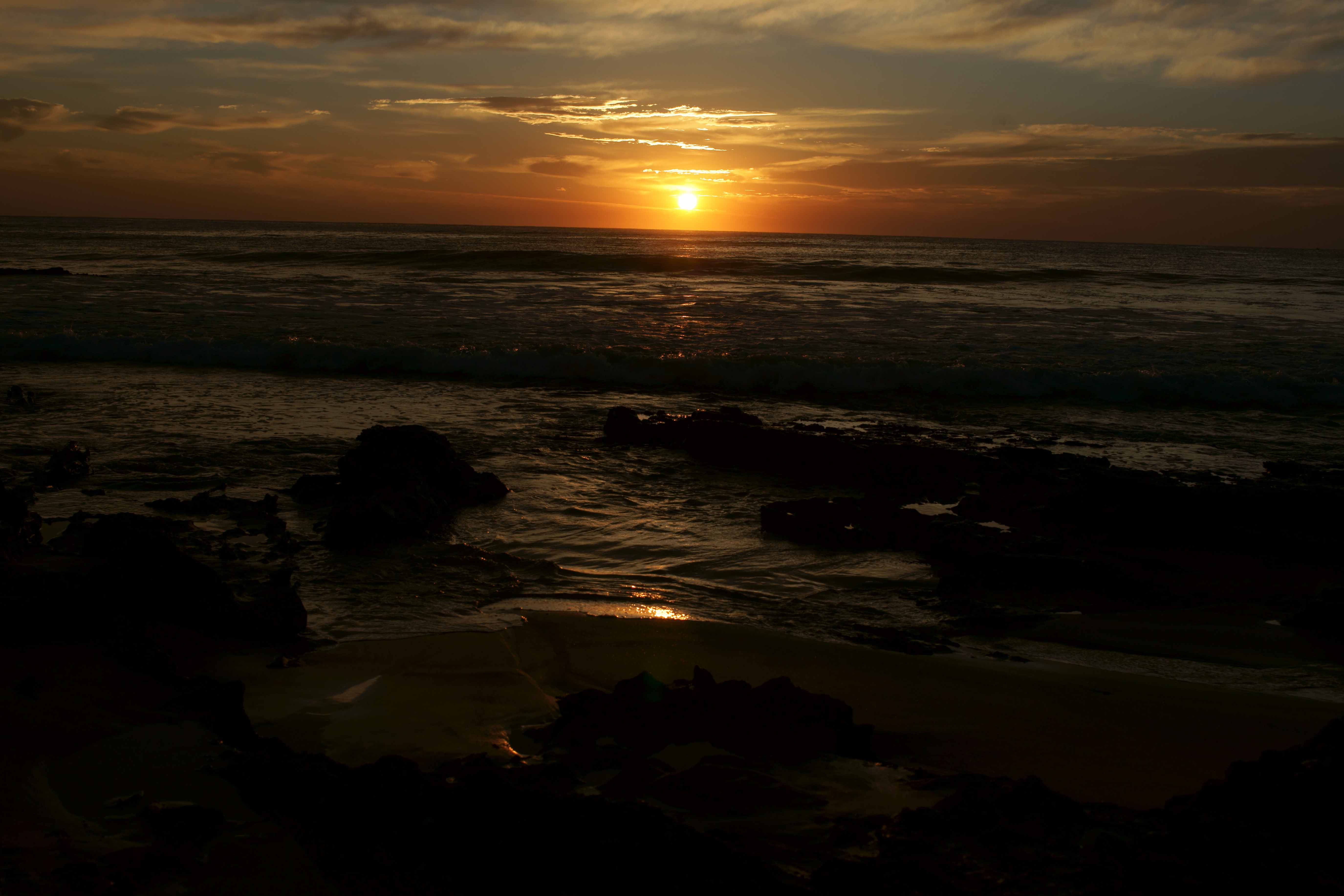
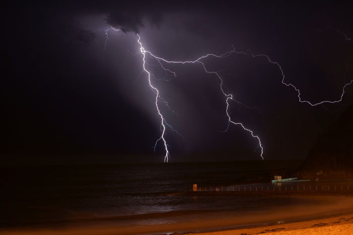
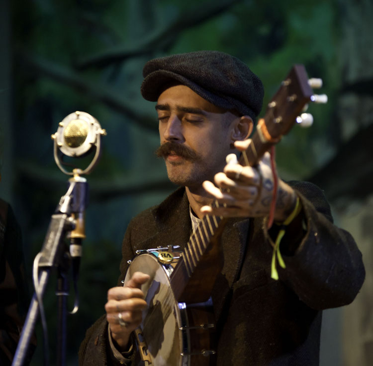
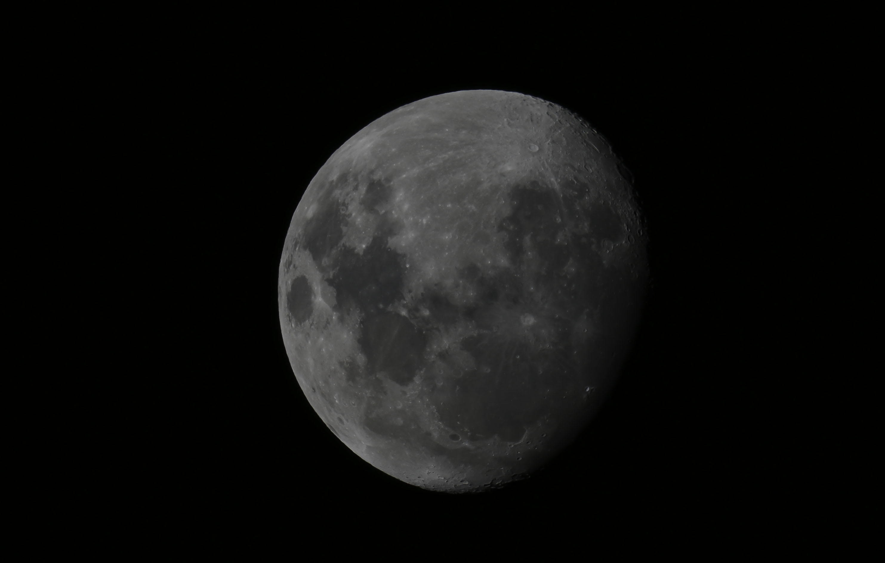
A great image Tom. I'm going to be a rebel and disagree with the others, simply because you said you were hunting a silhouette, and silhouettes are just black with no detail. I agree with Dhananjay though, as you know, a tripod lets us take great long exposures, but then, that sliver of moon would have been affected. Can I ask how you metered this scene, I'm thinking if you spot metered off a point in the sky, the moon and sky might have remained the same, while the lighthouse could possibly gone even darker. My comments are based on the fact that you said you were hunting a silhouette. But still a great image Tom. |
Jul 11th |
| 73 |
Jul 22 |
Comment |
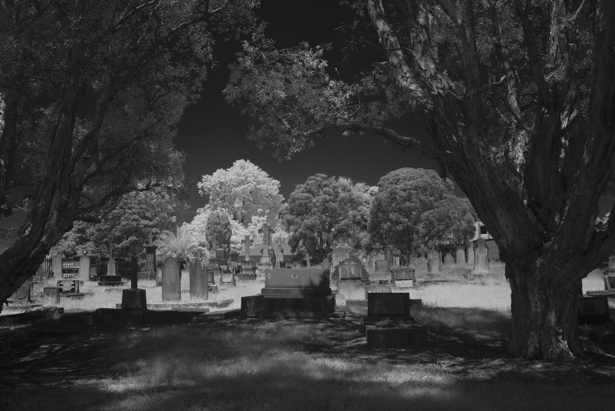
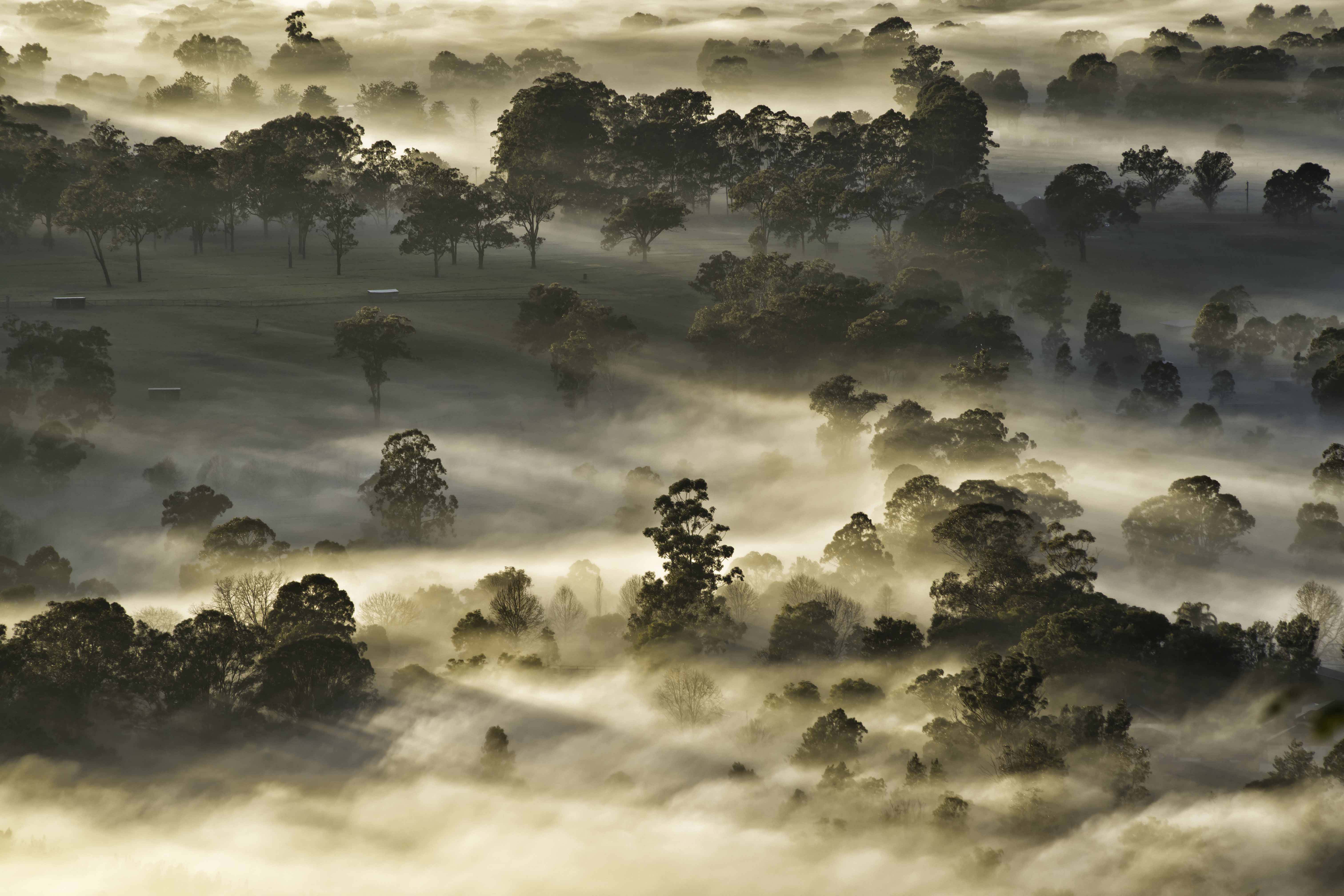
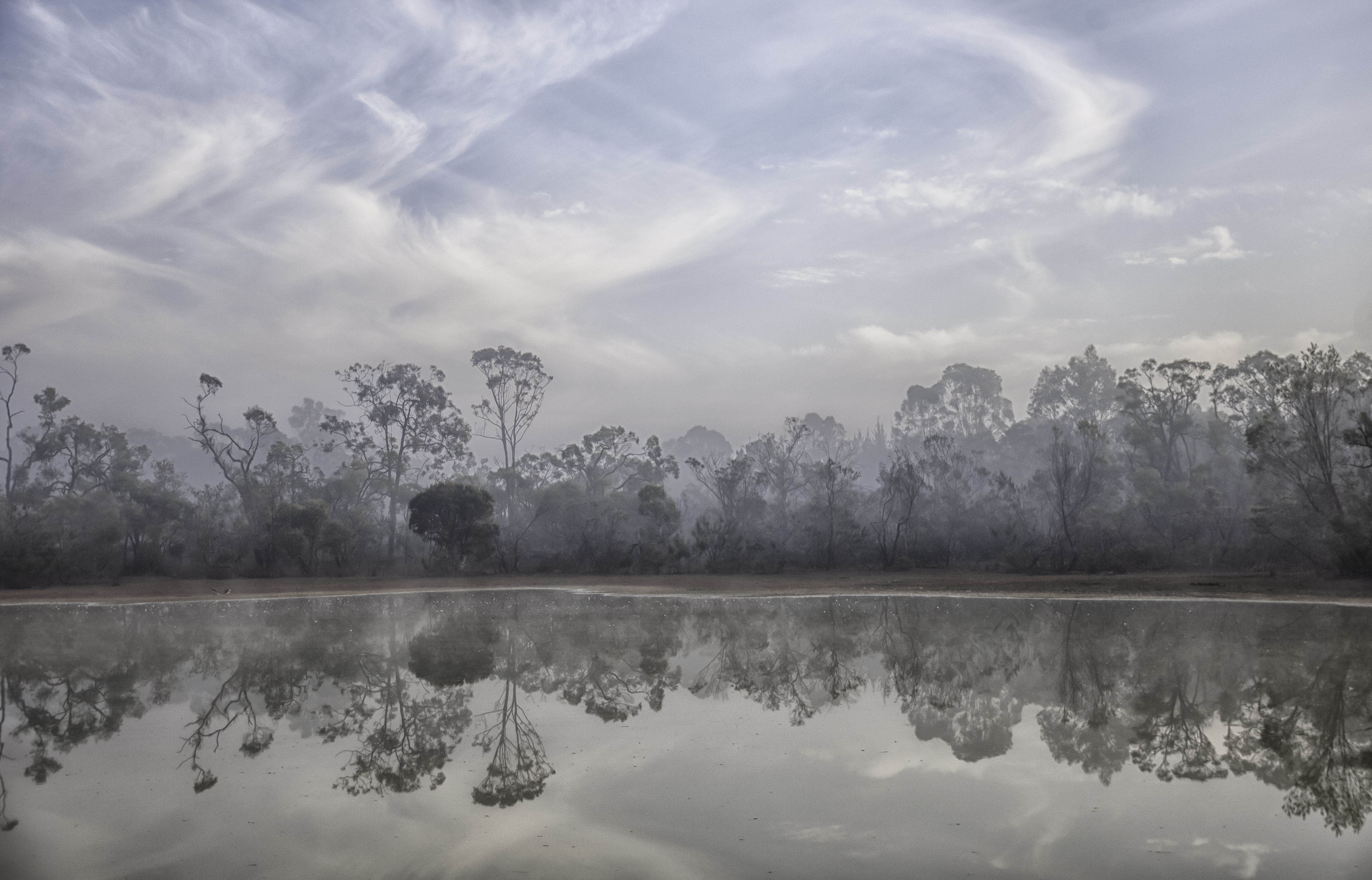
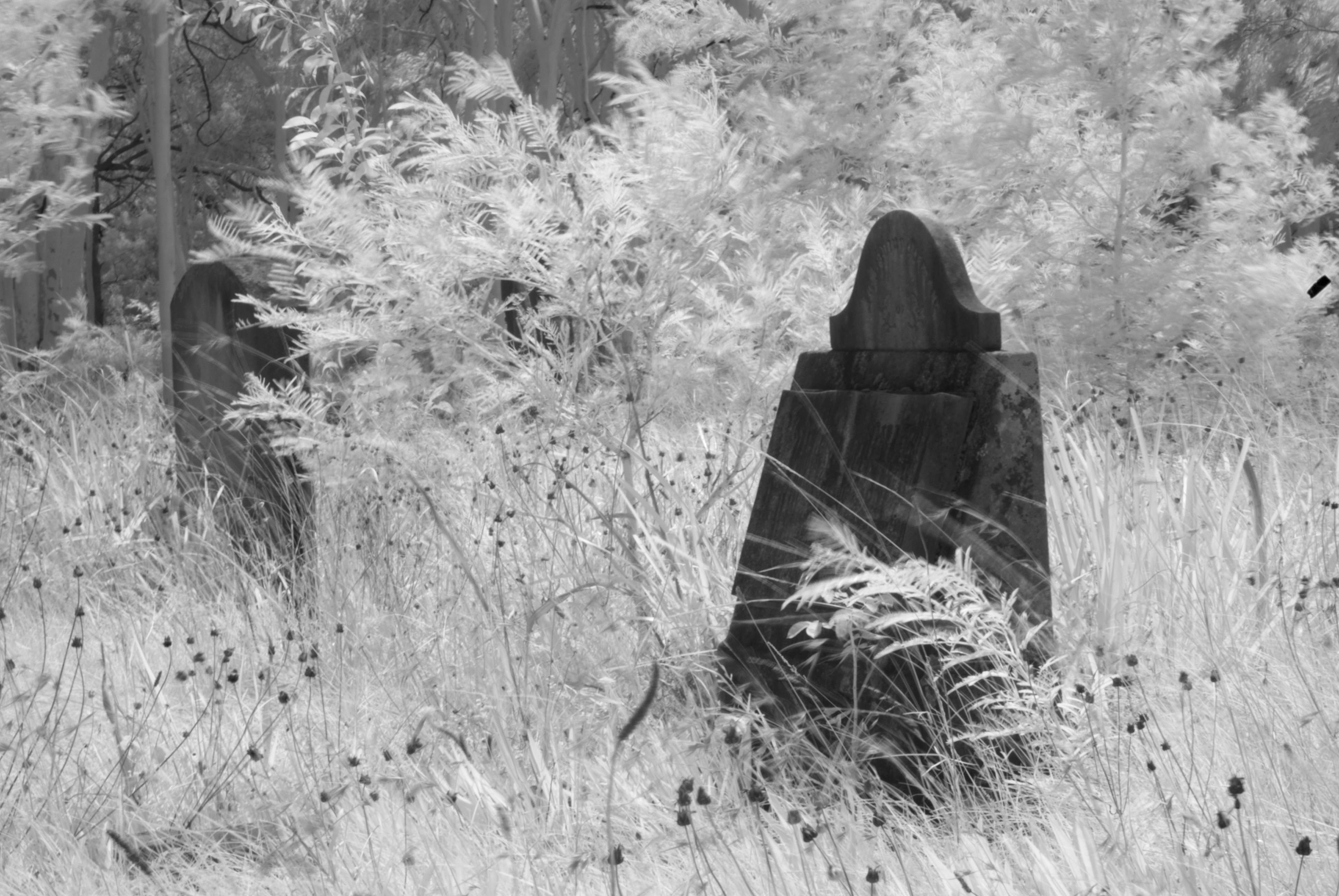
A simple superb image Sherry. Kenya? Animals and birds, then skies, but what about the people / inhabitants? I've also seen some incredible portraits, but then, we are a scape group. As the others have said, your dropping the horizon right to the base of the scene and concentrating on the sky really does justice to this image. And the mood of those clouds. Great processing and presentation. This is one of those images that can cope with many forms of presentation, normal, pano, square and even a vertical if you're happy to loose some of the sides. Congratulations. |
Jul 11th |
4 comments - 4 replies for Group 73
|
| 76 |
Jul 22 |
Reply |
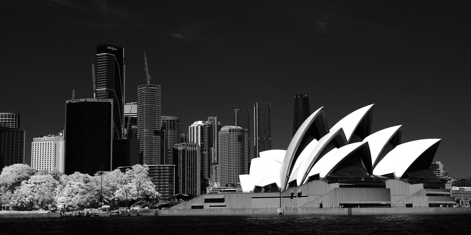
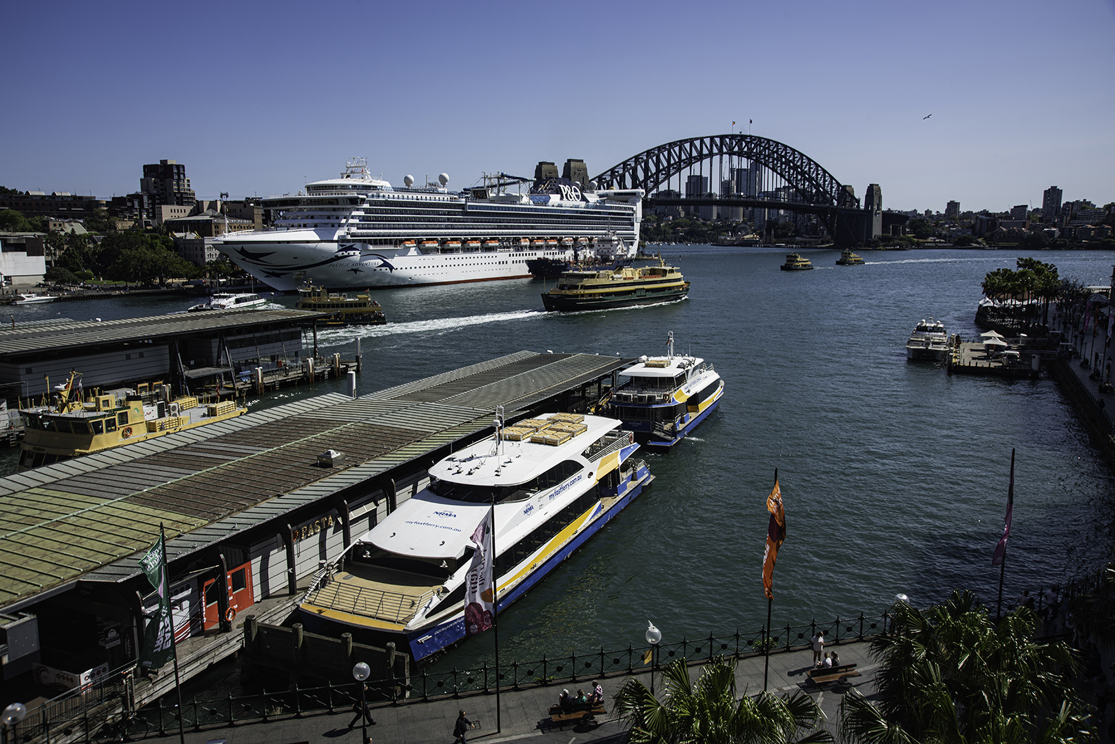
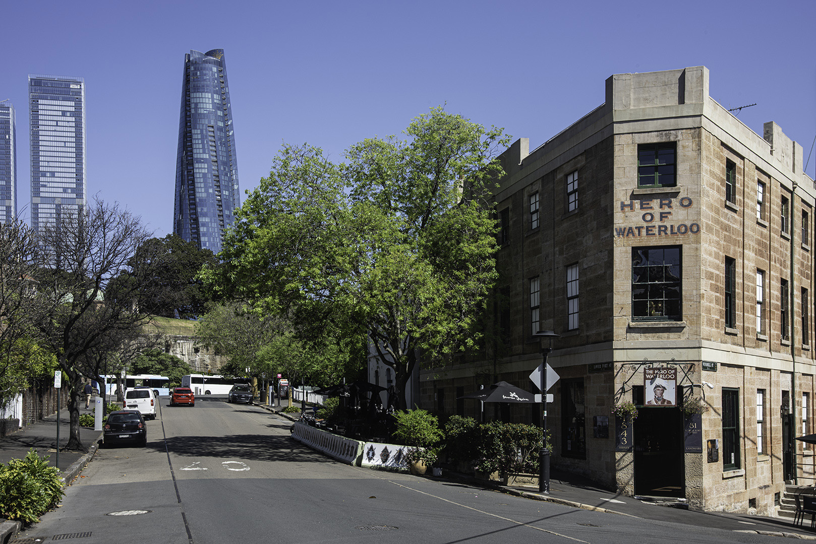
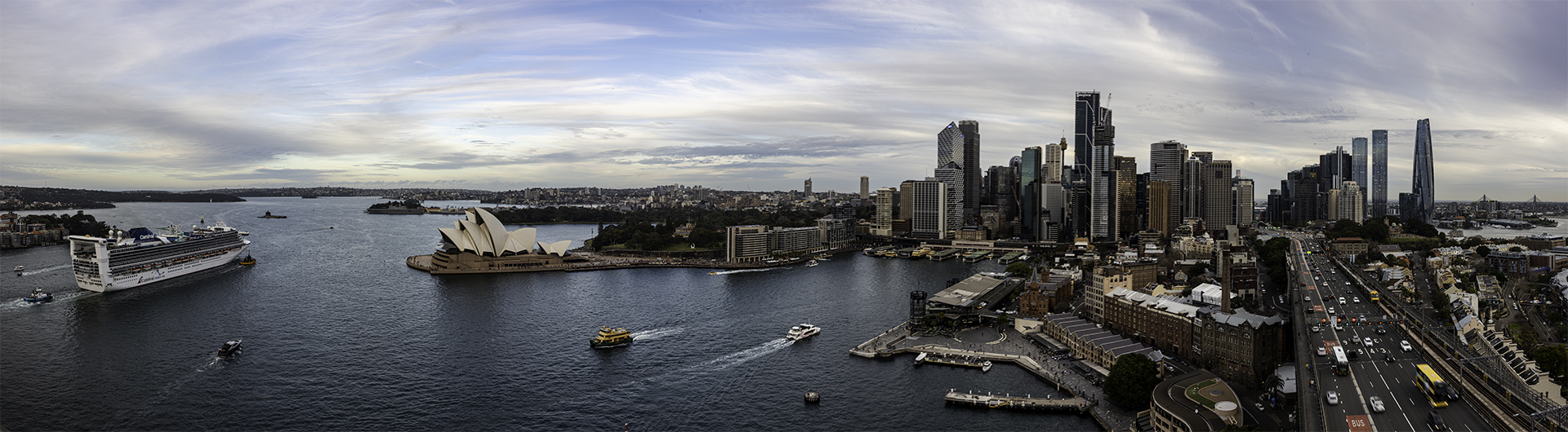
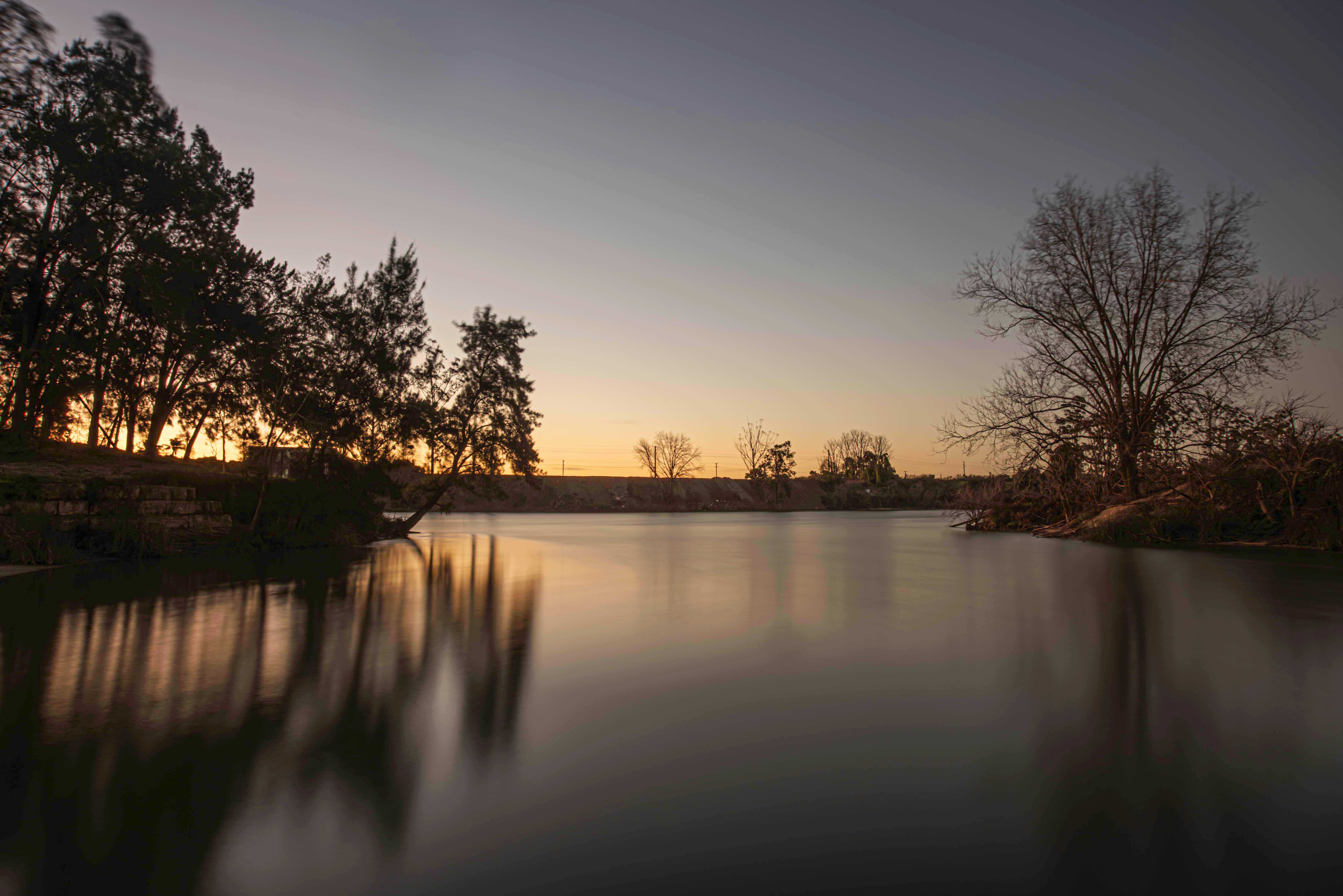
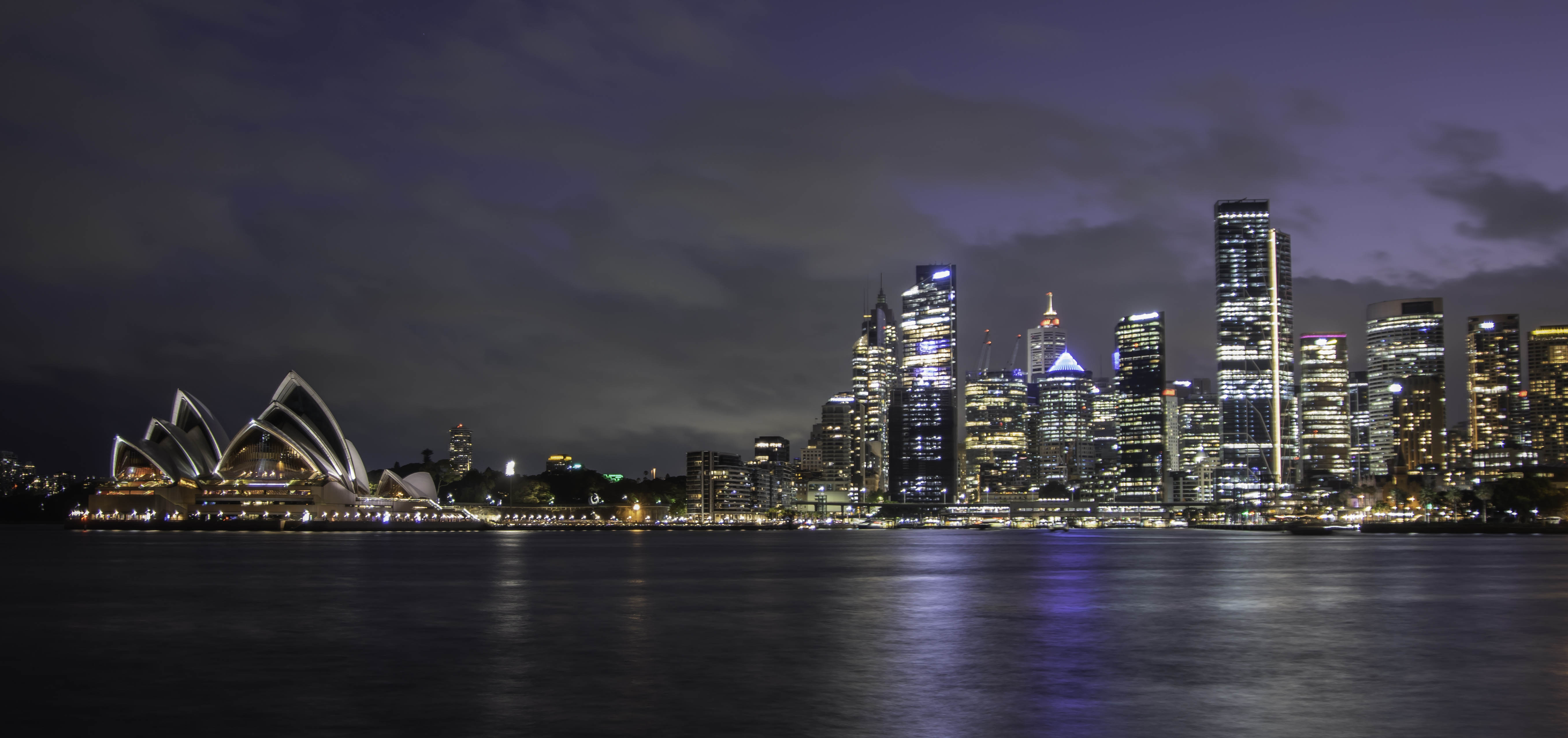
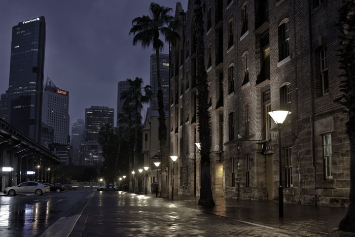
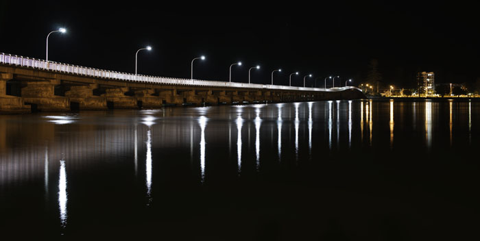
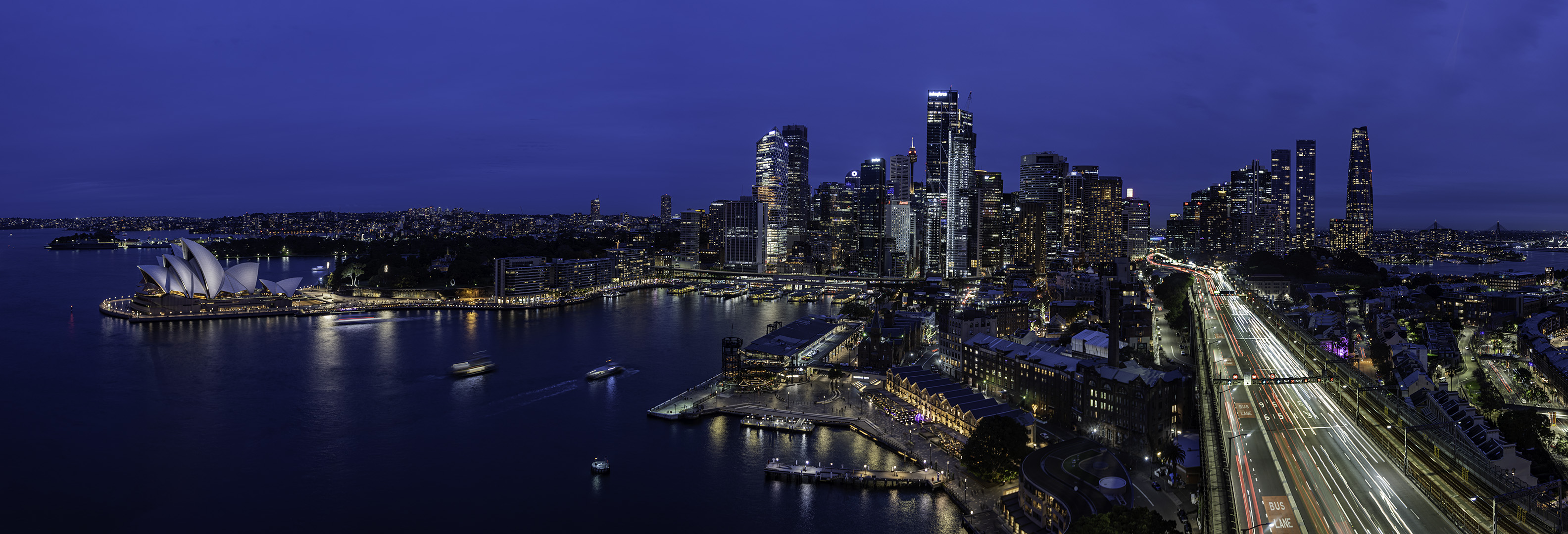
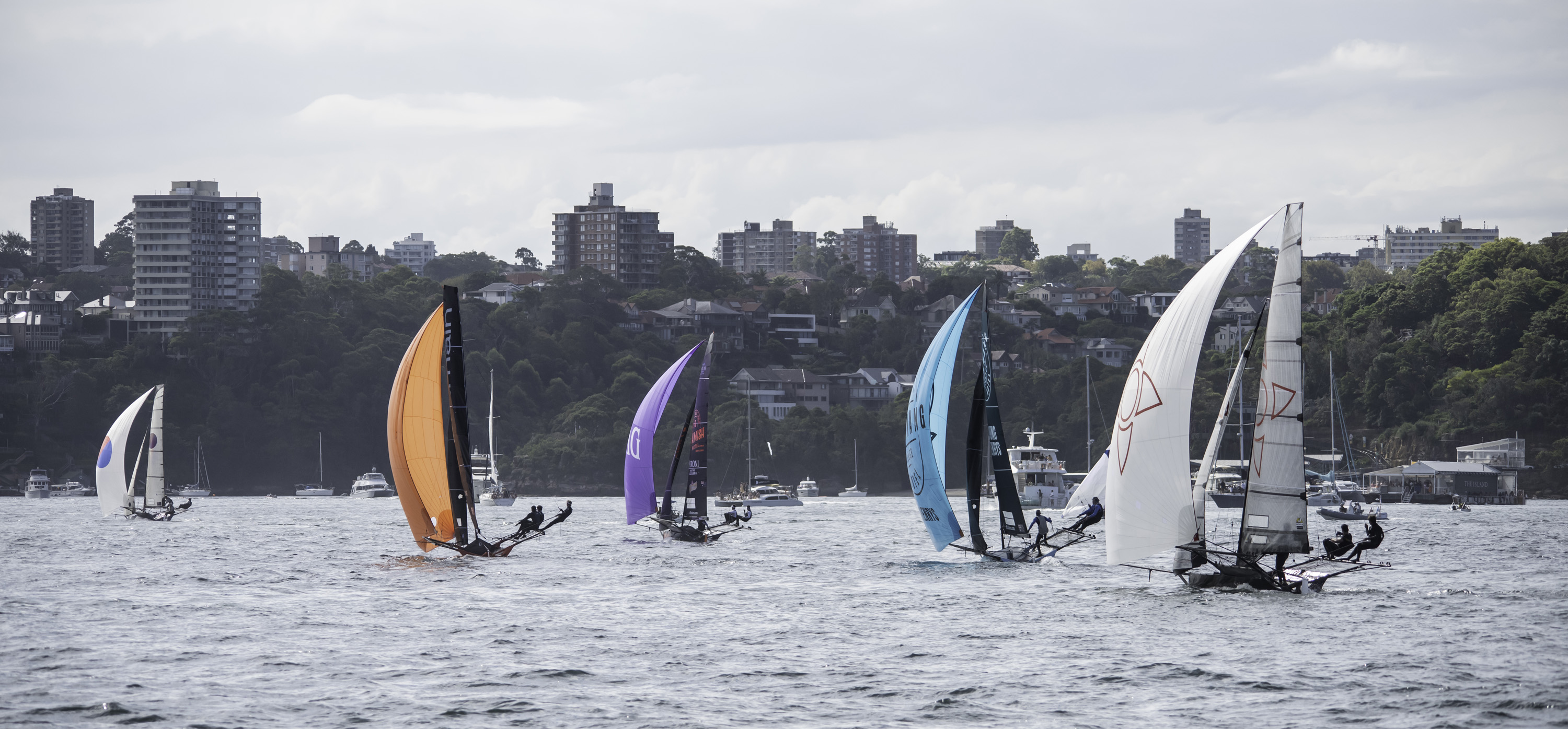
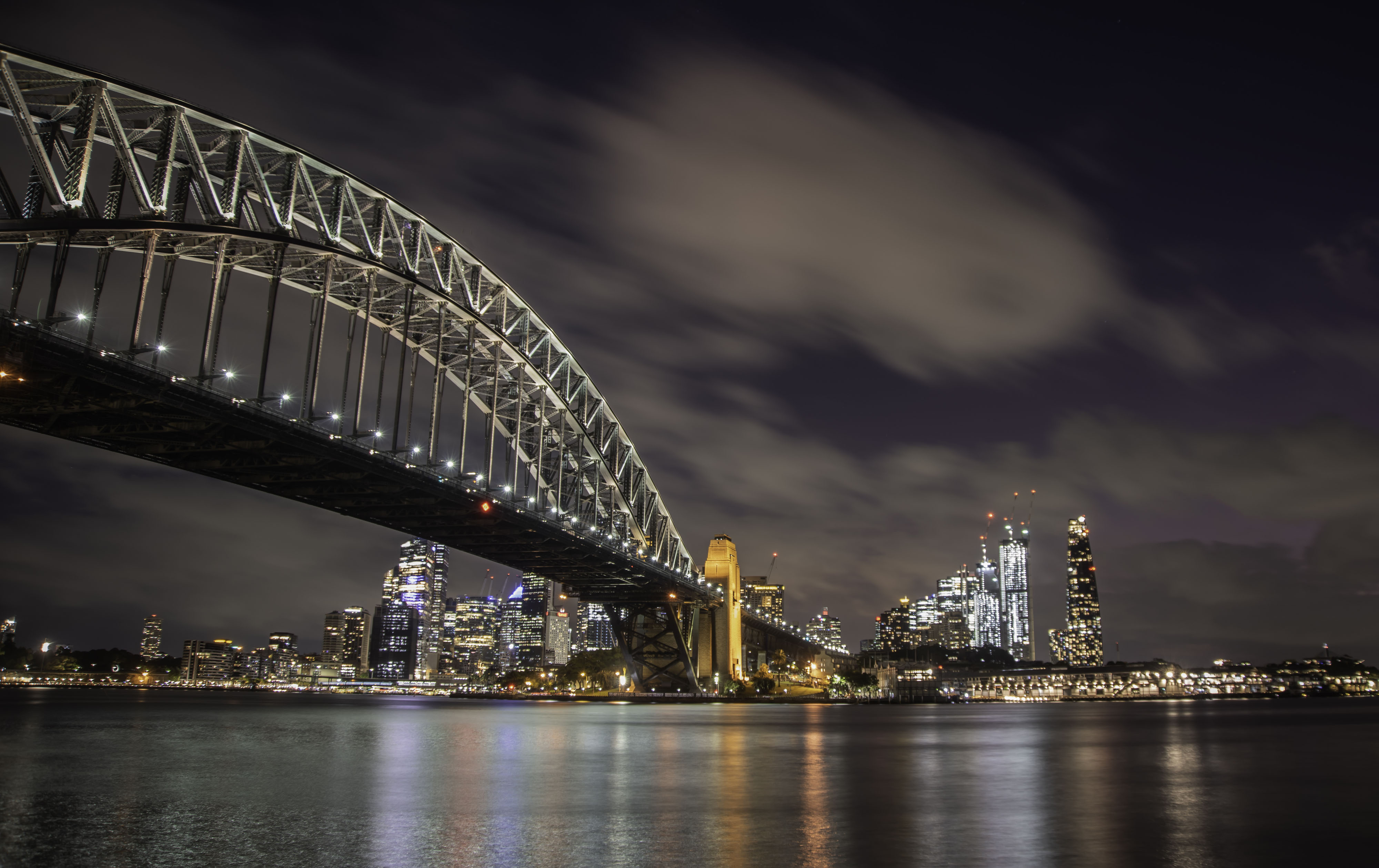
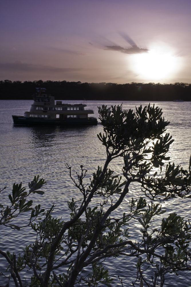
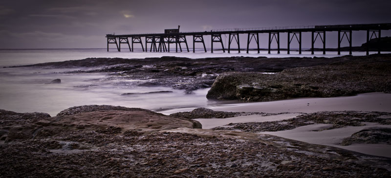
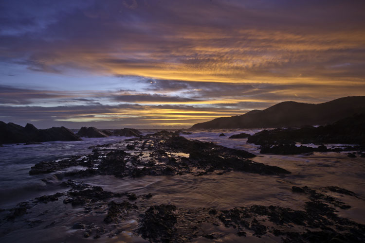
Thank you for your thoughts Sophie. One thing I forgot to mention in my story about the image, is that Sydney Harbour is a very busy place. In between me and the Opera House, out of shot to my right is Circular Quay, the place where all harbour ferries go from and arrive at. They are constantly coming and going, so one must time your photography when they are not passing in front of the camera. |
Jul 27th |
| 76 |
Jul 22 |
Reply |
Thanks for your comments Trey. On the far side of the Opera House is another bay. Those blue triangles are the top of a mast of a sailing boat that is lit up and cruising the harbor during the nights, as are many others. The dots in the background are the lights of a suburb on the other side of that bay. |
Jul 27th |
| 76 |
Jul 22 |
Comment |
Black and White vs Colour ??? Both have their good points and bad points. Good for the colour is warmth in the image, "honesty" as we see the performance in colour and less distractions. Bad for the colour is the woman's dress doesn't stand out from the stage floor behind her. Very bad in the black and white in my mind is the hoop in the top left corner and distracting white line on left of the floor near the end of the flag. Good for the black and white is the way her dress stands out more. My questions: Which image has more drama? Which image has more drama? Which image looks good from a distance and also up close? |
Jul 21st |
| 76 |
Jul 22 |
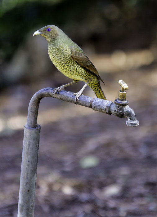
Comment |
A great image Jay. Well captured from a low viewpoint that removes many distractions and forces us to concentrate on the bird. Good and sharp in the areas it's supposed to be with a suitably blurred background. Well done. |
Jul 21st |
| 76 |
Jul 22 |
Comment |
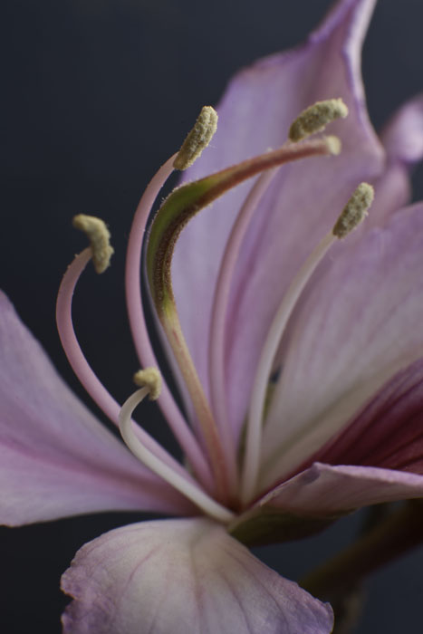
A fine image Trey and great processing of 9 stacked frames. The colours are pleasing and true to life. I appreciate the small size and delicacy of these new spring flowers which is evidenced by their surrounding environment, but I also hope you took more than this image, or 9. While I acknowledge your eye and skills, I can't help thinking and wishing I could also see another image with less leaf litter around. But this is still a good image showing the burst of new life during the coming of spring. |
Jul 21st |
| 76 |
Jul 22 |
Comment |
This is a very thought provoking image Henriette. Obviously being underground it is artificially lit. Your use of the available colours and foreground / background elements is good, but my mind is confused by a couple of things. Top left corner, I get the impression I'm looking through a window or similar, my eye is seeing two implied lines, one vertical one horizontal. The formation uppermost right, has different toning. Is the artificial light causing this? I'm not saying this is a bad image, but it does leave me feeling unsettled. What about B&W? As far as processing a phone photo in PS, I would imagine once it is in PS, the normal processing principles would apply, but I will defer to others more experienced than me.
|
Jul 18th |
| 76 |
Jul 22 |
Comment |
This is a fine shot Sanford, particularly as it is straight from the camera. For me there is some conflict between the two birds in the frame. I appreciate that that is what they do, particularly in mating season, and that is beyond your control, however, I do hope you took a number of photos. Then the resultant image may have left us able to concentrate on and appreciate just one individual bird. |
Jul 18th |
5 comments - 2 replies for Group 76
|
9 comments - 6 replies Total
|