|
| Group |
Round |
C/R |
Comment |
Date |
Image |
| 34 |
Apr 22 |
Comment |
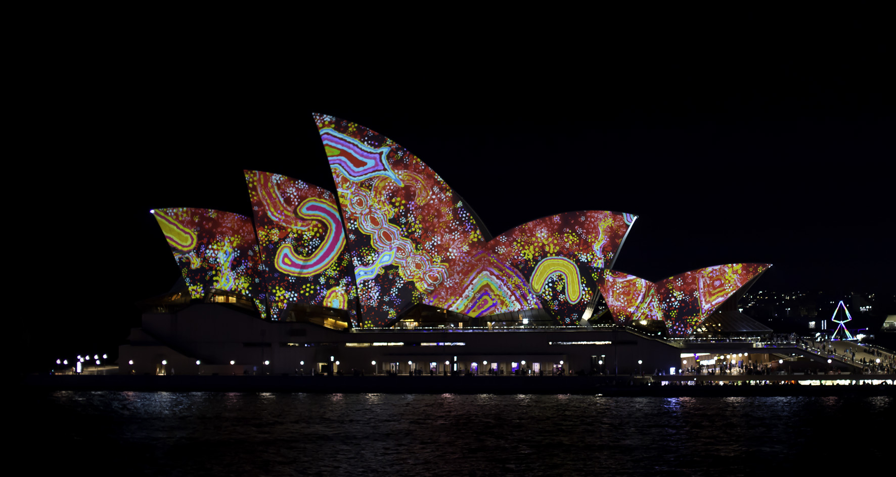
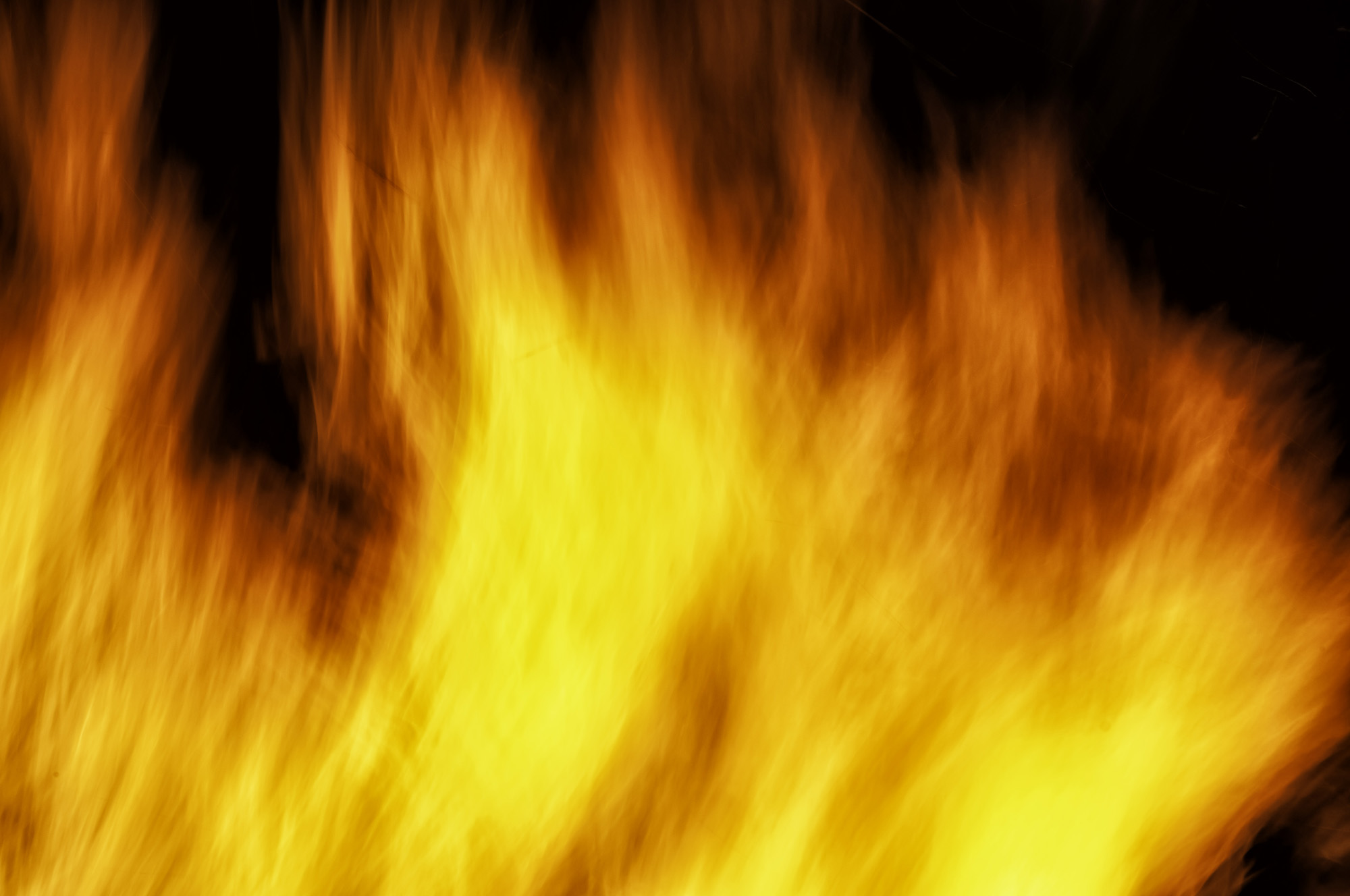
G'day Brian !!!
What a great image. I really enjoy the "celestial" feel. The stars, golden colours and that orb around the statue really suit this style and lift it out of the ordinary.
Great job.
PS, I'm going to be picking your brains about Topaz |
Apr 8th |
1 comment - 0 replies for Group 34
|
| 73 |
Apr 22 |
Reply |
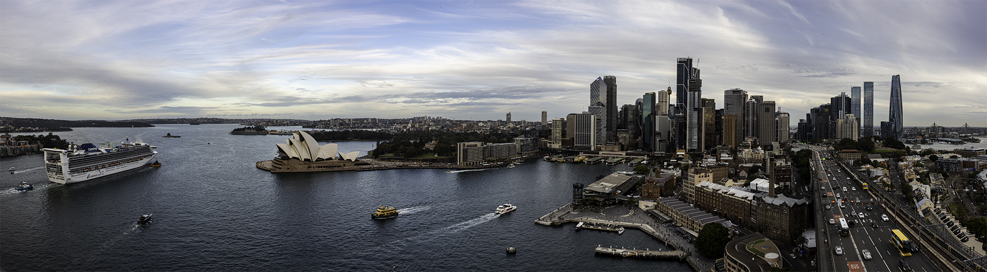
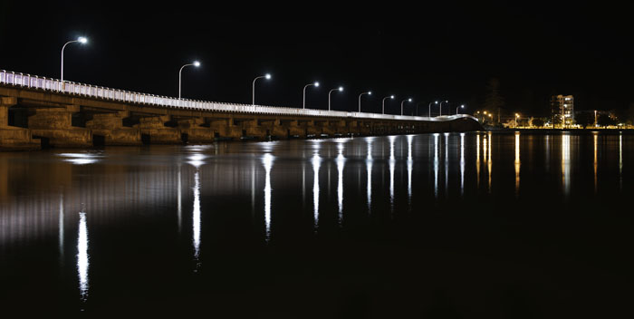
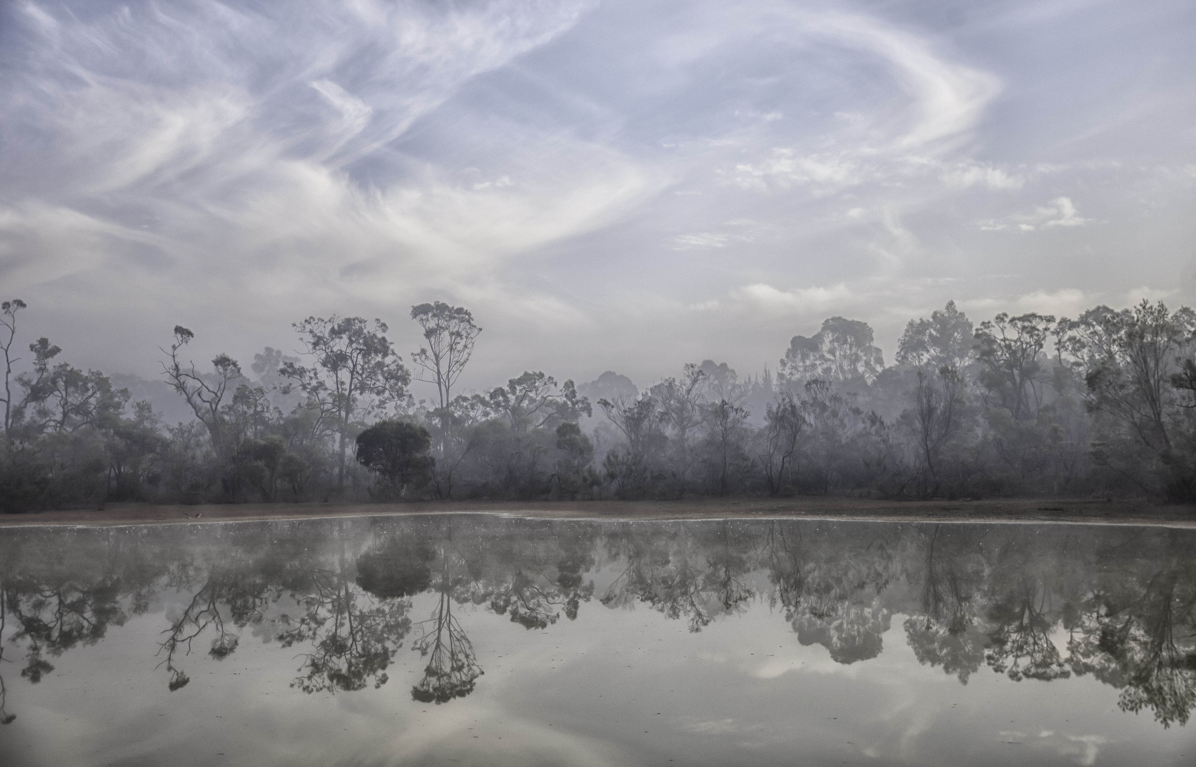
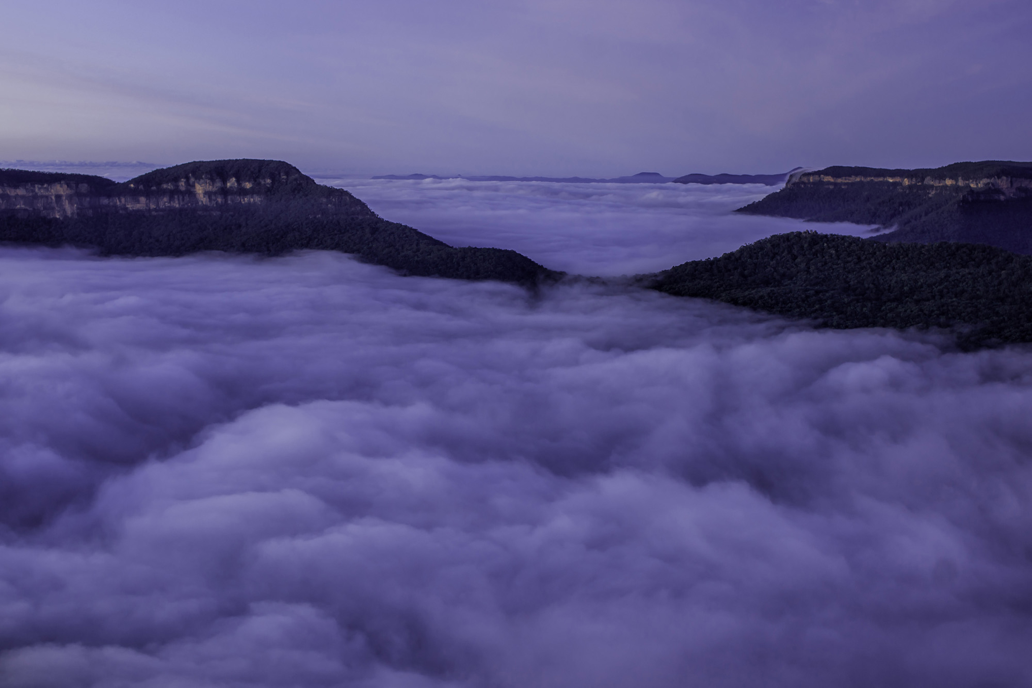
Thanks Tom, yes there were some panos taken while there that session, all showing many different aspects. |
Apr 21st |
| 73 |
Apr 22 |
Reply |
Thanks Debbie. |
Apr 21st |
| 73 |
Apr 22 |
Reply |
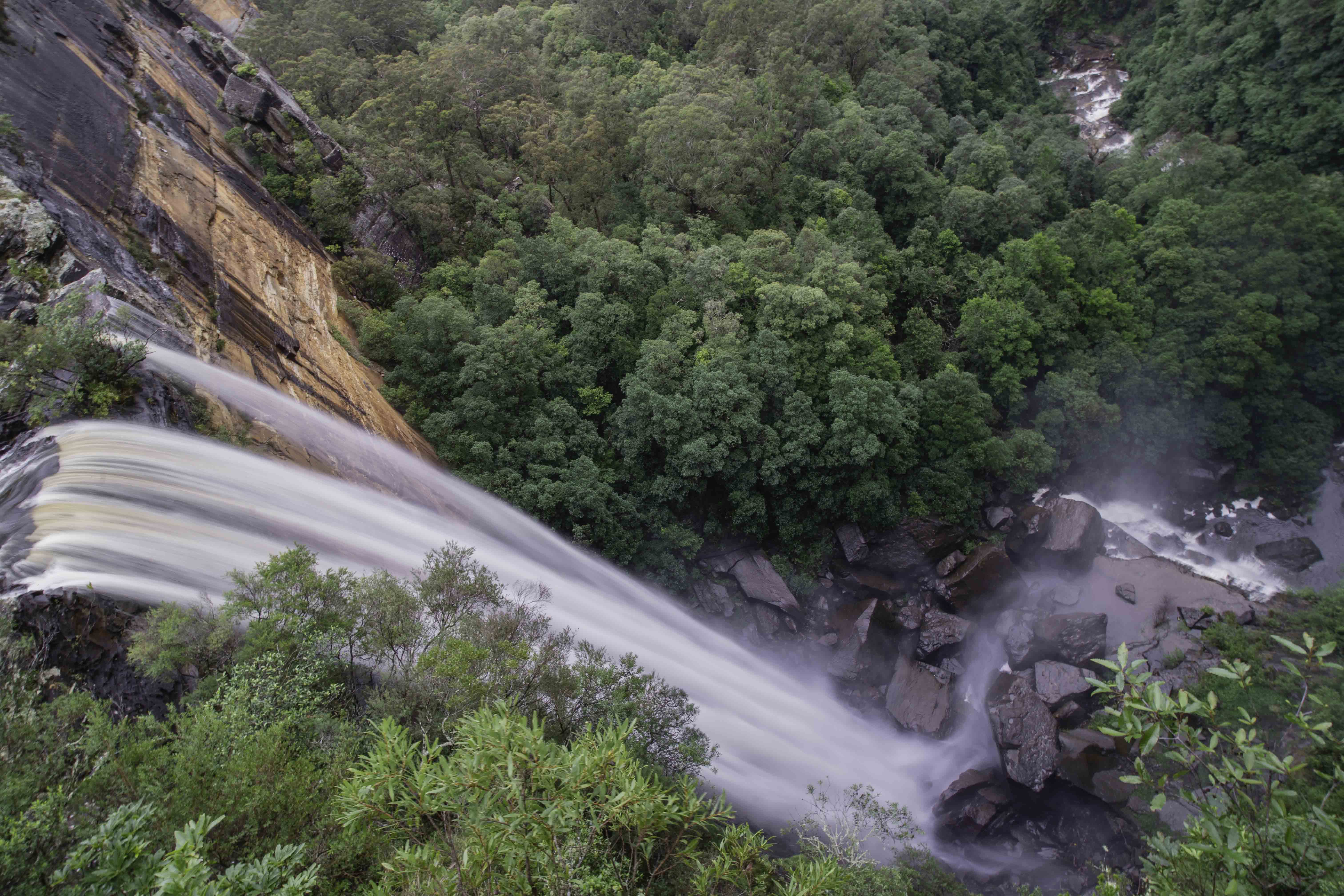
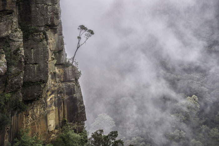
Thanks Sherry, persistence pays. Yes it is a long way down. |
Apr 21st |
| 73 |
Apr 22 |
Reply |
Thanks for your comments Dhananjay. |
Apr 21st |
| 73 |
Apr 22 |
Comment |
All artists, at some time, suffer pain for their (our) art Dave, and you have done so here. Much easier going up first and then back down, rather than down first and then back up. That hurts!!! Your composition and use of the elements is strong and it is rarely easy shooting into the sun. You have done well here. |
Apr 21st |
| 73 |
Apr 22 |
Comment |
A great image Tom, I really should get over there. But then I sometimes think I'd like to show you guys around down here too. Good forward thinking about using the background and waiting for the sun to drop nicely. Very nicely presented. |
Apr 21st |
| 73 |
Apr 22 |
Comment |
Great composition Debbie, and great use of the equipment you had at hand at that moment. You were there and I wasn't, but just as a thought, if you had moved a little to the left, if possible, that smaller older windmill would then not be hidden against that tree or shrubs. The juxtaposition between the old and new windmills would have been a bonus. |
Apr 21st |
| 73 |
Apr 22 |
Comment |
I love the depth you have achieved through the use of foreground and background elements Dhananjay. Yes, any city in your part of the world will have its fair share of issues with pollution, but that can be used to help tell the story of the location. Yes the views are stunning, but I'm having issues with just one minor detail, the walking surface on the wall. Is it shadow, or has some of it collapsed, leaving walkers in danger of falling? But still a great image. |
Apr 21st |
| 73 |
Apr 22 |
Comment |
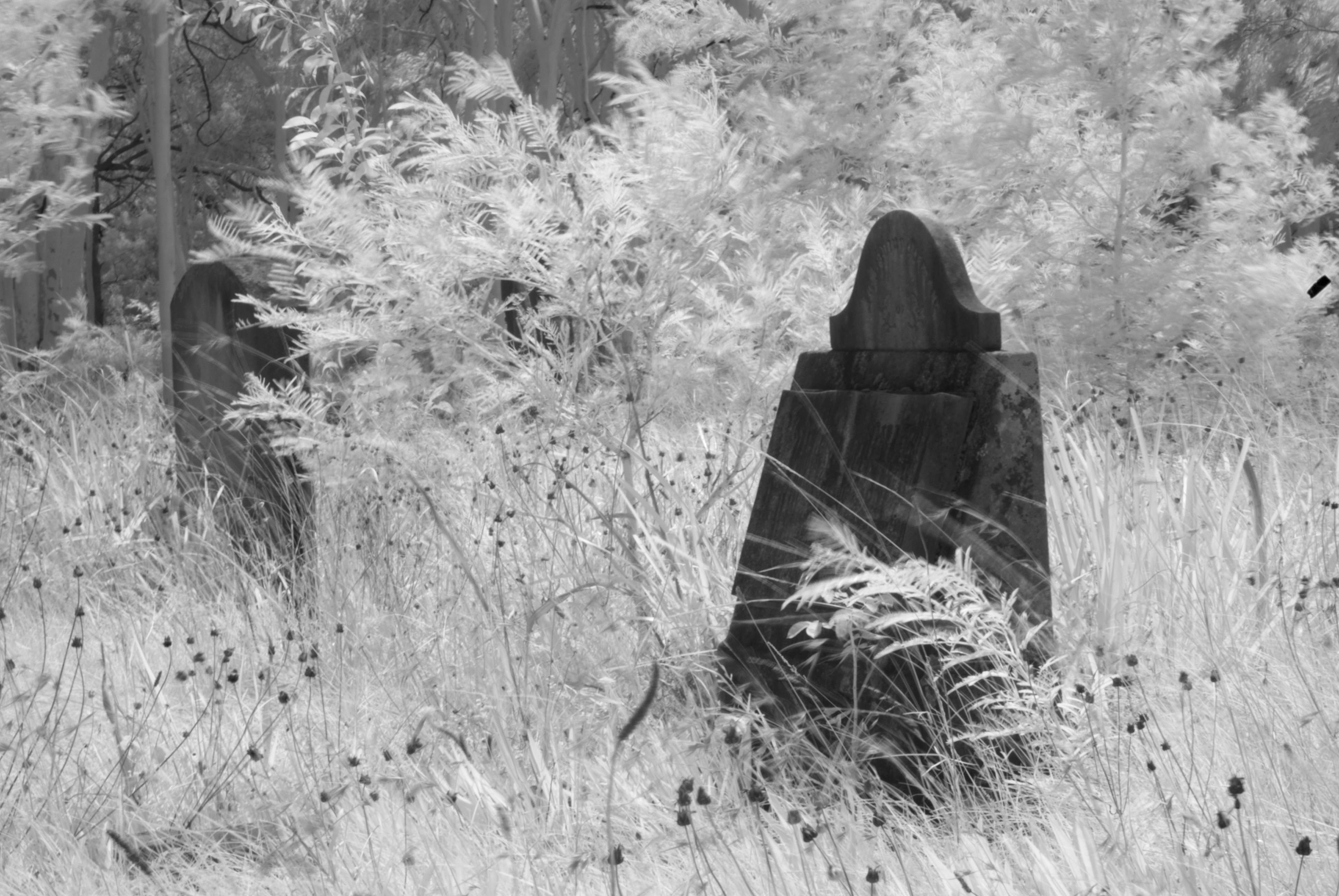
A superb image Sherry. Colours, timing of the capture and your timing of presentation are all perfect. I do like the additional detail in the crosses in Dhananjay's version, but all images start with a vision. A dear friend of mine down here often says "An image should tell a story to its viewer." The one speaks volumes. |
Apr 21st |
5 comments - 4 replies for Group 73
|
| 76 |
Apr 22 |
Reply |
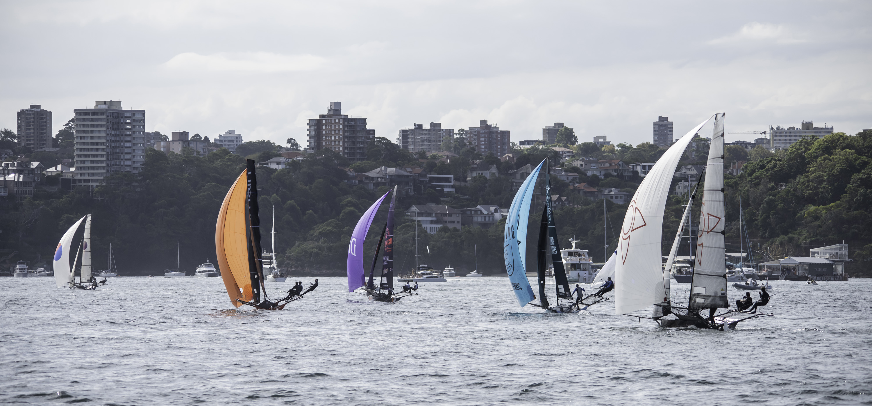
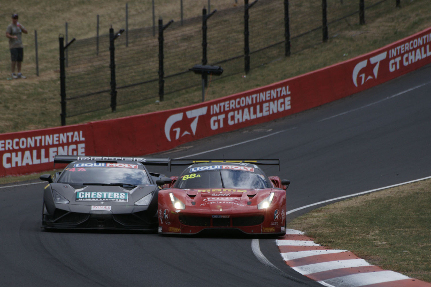
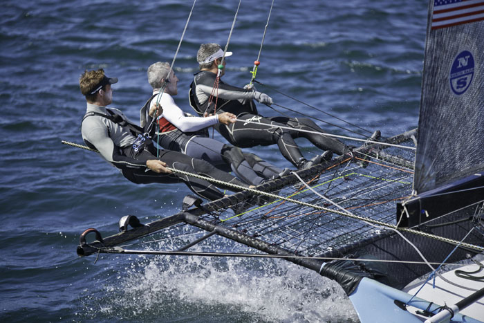
Thanks Trey, yes to crop or not to crop, that is always the question. Nothing wrong with your tighter crop at all, but personally, I like to give them a bit of space, showing where they have come from and where they are going. With the dollar amount, I was asking your thoughts about the value of the cars themselves. Prizemoney and points decrease as you go down the finishers list. To buy these cars from the showroom down here is closer to AUD$400k than AUD$300k, then to put them on the track, I estimate around AUD$800k. I'd had to put one into the concrete!!! |
Apr 25th |
| 76 |
Apr 22 |
Reply |
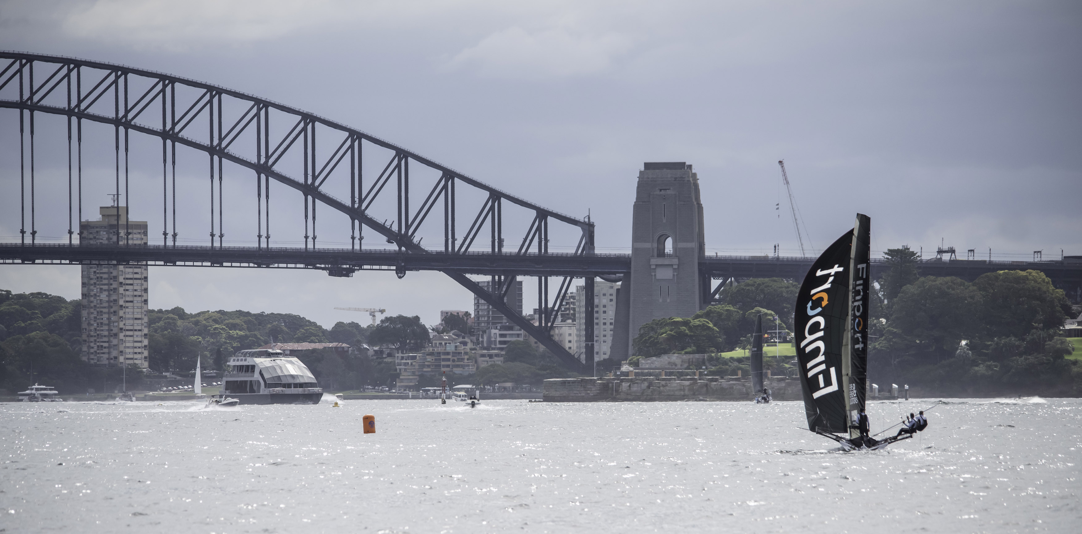
Thanks Jay, this circuit is about 4 miles in length with many great spots to point a camera from. Sadly, only one small section on each of the two straights are open to spectators, the starting section as they go "up" the mountain, and the braking area as they come back "down", so we can't get them at their full speed of around 180mph. Maybe that's a good thing for spectator safety. This particular corner is about half way across the top of the mountain. |
Apr 25th |
| 76 |
Apr 22 |
Reply |
Thank you for your thoughts Sophie. I usually come home from this day with over 500 images. I just like to crop some images and not spend too much time editing and processing. Other images, yes by all means get their processing time, but at the racing I like to get it as right as I can at the time of capture. |
Apr 25th |
| 76 |
Apr 22 |
Reply |
Congratulations on your upcoming exhibition of your circus images Sophie. That is a great accomplishment. Please do not be like me, I am my own worst and most harshest critic. To be fair to yourself, when the exhibition is open and on display, 1 step back, 2 look at your images as a collection and ask "Are they cohesive as a group?" 3 compare them to all others and again ask "Are they as good as most of the other images?" I wish you very well and would love to hear your thoughts on how it all goes. |
Apr 25th |
| 76 |
Apr 22 |
Reply |
Thank you Henriette, I love looking at the revision mirrors in between the two cars. A tribute to the drivers' skills. I never noticed the colours the way you mentioned, I was just lucky that's what their colours were. |
Apr 16th |
| 76 |
Apr 22 |
Comment |
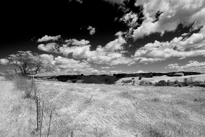
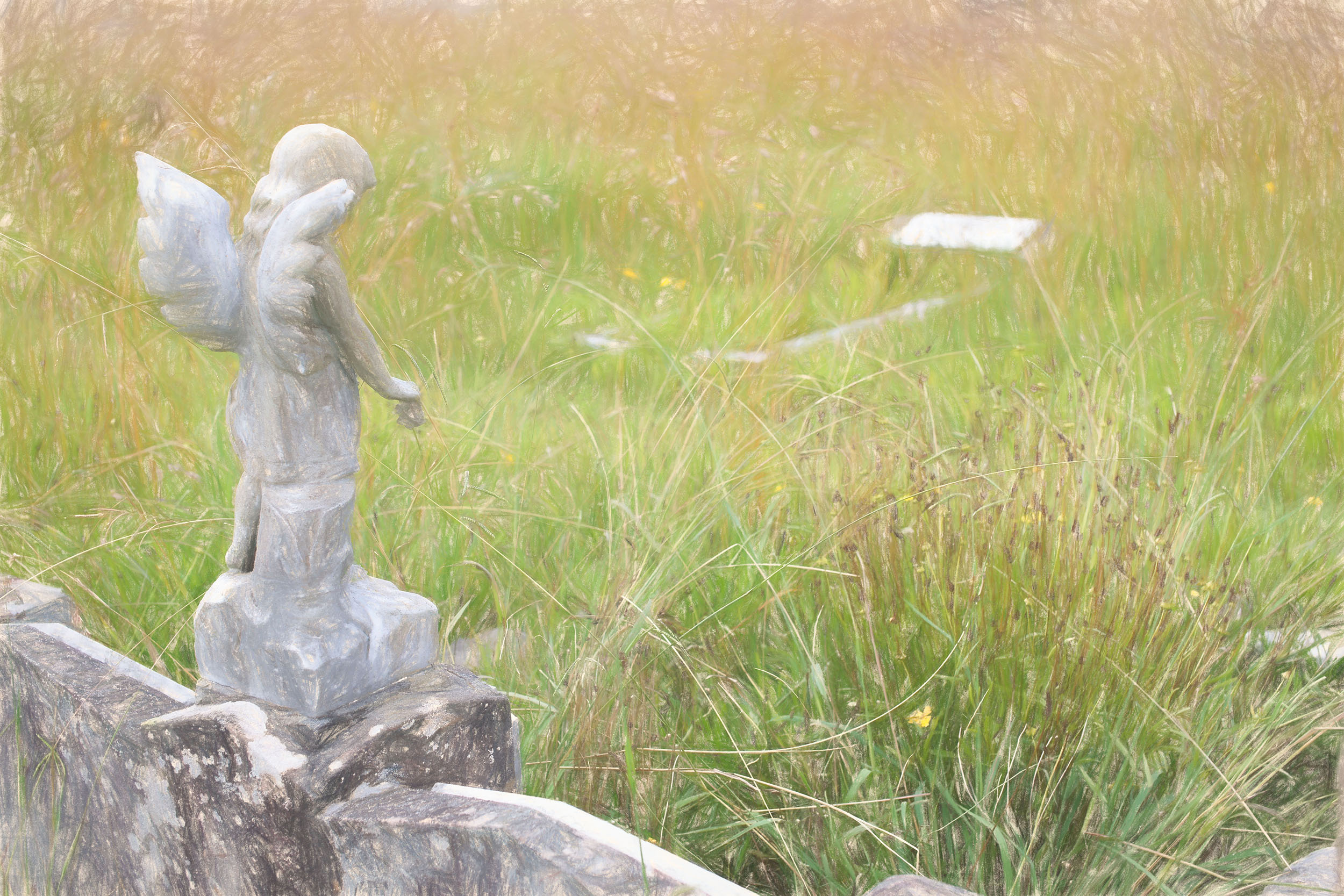
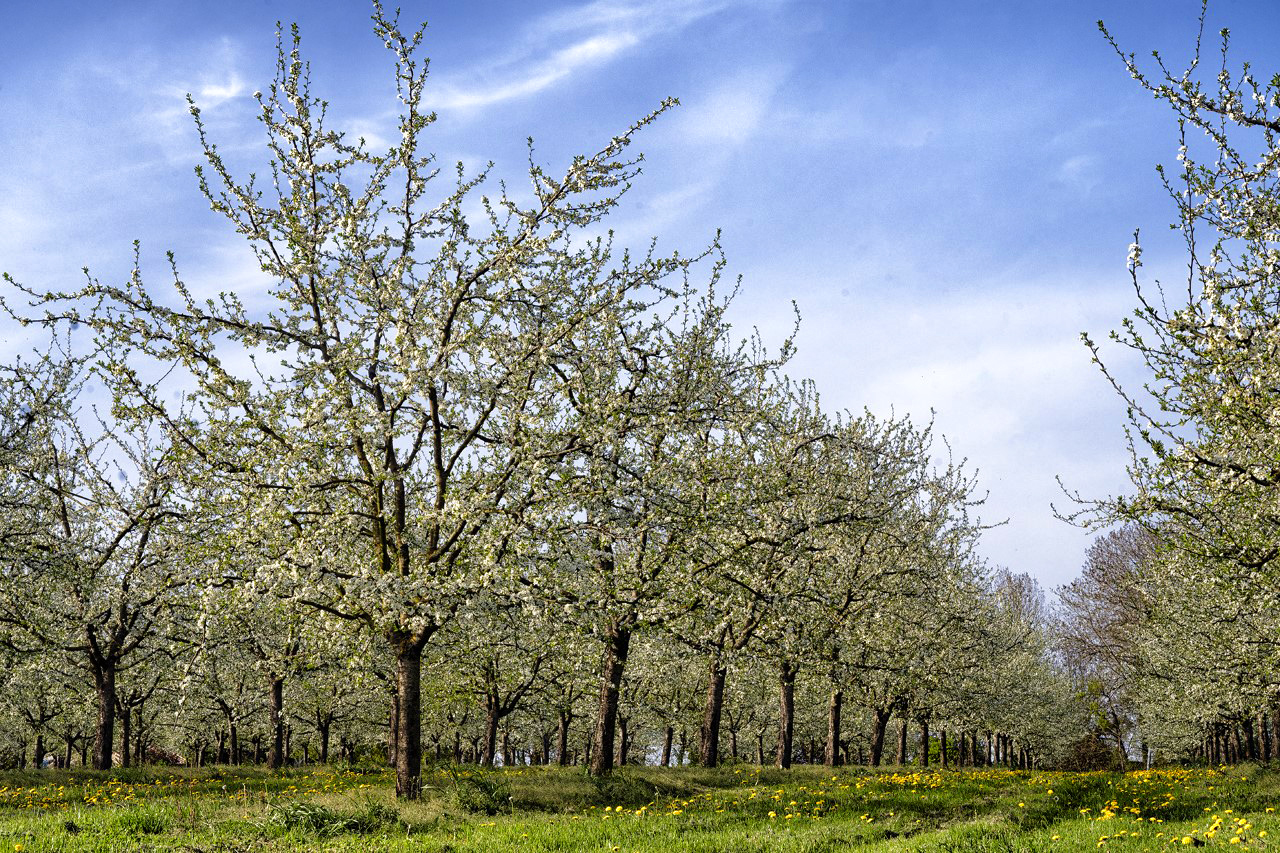
I salute and applaud you for stepping out of your comfort zone this month Sophie. Well done and please keep stepping out. That is how we all grow. You have mentioned previously that you would like to become a judge and that is excellent. Two friends of mine down here are judges and they often ask "What is the story in this image?" Sometimes the answer is obvious, sometimes not so obvious. This is a landscape and as many landscapes, they don't have much of a story, they rely on their content and elements to capture a viewer's attention. I like your viewpoint (yes I acknowledge you are in a wheelchair), but being a little lower, you have made good use of the foreground, that many of us may overlook, particularly the yellow flowers in the bottom. The trees have good details and the sky has "some" clouds. So, how can we help improve this image? Have you got, or heard of NIK filters, a plugin for photoshop. There are many options available, but I have gone straight to my favourite - Colour Efex Pro 4 - Tonal Contrast. In my mind and eye, this has brought out some more detail in the grass and yellow flowers, and the sky / clouds. Sadly, it also highlights any flaws, such as your dust spots, but they are easily fixed / removed. I also tried the "Fog" filter, but the blue sky made this look not quite right. Maybe switching to black and white? What do you think? I have attached my version with Tonal Contrast, and I have also just touched the saturation, just a little. |
Apr 16th |
 |
| 76 |
Apr 22 |
Comment |
Another great image from Antarctica Sanford. As Henriette said, so much can be done with this image, but please straighten up that horizon. There might not be any water there, but my mind is expecting to see some, so my eyes are wanting to see a level horizon. As opposed to your image last month "Solitude" where the story (for me) was in the vastness of the location, perhaps this month you could have cropped the image quite a bit, to show us more of the penguin having a scratch. Just me thinking out loud. |
Apr 16th |
| 76 |
Apr 22 |
Comment |
This is a great image of a family in their wild and natural location. Mum, Dad and Bub. A happy reunion. I admire wildlife photographers very much, particularly those who capture birds. They can be insanely fast and unco-operative. And then there's their environment, when choosing their nest locations, there never give a thought to us photographers. In all aspects of this image, you have done very well Henriette and I take my hat off to you. Very well done. |
Apr 16th |
| 76 |
Apr 22 |
Comment |
Heidi, this is one of your best images yet!!! Composition and lighting are perfect. I love the way you've used and balanced the colours, the reds and browns together, while I feel the greens and yellows complement each other. Absolutely stunning, an image I never tire of looking at. |
Apr 16th |
| 76 |
Apr 22 |
Comment |
Jay, what a stunner!!! As Henriette said, a great fun image to put a smile on any viewer's face. A very important part of photography, fun for the photographer and joy for the viewer. Compositionally, you have excelled. Original image shot a little big, with the intention of cropping out any un-necessary excesses in processing ;). A great technique. I'm just hoping you got some others shots with his/her heard up with pumpkin smeared around his/her chops. |
Apr 16th |
| 76 |
Apr 22 |
Comment |
Congratulations on this fine detail image Trey. Compositionally, you've nailed it, in the original. The "crown Victoria" badge is level, as I believe it would have been placed by Mr Ford. In your main image, it's a little off horizontal. If you were trying to even up the chrome work, I personally would have gone the other way and kept the Victoria badge horizontal. We are very used to seeing chrome work of all shapes, sizes and fixtures on cars, particularly of this era. I really like what you've done with the colours, they're nice and clean and crisp.
One last minor detail, top right hand corner, that shadow area. From a door handle or revision mirror? Is the shadow really necessary to the image? Me being picky, yes, but I believe in this type of image when there is not a lot of content material, what there is in it, should count. |
Apr 16th |
| 76 |
Apr 22 |
Reply |
Thanks for visiting our group Lance and for your comments. Yes, I don't see tripods at the races very much anymore, it's a shame because it shows me just how much time people spend looking at the event through just eye. Of course, I'm as guilty as others when I'm panning some shots, but my personal preference is to set up the camera and tripod and enjoy the racing, while capturing those moments. I also like to get a good number of images with two or more cars, to show them actually "racing". Again panning is a different practice that just focuses on just one car. Thanks again. |
Apr 16th |
6 comments - 6 replies for Group 76
|
12 comments - 10 replies Total
|