|
| Group |
Round |
C/R |
Comment |
Date |
Image |
| 41 |
Sep 19 |
Comment |
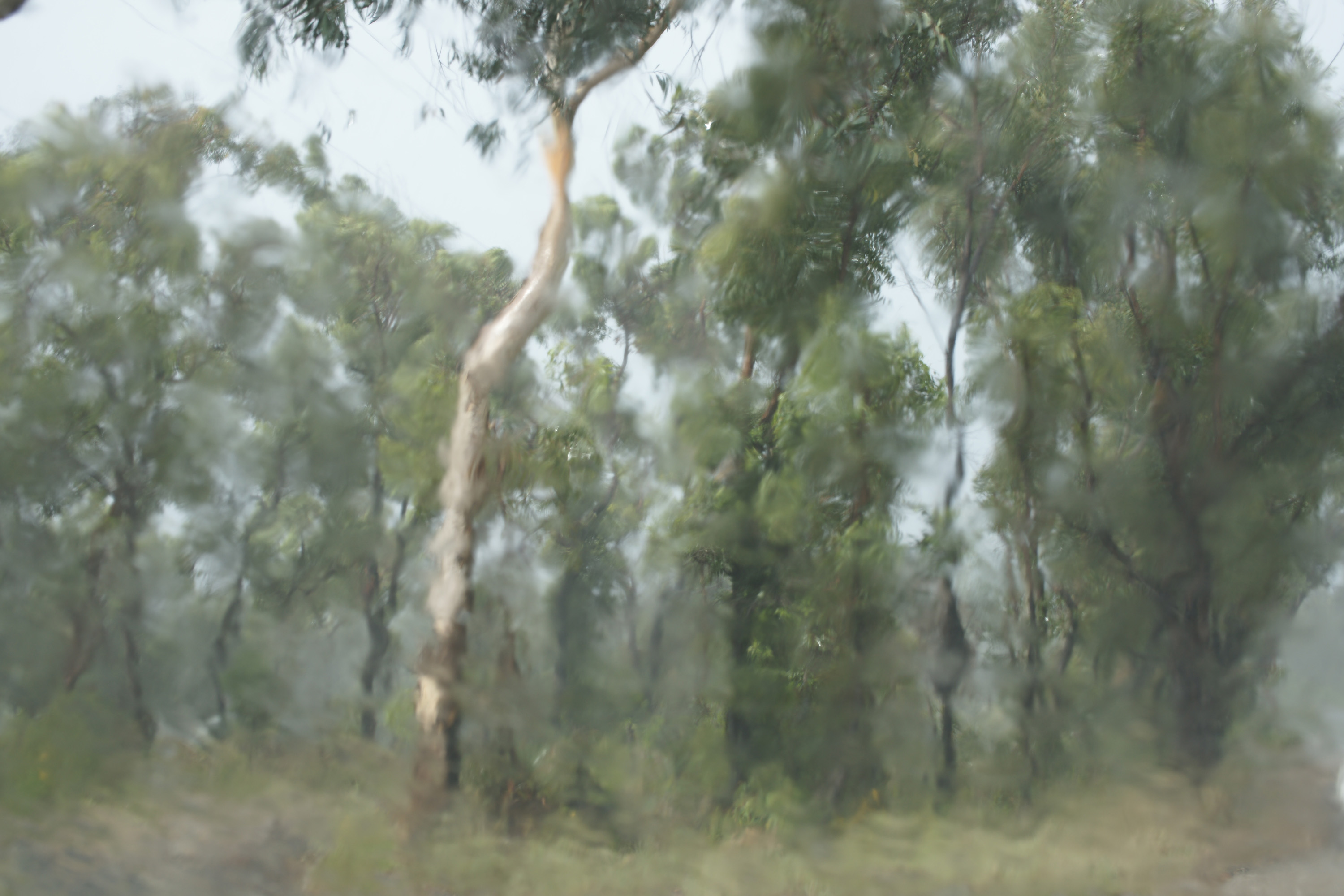
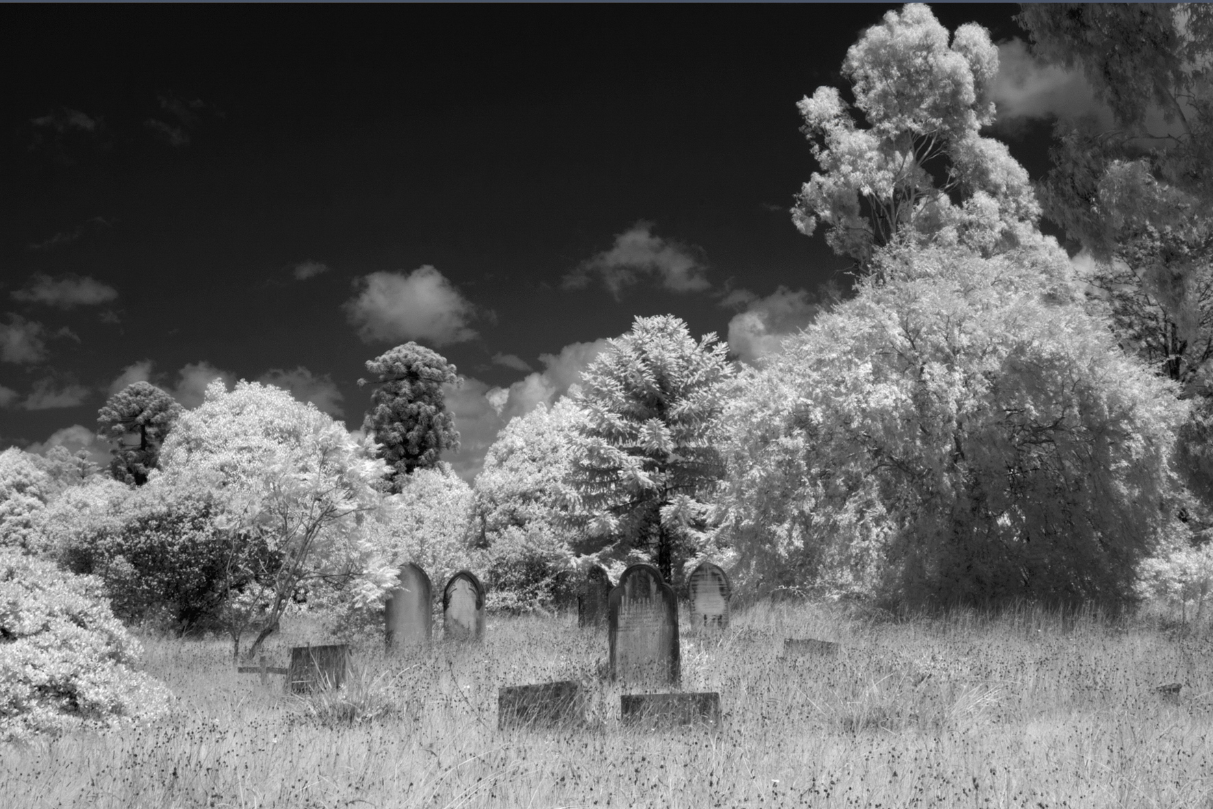
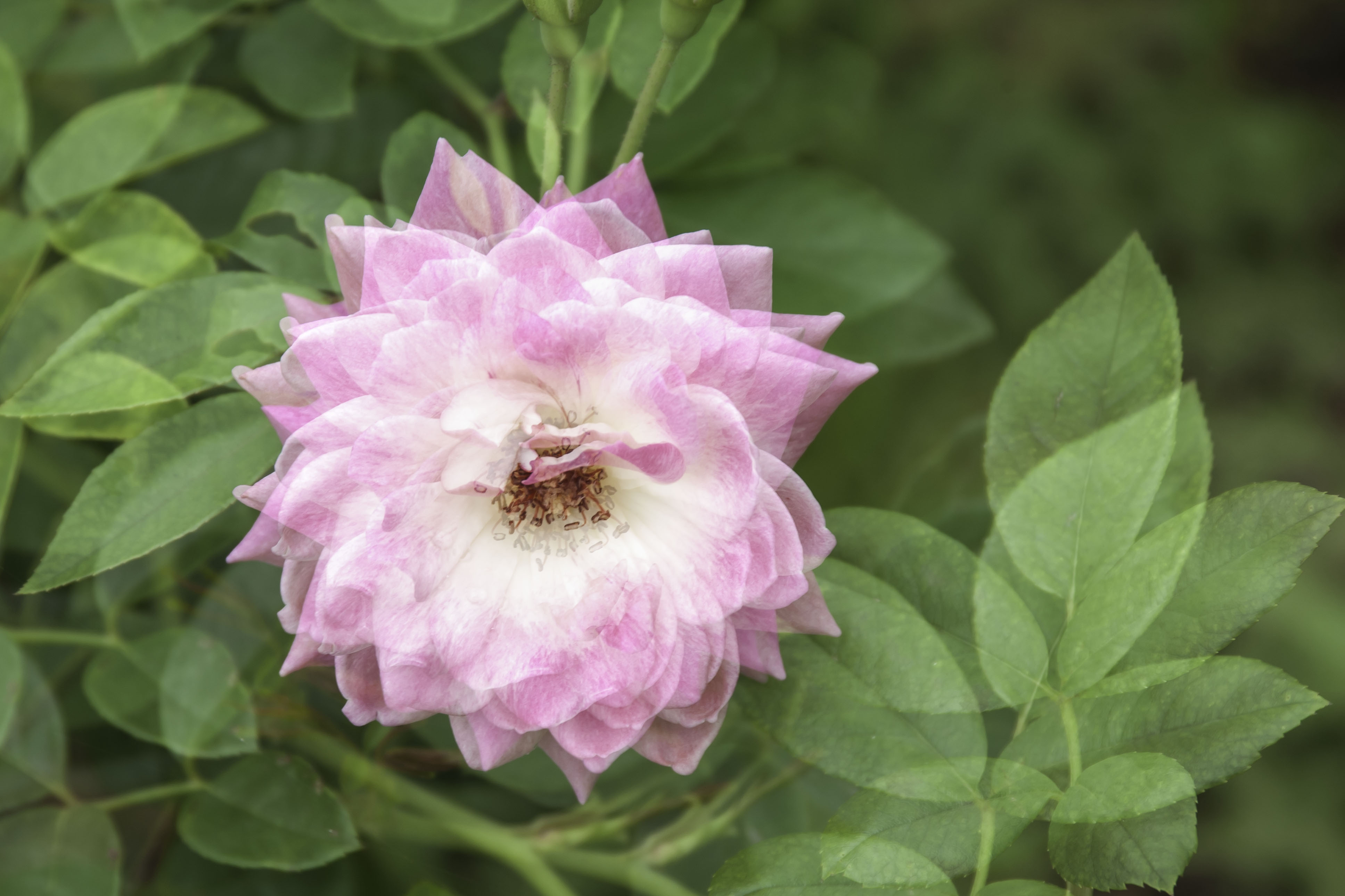
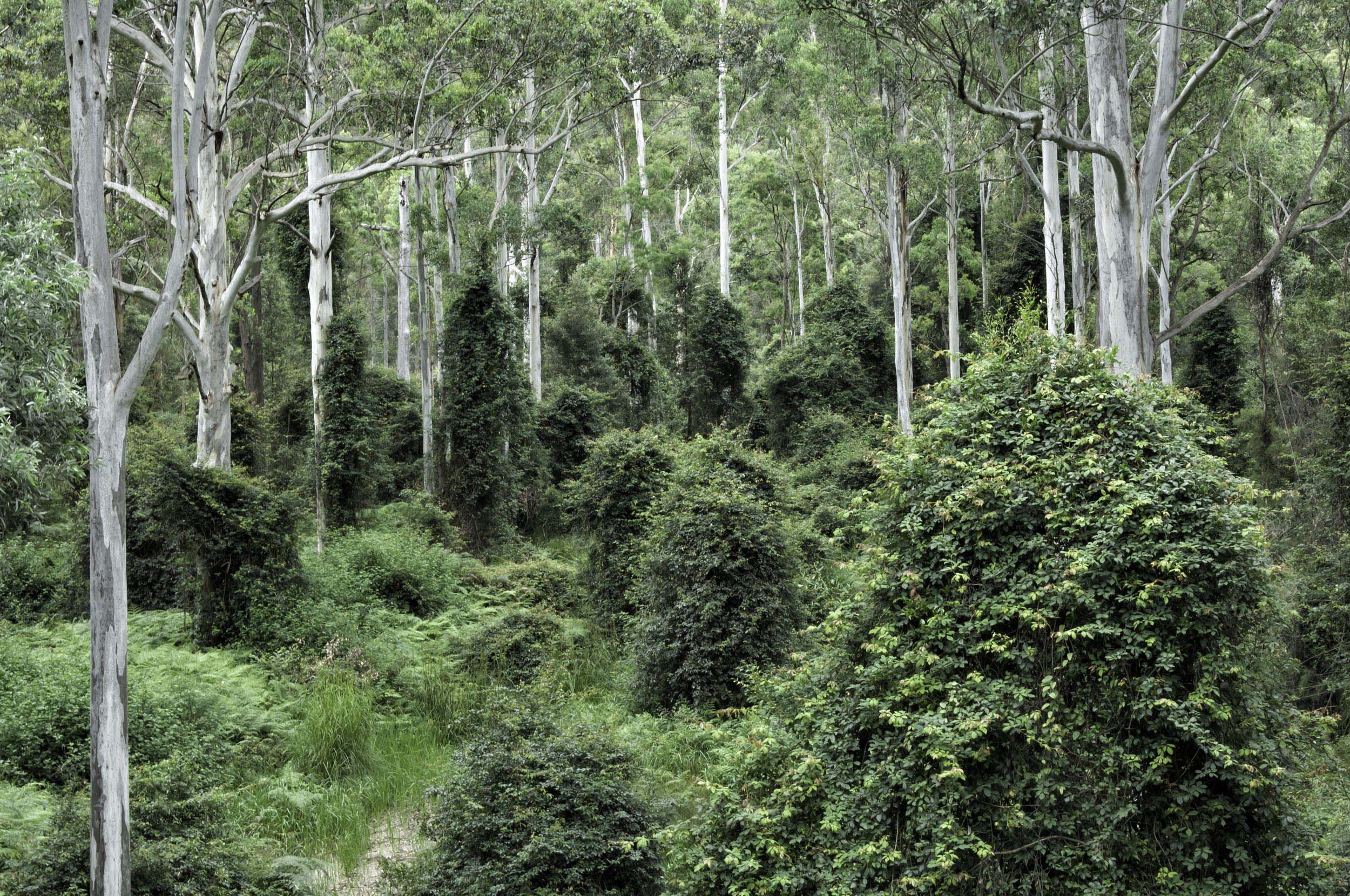
Hi Brad, this is a simply brilliant image. I love the concept, execution and presentation. I only wish I could produce images like this, perhaps one day. But may I please ask? The fern leaf that is "looking back at us", is relatively, a small percentage of your entire image, which also has a quite bright and sunny background. Is it possible, or have you thought about making it more prominent in your image and perhaps hiding it, just a little in a more busy, bushy or jungle type background. Maybe it would be even a little more haunting. Ian Groups 73 & 76. |
Sep 15th |
1 comment - 0 replies for Group 41
|
| 73 |
Sep 19 |
Reply |
Thanks for your thoughts Peter, no I didn't think about b&w. I will definitely give it a try. |
Sep 22nd |
| 73 |
Sep 19 |
Comment |
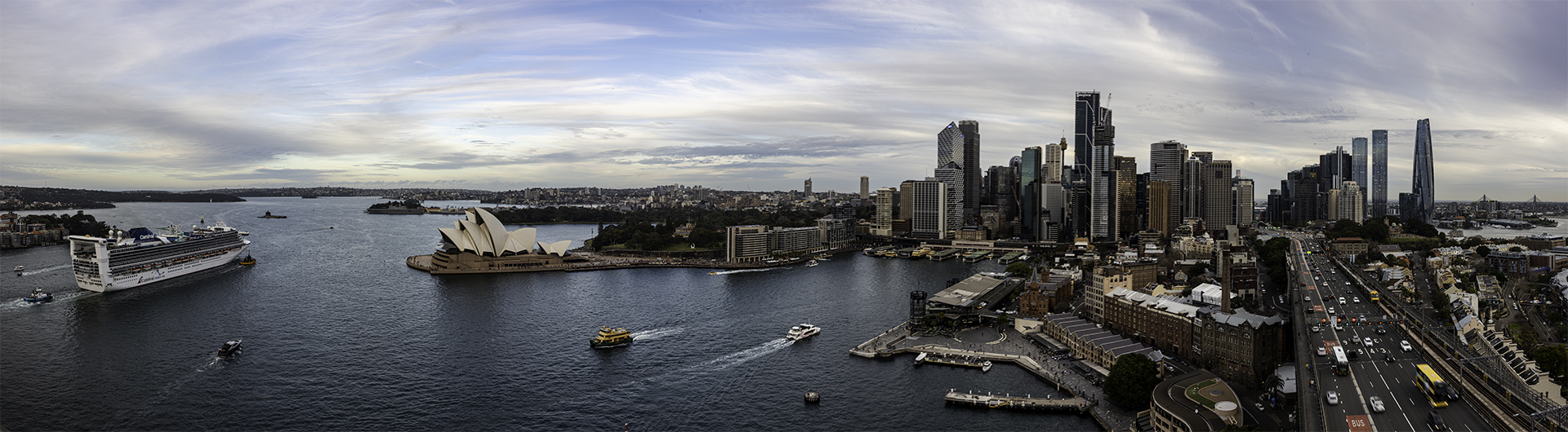
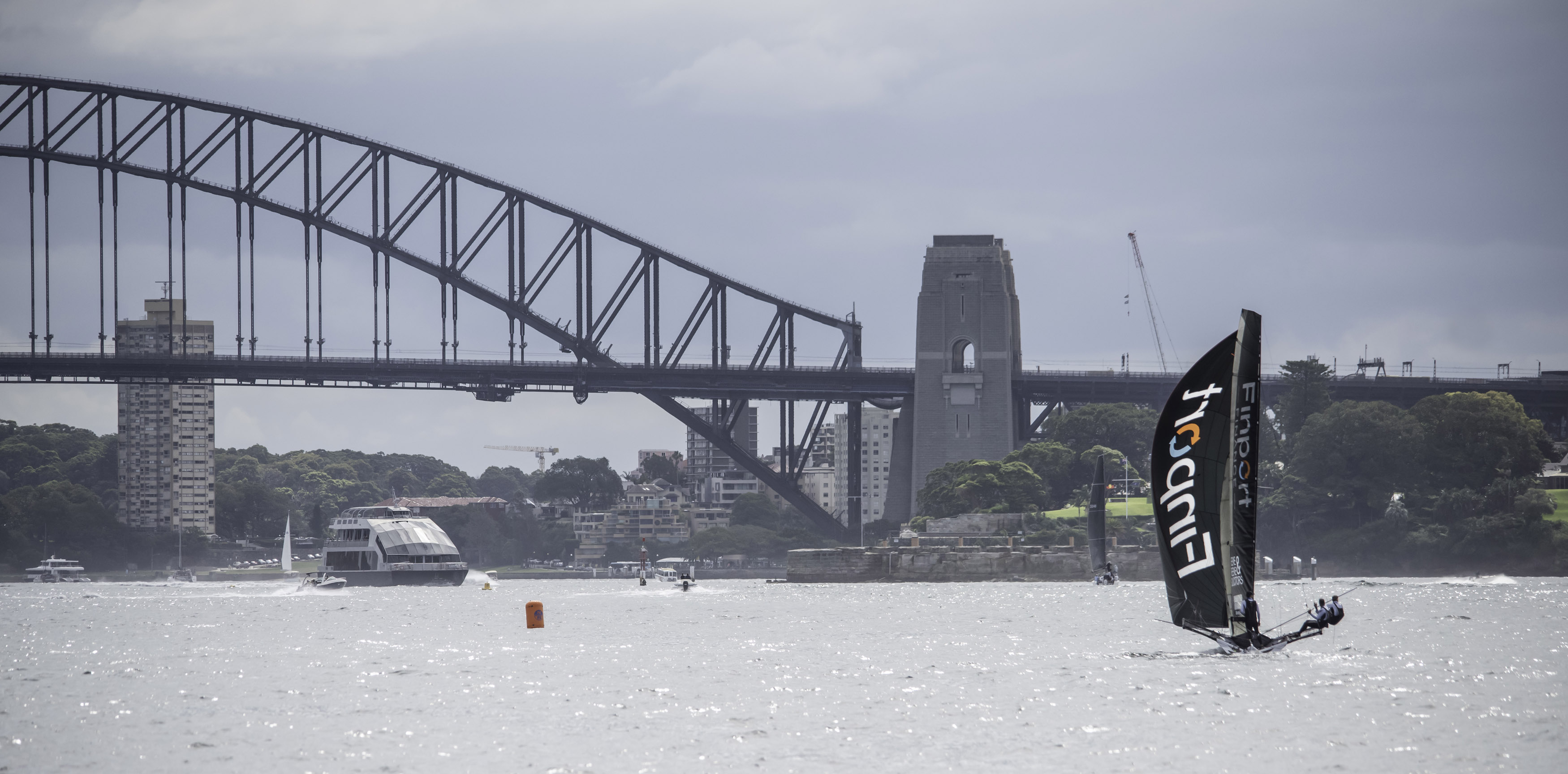
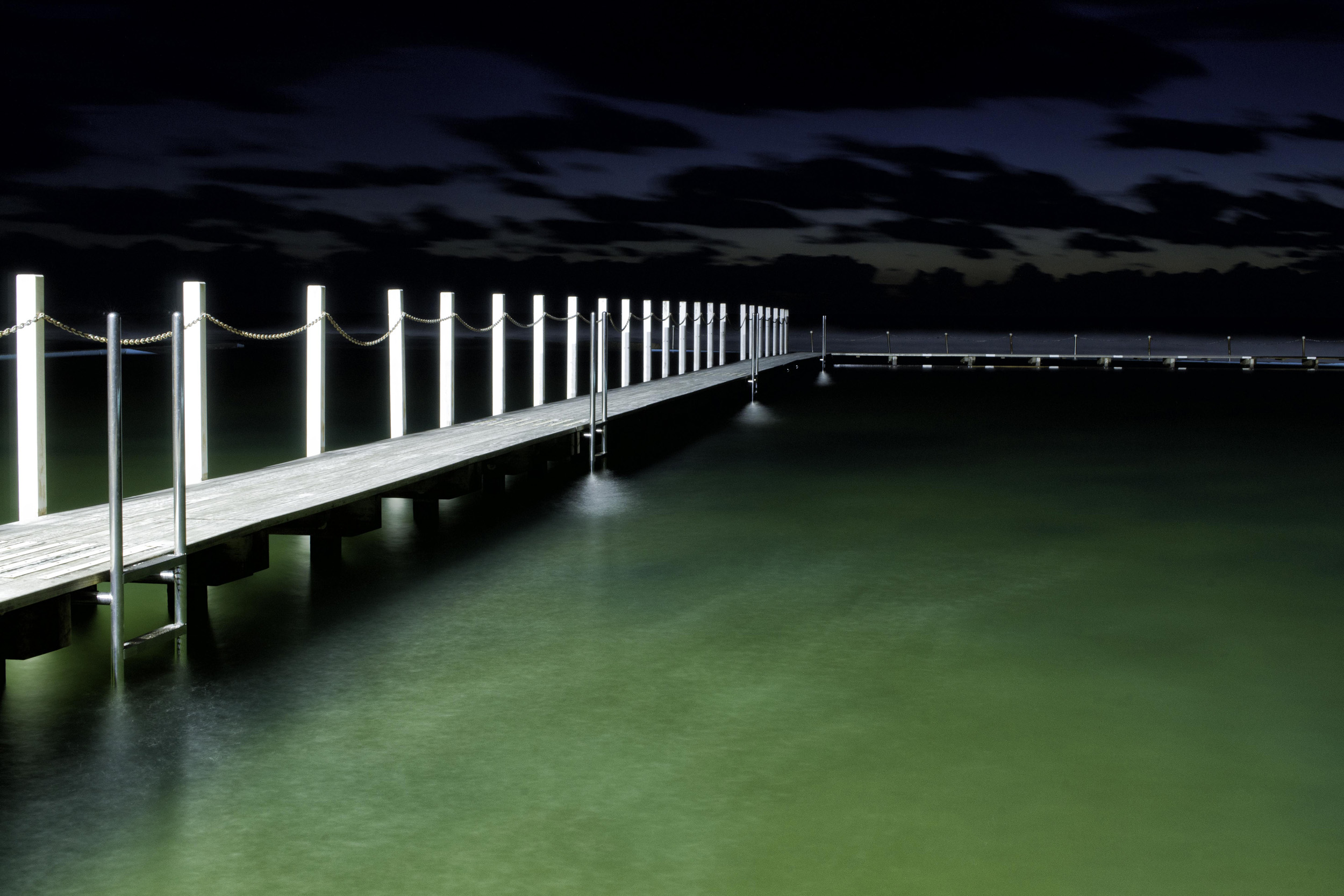
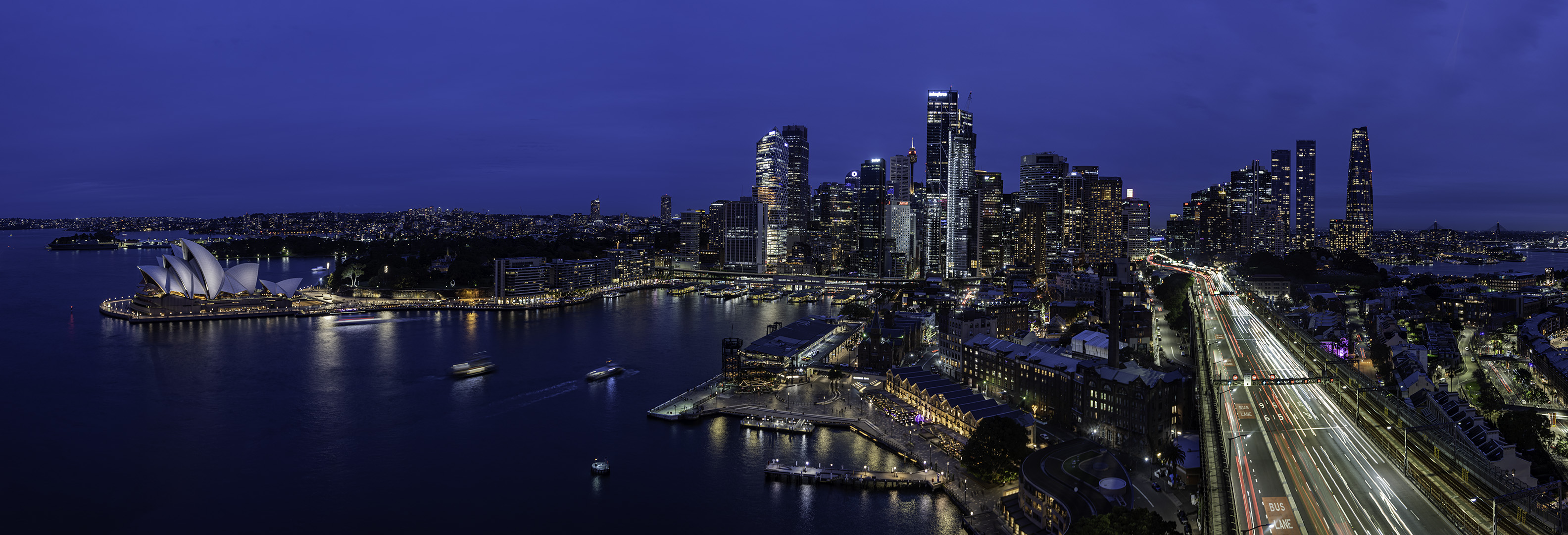
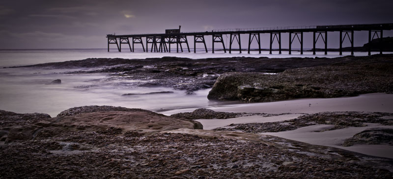
Another great image Tim. I agree with Sherry about cropping off the bottom to the walkway of the center pier. As always your verticals are spot on. You are inspiring me to go into Sydney and photograph a building that we affectionally call "The Paper Bag" building. There's not a vertical line to be seen in it. Could only happen in Australia. |
Sep 15th |
| 73 |
Sep 19 |
Comment |
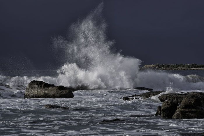
I tend to agree with Sherry about shooting before thinking. We have all been there, but I just also keep going back there !!! Personally, I'm allergic to any ISO above 400, so I applaud you with this one. The concept of this image is great and well worth further attempts when conditions permit. A number of us seem to have issues with soft images this month, me included. An image with loads of potential. |
Sep 15th |
| 73 |
Sep 19 |
Comment |
Tuhin, and others, please do what I just did. Go back to Nov 2017 when this group first started and look at your photographic journey. See how far you have travelled. Your long exposure work has become first rate and your composition skills have also greatly improved. Well done Tuhin, you have improved greatly. |
Sep 15th |
| 73 |
Sep 19 |
Comment |
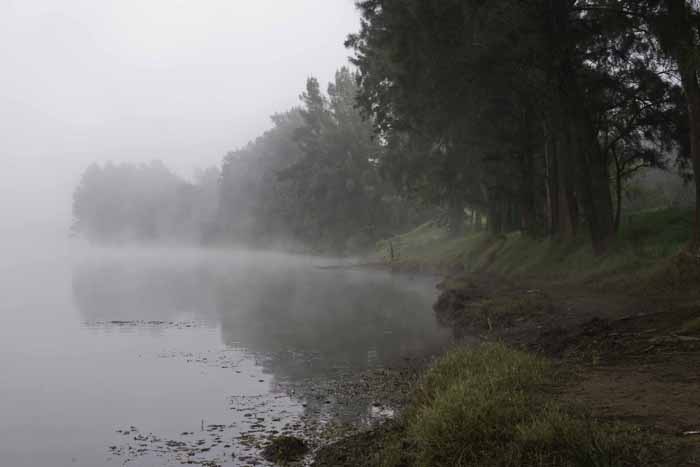
Peter, can you see that point, right smack in the middle of the lake? That's where you make me want to throw my camera. All I can say is that if you ever publish a photobook of your images, please put me down for a copy. |
Sep 15th |
| 73 |
Sep 19 |
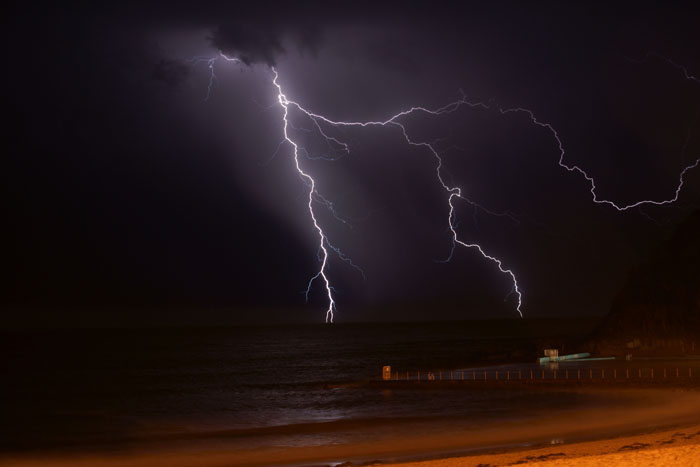
Comment |
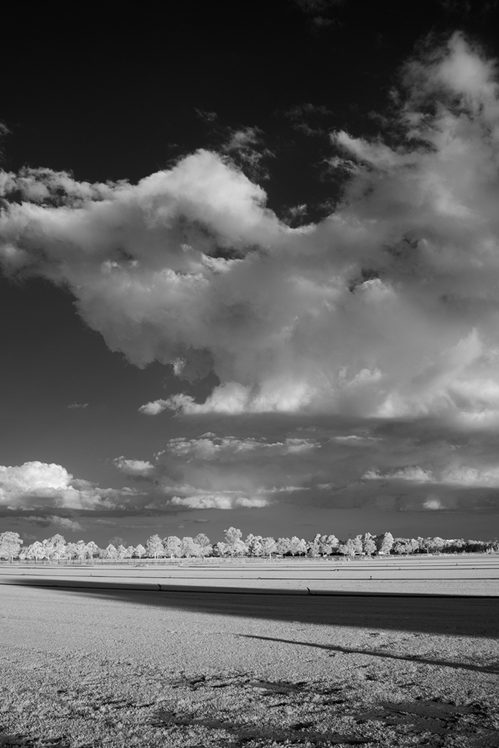
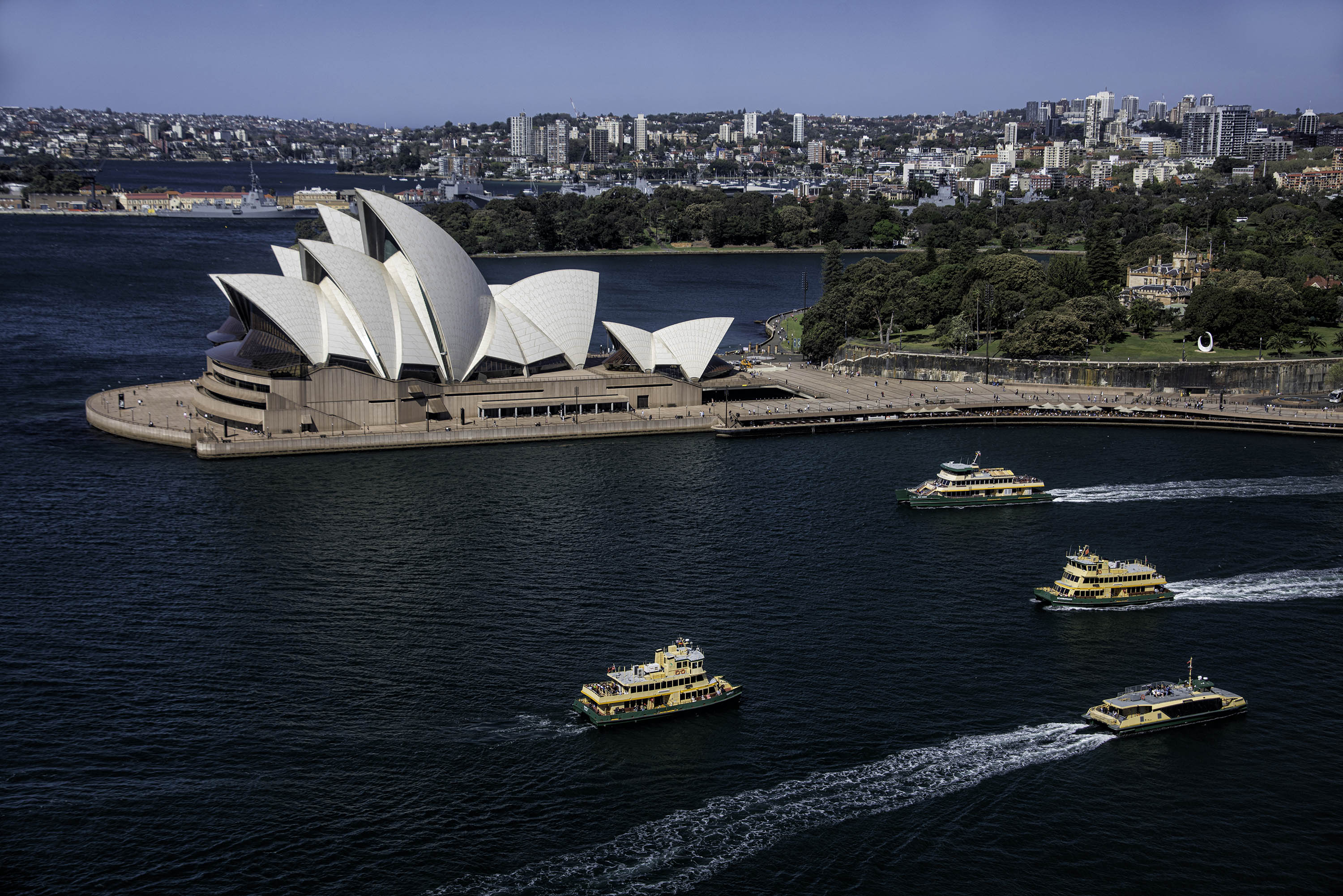
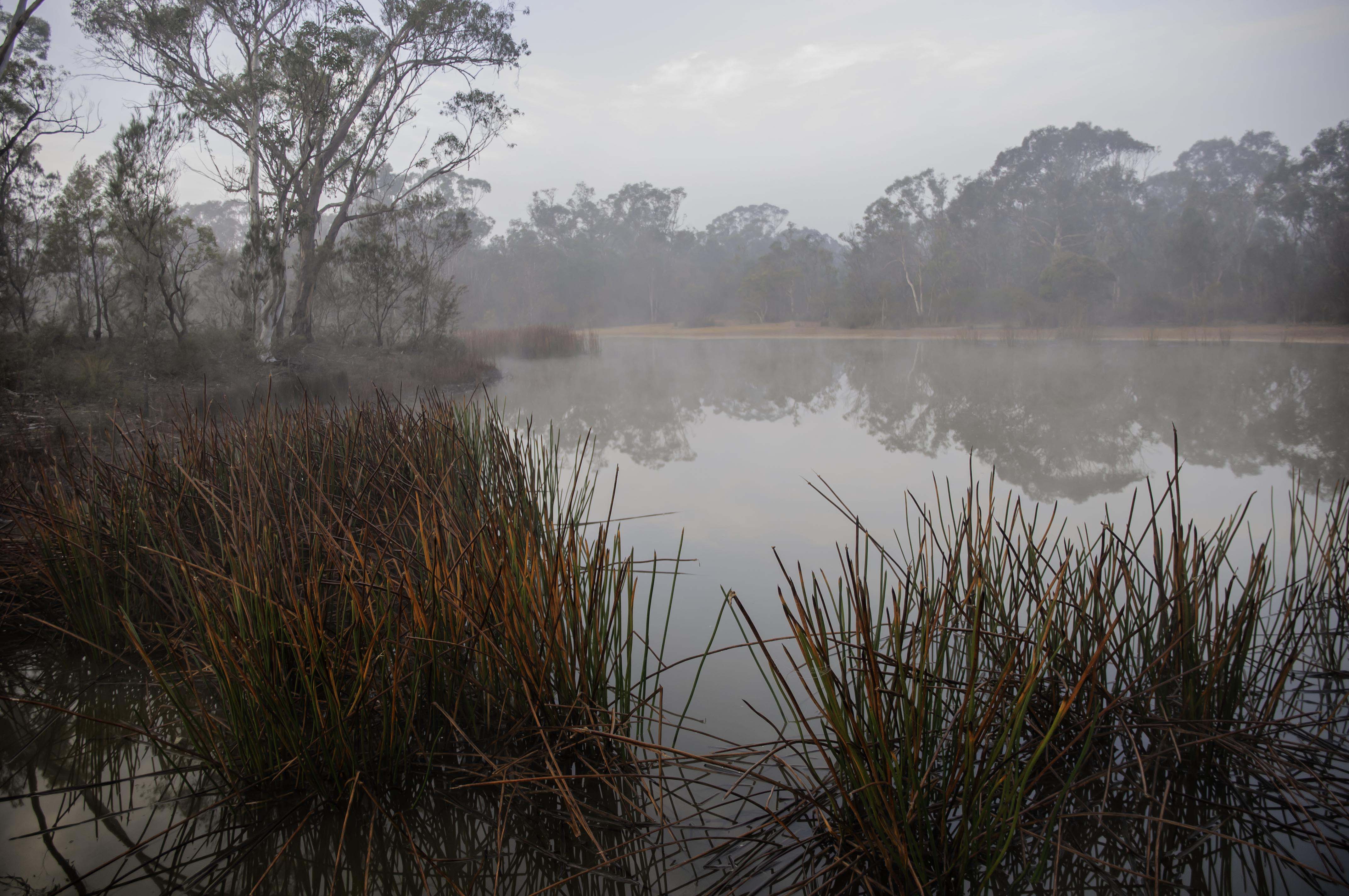
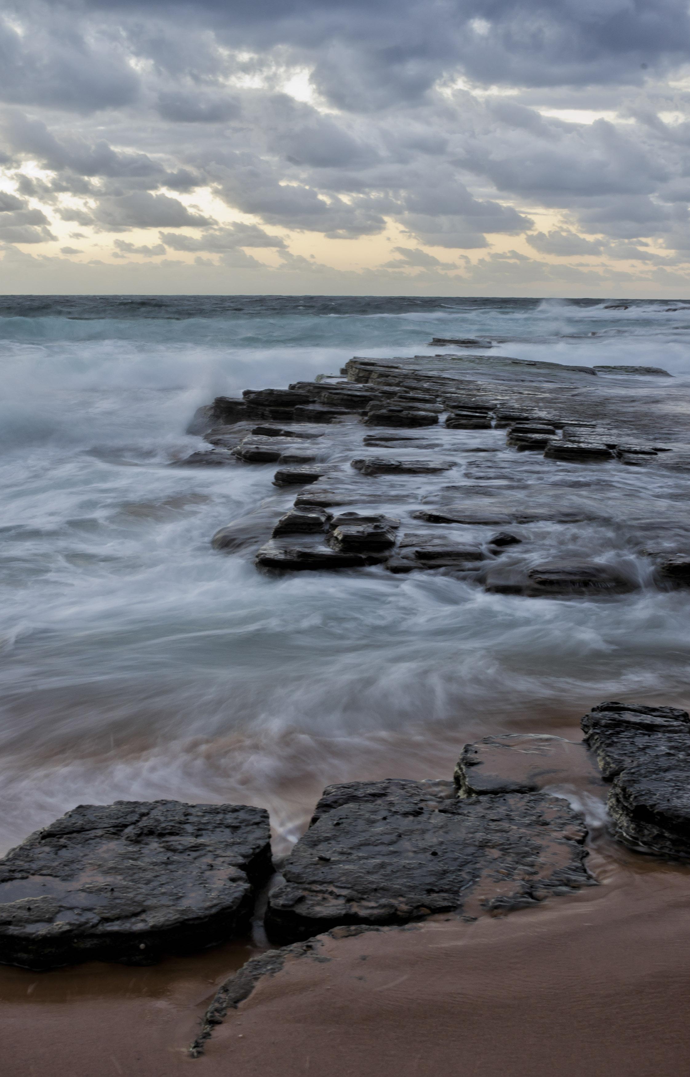
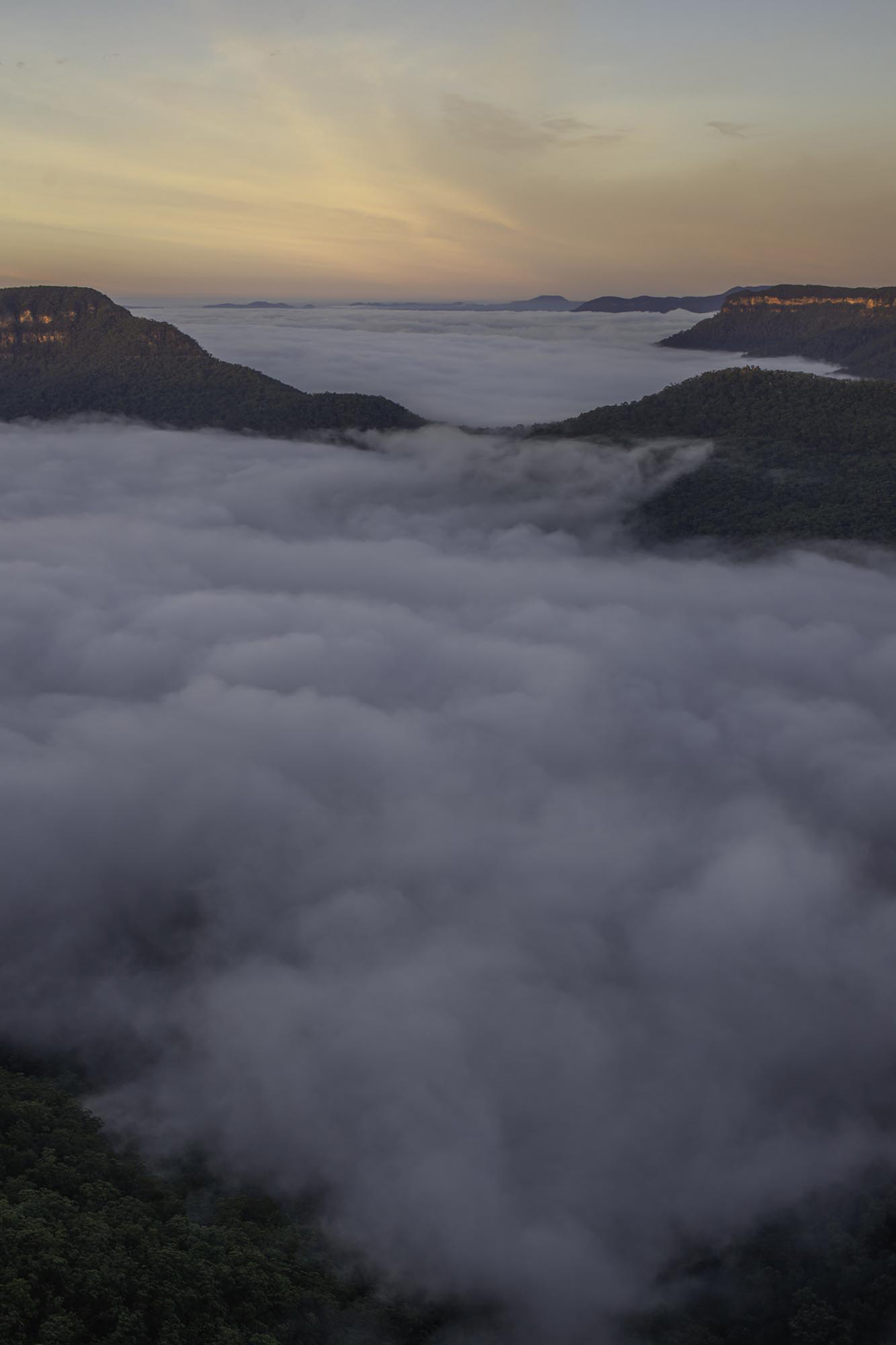
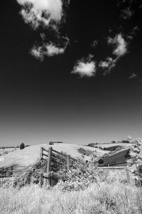
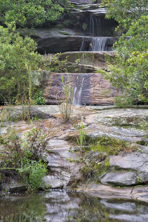
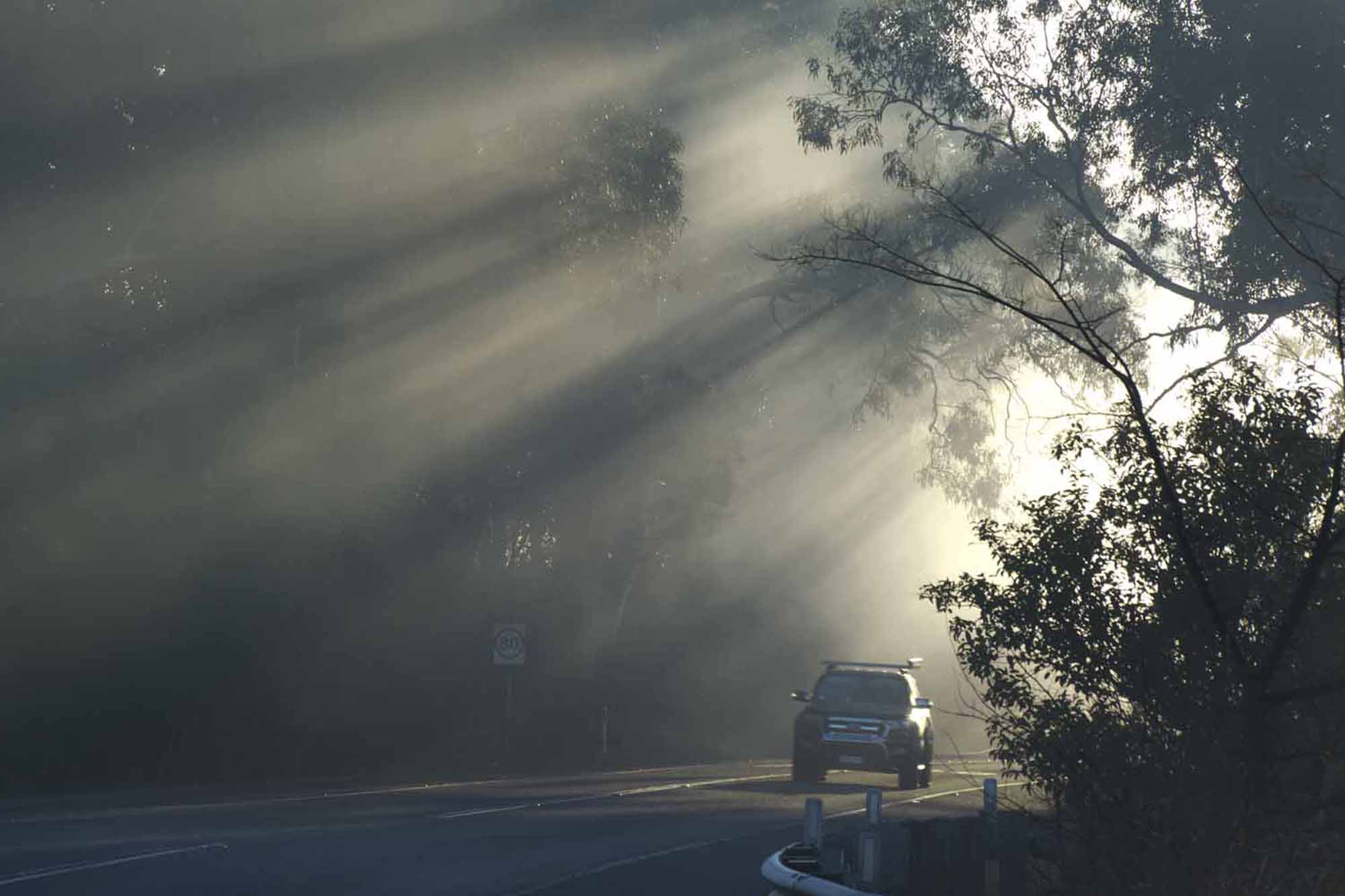
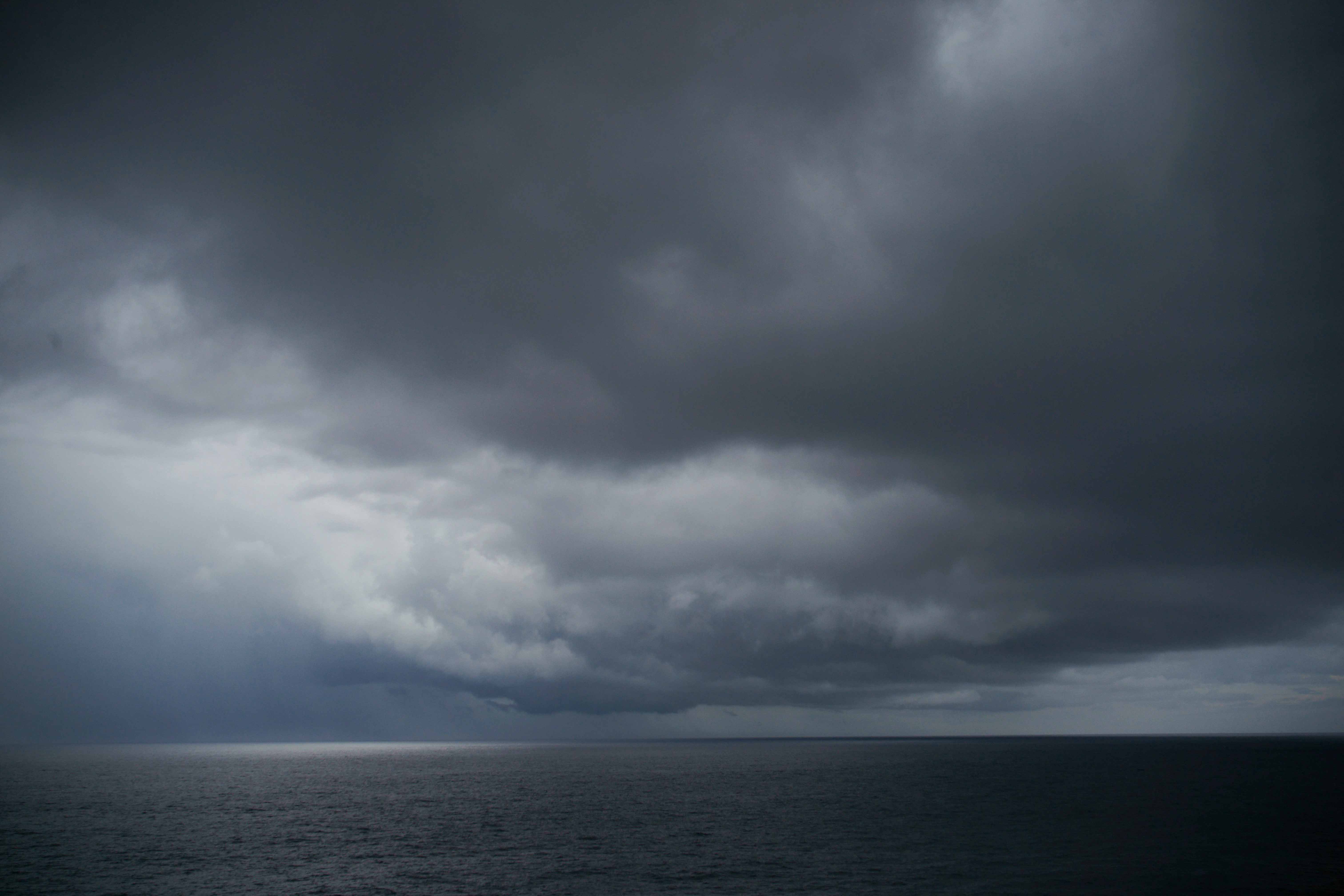
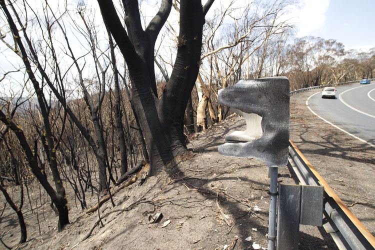
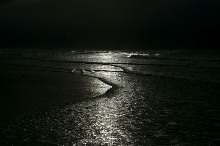
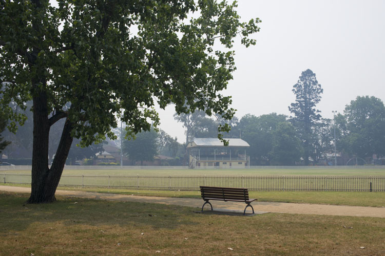
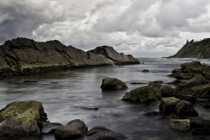
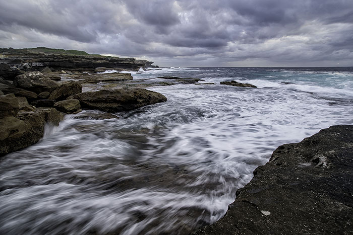
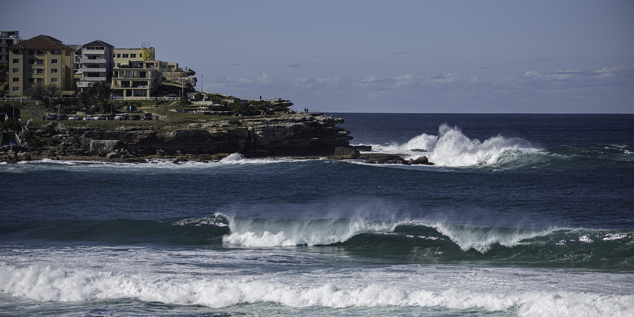
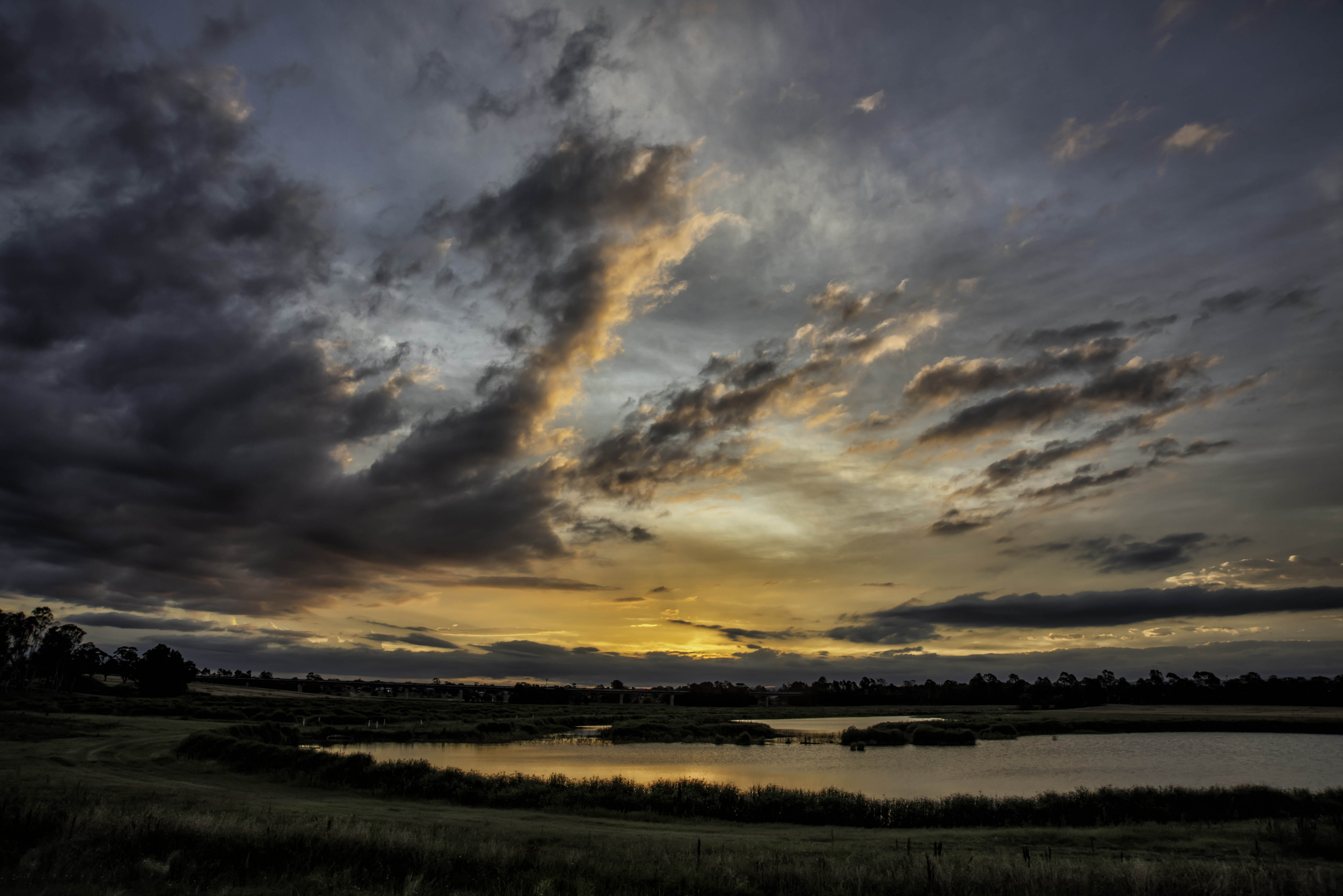
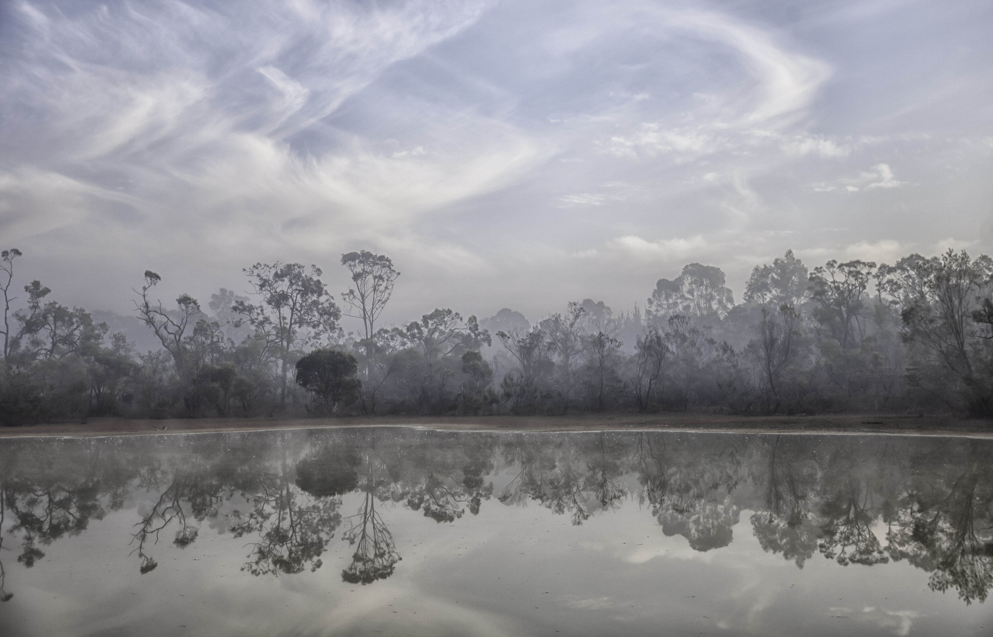
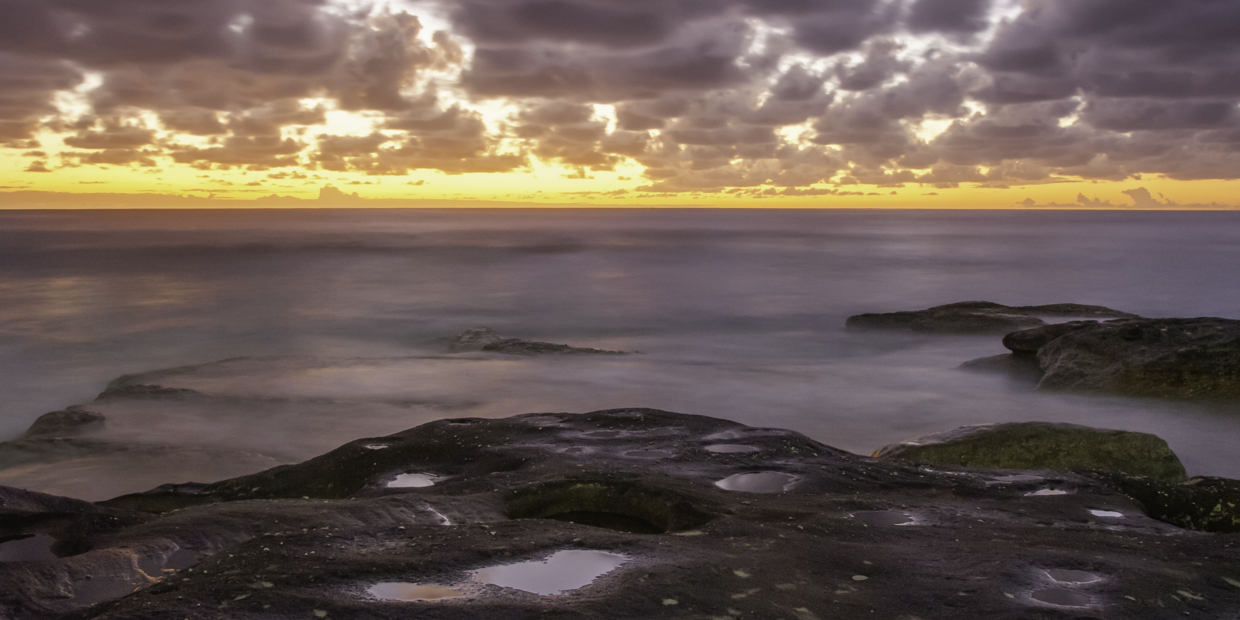
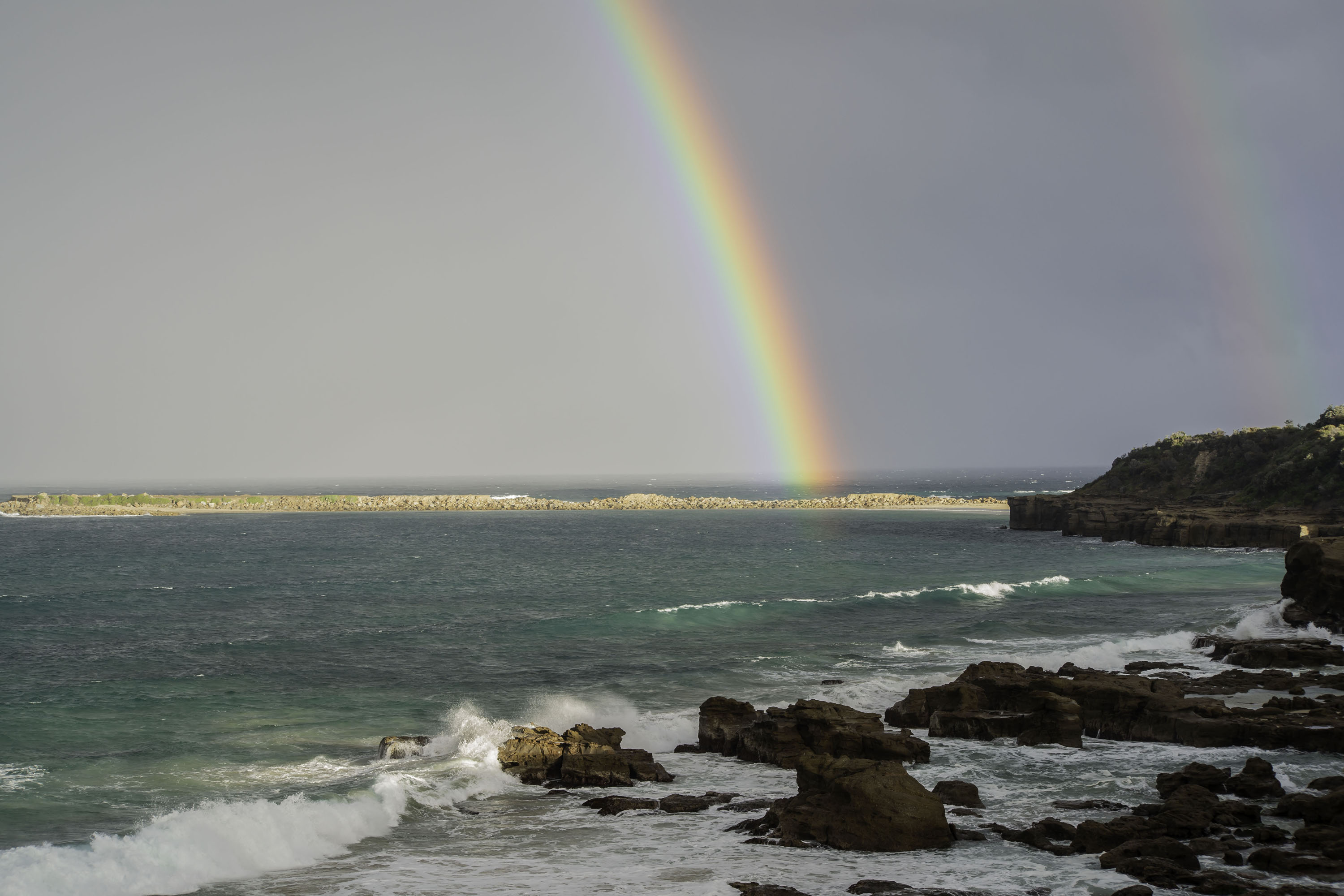
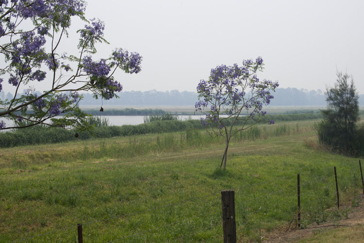
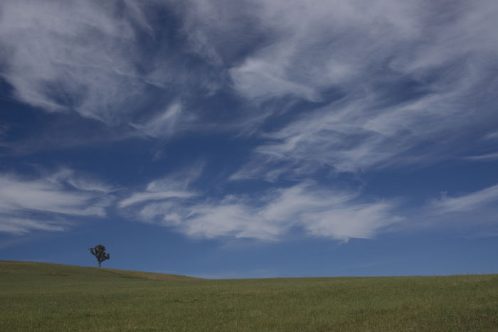
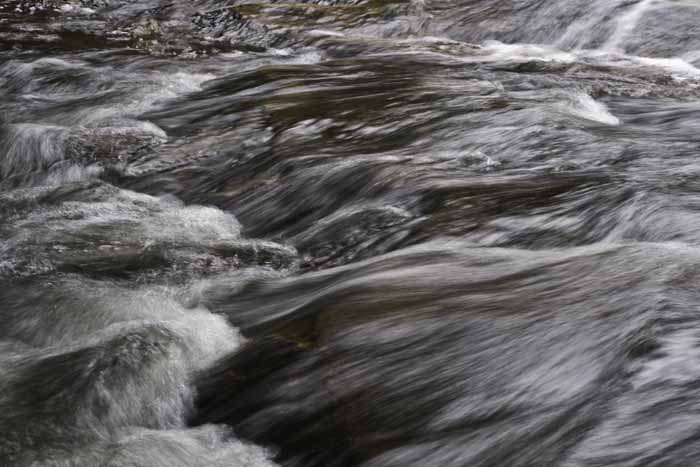
Must be the month for water !!! 6 out of 7 photographers surveyed agree. Bad weather always makes for interesting and dramatic images. Down here in Sydney we don't have cyclones or hurricanes, just bushfires, which have already begun for this year due to our drought conditions. This is a great image Sherry, and when I scroll it down so that the bright patch of sky goes out of the top of my screen, it goes even darker and more moody. The exposure is great as is the composition. The green ferny ball type plant in bottom left nicely balances the structure and bush center right. And everything else just adds to the image. |
Sep 15th |
| 73 |
Sep 19 |
Comment |
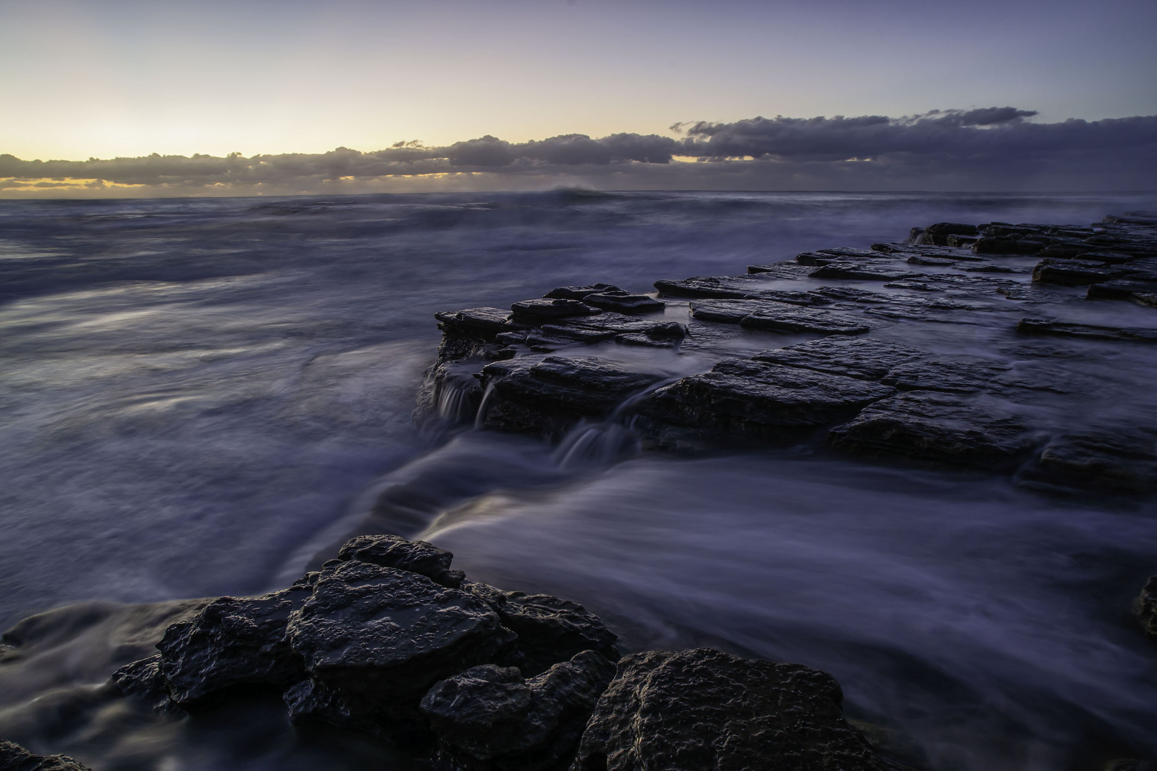
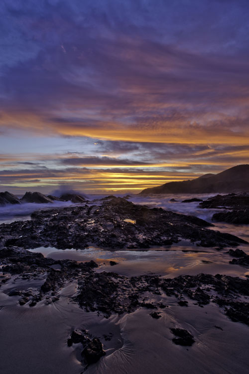
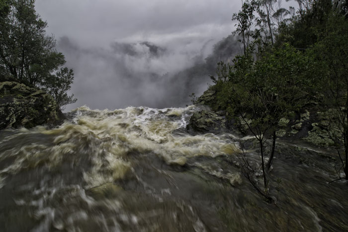
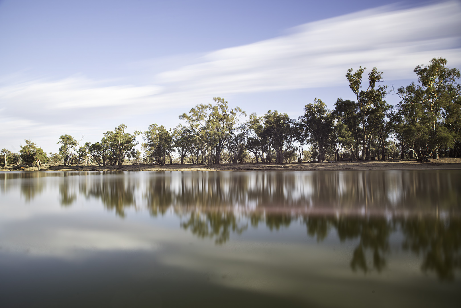
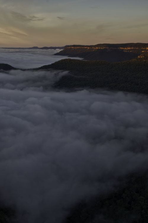
I'm glad to hear you are recovering Daryl. I must agree with Sherry on this image. While I applaud the concept of image stacking and your processing skills, which are far greater than mine, your final image leaves me asking
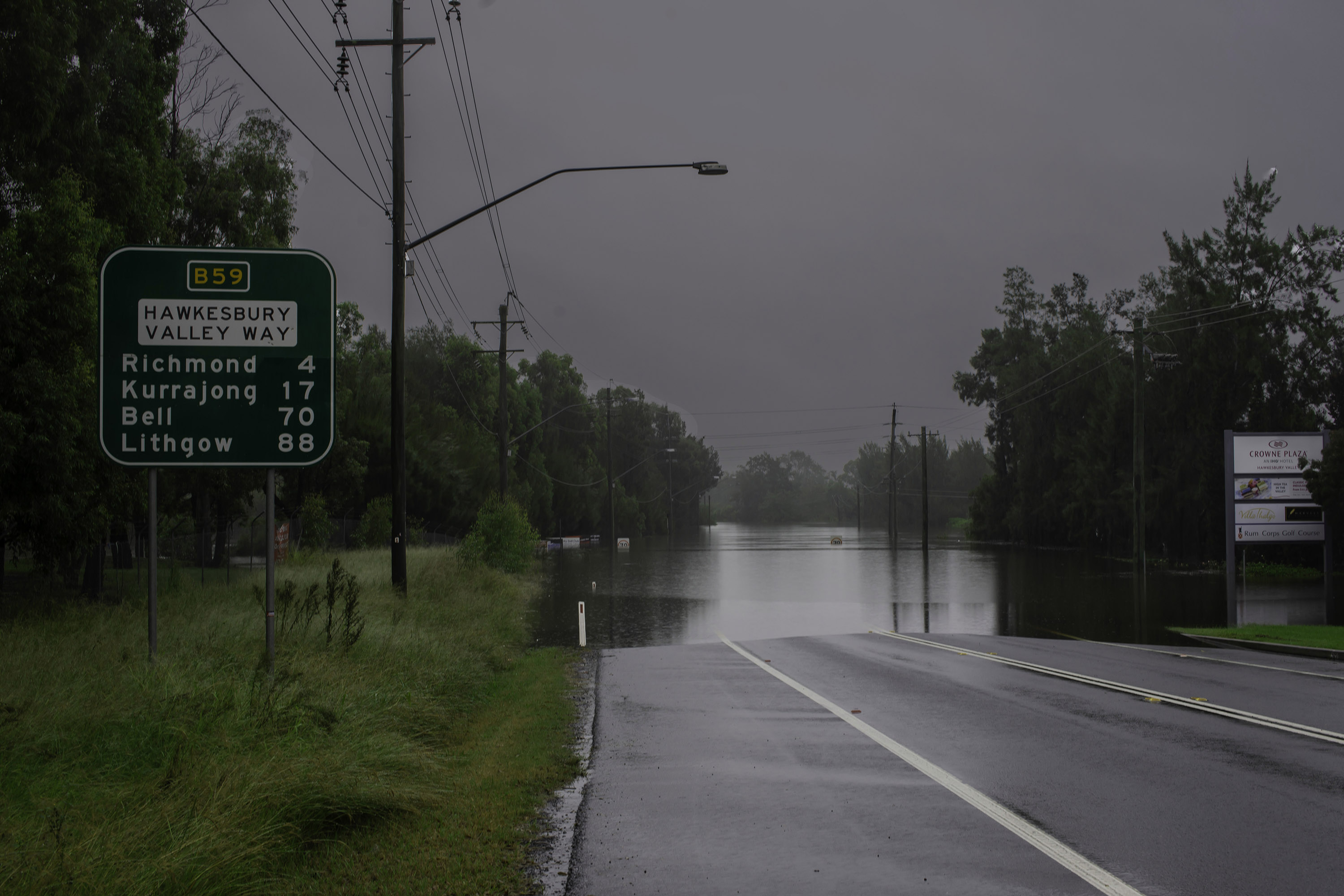
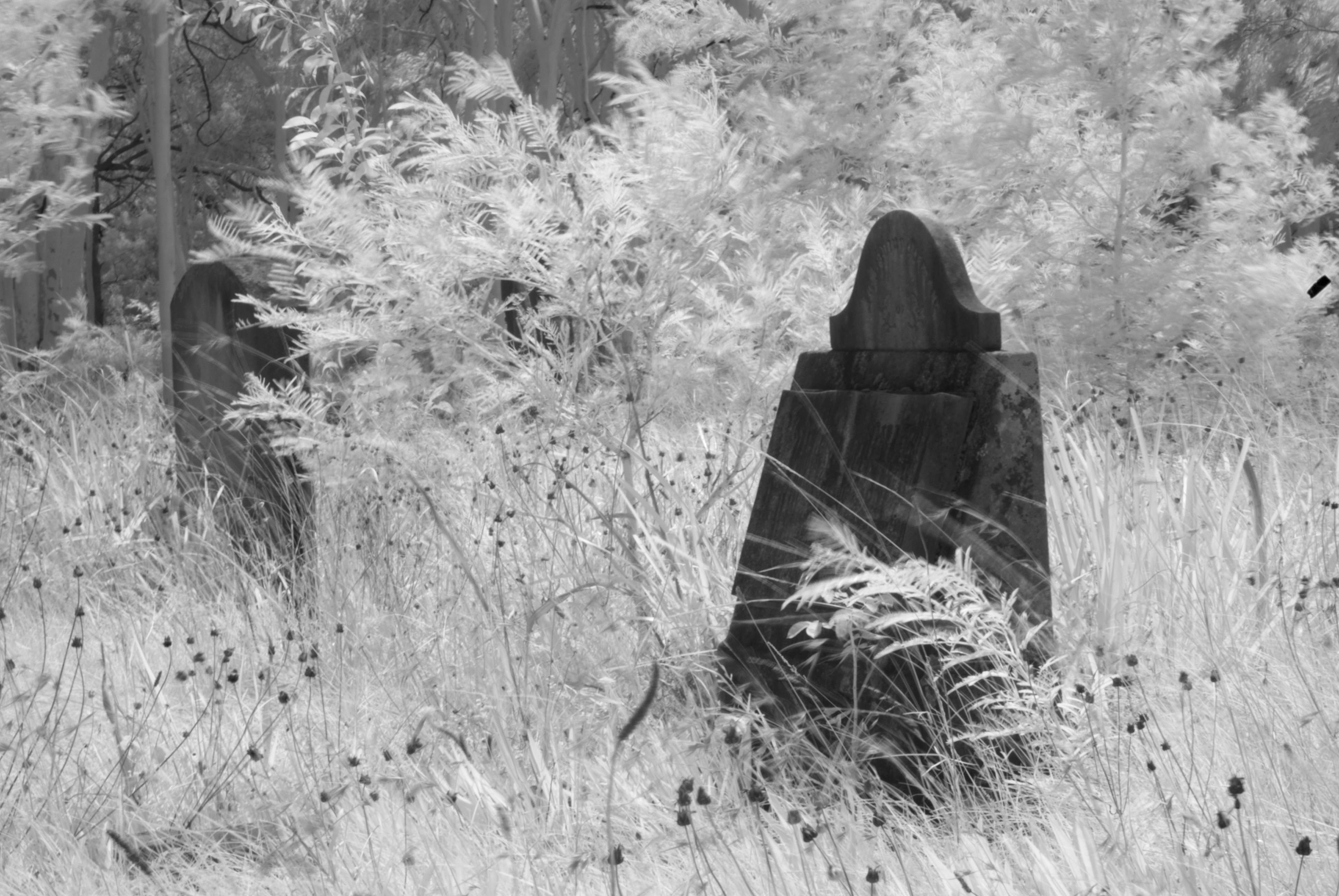
"What's it all about?" Down here, I hear many debates about negative space verses wasted space. But I feel this best relates when there is a strong positive focal point in the image. This group has heard me prattle on about panoramic images for ages. In my humble opinion, if you were to crop off the top 2/3 of the plain blue sky, then say half of the bottom foreground rocks, nothing essential to the image would be lost that would detract from the resultant image. Having said all that, there is still no really strong focal point. But a great example of what image stacking can do. |
Sep 15th |
| 73 |
Sep 19 |
Reply |
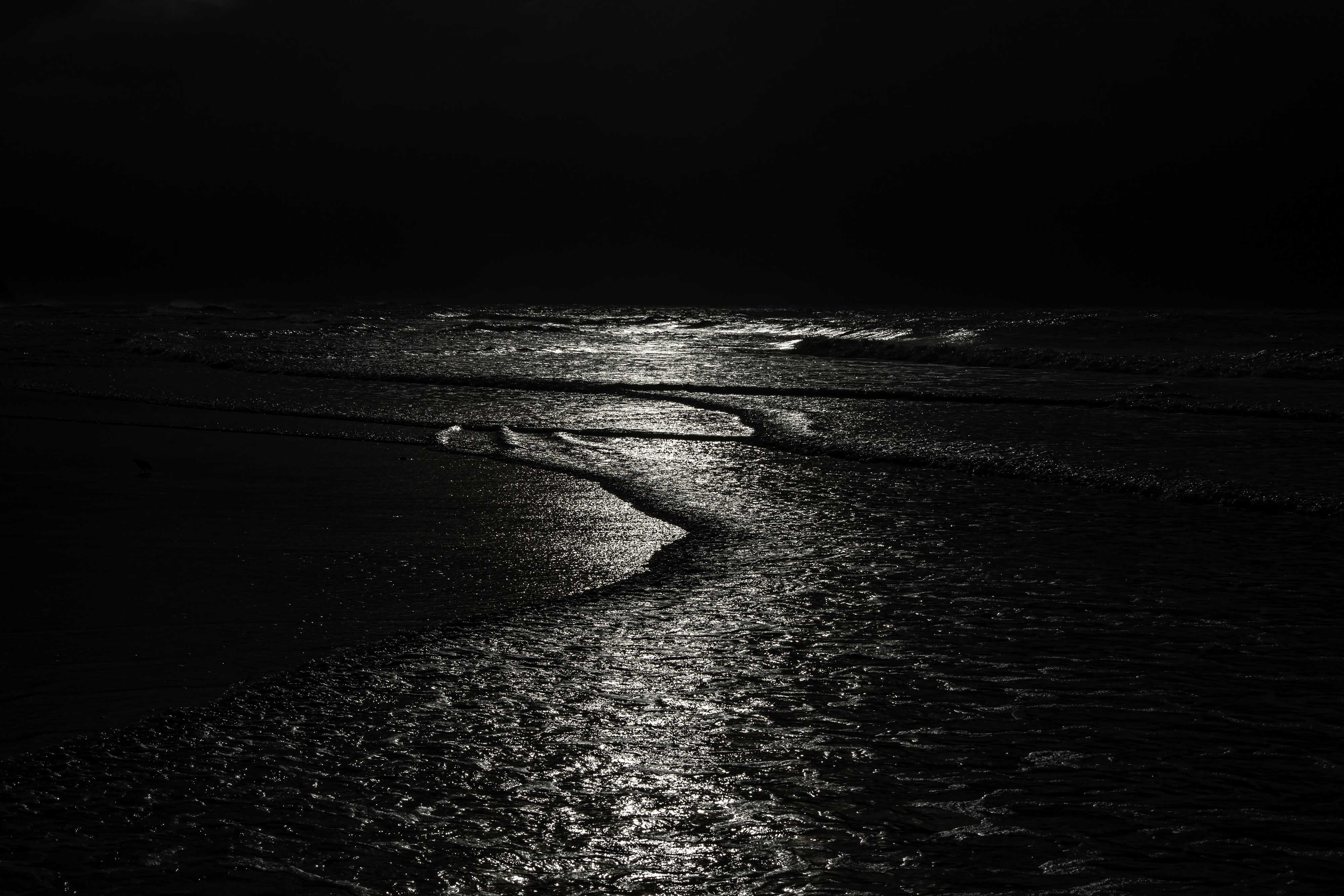
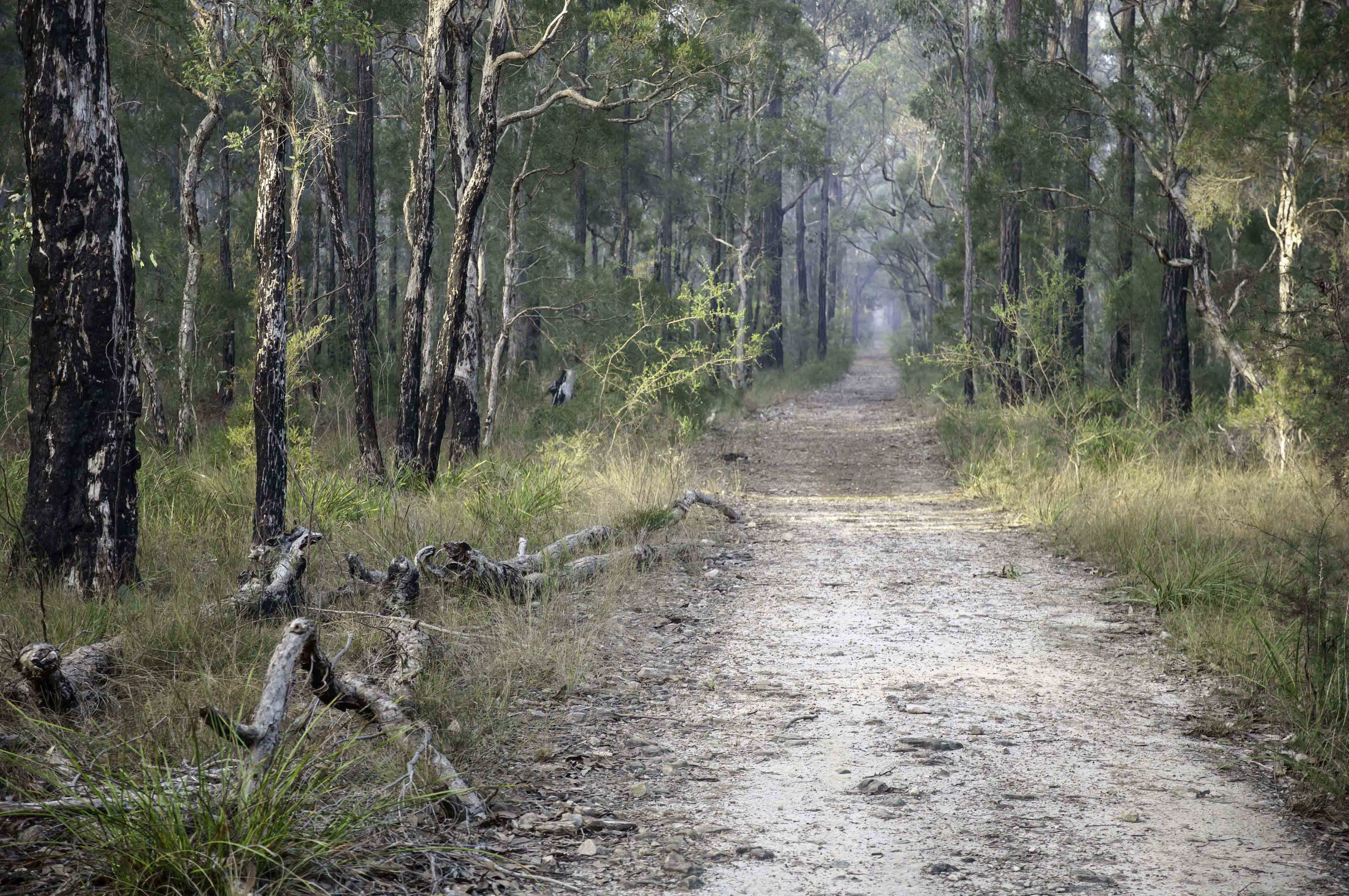
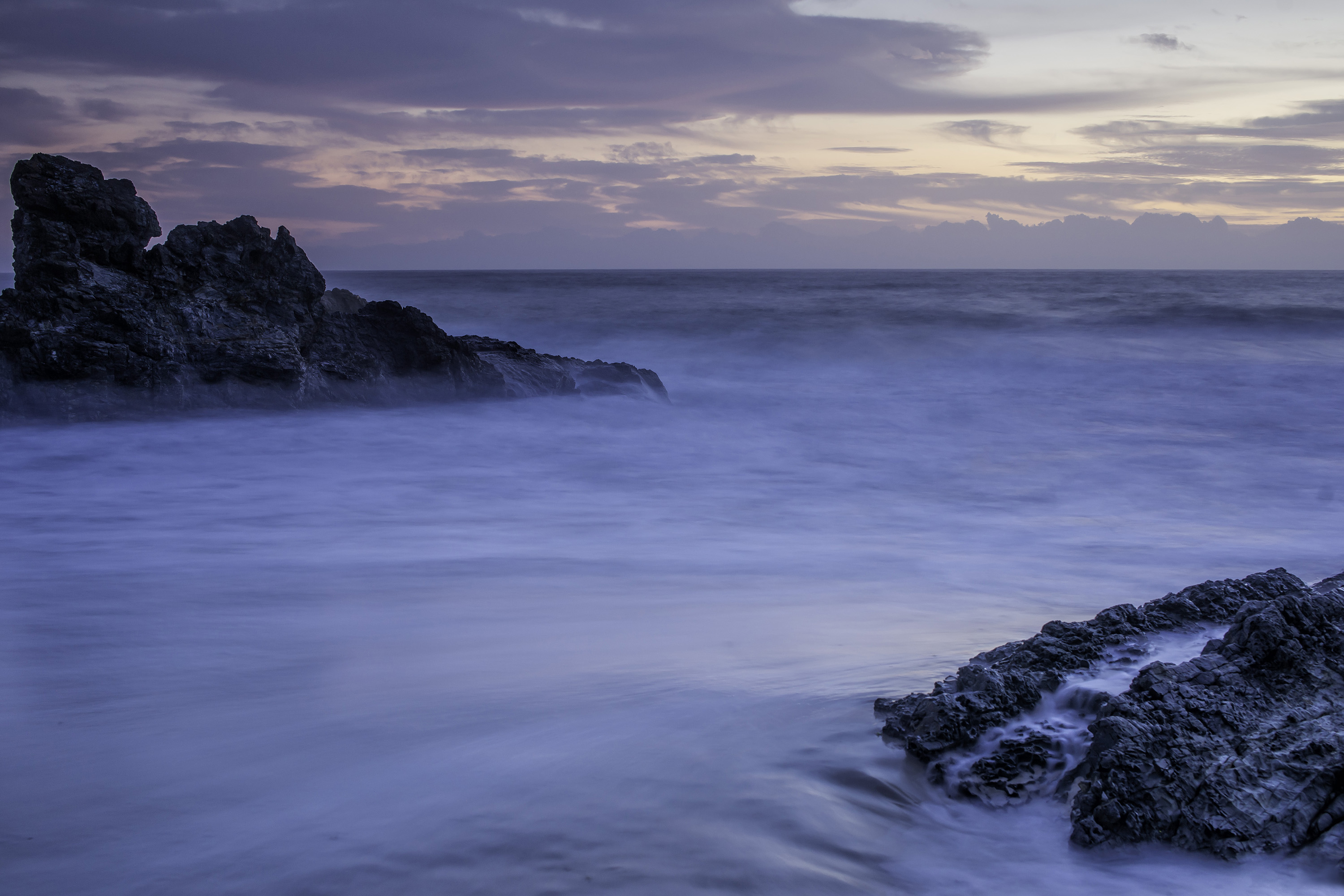
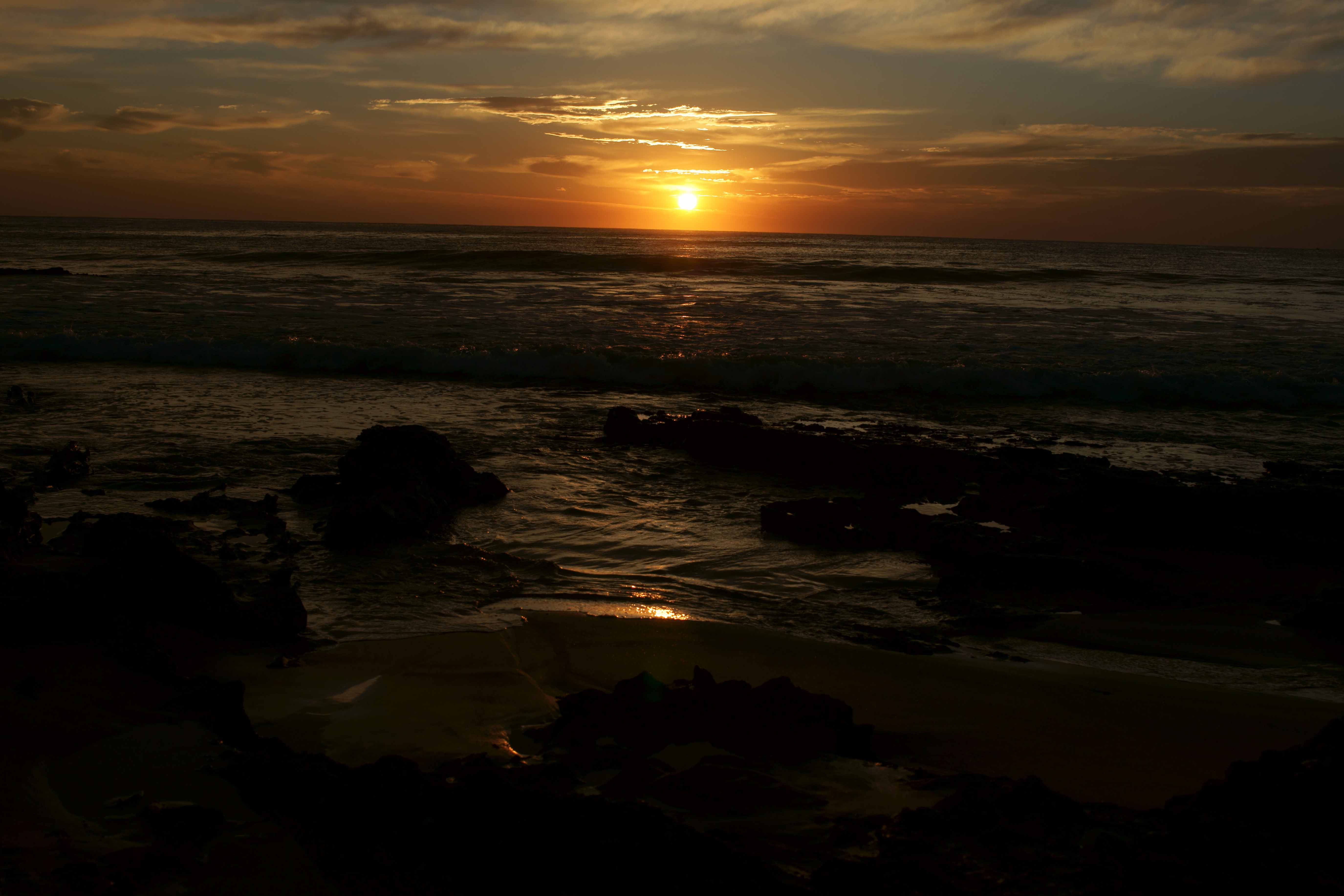
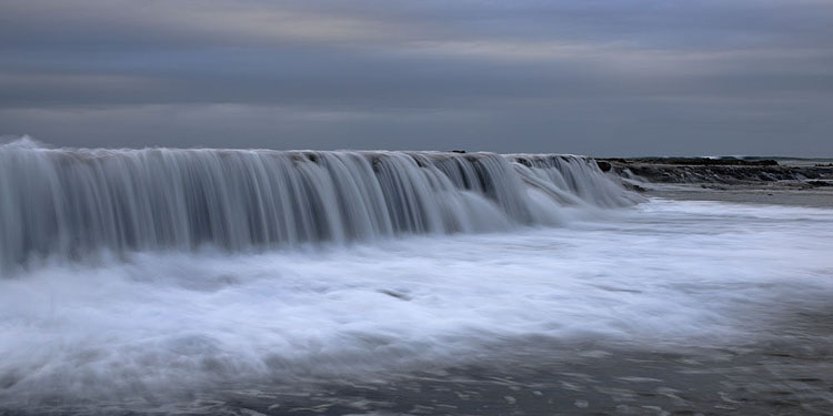
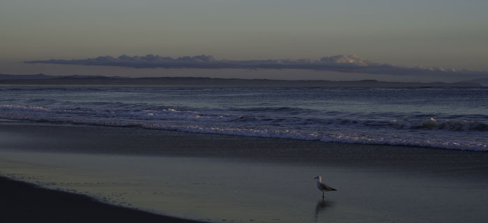
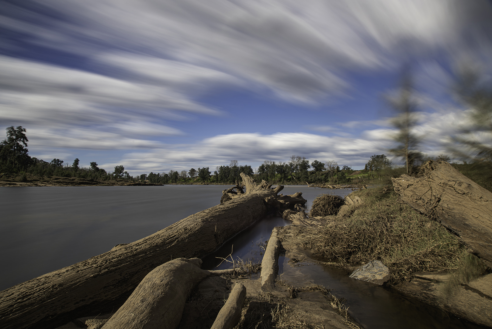
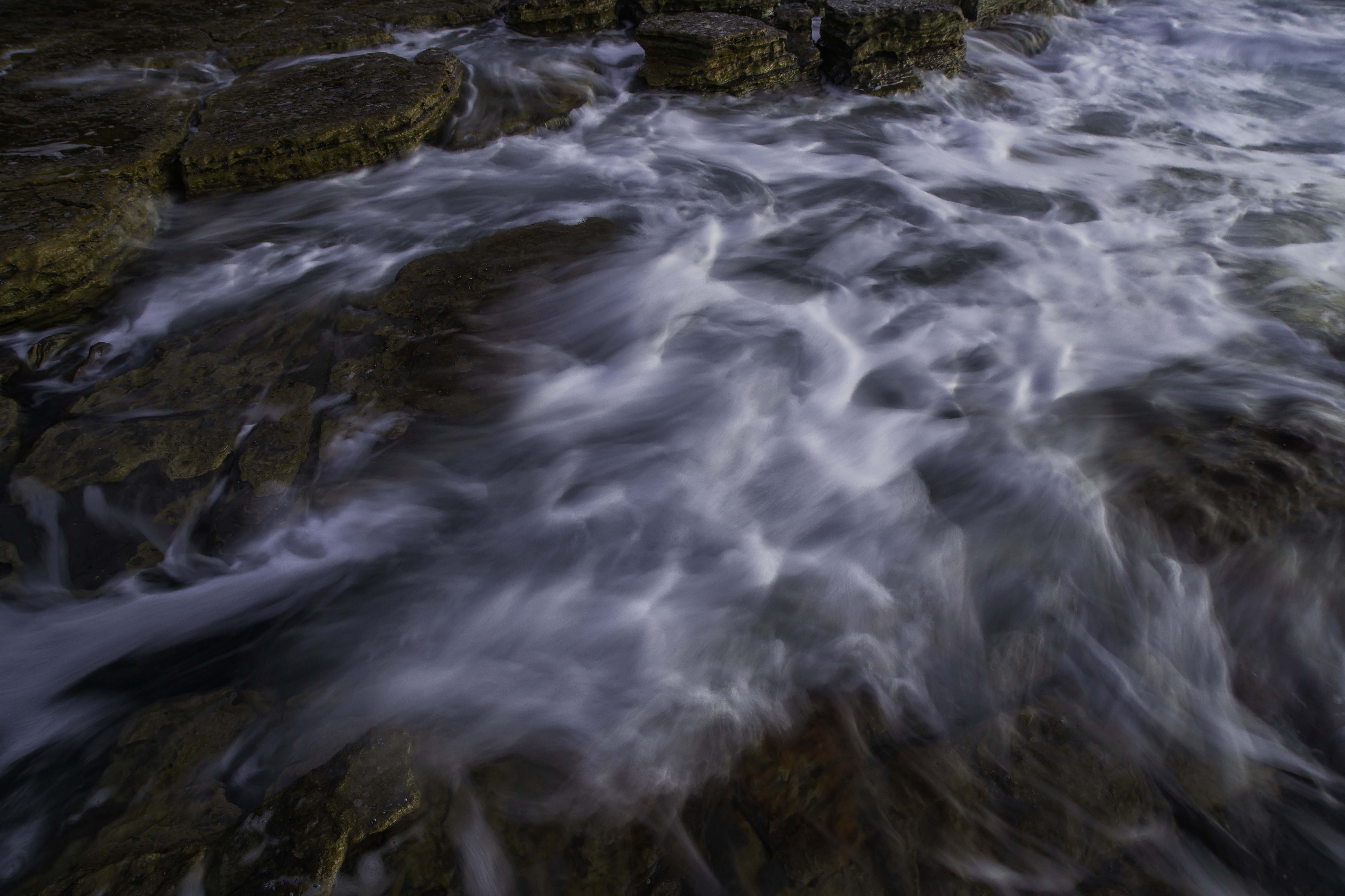
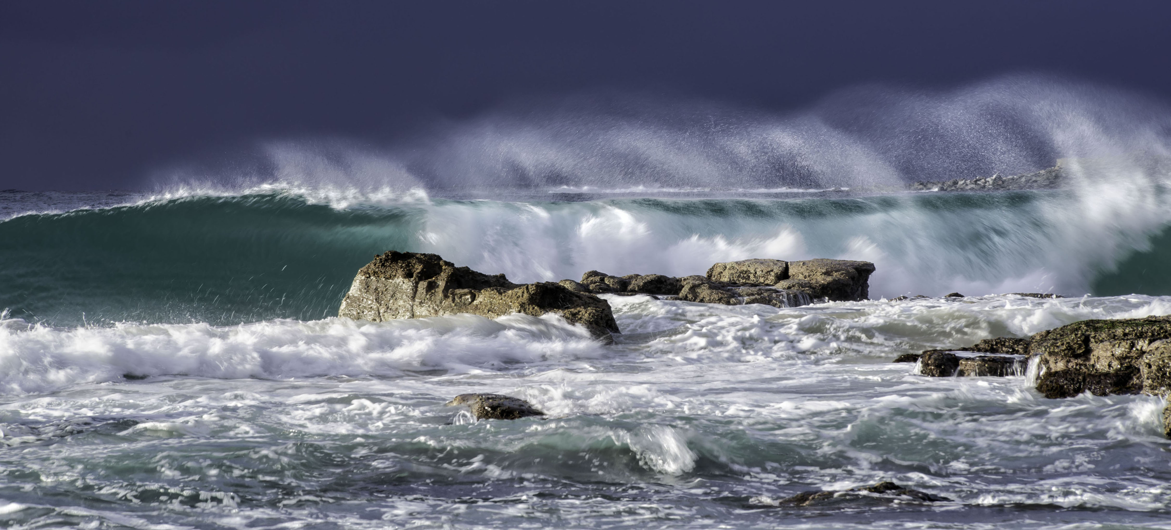
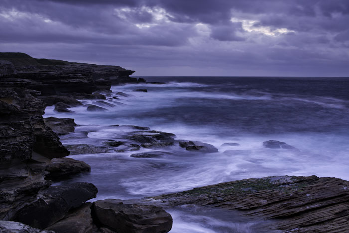
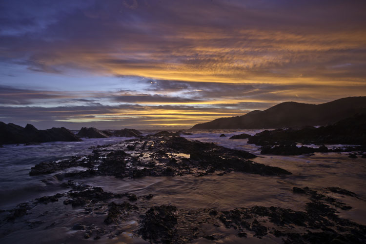
Thanks for your thoughts Sherry. This image was captured in "mirror lock up" and tripod mounted, which has now become a standard for my sunrise shoots. I usually let the camera auto focus on the foreground, lock it, then recompose the frame. Perhaps I slipped up with this one as when I look at it again on my own computer it does appear a little soft. There are many similar images taken with differences in wave movements. I must have picked a dud for this month. Oh well, the world will still turn. |
Sep 15th |
6 comments - 2 replies for Group 73
|
| 76 |
Sep 19 |
Reply |
Thanks for your comments Sanford. They are always appreciated. |
Sep 22nd |
| 76 |
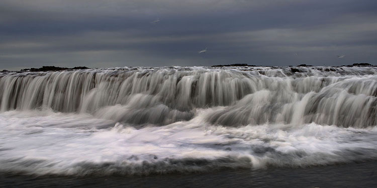
Sep 19 |
Reply |
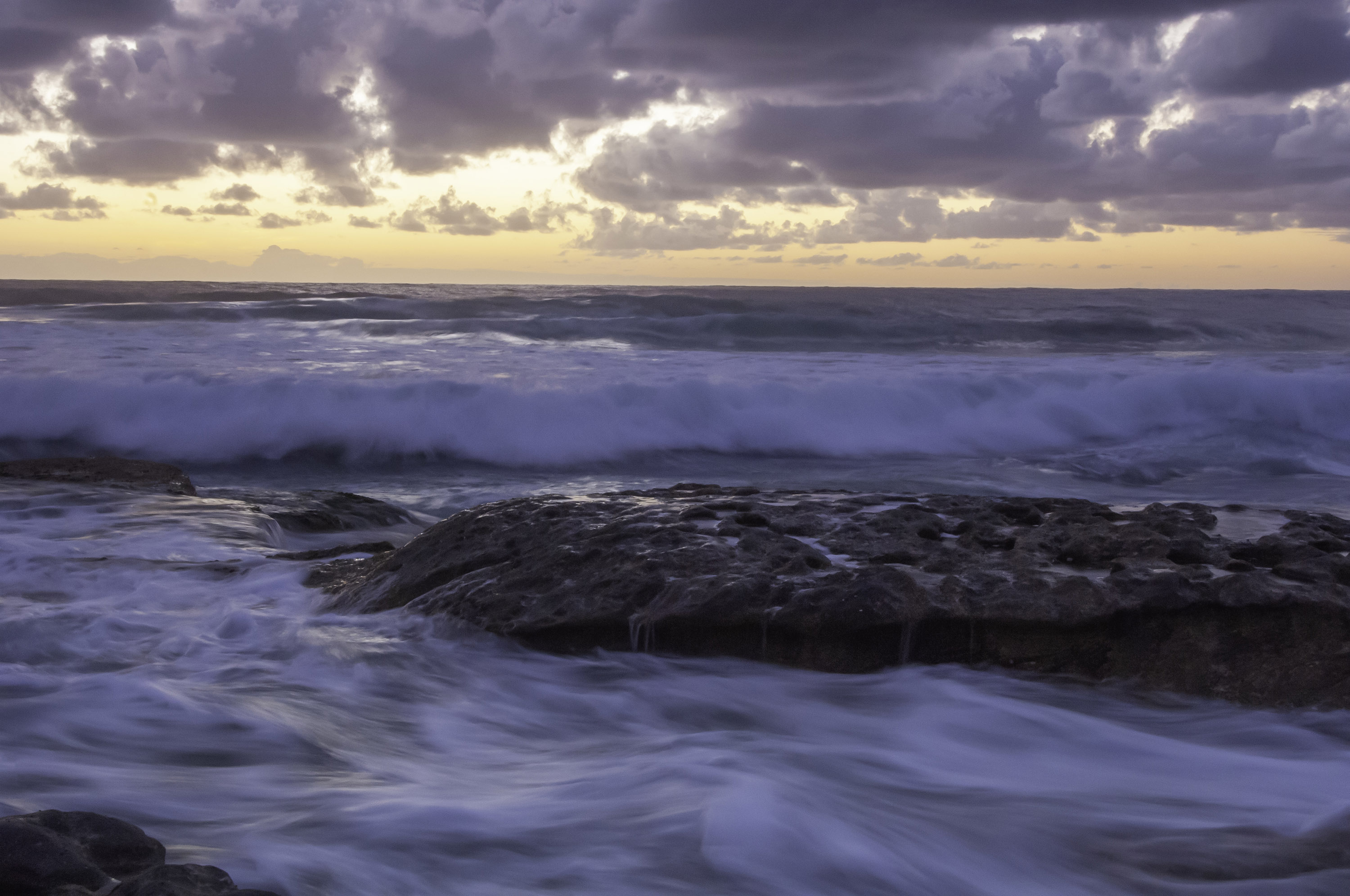
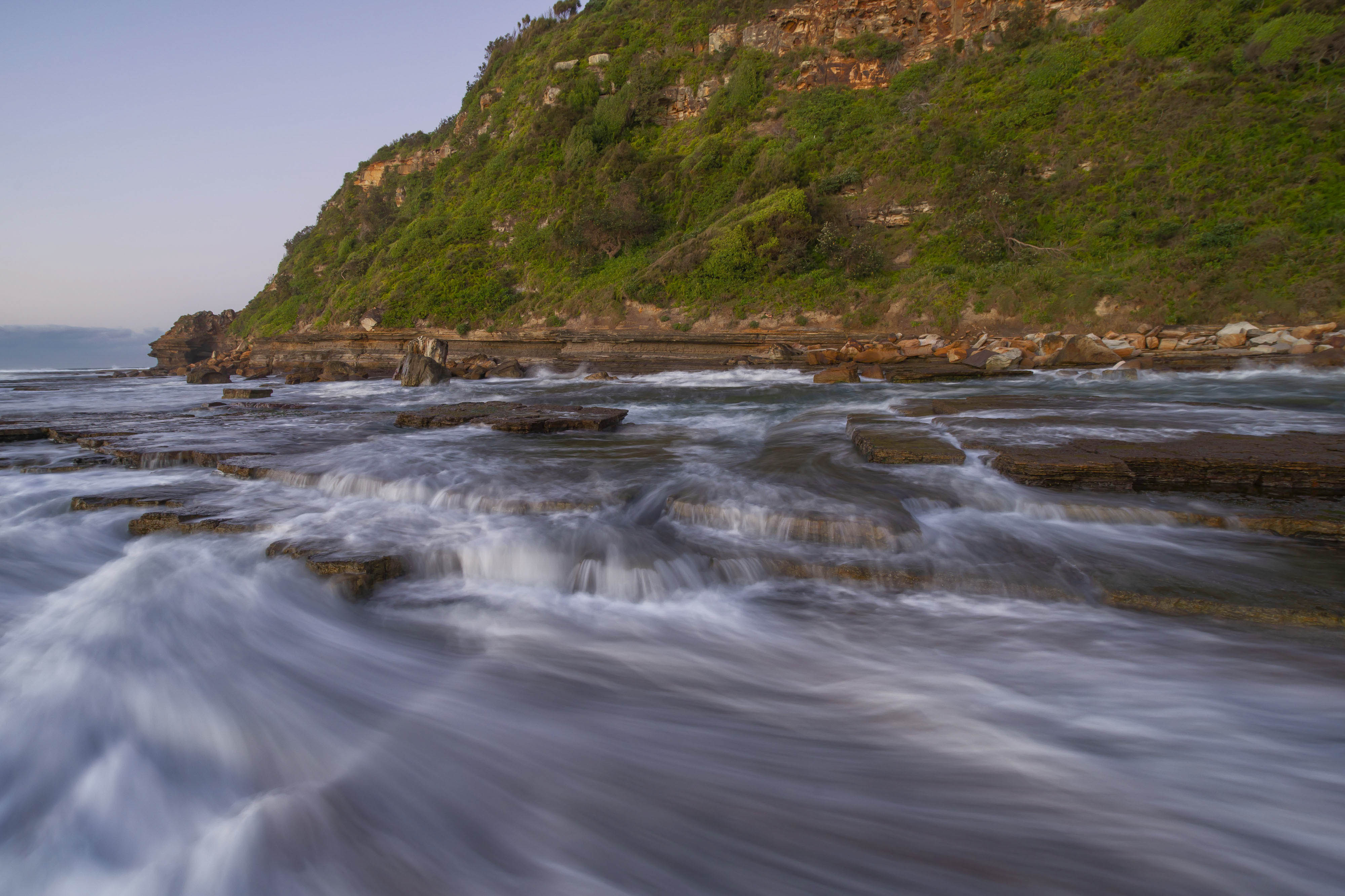
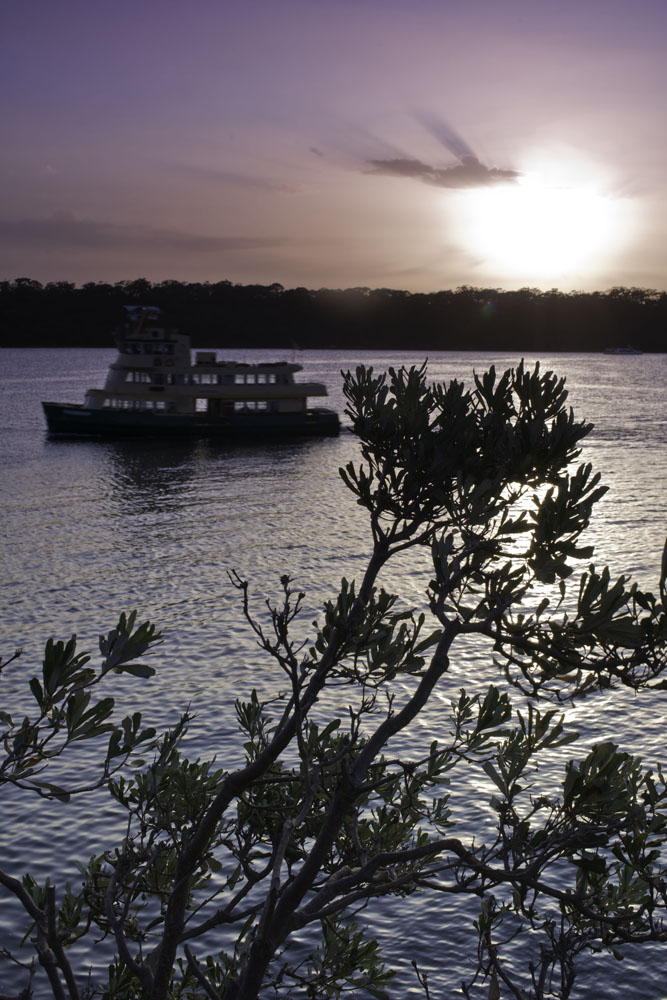
Thanks Cyndy for your thoughts. They are always welcome. This particular image has many close cousins, where the water has changed due to wave movements. I have tried to process them all just a little differently, to make them all a little individual. There could possibly be one in the collection that is along your thoughts. |
Sep 15th |
| 76 |
Sep 19 |
Reply |
Thanks Trey. With my images, you are very welcome to be as contrary as you like. Personally, I find that if a foreground is not sharp, I have a really hard job of dragging my eye past it into the rest of an image. I also believe that when the sky is rubbish, why keep it in the final image? Concentrate on an interesting foreground. |
Sep 15th |
| 76 |
Sep 19 |
Reply |
Thanks Jay. AS I mentioned, I love panoramas because you can crop them like crazy and still end up with an image even when the whole original frame is not strong. But you need to be thinking that way when you press the button. |
Sep 15th |
| 76 |
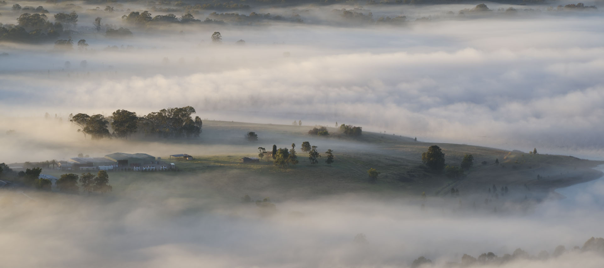
Sep 19 |
Reply |
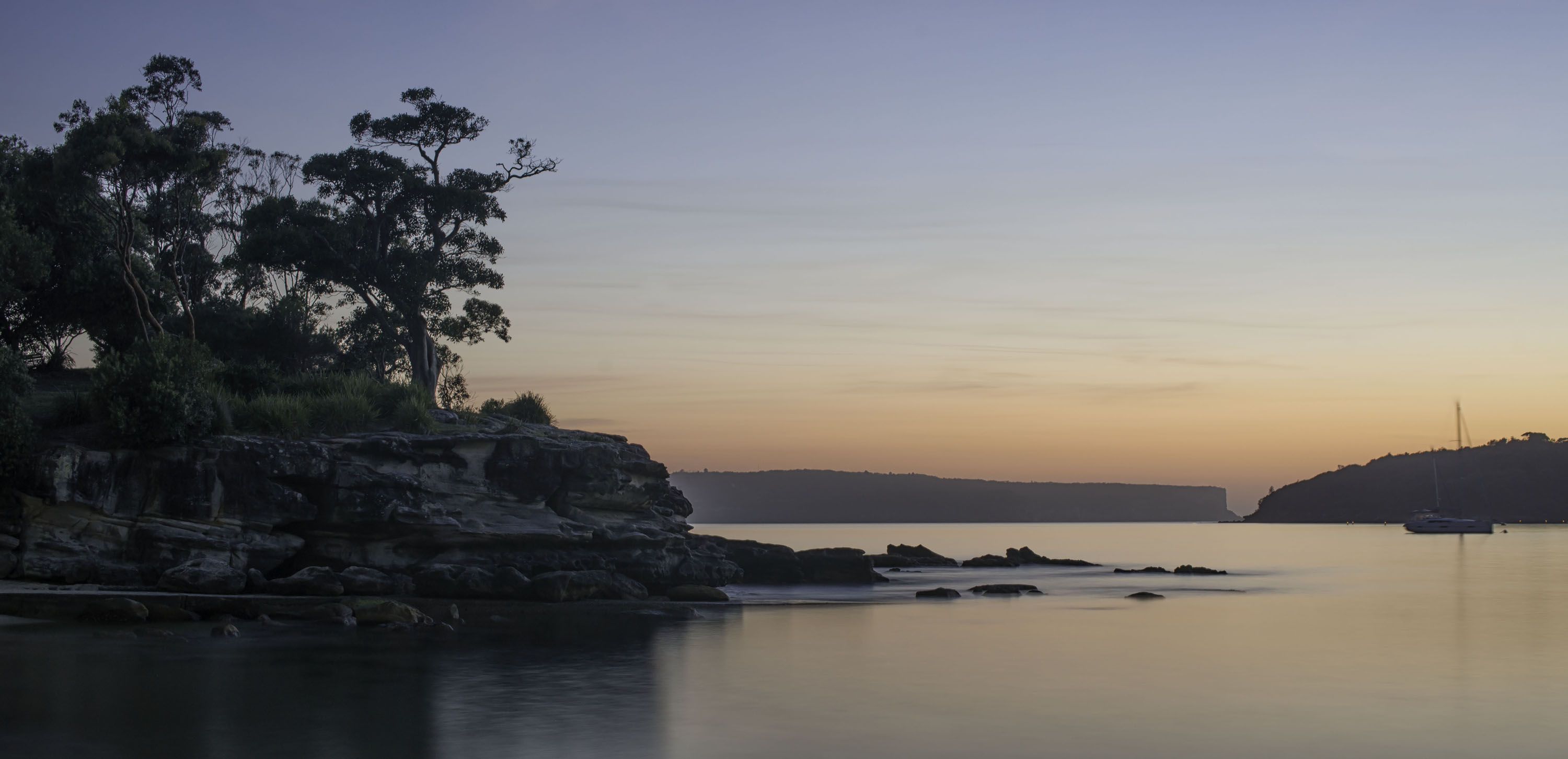
Thank you Jorn. This was taken at or just after sunrise. We were there an hour before the sun rose and started shooting from the moment we arrived. From memory and looking at the original, I would say this was taken just as the sun was rising above the horizon. |
Sep 15th |
| 76 |
Sep 19 |
Comment |
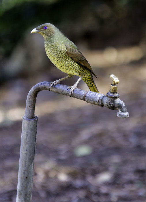
Another great image Cyndy, as we have come to expect from you. Your processing has really brought the bird out. The fine details in the feathers and bill are very strong indeed. Well done. Image of the month. |
Sep 15th |
| 76 |
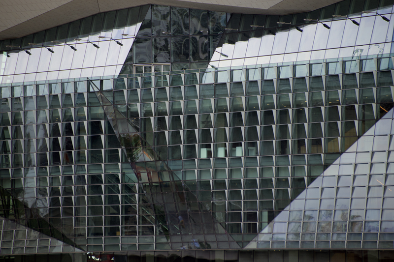
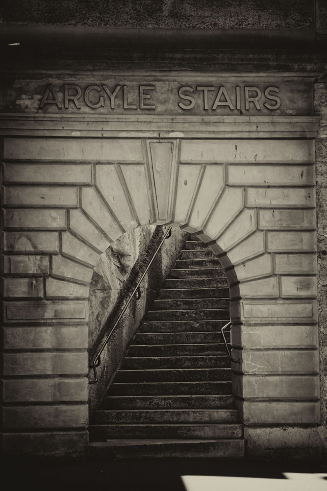
Sep 19 |
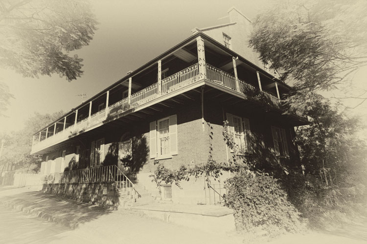
Comment |
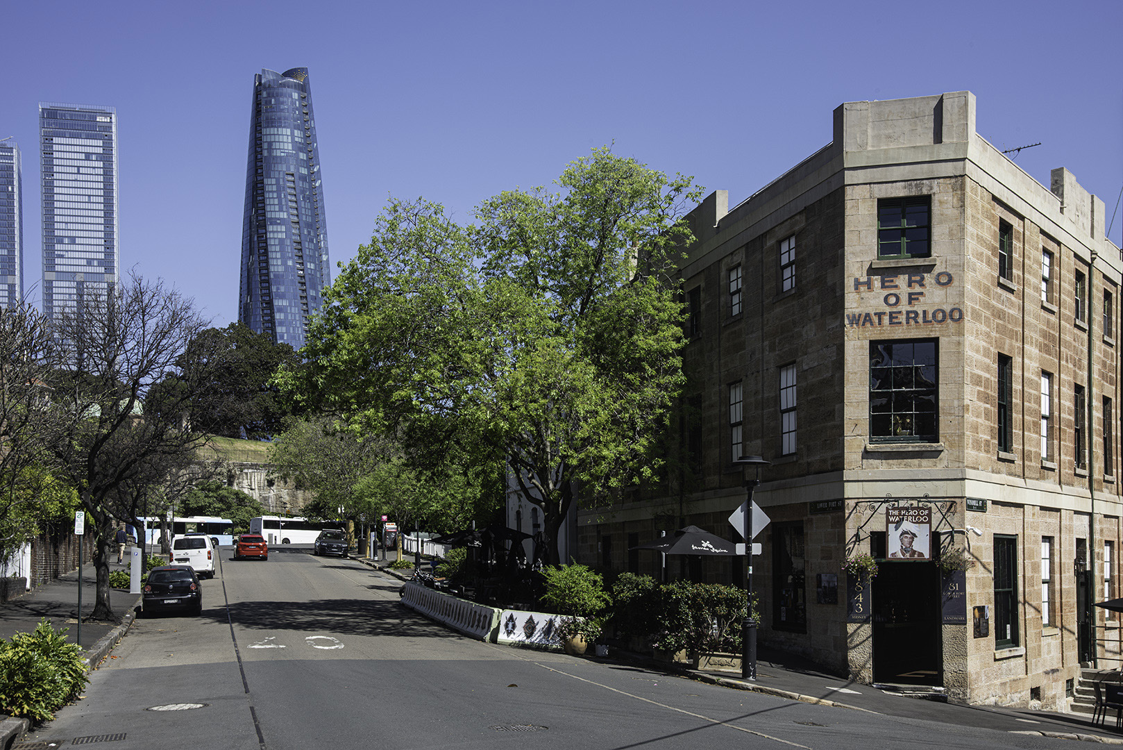
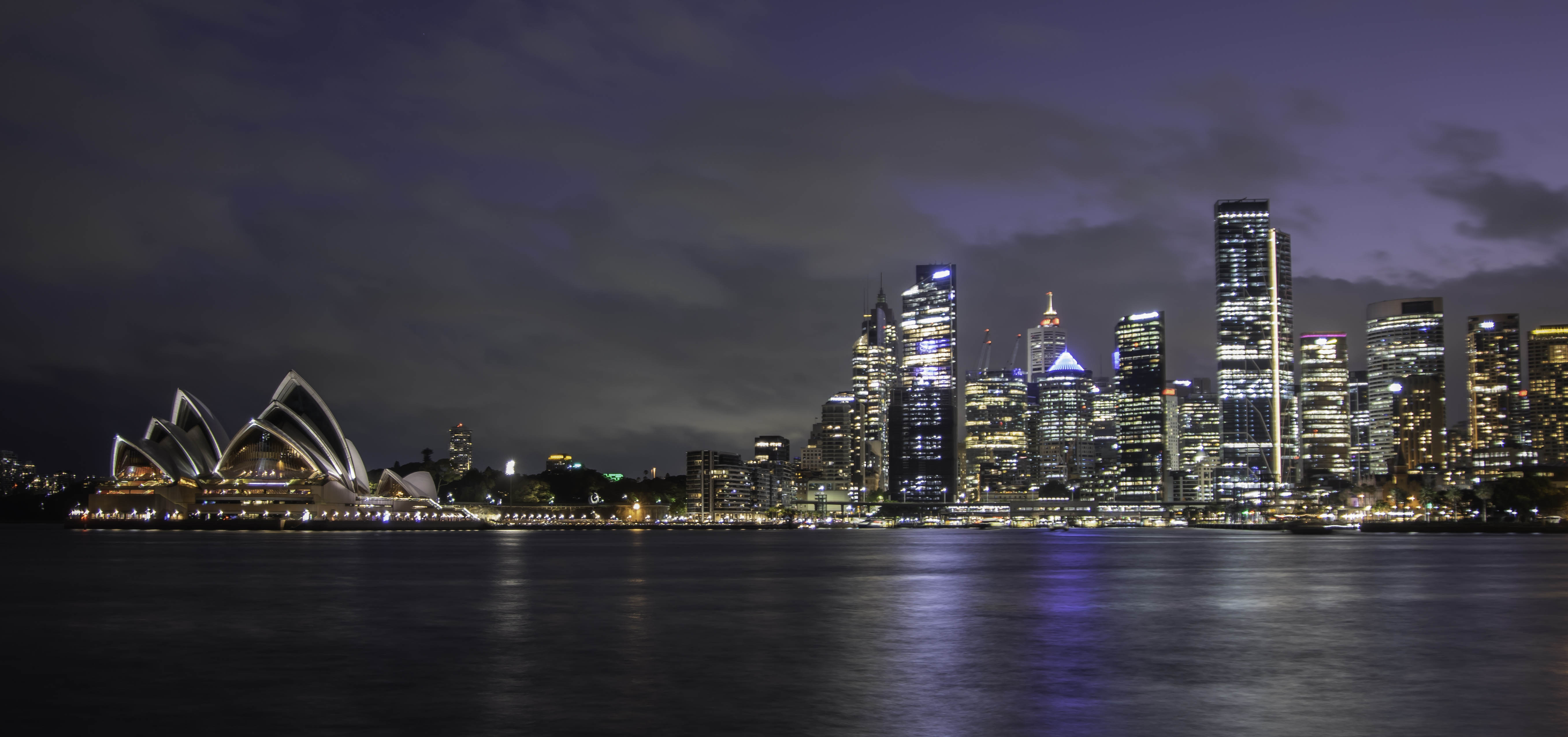
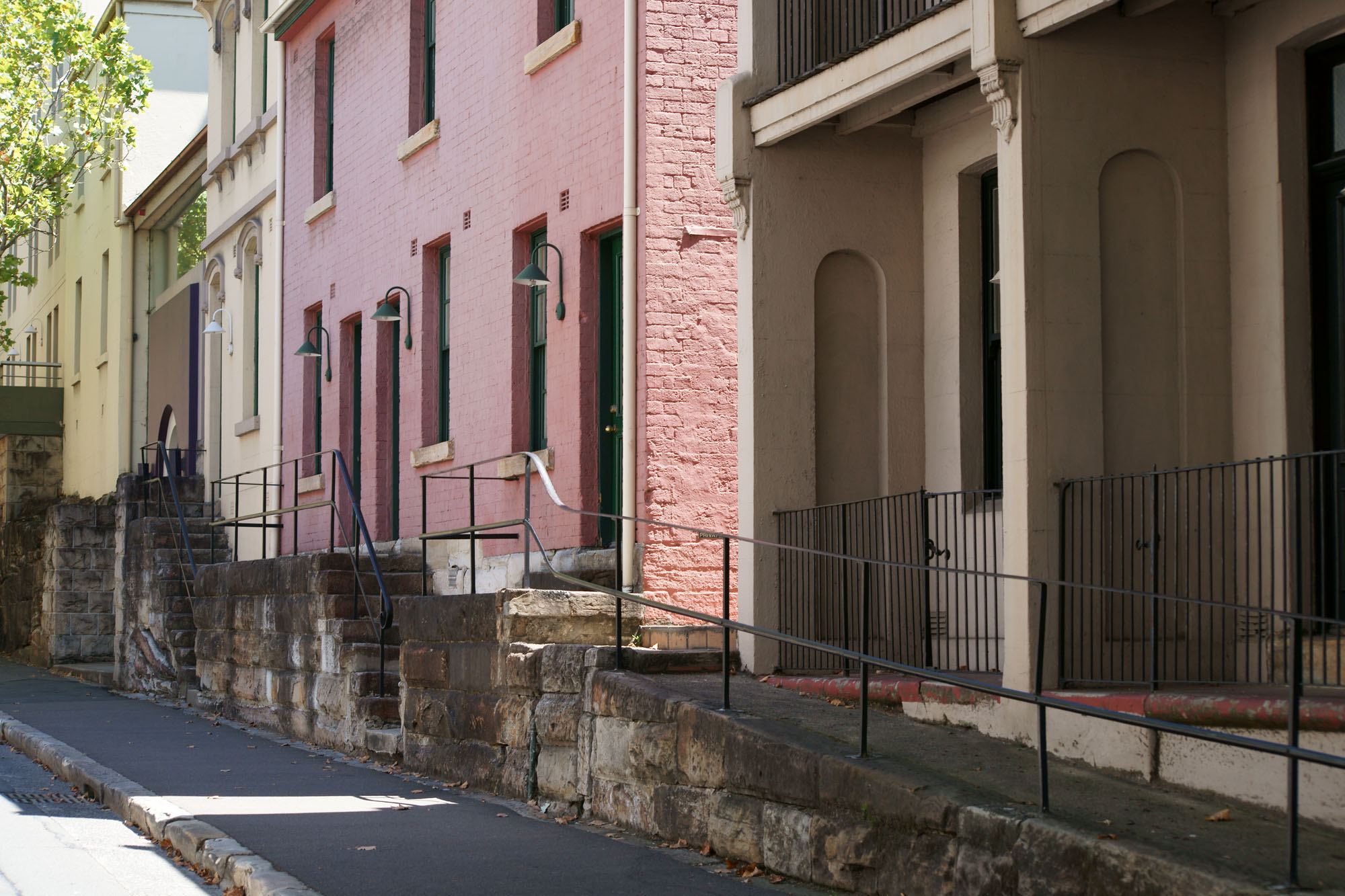
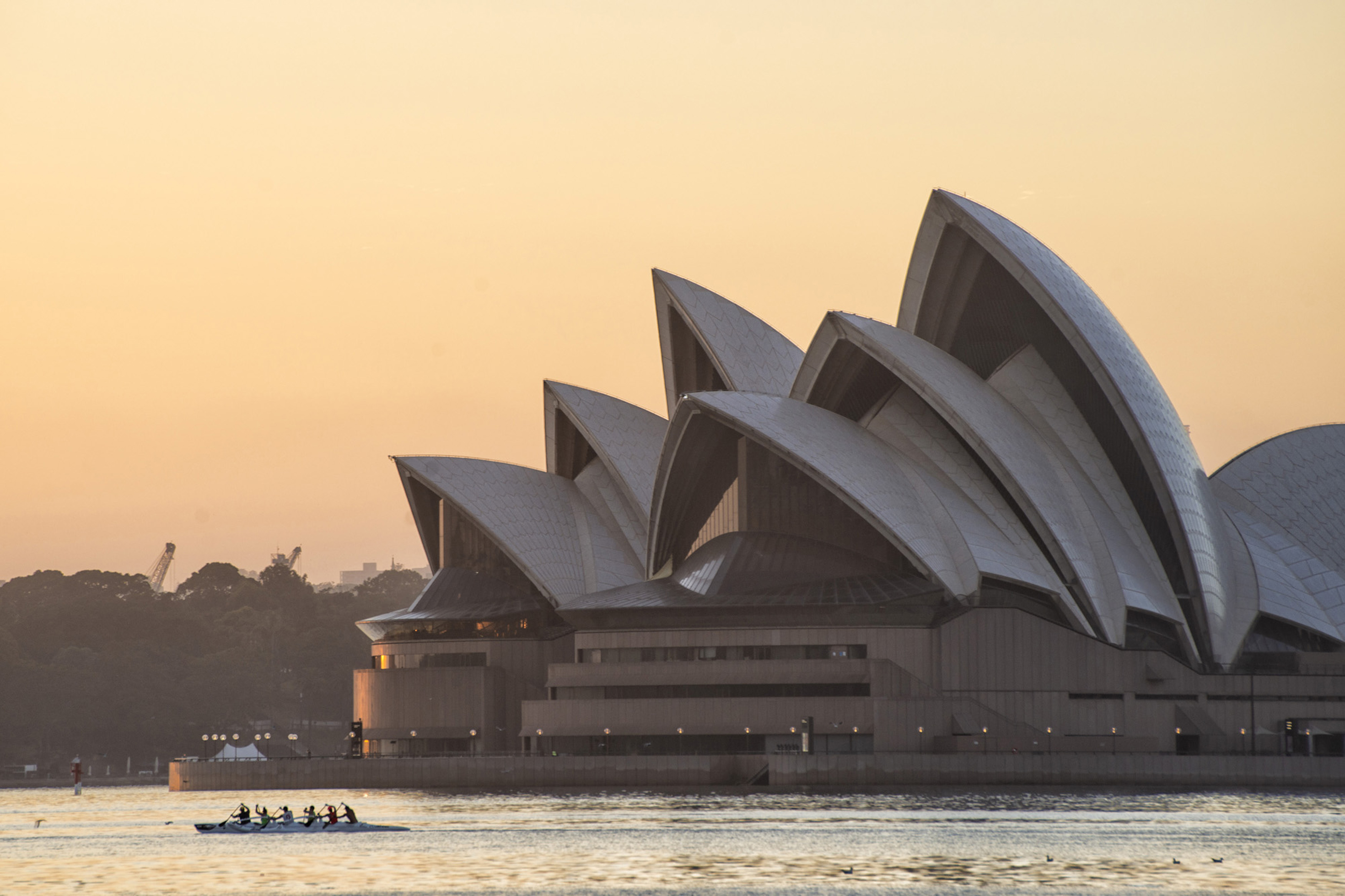
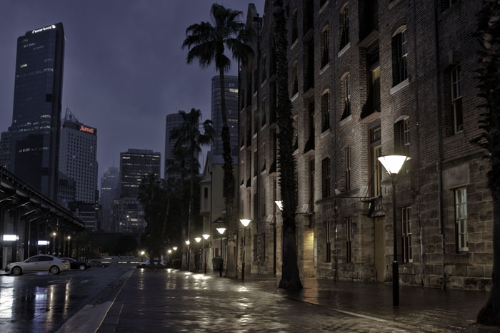
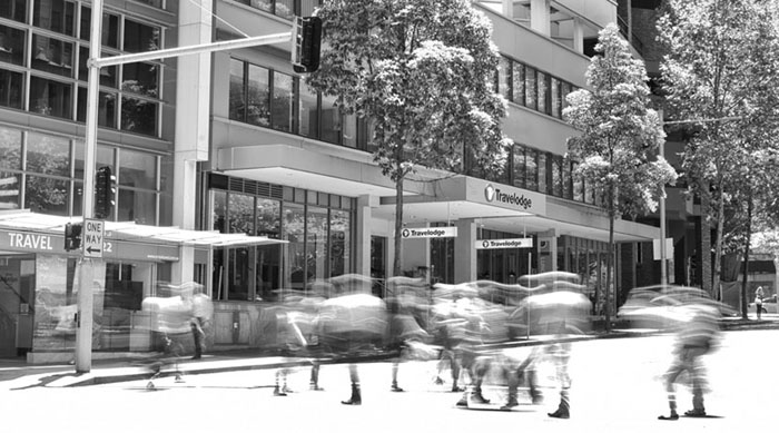
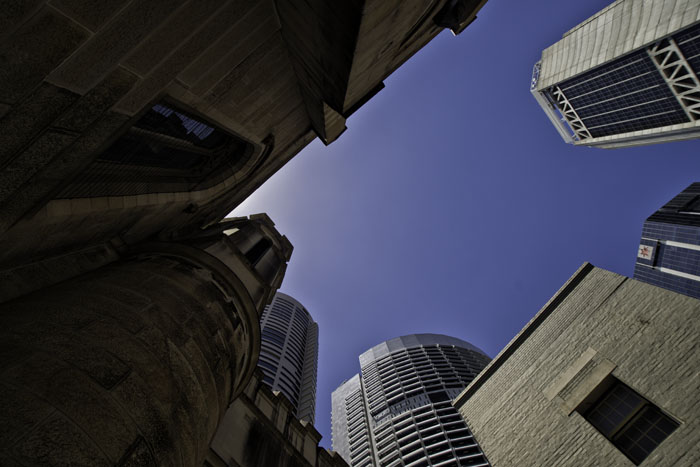
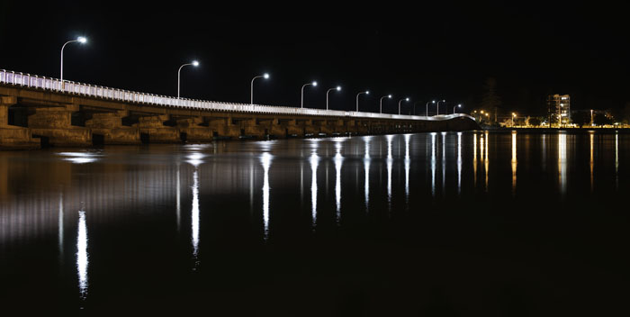
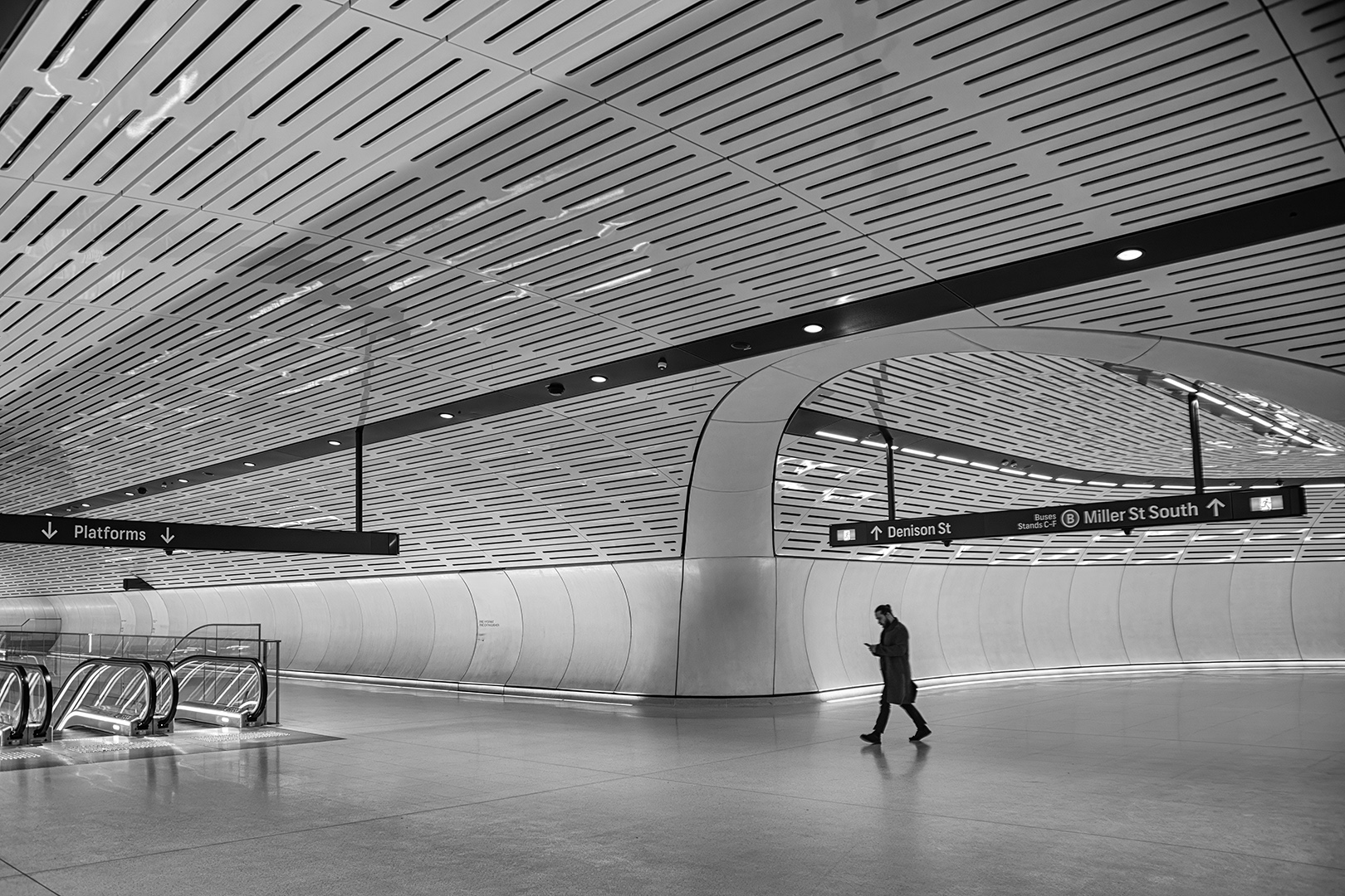
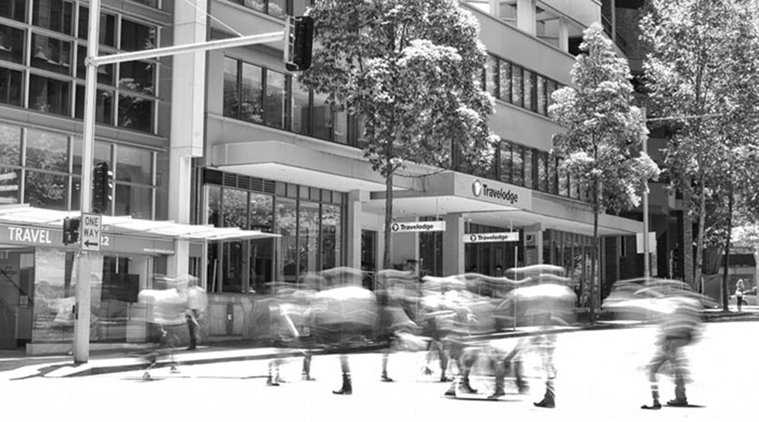
This is a fine image Sanford. A very dear friend of mine over here who is an emeritus professor of fine art photography once gave a presentation to our camera club titled something along the lines of "Looking but not seeing." How many people have walked past this building, looked at it, but not seen this image? For you to stop and photograph it shows your photographer's eye. Composition and exposure are good, however, I would just like to see that top edge of the lowest window pane level and maybe a little more balance in the blue sky at the top. But they are just relatively minor details. |
Sep 15th |
| 76 |
Sep 19 |
Comment |
A great image in your continuing project Jorn. Well done. You said earlier that your project was about "Craftspeople" going about their crafts and with this image Annemette is definitely the main subject. We can also clearly see her craft and the environment where she does it. Yes the background is bright, but don't most crafts need good lighting of some sort? An option might be to use the Original 1 image in your project. Annemette is still strong within the image, we can easily see what she is doing and there is no brightly lit background. A strong image Jorn, and I am looking forward to your continuing project. |
Sep 15th |
| 76 |
Sep 19 |
Comment |
Isn't this art called photography of ours such a wonderful thing? And aren't we all so different in our thoughts?
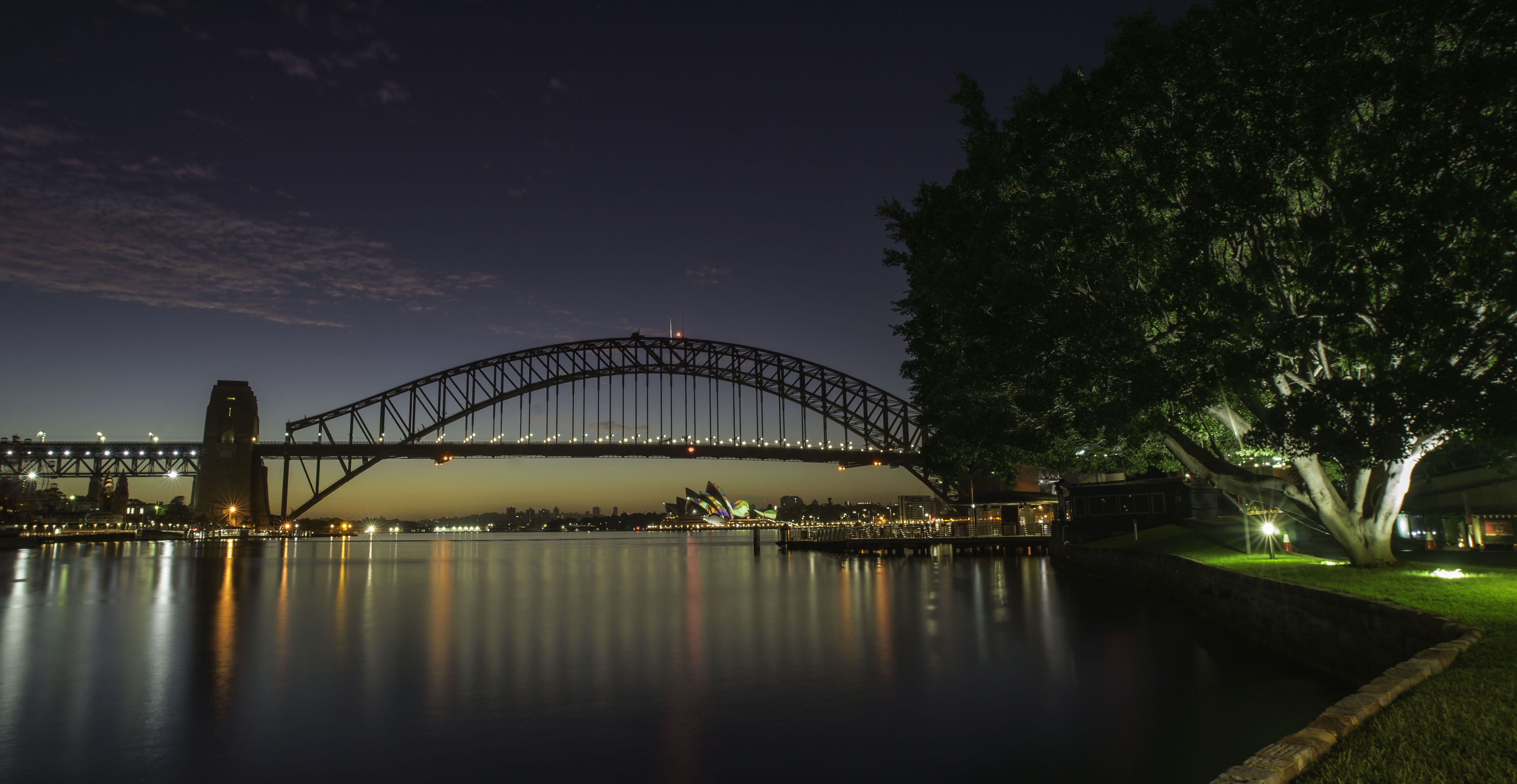
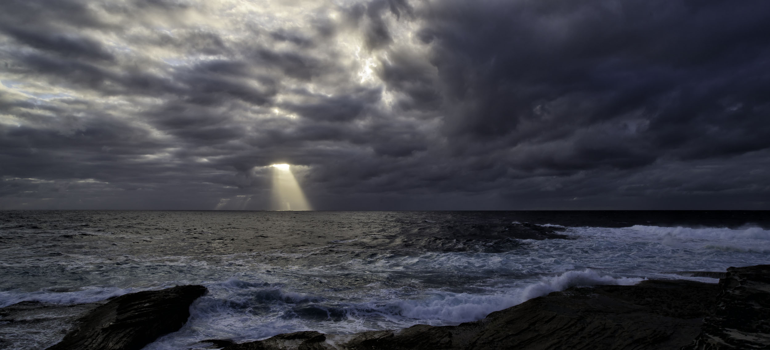
I had to laugh quietly to myself over here. Jay wants to remove "distracting elements" and Trey said he wants to see a person up the end as a "focal point". Looking at your original, Trey has his wish, although she's not in red. My question is "When does a focal point become a distracting element?" Or vice a versa, just as equally. Cyndy's comments about liking "darker" images is very valid. But in my humble opinion, and it is just my thoughts, is that there is too much clear detail on the bridge timbers and the sky is just too blue for this to become a truly "dark" image. And by dark I mean scary, dark, foreboding rather than under exposed. So in the end, Jay, this is a fine image and you have presented it in the way that you as the photographer wanted it presented. Well done, you have promoted discussion with this image and that is what these groups are all about. My only other comment is that when you have removed the tower from the ridgeline, I now can't take my eyes away from a repetition in the cloud's texture and detail. I don't mean this in any derogatory way, I just feel that if I don't mention it, I am not doing my job properly. |
Sep 15th |
| 76 |
Sep 19 |
Comment |
I agree with the comments made by Jay & Cyndy regarding the colors leaping at you, as the tractor also appears to be trying. But I also like the close cropping and the way you've removed extraneous distracting elements in the image. Treatment of this image definitely has the Trey signature to it. |
Sep 15th |
5 comments - 5 replies for Group 76
|
12 comments - 7 replies Total
|