|
| Group |
Round |
C/R |
Comment |
Date |
Image |
| 61 |
May 19 |
Comment |
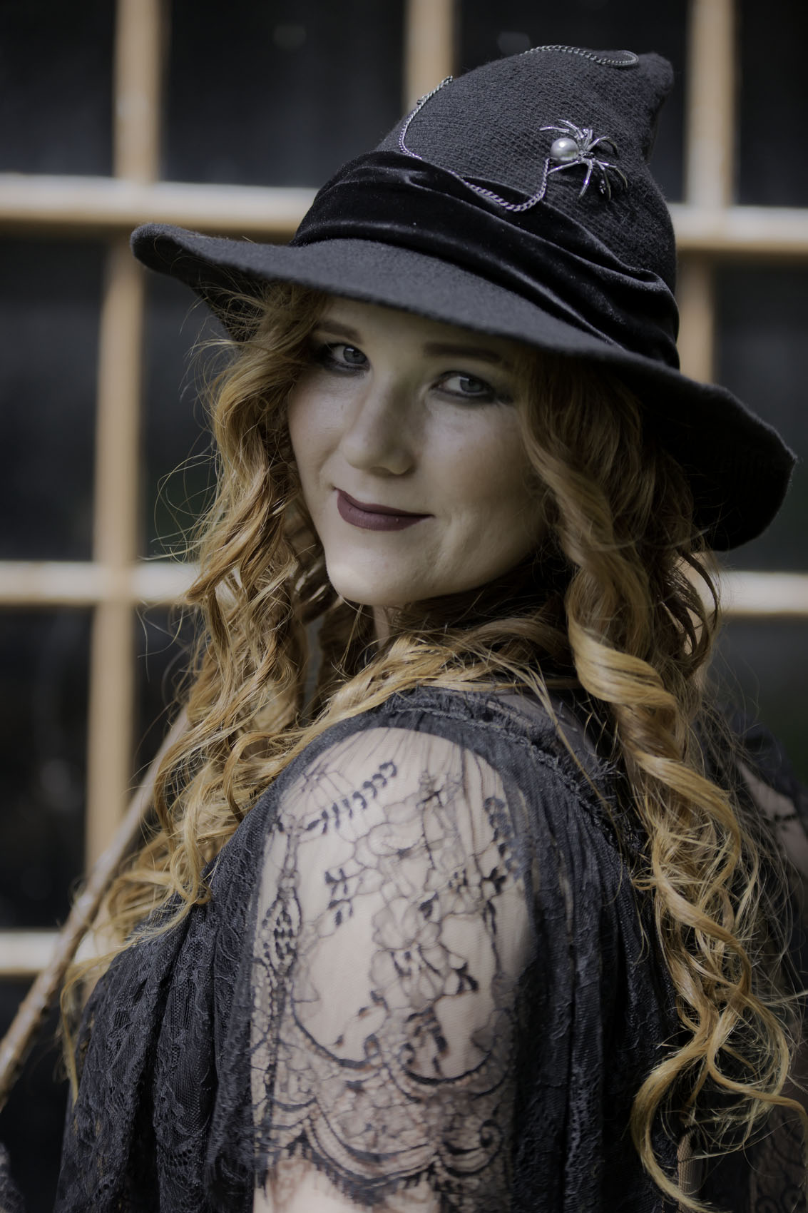
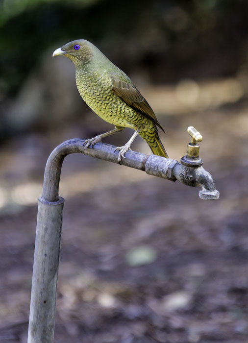
What a great image Manfred. The model, costume, pose and environment all work extremely well together. The lighting is superb, as is the focusing and dof. My favourite feature of this portrait is the fact that Lorinda is not facing you. To me it shows her attitude of "I know he's there and I don't care. But he will suffer greatly, should he upset me." A superb image. Ian groups 73 & 76. |
May 5th |
1 comment - 0 replies for Group 61
|
| 73 |
May 19 |
Comment |
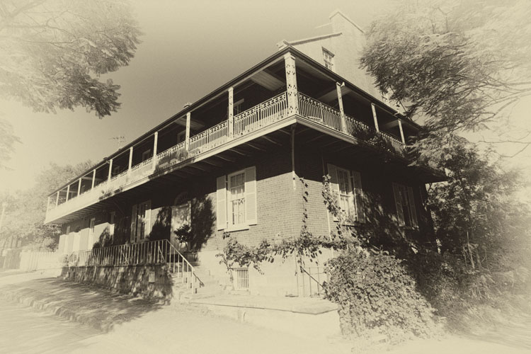
Thanks David, I use Lightroom & Photo Shop. I have lightened the pillars up as much as I dare. If I go any further the colours go off and look all wrong. Maybe next time I'll try 2 photos, one exposed for the pillars & one for the background and then blend them together. We live and learn. |
May 18th |
| 73 |
May 19 |
Comment |
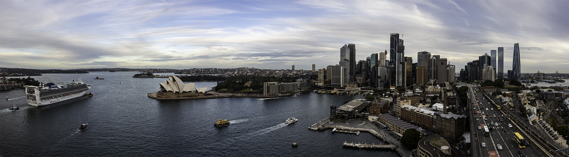
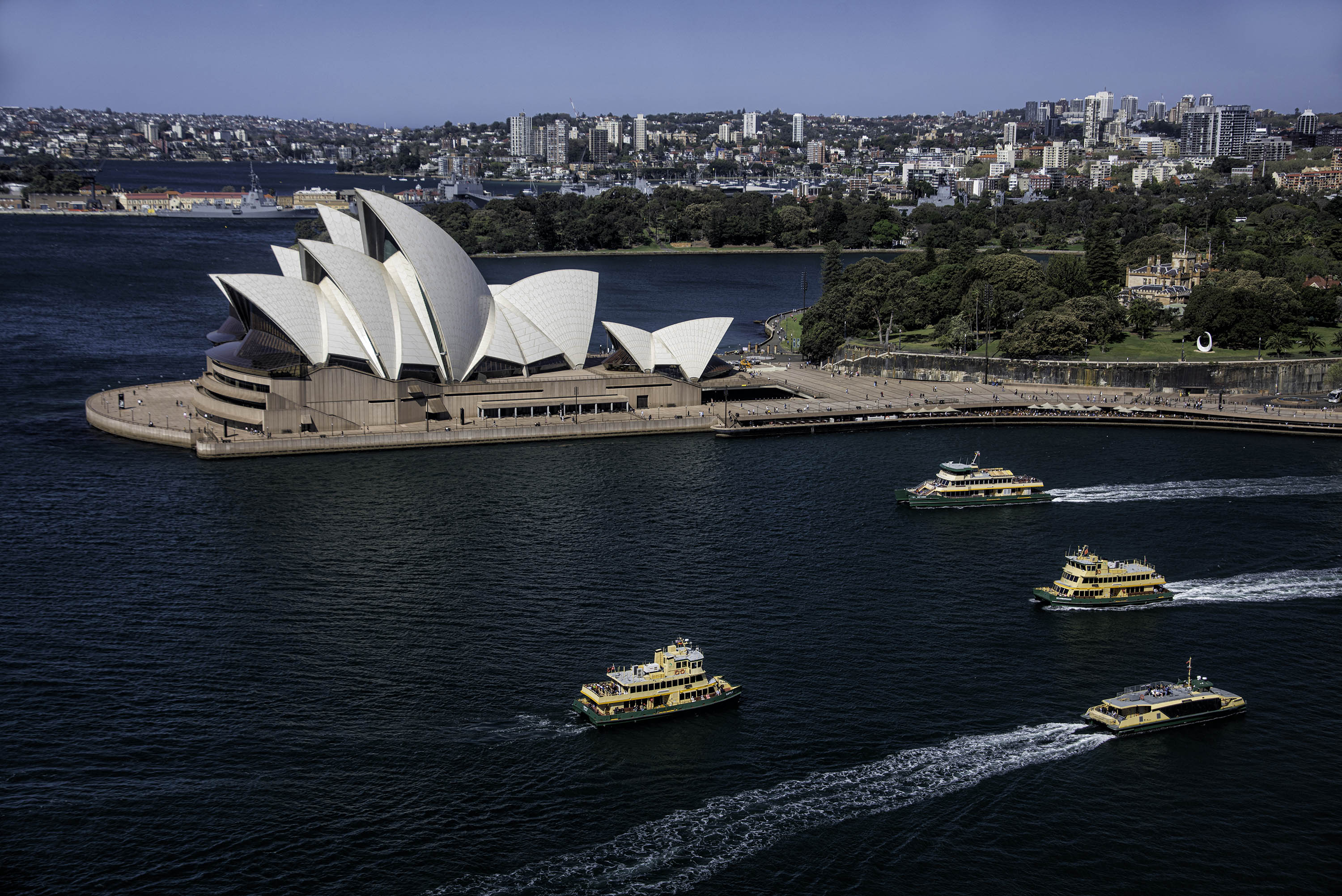
I can't stop looking at this image Tuhin. The sky, the water, the colours and the buildings are all stunning. What a fantastic photo Tuhin. |
May 17th |
| 73 |
May 19 |
Comment |
Absolutely superb image Peter. Brilliant in every aspect of photography. |
May 17th |
| 73 |
May 19 |
Comment |
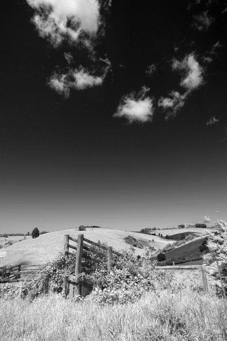
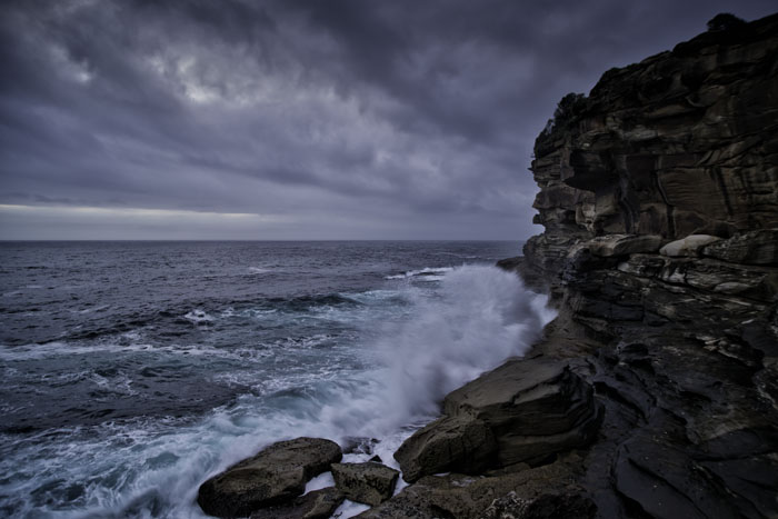
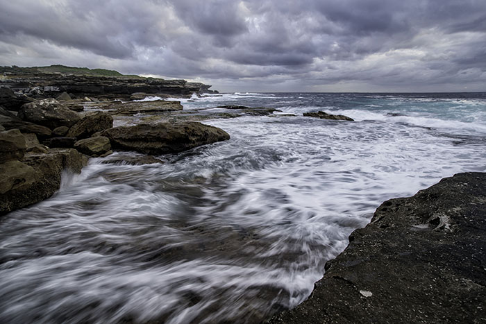
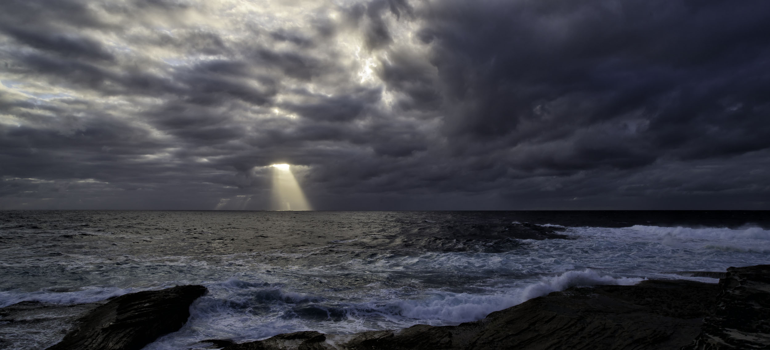
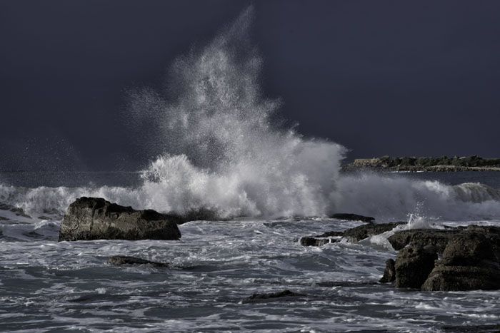
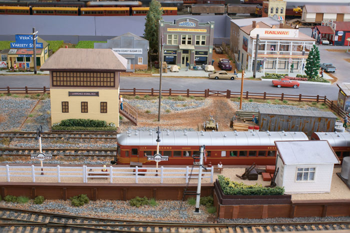
A great image Darryl. You have certainly bagged your big moody sky and the foreground rocks lead us right through this image. Please keep playing with your with your lens / camera combinations. You will then find out what works and what doesn't, just might take some trial and error. I have been playing with focus stacking the last couple of months on a neighbour's model train set. It's not all that hard to do in PS. I can't find where you mentioned the camera settings for this image. |
May 17th |
| 73 |
May 19 |
Comment |
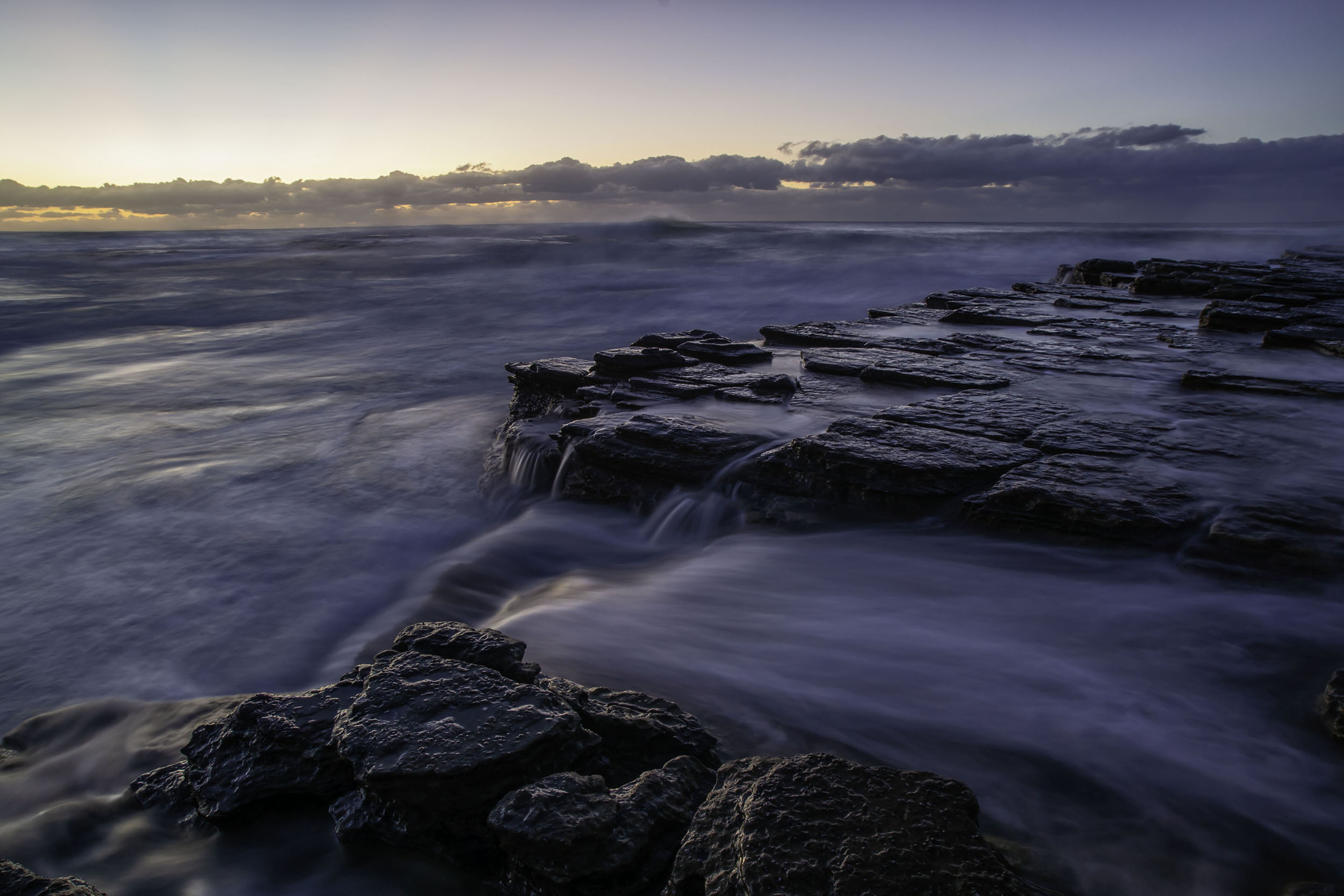
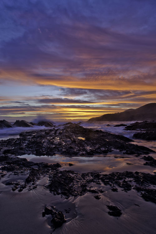
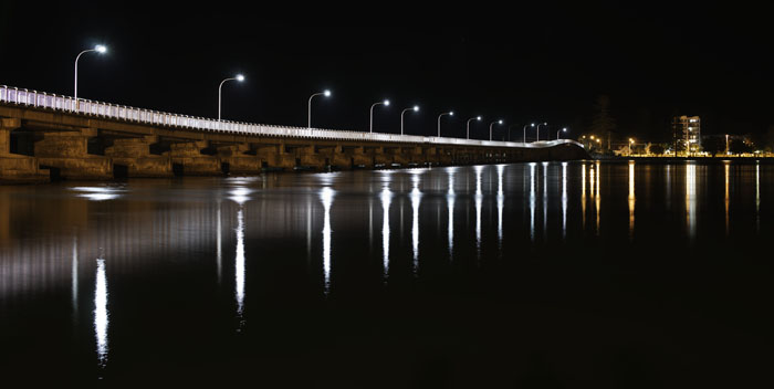
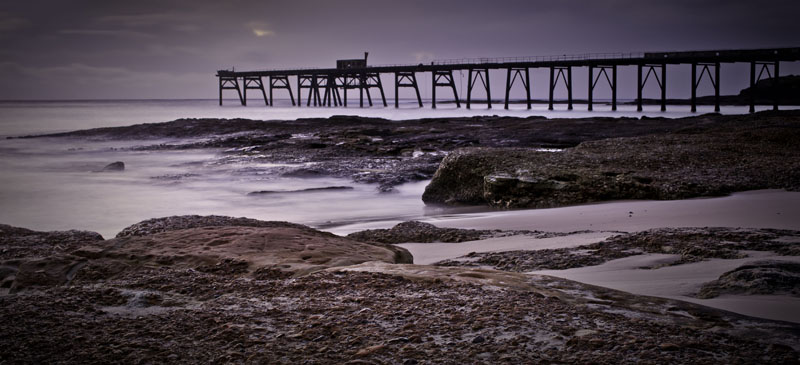
A very fine image Tim, but I'm with Sherry. There is a good amount of unproductive space in this image and I don't think loosing some of it would distract from the image. I'd like to see an alternate additional image as a pano which would include all of the reflection of the dis-used pylon on the right and loose say the top 2/3 on top left of the blue sky. Could also loose the partial white building facade on the right, but leave all the brown shrubs. |
May 17th |
| 73 |
May 19 |
Comment |
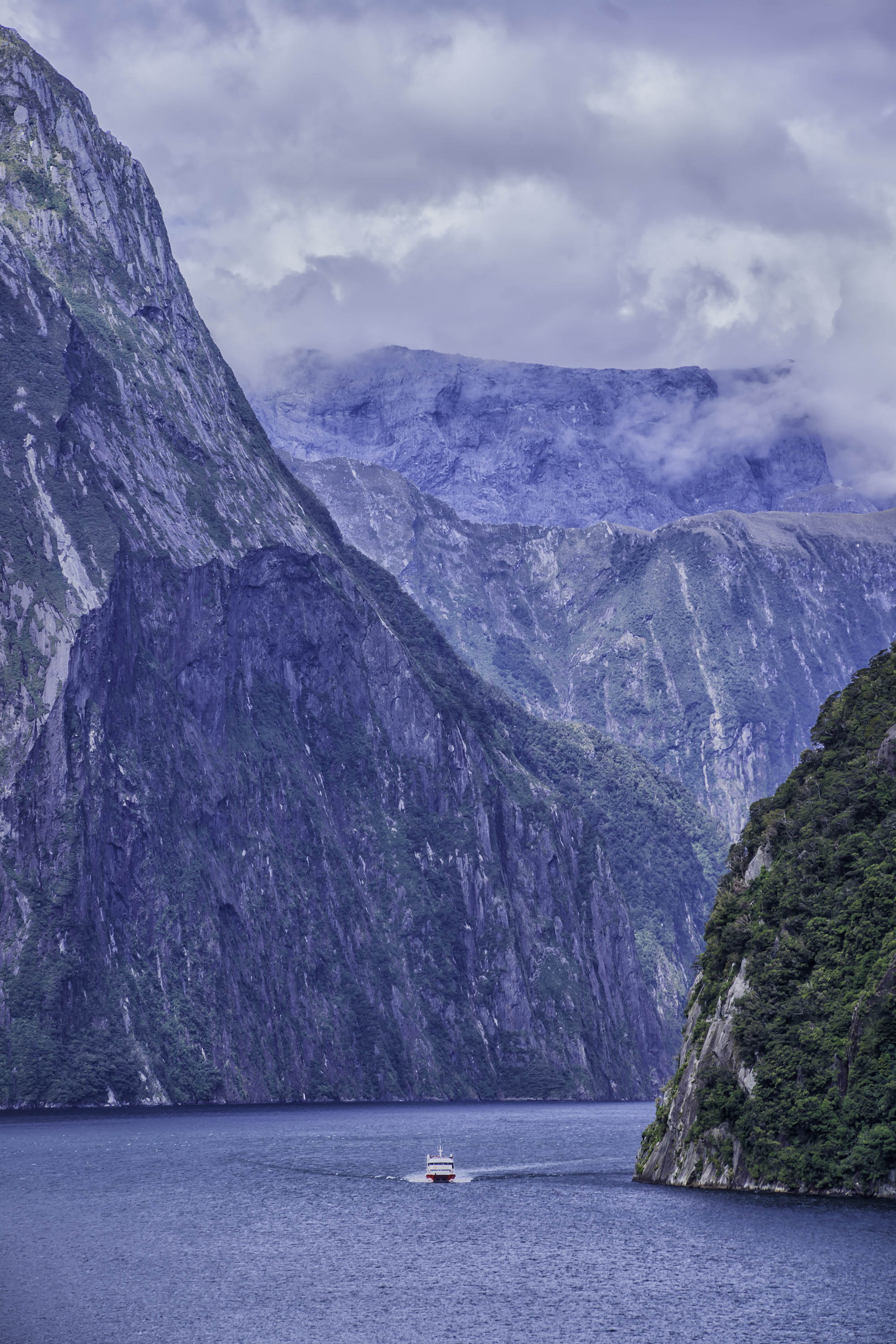
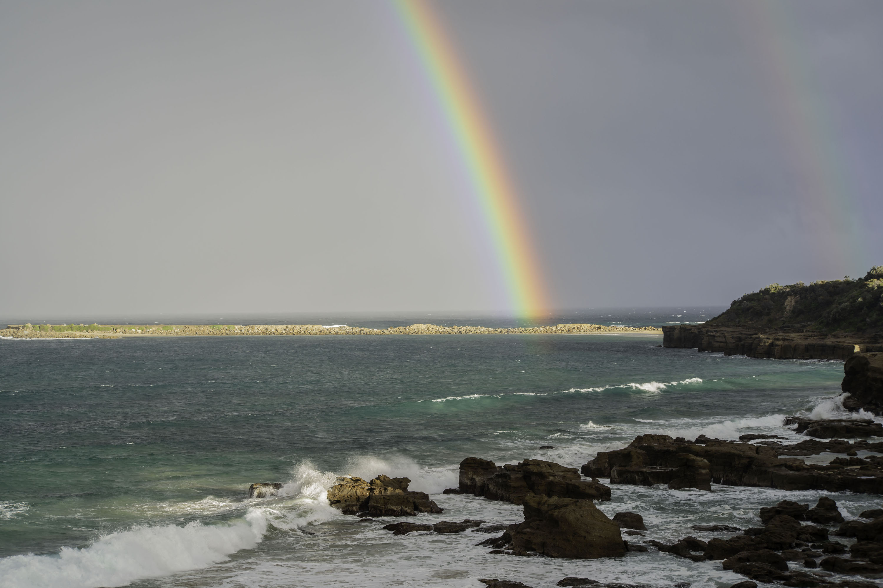
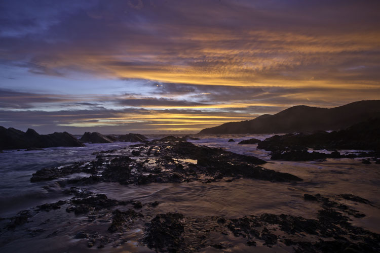
It's not fair. You guys are already half way to Iceland. Maybe I should re-visit some images I took in New Zealand a while ago. This image is great Sherry, and yes the mountain makes it. I love everything about it. I'm so glad you haven't got a reflection of a tourist bus in the windows, that would kill it. My aussie impressions of Iceland are cold, mountains, cold, ice, black sand and more cold. |
May 17th |
| 73 |
May 19 |
Comment |
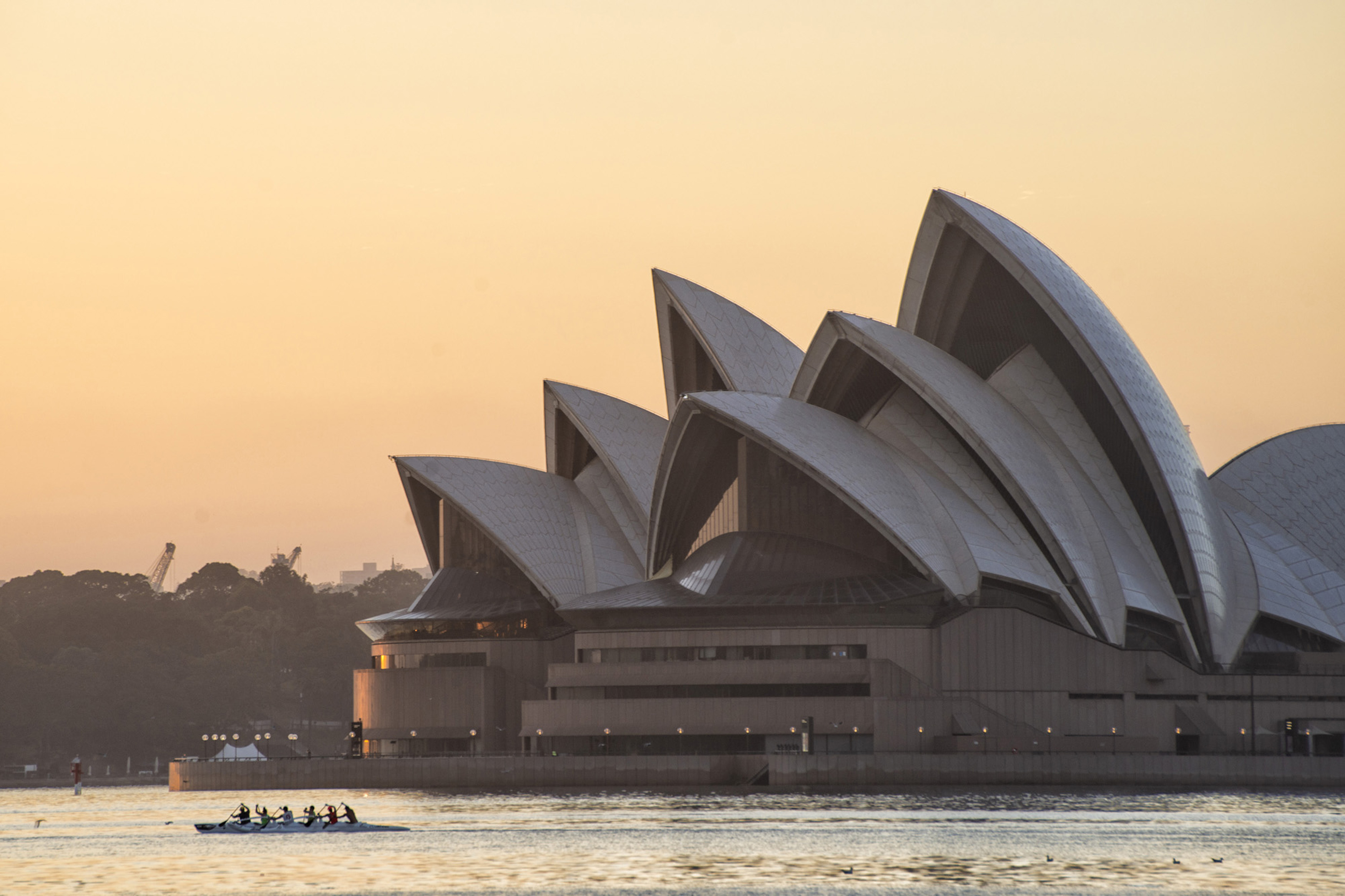
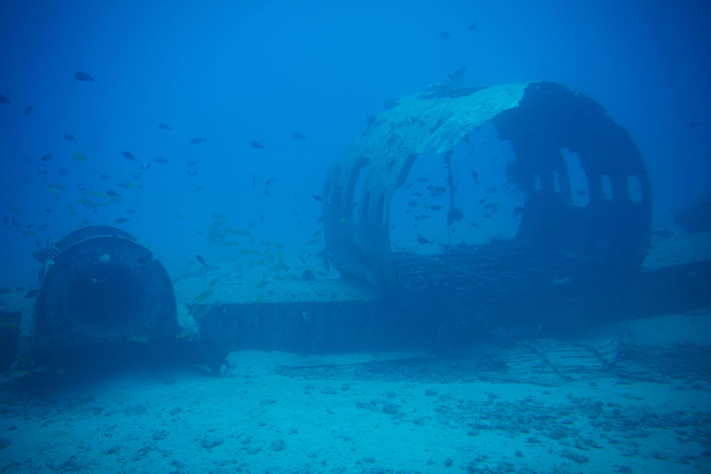
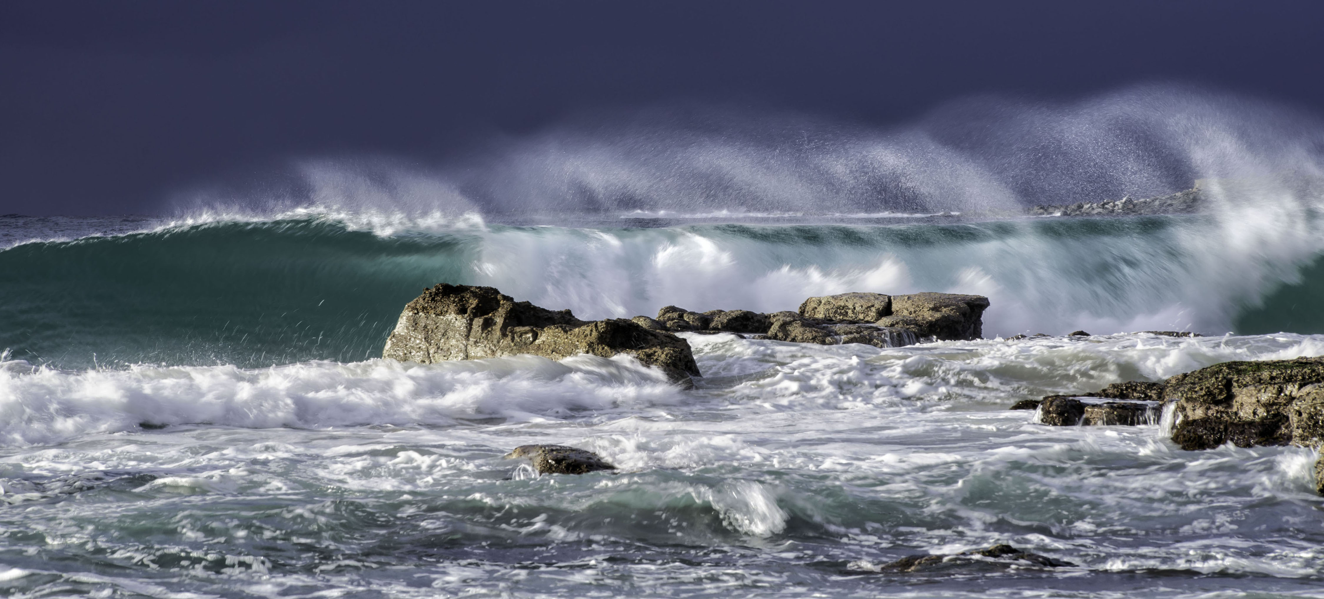
Two great images David, as I'm sure there are many more. Both images are very appealing. The tanker in the second one doesn't concern me too much. Oceans are the home of ships and I think it tends to balance the sun. You should be very proud of both. |
May 17th |
| 73 |
May 19 |
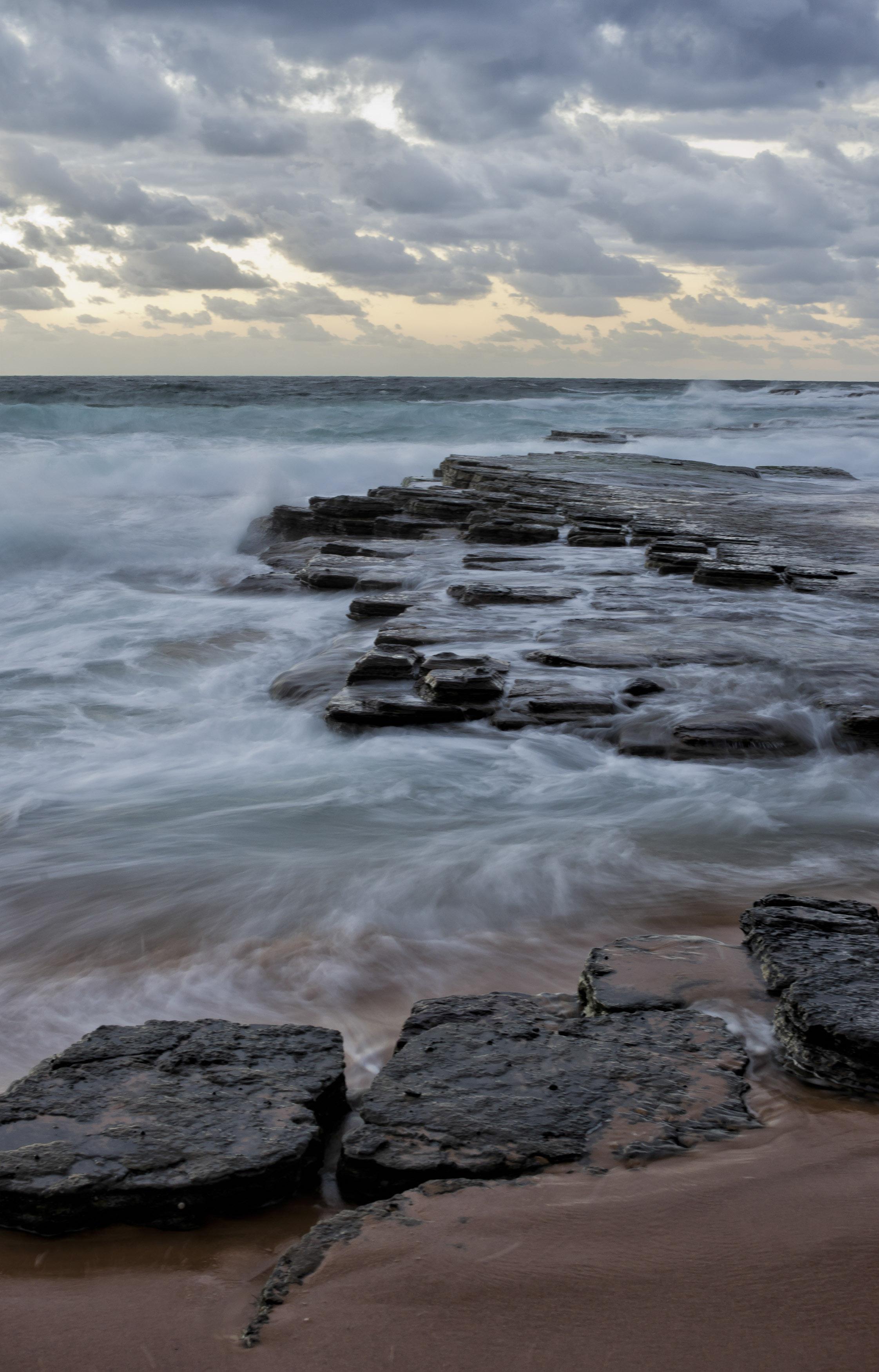
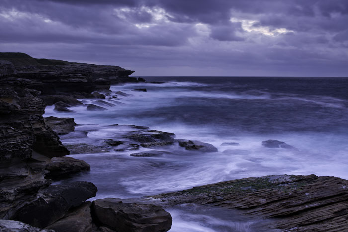
Reply |
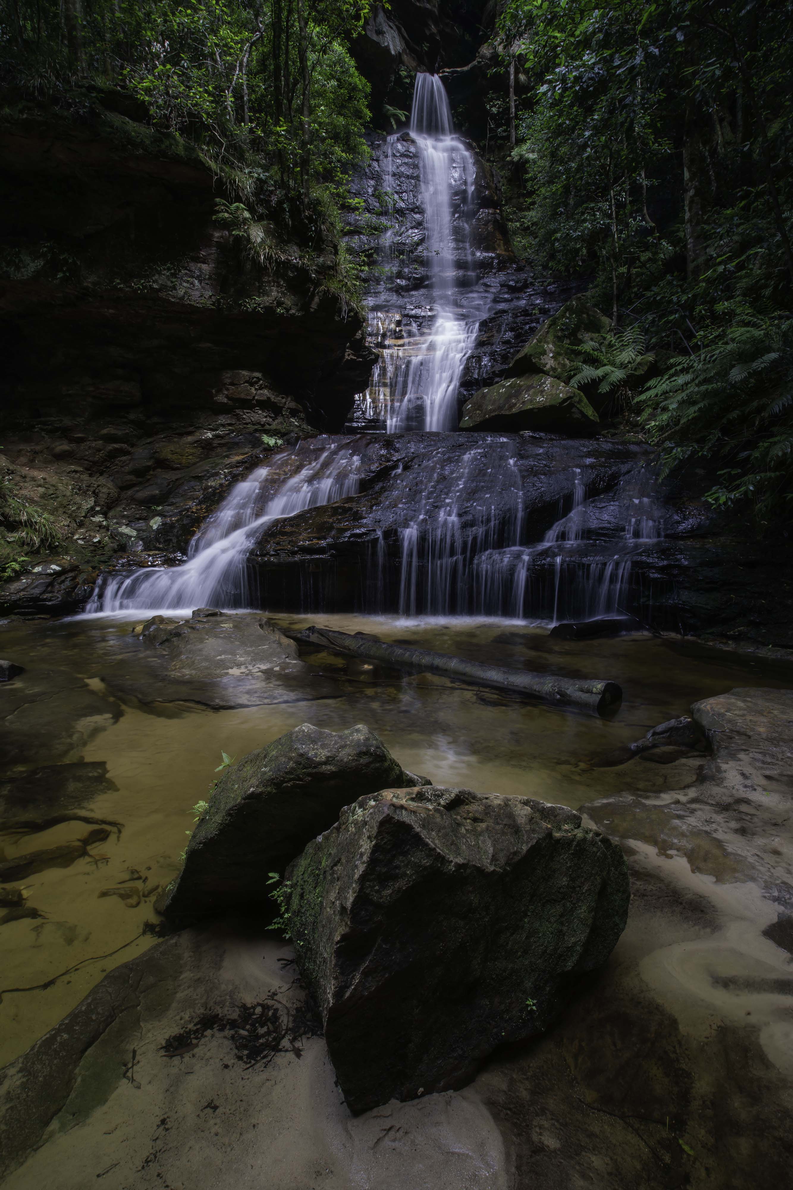
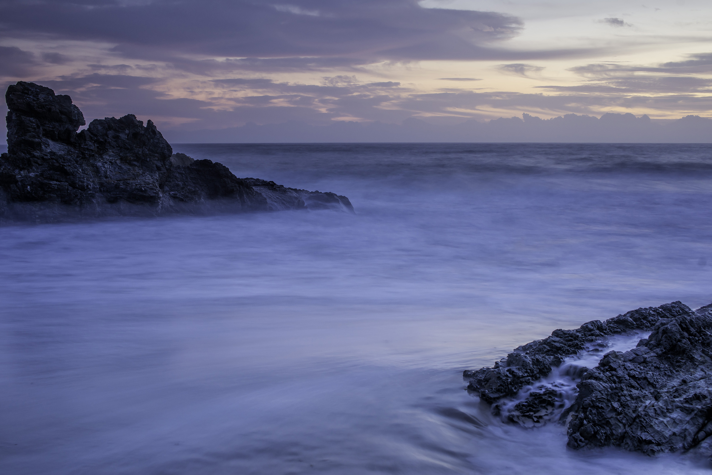
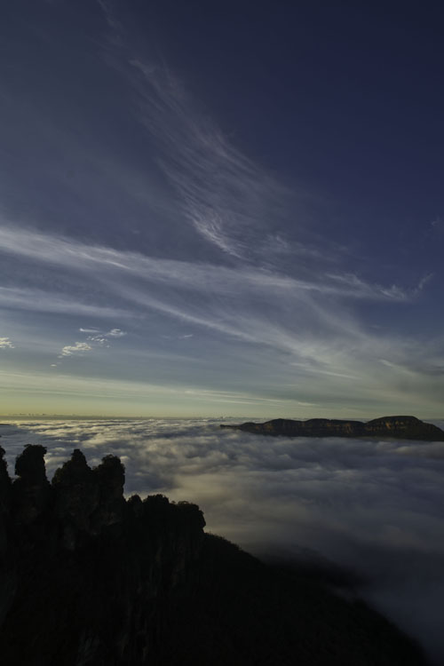
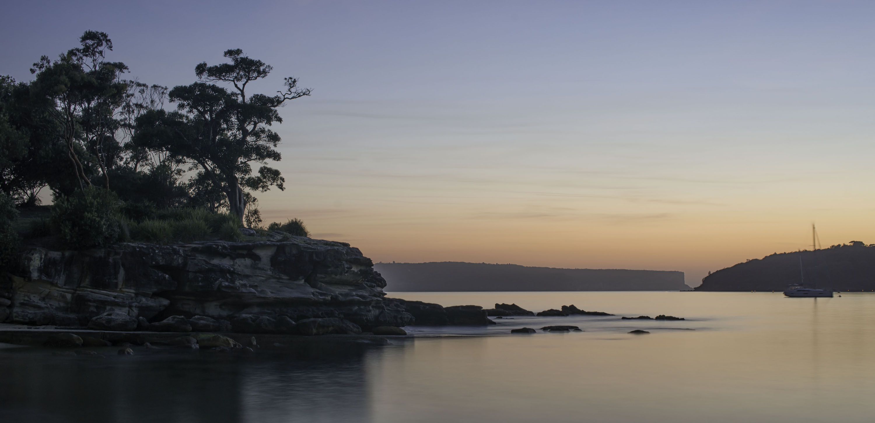
Thanks for your comments Sherry. This is a really difficult situation for a sunrise shot. The 3 rock pillars near bottom left are an iconic scene in our blue mountains, but at sunrise you can only see then while facing east, almost directly into the rising sun, which of course throws them into silhouettes. Might try for a sunset shoot next time. |
May 17th |
7 comments - 1 reply for Group 73
|
| 76 |
May 19 |
Reply |
And you have succeeded very well with your image Jorn. Nothing wrong with it at all. |
May 17th |
| 76 |
May 19 |
Reply |
Thanks Sanford. CWA = Center Weighted Averaging exposure. And in NIK, the touch was Color Effects / Tonal Contrast. |
May 4th |
| 76 |
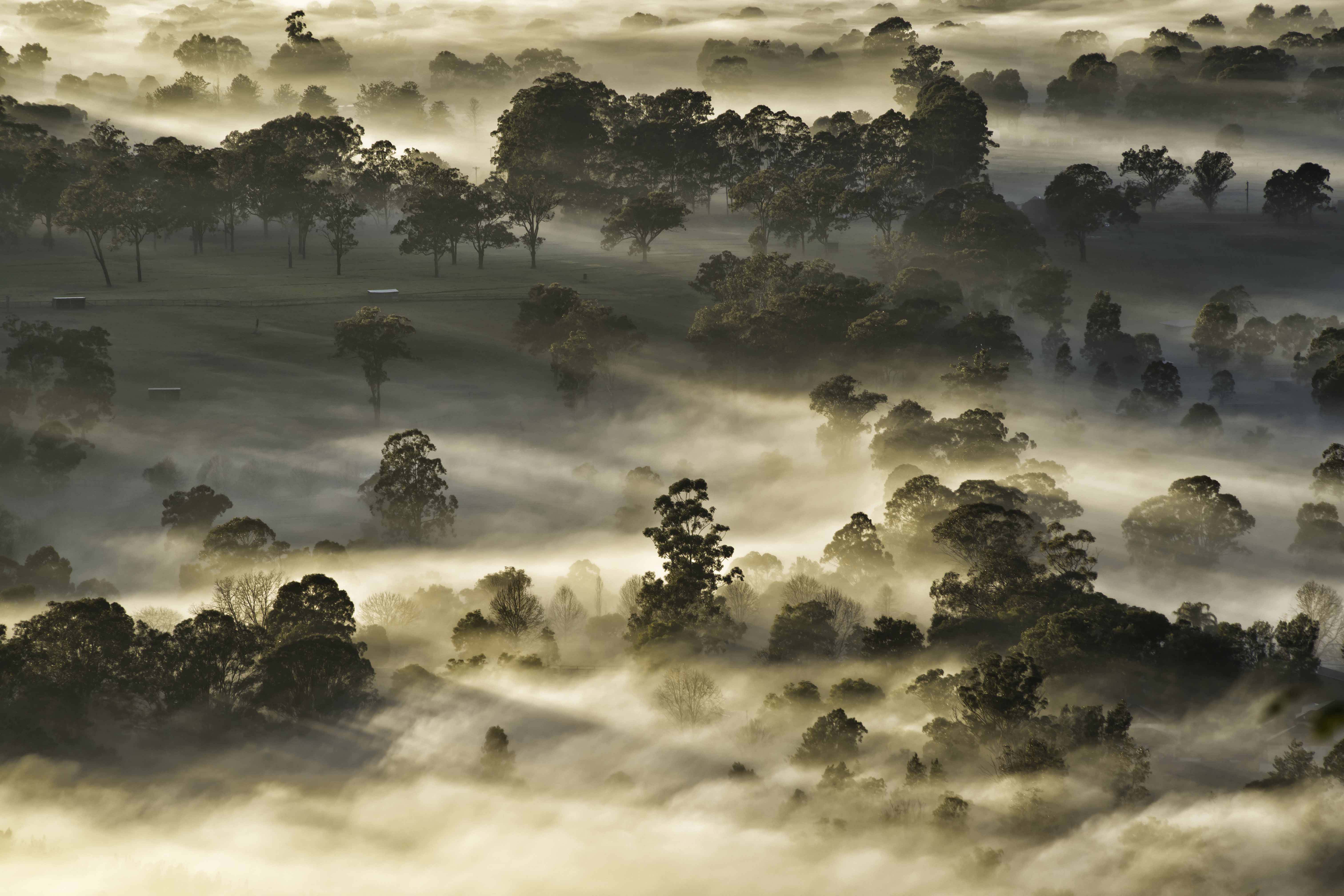
May 19 |
Reply |
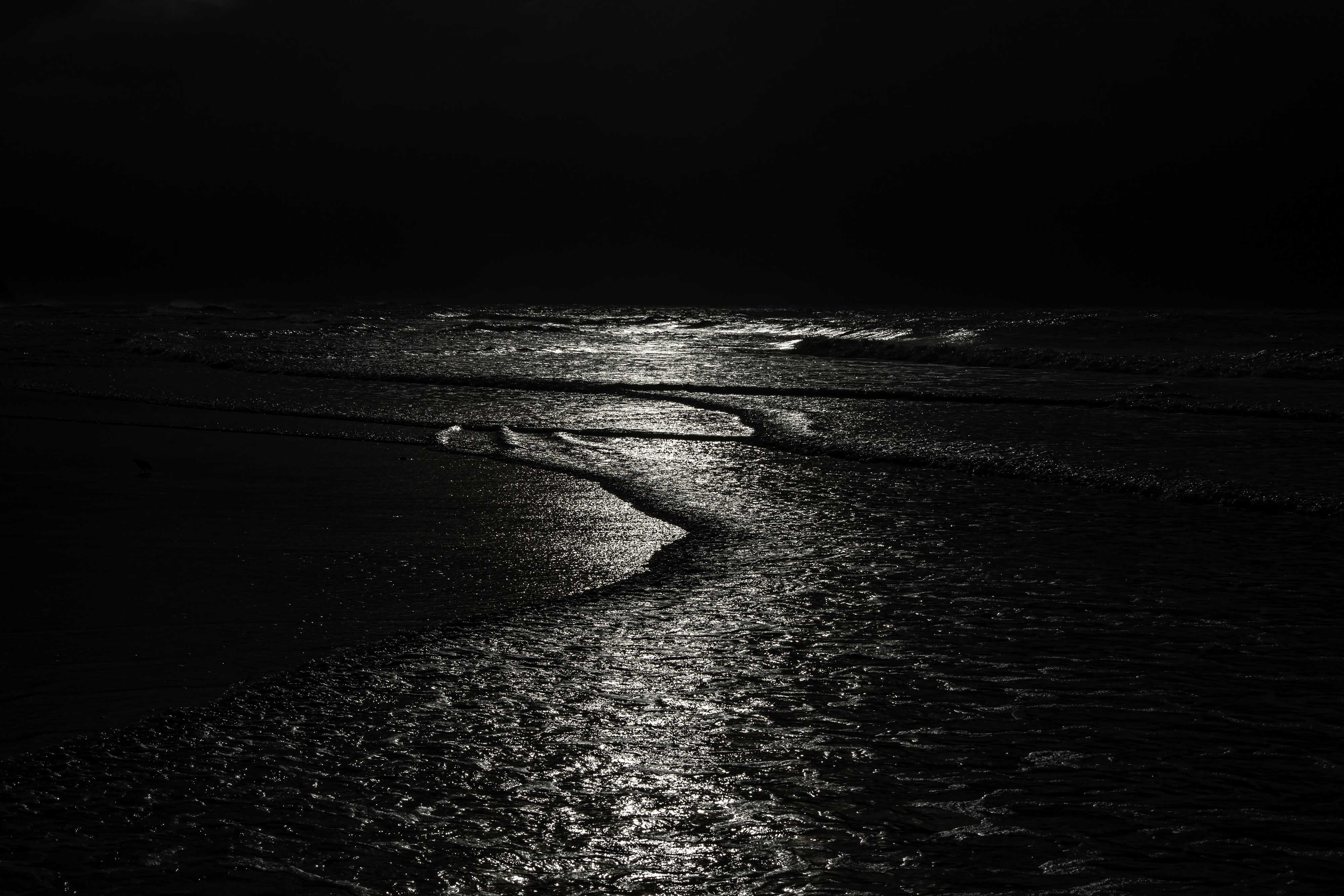
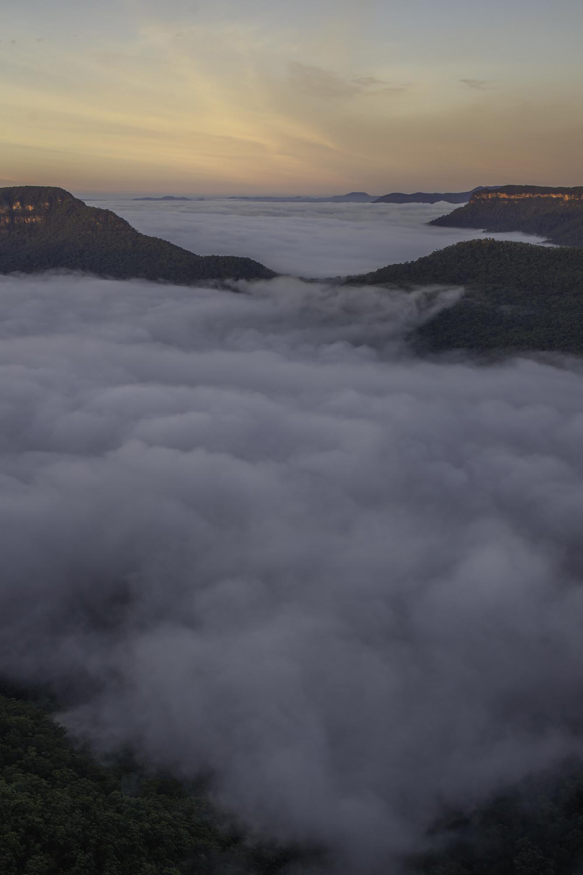
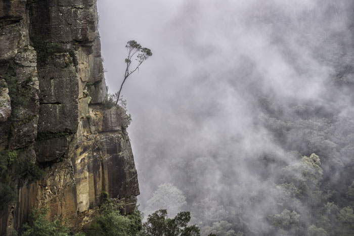
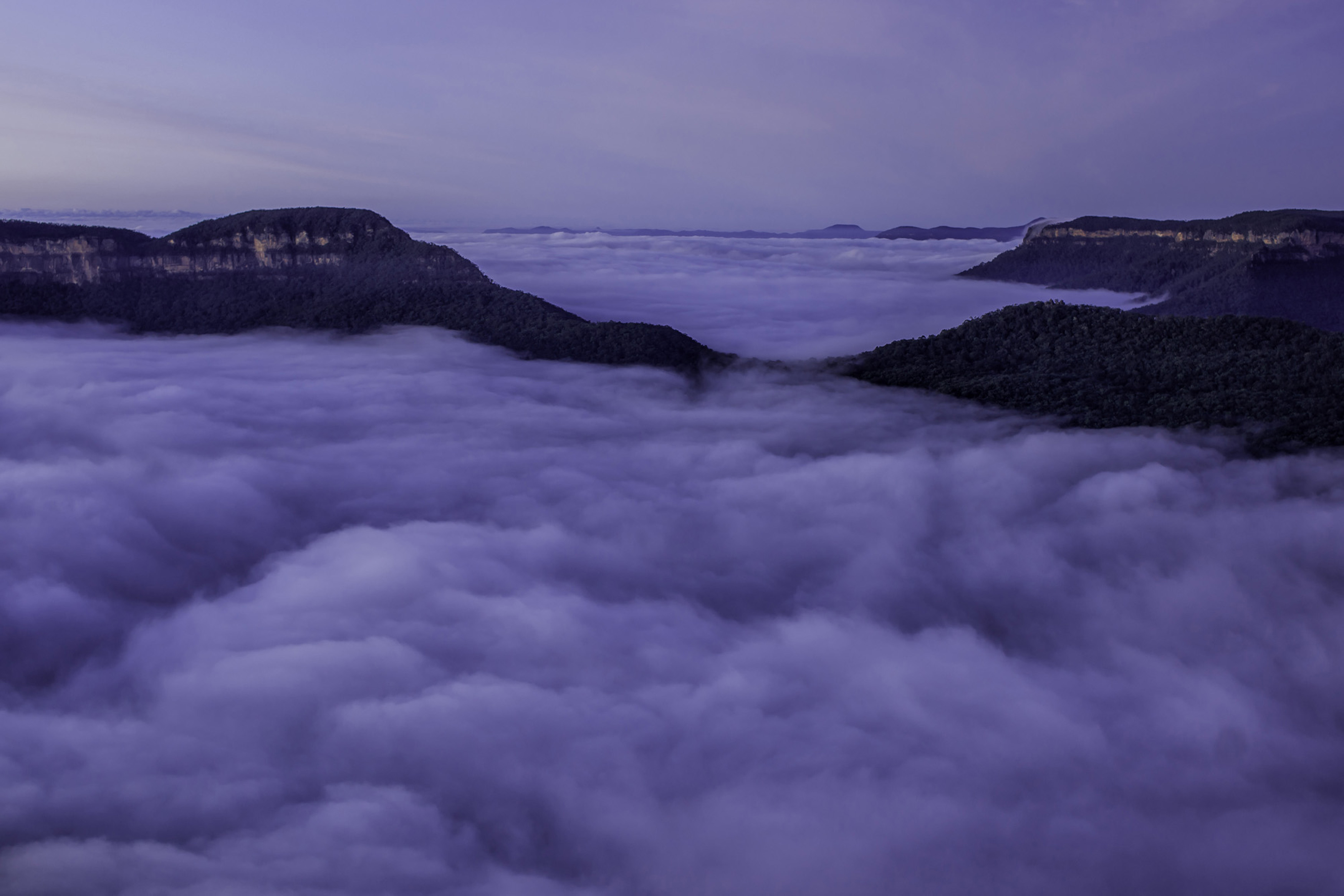
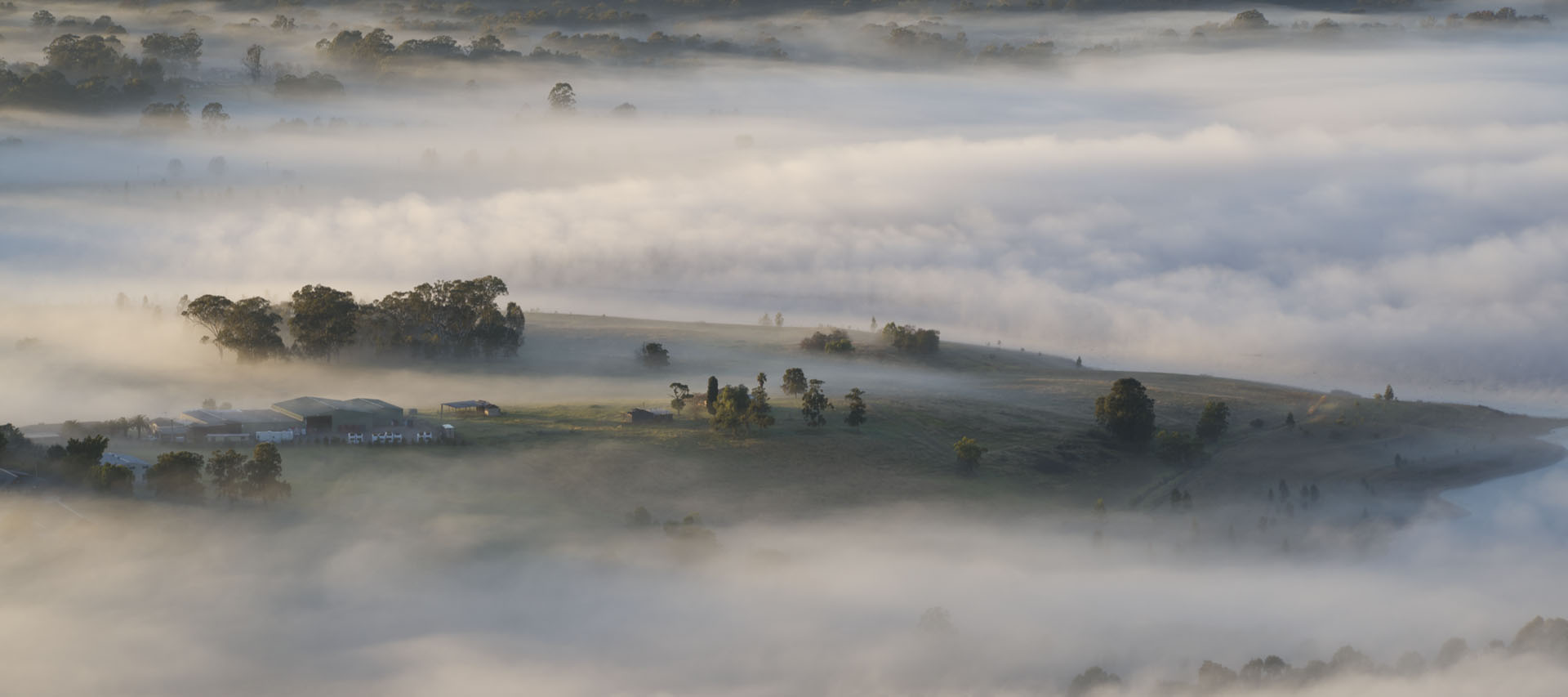
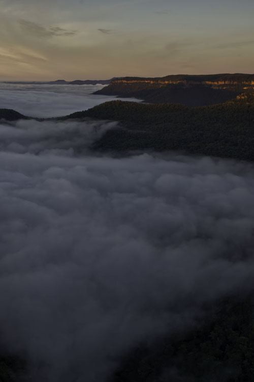
Thanks for your thoughts and comments Cyndy. This was just 1 of about 75 images taken that morning, in both landscape and portrait formats. The sun had not yet fully risen and was just staring to kiss the distant cliffs, so the fog was yet to have any light on it, so it was in fact quite blue/grey. Thanks for your processing suggestions, but for my taste, the sky and those cliffs are just a touch overcooked, but your thoughts are taken on board. Thanks |
May 4th |
| 76 |
May 19 |
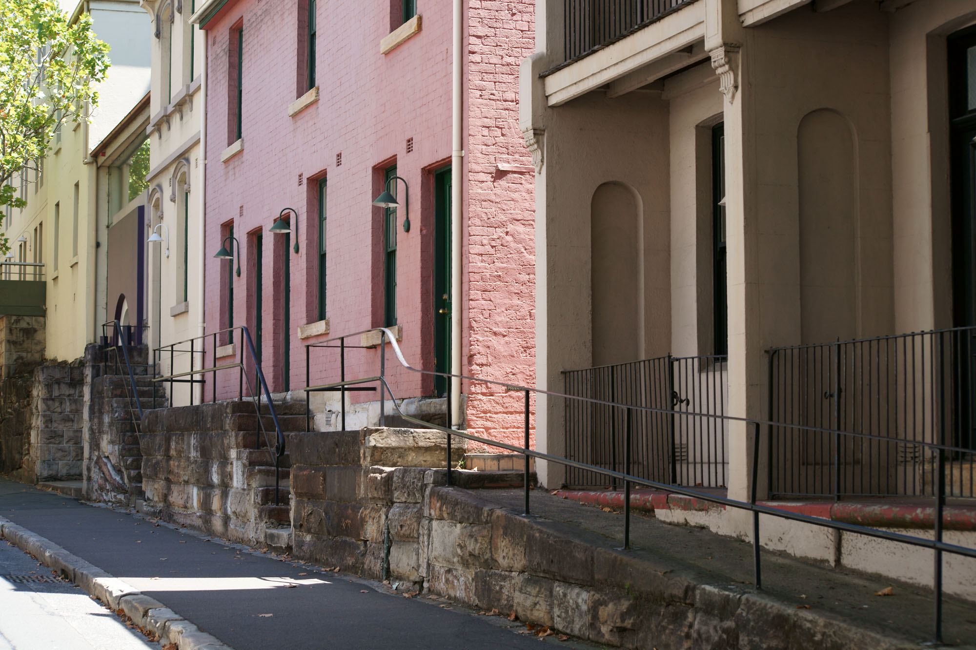
Comment |
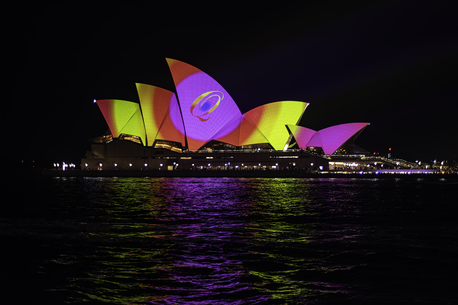
Great image Trey. Less is best. Yes it's a good idea to shoot a subject, but also put a theme to it. That's what portfolios are all about and they are great fun to do and also a superb learning tool. Black and chrome yes, they always look good together. Did you also apply a vignette? If so, that is great as it focuses our attention on what you want us to look at. Cropping is also excellent as well.
Very pleasing image indeed. |
May 4th |
| 76 |
May 19 |
Comment |
Excellent image Sanford. You have handled the different light values very well. The light coming in the background window, the brighter light out of sight to the right causing the bright floor and silhouetting the center pole, and the ambient glow on the walls. All these give a very good end result. Well done. |
May 4th |
| 76 |
May 19 |
Comment |
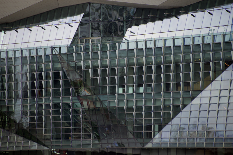
Yes Jay, a stunning image. Your processing is excellent, presenting us with an image with great interior and exterior exposure and details. Compositionally it's great as well. The plane facing out of that glass wall makes me think it wants to get back out and up into the sky, just like a bird wanting to get out of a cage.
Image of the month !!! |
May 4th |
| 76 |
May 19 |
Comment |
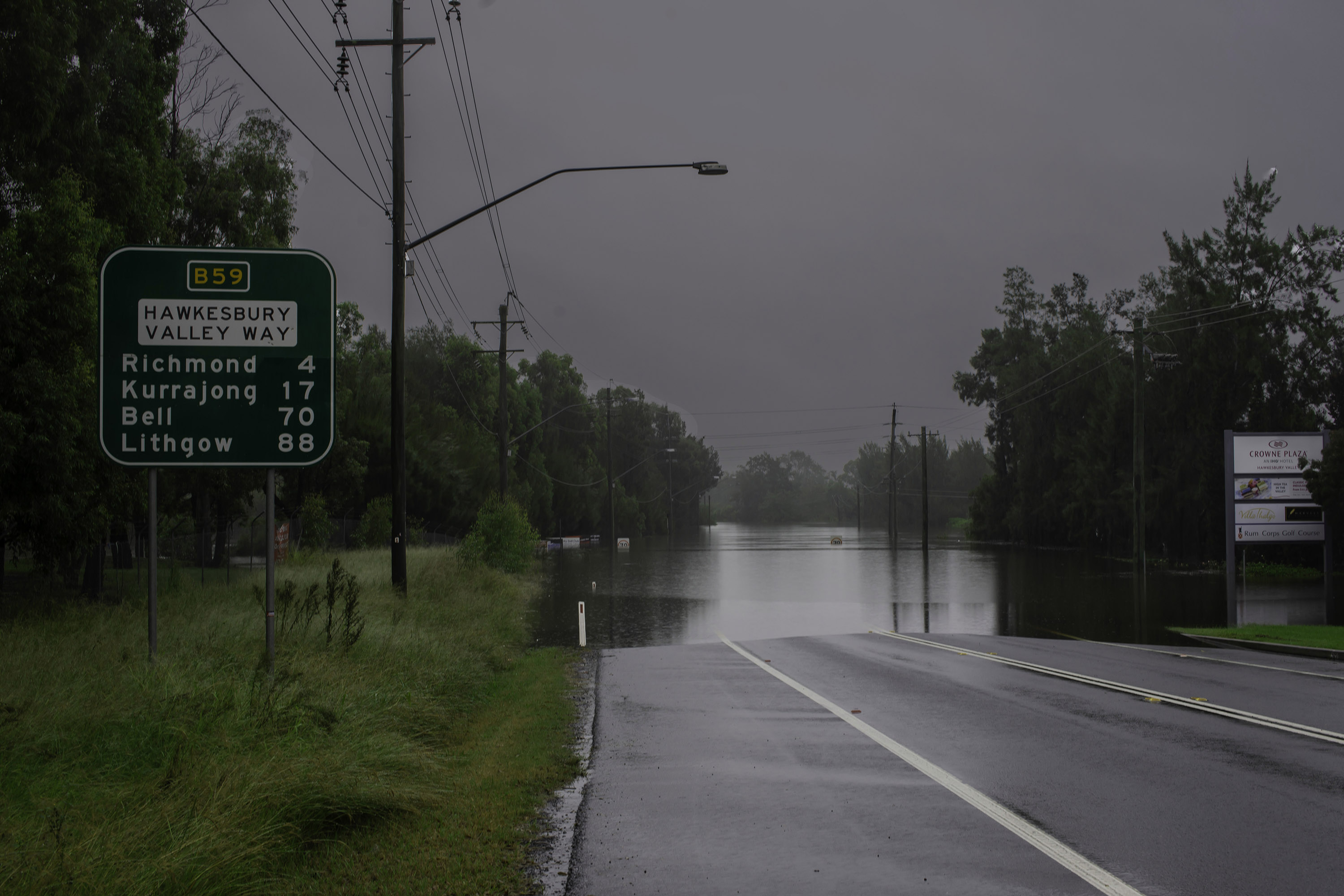
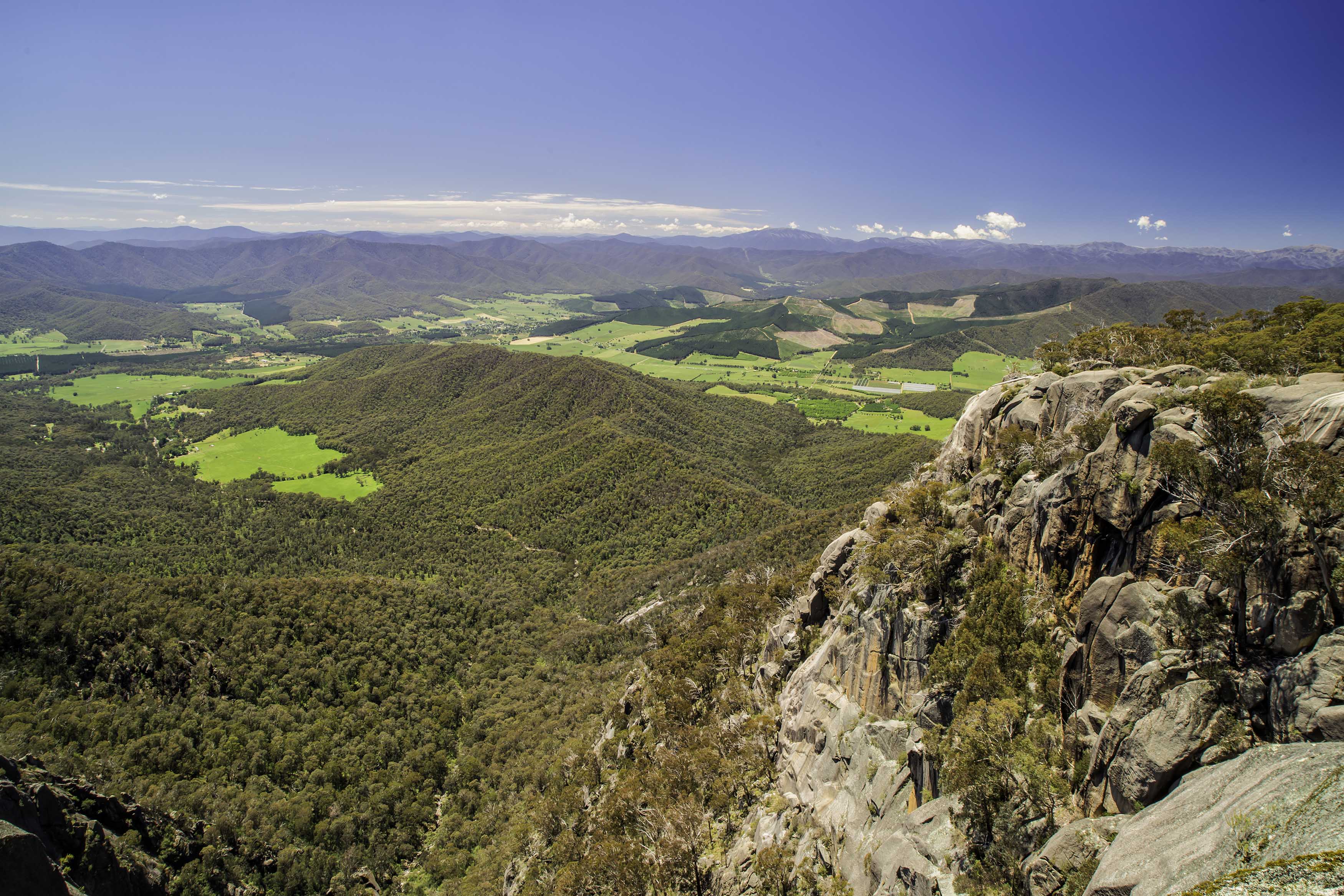
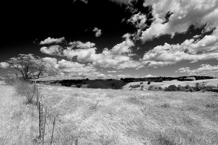
A good image Tyler. In my mind there are country locations and there are wilderness locations. Yes, that fence may be considered a distraction, but by including it and the raised building behind it, showing a human element, you've changed the location from wilderness to country. You were at this location and not me, so I know absolutely zip about what is just out of the frame, but I would have liked to see the fence taken at more of an angle, rather that just straight across and even some horizon along the top of those mountains. |
May 4th |
| 76 |
May 19 |
Comment |
Great image Cyndy, that began with a great original capture. You have done extremely well indeed, no doubt about it. But, your changing the background now gives it a "studio" feel about it, when the pelican is an outdoor bird, particularly when it's sitting on a piling. Your processing skills are way beyond mine, but I would like to see an alternate image where you have muted, softened or darkened the water, but leaving it recognisable as water. Then it would look more natural in my mind. I'm just thinking out loud Cyndy and don't think I would be doing my job, and would also do you a dis-service if I did not speak my thoughts. Still a great image you should be very proud of. |
May 4th |
| 76 |
May 19 |
Comment |
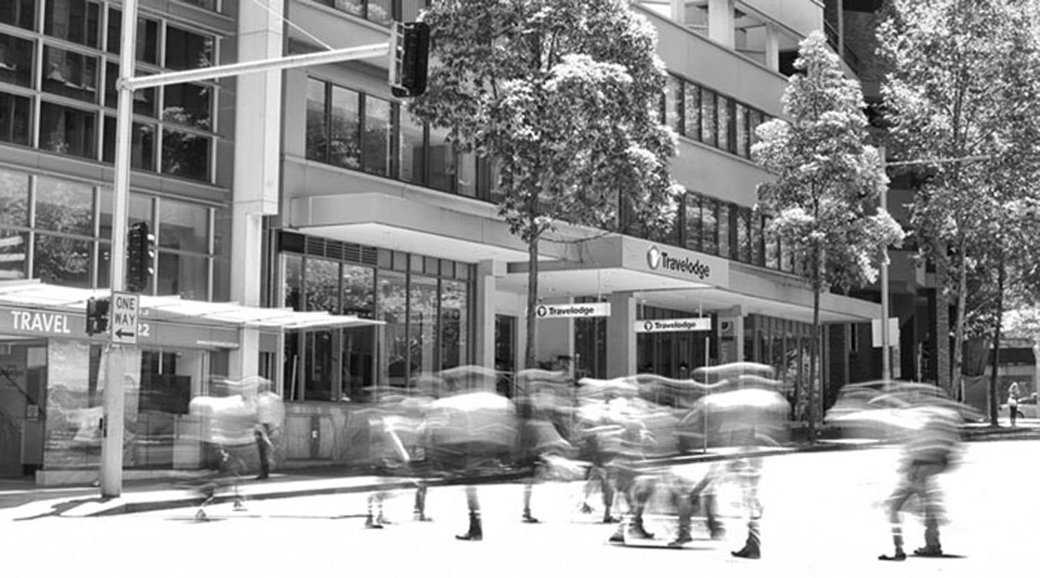
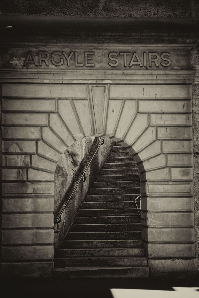
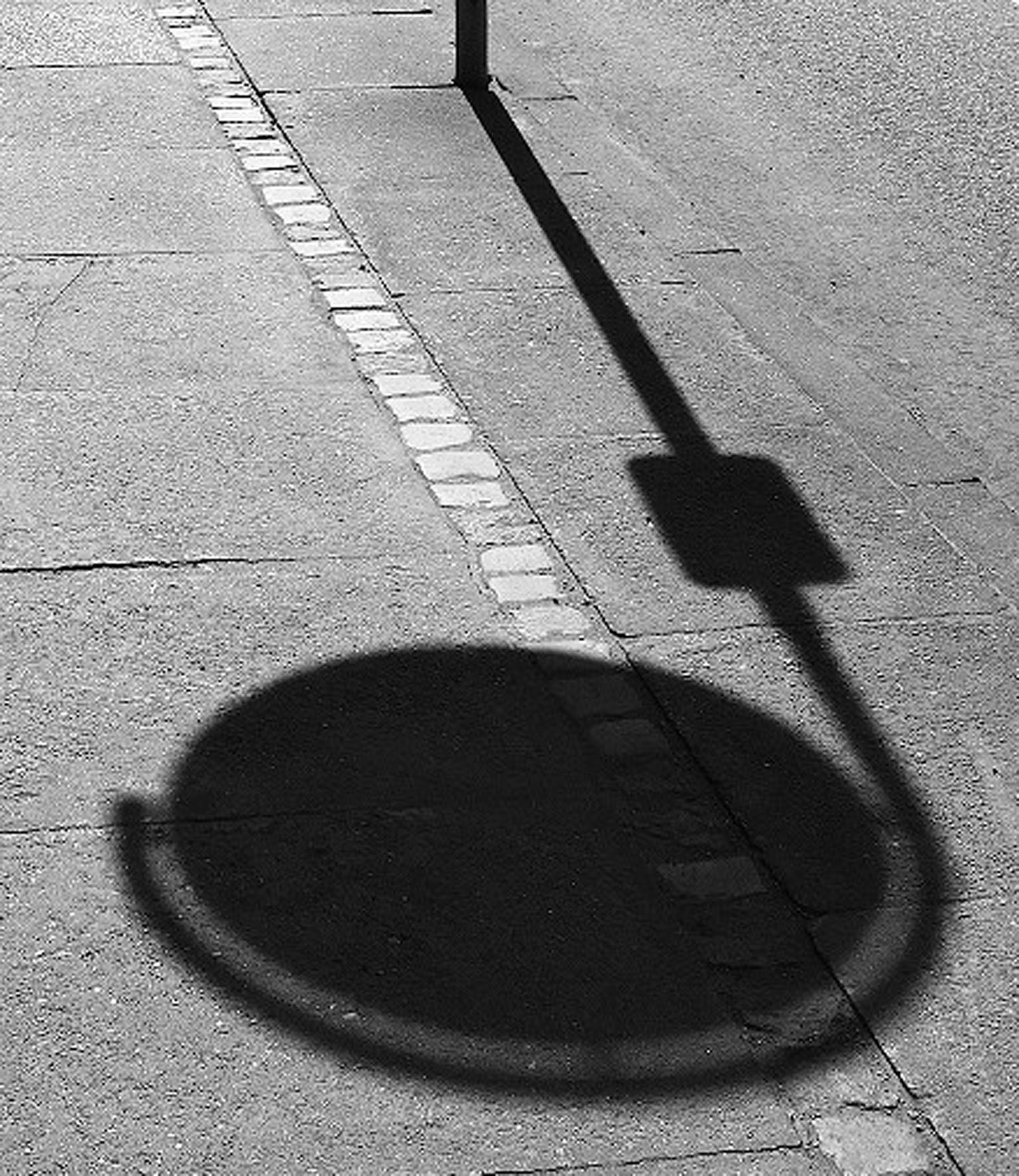
I'm going to be part rebel with this image Jorn. Presenting it in b&w is excellent, colors of the ground/road and its markings would be a big distraction. B&W forces us to look at the elements you want us to look at. Now, with all respect, I will differ from Cyndy & Sanford. If we were to see the full sign, we would then also see the other side of the street and in my humble opinion, that would bring in more elements, information and distractions that would lead our attention away from the shadow, which is what you want us to concentrate on. I feel the shadow shown in full gives me enough information to know what I am looking at. I have also cropped your image down to its bare essentials, as you say, Lines and Shadows. What are your and everyone else's thoughts? |
May 4th |
 |
6 comments - 3 replies for Group 76
|
14 comments - 4 replies Total
|