|
| Group |
Round |
C/R |
Comment |
Date |
Image |
| 73 |
Dec 18 |
Comment |
A strong image Tim, with the buildings dominating the scene. Cranes are part of suburbia and common place in almost every city these days. Yes it's nice to get rid of them, but sometimes you just can't. So minimizing them as much as possible is all that can be done. Your homeless people, I didn't even notice until I read about them, then I went looking for them. Your image is good, and Sherry's cropping is an improvement, however, I would go further and take out that whole building on the right, rather than leave part of it there. I would ask if that building was gone entirely, would the image be any less effective? |
Dec 10th |
| 73 |
Dec 18 |
Comment |
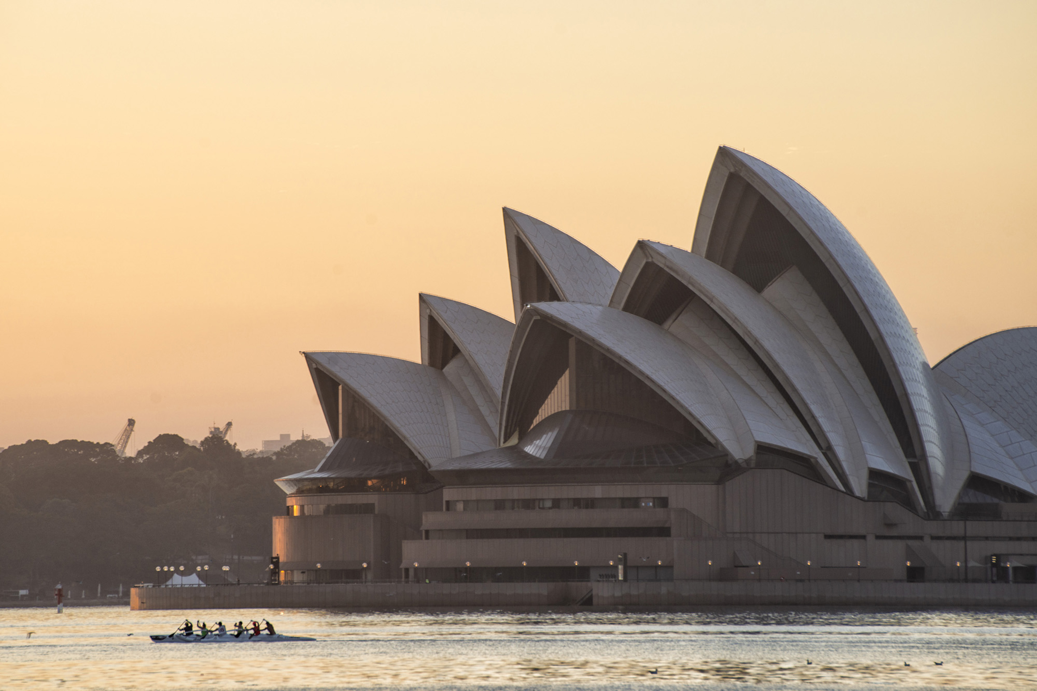
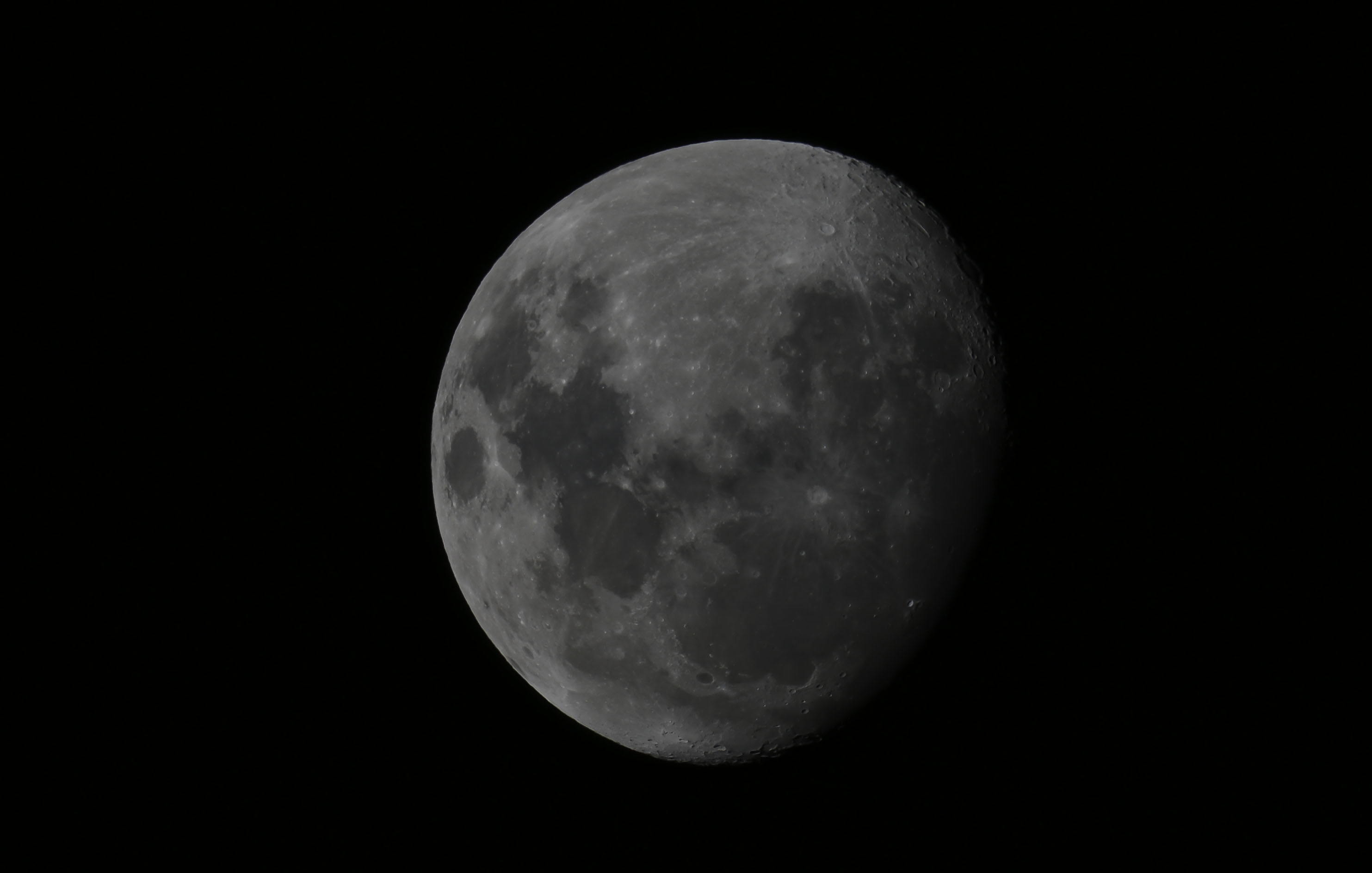
Tuhin, a very dear friend of mine over here once said "We must all suffer at some point for our art." You have now down that and been rewarded with a fine image. The composition and your use of the elements you had on the occasion is good, however I must agree with Sherry. The moon, although the color may be accurate to what you saw, is a little too yellow for me. A "normal" white moon would balance the light house and buildings beautifully. |
Dec 10th |
| 73 |
Dec 18 |
Comment |
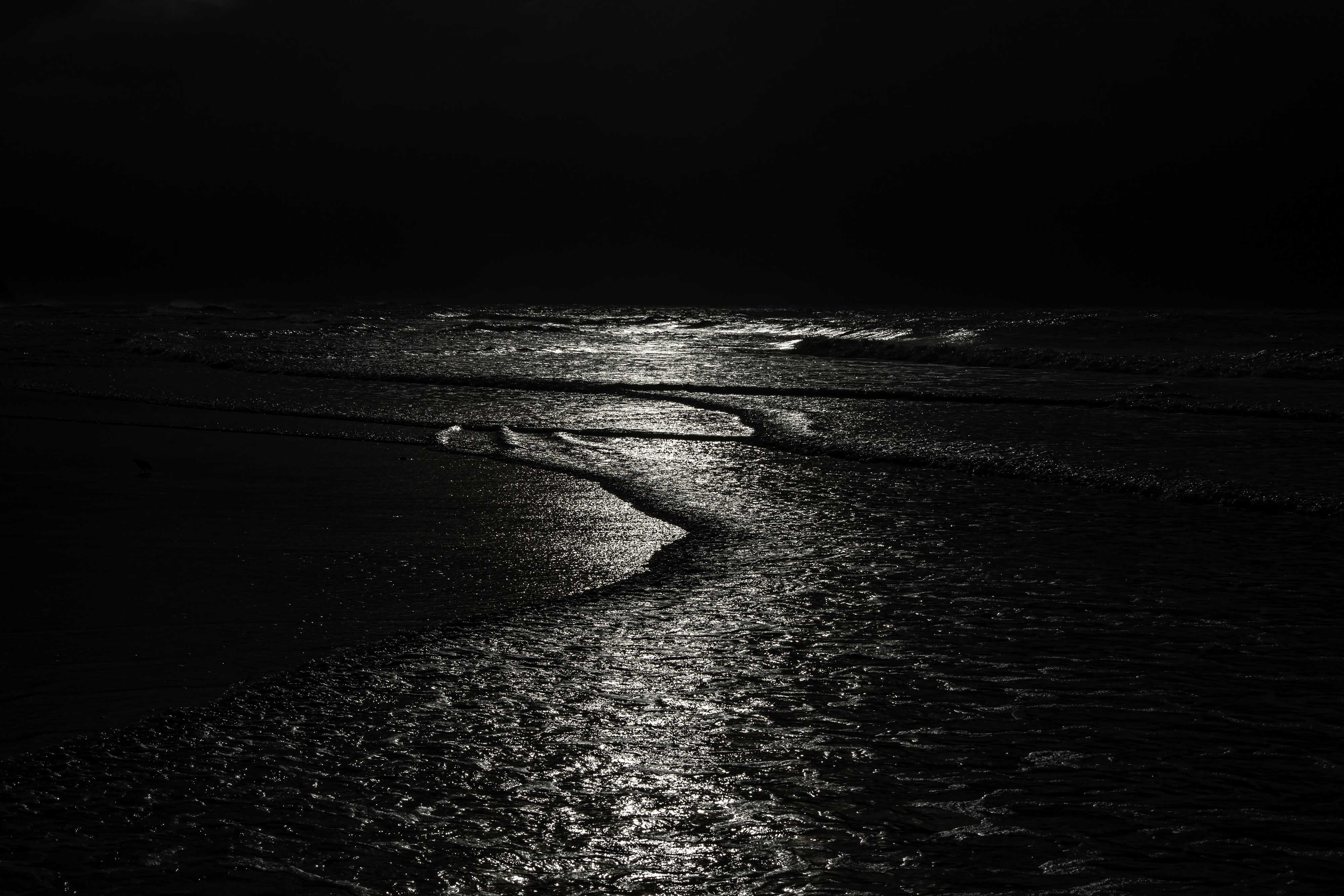
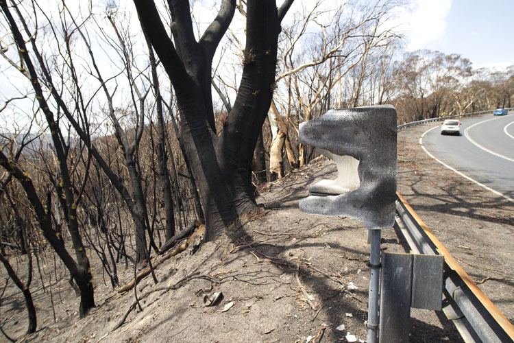
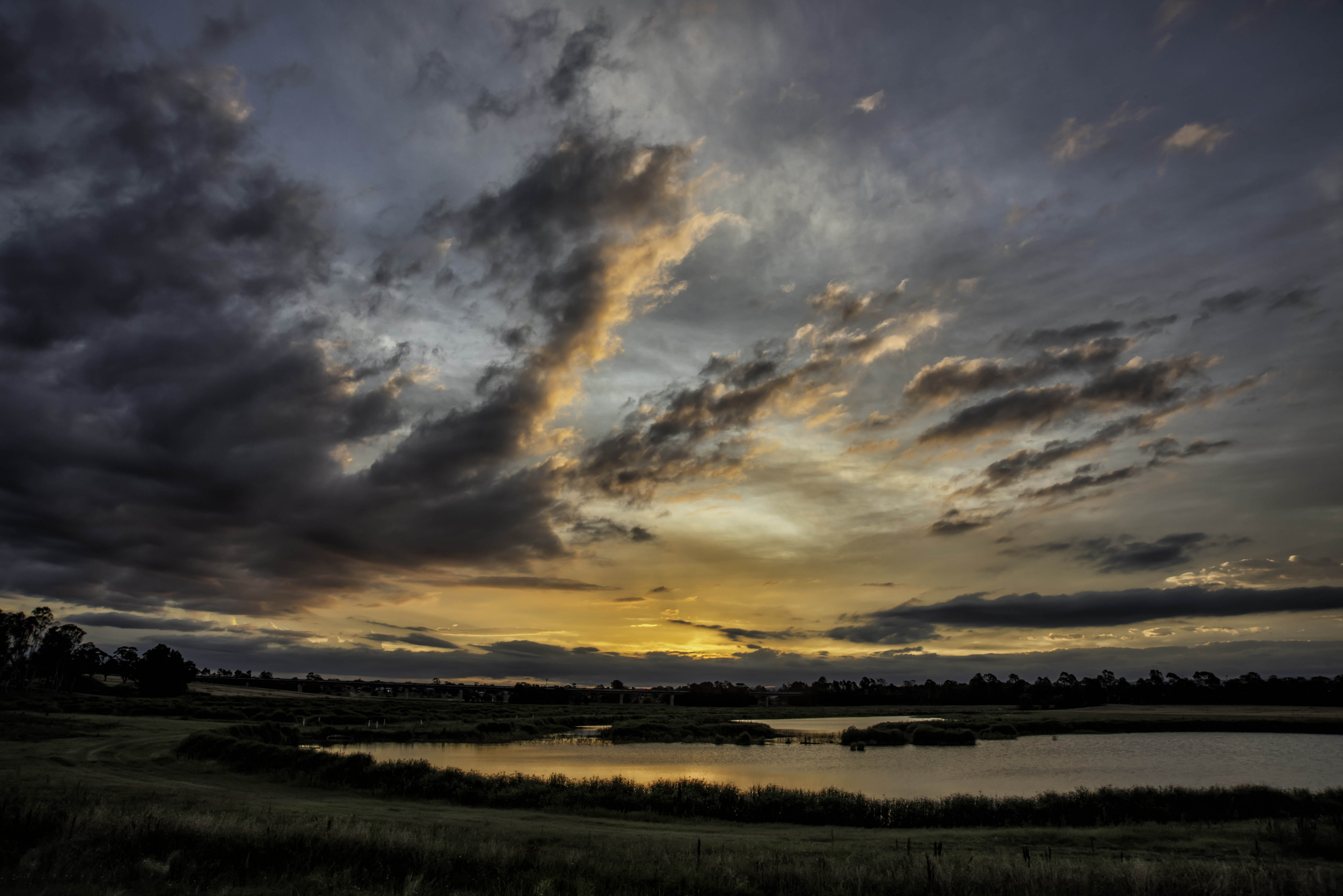
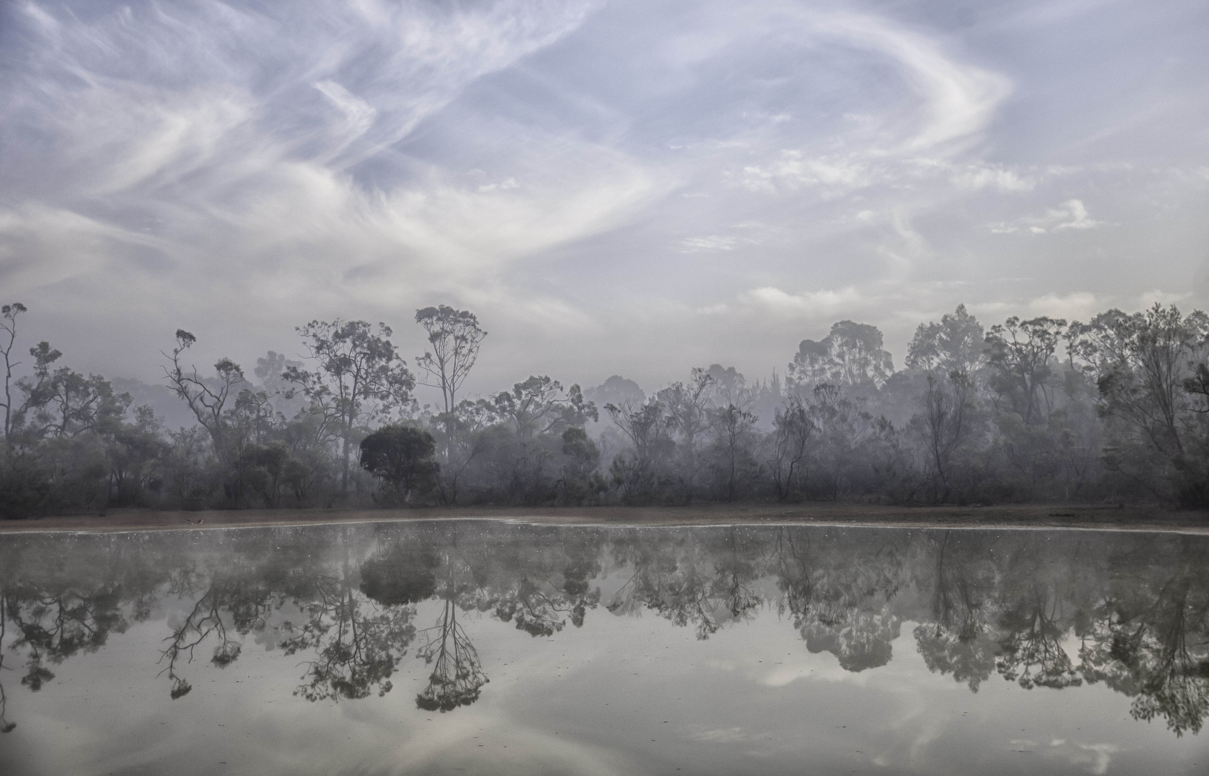
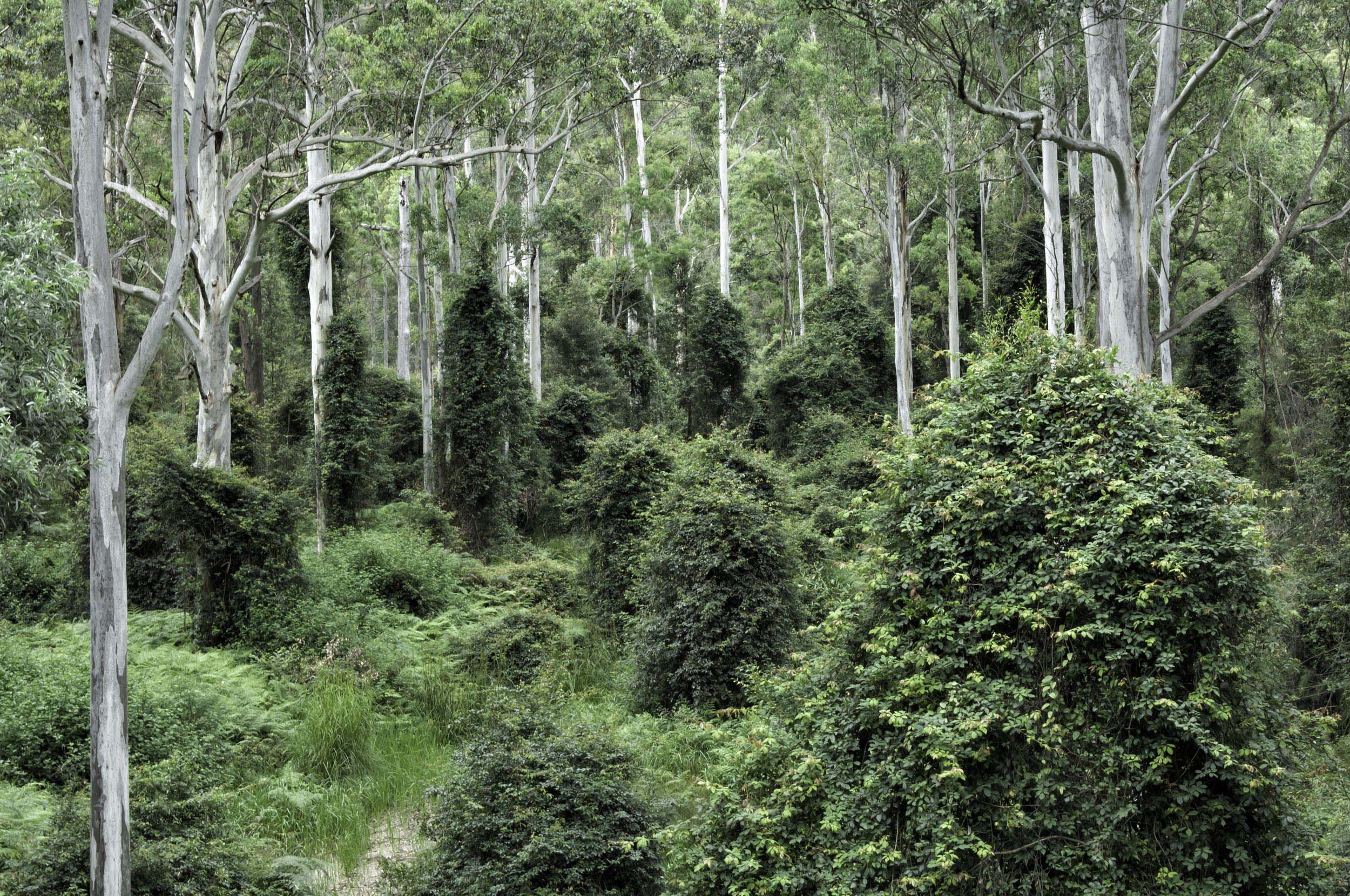
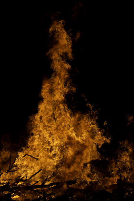
Fires are terrible things and their destructive forces are shocking. The way constructed this image with the hills receding into the distance and their color change is quite good. I would like to see a little more detail in the foreground trees as they could possibly bring in some added interest. But as Sherry said, a great journalistic photo. |
Dec 10th |
| 73 |
Dec 18 |
Comment |
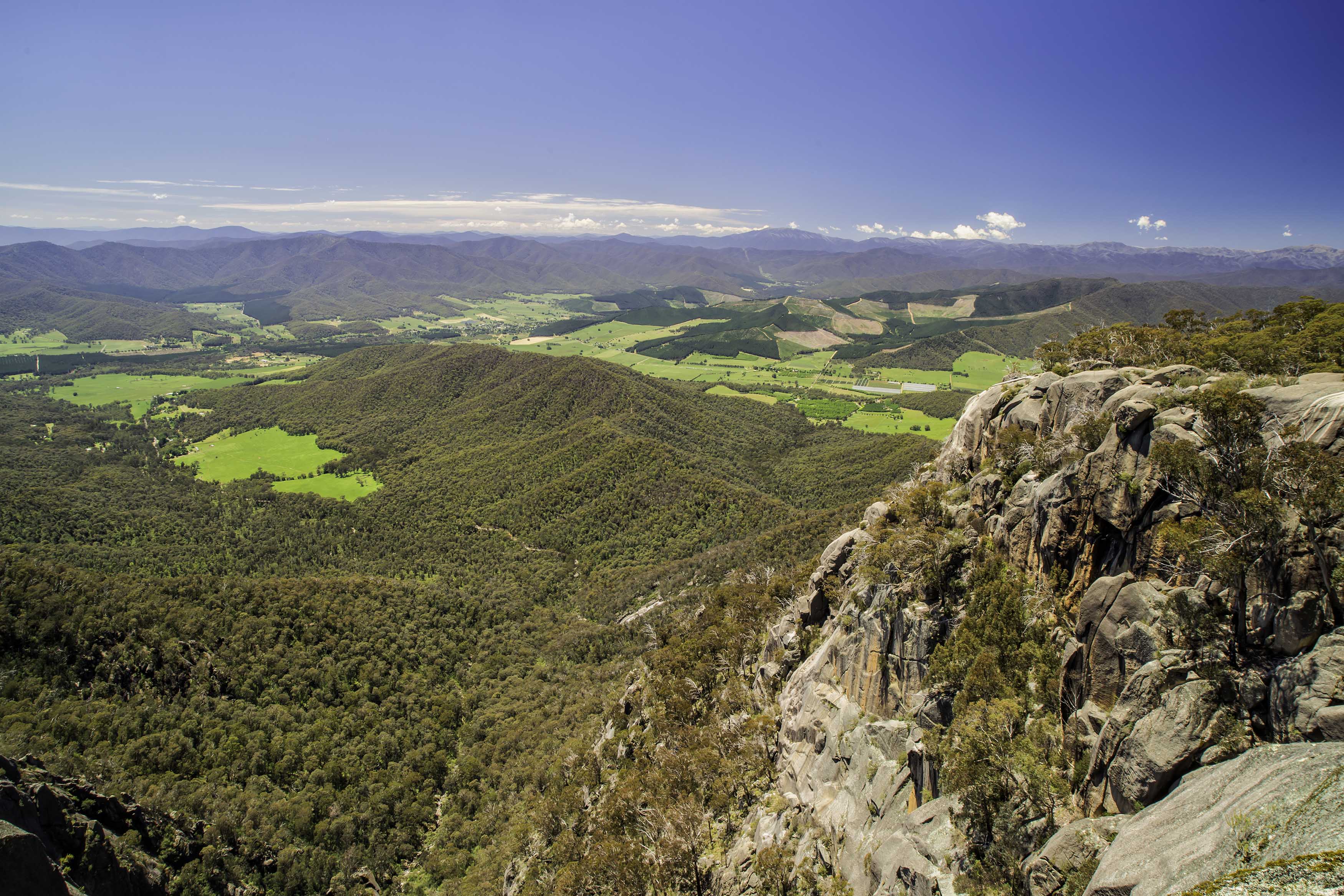
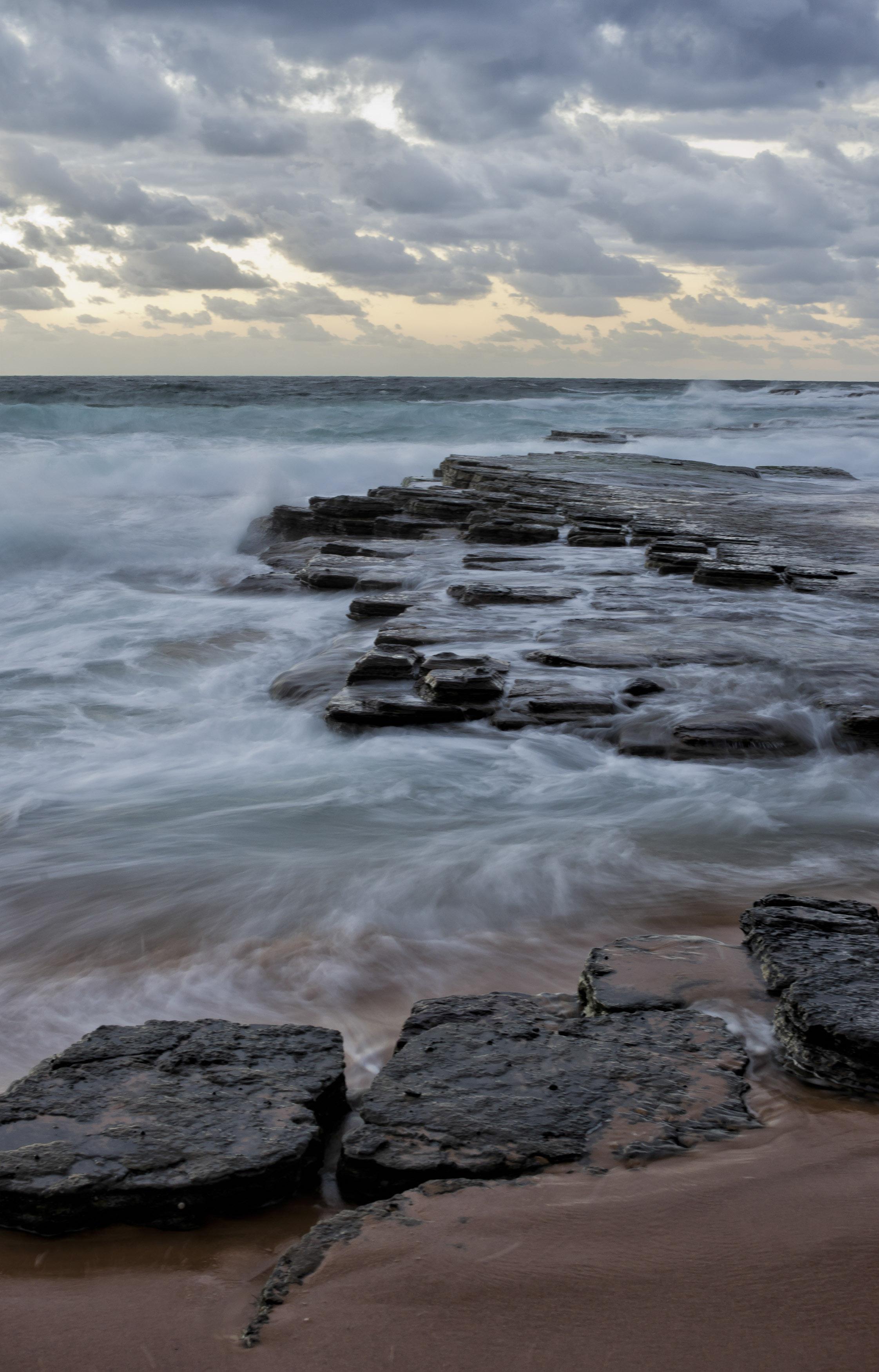
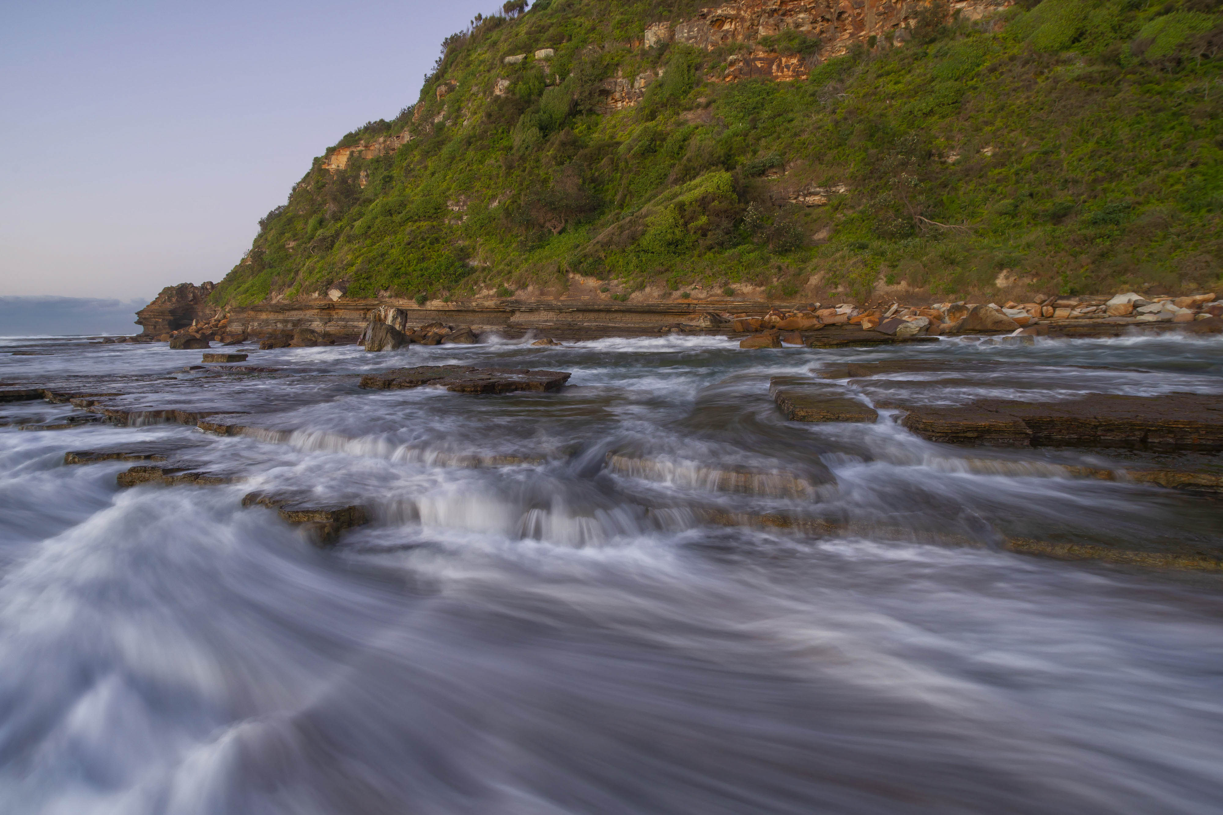
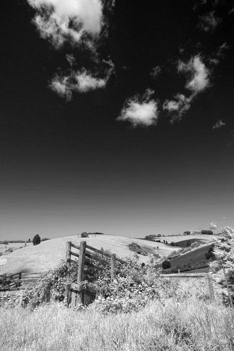
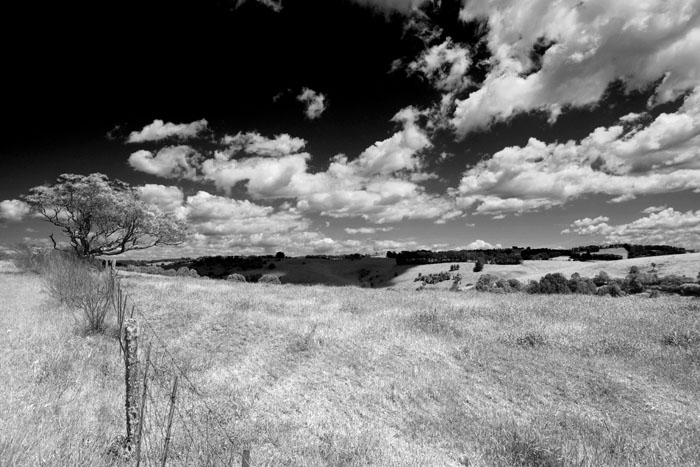
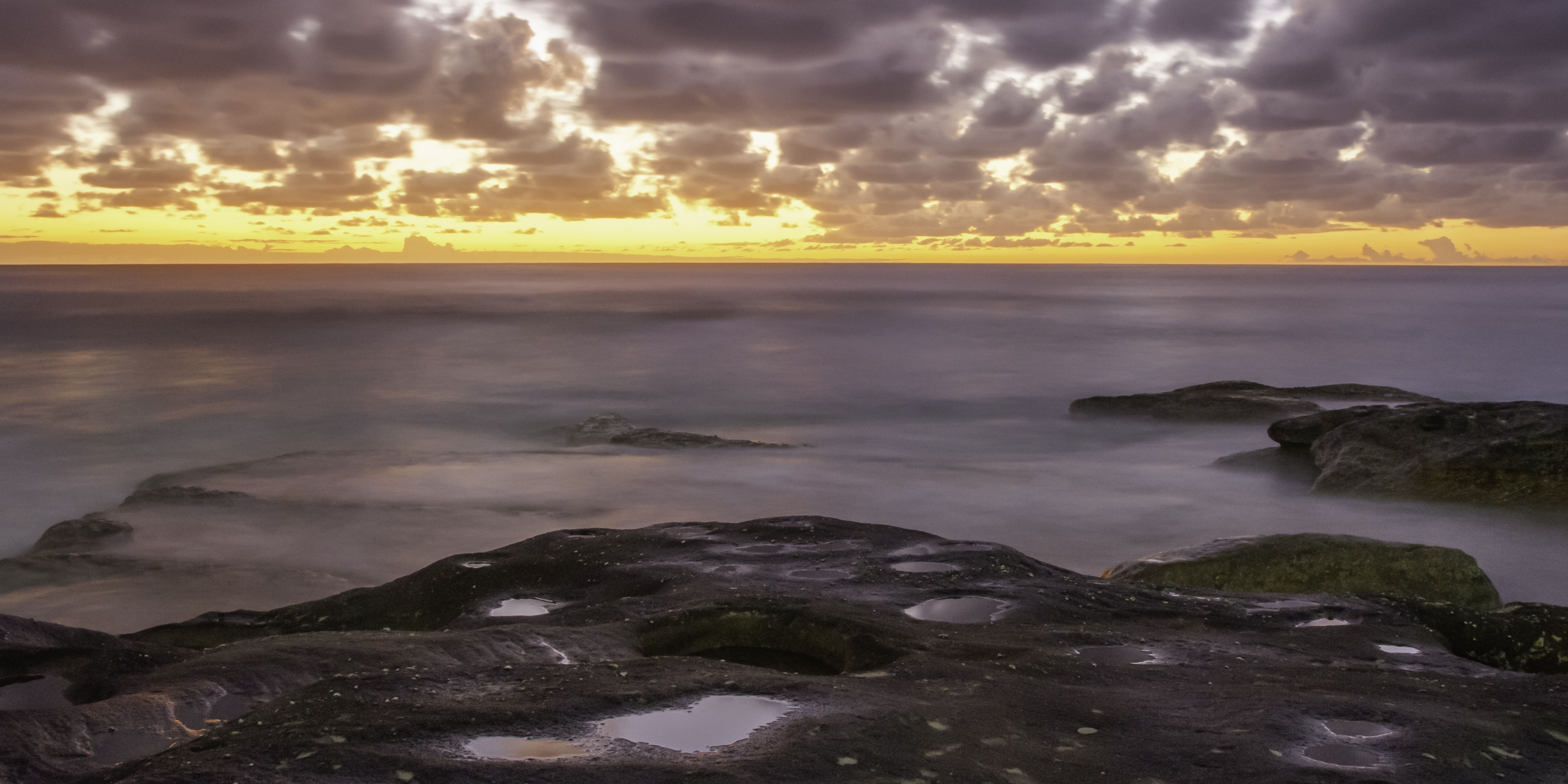
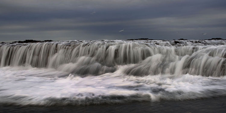
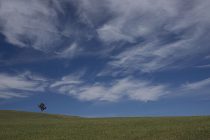
Great composition and use of the panoramic format Peter. I'm tending to ever so politely disagree with Sherry about the horizon. I'm thinking it's level, with that change in field grasses causing a bit of an optical illusion.
Also, congratulations on the PPOM on the back page of the November 2018 Journal. That is, if you are the same Peter Cheung. I better be more careful with my comments on your work from now on. |
Dec 10th |
| 73 |
Dec 18 |
Reply |
Thanks David, please see my reply to Tim. As I mentioned the RAW image is fine, so I assume something went astray during my post processing and caused a bit of pixelating. |
Dec 8th |
| 73 |
Dec 18 |
Reply |
Thanks Tim, I never even saw that color change in the tree trunks. I've had another look at the original RAW file and all tree detail is normal & as trees should be. There is a green branch hanging down in front of one trunk. So it must have occurred during post processing somehow. Thanks for pointing it out to me. Shows how I need to take closer looks at my work. |
Dec 8th |
| 73 |
Dec 18 |
Reply |
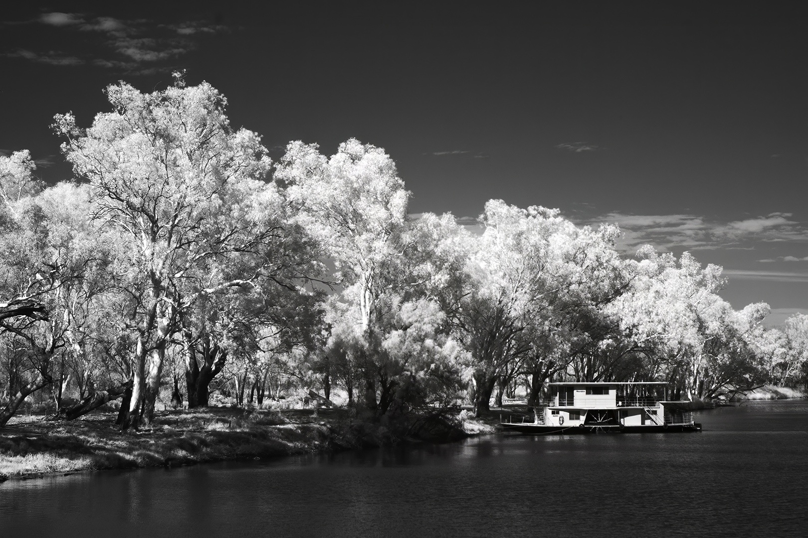
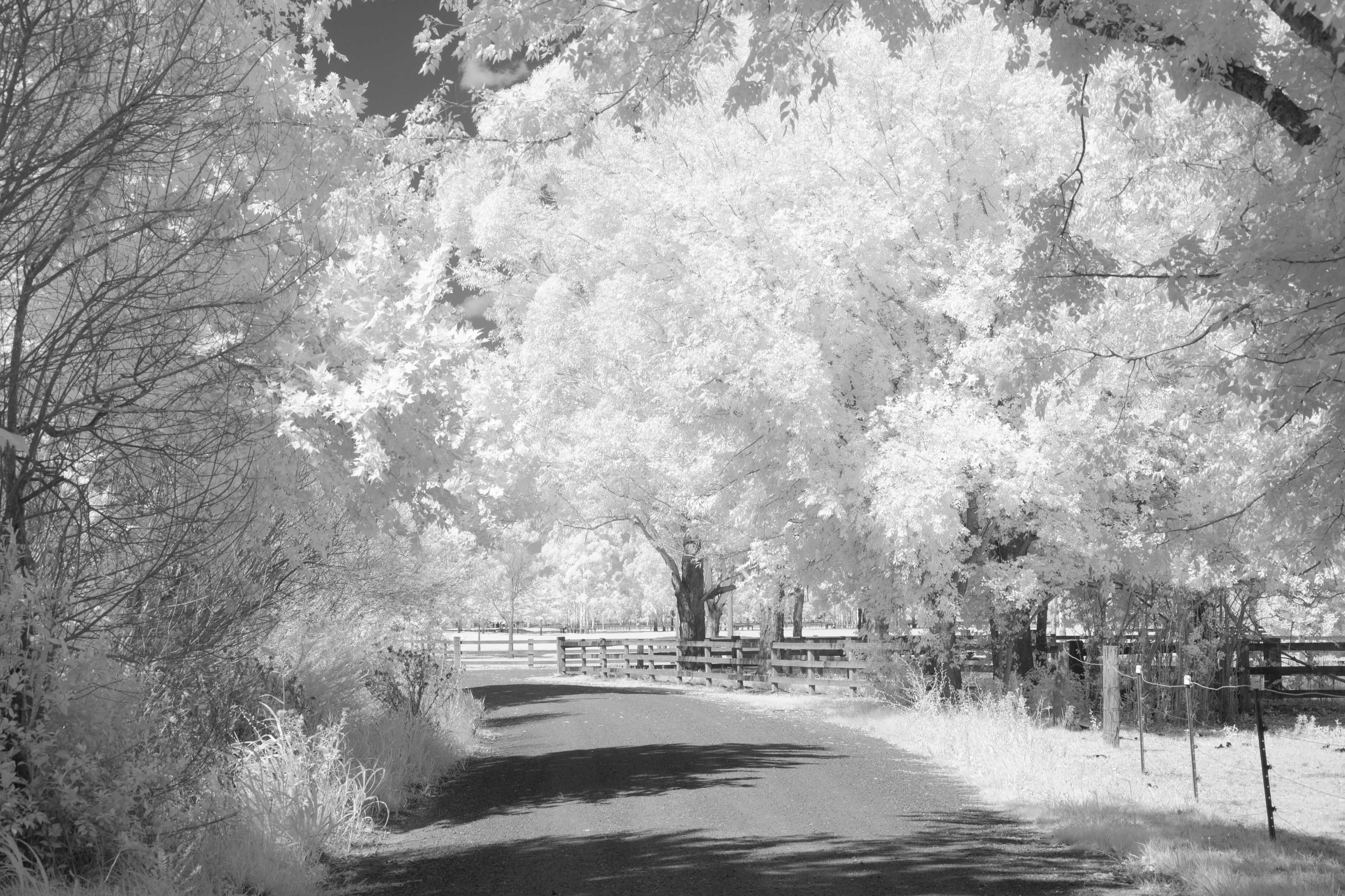
Much more moody with a dramatic sky. I have constant issue with dust spots as well, you are not alone. Your other idea with the sepia toning is great as well and the white vignette gives the appearance that the image was taken 50 or more years ago. Isn't it great how we can play with our images and get different results. I'm not going to pick a favorite or say one is better than the other. They are all different and good in their own right. When you are in Wakodahatchee or Green Cay next why don't you photograph some trees with pale green foliage and try your hand at infra red b&w. Now that's different and fun. |
Dec 5th |
| 73 |
Dec 18 |
Comment |
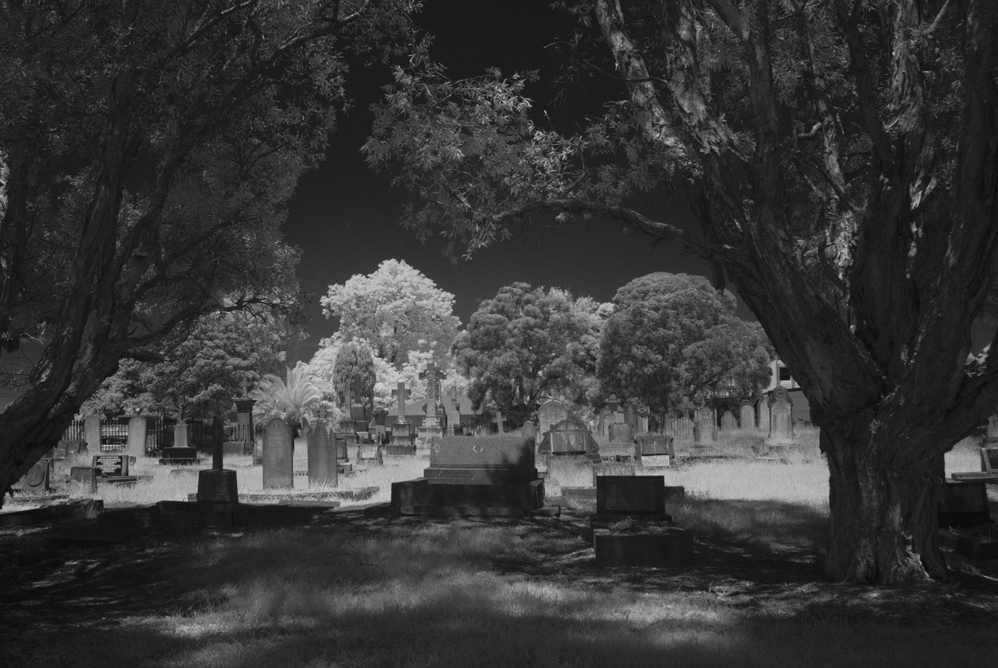
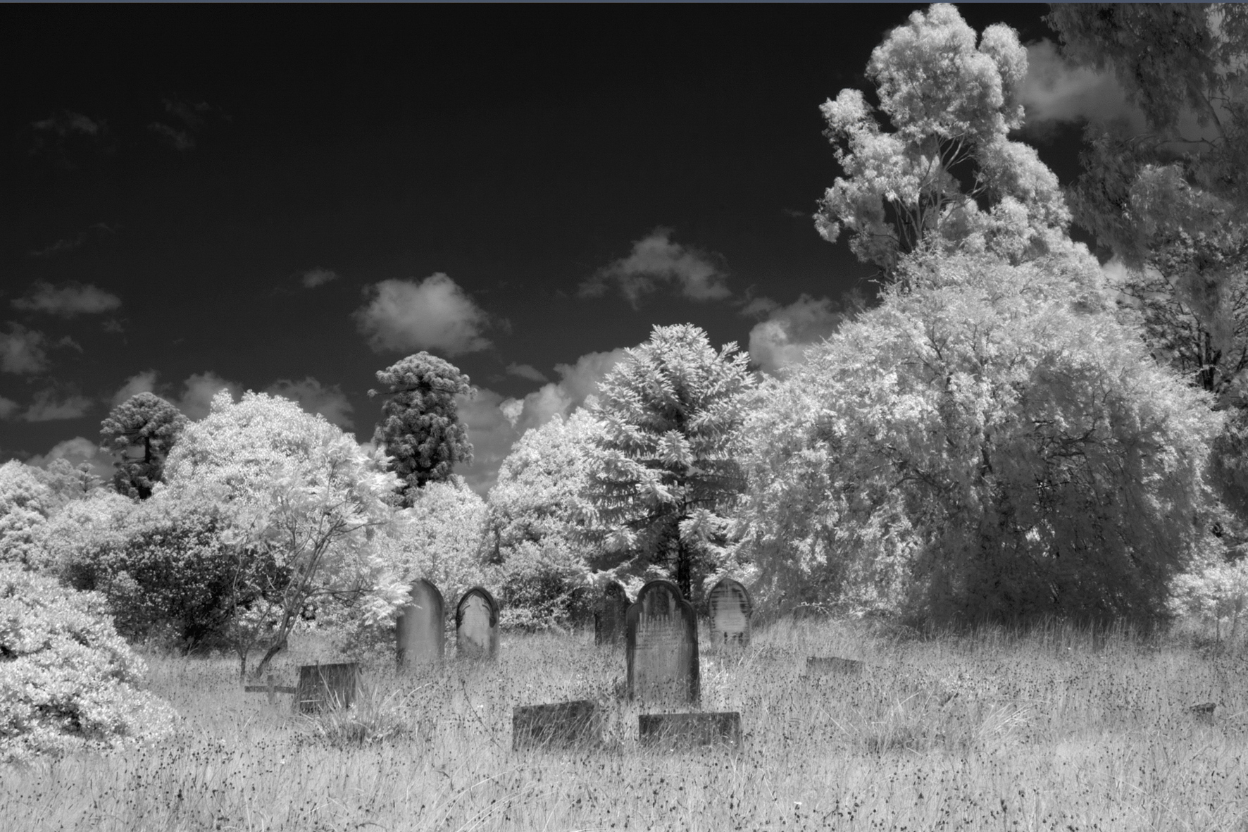
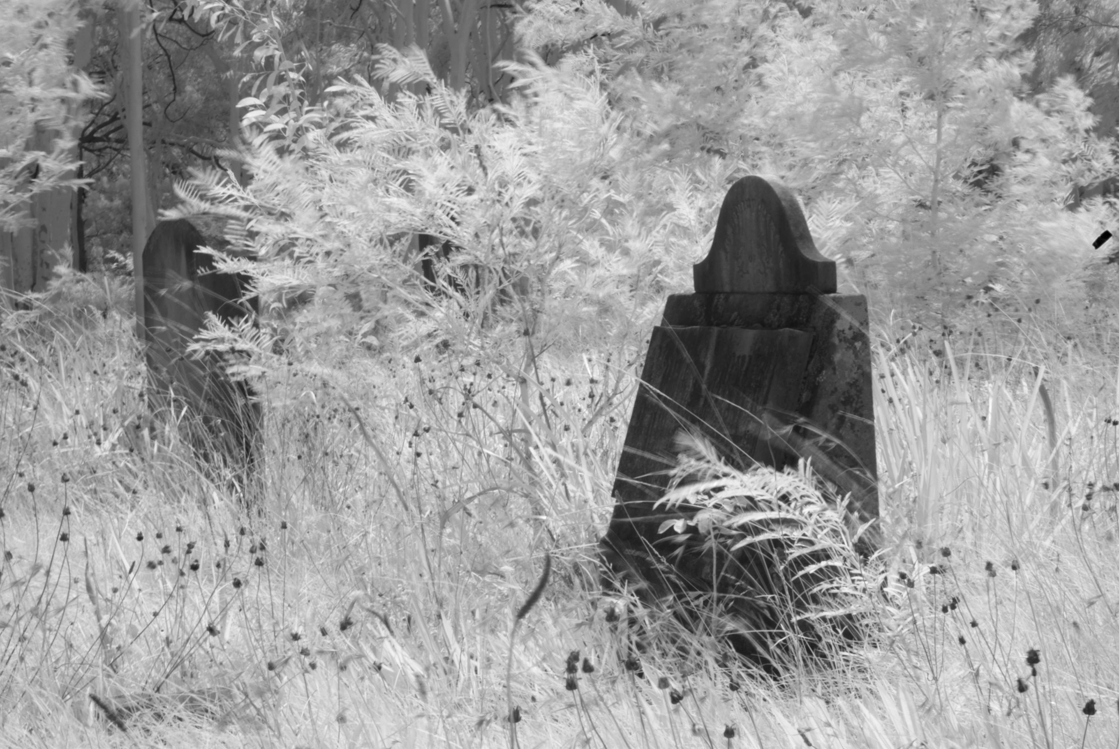
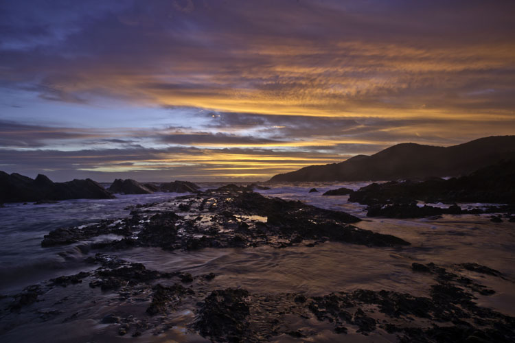
A fine image Sherry. And very effective presenting it in B&W. The removal of color makes it look cold & harsh like you would expect Iceland to be, particularly in those clouds. The inclusion of the coast at left gives a great sense of location. And a church would just not be complete without some graves. My only other thoughts would be to do something about those dust spots in the sky to the right of the steeple and left of the roofline. Your rather different "original" shows another side of this place and scene. The human touch, the life, the warmth & the colors. |
Dec 4th |
| 73 |
Dec 18 |
Comment |
Nice one David! Everything about this one is good. The colors, the landscape, the horses in the foreground with the mountains in the background provide great depth. It really shows the vastness of the area. And I think you've done well resisting the temptation to overcook this one with PP. |
Dec 3rd |
6 comments - 3 replies for Group 73
|
| 76 |
Dec 18 |
Reply |
Very simple and easy to use, just drape over the flash head, if needed a bit of sticky tape on the back of the flash will stop it from blowing off. Depending on how much you want to tone down the flash go for 1 ply, 2 ply or 3 ply, or more than one tissue. I find them a very quick simple solution when needed. |
Dec 12th |
| 76 |
Dec 18 |
Reply |
Soft boxes are the best thing!!! Sadly I don't have one so I use white facial tissues, which are the second best thing.
Very portable and easy to set up. |
Dec 9th |
| 76 |
Dec 18 |
Reply |
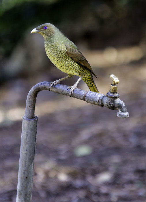
Just a bit of further thinking on this and your future attempts Jay. Before you offer the birds some bribery, when you are sitting there for the first time, just take a moment to "look, really look". Which direction is the light coming from? What stuff will be removed from the background if you just move a step or two either left or right? If you move back 8 or 10 feet, then also offer the food that 8 or 10 further away from the background, will that background then become more blurred? Aperture priority at f2 if you can, blur that background even more, nice fast shutter speed that your camera will then opt for, will freeze the bird's movement some more? I'm looking forward to seeing your future attempts. |
Dec 9th |
| 76 |
Dec 18 |
Comment |
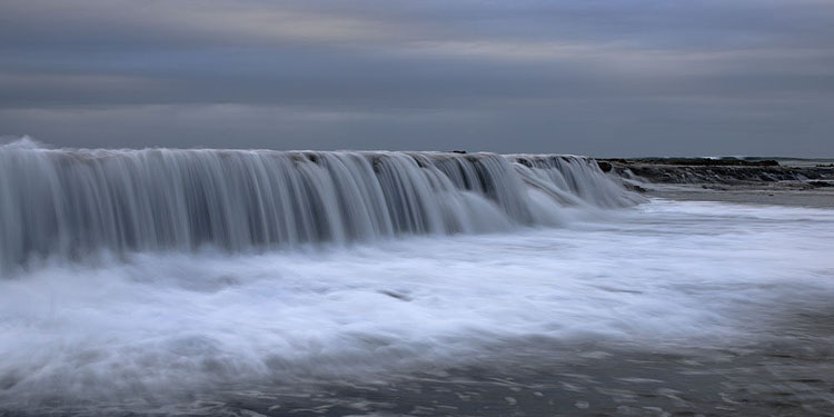
This is a fine image Jorn. the way you have used the path in the sand leads us from the foreground, through the middle ground, then off over the horizon down a couple of paths through the bush gives good depth to the photo. The sharpness in the foreground detail is great, as is the sharpness in the background. The colors and details in the sky is pleasing also. I'm glad you told us the story behind your photo, otherwise the viewers could be left wondering what the photo was all about. Well done. |
Dec 9th |
| 76 |
Dec 18 |
Comment |
You're quite right Tyler, a cool little shot. Nice time of day with a very low sun, putting the pine in the center with a small amount of fence behind it and a good balance of sky and land all make for great composition. Even when I open this image right up it all holds together well. As it stands, it is a great shot Tyler, however, if you would like to take this one further, I would suggest you do something about removing that little bubble thing above the tree line just left of center. |
Dec 3rd |
| 76 |
Dec 18 |
Comment |
I salute you Jay, for having a good try for a photo in very difficult circumstances. Small birds are remarkably quick. they go just as quickly as they come. To see some movement, lift a camera to the eye, compose and shoot before the bird vanishes again is never easy. And then there is their camouflage to deal with. Your final image is a great attempt to show us what you saw, in those brief seconds. My humble thoughts Jay would be go back and do it again, but with a some different approaches. 1 Birds usually see us coming before we see them (I think). 2 Camera with long lens on a monopod (for easy swivelling). 3 Just sit or kneal on the grass for 5 or 10 minutes. 4 Scatter some bread crumbs or bird seed on the grass from your fully outstretched arm (Bribery always works). 5 Go back and sit down again. 6 Wait. 7 Shoot when it all begins. 8 Repeat as necessary. 9 Enjoy. 10 Show us your results again then please. |
Dec 3rd |
| 76 |
Dec 18 |
Comment |
Your processing of this one Trey is excellent. The square format suits the elements in this photo as does your arranging the leaves and their colors. The treatment applied to the stones lifts them out of the ordinary and gives them great interest. I find myself studying the stones and the leaves equally. My only question, away from the photo itself, is that I would have expected to see quite a bit of distortion with a 5mm lens. Is that a typo for a 50mm lens? |
Dec 3rd |
| 76 |
Dec 18 |
Comment |
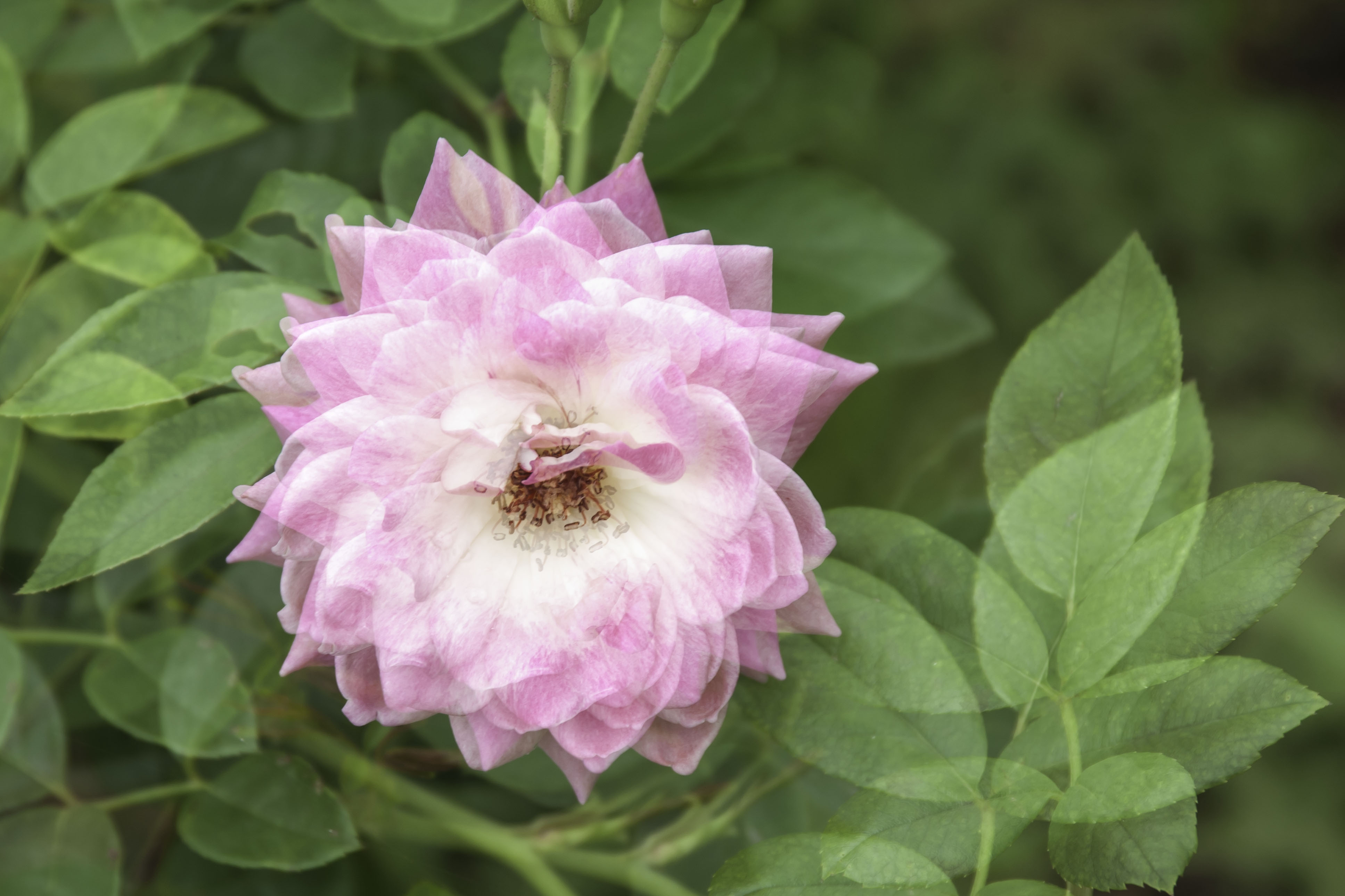
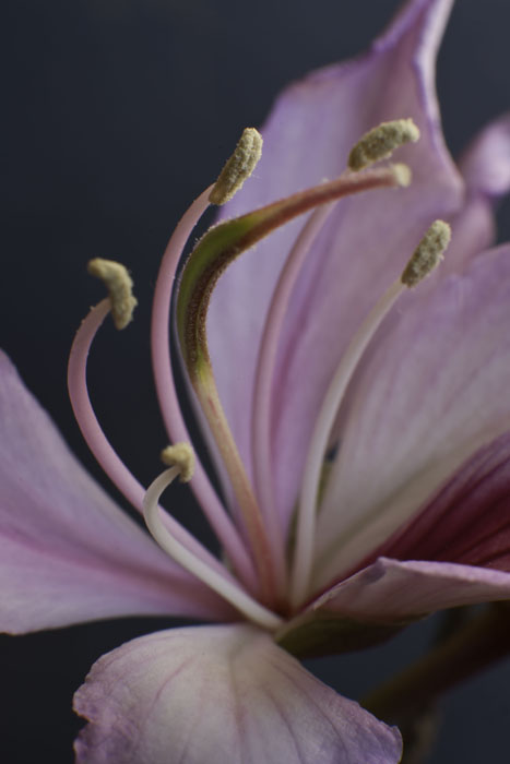
Excellent photo Cyndy. Low key images, and High keys are always eye catching, I think because they are different to the normal. And different is good. Compositionally, you have done very well and deep red blooms against a black background work well, with just enough green to give it a color we would expect to see in a plant study. I am no expert on PP in any way, but my only comment for possible improvement would be to try and tone down that bright edging to the bloom on the top left. Maybe just moving the position of the flash would help. Just my thoughts. But it is still a great photo. |
Dec 3rd |
| 76 |
Dec 18 |
Comment |
Good capture Sandy! However I must politely and most respectfully ask a question, the snowy egrets appear to be different in the two images, and some of the storks appear to have moved. So is this the same image, or possibly two taken in rapid succession? No real matter in any case. Your main image is the one we will look at and the square format suits it well. Photographing a flock of birds is quite tricky as they can look and wander in all directions at once. Your post processing has effectively giving the grass color some punch and also brought out details in the birds themselves. Well done. |
Dec 3rd |
6 comments - 3 replies for Group 76
|
12 comments - 6 replies Total
|